What is POP MART?
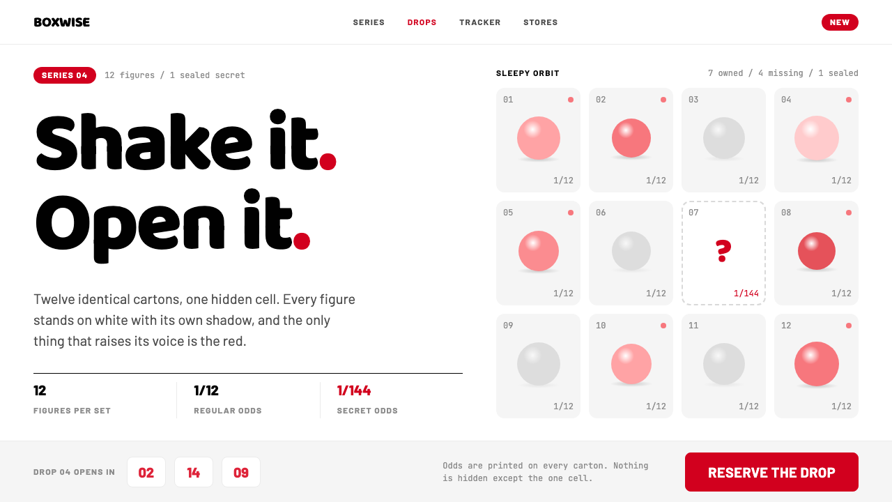
POP MART's look is a white shelf with a single red signal: a tidy grid of cartons, one hidden cell, and the small ritual of opening a blind box.
POP MART in brief
The POP MART style is the retail and collecting language of a Chinese designer-toy company founded in Beijing in 2010, whose blind-box visual identity took its present shape from about 2016. In this system every figure stands on a flat white sweep with its own small contact shadow underneath, every carton is a tall portrait box, and the cartons are packed into a dense grid of equal cells.
Colour is nearly all white, with one loud exception. A retail red marks the things a shopper must notice: prices, drops, limited releases and the small pill that says a product is new. Nothing else on the page competes with that red, so it works like a signal on a shelf label.
What makes the system distinctive is that it is organised around a ritual. A series contains twelve designs, one cell in the grid is a hidden design drawn with a dashed outline, the chance of drawing it is written in small monospaced type, and a countdown builds anticipation before a release. Commerce and play are fused in a single layout.

Where does POP MART come from?
POP MART was founded in Beijing in 2010, and its blind-box visual language, in the form the library records, dates from about 2016 to the present. The company grew out of a retail and collecting culture that was already forming around designer art toys: limited-run vinyl figures made by individual artists, sold as objects to be collected and displayed instead of toys to be played with and discarded.
The first ancestor of the style is designer art toy collecting. This is a world in which a figure's value comes from the artist's character design, the way a series is staged and the pleasure of completing a set. The visual language of a shop that sells such objects has to treat each figure like a small sculpture: lit cleanly, isolated against white and given room. That is why every figure in the system stands on its own white sweep.
The second ancestor is blind-box and gacha retail, a Japanese-rooted retail form in which the buyer does not know exactly which design is inside a sealed package. The thrill is in the unknown. The design system therefore has to display both certainty and mystery: the full series laid out as an orderly grid, and one cell kept back as a hidden design. It also has to be honest about the mechanics, which is why the odds are stated plainly in small monospaced type instead of being hidden.
The third ancestor is kawaii vinyl sculpture, the soft, round, friendly character form that gives the figures their appeal. The names recorded alongside the brand in the source are Wang Ning, Kenny Wong, Ayan Deng and Kasing Lung. The record does not describe individual contributions, so it is more accurate to say that these names belong to the world of artists and makers around the company, and that the interface language is meant to serve their work. The design makes the figures the stars. The page itself stays white and tidy, like a gallery shelf that happens to be a store.
What defines the POP MART look?
Color
White is the ground for almost everything, from the page to the sweep under each figure. One retail red carries every point of emphasis: prices, new-release pills, drop notices and limited tags. Because red is used for nothing decorative, it keeps its meaning as a signal. The figures themselves supply all the other colour, which is why the surrounding interface stays neutral.
The figure stage
Each figure stands on a flat white sweep with a soft contact shadow directly beneath it, like a product photographed on a shelf. The shadow grounds the figure without making it float, and the isolation lets the sculpt, not the background, be the subject.
Carton grid
Cartons are tall portrait boxes arranged in a dense, equal grid of identical cells. The regularity is the point: it reads as a shelf wall, makes a series feel complete and gives the eye a clear place to notice the one cell that breaks the pattern.
Hidden cell
In a series of twelve, one cell is drawn with a dashed outline instead of a solid image. It stands for the hidden design that only some buyers will draw. The dashed border is the only place the grid admits uncertainty, and it turns an inventory list into a small game.
Typography
The type system divides labour clearly. Barlow handles commerce, such as product names, prices and buttons. Baloo 2, a rounded face, handles series titles and the toy-box lettering. For Chinese text a standard sans-serif such as Source Han Sans is used. Small monospaced type is reserved for facts like the odds, and it gives them a deliberately honest, label-like tone.
Drop countdown
Before a release, a countdown block turns waiting into a feature. It is a plain strip of numerals in the commerce type, with the red signal marking the moment of the drop. The countdown reinforces scarcity without relying on flashing effects.

Who shaped POP MART?
A name recorded alongside the POP MART brand in the source; the record does not detail the contribution.
A name from the designer-toy world around the brand, as recorded in the source.
A name from the artist and maker circle associated with the brand in the source.
A name from the artist and maker circle associated with the brand in the source.
How do you use POP MART today?
For slides, the style is excellent for product launches, collection overviews and IP pitches. A cover can show one figure on a clean white sweep with a single red tag. A series slide can be a grid of equal cells with one dashed cell, which instantly explains the whole idea of a set with a hidden piece. Data slides should stay plain: white ground, monospaced small numbers, and red only for the figure that should be noticed.
For web interfaces, it is a natural fit for collectible and toy e-commerce, IP series pages, collection trackers and self-service kiosks in physical stores. Product grids should keep identical cell sizes, use the contact-shadow figure photography and reserve red for price, new and limited states. Collection trackers can show owned items as full images and missing ones as dashed placeholders. Drop pages should lead with the countdown.
For editorial and marketing work, the style suits seasonal releases, artist features, unboxing stories and social campaigns. Keep photography clean and isolated, and let the figures bring colour and personality. Copy should be short, friendly and plain about the rules of the game, including the odds, because that honesty is part of the tone.
A common mistake is to use red everywhere, on headings, borders and decorative blocks. Once red is decorative, it stops marking price and drops, and the shelf loses its single signal. A second mistake is to break the equal grid with cells of varied sizes in the name of dynamism; the regularity is what makes the hidden cell visible. Finally, avoid heavy backgrounds or busy patterns behind the figures. The sculpt needs a quiet white stage.

POP MART — FAQ
What is the POP MART design style?
It is the blind-box retail language of the Beijing designer-toy company: a white shelf, figures on a white sweep with contact shadows, a dense equal grid of portrait cartons, and one retail red used only as a signal for prices, drops and new items.
Why does the grid have a dashed cell?
The dashed cell stands for the hidden design in a series of twelve. It communicates that something is held back, turns the series into a small game, and works because every other cell is perfectly regular.
Why are the odds written in monospaced type?
Small monospaced type gives facts a plain, label-like tone. Showing the chance of drawing the hidden design openly is part of the system's honest, ritual-driven character.
Which fonts does the style use?
Barlow for commerce, Baloo 2 for rounded series titles and toy-box lettering, and a standard Chinese sans-serif such as Source Han Sans for Chinese text. Small monospaced type is reserved for facts such as odds.
What projects suit it?
Collectible and toy e-commerce, IP series pages, collection trackers, in-store kiosks, launch decks and any project built around a set of items with a small element of surprise. It is less suited to dense text-heavy or sombre work.
Related design styles
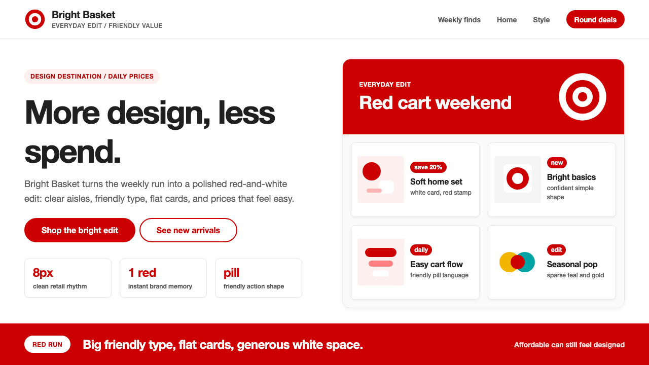 Target — Bullseye RedCheap-chic feels warm. Red bullseyes, pill CTAs, and white space make value l…
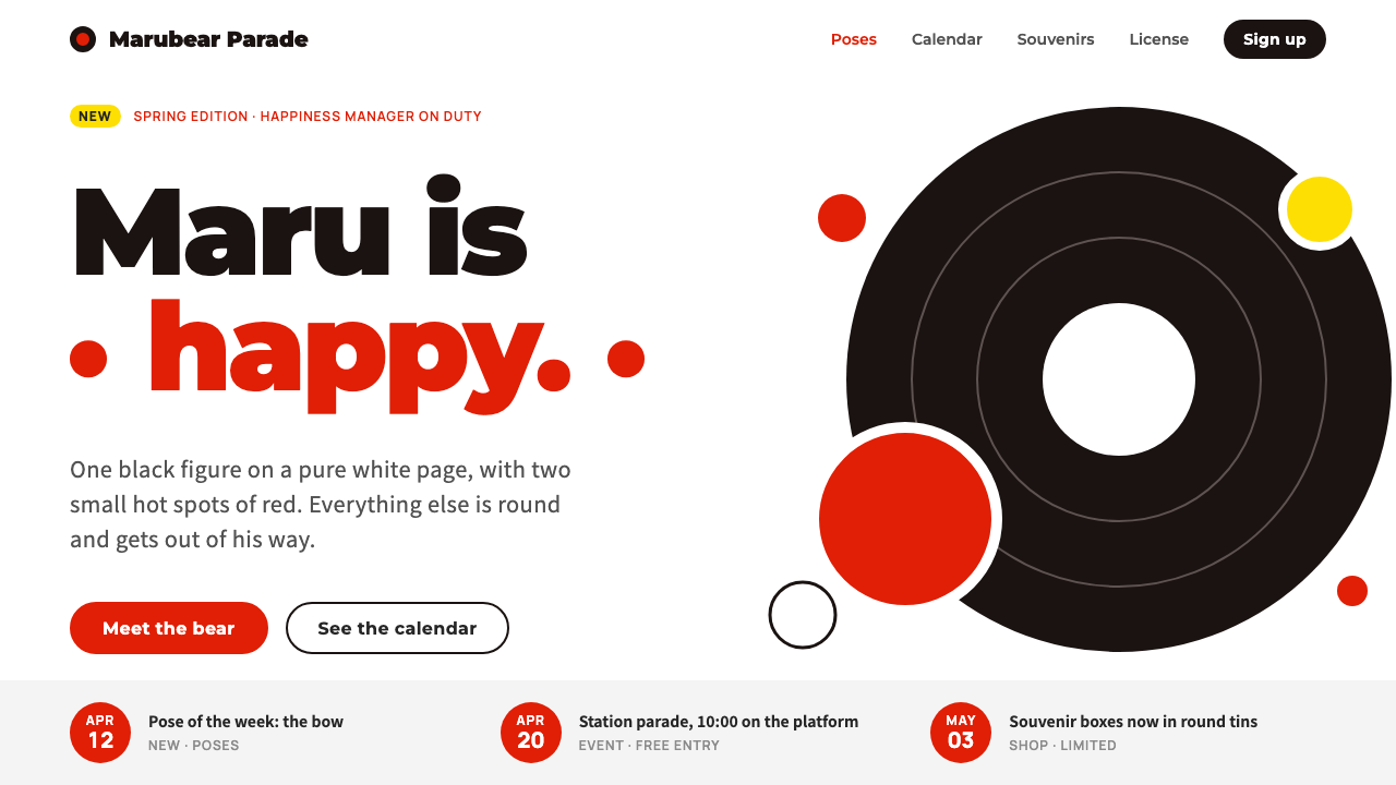 KumamonA black circle on pure white. Official red lands only on cheeks, buttons and…
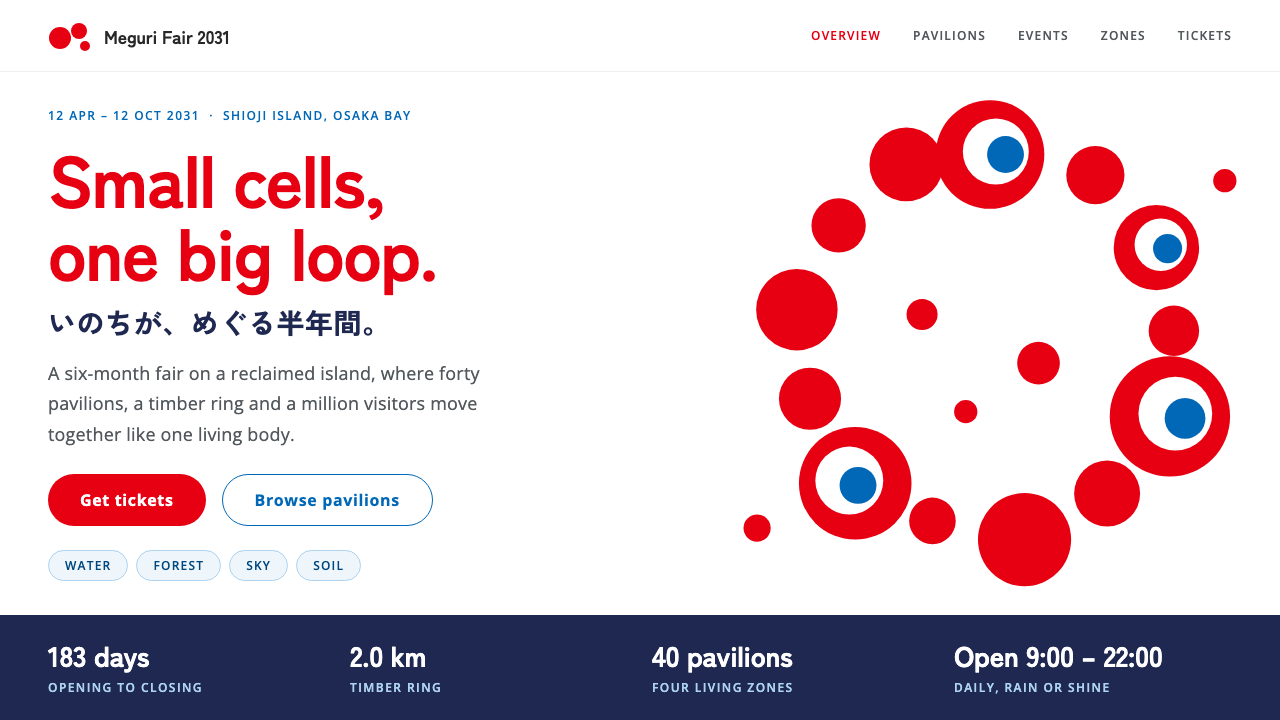 Expo 2025 OsakaRed cells that loop like something alive. Flat red and blue on pure white, bo…
 Kakao FriendsOne yellow, one gesture per cell. A white sticker sheet where speech bubbles…
 KlarnaFintech turns fashion-editorial. Dusty bubblegum pink, black Inter, and white…
 Miffy (Dick Bruna, 1955)Reduction feels alive. Flat primary shapes and one thick line float in pure w…