What is Kakao Friends?
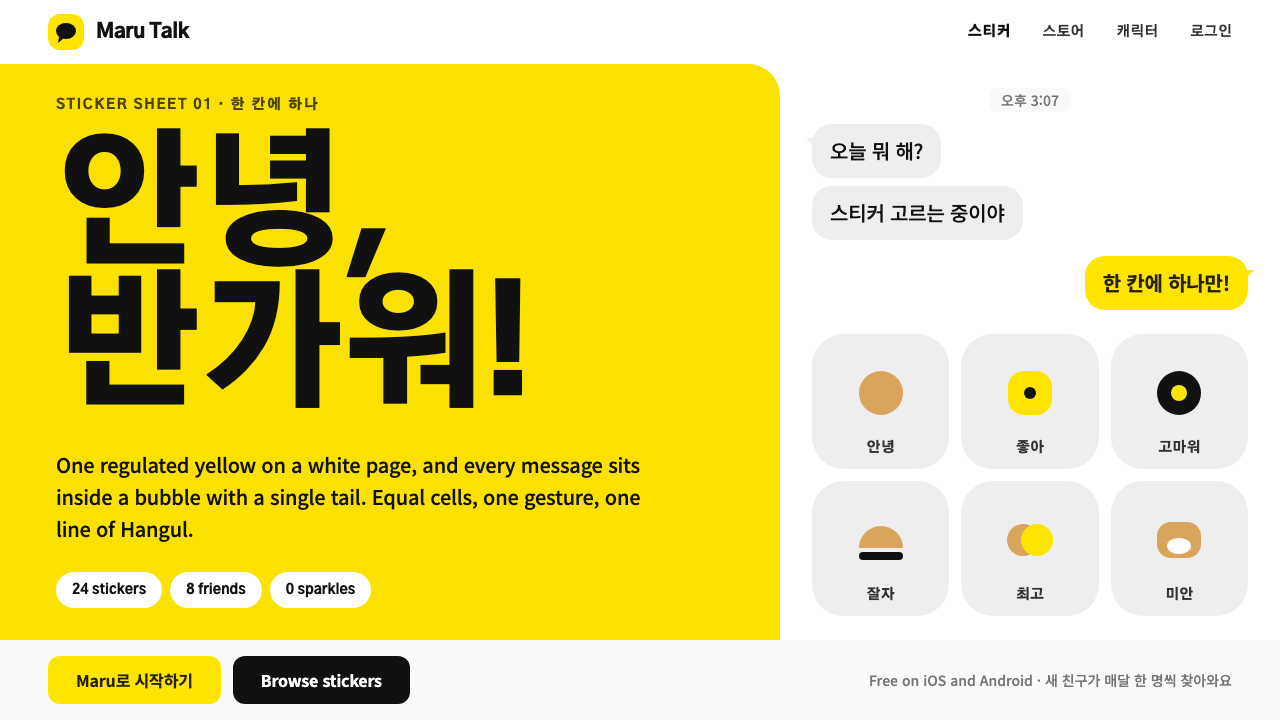
The Kakao Friends style turns a sticker sheet into a design system: one yellow, one gesture per cell, and speech bubbles that hold the content on a pure white page.
Kakao Friends in brief
The Kakao Friends style comes from a character business that began as a sheet of emoticons inside the KakaoTalk messenger and grew into a retail presence of flagship stores and shelves of plush toys. Its lead character in this style is Ryan, added in 2016: a maneless lion drawn in loess ochre, with two dot eyes, a white muzzle and a tulip-shaped white patch on his belly, rendered flat and without any outline. The design system built around him takes the grammar of a sticker sheet and applies it to interfaces.
That grammar is simple. The page is pure white. The colour that matters is Kakao yellow, applied in large areas. Speech bubbles are not background decoration but the container for actual content, so a message, a caption or a line of copy sits inside a bubble as if a character were saying it. The sheet is divided into equal cells, each cell carries a single gesture, and the text accompanying it is short and bold. Nothing sparkles: there are no gradients, no glows and no outlines.
The tone that results is friendly without being busy. Because every cell is the same size and every gesture is single, the eye scans a page the way it scans a chat, one beat at a time. Hangul and Latin text are set at matched size so that mixed-language messages feel like one voice rather than two. The impression is of a sticker sheet that has learned to behave like an interface, which is more or less what it is.

Where does Kakao Friends come from?
The source brief places the origin in Seoul, South Korea. KakaoTalk launched in 2010, and the Kakao Friends emoticons followed in 2012. In a messaging app, a sticker is a small drawing that stands in for a sentence of feeling, and it has to work at a very small size on a very crowded screen. That constraint, to be legible, to be friendly and to carry one idea per image, is the root of the style's visual economy.
Ryan debuted in 2016 and quickly became the most popular of the eight characters in the group. The retail format that followed explains the rest of the system. Flagship stores in Seoul neighbourhoods such as Hongdae and Gangnam, and shelves of plush toys, turned the sticker into a physical object. The style's visual language therefore reflects both the screen and the shop: flat vector drawing for the sticker, uniform cells for the shelf, and a single strong colour for brand recognition across both.
The movements it belongs to are commercial and popular rather than academic: Korean character intellectual property and licensed merchandise, messenger sticker culture and flat vector mascot design. Together they imply a discipline of consistency. A licensed character has to look the same on a phone, on a keyring and on a shop wall, so the rules are tight. Even the signature yellow is regulated: details such as the fill of the Kakao sign-in button and the opacity of its label are not left to the implementer's discretion.
Two names stand behind the system in the source brief: Kim Beom-su, the founder of Kakao, and Kakao IX, the group entity named for the character business. The visual period covered by this style runs from roughly 2016 to 2024, the years in which Ryan became the best-known face of the brand. The style has no single credited illustrator, which fits its nature: a character line works best when it looks the same whoever draws it.
What defines the Kakao Friends look?
A single regulated yellow
One yellow carries the brand, and it is applied in large areas rather than as a thin accent. It is a regulated colour, not a suggestion: the fill of the sign-in button and the opacity of its label are specified and cannot be altered at will. Everything else on the page is arranged so that this one colour is the first thing seen.
Pure white page
The page is pure white, like the backing of a sticker sheet. There is no tint, no texture and no pattern. This gives the yellow and the characters the maximum contrast and makes every sticker look as though it could be peeled off and placed somewhere else, which is precisely the feeling a sticker should give.
Speech bubbles as containers
The speech bubble is the layout's main container for content, not an ornament laid over it. Messages, captions, prices and calls to action all sit inside bubbles. Because the bubble is also the signature of a chat, the content reads as something said to the user, which is why the interface feels conversational even when it is showing a product list.
Equal cells, one gesture each
The sheet is split into equal cells, and each cell holds one gesture. Nothing spans two cells, and no cell tries to say two things. This is the sticker sheet's native layout and the reason the page scans so quickly: the eye never has to decide where one idea ends and the next begins.
Flat, outline-free drawing
Ryan is drawn flat, with no outline, so his body is defined by where the ochre stops and the white begins. Two dot eyes, a white muzzle and a tulip-shaped belly patch are all the detail there is. The same economy applies to the rest of the page: shapes are filled, edges are clean, and nothing glows or sparkles.
Matched Hangul and Latin, bold and short
Hangul and Latin letters are set at matched size so that mixed-language lines look like one voice. Type is heavy and lines are short, usually a single line of Korean per cell. The weight lets the words hold their own beside a bright yellow, and the brevity keeps each bubble a gesture rather than a paragraph.
The mascot as a detail budget
Ryan's anatomy sets the amount of detail the whole page may have: two dots, one muzzle, one patch. Icons, buttons and illustrations are held to that same level of simplicity, so a new element that needs more than a few simple shapes is a sign that it does not belong. The character works as a ruler for the rest of the system.

Who shaped Kakao Friends?
The lead character of this style, introduced in 2016: a maneless lion in loess ochre with two dot eyes, a white muzzle and a tulip-shaped belly patch. He was quickly the most popular of the group's eight characters. In design terms he sets the standard for flatness, restraint and recognisability that the rest of the system follows.
Named in the source brief as a key figure and known as the founder of Kakao, the company behind the KakaoTalk messenger. His relevance to the style is the platform itself: the sticker sheet exists because a messenger with millions of conversations needed a way to say feelings quickly, and the character business grew out of that need.
The group entity named in the source brief for the character business. Its role in the story is stewardship of the characters across stickers, stores and licensed merchandise, which is why the style puts such weight on consistency. A character that appears in so many forms needs rules strict enough to keep it looking like itself everywhere.
How do you use Kakao Friends today?
The Kakao Friends style is for products that want to feel like a conversation with a friendly character. It rewards disciplined simplicity: one colour, one gesture and one idea per cell. Applying it well means respecting the regulated yellow and the cell structure, not just drawing a cute animal on a white page.
For presentation slides, a cover can be a pure white field with a large block of yellow, a single character-like shape and a speech bubble holding the title. Content slides work as grids of equal cells, each with one short statement inside a bubble and one gesture beside it. Data slides suit simple comparisons and checklists, where each cell shows one number or one status with a short bold label. The style is a good fit for onboarding decks, internal culture presentations and anything aimed at a young or casual audience.
For web interfaces, the style suits onboarding flows, chat-like help screens, sticker and gift shops, loyalty programmes and any experience where tone matters more than density. Put content in bubbles, keep cells equal, and keep a single yellow action button, using the regulated treatment where a sign-in control is involved. For dashboards and pricing pages, keep the structure of equal cells and let each plan or metric occupy a single cell with a short bold label.
For editorial and marketing work, the style suits campaign pages, character launches, seasonal merchandise and social posts. Compose as a sticker sheet: a grid of equal cells, each with one gesture and a short line of text, on a plain white background. Keep sentences short and warm. The more a campaign leans on a single recognisable character and a single colour, the stronger it becomes.
The most common mistake is to treat the yellow as a general-purpose accent and scatter it in small touches, when the style depends on large, deliberate areas. Another is to add outlines, gradients or sparkle to the characters in the hope of making them richer; the flat, outline-free drawing is what makes them consistent across a screen, a keyring and a shop wall. A third is to alter the regulated yellow or the opacity of controls that the brand specifies. And the style is a poor fit for serious or high-stakes contexts, such as medical, legal or financial warnings, where its cheerfulness would undercut the message.

Kakao Friends — FAQ
Who is Ryan?
Ryan is the lead character of this style, added to the Kakao Friends group in 2016. He is a maneless lion drawn in loess ochre, with two dot eyes, a white muzzle and a tulip-shaped patch on his belly, rendered flat with no outline. He quickly became the most popular of the group's eight characters, and the design system takes its simplicity as its standard.
Why is the yellow so tightly controlled?
Because it is the brand's most valuable asset. A licensed character and a messenger platform have to look the same in every context, from a phone screen to a shop wall, so the yellow is regulated down to details such as the fill and label opacity of the sign-in button. Consistency is what turns a colour into a recognisable identity.
Can I use the style without the characters?
Yes. The grammar travels: a pure white page, one strong yellow, equal cells, one gesture per cell, content inside speech bubbles and short bold type. It will feel like the same family without any character at all, though the characters add the warmth. If you use a mascot of your own, hold it to the same level of simplicity.
Why do speech bubbles hold the content?
Because the style comes from chat. In a messenger, everything of importance arrives inside a bubble, so putting content in bubbles tells the user that the interface is speaking to them directly. It also keeps content in compact, self-contained units, which suits the equal-cell layout and keeps lines short.
How does the style handle Korean and English text together?
Hangul and Latin letters are set at matched size, in heavy weight and short lines, so that a bilingual message reads as one voice. Avoid shrinking the Latin text to look like a footnote, and avoid mixing several typefaces. The goal is that a cell holds a single gesture whichever script it is written in.
Related design styles
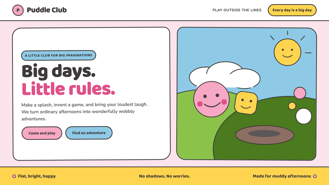 Peppa Pig (2004)Cheer without irony. Bubblegum pink, chubby type and thick outlines keep ever…
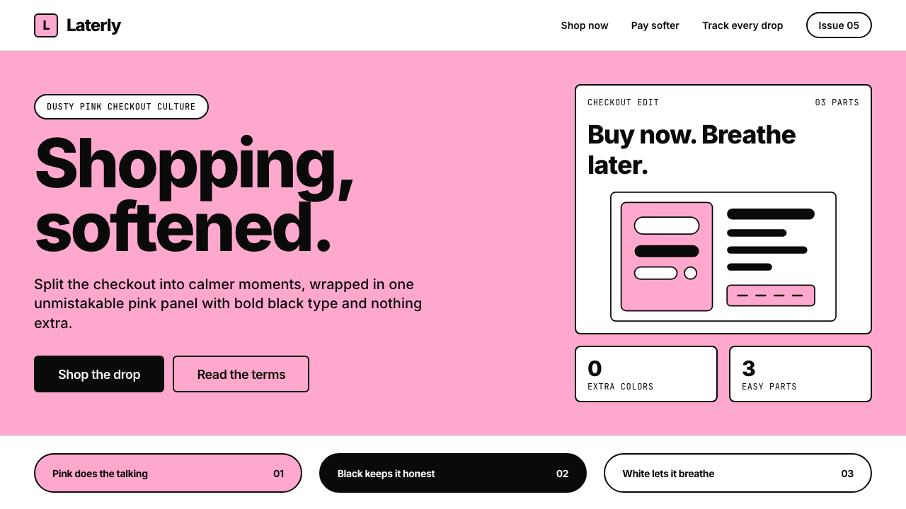 KlarnaFintech turns fashion-editorial. Dusty bubblegum pink, black Inter, and white…
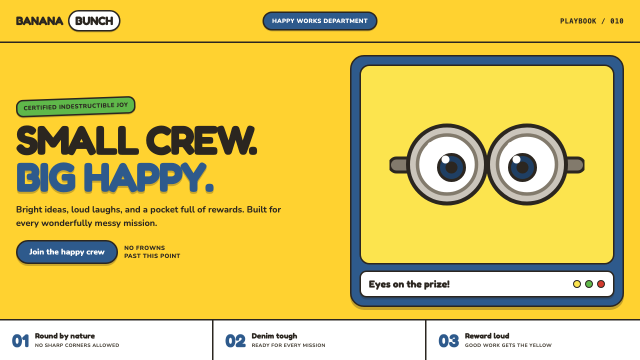 Minions (Despicable Me, 2010)Indestructibly cheerful. Minion yellow, denim blue, and chunky goggle geometr…
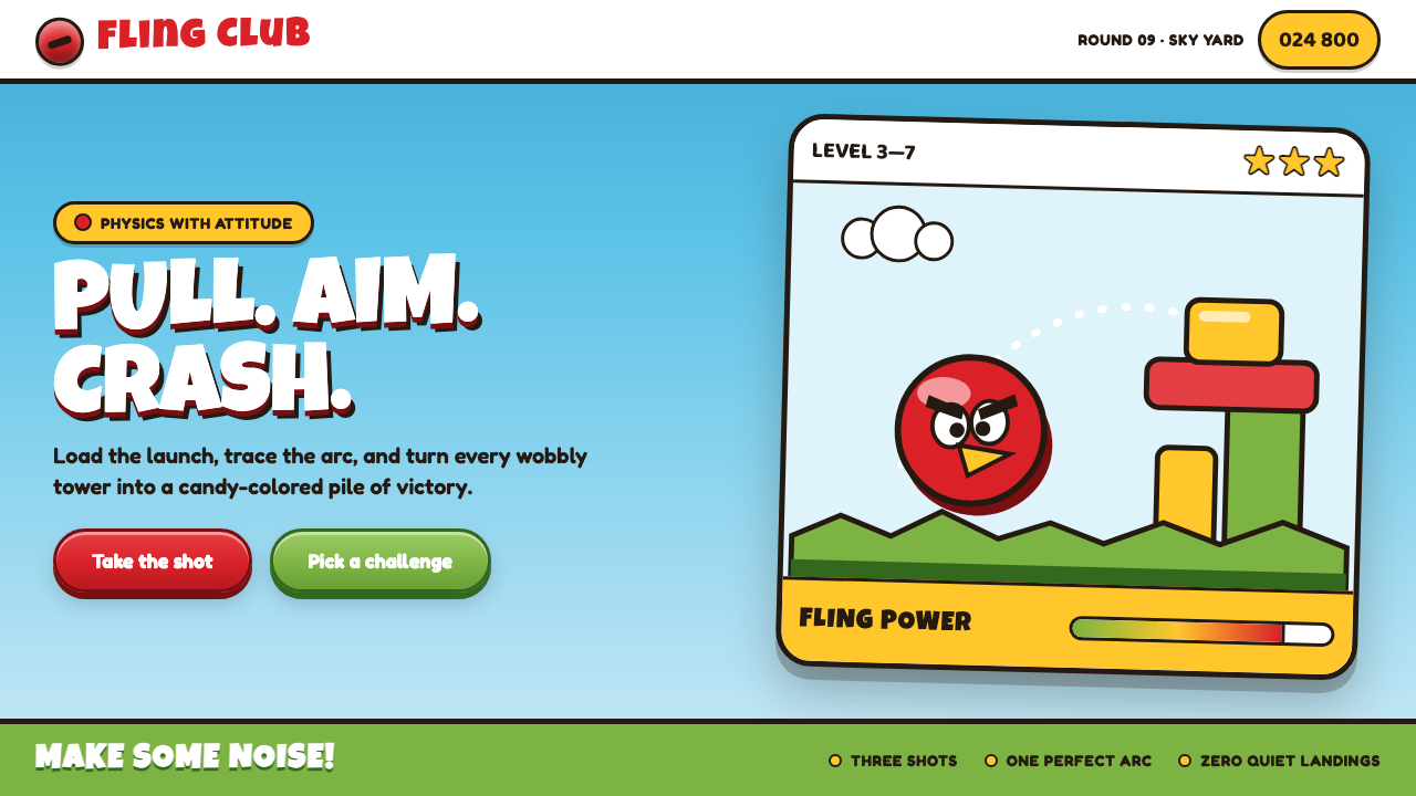 Angry Birds (2009)Adorable aggression takes flight. Candy primaries, chunky outlines, and a dot…
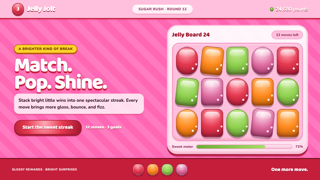 Candy Crush (2012)Sugar rush without restraint. Glossy candy tiles pulse across a striped bubbl…
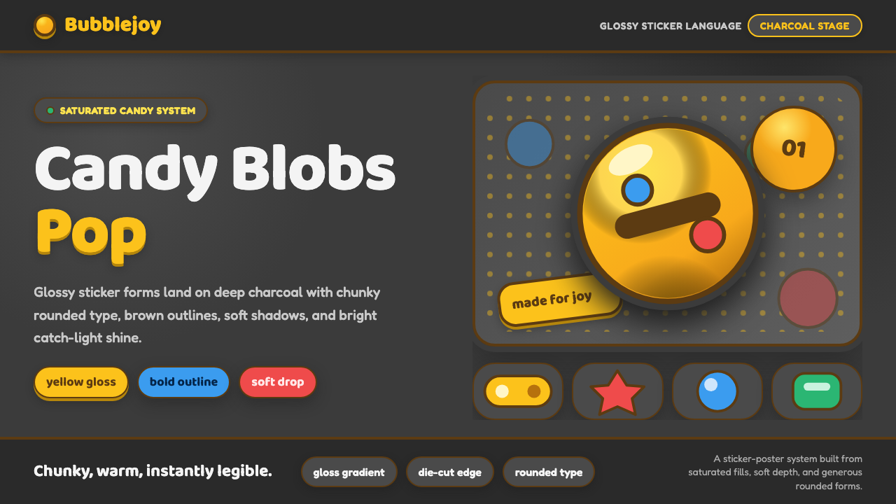 Emoji & Sticker DesignJoy goes glossy. Blob-yellow spheres pop on charcoal with brown sticker outli…