What is Peppa Pig (2004)?
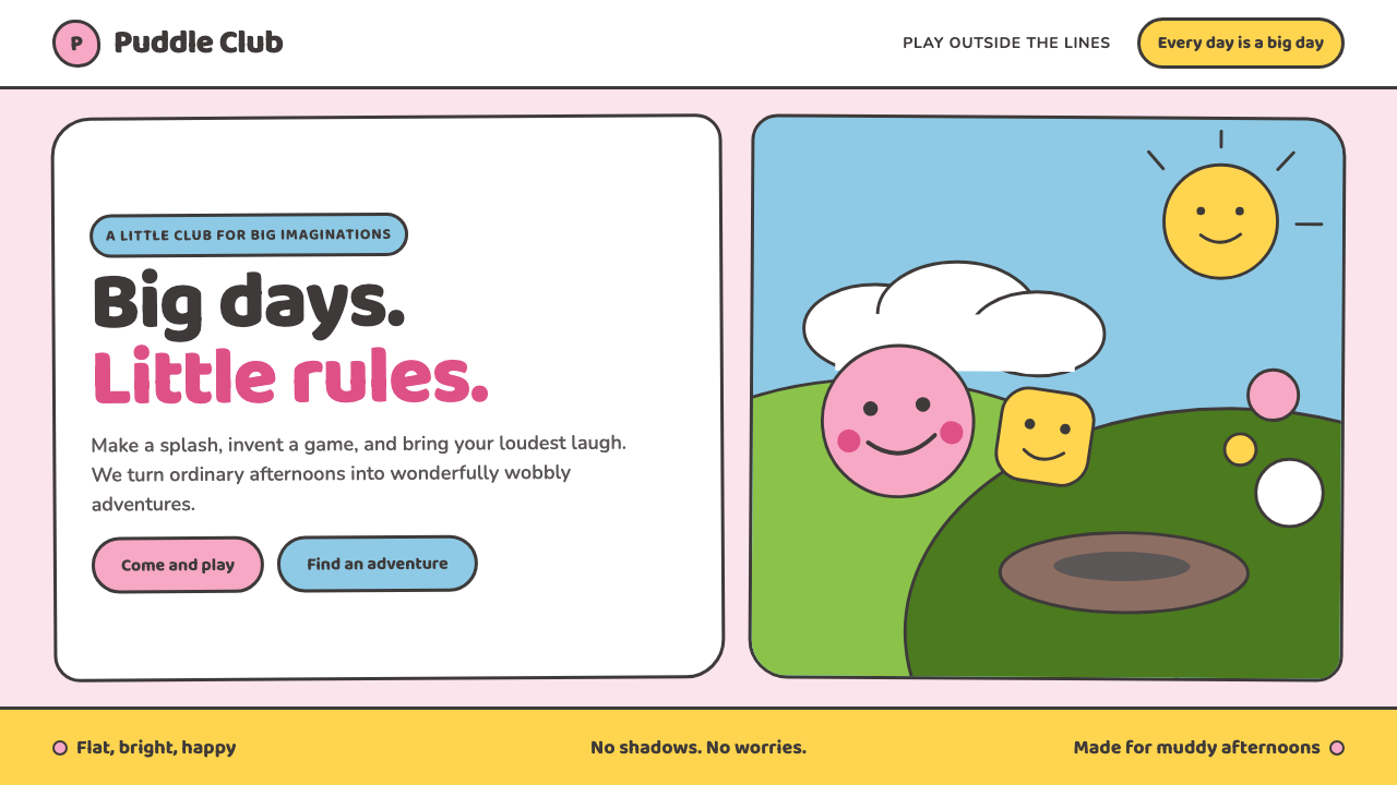
Peppa Pig makes a whole world from the visual confidence of a child’s drawing: pink, round, flat, and delighted with itself.
Peppa Pig (2004) in brief
Peppa Pig is a British pre-school animation style associated with the London studio Astley Baker Davies and first broadcast in 2004. Its visual language is deliberately reduced: bubblegum-pink pigs, rounded bodies, hairdryer-shaped heads, sideways faces that show both eyes, and bold black contours. The apparent simplicity is not a lack of design. It is a consistent system that makes characters, objects, and settings immediately legible.
The style treats flatness as a source of cheer. Opaque fills sit beside thick, even outlines; green hills stack across the background like cut pieces of felt; and hand-drawn wobble keeps clean digital construction from feeling clinical. Perspective is largely ignored, shadows do not model form, and texture does not compete for attention. A puddle, a house, a tree, and a character all belong to the same friendly visual universe.
Its emotional register is equally important. Peppa Pig does not use polish, realism, or visual irony to create charm. It prefers directness: a broad silhouette, a simple face, an obvious object, and an image that can be understood almost at once. The result feels like an invitation to play rather than a performance of cleverness.
Where does Peppa Pig (2004) come from?
Peppa Pig belongs to British pre-school animation and emerged in 2004, when its first broadcast appeared on 31 May through Channel 5 and Nick Jr. The provided description places its origin in London at Astley Baker Davies. That setting matters because the style is not presented as a generic children’s look: it is a distinct approach built around a small, repeatable set of drawing decisions.
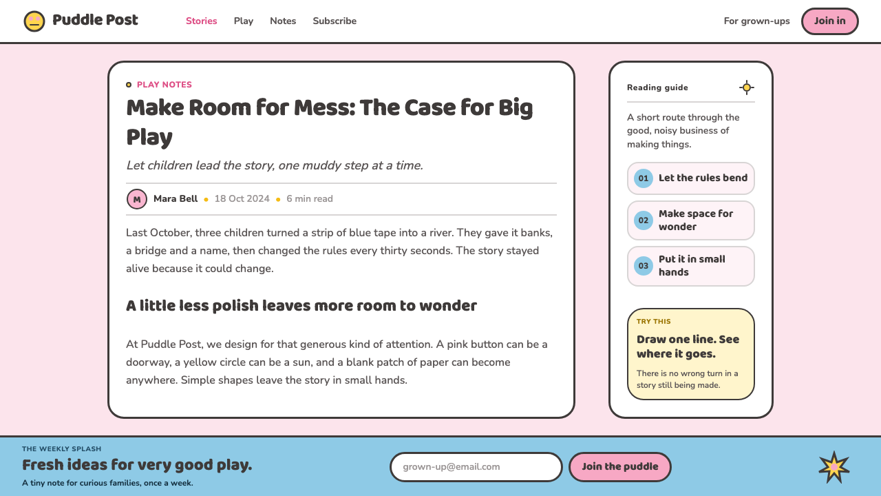
The visual premise is intentionally childlike, but not careless. The world is drawn as though by a confident four-year-old holding a fat crayon: form comes before realism, and recognition comes before detail. Heads take an unusual hairdryer-like profile, faces turn sideways while retaining both eyes, and outlines remain thick rather than tapering away. These choices make the image feel made, not observed.
Its method sits at the meeting point of flat 2D digital vector cartooning and minimalist character design. Digital construction gives the style consistency, while wobbly strokes preserve the feeling of a hand moving across paper. The line is allowed to be a little irregular; that irregularity is not a defect to correct, but part of the warmth that prevents the composition from becoming mechanical.
The style has continued from 2004 to the present because its visual rules are clear enough to sustain an entire universe. Rather than asking every new setting to prove its realism, it asks it to join the same visual agreement: flat opaque color, sturdy contour, simple silhouette, rolling hills, and uncomplicated optimism. The world remains coherent because every object accepts that agreement.
What defines the Peppa Pig (2004) look?
Flat Opaque Color
Color appears as clear, opaque fields rather than as light falling across a modeled surface. Bubblegum pink gives the pigs their immediate identity, while the surrounding world uses uncomplicated color areas to separate land, sky, objects, and characters. The absence of gradients is fundamental: color names a thing and sets its mood, rather than pretending to describe its material depth.
Even Black Outline
Thick black outlines hold the universe together. They do not taper delicately or disappear into shaded edges; they remain present around heads, bodies, trees, houses, and puddles. Their consistency gives every element equal visual citizenship. A small prop and a central character can coexist because both are spoken in the same sturdy line language.
Childlike Geometry
Forms are simplified into broad, friendly shapes that favor recognition over anatomy or perspective. The pigs’ distinctive sideways heads and simultaneously visible eyes are not realistic observations; they are an efficient visual shorthand. Circles, curves, and rounded masses make the world feel soft and approachable, while the refusal of strict realism keeps it open to imaginative play.
Wobbly Hand-Drawn Stroke
Although the style belongs to digital vector cartooning, its strokes retain a gentle hand-drawn wobble. This small instability matters. Perfectly rigid contours could make the world feel engineered; the wobble suggests a crayon-like hand and makes repeated shapes feel alive. It introduces personality without adding visual clutter or abandoning the system’s clarity.
Cut-Out Landscape
Rolling green hills are stacked like felt cut-outs rather than receding through naturalistic distance. The landscape reads in layers, not in deep space. This gives backgrounds a theatrical simplicity: they support action, establish place, and remain easy to scan. Hills, sky, and ground behave as large compositional shapes rather than as scenery demanding attention.
Cheer Without Irony
The style’s strongest rule is emotional rather than technical. It is chunky, cheerful, and sincere. Nothing in the provided visual vocabulary asks the viewer to stand outside the joke, admire a knowing reference, or distrust the sweetness of the scene. A muddy puddle is simply an occasion for a good stomp, and that wholeheartedness guides every color field, contour, and smile.

Who shaped Peppa Pig (2004)?
Neville Astley is listed in the provided source material as a key figure for Peppa Pig. Within the approved account, the name belongs to the creative context surrounding the London-based Astley Baker Davies studio and the style’s continuing history from 2004 to the present.
Mark Baker is identified as a key figure in the source material. The supplied context places this name alongside the studio responsible for a visual world defined by flat color, thick outlines, minimal character construction, and uncomplicated pre-school cheer.
Phil Davies appears among the source material’s key figures. The available material connects the name to the Peppa Pig context originating in London, where the programme’s repeatable visual rules turn simplified forms into a coherent everyday world.
Harley Bird is also named as a key figure in the approved material. The supplied record does not assign a separate visual role, but places the name within the programme’s public history and its enduring identity as British pre-school animation.
How do you use Peppa Pig (2004) today?
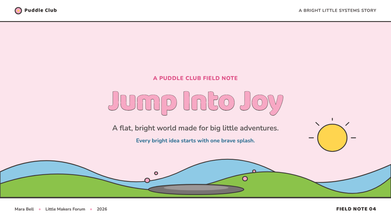
For presentation covers, use the style’s confidence rather than trying to reproduce every cartoon detail. Let a single rounded character-like silhouette, a pink focal form, or a rolling hill establish the page, then give the title enough open space to read instantly. The cover should feel like a child’s certain mark on paper: broad, direct, and happy. Avoid realistic scene-building, intricate illustration, or dramatic lighting.
On content slides, treat each idea as a plainly bounded object. Thick outline-like dividers, rounded containers, simple icons, and clear pictorial labels can make information approachable without making it childish. Keep the hierarchy obvious through grouping and scale. For data slides, reduce charts to bold filled forms with strong outlines and immediately readable categories; the goal is a friendly explanation, not a miniature simulation of an analytical interface.
For web interfaces, this language works best where warmth, reassurance, and quick comprehension matter: family-oriented experiences, beginner learning flows, playful dashboards, and simple plans or pricing pages. Use a light, open field, large rounded forms, consistent dark contours, and generous separation between actions. Controls should look touchable and named clearly. The interface should welcome a user in rather than make them decode a visual puzzle.
For editorial and marketing work, use the cut-out landscape logic to organize a page into cheerful zones. A headline can sit beside a rounded illustration or a simple hill-like panel; short explanatory blocks can follow as neatly separated objects. Marketing moments should stay sincere and legible, with playful pictures supporting the message rather than covering it in busy decoration. The style is especially effective when the product promise is uncomplicated and optimistic.
A common mistake is to confuse this style with generic pastel minimalism. Peppa Pig’s look depends on the relationship between flat opaque fills, thick even black outlines, childlike distortion, and unembarrassed cheer. Soft realistic shading, polished dimensional effects, finely tapered linework, or sarcastic copy all weaken that relationship. Another mistake is overfilling the page: its simplicity works because each rounded form has room to be recognized.
Peppa Pig (2004) — FAQ
Why do Peppa Pig characters show both eyes in profile?
The supplied material describes sideways faces that show both eyes at once. This is a deliberate departure from natural observation and fits the style’s larger priority: immediate readability over realism. The face remains unmistakably a side view while retaining the direct emotional clarity that two visible eyes provide. It is visual shorthand, not an attempt at anatomical accuracy.
Is the flatness merely a low-detail production shortcut?
No. The provided description presents flat opaque fills, the absence of gradients, cast shadows, and texture, and the use of layered hills as a coherent aesthetic language. Flatness makes objects comparable, keeps contours dominant, and protects the childlike confidence of the world. Removing depth is therefore an expressive decision as well as a simplifying one.
Can this style work without pink?
Bubblegum pink is central to the supplied description of the pigs, so removing it changes a major recognition cue. But the broader language also depends on rounded forms, thick even outlines, opaque flat fills, wobbly strokes, and a sincere emotional tone. A related application can use another clear cheerful color, provided it keeps those structural decisions together rather than borrowing only a superficial palette.
Why avoid texture and realistic shadows?
Texture and realistic shadows would ask the viewer to read material, lighting, and depth before reading the simple idea of the object. Peppa Pig reverses that order. A puddle, hill, or character is identified through contour and filled shape, then supported by the scene’s uncomplicated color. This preserves speed, warmth, and visual equality across the world.
What makes an imitation feel wrong?
An imitation usually fails when it preserves isolated motifs but loses the style’s agreement with itself. Pink without sturdy contours, rounded characters rendered with realistic depth, or playful shapes paired with cynical language create competing messages. The source material describes a world with no apology and no irony. A successful adaptation must let line, color, shape, landscape, and tone all carry that same uncomplicated invitation to play.
Related design styles
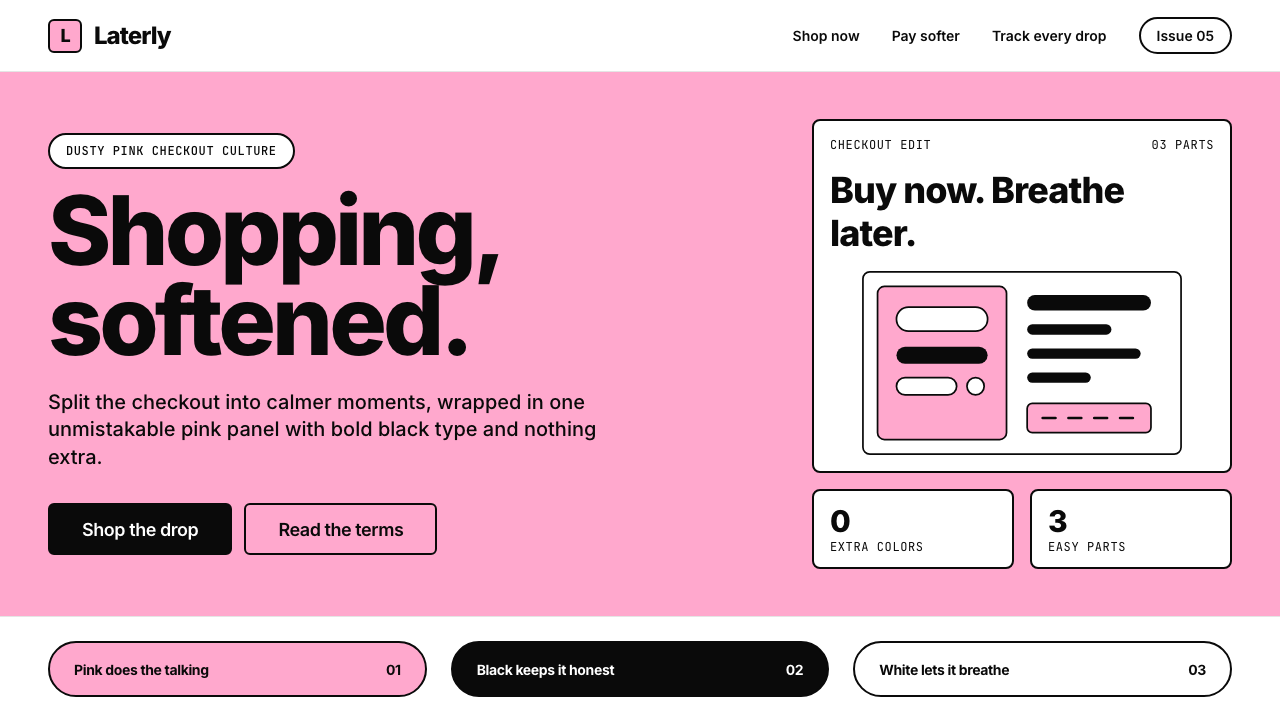 KlarnaFintech turns fashion-editorial. Dusty bubblegum pink, black Inter, and white…
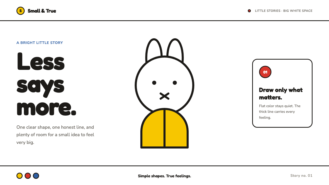 Miffy (Dick Bruna, 1955)Reduction feels alive. Flat primary shapes and one thick line float in pure w…
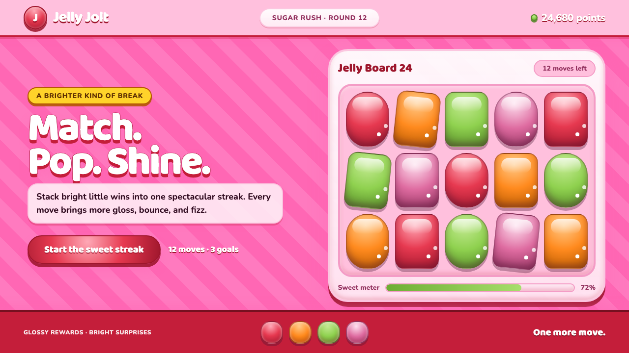 Candy Crush (2012)Sugar rush without restraint. Glossy candy tiles pulse across a striped bubbl…
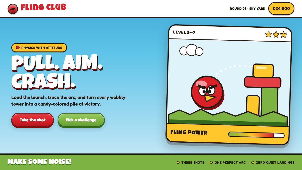 Angry Birds (2009)Adorable aggression takes flight. Candy primaries, chunky outlines, and a dot…
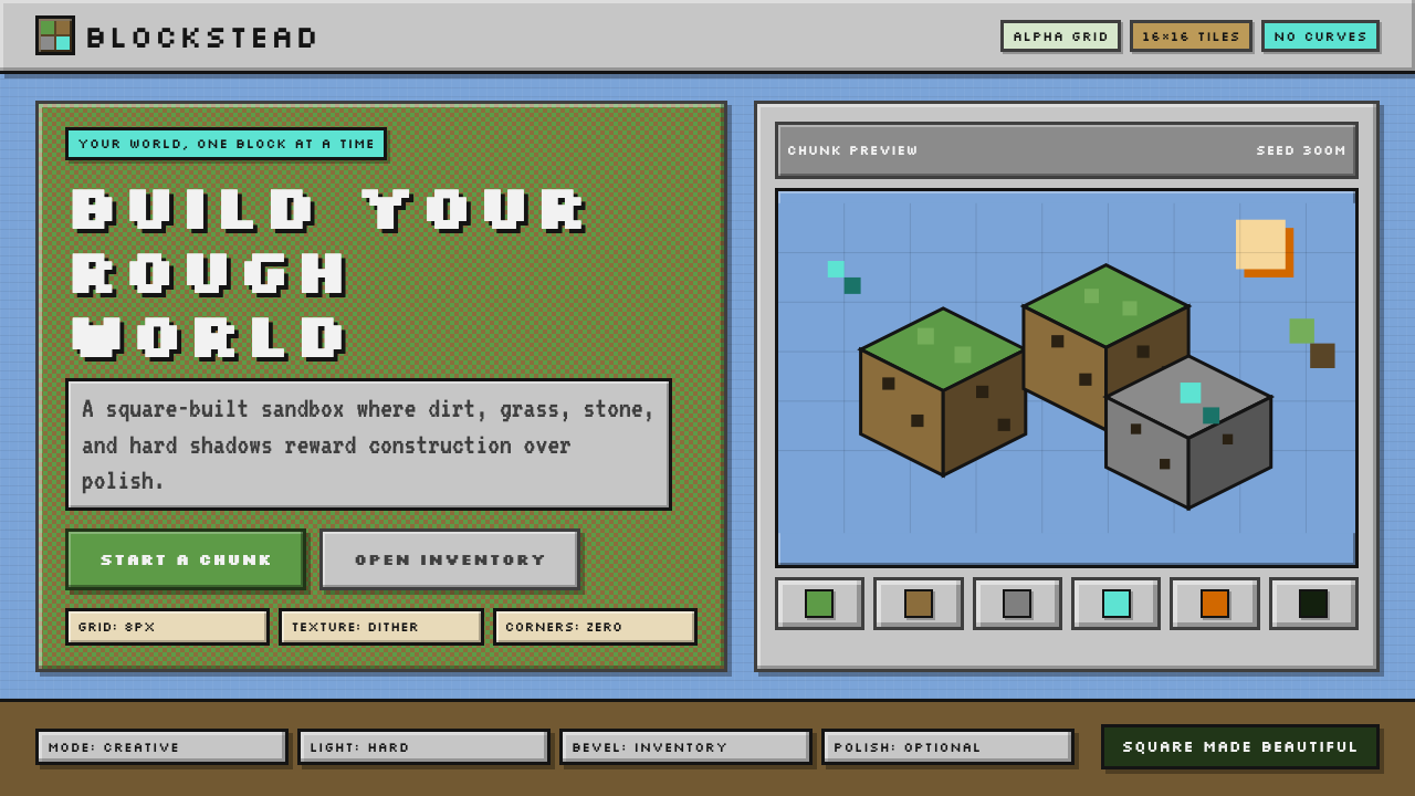 Minecraft VoxelUgly becomes buildable. Grass green, dirt brown, hard bevels, and 16×16 grids…
 Nickelodeon Orange Splat (1984)Kids own the screen. Orange fields, slime-green pops, and wobble borders do t…