What is Miffy (Dick Bruna, 1955)?
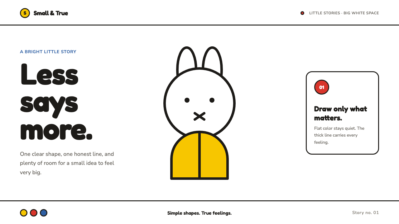
Miffy makes reduction feel alive: flat color, one unmistakable line, and white space large enough to let a tiny rabbit breathe.
Miffy (Dick Bruna, 1955) in brief
Miffy is the visual language created by Dutch designer Dick Bruna in 1955 for Nijntje, the small rabbit known internationally as Miffy. It is an unusually complete system of reduction: simple flat fields of color, a heavy hand-painted contour, compact figures, and a pure white ground that is never treated as leftover space. The result is immediately legible, but not mechanical. Its apparent simplicity carries warmth because every curve and mark retains the feeling of a hand deciding where it belongs.
Bruna's method was patient subtraction. He repeatedly drew the same shape until the most direct and truthful version remained, then painted it as a flat area and gave it room. The outline performs the expressive work: it establishes the figure, suggests gesture, and gives a face its emotional presence. Color does not model volume or simulate light. It sits quietly inside the line, allowing the silhouette and expression to remain clear.
The Miffy language belongs to post-war Dutch graphic design, late De Stijl reduction, children's picture-book modernism, and flat-color illustration, yet it has a character all its own. It is not minimalism as cool restraint. Its simplicity is protective and attentive: an image is reduced until a child can recognize it quickly, while enough irregularity remains for the image to feel tender, human, and alive.
Where does Miffy (Dick Bruna, 1955) come from?
The origin point is Utrecht in the Netherlands, where Dick Bruna created Nijntje in 1955. From that beginning onward, Miffy developed as a picture-book language rather than as a decorative style applied after the fact. The rabbit's identity emerged through repeated acts of drawing, editing, painting, and clearing space around the image. Its discipline came from deciding what could be removed without losing recognition or feeling.
Bruna's working process is central to the style's meaning. A shape was not made simple by being drawn casually; it became simple after being tested again and again. This gives the finished forms their unusual confidence. A head, ear, flower, garment, or face does not compete for attention through detail. Each has been compressed into a broad, readable sign, while the hand-painted line prevents the sign from becoming impersonal.
The mature flat-color house style was established by the early 1960s. By then, the relationship between line, color, and white space had become stable: the dark contour states the form, flat color fills selected areas, and the white field holds the composition open. This was a visual system capable of consistency without losing intimacy, because its consistency came from a way of seeing rather than from decorative repetition.
Its approved historical context includes post-war Dutch graphic design, late De Stijl reduction, children's picture-book modernism, and flat-color illustration. Henri Matisse, Fernand Léger, and Gerrit Rietveld belong to the reference field around this language alongside Bruna. Their presence helps locate Miffy within a modernist culture of simplified form, clear structure, and deliberate color, while Bruna's rabbit turns those ambitions toward a particularly gentle visual world.
What defines the Miffy (Dick Bruna, 1955) look?
The Living Outline
A single heavy, hand-painted outline carries identity, expression, and structure. It is confident but never sterile: small shifts in its path make the figure feel drawn rather than manufactured. The line defines forms without shading, texture, or descriptive clutter.
Flat Color Fields
Color appears as calm, solid fields behind the outline. It does not imitate material, depth, or changing light. Its role is to separate forms, give an object presence, and keep the image cheerful without interrupting the clarity of the drawing.
White Silence
Pure white is an active compositional field, not an empty background waiting to be filled. It gives every figure room, protects the small number of marks from visual noise, and makes a compact subject feel unexpectedly spacious.
Reduced Form
Objects are reduced to their most recognizable visual truth. Curves are broad, silhouettes are compact, and features are few. This is not simplification for speed; it is a deliberate search for the smallest form that can still carry personality and meaning.
Gentle Expression
Emotion is conveyed with remarkable economy. A face does not require elaborate anatomy or theatrical gesture to be present. The restraint leaves room for viewers, especially children, to meet the character without being overwhelmed by instruction or detail.
Disciplined Repetition
The visual language gains strength through repeated decisions: the same direct contour, the same flat treatment, the same respect for white space. Repetition is not formula. It is a promise that every new image will obey a coherent, caring logic.
Who shaped Miffy (Dick Bruna, 1955)?
Bruna created Nijntje in Utrecht in 1955 and developed the visual language known internationally as Miffy. His practice of repeatedly redrawing a form until its simplest true version survived is the foundation of the system. The heavy hand-painted line, flat color, and expansive white space are inseparable from that editorial discipline.
Matisse is part of the approved reference field for Miffy. In this context, his name helps frame the importance of flat color and reduced shape: color can be a complete visual event rather than a surface effect, and a simplified form can remain expressive rather than merely spare.
Léger appears in the reference field around Miffy as a figure associated with bold, legible form and clear color relationships. That context is useful for reading Miffy as a modern graphic language in which separate shapes retain force, rather than dissolving into atmospheric detail.
Rietveld belongs to the late De Stijl context named for the style. His presence situates Miffy near a Dutch modernist interest in reduction, structure, and deliberate visual relations. Bruna's work translates that structural clarity into a small, welcoming picture-book world.
How do you use Miffy (Dick Bruna, 1955) today?
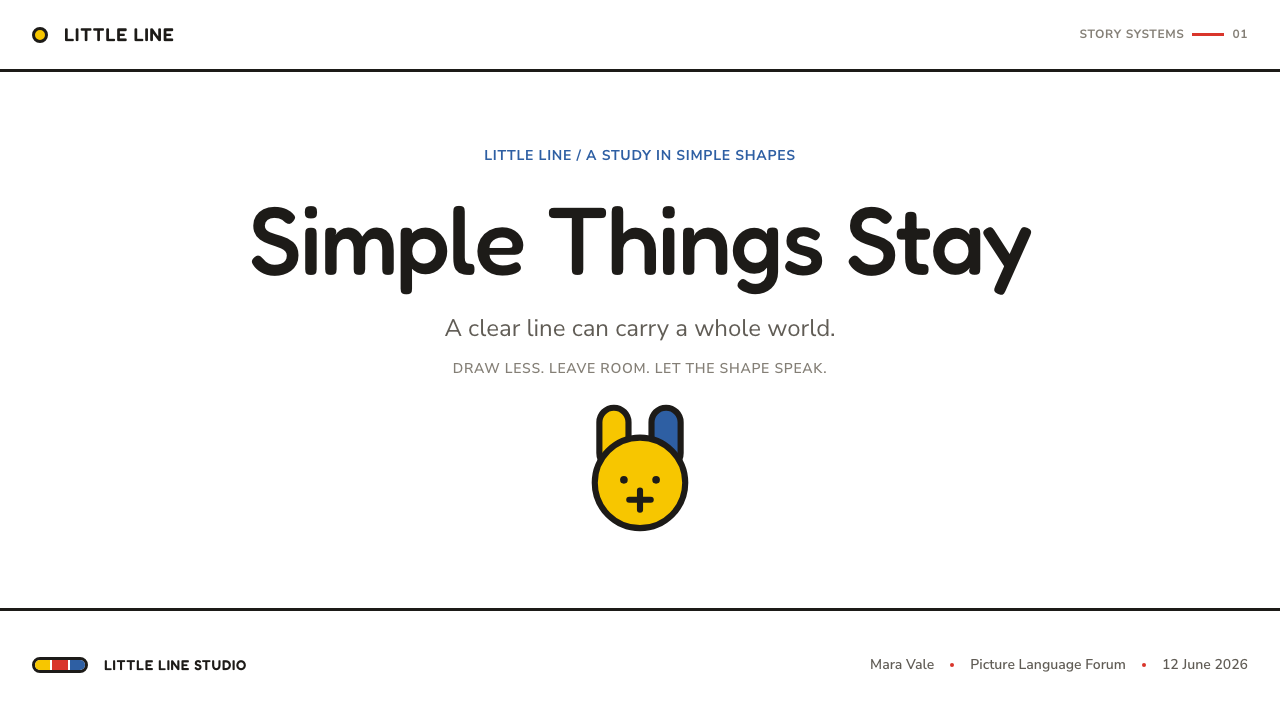
For presentation covers, use the Miffy language as an exercise in confidence. Place one reduced illustration or one large, flat form within a generous white field, then let the title sit with equal calm rather than competing for spectacle. Content slides should preserve that restraint: short statements, direct labels, and clear visual pauses are more faithful than busy explanatory decoration. On data slides, treat charts as a small set of readable shapes, using color to separate categories rather than to create visual excitement.
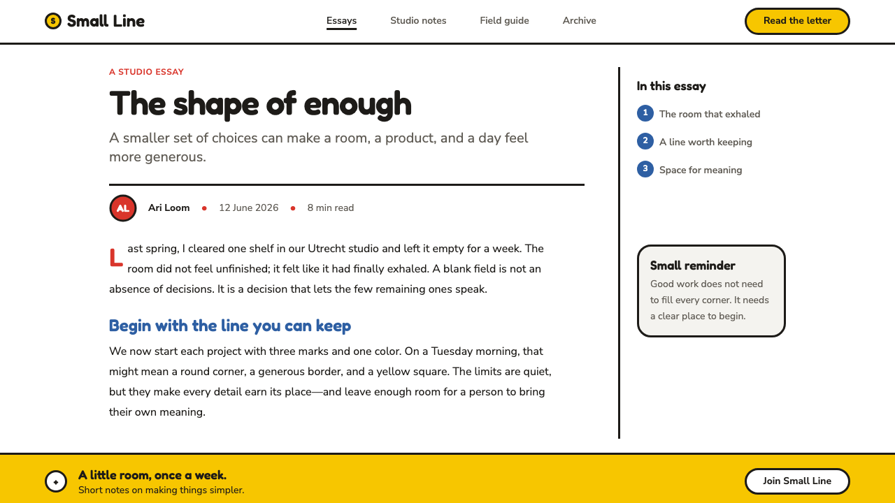
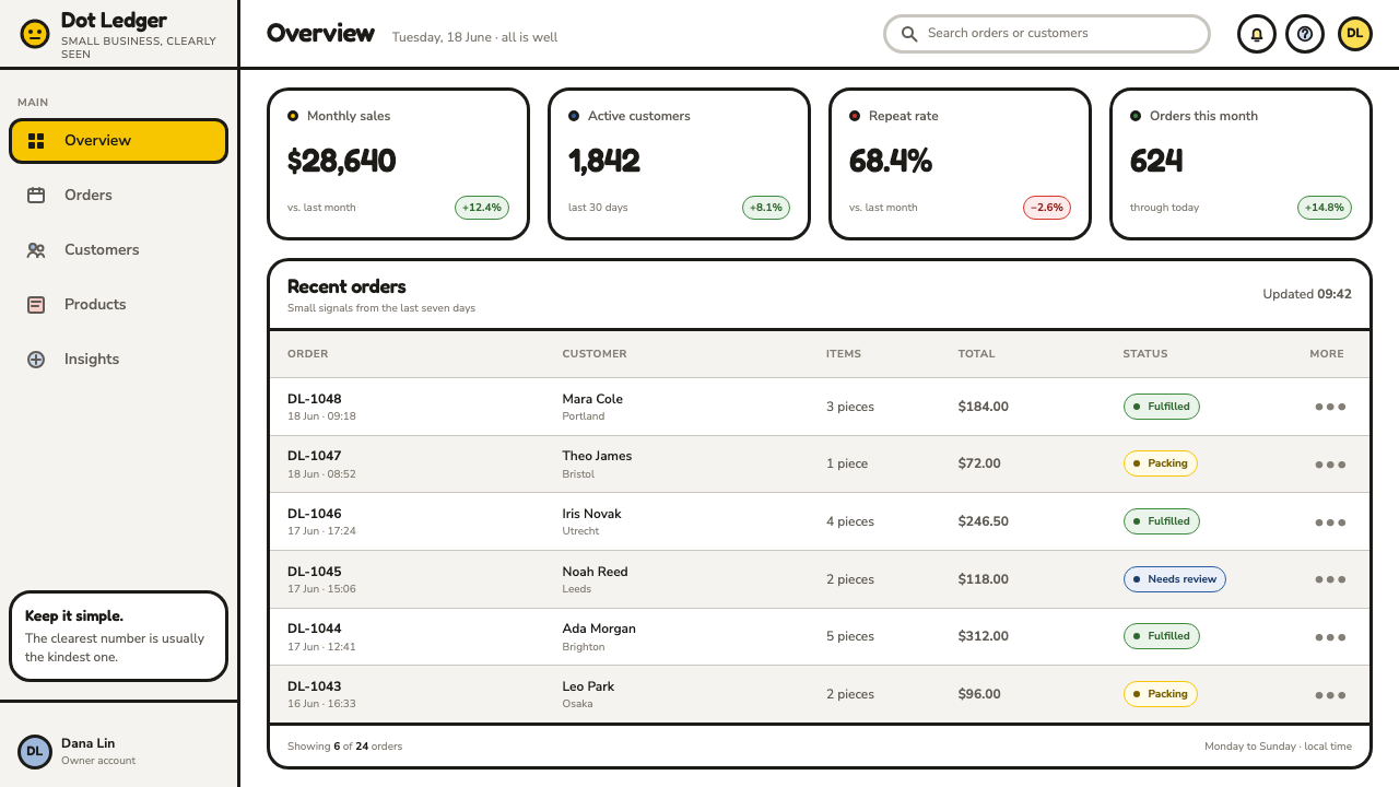
For web interfaces, this style works best where reassurance, immediate recognition, and calm navigation matter. Dashboards can use clear silhouettes, gentle states, and large regions of white to make information feel approachable. Pricing pages benefit when tiers are presented as distinct, simple blocks with direct language instead of layered promotional effects. Interface icons should behave like tiny illustrations: recognizable at a glance, outlined consistently, and free from unnecessary internal detail.
For editorial and marketing work, Miffy-inspired design is strongest when the message is brief and human. A poster, landing page, campaign card, or product explainer can build its hierarchy from a single figure, one compact headline, and a carefully chosen color field. Leave space around copy and images rather than filling every gap. The quietness makes a small gesture feel meaningful, which is especially useful for family-facing communication, invitations, announcements, and educational material.
The style also offers a practical lesson for illustration systems. Establish a limited family of contours, shapes, facial features, and flat fills, then apply them consistently across a set of pages or screens. Consistency should come from the drawing logic, not from adding matching decorative motifs everywhere. When a new object enters the system, reduce it until it looks as though it belongs naturally beside the existing characters.
A common mistake is to copy the rabbit's surface cues while abandoning its discipline. Adding busy patterns, modeled shadows, glossy effects, elaborate type treatments, or crowded scenes changes the visual logic completely. Another mistake is making every element equally cute or equally colorful. The essential contrast is between a small, direct image and the large white silence around it. Preserve that contrast, and the result can feel inspired by Miffy without becoming imitation.
Miffy (Dick Bruna, 1955) — FAQ
Is Miffy style simply minimalism for children?
No. Its reduction is designed to preserve recognition and feeling, not merely to remove visual material. The hand-painted outline matters because it keeps the system emotionally present. A sparse layout without that sensitivity can look empty or generic; Miffy feels alive because every remaining mark has been carefully earned.
Why is white space so important in Miffy-inspired work?
White space is part of the image's meaning. It isolates the figure, gives the line room to be seen, and makes flat color feel deliberate rather than decorative. If the space is crowded with labels, borders, textures, or secondary illustrations, the central form loses the quiet clarity that makes the language distinctive.
Can this style use complex subjects?
Yes, but complexity must be handled through selection rather than accumulation. Identify the feature that makes a subject recognizable, reduce it to a broad silhouette or direct contour, and let supporting information remain separate. The style is strongest when it states the essential idea clearly instead of trying to depict every visible fact.
What makes a Miffy-inspired design feel authentic rather than derivative?
Use the underlying discipline rather than recognizable borrowed symbols. Draw forms until they become direct, give them generous space, let a consistent hand-drawn contour carry expression, and use flat color with restraint. Avoid reproducing the rabbit, its face, or its familiar objects. The enduring lesson is Bruna's method of reduction, not a collection of motifs.
Related design styles
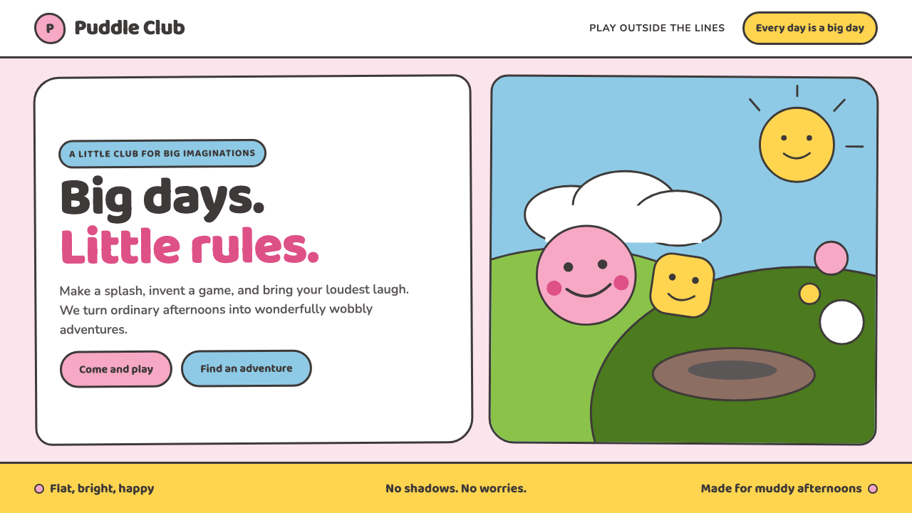 Peppa Pig (2004)Cheer without irony. Bubblegum pink, chubby type and thick outlines keep ever…
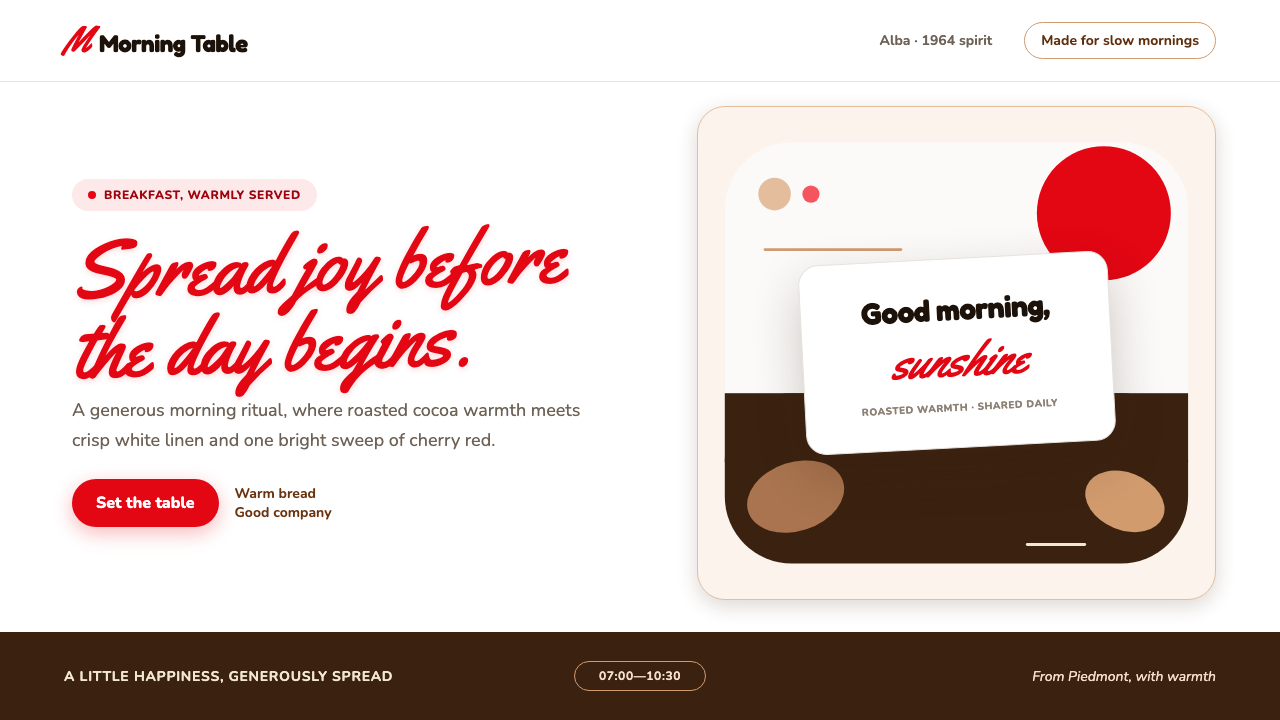 Nutella (1964)Breakfast feels brighter. Cherry script and roasted-hazelnut brown warm a cri…
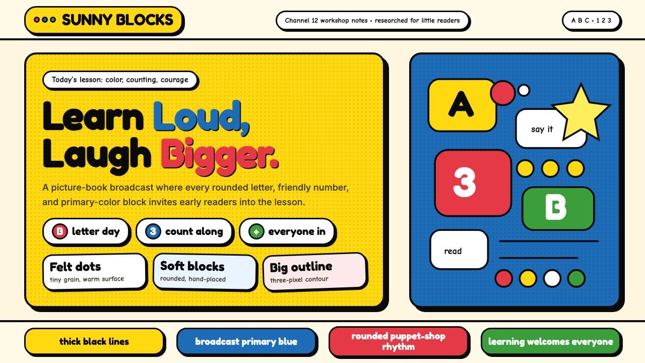 Sesame Street (1969)Learning feels handmade. Big yellow, monster blue, chunky outlines, and round…
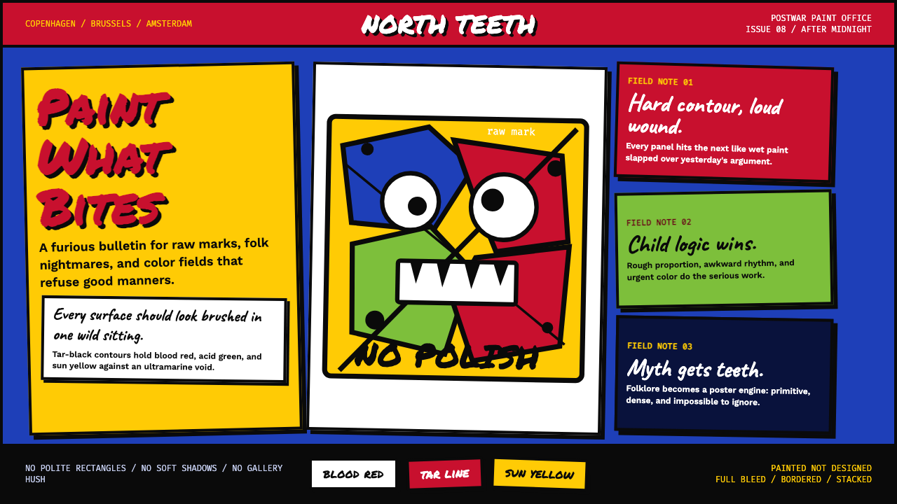 CoBrA (Asger Jorn, 1948)Paint refuses polish. Ultramarine ground, blood red slabs, and marker type th…
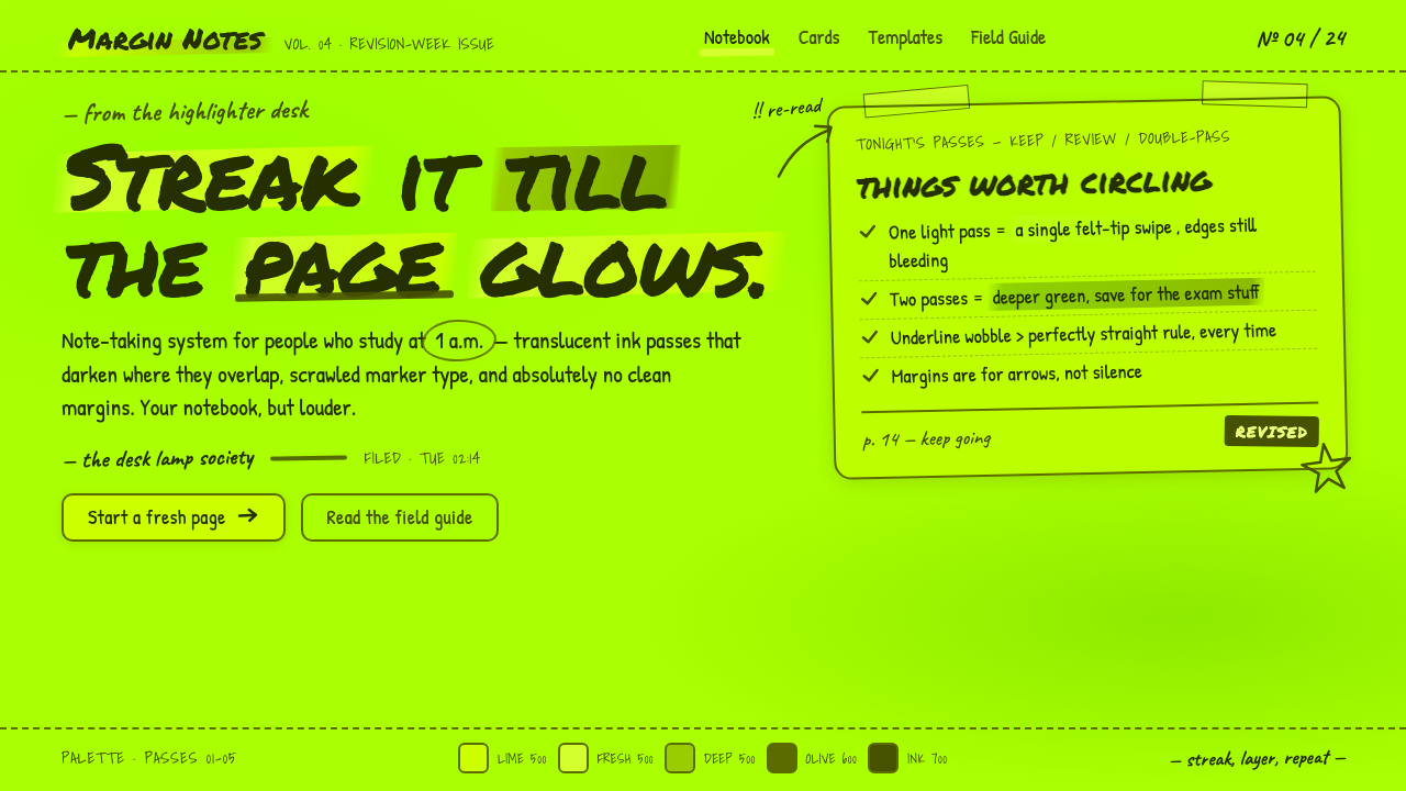 Fluorescent HighlighterStudy notes at 1am, made into a system. Translucent lime ink layered until th…
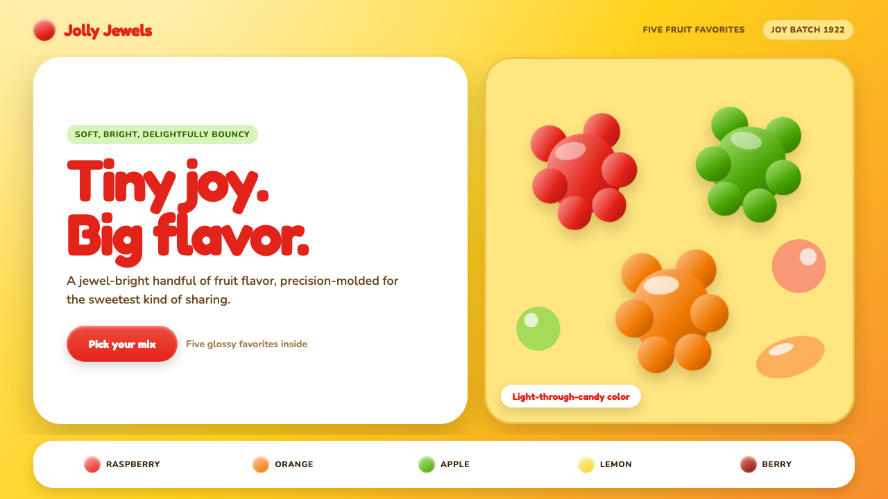 Haribo Goldbears (1922)Childhood joy, precision-molded. Glossy fruit colors tumble across a foil-gol…