What is Expo 2025 Osaka?
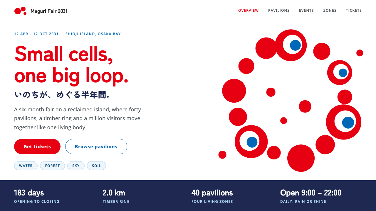
Expo 2025 Osaka made a world's fair out of living cells: a ring of uneven red forms, a flowing blue body, and a calm white page that lets both breathe.
Expo 2025 Osaka in brief
The Expo 2025 Osaka style is the visual identity of the World Expo held on Yumeshima island in Osaka, Kansai, between April and October 2025. Its theme was to design the future society for our lives, and its look is built around a loose ring of red cells of different sizes, some of which seem to look back at the viewer through white-and-blue eyes.
The identity is lively and unusual, yet it always rests on a disciplined white page. The emblem red is saved for headings and key actions, a clear Expo blue carries information and links, and a deep navy anchors data bands and footers. The type is a bold Japanese gothic paired with a clean Latin sans, set with generous space around it. Energy comes from the shapes; order comes from the page.
The style fits anything that has to be playful and trustworthy at once: event sites, pavilion guides, schedules, ticketing and public-facing information that must be read quickly by a very broad audience. It borrows the mood of a festival without surrendering the clarity of a public service.

Where does Expo 2025 Osaka come from?
The Expo took place in Osaka, Kansai, Japan, as a World Expo under the framework of the Bureau International des Expositions. World Expos have long been occasions for national and city identity to be shown to the world, and each one produces a distinct graphic identity. For Osaka, that identity centers on circulation and life, a concept summed up as the circulation of lives.
The emblem was selected in 2020. It was designed by a team called TEAM INARI, and it takes the form of red cells of uneven size looped into a ring. The unevenness is deliberate: a perfect circle of identical dots would look like a logo, while a ring of cells that vary in size and character looks like something alive. A few of the cells have eyes, and that small touch gives the whole mark a gaze.
A design system followed in 2022, extending the emblem into a consistent set of colors, type and rules for the many sites, signs and printed items an Expo needs. The mascot Myaku-Myaku was built from the same idea: red cells joined to a flowing blue water-like body, so that the two main colors of the identity became a character as well as a palette. The Expo was held from 13 April to 13 October 2025.
People named in connection with the project include Tamotsu Shimada, Kohei Yamashita and the architect Sou Fujimoto. The identity belongs to the wider field of contemporary Japanese graphic design, which is known for combining strong, slightly strange forms with a very clean sense of order. This system keeps that combination: the emblem's wildness is contained by a plain white page and a firm hierarchy.
What defines the Expo 2025 Osaka look?
Color
Three colors do three jobs. Emblem red is reserved for headings and the actions that matter. Expo blue carries information, links and interactive hints. A deep navy settles heavy areas such as footers and data panels. The ground stays pure white, and the colors are applied flat, with no gradients, so each one reads as a role rather than as decoration.
Cell motif
The cell is the central shape: rounded forms of uneven size, joined or looped, sometimes with a white-and-blue eye. It can appear as a ring, as a cluster, or as a single large form behind a heading. The key is irregularity. If the cells become identical or perfectly aligned, the sense of life disappears and the motif turns into a pattern.
Typography
Headings are set in a bold Japanese gothic with clear, open shapes, paired with a friendly Latin sans for English text and numerals. Weight is high for titles and moderate for reading text, and letterspacing is comfortable rather than tight. The pairing is chosen so Japanese and Latin text feel like one voice, which matters for a bilingual event audience.
White space
The identity is noisy in its shapes and quiet in its layout. Bold headings are surrounded by plenty of white, blocks of information are separated by space instead of heavy borders, and the page never feels crowded even when the content is long. White is not emptiness here; it is the frame that makes the red and blue look intentional.
Flatness
Surfaces are flat. There are no heavy shadows, textures or glossy effects; shapes are filled with solid color and distinguished by color and size alone. This keeps the look clear in print and on small screens, and it gives the identity a graphic, poster-like confidence that suits a public event.
Playful order
Playfulness is concentrated in a few places, such as the cell ring, the mascot and a few accent shapes, while the structure of the page stays orderly with clear headings, consistent alignment and predictable navigation. The result is a style that can be fun without making users hunt for information, which is the right balance for a visitor-facing service.

Who shaped Expo 2025 Osaka?
The team behind the Expo emblem selected in 2020. Their idea of looping cells of unequal size into a ring gave the whole identity its shape and its sense of life.
Named among the key figures connected with the Expo's design. His presence reflects the involvement of established Japanese graphic design in shaping a national event's public face.
Another figure connected with the identity. The Expo's look belongs to a generation of Japanese designers who combine expressive forms with careful systems thinking.
The architect associated with the Expo's site. His large-scale built work gives the event a physical counterpart to the identity's ideas of connection and circulation.
How do you use Expo 2025 Osaka today?
On slides, the style is a good fit for event decks, program overviews and public-sector presentations. Open with a white cover, a large bold title in emblem red and a single cell ring as an illustration. Content slides can use blue for subheadings and links and keep the red for one key point per slide, so the audience knows where to look first.
For data and schedule slides, use the navy for header bands or summary panels, and set figures in the bold gothic against white. Tables should be separated by space and thin dividers rather than boxes, with blue marking the item currently in focus. Avoid filling every cell with color, because the style relies on a small number of clear accents.
On the web, it suits event sites, venue guides, timetable pages and ticketing flows. A hero with a large cell form, a bold headline and a single red button is enough; the rest of the page should settle into white with blue links and navy footers. Keep the cell motif to a few key places, such as the hero and section openers, so the interface stays functional.
In editorial and marketing material, treat the cell as a recurring character. It can peek from the corner of a poster, loop around a photograph, or sit behind a pull quote. Pair it with real photography of visitors and places, kept clean and bright, so that the abstract shapes and the people share the same cheerful tone.
The most common mistake is to turn every shape identical and every color equal. If the cells are all the same size, or if red, blue and navy compete at the same volume, the identity loses both its life and its hierarchy. Another mistake is adding shadows or gradients to make it look modern; the flat, poster-like quality is the point. Let red lead, blue support, navy ground, and white hold everything together.

Expo 2025 Osaka — FAQ
What is the Expo 2025 Osaka design style?
It is the visual identity of the World Expo held in Osaka, Kansai in 2025. It is built from a ring of red cells of uneven size, a flowing blue body used for the mascot, and a clean white page with navy accents. The type is a bold Japanese gothic with a friendly Latin sans, and the surfaces are flat and uncluttered.
Who is Myaku-Myaku?
Myaku-Myaku is the Expo's mascot. It joins the red cells of the emblem to a flowing blue water-like body, so the two main colors of the identity become a living character. In the design system it acts as an optional illustration rather than a required element.
How should red and blue be used together?
Give them different jobs. Red is for headings and the most important actions, while blue is for information, links and secondary cues. Because both are strong, they should not compete in the same area. Use plenty of white between them and let navy settle heavy sections like footers and data bands.
Is it suitable for a serious or corporate product?
It works for products that are friendly and public-facing, such as event, travel, civic or education services. For a strictly corporate tool, the strong red and the cell motif may feel too festive. In that case, keep the white page, the type and the blue, and use the cell sparingly or not at all.
Why are the cells uneven?
Unevenness is what makes the ring feel alive. Identical dots read as a mechanical pattern, while cells of varying size suggest growth and movement. It also reflects the Expo's idea of the circulation of lives, where many different things make up one whole.
Related design styles
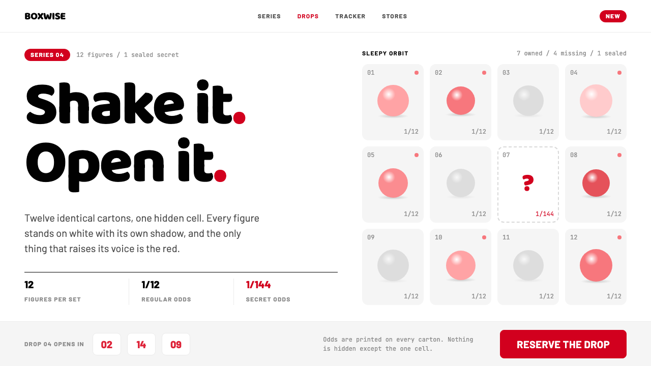 POP MARTA white shelf with one red signal. Twelve-cell blind-box grid, one dashed hid…
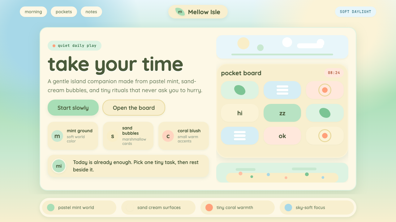 Animal Crossing — New HorizonsNo pressure, only daylight. Mint fields and sand bubbles soften every edge.
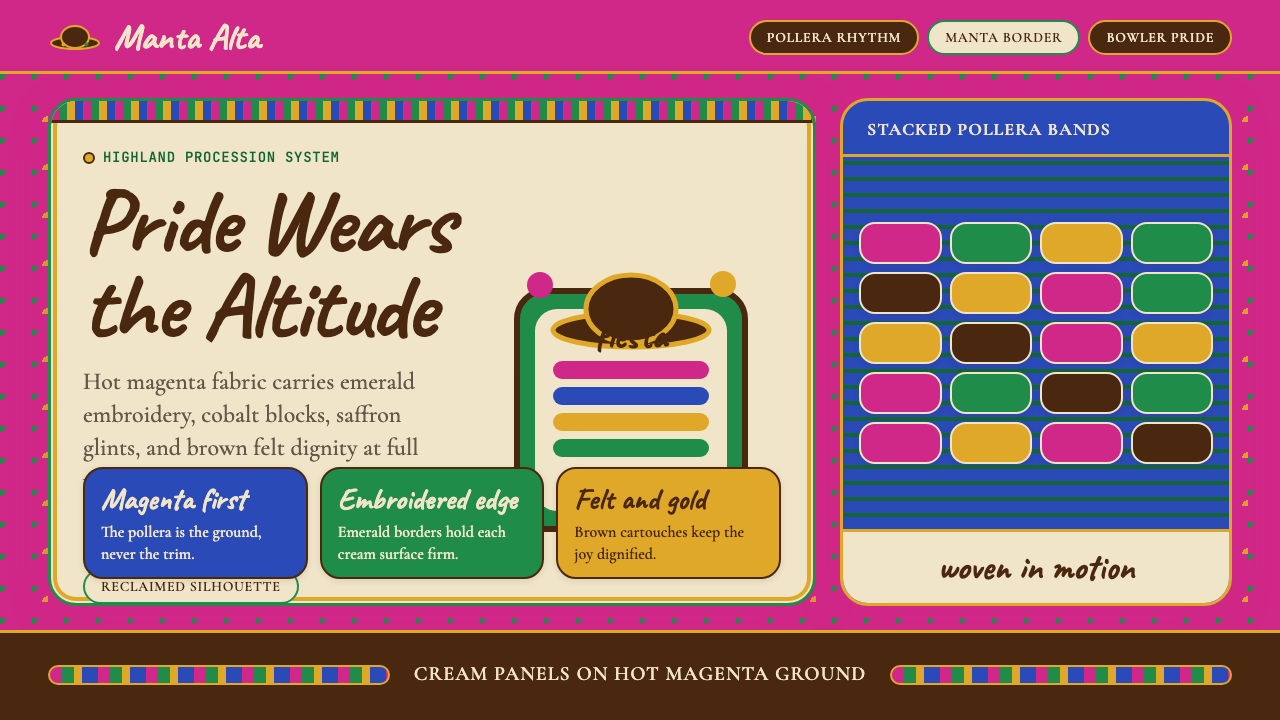 Bolivian Cholita (Bowler-Hat Fiesta)Loud pride, fully reclaimed. Magenta pollera bands, emerald borders, bowler c…
 Chiikawa (2022)Tenderness made visible. Powder pink, warm-brown wobbles, and pill-soft forms…
 Emoji & Sticker DesignJoy goes glossy. Blob-yellow spheres pop on charcoal with brown sticker outli…
 KumamonA black circle on pure white. Official red lands only on cheeks, buttons and…