What is Kumamon?
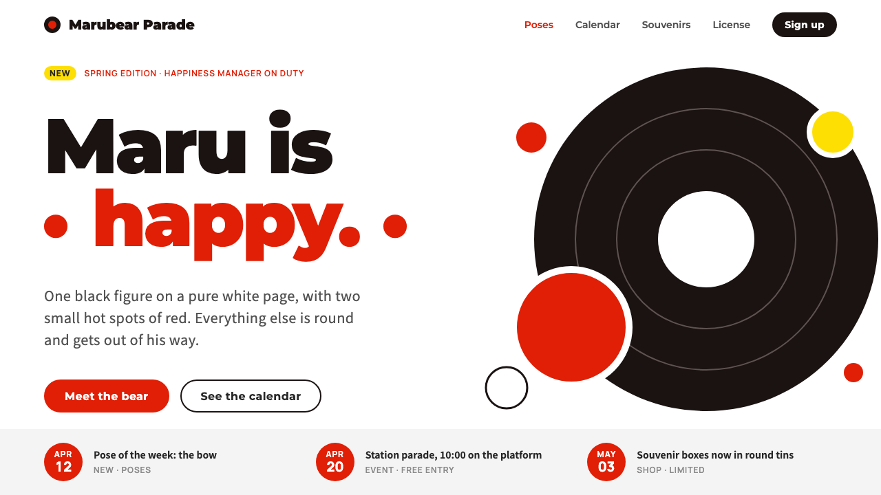
Kumamon is a design built from circles: a black bear on pure white, with official red only on the cheeks, the buttons and the date badges.
Kumamon in brief
The Kumamon style is the visual language of the black bear mascot that Kumamoto Prefecture introduced in 2010 for the opening of the Kyushu Shinkansen line. It is built from a handful of circles: a round head, round ears, wide white eyes and two red cheeks. The page around him is pure white, the figure is a single near-black, the official red appears only where it matters, and a small yellow is kept for news labels.
Everything in the system is round, flat and spaced out. Buttons are capsules, panels have soft corners, and there are no gradients, textures or shadows. The generous whitespace is a design decision, not an absence of one: it leaves the bear room to stand in the middle of the frame and do the talking.
Kumamon is useful to study because it shows how little a brand needs. One shape, one dark tone, one red and a lot of white are enough to build a recognizable identity, and the identity is so simple that anyone can reproduce it correctly. That simplicity is also why it spread so widely.

Where does Kumamon come from?
Kumamon was created in 2010, when Kumamoto Prefecture, on the island of Kyushu in southwestern Japan, prepared for the opening of the Kyushu Shinkansen high-speed line. The prefecture wanted attention for itself, rather than as a stop on the way to somewhere else. A campaign built around surprise was launched, and a mascot was needed to carry it. The designer chosen was Manabu Mizuno of the studio good design company.
Mizuno drew the bear from a small set of circles, and the construction is the heart of the style. A black body, a round head, round ears, white eyes that look permanently astonished, and two red cheeks are all the character needs. The red is not accidental: it nods to Kumamoto's identity, and it is used sparingly so that it remains an accent. Kundo Koyama, the writer and producer named among the key figures, is associated with the creative thinking behind the campaign, and Ikuo Kabashima, the governor of the prefecture, represents the local government that backed it.
The tradition behind Kumamon is that of the yuru-chara, the loose and slightly clumsy regional mascots that Japanese towns and prefectures use to promote themselves. Many are charming but crude; Kumamon was notable because it was designed with professional discipline, giving a regional mascot the clarity of a corporate identity. In 2011 he won the Yuru-chara Grand Prix, which turned him from a local campaign figure into a national star.
The decisive structural choice came next: licensing. The prefecture allowed the image to be used free of charge by companies, which meant that Kumamon appeared on souvenir boxes, train cars, stationery, signs and packaging across the country. Free licensing is a rare piece of brand strategy, and it shaped the visual style too, since a design that thousands of different makers will reproduce has to be easy to draw, easy to print and hard to get wrong. This is the principle of place branding combined with royalty-free character licensing, and it is the reason the simplicity of the system is not just a taste but a necessity.
What defines the Kumamon look?
Color
The ground is pure white. The figure is a single near-black, and one official red appears on the cheeks, on headings and on buttons. A small, bright yellow is kept for news labels. There are no tints, gradients or secondary palettes. Because so few colors are used, each one has a clear job, and the red always means attention or action.
Shape
Circles come first: round head, round ears, round eyes and round cheeks. Interface shapes follow the same logic, with capsule buttons, soft-cornered panels and circular badges. There are no sharp angles and no complex outlines. The figure can be drawn from a few circles, which makes it easy to reproduce at any size and by anyone.
Whitespace
The page is intentionally empty around the subject. Whitespace gives the figure presence and keeps the layout calm, and it prevents the red from becoming overwhelming. Content blocks are spaced widely and rarely stacked tightly. The emptiness is part of the character: the bear stands alone and has no need to be surrounded.
Type
Type is friendly and rounded, set in a clean sans-serif with a gentle, readable character. Headings may use the official red; body text stays in the near-black of the figure. Type is never ornamental and never competes with the bear. Labels and dates are short, set inside capsules or badges.
Surface
Everything is flat. There are no gradients, textures, bevels or shadows, which makes the system look clean on screen and cheap to print. Flat color is also what lets the character move easily between media: the same bear appears on a train, a box and a website without change.
Tone
Friendly, a little surprised, and a little silly. The mascot's wide eyes give the whole system a look of cheerful astonishment, and the copy follows with short, warm phrases. It is local and proud without being solemn. It uses humor to make a place feel approachable.

Who shaped Kumamon?
Mizuno of good design company drew Kumamon from a handful of circles and gave a regional mascot the discipline of a professional identity. His decision to keep the figure extremely simple, one dark tone, one red and a lot of white, is the reason the design is both memorable and easy to reproduce. Any design that borrows from the style should respect that economy.
Koyama is a writer and producer named among the key figures, associated with the creative thinking behind the Kumamoto campaign. A mascot needs a story and a reason to exist, and the idea of surprise gave Kumamon a purpose beyond appearance. Style borrowed from Kumamon works best when it keeps that sense of friendly surprise.
Kabashima, the governor of Kumamoto, represents the local government that backed the campaign and the decision to license the image widely. The permissive licensing is one of the most distinctive aspects of the project, and it explains why the visual identity is so simple and robust. A public body chose reach over control, and the design had to be built to survive that choice.
How do you use Kumamon today?
In presentations, Kumamon works for friendly, approachable decks: tourism, regional promotion, community programs, school projects, small-business introductions and anything that benefits from a warm, local tone. A cover can be a white slide with a central round figure and one red headline. Keep the layout clean and the number of elements small.
For content and data slides, use white backgrounds, near-black text and the official red for the one thing that matters. Charts can be built from capsules and circles, with the red used for the highlighted value and the near-black for the rest. A small yellow label can mark news items or new data. Give every slide wide margins and avoid crowding.
In web interfaces, the style fits tourism sites, local government pages, community apps, event pages, small shops and brand sites with a mascot at the center. A hero section can be a large white area, the figure in the middle and a capsule button below. Cards should have soft corners, no shadows and plenty of spacing. Date badges in red make event lists easy to scan.
In editorial and marketing work, it suits souvenir packaging, posters, stickers, merchandise, event flyers and social posts. Because the system is flat and uses few colors, it reproduces well in print and on screen. The style is also well suited to collaborations, since the simple construction can be adapted without losing identity.
The common mistake is to overuse the red. When the red spreads across large areas, the cheeks stop being the point and the page loses its calm. Another error is to add gradients, shadows or detailed textures, which destroy the flat clarity. A third is to crowd the whitespace; the bear needs room. Finally, avoid redrawing the figure with extra details: the simplicity of the circles is the identity, and every addition weakens it.

Kumamon — FAQ
What is the Kumamon design style?
It is a flat, round and spacious style built from the 2010 Kumamoto mascot: a pure white page, a near-black bear, official red only on cheeks, headings, buttons and date badges, and a small yellow for news labels. Circles, capsules and generous whitespace define it.
Who designed Kumamon and why?
Manabu Mizuno of good design company designed him in 2010 for Kumamoto Prefecture, which was preparing for the opening of the Kyushu Shinkansen line and wanted attention. A campaign built around surprise needed a mascot, and the bear became its face.
Why is the system so simple?
Partly taste, partly necessity. The prefecture licensed the image free of charge to companies, so thousands of different makers would reproduce it. A design that many hands will copy has to be easy to draw, easy to print and hard to get wrong. The simplicity is what let it travel.
How much red should I use?
As little as possible. The red belongs to the cheeks, the headings, the buttons and the date badges, and it works as a signal. If it covers large areas, it stops being a signal and starts being noise. Keep the page mostly white and the figure near-black.
Can I use it for a serious brand?
With care. The flat, round look can bring warmth to services, public bodies and education. For finance, legal or medical contexts, use it sparingly: keep the white field and the single red accent, and drop the mascot-like decoration. The restraint of the system is its most transferable quality.
Related design styles
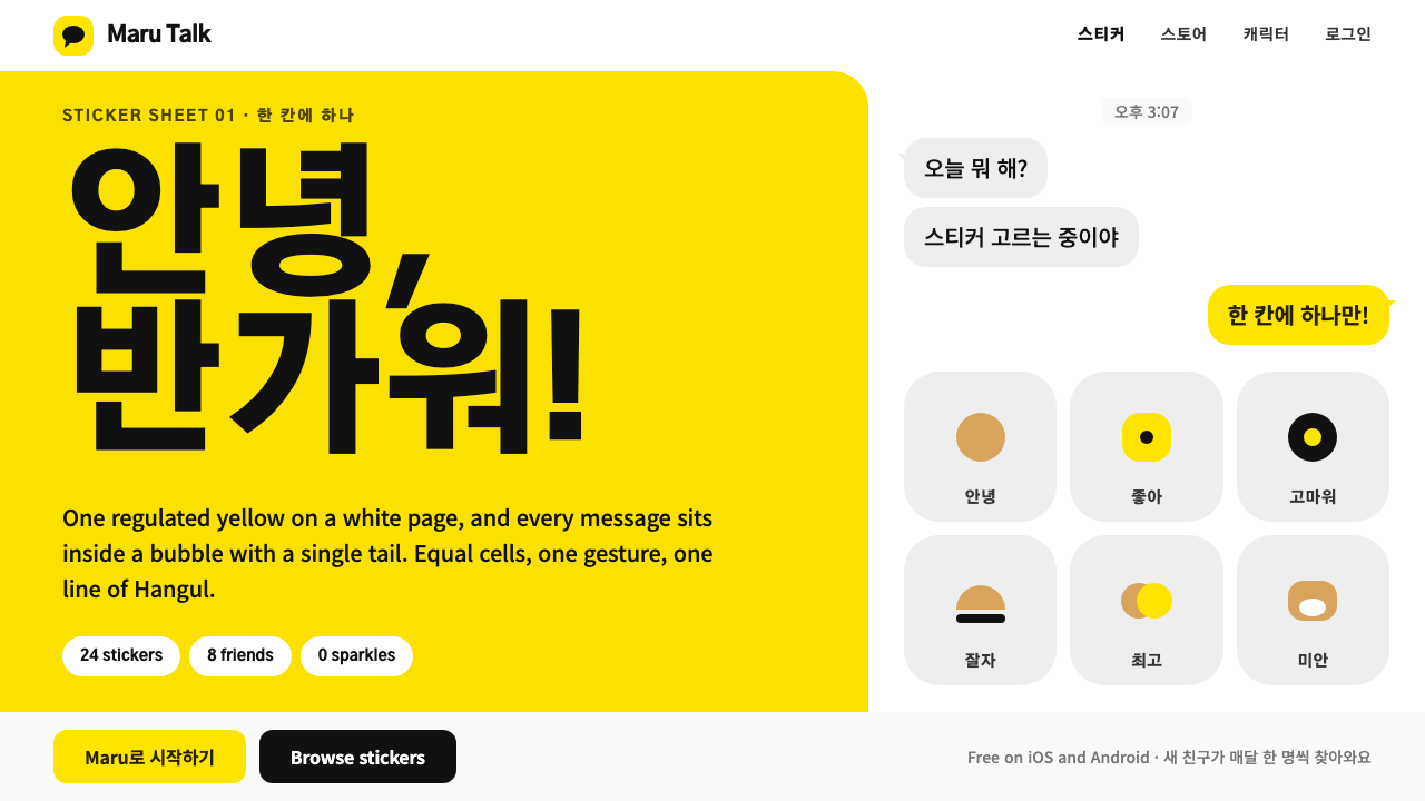 Kakao FriendsOne yellow, one gesture per cell. A white sticker sheet where speech bubbles…
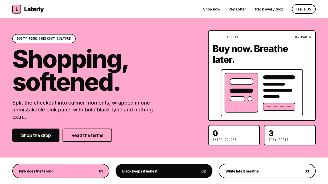 KlarnaFintech turns fashion-editorial. Dusty bubblegum pink, black Inter, and white…
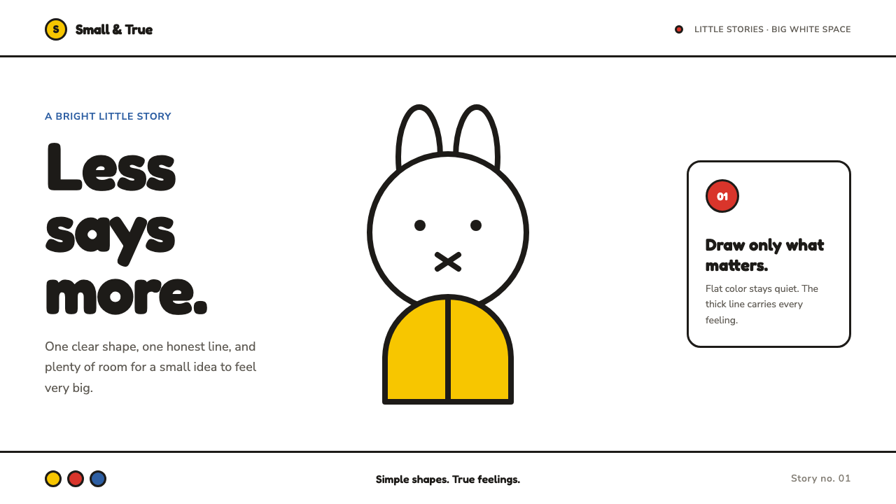 Miffy (Dick Bruna, 1955)Reduction feels alive. Flat primary shapes and one thick line float in pure w…
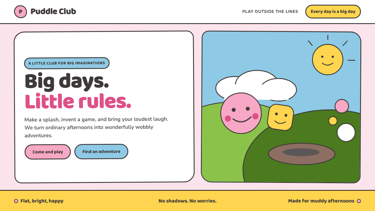 Peppa Pig (2004)Cheer without irony. Bubblegum pink, chubby type and thick outlines keep ever…
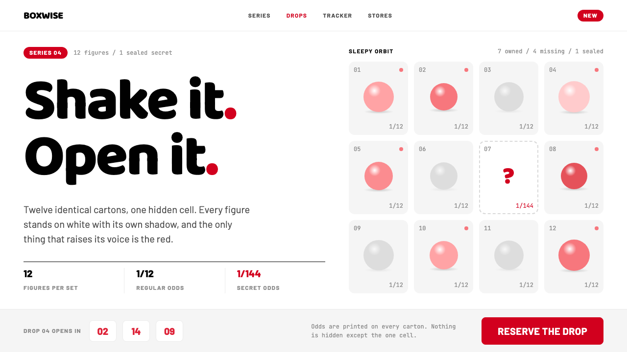 POP MARTA white shelf with one red signal. Twelve-cell blind-box grid, one dashed hid…
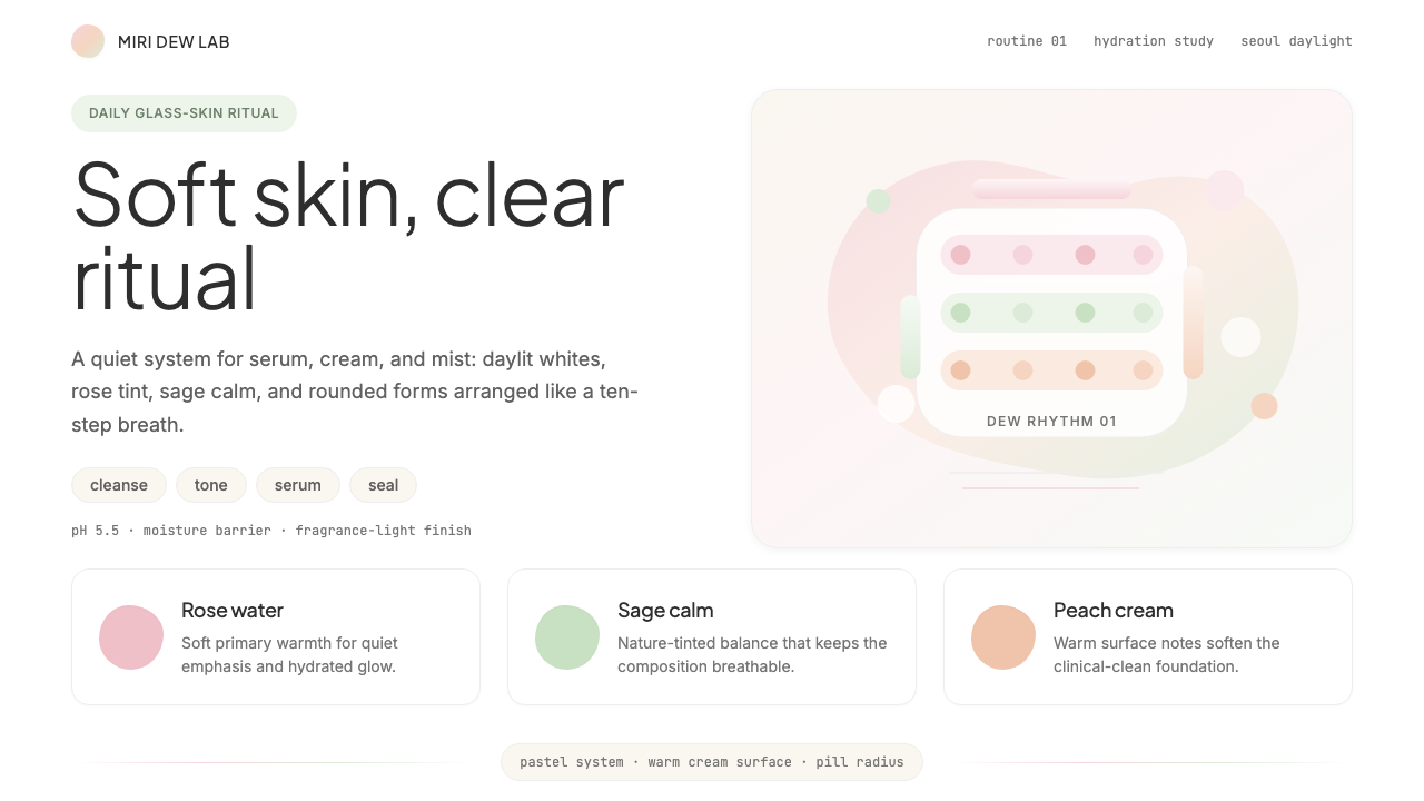 K-Beauty CleanCalm arrives dewy. Rose, sage, and peach pastels float through airy rounded f…