About Expo 2025 Osaka
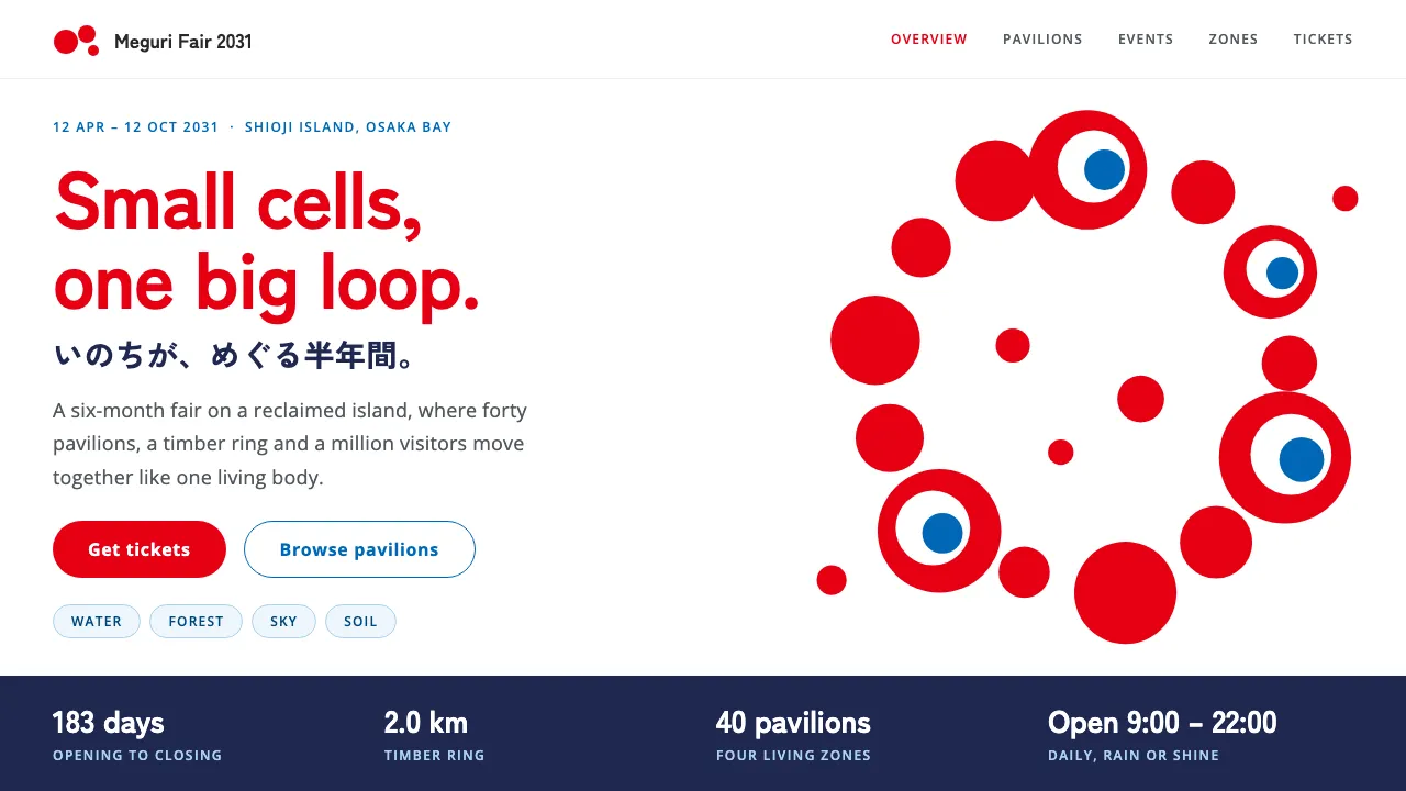
Expo 2025 Osaka, Kansai built its identity from red cells. TEAM INARI's emblem loops cells of uneven size into a ring, a few of them looking back at you through white-and-blue eyes, and the mascot Myaku-Myaku pairs those cells with a flowing blue water body.
This system keeps that energy on a disciplined white page: emblem red for headings and key actions, Expo blue for information and links, navy for data bands, and Zen Kaku Gothic New with Open Sans set bold and well spaced.
- Origin
- Osaka, Kansai, Japan
- Era
- 2020 emblem selected; design system 2022; Expo held 13 April – 13 October 2025
- Key figures
- Tamotsu Shimada · Kohei Yamashita · Sou Fujimoto
- Movements
- World Expo identity design under the BIE · Japanese contemporary graphic design · "Circulation of Lives" design-system concept
Expo 2025 Osaka design spec
Colors
Background
Surface
Primary
Secondary
Accent
Text
Typography
Zen Kaku Gothic NewHeadings
Open SansBody
ui-monospaceMono
Unlock for 1 credit
The other 11 sections — buttons, cards, spacing, motion, techniques and more — open once you unlock. Download the DESIGN.md or send it to your AI in one click. Unlock once, yours forever.
Sign up nowHave an account? Sign in
Styles similar to Expo 2025 Osaka
Also inspired by brands & products, with a close feel.
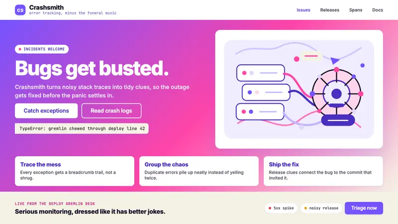 Sentry 2023Debugging gets weird on purpose. Purple-pink gradients, Inter heft, and doodled bugs.
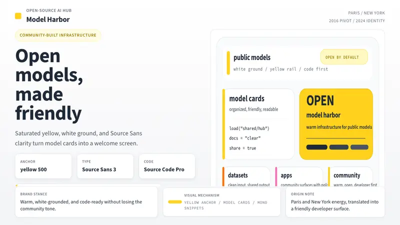 Hugging Face Emoji-YellowWarm infrastructure. Yellow rails, Source Sans, and code cards make openness feel human.
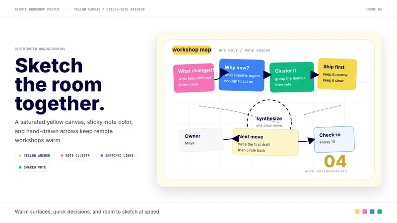 Miro Collab YellowWarm brainstorming in motion. Yellow canvas, sticky-note rainbow, hand-drawn arrows.
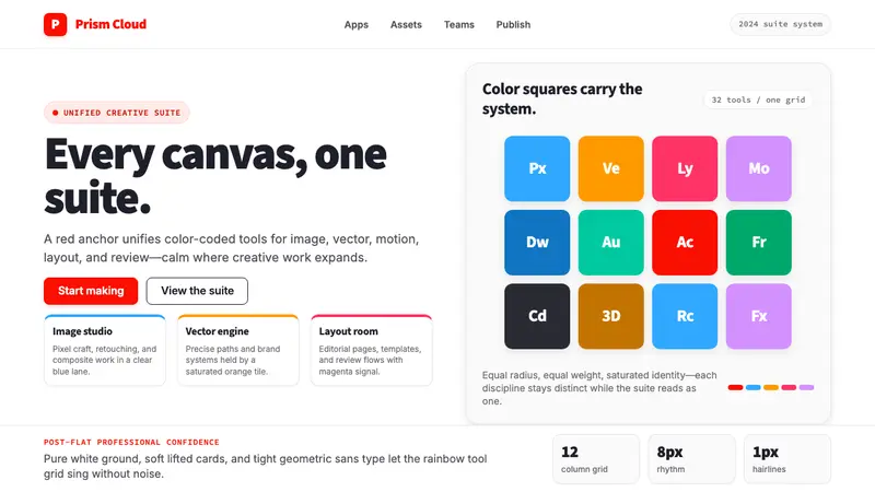 Adobe Creative CloudUnified, not uniform. Red anchor, white space, and saturated app tiles organize the suite.