What is HEYTEA?
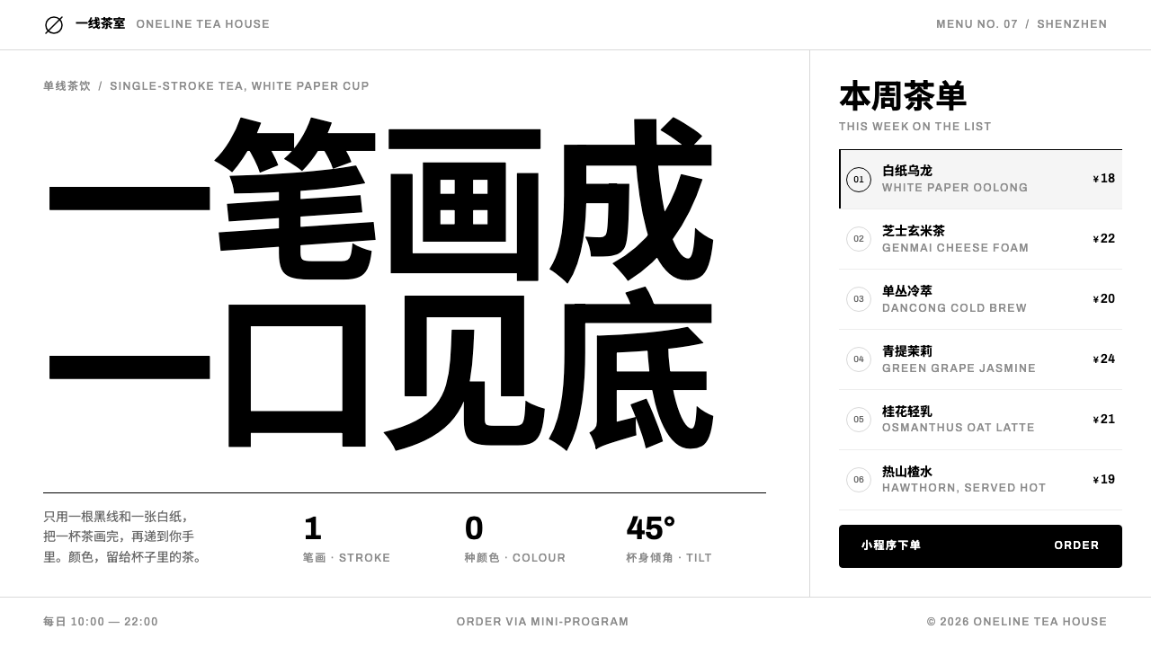
HEYTEA is a brand built from almost nothing: one black line on white paper, no brand colour at all, and Chinese type that leads while small Latin labels follow.
HEYTEA in brief
HEYTEA is the visual identity of the Chinese tea brand of the same name, and as a design style it is defined by what it leaves out. There is no chromatic brand colour at all. A single pure black carries the mark, the type and every rule, a neutral grey ramp handles everything secondary, and the ground is white paper. The cup is white, the shop walls are pale concrete and the website is white. The brand lives in the line, not in a hue.
At the centre of the system is 阿喜 (A-Xi), a one-stroke line drawing of a face in profile, head tipped back, tilting a cup at about 45 degrees to drink cheese tea straight from the rim, with no straw. The line is continuous, confident and spare, and everything around it is arranged to give it room. Wherever the mark appears it stands alone with generous white space on every side, so it reads as a signature rather than a decoration.
Typography and layout complete the picture. Chinese is the primary reading language: headlines are enlarged and set tight so that they have the weight of a statement. Latin labels follow beneath in small type with even spacing, a quiet second voice. Menus and listings borrow the logic of a WeChat mini-program, with a category rail on the left that stays pinned as you scroll, rows separated by fine lines and prices aligned to the right. The style suits restrained, spacious interfaces where information has to be very clear.

Where does HEYTEA come from?
HEYTEA began in 2012 as Royal Tea, 皇茶, a tea business rooted in Jiangmen in Guangdong, China. Its early years belong to the wave now called new-style Chinese tea, xinshi chayin (新式茶饮): freshly made tea drinks, often crowned with a layer of cream cheese, sold in design-conscious shops to a generation that treated a cup of tea as a small, shareable ritual. The brand later became rooted in Shenzhen as well as Jiangmen, and Neo Nie (聂云宸) is the name most closely tied to this story.
In 2016 the brand renamed itself HEYTEA, in Chinese 喜茶, replacing the imperial associations of 皇茶, which literally means royal tea, with a word whose key syllable means joy. The shift was visual as much as verbal. The new identity abandoned ornament and put a single drawn character at its centre: 阿喜. The logic of the whole system shows in that move. When a name changes from imperial to joyful, the look follows by becoming lighter, plainer and more open.
阿喜 was drawn from a coin portrait: a single-stroke profile of a face with the head tipped back and the cup tilted at 45 degrees, with no straw. The reference to coinage gives the figure an old, almost numismatic dignity, while the single line gives it modern simplicity. It was kept deliberately genderless and without regional markers, so that it could belong to any drinker. The decision to leave out colour completes the thought: a mark with no gender, no region and no hue is one that anyone can see themselves in, and one that can be printed on any surface.
Around the mark the brand built a monochrome system supported by two currents, monochrome line-art branding and minimal retail architecture. Shops pair pale concrete walls with white cups and black linework, and the web inherited the same palette. The current visual era runs from the 2016 rebrand to roughly 2025. Over that time the system has proved durable because it asks for so little: a white ground, a black line, a grey for secondary information, and the discipline not to add anything else.
What defines the HEYTEA look?
No Brand Colour
The most radical decision is the absence of a chromatic brand colour. Pure black is the only strong value and white the only ground; between them a neutral grey ramp handles secondary text, borders, inactive items and disabled states. Because there is no hue to protect, the system is extremely portable: it sits comfortably beside any product photograph, which becomes the only source of colour on the page.
A Single Black Line
The mark and any illustration that accompanies it are drawn in one continuous stroke of consistent thickness, with no fill, no shading and no second colour. The line is allowed to be slightly irregular, hand-drawn in spirit, but never decorative. It describes a gesture rather than a figure, and it is always surrounded by enough empty paper to make the gesture legible.
White Paper Ground
The ground is plain white, in the manner of a cup, a receipt, a menu card. It is not warmed or textured, and it does not carry gradients or tints. White here is a material, the paper on which a line is drawn, and everything else on the page is read against it. Pale concrete in the shops and grey in the interface are the only concessions to depth.
Chinese-First Type
Chinese is the language of reading and the language of hierarchy. Headlines are enlarged and set tight, so that a short phrase fills a line with the weight of a statement, and the supporting text is quiet and small. Type is set plainly, without decorative faces, without effects and without colour. Hierarchy is made by size and position alone, and the black is always the same black.
Evenly Spaced Latin Labels
Latin text appears as a second, quieter voice: small, evenly spaced labels that sit beneath or beside the Chinese. They translate and categorise rather than lead. The even spacing gives them a measured, engraved quality, as if stamped on a cup sleeve, and keeps them from competing with the headline. The pairing signals a brand that is local in its first language and international in its manners.
Mini-Program Menu Rows
Listings are built like a WeChat mini-program menu. A category column on the left stays pinned while the item list scrolls beside it; each item is a plain row, separated from the next by a fine grey line; the price sits flush right. There are no heavy cards, no shadows and no tiles. The result is fast to scan and very familiar to the users it targets, because it behaves like the ordering screens they already use.
Generous Emptiness
Space is the most important material after black and white. Margins are wide, blocks are separated by pauses rather than by boxes, and the single mark is allowed to float in an expanse of white. There is no ornament filling the gaps. The emptiness is not a lack of content but a way of holding attention: the fewer things there are, the more each one is looked at.

Who shaped HEYTEA?
The name most closely tied to the brand's story, from the 2012 shop in Jiangmen under the name Royal Tea to the 2016 rebrand as HEYTEA, with Shenzhen as its other home. For a reader of the style, his significance lies in the consistency of the result: a tea brand that expresses itself through a minimal monochrome system rather than through colour, ornament or heritage imagery.
The one-stroke mark at the centre of the identity: a face in profile tipping a cup back at 45 degrees, drawn from a coin portrait and kept deliberately genderless. It is both the logo and the only character in the system, and almost every compositional decision, from the white ground to the empty space around it, exists to let this single line be seen clearly.
The brand's original name, from its 2012 founding until the 2016 rebrand. Its imperial wording is the counterpoint that makes the later identity legible: the move from royal to joyful, from ornament to a single line, is the story the style tells. Royal Tea is the past that HEYTEA's plainness deliberately steps away from.
How do you use HEYTEA today?
HEYTEA is a strong reference when a product wants to feel confident without being loud: consumer ordering apps, loyalty and membership pages, retail brand sites, cafés and food-and-drink menus, and any context where the information is practical and the brand has to be recognisable through restraint. Its great advantage is portability. With no brand colour to reproduce, it survives every medium from screen to paper unchanged.
On presentation slides, a cover can be a single black line drawing or mark set alone in the middle of a white field, with the title in large, tightly set Chinese and a small, evenly spaced Latin line beneath. Content slides work as menu-like lists: a short category label on the left, items in plain rows, fine grey separators between them. Data slides should be monochrome, with greys for context and black for the one series being discussed, and no coloured legends.
In web and app interfaces, build the layout around the mini-program menu pattern. On wide screens keep a pinned category rail on the left; on narrow screens turn it into a row of tabs along the top. Items are plain rows with right-aligned prices, and the buttons are solid black with white text, with a grey outline for secondary actions. Photography of drinks and food is the only colour on the screen, which makes the products themselves the visual focus. Keep empty space generous, particularly around the mark and the main call to action.
For editorial and marketing work, the style favours short, confident copy and plenty of white. Campaign pages can use line illustration drawn in the same stroke as the mark, with the Chinese headline large and tight and a small Latin translation beneath. Collaborations and seasonal launches should adapt the line drawing, not add colour to the page. Where a page needs emphasis, enlarge the type or add space rather than introducing a highlight tone.
The commonest mistake is to add an accent colour so the page will stand out. The moment a hue appears the system loses its identity, because the absence of colour is the brand. Others include using soft shadows or gradients, drawing illustrations with varying line weights, setting the Latin text larger than the Chinese, and crowding the mark with badges or decoration. If something feels flat, the right response is more space and better type, not more effects.

HEYTEA — FAQ
Does 'no brand colour' mean the interface can have no colour at all?
The brand itself has no chromatic colour, but a real product interface still needs a few functional signals. Product photography will bring colour naturally, and necessary alerts or status indicators can be used sparingly and kept as small as possible. What the style rules out is a colour acting as identity: a hue on buttons, headings or backgrounds that makes the page look branded. Anything that is not functional should stay black, white or grey.
Why is the mark a single continuous line?
A single line is the simplest way to draw a gesture, and the gesture is the point: someone tipping a cup back to drink. It also reproduces cleanly on a cup, a wall, a screen and a stamp with no change, which is practical for a brand that appears on many surfaces. The reference to a coin portrait gives the line a historical dignity, and keeping it genderless and regionless lets it represent any drinker.
Can the style work in an English-only product?
Yes. The system is not tied to a particular script, only to its hierarchy. Put the primary language in large, tightly set headlines, and use small, evenly spaced labels for categories and metadata. The pairing of one large, tightly set voice with a smaller, evenly spaced one is the essential idea. What would be lost is the specific interplay between Chinese and Latin that gives the original its bilingual texture.
How is it different from generic minimalism?
General minimalism often keeps a warm neutral palette, soft shadows and one accent colour. HEYTEA is stricter: pure black on white with a neutral grey ramp and nothing else, no accent hue, no tinted ground. It is also anchored by a hand-drawn single-line mark and by the specific pattern of a mini-program menu, which give it a recognisable character instead of a merely tidy one.
Would an inverted, dark version still feel like HEYTEA?
Only partly. The identity is built on a black line on white paper, so a white line on a black field reads as a negative of it rather than a native version. If a dark mode is needed, keep the same discipline: no accent colour, the same single-line mark, a carefully tuned grey ramp for secondary information and plenty of space. Still, the paper-and-ink feeling that makes the original distinctive will be weaker.
Related design styles
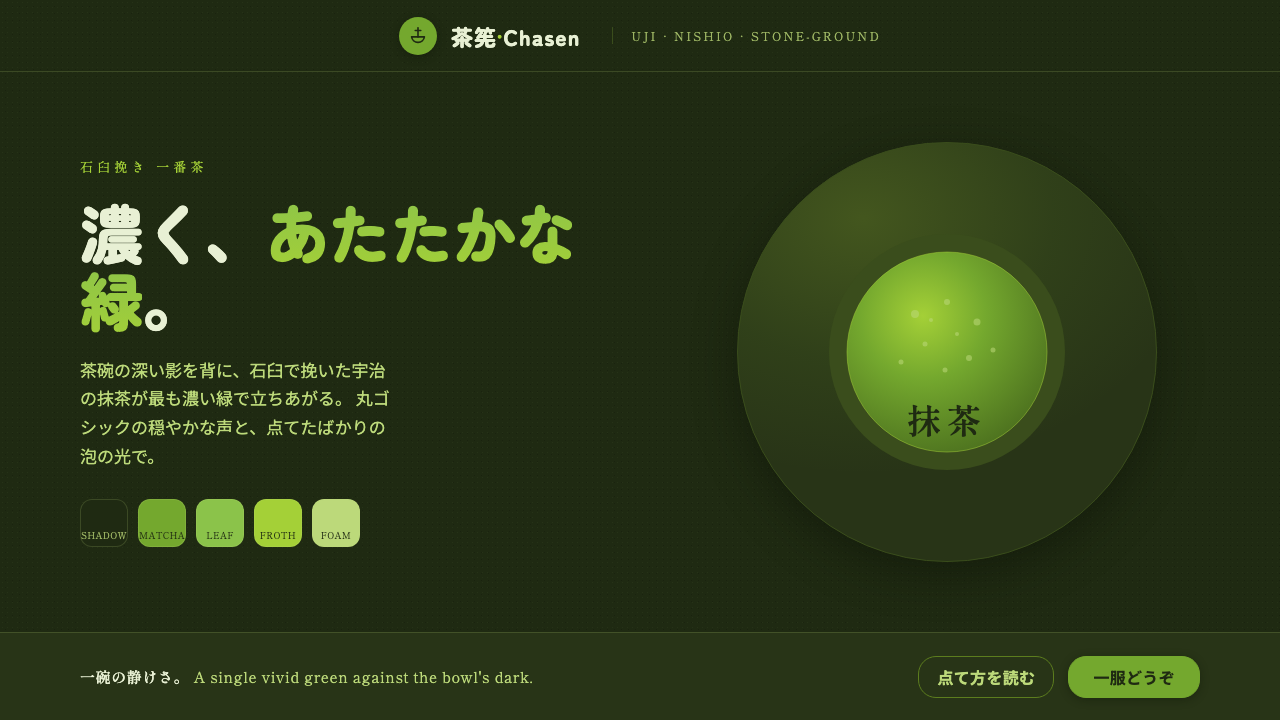 Matcha Latte Powder GreenA single vivid green at full strength. Stone-ground matcha on a dark tea-bowl…
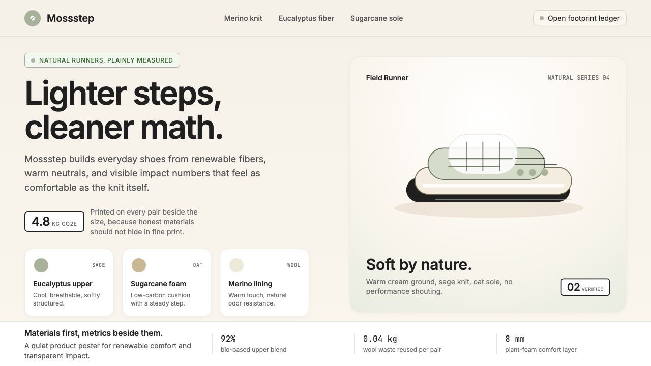 AllbirdsSustainability that breathes. Cream-and-sage tones, carbon labels next to pri…
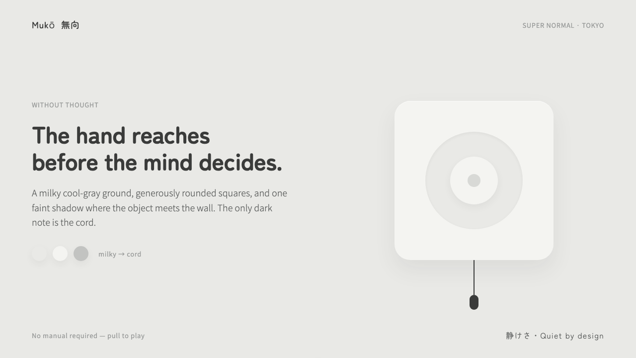 Fukasawa Without ThoughtHand reaches before mind decides. Milky cool-gray plastic, rounded squares, o…
 K-Beauty CleanCalm arrives dewy. Rose, sage, and peach pastels float through airy rounded f…
 Kavak MarketplaceUsed cars, finally trustworthy. Kavak Purple on violet-tinted white, green ce…
 Threads (Meta)Restraint is the brand. Black Inter type, narrow feed, thin connectors, white…