What is Matcha Latte Powder Green?
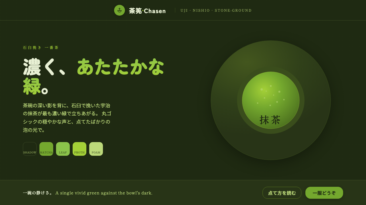
Matcha Latte Powder Green turns stone-ground tea into a visual atmosphere: one warm vivid green suspended over the deep shadow of a tea bowl, softened by rounded type and matte calm.
Matcha Latte Powder Green in brief
Matcha Latte Powder Green is a contemporary Japanese cafe aesthetic built around a single vivid yellowish green at full strength. Its reference is not the pale exterior of a white ceramic cup, but the dark cha-iro interior of a stoneware tea bowl: the shadowed vessel that gives whisked matcha its visual depth. Against that ground, the green reads warm, concentrated, and unmistakably botanical.
The style combines the sensory identity of stone-ground matcha with the composure of a modern wagashi shop. Its surfaces feel matte rather than glossy, like powder settled into a bowl or foam resting on a freshly whisked drink. Rounded maru-gothic type keeps the system approachable without becoming playful, while generous spacing gives the composition the quiet interval associated with careful preparation and deliberate service.
Visually, the system is narrow in its vocabulary and rich in atmosphere. A deep tea-bowl shadow establishes the field; vivid matcha green supplies the principal visual event; pale foam highlights provide relief; and rounded letterforms carry names, labels, and short statements. The result is Japanese, minimal, and quietly contemporary — a design language suited to products that want to feel crafted, calm, and sensorial without becoming ornate.
Where does Matcha Latte Powder Green come from?
Matcha Latte Powder Green belongs to the contemporary matcha-cafe aesthetic that has developed from 2010 to now, while drawing on a tea tradition described as centuries old. Its cultural field is Japan, especially the matcha traditions of Uji and Nishio, with the visual language subsequently spreading through cafes around the world. The style therefore sits between inherited tea culture and a globally legible cafe identity.
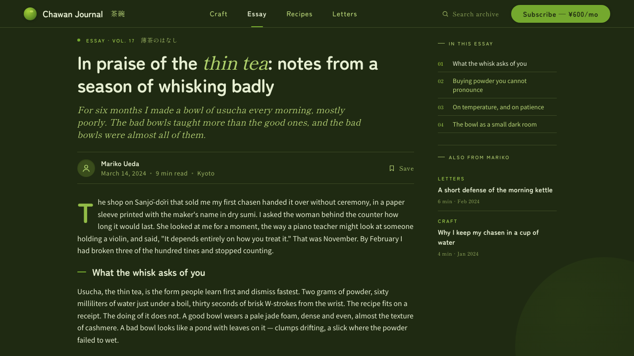
Its deeper reference is the aesthetic of Japanese tea ceremony, or chado: a mode of presentation in which atmosphere, material, and restraint matter as much as the central object. The design does not reproduce a ceremonial setting literally. Instead, it translates the feeling of a tea bowl, whisked surface, quiet interval, and carefully limited visual field into branding and interface language. What matters is the sense that attention has been concentrated rather than decoration added.
The image of stone-ground powder gives the style its material character. Matcha is not represented as an abstract green swatch; it is understood as a finely worked substance with a dry, matte presence. The tea-bowl interior is equally important. Choosing the deep shadow inside the vessel instead of its white exterior allows the green to appear at full warmth and vividness, while pale whisked foam introduces a soft counterpoint without turning the composition glossy or sweet.
Modern matcha-cafe culture completes the translation. Contemporary cafes and wagashi shops need an identity that can feel rooted in Japan while remaining clear across packaging, menus, storefronts, digital ordering, and social imagery. Matcha Latte Powder Green answers that need through a compact system: deep bowl shadow, concentrated tea green, rounded maru-gothic type, and generous spacing. Its global spread does not erase its origin; it makes the visual shorthand more portable.
What defines the Matcha Latte Powder Green look?
Tea-Bowl Shadow
The ground is a deep, warm tea-bowl shadow rather than a neutral black or a bright ceramic white. It recalls the interior of stoneware and gives the green a concentrated stage. The darkness should feel earthen and enveloping, not metallic, glossy, or theatrical. It is the visual equivalent of looking into the vessel rather than at its exterior.
Full-Strength Matcha Green
Green is used as the principal event, not as a timid accent. It is vivid, warm, and visibly yellowish, closer to freshly whisked matcha than to a cool botanical or mint tone. Because the ground is dark, the green can remain singular and intense without needing a crowded palette. Its strength should come from concentration, not fluorescent brightness.
Rounded Maru-Gothic Type
Rounded maru-gothic type softens the system's dark ground and saturated green. Letterforms should feel smooth, open, and calmly friendly, with enough presence to hold short names and direct labels. The type is not ornamental calligraphy and not a severe modern grotesque. Its role is to make the carefully controlled atmosphere feel human and usable.
Matte Powder Texture
Texture is suggested through visual quietness rather than literal grain everywhere. The green should feel powdered, dry, and softly absorbent, while the dark ground retains the weight of stoneware. If imagery is used, it should support this tactile impression through restrained surfaces, whisked foam, and close attention to material. Gloss, chrome, and synthetic shine weaken the reference.
Generous Calm
Spacing is generous and unhurried. Content should not be compressed merely to fill the dark field; the surrounding quiet is part of the identity. A short title, a green object, or a pale foam highlight can carry the composition when given room to breathe. This restraint connects the contemporary cafe expression to the attentiveness associated with tea preparation.
Who shaped Matcha Latte Powder Green?
Uji tea masters represent the inherited knowledge behind the style's Japanese matcha reference. Their presence in the system is cultural rather than portrait-based: the concentrated green, disciplined preparation, and quiet presentation point toward Uji matcha culture without turning the design into historical illustration.
Nishio stone-grinding artisans embody the material origin of the powder reference. The matte green, dry surface language, and emphasis on finely worked substance acknowledge their craft. The style treats matcha as a made material with texture and weight, not simply as a color chosen from a palette.
Modern matcha-cafe culture is the immediate carrier of the visual system. It translates tea tradition into a contemporary environment of cafes, menus, packaging, and digital touchpoints, allowing the identity to remain distinctly Japanese while traveling through a global cafe network.
The aesthetics of chado provide the style's discipline of attention and restraint. Rather than copying ceremony, the design borrows its preference for material presence, quiet intervals, and a limited field in which each chosen element is allowed to matter.
How do you use Matcha Latte Powder Green today?
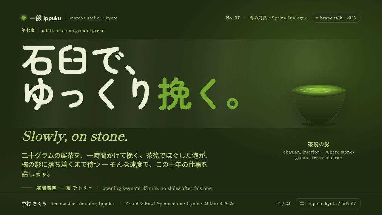
For presentation slides, use the tea-bowl shadow as the stable field across the deck, then let matcha green identify the central idea or featured object. Cover slides benefit from one concentrated green form, a short rounded title, and ample surrounding darkness. Content slides should keep copy brief and clearly grouped, with pale foam-like highlights used sparingly for secondary information. Data slides work best when the green carries the main series or key figure, while the dark ground and pale supporting marks preserve the calm, menu-like clarity.
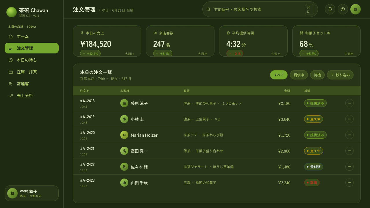
For web interfaces, this style suits matcha ordering flows, cafe dashboards, tasting catalogs, and other products that need warmth without visual noise. Dashboards can use the deep ground as a continuous surface, with vivid green reserved for active states, selected categories, progress, or the most important metric. Rounded type and generous spacing keep dense operational information approachable. Surfaces should feel matte and grounded; avoid making every card glow, shine, or compete for attention.
Pricing pages can use the system's single-color concentration to make comparison feel composed rather than promotional. A featured plan may receive the strongest matcha-green treatment, while surrounding plans remain quiet against the tea-bowl field. Labels should be direct, rounded, and easy to scan. Pale accents can clarify included features or calls to action, but the page should still feel like a considered cafe menu rather than a loud sales funnel.
For editorial and marketing work, the style is especially effective for tea stories, food launches, hospitality brands, wellness narratives, and product pages centered on craft. Pair close material imagery with short blocks of copy and substantial negative space. Headlines can sit like labels on a package or menu, while green objects, pale foam, and dark ceramic surfaces create a tactile rhythm. The restraint also supports social graphics: one recognizable green subject can be more distinctive than a busy collage.
The most common mistake is treating the style as generic green branding. Cool mint, neon effects, glossy gradients, white ceramic backgrounds, and excessive Japanese ornament all move away from the source. Another mistake is using the vivid green everywhere until it loses its role as the principal event. Keep the tea-bowl shadow deep and material, keep type rounded but not childish, and allow quiet space to do real compositional work.
Matcha Latte Powder Green — FAQ
Is Matcha Latte Powder Green simply a green-and-black palette?
No. Its identity depends on the relationship between a warm, yellowish matcha green and the deep interior shadow of a tea bowl. A neutral black ground can make the result harsher and more digital, while a pale ceramic ground removes the concentrated atmosphere. The rounded type, matte powder reference, pale foam highlights, and generous spacing are equally important. The style is a material and cultural translation, not a color pairing alone.
Why use the inside shadow of the tea bowl instead of white ceramic?
The dark cha-iro interior gives the matcha green a deeper visual field and allows its warm vividness to register fully. The white exterior would make the reference lighter and more conventional, shifting attention toward the vessel rather than the tea. Using the interior shadow also reinforces the style's preference for quiet depth, stoneware weight, and concentrated material presence.
Can this style work without matcha photography or food imagery?
Yes, provided the visual relationships remain intact. A deep tea-bowl-shadow ground, a concentrated warm green, rounded maru-gothic type, and generous spacing can carry the identity on their own. Imagery helps communicate powder, foam, and stoneware, but it is not the only carrier. The system should suggest the material origin through atmosphere and restraint rather than depend on literal pictures everywhere.
Does the style suit products outside cafes and tea?
It can, especially when a product values craft, calm, sensory detail, and contemporary Japanese restraint. Hospitality, food, wellness, packaging, editorial platforms, and carefully made consumer goods can all use the language effectively. It is less suitable when the product requires exuberance, technical aggression, or a broad multi-color identity. The decisive question is whether the product can credibly support the style's concentrated atmosphere.
Related design styles
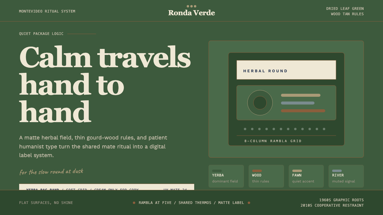 Uruguayan Yerba MateCalm in deep green. Wood-tan rules, Recoleta type, and cream bands keep the r…
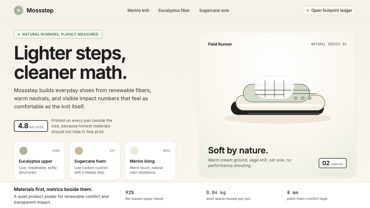 AllbirdsSustainability that breathes. Cream-and-sage tones, carbon labels next to pri…
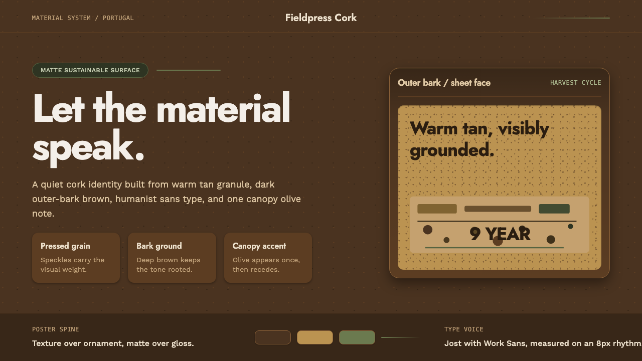 Portuguese CorkGrounded by texture. Cork tan speckles on bark brown, with one olive rule.
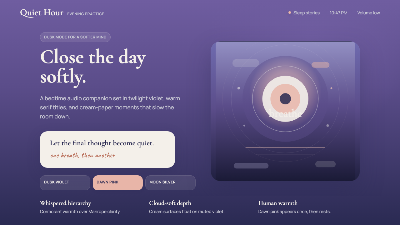 Calm App Purple MeditationWhispers at bedtime. Dusk-purple gradients, cream serif type, and dawn-pink w…
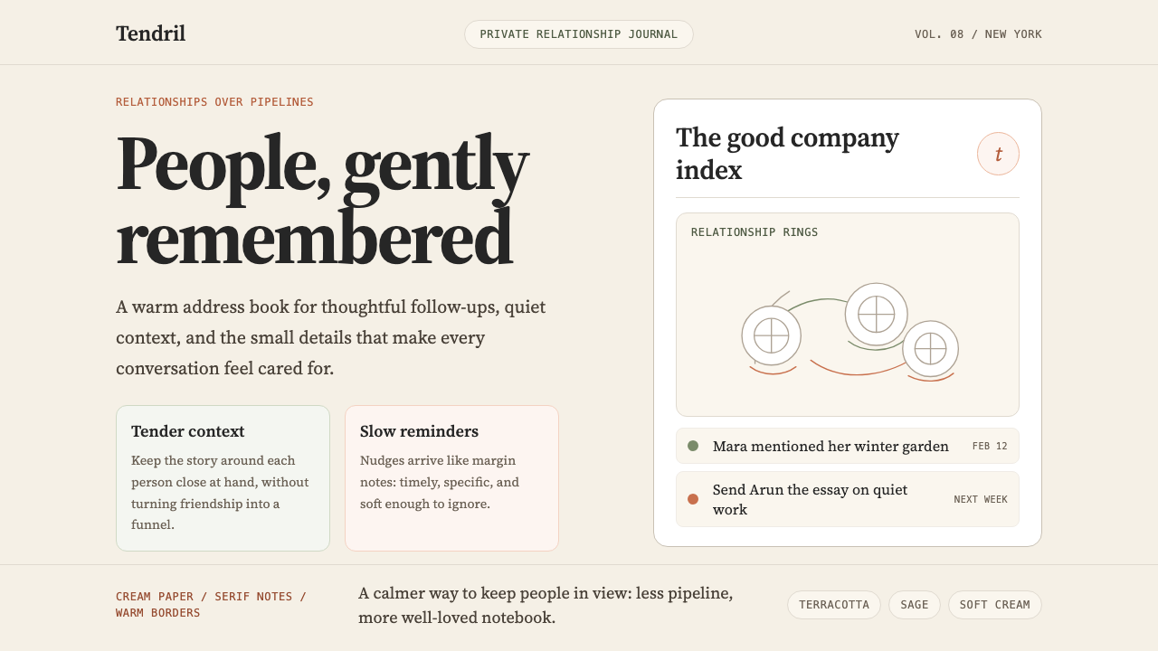 Clay 2024CRM as a sketchbook, not a sales pipeline. Cream backgrounds, terracotta, han…
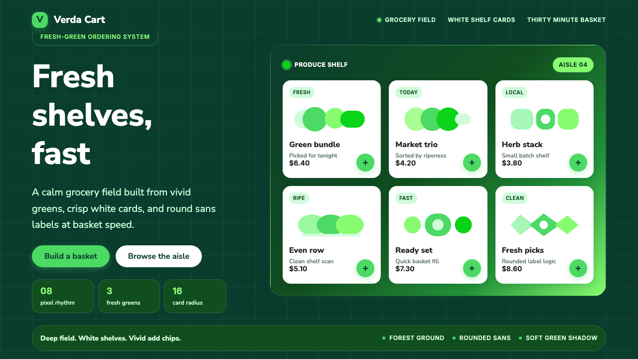 Cornershop AppProduce-fresh and calm. Forest green field, white shelf cards, vivid green ac…