What is Cornershop App?
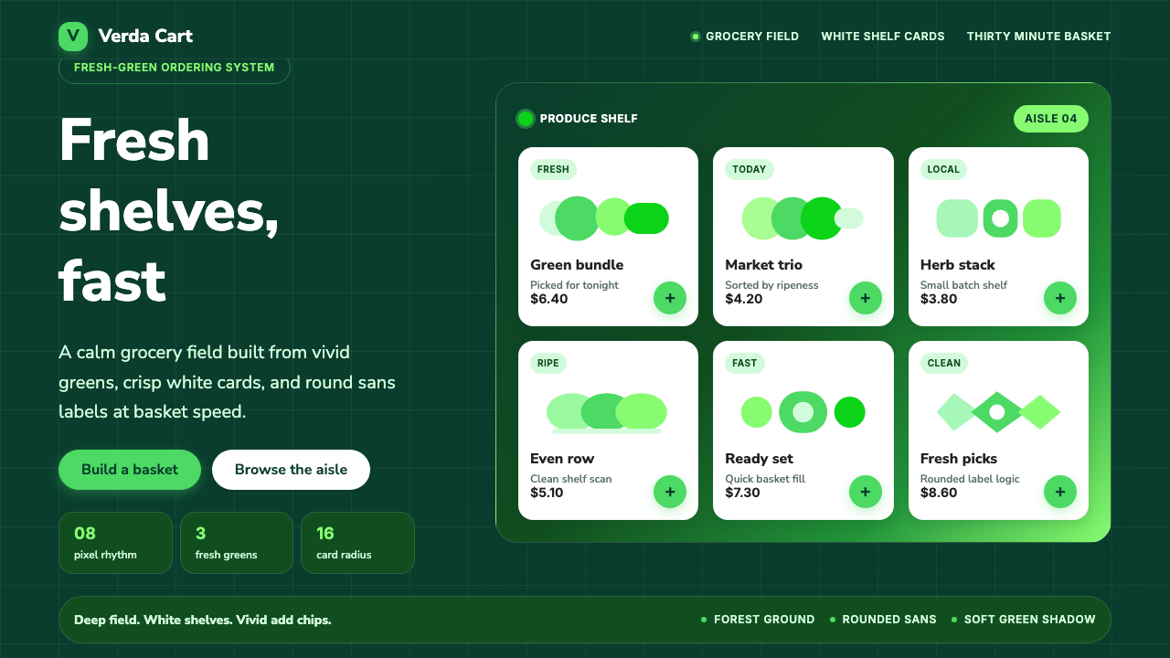
Cornershop takes a Latin American grocery-delivery startup's fresh-green-on-white brand and inverts it into a deep forest-green field where white shelf cards carry the calm.
Cornershop App in brief
Cornershop is the design identity of the Chilean-Mexican grocery-delivery startup of the same name, later acquired by Uber. The brand it is drawn from was built on a fresh-green-on-white grocery interface: clean white shelf cards, friendly product photography of the actual groceries being delivered, and a tidy, modern geometric sans that kept prices, quantities, and delivery times easy to scan at a glance. Rather than a single signature color, the brand's system codifies an entire family of vivid greens, each doing a slightly different job.
Rendered as a screen design system, the relationship is deliberately inverted. The page ground becomes a deep grocery forest-green drawn from that same green family, rather than the white the original app used as its base. The brand's signature fresh green is kept as the accent color, and white is reserved specifically for shelf cards — the surfaces that actually hold products, prices, and content — rather than for the page itself.
The result reads as calm, clean, and produce-fresh rather than loud or saturated. Despite the deep green ground, nothing about the system feels dark or heavy: the white cards do the visual work of freshness and order, the way a well-organized grocery shelf feels calm precisely because each item has its own clearly bordered space.
Where does Cornershop App come from?
Cornershop was founded in 2015 in Santiago, Chile, by Oskar Hjertonsson, Daniel Undurraga, and Juan Pablo Cuevas, as an on-demand grocery-delivery service. Rather than building its own warehouses, the company sent personal shoppers into existing local supermarkets and pharmacies to pick items and deliver them directly to customers — a model that let it launch quickly across a category, groceries and everyday essentials, that most e-commerce startups of the period were not yet tackling. It expanded from Santiago into Mexico City soon after launch, becoming one of the more prominent examples of the Latin American on-demand grocery wave of the mid-2010s.
The company grew quickly enough to attract attention from Walmart, which moved to acquire a majority stake in 2018. That deal drew scrutiny from Mexico's antitrust regulator, COFECE, which raised concerns about market concentration in on-demand grocery delivery and ultimately reshaped the terms of Walmart's involvement rather than allowing an uncontested majority acquisition. The episode became a notable early case of Latin American competition regulators intervening in a platform and gig-economy acquisition.
Uber subsequently built its own position in the company and went on to acquire full ownership, folding Cornershop into Uber Eats' grocery-delivery operations in the years that followed. The design identity this system documents belongs to Cornershop's era as a distinct, independently branded company — the fresh-green-on-white grocery interface that consumers in Chile and Mexico associated with the app before its integration into Uber's broader product family.
Throughout this arc, the visual brand stayed remarkably consistent: a design-system-led approach to product branding in which the same family of greens, the same white card language, and the same friendly geometric sans carried through the company's marketing, its delivery app, and its packaging, giving a fast-scaling, multi-country startup a coherent identity even as its ownership changed hands twice in under a decade.
What defines the Cornershop App look?
A Family of Greens
Rather than one signature color, the system works with a coordinated family of vivid greens: a deep forest tone for the ground, a brighter signature green reserved for the primary accent, and quieter supporting greens for secondary states. Each shade has a distinct job, and the hierarchy between them is what keeps the palette calm rather than busy.
The Shelf-Card Metaphor
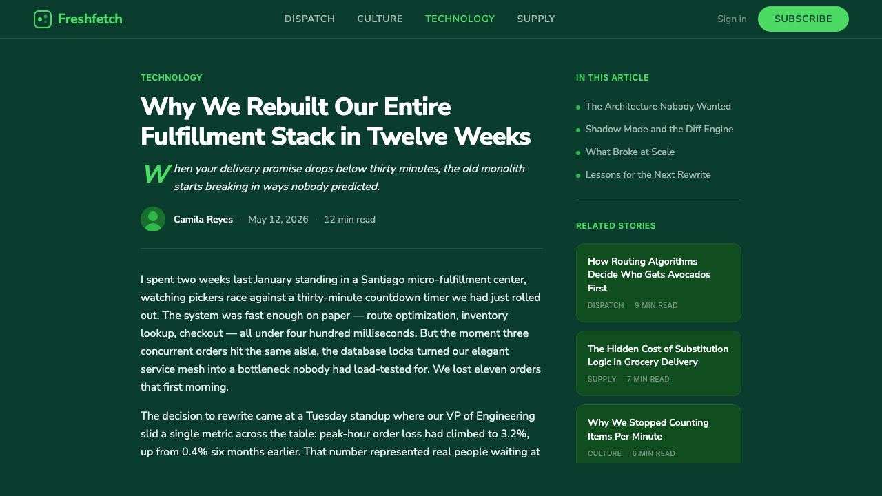
White surfaces are treated as shelf cards — the bordered, orderly rectangles that hold a product, a price, or a piece of content, the same way a labeled shelf tag holds one item's information. White is never the page; it is always a specific, bounded object sitting on the green ground.
Friendly Product Photography
Imagery favors bright, well-lit, straightforward photography of real products rather than stylized illustration or abstract graphics. The tone is approachable and everyday — the same register a shopper would expect from a photo of the actual item arriving at their door.
Tidy Geometric Typography
Letterforms are modern and geometric, built for quick scanning of prices, quantities, and delivery windows rather than for expressive character. The typographic tone is efficient and trustworthy, supporting the system's grocery-logistics function rather than competing with the product photography for attention.
Calm, Generous Composition
Each white card carries generous internal breathing room, echoing the sense of an orderly, well-stocked shelf rather than a cluttered discount bin. Density is kept low even where a screen must show many items at once, because calm is a stated brand value, not an incidental effect.
The Ground-Inversion Logic
This system's deep-green ground is a deliberate reinterpretation of a brand whose original app used white as its base and green only as accent. Applying the system correctly means preserving that inversion — green ground, white cards — rather than reverting to a white-ground layout that would misrepresent how this particular design system is built to work.
Trust Through Restraint
Every element of the system — the narrow green family, the single accent, the plain geometric type, the honest product photography — is chosen for legibility and trust rather than novelty. This is a brand for a service people rely on for their actual groceries arriving correctly, and the restraint is what earns that reliability, not a decorative afterthought layered on top of it.
Who shaped Cornershop App?
One of Cornershop's co-founders in Santiago in 2015, part of the leadership that built the personal-shopper delivery model and steered the company through its expansion into Mexico and its subsequent acquisition history with Walmart and Uber.
A co-founder of Cornershop, part of the team that established its grocery-delivery model in the Chilean market before the company's expansion into Mexico and its growth into one of the more prominent Latin American startups of its generation.
A co-founder of Cornershop, part of the founding team behind the company's launch in Santiago and its subsequent development into a multi-country grocery-delivery platform serving Chile and Mexico.
Cornershop belongs to a broader wave of on-demand grocery and delivery startups that emerged across Latin America in the mid-2010s, competing to solve last-mile grocery delivery in major cities. This movement's competitive pressure, and its later wave of consolidation by larger international platforms including Walmart and Uber, shaped Cornershop's trajectory from independent startup to an integrated part of Uber Eats.
How do you use Cornershop App today?
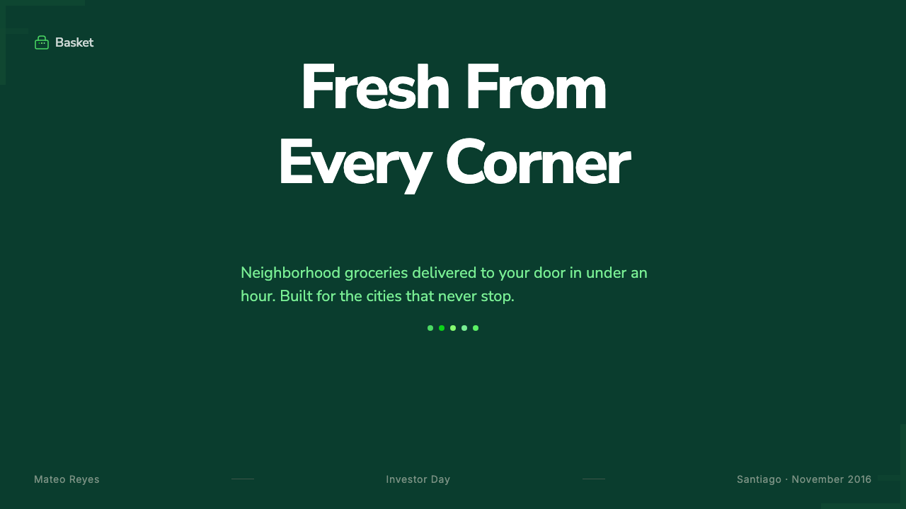
For presentation slides, a cover works well as a deep forest-green field carrying bold white or light type, with a single white shelf-card element anchoring a corner — a preview of the system's core visual move rather than a full card layout. Content slides should shift the balance toward white cards holding the body text and imagery, letting the green ground frame the composition rather than dominate the reading area.
Data on slides suits the shelf-card metaphor directly: a metric or statistic rendered as its own small white card against the green ground, with the signature accent green reserved for the specific number or trend being highlighted. Coloring an entire chart in multiple greens undercuts the hierarchy the family of greens is built to provide.
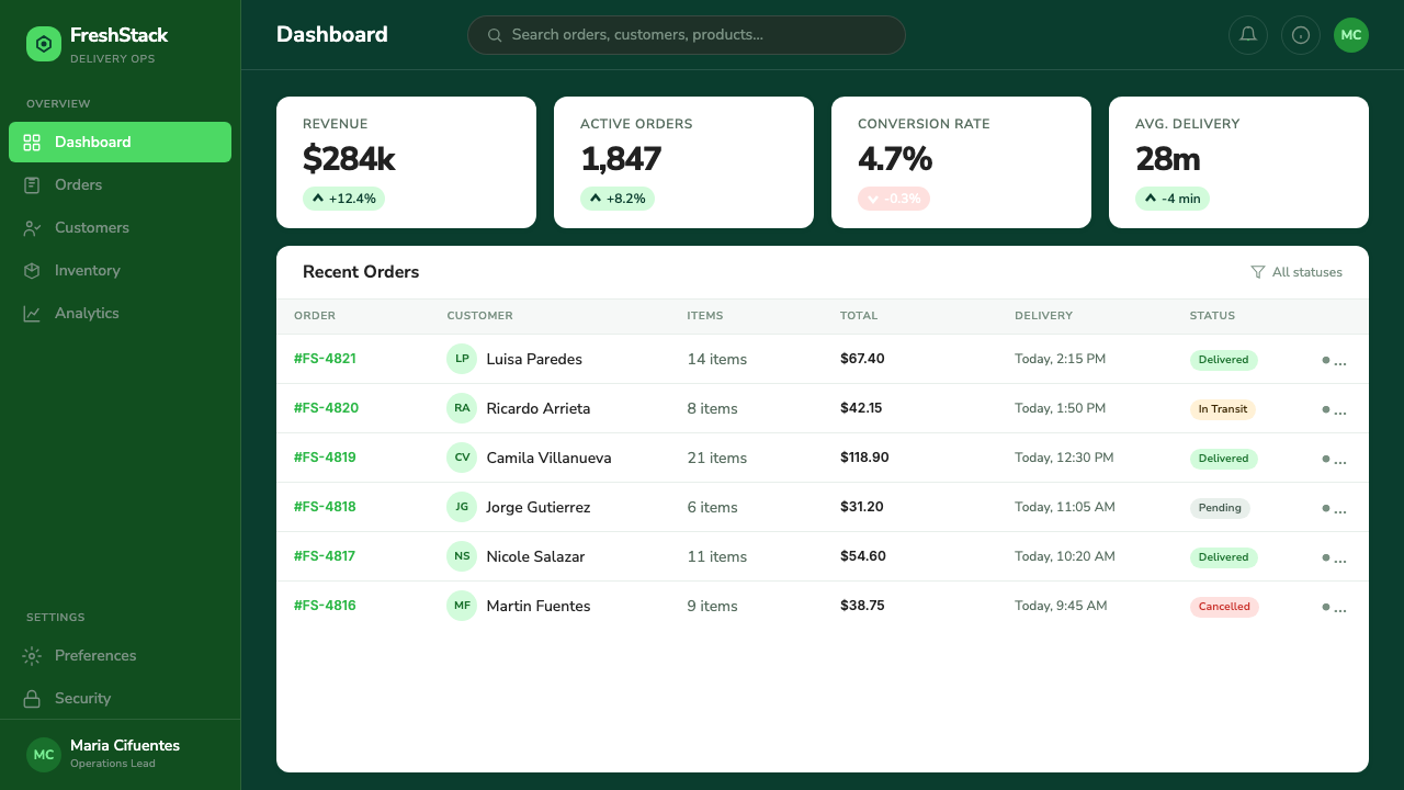
For web interfaces, this system is a strong fit for grocery, food-delivery, and logistics products, and extends naturally to wellness, sustainability, and farm-to-table consumer brands that want to signal freshness and calm rather than urgency. On a dashboard, working panels should be the white shelf-card surfaces; on a pricing page, each tier reads well as its own white card on the green field, with the accent green reserved for the recommended tier or the primary call-to-action button.
In editorial and marketing contexts, the system supports product-photography-forward storytelling particularly well — hero sections built around real, well-lit imagery of the product on a green ground read as fresh and trustworthy rather than as a generic tech-startup gradient. It suits food, grocery, and everyday-essentials marketing more naturally than it suits abstract software categories with nothing physical to photograph.
The most common mistake is letting the green ground spread into areas that should be white shelf-card surfaces, which muddies the calm the system depends on and makes dense information hard to scan against a colored background. A second mistake is treating the family of greens as interchangeable rather than hierarchical — using several different greens at equal weight erases the clear distinction between ground, accent, and supporting states that gives the palette its order.
Cornershop App — FAQ
Was Cornershop's real app actually green with white shelf cards, or is the dark ground unique to this design system?
The original consumer app used white as its dominant base with green reserved mainly for accents and branding touches. This design system deliberately inverts that relationship for screen use, making the deep forest-green the ground and reserving white specifically for card surfaces. Both choices draw on the same underlying family of greens, but the ground-inversion is a considered reinterpretation, not a literal reproduction of the original app's layout.
What happened to Cornershop as a company?
It grew from a Santiago-founded startup into a multi-country Latin American grocery-delivery platform, drew a majority-acquisition attempt from Walmart in 2018 that was reshaped by Mexican antitrust regulators, and was ultimately fully acquired by Uber, which folded its operations into Uber Eats' grocery-delivery business. The design identity captured in this system belongs to its era as an independently branded company.
How is this different from a generic grocery-app green palette?
A generic grocery green tends to use one shade of green as a flat accent against an ordinary white or grey interface. This system is built on a coordinated family of greens with a clear internal hierarchy, an inverted dark-ground structure, a specific shelf-card metaphor for how white is used, and a consistent pairing of friendly product photography with tidy geometric type — a full, coherent brand system rather than a single color choice.
Can this system work with a light background instead of the deep green ground?
It can, and doing so moves the system closer to the original app's own light-ground layout, but it should still preserve the family-of-greens hierarchy and the shelf-card logic — one signature accent green, supporting greens for secondary states, and cards or bordered surfaces used deliberately rather than color washed everywhere. Simply swapping the ground to white without keeping that structure produces a generic light UI rather than a recognizable variant of this system.
What kinds of products or brands does this style suit best?
It suits grocery, food-delivery, and logistics products directly, and extends naturally to wellness, sustainability, and farm-to-food brands that want to communicate freshness, order, and calm trustworthiness. It is a weaker fit for categories with nothing physical to photograph or for brands seeking an urgent, high-energy tone, since the system's whole logic is built around calm rather than excitement.
Why does a grocery-delivery brand's identity matter enough to study as a design system?
Because Cornershop is a case of design-system-led product branding working at real speed and scale: a company expanding across countries, changing ownership twice, and still keeping its product, marketing, and packaging visually coherent through a disciplined green family and a consistent card-and-photography language. That discipline — not a single clever logo — is what let the brand survive rapid growth and corporate transitions without losing recognizability, which is exactly the kind of system a fast-moving product team can learn from.
Related design styles
 Whole Foods MarketFarmer’s-market polish. Moss green on butcher-paper cream, white cards, growe…
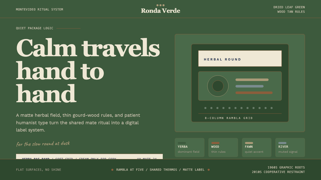 Uruguayan Yerba MateCalm in deep green. Wood-tan rules, Recoleta type, and cream bands keep the r…
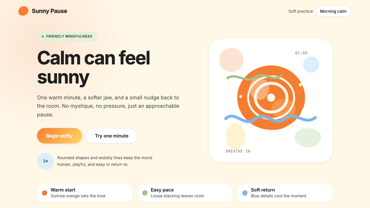 HeadspaceOptimism makes calm approachable. Sunrise orange and wobbly rounded forms bre…
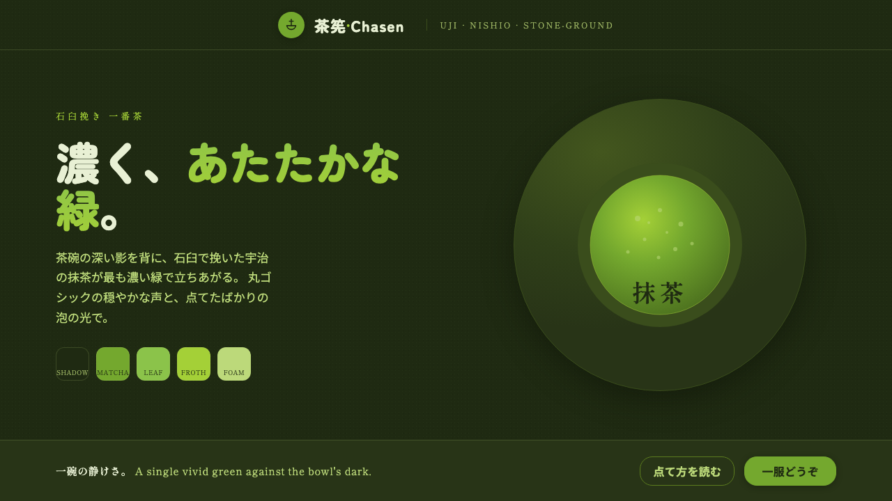 Matcha Latte Powder GreenA single vivid green at full strength. Stone-ground matcha on a dark tea-bowl…
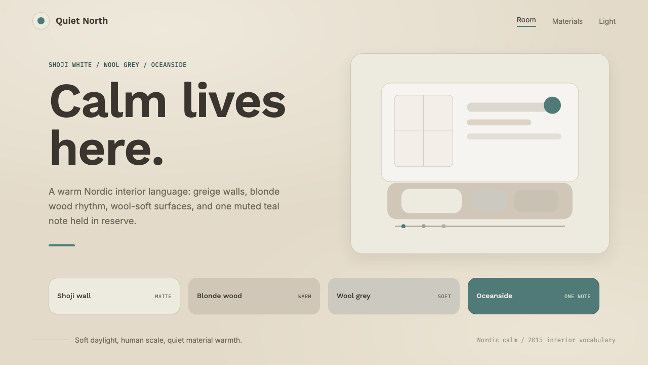 Scandinavian HyggeCalm is the brief. Greige walls, wool-grey cards, and one muted teal line.
 AmazonUgly sells efficiently. Navy chrome, orange buttons, red prices crowd a dense…