What is Threads (Meta)?什么是 Threads (Meta)?
Threads arrived in 2023 and made restraint a product strategy — pure black type, pure white air, and nothing else.Threads 于 2023 年横空出世,将克制变成产品策略——纯黑字体、纯白留白,除此之外别无他物。
Threads (Meta) in briefThreads (Meta) 速览
Threads is a text-first social feed created by Meta's Instagram team, launched on July 5, 2023, as a direct response to the turbulence at Twitter. Its visual language is defined by a single, radical decision: the removal of color from the interface entirely. Where virtually every major social platform at the time competed on the vibrancy of its brand palette, Threads arrived achromatic — pure black type on a pure white ground, with no accent color in the chrome, no interactive badge hues, no decorative flourish of any kind. Within five days of launch it had reached one hundred million users, demonstrating that the design's austerity was itself a form of invitation.Threads 是 Meta 旗下 Instagram 团队打造的文字优先社交信息流,于 2023 年 7 月 5 日上线,直接回应彼时 Twitter 的动荡局势。其视觉语言由一个单一而彻底的决定所定义:将色彩从界面中完全移除。在当时几乎所有主要社交平台都在争相展示品牌调色板的鲜艳度时,Threads 以消色差姿态登场——纯黑字体置于纯白底面,界面镀铬层不含任何强调色,无交互徽章色彩,无任何装饰元素。上线五天内即突破一亿用户,证明了这种设计上的克制本身就是一种邀请。
The aesthetic is grounded in the sensibility of Instagram, from which Threads inherits its core structural DNA: generous whitespace, circular avatar crops, softly rounded media containers, and a typographic rhythm that breathes rather than crowds. What Threads adds to this inheritance is a strict text-first editorial logic. Photography and video appear, but as guest elements within a reading flow — not as the dominant medium. The connective thread motif, expressed as a thin vertical line linking avatar to reply, is among the most minimal pieces of interaction design in any major consumer product: a single stroke that transforms a linear feed into a visible conversation tree.这套美学植根于 Instagram 的气质——Threads 从中继承了核心结构基因:慷慨的留白、圆形头像裁剪、边角柔和的媒体容器,以及呼吸有致而非拥挤的排版节奏。Threads 在此基础上叠加了严格的文字优先编辑逻辑。摄影与视频出现时,是阅读流中的访客元素,而非主导媒介。细竖线将头像与回复串联的「线索」母题,是主流消费类产品中最极简的交互设计之一:一根笔触,将线性信息流转化为可见的对话树状结构。
In design terms, Threads represents a bet that radical subtraction can be a differentiator. The interface trusts the user's own content — profile images, attached photography, link previews — to supply whatever color and visual interest the screen needs. The system itself remains neutral, almost monastic. It is closer in spirit to a well-set book than to a traditional social application, and that comparison to print typography is not accidental: the team made deliberate choices about measure, line spacing, and vertical rhythm that place prose legibility at the center of every decision.从设计角度看,Threads 是一场关于彻底减法能否成为差异化优势的赌注。界面信任用户自身的内容——个人资料图片、附带摄影、链接预览——来为屏幕提供所需的色彩与视觉趣味。系统本身保持中立,近乎修道院般的沉静。它在精神上更接近一本排版精良的书籍,而非一款传统社交应用。这与印刷排版的类比并非偶然:团队对行宽、行距和垂直节奏做出了刻意的选择,将散文的可读性置于每一个决定的核心。
See the Threads (Meta) design system查看 Threads (Meta) 完整设计系统
Where does Threads (Meta) come from?Threads (Meta) 从何而来?
Threads was conceived and shipped during an unusually compressed timeline in the first half of 2023, as Meta moved to capture users disaffected by the ownership transition and policy upheaval at Twitter. Adam Mosseri, the head of Instagram, led the product effort alongside Mark Zuckerberg. The design team was drawn primarily from Instagram's existing mobile design organization, which meant the visual system was built on established internal components rather than invented from scratch. The decision to launch without a distinct brand color — an almost unheard-of choice for a consumer social product — appears to have been both a design principle and a strategic one: the absence of accent color positioned Threads as a neutral town square rather than a branded destination.Threads 在 2023 年上半年以异常压缩的时间线完成构想与交付,彼时 Meta 正在争取那些对 Twitter 所有权更迭与政策动荡感到失望的用户。Instagram 负责人 Adam Mosseri 与 Mark Zuckerberg 共同主导了产品工作。设计团队主要来自 Instagram 既有的移动设计组织,这意味着视觉系统建立在成熟的内部组件之上,而非凭空创造。不采用专属品牌色的决定——对于消费社交产品而言几乎闻所未闻——似乎同时出于设计原则与战略考量:强调色的缺失将 Threads 定位为中立的公共广场,而非一个有强烈品牌感的目的地。
The platform launched with support for ActivityPub, the open social networking protocol that underlies the federated Fediverse, including Mastodon. This technical commitment to interoperability had a subtle but real influence on the aesthetic: a platform designed to connect to a broader, decentralized ecosystem needed a visual language that would not impose its brand on conversations that might ultimately live outside its walls. The achromatic restraint is, in this reading, not only an aesthetic stance but a statement of intent about platform architecture — a product that does not demand to be seen.该平台上线时即支持 ActivityPub——支撑去中心化 Fediverse(包括 Mastodon)的开放社交网络协议。这一对互操作性的技术承诺对美学产生了微妙而真实的影响:一个旨在连接更广泛去中心化生态的平台,需要一套不会将自身品牌强加于对话的视觉语言——那些对话最终可能存在于其围墙之外。在这种解读下,消色差的克制不仅是一种美学立场,也是关于平台架构意图的声明——一个不要求被注视的产品。
Instagram's design language at the time of Threads's launch had itself been through a significant evolution. The original Instagram aesthetic of the early 2010s — warm filters, rounded icons, the gradient logo introduced in 2016 — had given way by 2023 to a considerably more neutral and typographic product. Threads inherited this mature Instagram sensibility and distilled it further. The gradient, the warm filter, the playful icon — all were stripped away. What remained was the structural logic: circular avatar, soft media radius, generous vertical spacing. The design team applied these elements with even greater discipline than their parent app, producing something that felt simultaneously familiar and pared back to essentials.Threads 上线时,Instagram 的设计语言自身已经历了一场重大演变。2010 年代初 Instagram 最初的美学——温暖滤镜、圆角图标、2016 年引入的渐变标志——到 2023 年已让位于一个更为中立、更重字体排版的产品。Threads 继承了这种成熟的 Instagram 气质并进一步蒸馏。渐变、温暖滤镜、趣味图标——全部被剥离。留下的是结构逻辑:圆形头像、柔和的媒体圆角、慷慨的垂直间距。设计团队以比母应用更大的自律运用这些元素,产出了一种既熟悉又被还原至本质的产品。
The Inter typeface, used throughout Threads for both interface labels and user-generated text, had by 2023 become the dominant sans-serif in professional digital interface design, chosen by dozens of major products for its exceptional legibility at small sizes and its neutral, functional character. Its selection for Threads was consistent with the overall philosophy: use the most readable, most neutral tool available and let content lead. The thin connector line linking threaded replies — the motif that gives the product its name — was reportedly refined through multiple iterations before launch, with the team testing various weights and lengths before settling on the lightest possible stroke that remained perceptible across all device sizes and ambient conditions.贯穿 Threads 界面标签与用户生成文字的 Inter 字体,到 2023 年已成为专业数字界面设计中最主流的无衬线字体,被数十个主要产品选用,原因在于其在小字号下卓越的易读性与中立的功能性格。为 Threads 选用 Inter,与整体哲学一脉相承:使用最易读、最中立的工具,让内容领路。连接串联回复的细竖线——这个赋予产品名字的母题——据悉在上线前经历了多轮迭代,团队测试了多种粗细与长度,最终确定了在所有设备尺寸与环境条件下仍可感知的最细笔触。
What defines the Threads (Meta) look?Threads (Meta) 的视觉特征是什么?
Achromatic Palette消色差调色板
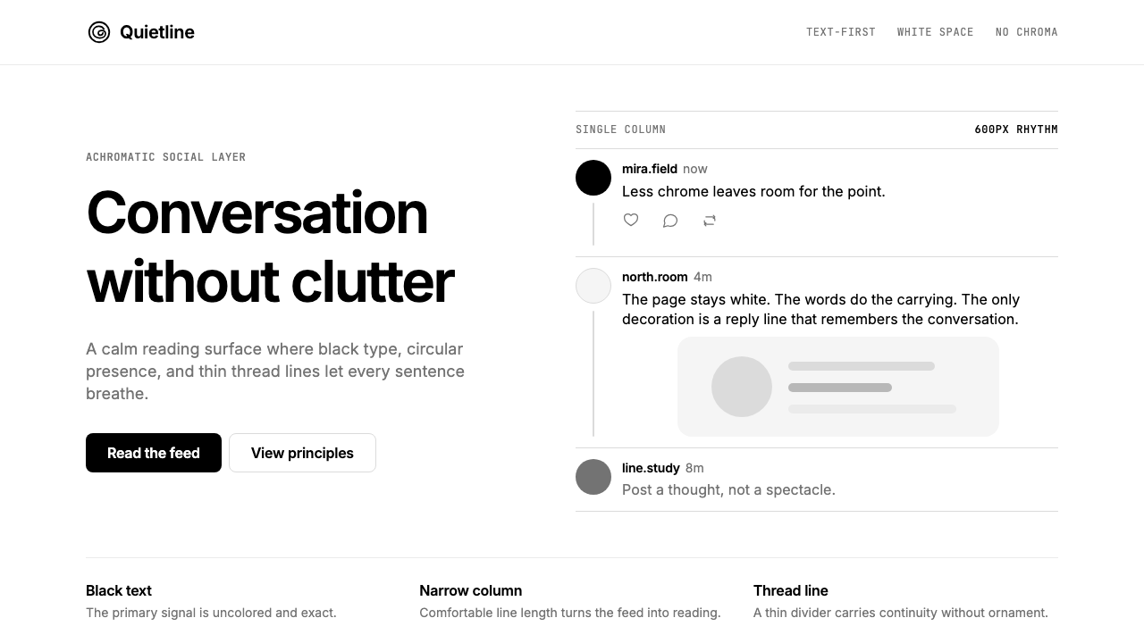
Threads operates in a strict black-and-white register for all interface elements — navigation bars, action icons, type hierarchy, interactive states, and structural dividers. No brand color appears in the chrome. The only color on screen at any moment arrives through user-uploaded photography, video thumbnails, and link-preview images. This makes Threads perhaps the most color-restrained major consumer application ever shipped, a choice that reads as confident neutrality rather than aesthetic poverty.Threads 所有界面元素——导航栏、操作图标、字体层级、交互状态、结构分割线——均运行于严格的黑白色域。镀铬层中不出现任何品牌色。屏幕上任何时刻的唯一色彩,来自用户上传的摄影、视频缩略图和链接预览图像。这使 Threads 成为有史以来色彩克制程度最高的主流消费类应用之一,这一选择读来是自信的中立,而非美学上的匮乏。
Thread Connector Line线索连接线
The thin vertical stroke linking a post's avatar to the avatars of its replies is the defining original motif of the Threads visual system. It transforms what would otherwise be a flat sequential list into a visible branching conversation structure. The line is drawn at the absolute minimum weight where it remains perceptible — gossamer-thin, clearly intentional, never decorative. It is simultaneously an interface affordance and the source of the product's name.将帖子头像与其回复头像相连的细竖线,是 Threads 视觉系统中最具原创性的核心母题。它将原本平铺的顺序列表转化为可见的分支对话结构。这条线以恰好可感知的最细笔触绘制——轻若蛛丝,意图明确,绝非装饰。它同时是界面功能元素,也是产品名称的来源。
Typography-Led Hierarchy字体主导的层级
Without color to establish visual hierarchy, Threads relies entirely on typographic contrast — variation in size, weight, and opacity — to distinguish username from handle, post body from timestamp, primary action from secondary one. The system uses a small number of clearly differentiated text styles applied with consistency across every surface. Labels are clipped to their necessary minimum; prose gets room to breathe. The result is a reading environment unusually well calibrated for sustained text consumption on a mobile screen.在没有色彩建立视觉层级的情况下,Threads 完全依赖字体对比——尺寸、字重与不透明度的变化——来区分用户名与账号、帖子正文与时间戳、主要操作与次要操作。系统使用少量明确区分的文字样式,在所有界面中一致应用。标签被裁剪至必要的最小值;散文获得足以呼吸的空间。结果是一个在移动屏幕上针对持续文字阅读异常精准校准的阅读环境。
Circular Avatars and Soft Radii圆形头像与柔和圆角
Inherited from Instagram, the circular avatar crop is applied with structural consistency across the entire Threads interface — in feed items, reply chains, notification rows, and profile views. Attached media — photographs, link cards — use a generously rounded corner radius that softens the rectilinear grid without introducing organic irregularity. The combination of circular portrait and rounded rectangle creates a visual vocabulary that is warm and approachable while remaining entirely geometric.从 Instagram 继承而来,圆形头像裁剪在整个 Threads 界面中以结构性一致性应用——在信息流条目、回复链、通知行和个人主页视图中。附加媒体——照片、链接卡片——使用慷慨的圆角半径,在不引入有机不规则性的前提下柔化了矩形网格。圆形头像与圆角矩形的组合创造了一套既温暖亲切又完全几何化的视觉词汇。
Generous Vertical Spacing慷慨的垂直间距
Threads allocates significantly more vertical space between feed items than most competing social feeds, a decision that creates a calm, unhurried reading rhythm. The padding above and below each post, combined with the thin separator line between items, gives every piece of content its own zone of visual quiet. This is not wasted space — it is the mechanism by which the interface avoids the cramped, attention-fragmented quality that characterizes high-density social feeds. The generous spacing also makes the thread connector line legible at a glance.Threads 在信息流条目之间分配了比大多数竞争社交信息流显著更多的垂直空间,这一决定创造了一种平静、从容的阅读节奏。每篇帖子上下的内边距,与条目间的细分割线相结合,为每条内容提供了属于自己的视觉静默区域。这不是被浪费的空间——它是界面避免高密度社交信息流那种局促、注意力碎片化特质的机制。慷慨的间距也使线索连接线能够一目了然地被读取。
Minimal Iconography极简图标系统
The action icons — reply, repost, like, share — are drawn as outlines at a relatively small touch target, using strokes that match the weight family of the typeface. No filled icons appear in resting state; fill is reserved for active or selected states, creating a quiet before-and-after that communicates state change without color. The icon set is deliberately small: Threads avoids the icon inflation common to feature-dense platforms, keeping the visual vocabulary of actions to an interpretable minimum.操作图标——回复、转发、喜欢、分享——以轮廓线绘制,使用与字体笔画粗细系列相匹配的描边,触控目标相对较小。静止状态下不出现填充图标;填充保留用于激活或选中状态,创造一种无需色彩即可传达状态变化的静默前后对比。图标集被刻意压缩到最小:Threads 回避了功能密集平台常见的图标膨胀,将操作的视觉词汇保持在可解读的最低限度。
Dark Mode Inversion深色模式反转
Threads supports a dark mode that inverts the light-ground logic to a near-black ground with near-white type. The achromatic discipline transfers cleanly to the dark variant: because there is no brand color to manage, the dark mode is a pure luminance inversion rather than a palette renegotiation. The connector line remains a single stroke; the avatar circles hold their shape; the typographic hierarchy reads identically. This consistency across modes is only possible because the system has no color to lose.Threads 支持深色模式,将浅色底面的逻辑反转为近黑底面与近白文字。消色差的自律在深色变体中完美转移:由于没有品牌色需要管理,深色模式是纯粹的亮度反转,而非调色板的重新谈判。连接线仍是单一笔触;头像圆形保持形状;字体层级读来完全一致。这种跨模式的一致性之所以可能,正是因为系统没有任何色彩可以丢失。
See the Threads (Meta) design system查看 Threads (Meta) 完整设计系统
Who shaped Threads (Meta)?谁塑造了 Threads (Meta)?
As head of Instagram, Mosseri served as the primary product leader for Threads from conception through launch. His public communications during the development period consistently framed Threads as a platform for public conversation that prioritized a calmer, less algorithmically aggressive experience than its competitors — a positioning that the visual system's restraint directly embodies. Mosseri has continued to guide the product's evolution through its post-launch phase, including decisions about feature addition and federation rollout that have shaped the platform's design priorities.作为 Instagram 负责人,Mosseri 在 Threads 从构想到上线的全过程中担任主要产品领导者。他在开发期间的公开沟通中,始终将 Threads 定位为一个优先提供比竞争对手更平静、算法侵略性更低的公共对话平台——这一定位被视觉系统的克制直接具象化。Mosseri 继续引导产品在上线后阶段的演进,包括功能添加与联合协议推出的决策,这些决策持续塑造着平台的设计优先级。
Zuckerberg's involvement in Threads extended beyond executive oversight to active product participation: he was among the earliest and most prolific users of the platform, using his own account to model the conversational, text-forward behavior the product was designed to encourage. His decision to ship Threads with ActivityPub support — a technically complex choice that required significant engineering investment — reflects a broader platform philosophy that influenced the product's positioning as an open alternative, and indirectly reinforced the visual system's studied neutrality.Zuckerberg 对 Threads 的参与超越了高管监督,延伸至积极的产品参与:他是平台最早也是最活跃的用户之一,用自己的账号示范产品旨在鼓励的对话式、文字优先行为。他决定携带 ActivityPub 支持推出 Threads——这是一个需要大量工程投入的技术复杂选择——反映了更广泛的平台哲学,这一哲学影响了产品作为开放替代品的定位,并间接强化了视觉系统的深思熟虑的中立性。
The collective Instagram design organization — rather than a single named designer — is the credited creative force behind Threads's visual language. The team brought to the project the accumulated expertise of building and iterating Instagram's mobile design system over more than a decade, including its component library, spacing system, and typographic conventions. The decision to build Threads on Instagram's existing design infrastructure rather than establishing a wholly distinct visual identity gave the product an immediate coherence and production quality that would have been impossible to achieve in the compressed launch timeline otherwise.Instagram 集体设计组织——而非某一位具名设计师——是 Threads 视觉语言背后被记录在案的创意力量。该团队将十余年构建和迭代 Instagram 移动设计系统的积累经验带入了这个项目,包括其组件库、间距系统和字体排版惯例。选择在 Instagram 既有设计基础设施上构建 Threads 而非建立全然独特的视觉识别,赋予了产品一种即时的连贯性和制作品质,否则在压缩的上线时间线内这将是不可能实现的。
While not a design team in the traditional sense, the developers and community advocates behind the ActivityPub open protocol — including those working on Mastodon and the broader Fediverse — exerted indirect influence on Threads's design posture. By building toward federation, Meta committed to a product that needed to work within an ecosystem it did not control, which reinforced the logic of building a visually neutral, content-forward interface that would not feel like an imposition in decentralized social contexts. The eventual rollout of federation features in 2024 validated the design team's early instinct toward restraint.虽然不是传统意义上的设计团队,ActivityPub 开放协议背后的开发者与社区倡导者——包括从事 Mastodon 和更广泛 Fediverse 工作的人——对 Threads 的设计姿态产生了间接影响。通过朝联合方向构建,Meta 承诺了一个需要在其不控制的生态系统中运作的产品,这强化了构建视觉中立、内容优先界面的逻辑,使其在去中心化社交语境中不会显得具有侵略性。2024 年联合功能的最终推出,验证了设计团队早期对克制的本能判断。
How do you use Threads (Meta) today?今天怎么用 Threads (Meta)?
Threads's visual language translates effectively to designed artifacts because its principles are unusually clear and easy to state: remove color from the system, let content supply it; establish hierarchy through typographic contrast alone; use the thinnest possible structural elements. The style is best understood as a discipline of subtraction rather than a specific set of visual components, which makes it both highly portable and easy to misapply.Threads 的视觉语言能有效转化为设计产物,因为其原则异常清晰而易于陈述:从系统中移除色彩,让内容提供色彩;仅通过字体对比建立层级;使用尽可能细的结构性元素。这种风格最好被理解为一种减法的自律,而非一套具体的视觉组件,这使它既高度可移植,又容易被误用。
For presentation slides, the Threads approach works well across both cover and content pages, though it requires more confidence in negative space than most designers are accustomed to exercising. A cover built on this system uses a black typeface at a large scale on a white ground, perhaps with a single thin horizontal rule as a structural accent. The absence of a background color or graphic element will feel stark initially — that starkness is the style. Content slides should use two or three levels of type size and weight to create the full hierarchy, with generous margins and generous space between text blocks. Data visualizations in this system become monochrome diagrams: bar charts in solid black, axis labels in a lighter weight, no gridlines or only hairline gridlines. The data is the color.对于演示文稿,Threads 方式在封面页与内容页上都表现出色,但它需要比大多数设计师习惯于运用的更多对负空间的信心。建立在这套系统上的封面,在白色底面上大尺度使用黑色字体,也许以一条细水平线作为结构性强调。缺少背景色或图形元素最初会显得刺眼——那种刺眼感正是这种风格。内容页应使用两到三级字号和字重来创建完整层级,留有慷慨的页边距和文本块之间的慷慨间距。在这套系统中,数据可视化成为单色示意图:实心黑色柱状图、较细字重的坐标轴标签、无网格线或仅有发丝般细的网格线。数据本身就是色彩。
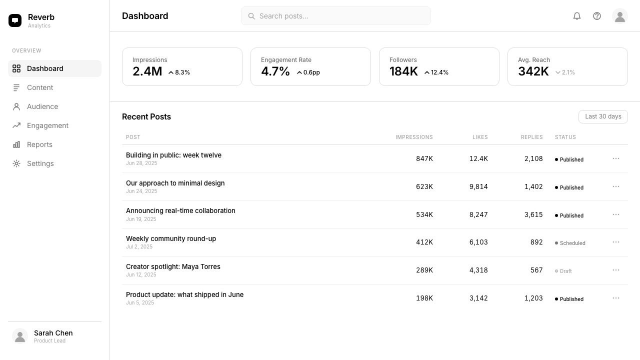
For web interfaces and dashboards, the Threads aesthetic translates to a system built on near-white or pure white backgrounds, black body text, and a single typographic variable — opacity or weight — to signal interactivity. Navigation elements are text-only or use outline icons; no filled icon appears at rest. Cards and containers use a thin border in a lighter gray rather than a drop shadow. Interactive states — hover, focus, selected — are expressed through weight change, underline, or a background shift to a very light gray rather than through any color accent. The style is particularly suited to reading-heavy interfaces: documentation platforms, content management views, long-form editorial environments.对于网页界面和仪表板,Threads 美学转化为一套建立在近白或纯白背景、黑色正文文字,以及单一字体变量——不透明度或字重——来标示交互性的系统。导航元素为纯文字或使用轮廓图标;静止状态下不出现填充图标。卡片和容器使用较浅灰色的细边框,而非投影。交互状态——悬停、焦点、选中——通过字重变化、下划线或背景切换至极浅灰来表达,而非通过任何色彩强调。这种风格特别适合阅读密集的界面:文档平台、内容管理视图、长篇编辑环境。
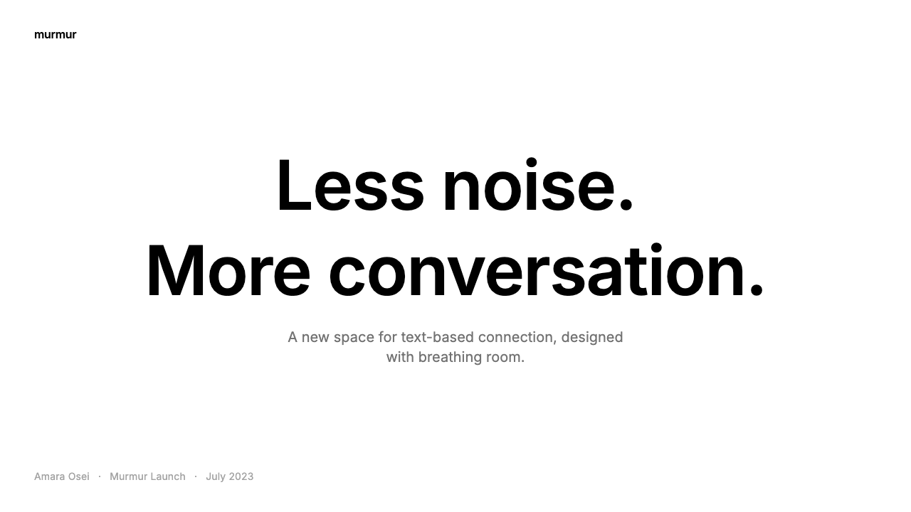
For editorial and marketing contexts, the style's poster-like typographic confidence produces strong results when applied with discipline. A full-page editorial treatment in this system alternates between black type on a white ground and white type on a black ground — the only form of color variation available. Section breaks are marked by a thin rule rather than a decorated divider. Marketing pages use large-scale typographic headlines as their primary visual element, with secondary information in a noticeably smaller weight. Photography, when used, is allowed to carry all the color — cropped generously, given ample surrounding white space, never decorated with overlaid text or graphic elements.对于编辑与营销语境,这种风格海报式的字体自信,在以自律应用时产生强劲效果。在这套系统中,全页编辑处理在白底黑字与黑底白字之间交替——这是系统内唯一可用的色彩变化形式。段落分隔以细线标记,而非装饰性分割符。营销页面以大尺度字体标题作为主要视觉元素,辅以明显更小字重的次要信息。摄影图像使用时,被允许承载所有色彩——慷慨裁剪,周围留有充裕的白色空间,绝不以叠加文字或图形元素加以装饰。
The most common mistake when applying Threads's visual language is interpreting the absence of color as an invitation to substitute a brand accent at key moments — to add a blue call-to-action button, a green success state, a red error indicator. These additions are not wrong in themselves, but they represent a departure from the system's logic rather than an application of it. Threads handles error and success states through iconography and type weight changes, not color. If a product needs color for semantic reasons — accessibility standards, regulatory requirements, established user expectations — those needs should be addressed directly, and the resulting design should be understood as a color-modified version of the system rather than the system itself. Attempting to add color in a piecemeal way produces results that feel inconsistent rather than intentionally adapted.应用 Threads 视觉语言时最常见的错误,是将色彩的缺失解读为在关键时刻引入品牌强调色的邀请——添加蓝色行动按钮、绿色成功状态、红色错误提示。这些添加本身并无错误,但它们代表的是对系统逻辑的偏离,而非对它的应用。Threads 通过图标和字重变化处理错误与成功状态,而非色彩。如果一个产品出于语义原因需要色彩——无障碍标准、法规要求、既定用户预期——那些需求应当被直接满足,所产生的设计应当被理解为系统的色彩修改版本,而非系统本身。以零散方式添加色彩,产出的结果会显得前后不一致,而非经过刻意适配。
See the Threads (Meta) design system查看 Threads (Meta) 完整设计系统
Threads (Meta) — FAQThreads (Meta) · 常见问题
Is Threads a minimalist design style or something more specific?Threads 是极简主义设计风格还是更具特定性的东西?
Threads is best described as achromatic product design rather than minimalism in the broad sense. Minimalism as a design philosophy encompasses many different approaches — some use rich color in a simplified palette, some rely on generous negative space with textural variation. Threads is more specific: it eliminates brand color from the interface entirely and achieves its visual reduction through the removal of chromatic information rather than through spatial simplicity alone. The result can feel minimal, but the mechanism is a particular kind of color restraint that distinguishes it from, say, a white-heavy material design or a sparsely laid out typographic layout that still uses a strong brand hue.Threads 最准确的描述是消色差产品设计,而非广义上的极简主义。作为设计哲学的极简主义涵盖许多不同方式——有些在简化的调色板中使用丰富色彩,有些依赖带有质感变化的慷慨负空间。Threads 更为具体:它将品牌色彩从界面中完全移除,通过去除色度信息而非仅靠空间简化来实现视觉减法。结果可能感觉极简,但其机制是一种特殊的色彩克制,使其有别于——比如——大量使用白色的材料设计,或仍然使用强烈品牌色的稀疏排版布局。
How does Threads handle visual hierarchy without color?Threads 在没有色彩的情况下如何处理视觉层级?
Entirely through typographic means: variations in size, weight, and opacity. A username is displayed at a specific weight; the handle beneath it appears at the same size but in a visibly lighter opacity; the post body text is set at a larger size and a regular weight; the timestamp and engagement counts are smaller and lighter still. This creates a five or six-level hierarchy using nothing but the same typeface in different configurations. Interactive elements are distinguished by their proximity to icons and by subtle weight shifts on press, not by color. It is a system that demands more from the type design and from the spacing decisions than a color-assisted hierarchy would, and the fact that it reads clearly is evidence of careful calibration.完全通过字体手段:尺寸、字重和不透明度的变化。用户名以特定字重显示;其下方的账号以相同尺寸但明显更低的不透明度呈现;帖子正文以较大尺寸和常规字重排版;时间戳和互动数量更小更轻。这用同一字体的不同配置创造了五到六级层级。交互元素通过与图标的邻近关系和按压时的细微字重变化来区分,而非色彩。这是一套对字体设计和间距决策要求比色彩辅助层级更高的系统,而它读来清晰,正是精心校准的佐证。
Can the Threads style work for a product that needs strong brand recognition?Threads 风格适用于需要强烈品牌辨识度的产品吗?
This depends on where brand recognition is being sought. Threads has achieved significant brand recognition without a dedicated interface color — its recognizability comes from the distinctive thread connector motif, the circular avatar system, and the overall reading-environment quality of the feed. These elements function as brand markers as effectively as a color would. For products that need to compete visually in high-color environments — retail shelves, advertising placements alongside vivid brand work — the absence of color may be a liability. For products that live within their own interface and are recognized by name and interaction pattern rather than by hue, the achromatic approach can work effectively. The Threads case suggests it is a viable choice for any product confident enough in its structural identity to forgo the shortcut of a distinctive color.这取决于在哪里寻求品牌辨识度。Threads 在没有专属界面色彩的情况下实现了显著的品牌辨识度——其可辨识性来自独特的线索连接母题、圆形头像系统以及信息流整体的阅读环境品质。这些元素作为品牌标记的效果与色彩同样有效。对于需要在高色彩环境中进行视觉竞争的产品——零售货架、与鲜艳品牌作品并置的广告投放——色彩的缺失可能是一种劣势。对于存在于自身界面中、靠名称和交互模式而非色调被识别的产品,消色差方式能有效运作。Threads 的案例表明,对于任何对自身结构性身份足够自信、愿意放弃独特色彩这一捷径的产品,这都是一个可行的选择。
What is the relationship between Threads's design and Instagram's design?Threads 的设计与 Instagram 的设计之间是什么关系?
Threads is best understood as a further reduction of the visual language Instagram had arrived at by 2022 and 2023. The shared elements are clear: circular avatars, soft media radii, generous vertical spacing, a typographic system built on a single sans-serif at multiple sizes and weights. The divergence is equally clear: Instagram retains color in its interface — gradient icons, colored story rings, algorithmic highlight states — while Threads eliminates all of it. Threads is what Instagram's structural logic looks like when its chromatic elements are removed. This makes Threads something like a stress test of the underlying design system: if the hierarchy and legibility still work without any color, the structural foundation must be sound.Threads 最好被理解为对 Instagram 到 2022 至 2023 年间所形成的视觉语言的进一步精简。共同元素清晰可见:圆形头像、柔和的媒体圆角、慷慨的垂直间距、建立在单一无衬线字体多尺寸多字重上的字体系统。分歧同样清晰:Instagram 保留了界面中的色彩——渐变图标、彩色故事环、算法高亮状态——而 Threads 将这一切全部去除。Threads 是 Instagram 结构逻辑去除色度元素后的模样。这使 Threads 成为某种底层设计系统的压力测试:如果在没有任何色彩的情况下层级和易读性仍然有效,那么结构基础必定是扎实的。
Does the Threads style work in print and offline contexts?Threads 风格在印刷和线下环境中有效吗?
Unusually well, for reasons intrinsic to its achromatic foundation. Designs built on pure black and white require no color management, no Pantone matching, no CMYK conversion anxiety, and no consideration of how a brand color will shift between screen and paper. A Threads-styled event poster, publication, or environmental graphic reproduces identically whether output on a commercial press, a laser printer, a photocopier, or as a screen display. The thin connector line motif and the typographic hierarchy translate cleanly to any medium with sufficient resolution. The only adaptation required is ensuring that the structural elements — particularly the thin rules and lightweight type — are specified at a weight that will hold up through the production process, since single-weight hairlines can be lost in certain printing conditions.出乎意料地有效,原因内在于其消色差基础。建立在纯黑白上的设计不需要色彩管理、无需 Pantone 配色、无 CMYK 转换焦虑,也无需考虑品牌色在屏幕与纸张之间的色移。Threads 风格的活动海报、出版物或环境图形,无论在商业印刷机、激光打印机、复印机还是屏幕显示上输出,复制效果完全一致。线索连接母题与字体层级可以清晰转译至任何具有足够分辨率的媒介。唯一需要适配的是确保结构性元素——尤其是细线和轻字重字体——以能够在生产流程中保持的粗细规格确定,因为单线重发丝线在某些印刷条件下可能会丢失。
Related design styles相关设计风格
 Android Bugdroid GreenFriendly tech, reduced to geometry. Vivid green pops from Grey 900 and rounde…友好科技化为几何:明绿从 Grey 900 与圆润字形中跃出。
 AsanaCalm productivity breathes. Cream canvas, lavender panels, coral-blue-yellow…安静生产力会呼吸:奶油画布、薰衣草面板与三色圆点。
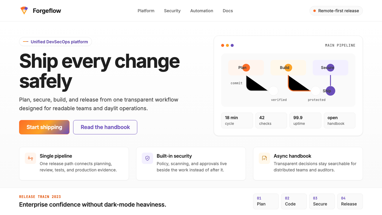 GitLab 2023DevOps in daylight. Tanuki orange-to-purple gradient, Inter, warm enough for…DevOps 走出暗色房间:标志性狸猫橙紫渐变、宽松行高、Inter 字体——…
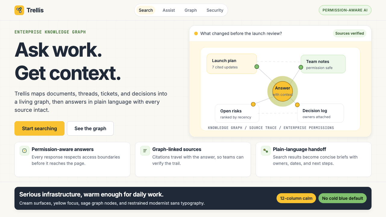 Glean Enterprise-SearchWarm enterprise AI. Cream ground, yellow focus, sage graph nodes, and sans ca…温暖的企业 AI:奶油底、黄焦点、鼠尾草节点与无衬线克制。
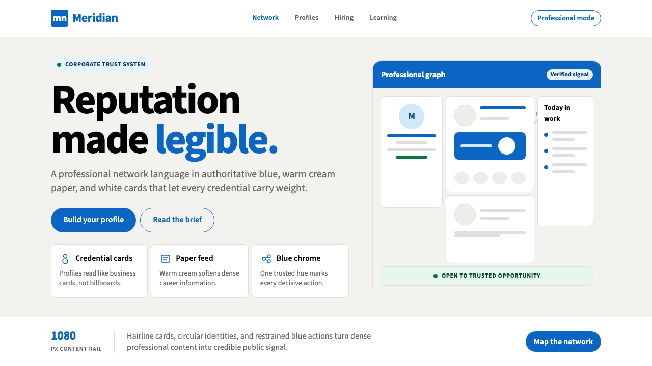 LinkedInCorporate trust, digitized. Authoritative blue frames white cards on warm cre…企业信任数字化:权威蓝框住暖奶油纸面上的白卡。
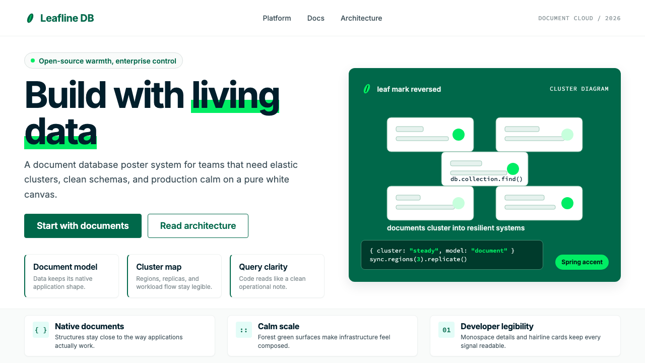 MongoDB Leaf GreenDisciplined green, open warmth. Forest leaf forms and Spring accents breathe…克制的绿有开源温度:森林绿叶形与春绿点缀,留白呼吸。