What is Fukasawa Without Thought?
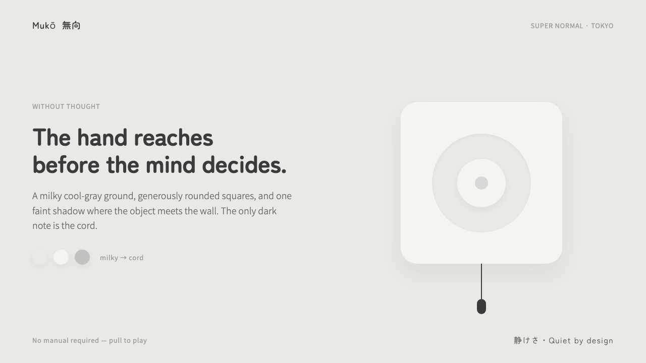
Fukasawa Without Thought makes the familiar feel inevitable: a quiet object, a waiting hand, and almost nothing left to explain.
Fukasawa Without Thought in brief
Fukasawa Without Thought is a design language built around an unusually demanding kind of ease. Its premise is not that objects should attract attention, demonstrate cleverness, or announce their refinement. Instead, an object should be resolved so calmly that the hand understands it before conscious judgment begins. The interaction feels less like learning a product than recognizing something that was already waiting in the world.
The visual vocabulary is deliberately soft and reduced: matte off-white plastic, a milky cool-gray field, rounded-square bodies, low-contrast neutral surfaces, and gentle rounded sans-serif typography. The forms do not compete for authority. Their softness is not cute, and their restraint is not sterile; it gives the object an ordinary, domestic presence that makes it easier to approach.
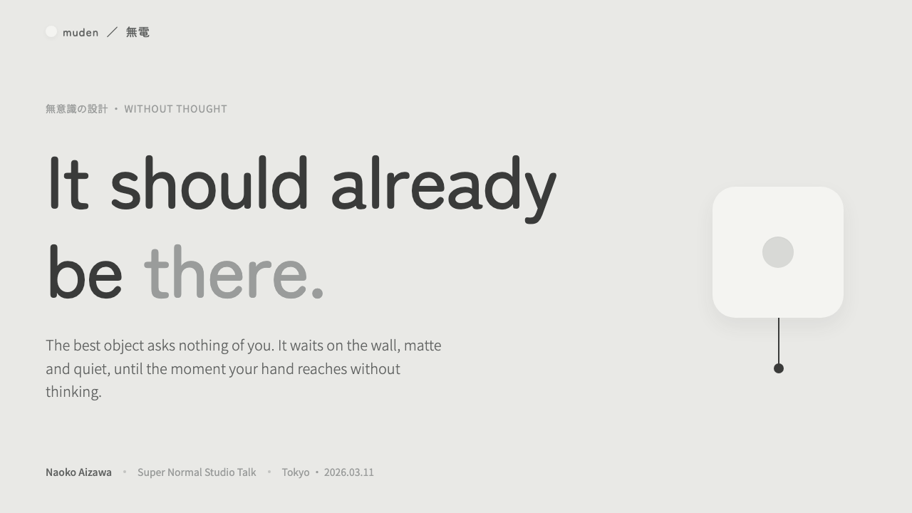
The style is associated with the Muji wall-mounted CD player and the ±0 humidifier, but its value reaches beyond those objects. It translates Super Normal calm into a broader system for screens, products, and communication. Ornament is nearly absent. Depth is limited to a faint cool shadow where an object meets the wall. Against this quiet white world, a thin near-black cord becomes meaningful precisely because it is the only dark interruption.
Where does Fukasawa Without Thought come from?
The source context places this language in Tokyo, Japan, across the period from 1990 to 2010. Its named reference points are the Muji wall-mounted CD player from 1999 and the ±0 humidifier era. These are not presented as theatrical icons. They are quiet domestic objects whose visual restraint makes use feel immediate rather than ceremonial.
Naoto Fukasawa is the central figure named in the source material, and Without Thought is the phrase that gives the system its governing ambition. The idea shifts attention away from visible expression and toward the moment before expression: the reach, the touch, the unforced recognition of what an object is for. A successful result feels obvious after the fact, even when that obviousness required careful resolution.
The source also locates the language within Super Normal and Japanese minimalism or quiet design. In this context, normality is not a lack of design. It is design disciplined enough to avoid competing with ordinary life. Soft material cues, low visual contrast, and familiar rounded forms allow the object to occupy a room without turning every encounter into a statement.
Jasper Morrison, Muji, and ±0 are included among the key figures and institutions surrounding this design context. Together, the names frame Without Thought as more than a signature look. It is a shared argument for products that feel settled, usable, and emotionally undemanding: things whose care is experienced in the hand before it is articulated in language.
What defines the Fukasawa Without Thought look?
Quiet Inevitability
The style aims for recognition rather than surprise. A control, surface, or object should seem understandable before the user begins to inspect it. This does not mean making every function explicit or instructional. It means removing visual friction until the form feels naturally available to the hand. The strongest result is almost difficult to praise in a dramatic way, because it feels as though it could not have been otherwise.
Milky Cool Neutrals
The ground is milky and cool-gray rather than stark white or conventionally luxurious. Neutrals remain close to one another, allowing shape, spacing, and touchable presence to carry the composition. Contrast is present but quiet. The atmosphere should resemble a softly lit domestic surface, not a gallery wall, a technical interface, or a polished luxury display.
Rounded-Square Form
Generously rounded squares give the system its core physical character. They avoid the severity of sharp rectangles while retaining the reassuring order of a square. The form reads as made rather than drawn: a softly molded body, calm at the corners, compact without feeling compressed. Repeating this geometry creates family resemblance without requiring logos, patterns, or decorative framing.
Matte Material Calm
Soft matte off-white plastic is not treated as an empty default. It is the material expression of restraint: absorbent rather than reflective, tactile rather than showy, and suitable for close daily contact. On screens, the equivalent is a surface that avoids gloss, spectacle, and decorative texture. The design should feel settled before any content or interaction asks for attention.
Faint Wall Shadow
Depth is reduced to one nearly architectural cue: the faint cool shadow where an object meets the wall. It does not make the object float theatrically. Instead, it establishes contact, thickness, and place. The shadow should be subordinate to the object and consistent with the room-like calm of the composition. It is evidence of presence, not an effect added for visual drama.
Gentle Typography
A rounded sans-serif voice supports the physical softness of the objects. Type should be clear, even, and unhurried, with hierarchy carried through calm differences rather than forceful contrast. The reading experience should not feel editorially aggressive or technologically cold. Labels and headings belong to the same quiet world as the product body: present when needed, absent when not.
The Single Dark Line
The thin near-black cord is the system's most consequential contrast. In a field of quiet whites and cool neutrals, it gives direction, function, and a small note of reality. Its power depends on rarity. If dark marks multiply into borders, icons, or decorative graphics, the cord loses its role and the composition becomes louder than the language permits.
Who shaped Fukasawa Without Thought?
Fukasawa is the central designer named in the source material and the figure attached to Without Thought design. The language is defined through the idea that objects can be so quietly resolved that the hand reaches before deliberate judgment. The Muji wall-mounted CD player and the ±0 humidifier are the named product reference points for this approach.
Morrison is named among the key figures in the Super Normal context surrounding this language. His presence situates Without Thought within a wider design conversation about ordinary objects, visual restraint, and the value of a product that does not ask to be admired before it can be used.
Muji is a named institutional reference through the wall-mounted CD player. In this source context, the product represents the domestic, wall-adjacent calm of the language: soft material presence, rounded geometry, minimal ornament, and an interaction that can be understood through approach rather than explanation.
±0 is named through the humidifier era that informs the system. It reinforces the style's preference for soft matte off-white bodies, quiet neutral surroundings, and forms that feel at home in everyday space. The reference is important because it grounds the screen translation in a physical product sensibility rather than an abstract minimalist trend.
How do you use Fukasawa Without Thought today?
For presentation covers, use the language as an invitation rather than a poster. Let a rounded-square object or panel sit on a milky cool-gray ground, with the title rendered in gentle, readable type and generous empty space around it. Keep the composition physically believable: one faint wall-contact shadow can establish presence. Avoid turning the cover into a collection of floating cards, badges, and visual claims.
For presentation content and data pages, treat calm hierarchy as the main design task. Separate ideas through breathing room, restrained grouping, and a small number of soft containers. Data should remain readable without becoming technical theater: charts can use quiet neutral families, while a single near-black line or mark identifies the active comparison. The goal is not to make information disappear, but to make its structure feel immediately available.
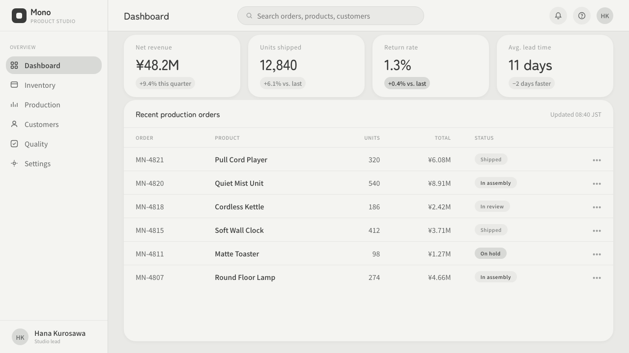
For web interfaces, this language works especially well for dashboards, device companions, settings surfaces, and pricing pages that benefit from trust and ease. Use rounded-square modules, gentle labels, and low-contrast backgrounds to make categories feel approachable. Reserve the darkest line for the most consequential functional cue, such as connection, status, or a primary path. If every action is equally dark and emphatic, the interface loses its measured rhythm.
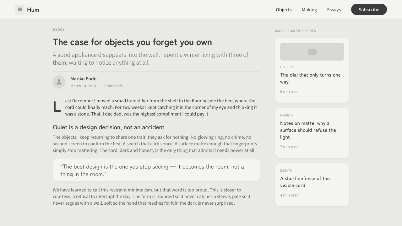
For editorial and marketing work, let product presence do more of the persuasion. Photography or imagery should feel domestic, quiet, and close to the material world rather than glossy or theatrical. A marketing page can move between large expanses of pale space and concise product statements, using one subtle shadow relationship to keep the object grounded. Copy should be plainspoken and confident; excessive slogans break the sense that the product needs no performance.
The common mistake is to confuse quiet design with simply removing content. Without Thought is not blankness, generic minimalism, or a collection of pale rounded cards. Its restraint depends on purposeful cues: the tactile suggestion of matte material, the rounded-square proportion, the faint wall shadow, and the rare dark cord-like line. Add too many decorative details and the calm becomes precious; remove all functional distinction and the calm becomes vague.
Fukasawa Without Thought — FAQ
Is Without Thought just another form of minimalism?
No. Minimalism can describe a visual reduction, but Without Thought describes the desired relationship between a person and an object. The point is not merely to show less. It is to resolve form, material, and interaction so quietly that use begins before deliberation. A sparse screen that feels confusing or generic is minimal, but it is not necessarily Without Thought.
Why is the cord such an important detail?
Because the source language gives the cord a rare role: it is the only dark note in a world of quiet white. That contrast makes function visible without adding visual noise. It suggests connection and practical reality while the rest of the composition remains soft, matte, and low contrast. Its importance comes from restraint, not from decorative emphasis.
Can this style work for information-heavy dashboards?
Yes, provided calm is used to clarify rather than conceal. Group related information in soft rounded-square regions, use whitespace to separate decisions, and reserve the deepest contrast for the active or consequential signal. The dashboard should not become uniformly pale; users still need to recognize status, connection, and priority. The style works when hierarchy feels obvious without becoming loud.
What breaks the feeling most quickly?
Visual overstatement breaks it first: glossy surfaces, dramatic depth, numerous dark borders, loud icons, or decorative effects that compete with use. A second failure is generic softness, where every element is rounded and pale but none has a clear function or grounded material cue. The language needs both restraint and intention. Its quietness should feel resolved, not unfinished.
Related design styles
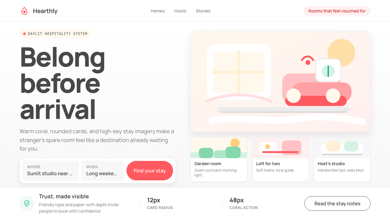 Airbnb 2014Coral red, soft pill cards, Cereal type. The Bélo wraps strangers in warm, da…
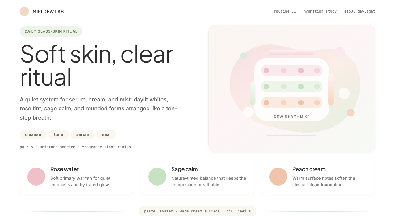 K-Beauty CleanCalm arrives dewy. Rose, sage, and peach pastels float through airy rounded f…
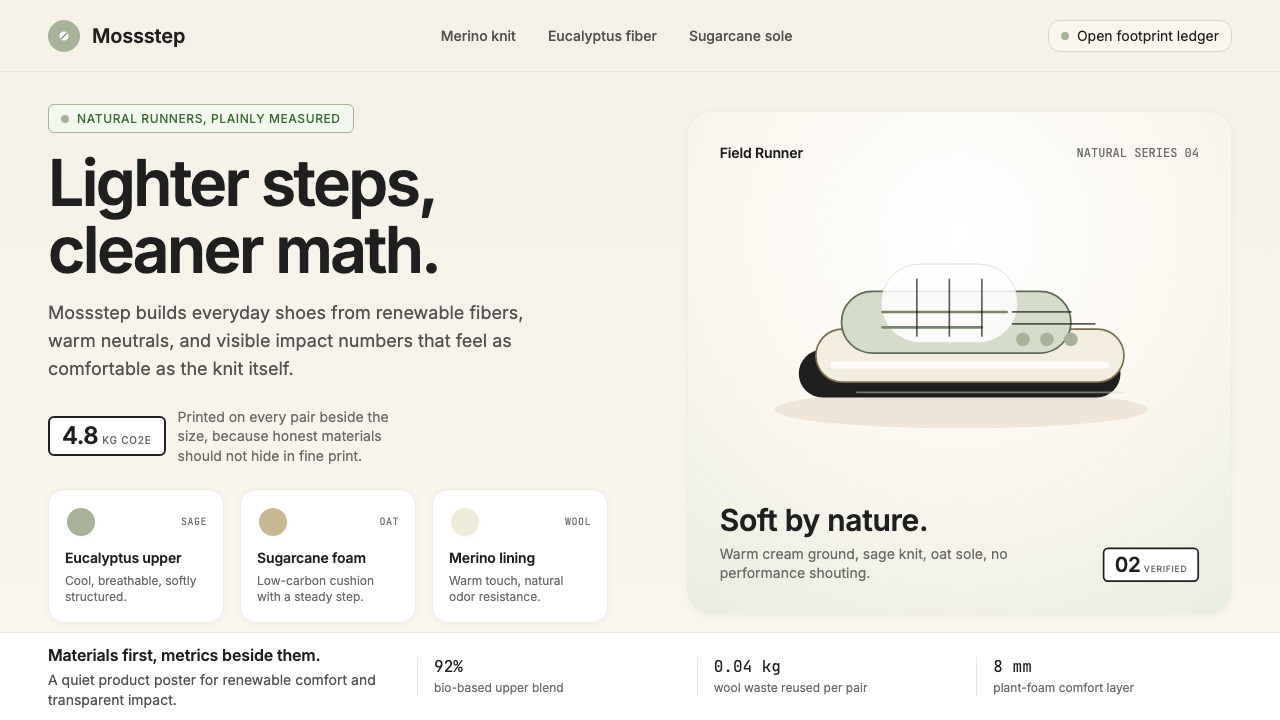 AllbirdsSustainability that breathes. Cream-and-sage tones, carbon labels next to pri…
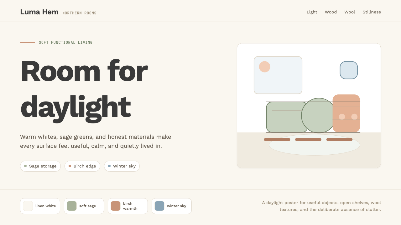 Scandi Hygge (IKEA)Warmth from restraint. Sage, linen white, Work Sans, and wide breathing room.
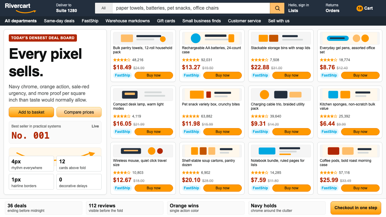 AmazonUgly sells efficiently. Navy chrome, orange buttons, red prices crowd a dense…
 Whole Foods MarketFarmer’s-market polish. Moss green on butcher-paper cream, white cards, growe…