About HEYTEA
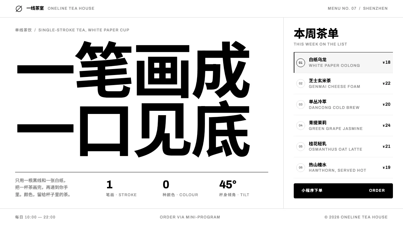
HEYTEA is a black line on white paper. The 2016 rebrand replaced Royal Tea with 「阿喜」, a single-stroke profile of a face tipping a cup back at 45 degrees, no straw, drawn from a coin portrait and kept deliberately genderless.
The system that grew around it has no chromatic brand colour at all. Pure black carries the mark, the type and every rule; a neutral grey ramp handles everything secondary. Chinese leads, Latin labels follow small and evenly spaced, and menus read like a WeChat mini-program.
- Origin
- Jiangmen and Shenzhen, Guangdong, China
- Era
- 2012 founded as Royal Tea (皇茶); HEYTEA rebrand and 「阿喜」 mark 2016; current visual ~2016–2025
- Key figures
- Neo Nie (聂云宸)
- Movements
- New-style Chinese tea (新式茶饮) · Monochrome line-art branding · Minimal retail architecture
HEYTEA design spec
Colors
Background
Surface
Primary
Secondary
Accent
Text
Typography
ArchivoHeadings
Unlock for 1 credit
The other 11 sections — buttons, cards, spacing, motion, techniques and more — open once you unlock. Download the DESIGN.md or send it to your AI in one click. Unlock once, yours forever.
Sign up nowHave an account? Sign in
Styles similar to HEYTEA
Also inspired by brands & products, with a close feel.
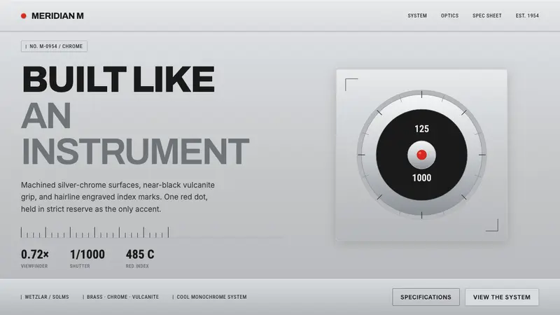 Leica M Silver ChromeBuilt like an instrument. Brushed silver-chrome on near-black vulcanite, one red dot, lone accent.
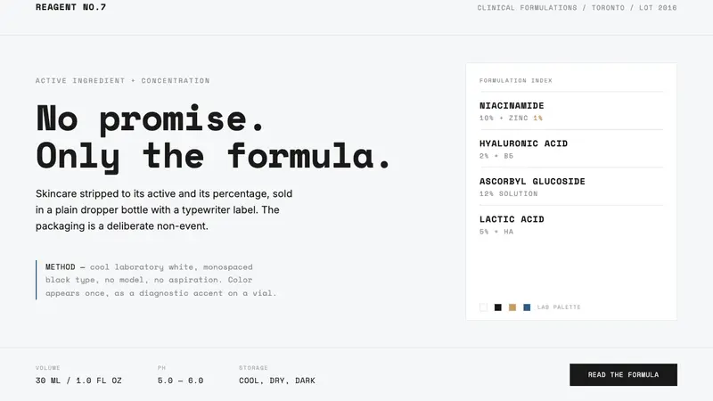 The OrdinaryNo promise, only the formula. Cool lab white, Space Mono labels, color as rare diagnostic accent.
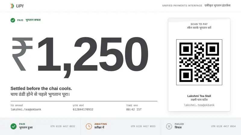 UPI PaymentsUtility, not brand. Grey Helvetica, a saffron-green chevron, black QR on white laminate.
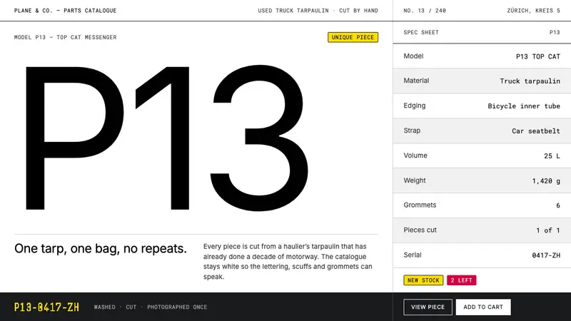 FREITAGColour-zero on purpose. White sweep, hairline grid, one type weight — the tarp holds the chroma.