About UPI Payments
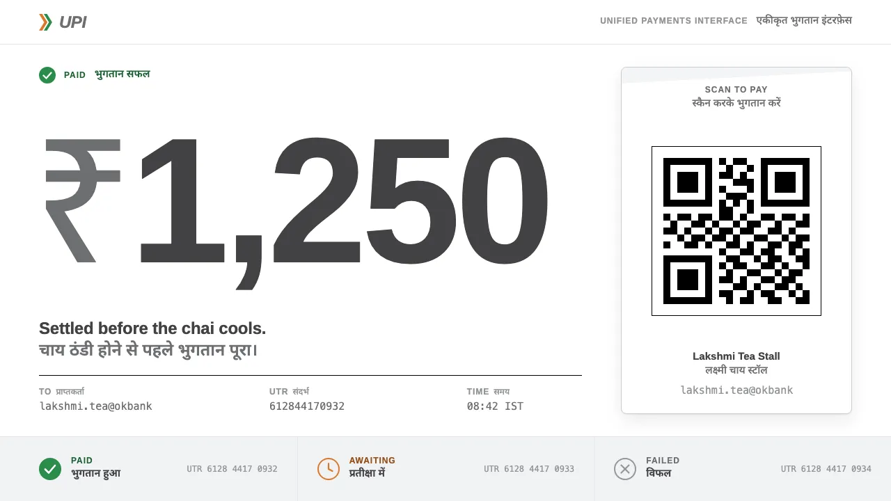
UPI is the payment rail NPCI switched on in April 2016, and its real face is a laminated white QR plate leaning against a vegetable cart. The mark is almost bureaucratic: the word UPI in grey Helvetica, a saffron-and-green chevron beside it, plain white behind.
This system builds from that kit — white sheets, hard black QR modules, a single green for "paid", saffron for "waiting", and Hindi stacked under every English label.
- Origin
- India
- Era
- 2016 launched (April); QR standees and soundboxes spread 2017–2020; current brand guidelines ~2022–2024
- Key figures
- Dilip Asbe · National Payments Corporation of India (NPCI) · Reserve Bank of India
- Movements
- India Stack / digital public infrastructure · Interoperable QR payments · Virtual payment addresses
UPI Payments design spec
Colors
Background
Surface
Primary
Secondary
Accent
Text
Typography
ArimoHeadings
ui-monospaceMono
Unlock for 1 credit
The other 11 sections — buttons, cards, spacing, motion, techniques and more — open once you unlock. Download the DESIGN.md or send it to your AI in one click. Unlock once, yours forever.
Sign up nowHave an account? Sign in
Styles similar to UPI Payments
Also inspired by brands & products, with a close feel.
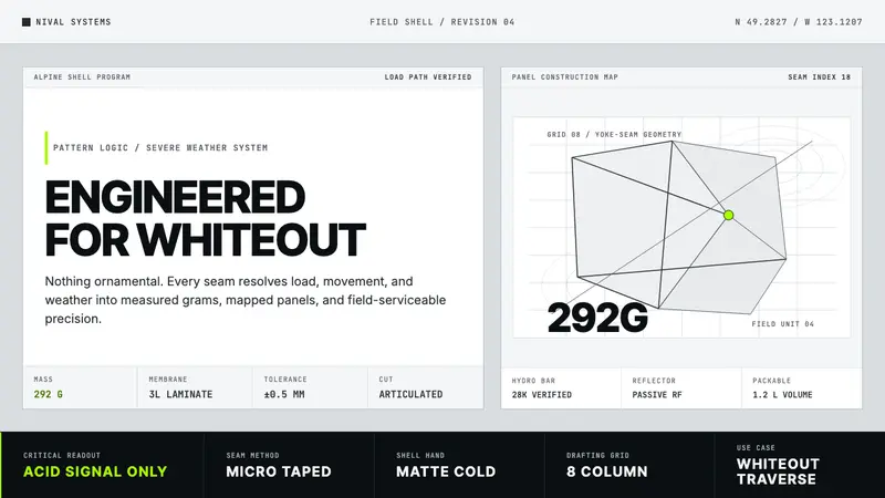 Arc'teryx Technical OutdoorEngineered, never ornamental. Glacier silver grid, mono specs, one acid-green signal.
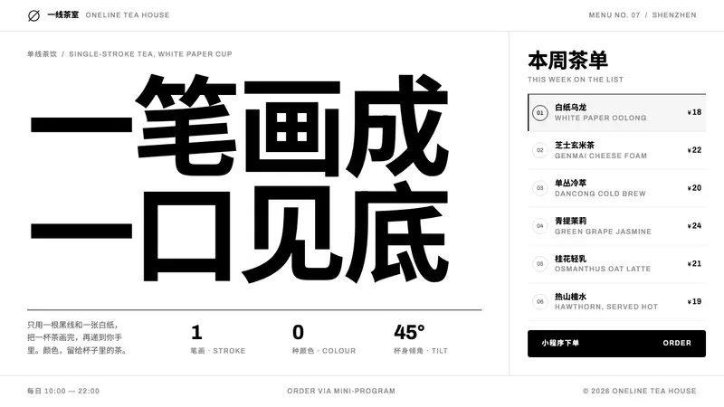 HEYTEANo colour at all. One black line on white cup paper, Chinese-first type, mini-program menu rows.
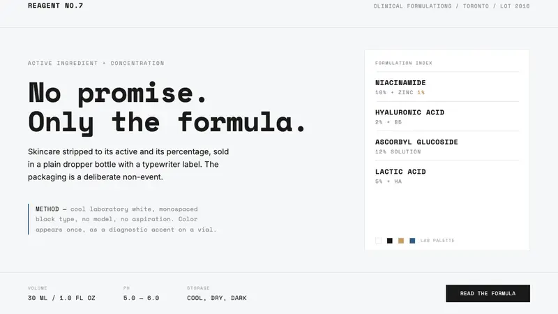 The OrdinaryNo promise, only the formula. Cool lab white, Space Mono labels, color as rare diagnostic accent.
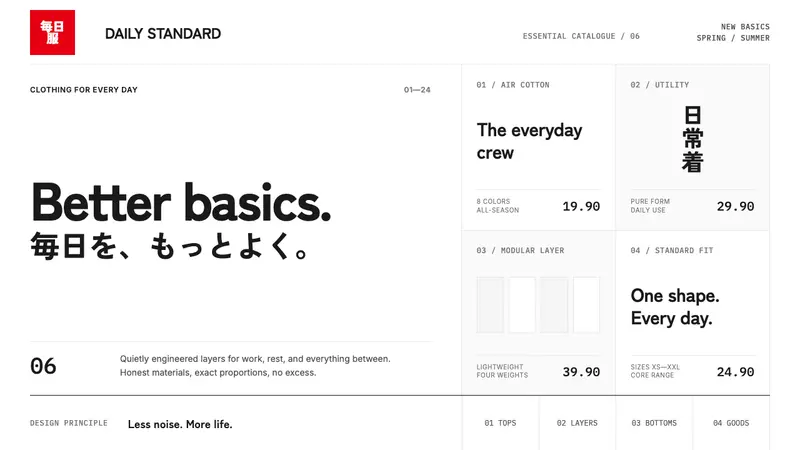 UNIQLO LifeWear (2006)Whitespace is the product. A hard modular grid and one rationed red square enforce calm.