What is UPI Payments?
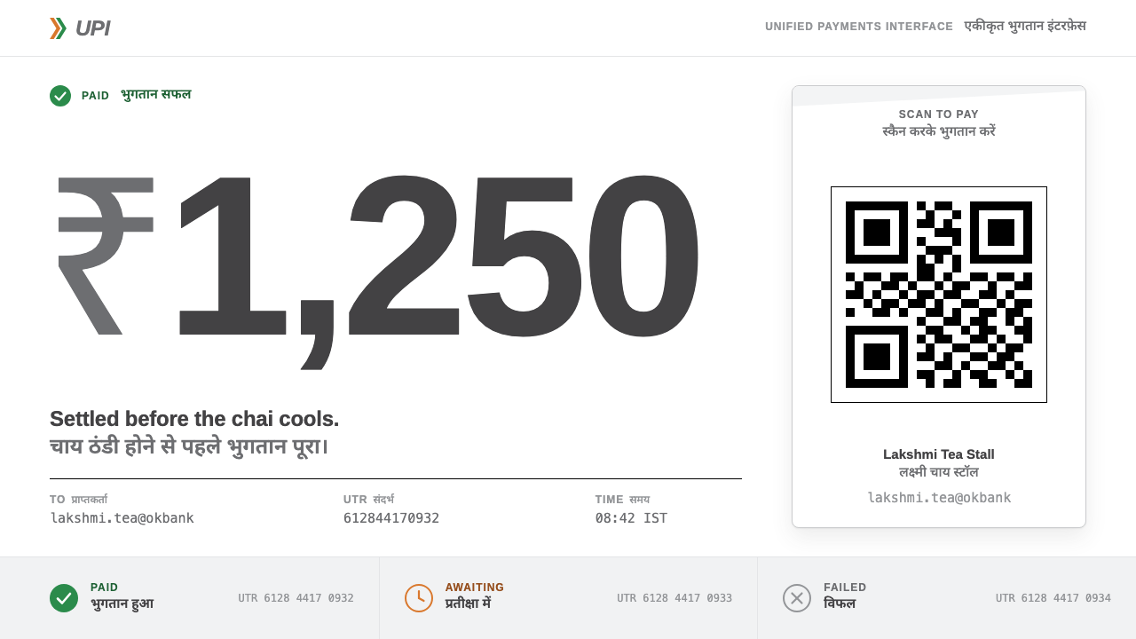
UPI Payments is utility rather than brand: grey Helvetica, a saffron-and-green chevron, hard black QR modules, and Hindi stacked under every English label.
UPI Payments in brief
UPI Payments is a design style drawn from the Unified Payments Interface, the instant payment rail that India's National Payments Corporation, NPCI, switched on in April 2016. Its real face is not an app icon but a laminated white QR plate leaning against a vegetable cart, or standing at a tea stall, a betel shop or a temple donation box. The official mark is almost bureaucratic: the letters UPI in grey Helvetica, a saffron-and-green chevron beside them, plain white behind.
The style keeps only what that kit contains: white sheets, hard black QR modules, a single green meaning paid, saffron meaning waiting, and Hindi stacked neatly under every English label. Around the plate sit the white checkout screens of payment apps, payment addresses written in the name@bank form, and soundbox speakers that announce each incoming payment aloud.
The result is a deliberately neutral, public-utility aesthetic. It does not try to be a brand; it tries to be infrastructure. Pages feel like forms, receipts and notice boards, and that is the point: when a payment must be understood by anyone, in any language, in a second, the design's job is to disappear into the transaction.

Where does UPI Payments come from?
UPI is the payment rail NPCI switched on in April 2016, and its design makes sense only against that origin. NPCI runs shared payment infrastructure alongside the Reserve Bank of India, the country's central bank, and UPI was built as a common rail rather than the product of a single company: any bank and any app could connect to it, and money could move between accounts in seconds. The design language that grew around it inherited that public, interoperable character. The choice to build on a shared rail rather than a closed network is the root of the style's neutrality: a design that has to stand beside the logos of many competing apps cannot afford a loud identity of its own.
Three ideas from its lineage shape the look. India Stack, or digital public infrastructure, treats payment as a public layer on which many private products can be built, so the common surface has to be neutral. Virtual payment addresses, written in the name@bank pattern, let a person receive money without sharing an account number and turn a payment identity into a short line of text that fits on a sign. Interoperable QR payments mean that one printed code can be scanned by any compatible app, so a shopkeeper needs only a single plate whichever app the customer uses.
The QR standee and the soundbox took the system from phones into streets. Between 2017 and 2020, laminated plates spread across vegetable carts, tea stalls, betel shops and temple donation boxes, and small speakers began to announce each payment received. The speaker is a design decision as much as a device: in a loud market a visual confirmation can be missed, so sound makes the 'paid' state public and unmistakable to the merchant. The brand guidelines that followed, in roughly 2022 to 2024, are plain by intent, a mark reduced to a few letters and a chevron.
That plainness is a social choice. UPI serves a country of many languages, scripts and levels of literacy, and its design has to work for a customer reading English, a customer reading Hindi and a customer who reads neither but recognises the shape of the plate. Stacking Hindi under English, using colours with fixed meanings and relying on the universal QR square all follow from that requirement. The names associated with the system, from NPCI and the Reserve Bank of India to its executive Dilip Asbe, are a reminder that this is an institutional design language, produced for public use rather than as the creative statement of an individual.
What defines the UPI Payments look?
Plain White Sheets
The ground is plain white, the colour of laminate and printed forms, with no tint, texture or gradient. White gives the QR code its highest possible clarity and makes every other element feel placed on a clean sheet. The page should look like something that could be printed, laminated and propped up at a stall.
Neutral Grey Grotesque Type
The wordmark is set in grey Helvetica, one of the most neutral sans-serif typefaces in the world, and the rest of the typography follows its register: plain, evenly spaced, unemotional. The grey is deliberate. It lowers the volume of the brand and lets the colours and the code carry meaning.
The Saffron-and-Green Chevron
Beside the letters sits a layered chevron in saffron and green, the only decorative gesture in the whole identity. It points forward, suggesting movement of money, and its two colours carry quiet national associations. In the design system these same two colours are promoted from logo to functional palette.
Hard Black QR Modules
The QR code is the hero object: crisp black square modules on white with a wide empty margin around them. Its edges are never softened, rounded or decorated, because a code must stay machine-readable. Everything else on the page is arranged to protect and present it.
Status Colours with Fixed Meanings
Green means paid. Saffron means waiting. Each colour has one job and is used for nothing else, so a merchant glancing at a screen across a noisy counter can read the state without reading a word. This strict functionalism is the difference between a status system and decoration.
Hindi Stacked Under English
Every English label has its Hindi counterpart directly beneath it, aligned to the same edge and treated as an equal partner rather than a footnote. The stack lets one layout serve two audiences without switching language modes. Devanagari needs generous line height and size to stay legible, so the second line is never squeezed.
Short Addresses and Brief Confirmations
Payment addresses in the name@bank form appear as single, plain lines of text, and confirmation screens are short, unambiguous and readable at a glance, echoing the soundbox's one-line announcement. There is no illustration, no celebration, no marketing copy. The page confirms the fact and gets out of the way.

Who shaped UPI Payments?
The executive associated with NPCI's leadership during the years in which UPI grew from its launch to national scale. He stands for the institutional face of the system, a reminder that the design language belongs to a public organisation whose aim is reliability and reach rather than a distinctive personal voice.
The organisation that switched UPI on in April 2016 and runs the shared rail on which banks and apps compete. Its identity is the source of the plain mark and the bureaucratic neutrality that the style borrows: an infrastructure operator that wants to be recognised and trusted, not admired.
India's central bank, the institutional partner behind the country's payment infrastructure. Its presence in the lineage explains the style's sober tone: payments are a regulated public matter, and the visual language is expected to feel steady, official and clear to everyone.
How do you use UPI Payments today?
UPI Payments is best for utility-first products where the user must understand a state or complete a transaction without hesitation: payments, billing, merchant tools, public services, forms, receipts and onboarding. Its authority comes from being unremarkable on purpose, and it rewards teams who care more about completion rates than about first impressions.
On slides, a cover can be nothing more than a white field, a grey grotesque title with its translation stacked below, and a single saffron-and-green accent. Content slides should read like forms: labelled rows, bilingual headings and plenty of white. Data slides should present tables and simple charts in grey and black, with green and saffron reserved for status cells such as paid and pending, so the colours keep their meaning.
In web interfaces the style suits checkout pages, invoices, merchant dashboards and payment-status screens. Place the QR code large, centred and surrounded by empty white margin; keep addresses and amounts in plain, legible text; and use green and saffron only as status indicators. If your product serves several languages, stack the second language under the first instead of hiding it behind a toggle. Avoid shadows, gradients and decorative icons, since each of them lowers clarity.
For editorial and marketing work, the style fits explainer articles on digital public infrastructure, reports from public bodies and non-profits, merchant onboarding leaflets, and printed signage. Posters should look like notices: a short bilingual headline, a large code, one line of instruction. Credibility comes from restraint, and an over-designed page would undermine the sense that this is a rail everyone can trust.
The most common mistake is to make it look like a fintech brand. Glossy cards, neon gradients, dark themes and playful illustration all contradict the utility premise. A second mistake concerns the code itself: rounding its modules, tinting it or embedding decoration inside it may look clever but can make it harder to scan. A third is spending green and saffron as ornament, which strips them of their status meaning. Finally, treat the official mark as the property of its owners; this style takes its logic from the kit, not the right to reproduce the mark.

UPI Payments — FAQ
Is this the official UPI brand identity?
No. It is a design style inspired by the visible kit around UPI: the white QR plate, the grey wordmark, the chevron, the status colours and the bilingual labels. It is not the official guideline, and the official mark should only be used as its owners permit. The style borrows the logic of the kit, not the identity itself.
Why is the style so plain?
Because plainness is a feature of infrastructure. A payment rail used by people with different languages, devices and levels of literacy has to be readable at a glance, and decoration competes with clarity. The restraint also signals trust: the less a payment page tries to impress, the more it looks like something that simply works.
Why do saffron and green mean waiting and paid?
Green is widely read as complete and successful, while saffron reads as in progress and worth attention. Both colours already sit in the chevron, so using them as status colours extends the identity into function rather than introducing a new palette. The key rule is consistency: each colour carries one meaning and is never reused as ornament.
Does the stacked bilingual approach work for other languages?
Yes. The principle is to give a second script its own line, directly below the first, at a comparable size and with enough line height to be comfortable. The same structure can serve any pair of languages, including pairs where one script needs more vertical room than the other. What matters is treating the second language as a first-class partner, not as a small translation tucked underneath.
Can it be used outside payments?
Yes. Government forms, utility bills, ticketing, logistics tracking, health administration and any service where clarity beats personality can borrow it. It is a weaker fit for emotional storytelling, luxury or entertainment brands, where its deliberate blandness would feel like absence of voice.
Related design styles
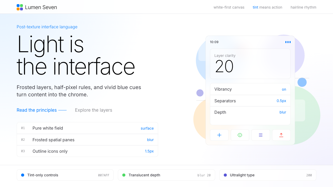 Flat Design iOS 7The day skeuomorphism died. Bright tints on white, hairline separators, frost…
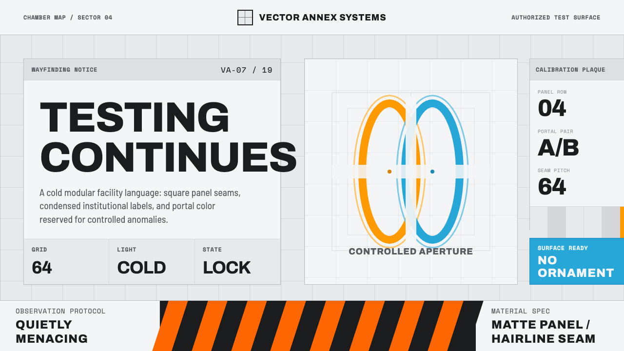 Aperture ScienceSterile authority. Cool panel seams, Archivo signage, and sparse orange-blue…
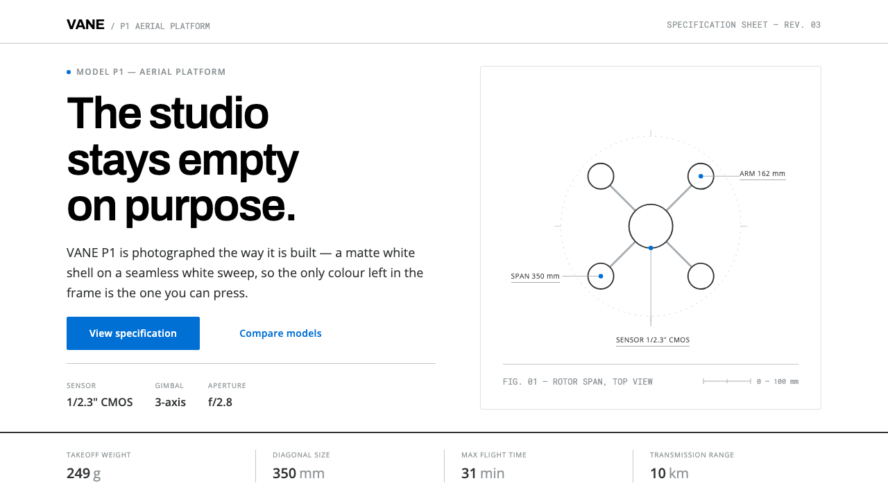 DJI PhantomWhite on white, one blue allowed. Hairline spec tables make the hardware the…
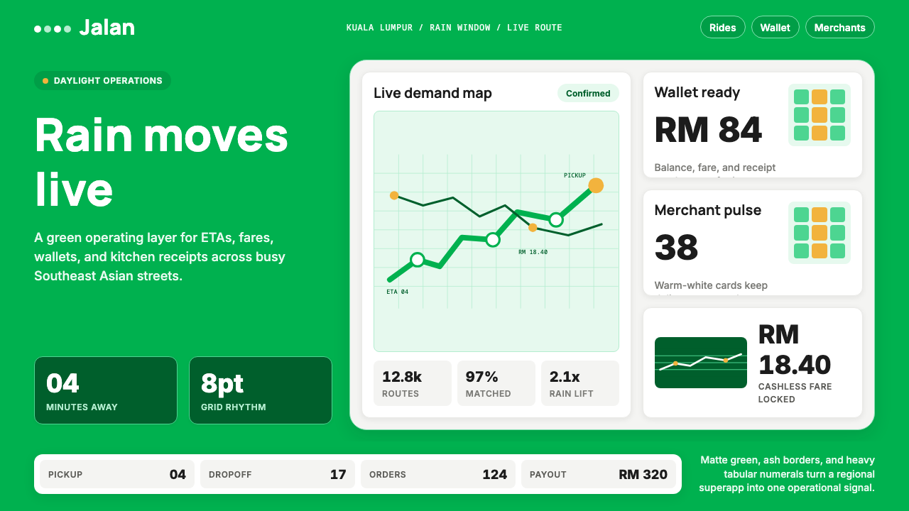 Grab SEA Superapp 2018Operational warmth. Saturated green, Inter numerals, and tight dashboard card…
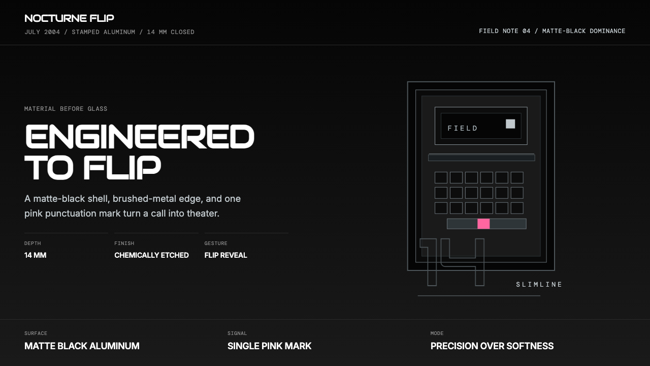 Motorola RAZR Flip (2004)Precision beats glamour. Matte black, brushed steel, and one pink accent.
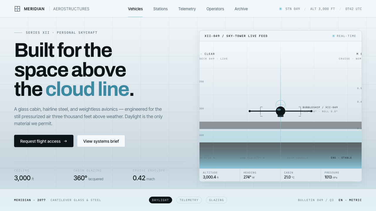 Oblivion Sky TowerSterile daylight futurism. Cool sky-grey glass, hairline steel mullions, a si…