What is DJI Phantom?
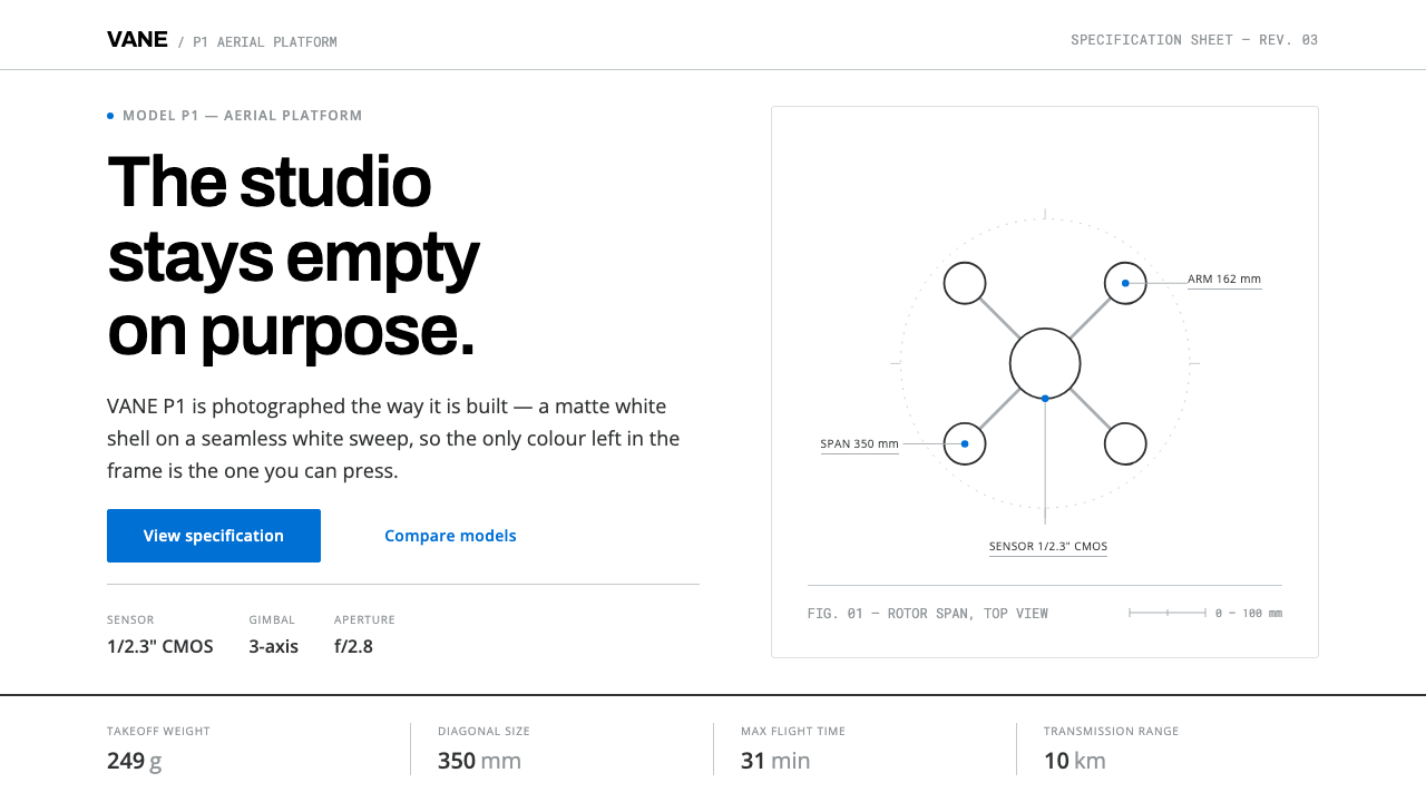
DJI’s Phantom pages turned a camera drone into a consumer product by getting out of the way: white hardware on a white sweep, one blue to click, and numbers where other brands put adjectives.
DJI Phantom in brief
The DJI Phantom style is the visual language of the product pages that introduced the Phantom camera drone to ordinary buyers. A white moulded shell is photographed on a seamless white sweep, so nothing in the frame competes with the hardware. Type sits in a white band beside the image and never over it. Everything actionable is one blue, everything else is a cool grey, and the layout rides a modular grid as measured as the airframe it describes. The look held, in broad terms, from 2013 into the 2020s.
The idea underneath is that the product is the argument. A page does not need adjectives to persuade when the object is the right shape and the numbers are good, so the copy is reduced to a parameter and a unit, and the design is reduced to whatever helps those parameters be compared. White-on-white photography removes the setting, the grey ramp removes emphasis, and the single blue removes any doubt about where to click. What remains is evidence.
Visually, the pages alternate between two kinds of band. Full-width aerial photographs carry emotion and show what the camera sees; white specification bands carry facts and show what the machine is. Long horizontal comparison tables divide their cells with hairlines, align numbers to the right, and let columns of figures do the work that paragraphs do elsewhere. It is a style that earns trust by being checkable.

Where does DJI Phantom come from?
DJI was founded in 2006 in Shenzhen, and its founder Frank Wang Tao is the central figure in the company’s story. For its first years it was a maker of components for hobbyist flying machines rather than a consumer brand. The shift came in January 2013, when DJI released the Phantom 1. In DJI’s own telling, and in the source material behind this theme, it was the first aerial-photography drone that a buyer could take out of the box and fly, with no assembly, no tuning and no separate camera mount.
The hardware dictated the look. The Phantom 1 had a white moulded shell, a black gimbal and silver-grey trim, and the website made a deliberate choice about it: photograph the white product on a seamless white background. White on white meant the shell’s curves were read through shading alone, and nothing in the picture could be mistaken for a feature. Text was kept to the white band beside the image so that the product photograph was never covered. For a company selling a complicated machine to people who had never owned one, this was an act of reassurance as much as an aesthetic.
Three traditions meet in the result, all named in the sources. The first is Shenzhen hardware design, the culture of fast, specification-led electronics in which the product page is expected to answer questions about numbers before it says anything about feelings. The second is seamless-white studio product photography, the long-standing catalogue convention of isolating an object from any context. The third is the specification-table comparison layout, familiar from electronics retail, in which a buyer judges two models by reading across a row. The DJI pages did not invent any of these; what they did was commit to all three at once and keep the discipline for more than a decade.
The grid beneath the pages is also derived from DJI’s own identity. Its X-Factor grid is generated from the height of the lowercase letter i in the company wordmark, which means the module that governs spacing is a part of the logo rather than an abstract number. This theme borrows the cool grey ramp that DJI used in its production stylesheet for text, labels and dividers, the black wordmark colour for headings, and one blue for anything a visitor can click. The consequence is a system with very few colours and very few reasons to add more.
What defines the DJI Phantom look?
Colour
The ground is pure white, headings take the black of the wordmark, and body text, labels and dividers step down through a ramp of cool greys, from a deep charcoal for reading to a pale hairline grey for rules. One blue is allowed, and it is reserved for things a visitor can act on. Because there is no second accent, the blue is never ambiguous: if it is blue, it is a control. Colour is a signal, never a decoration.
White-on-White Photography
The hardware is shot on a seamless white sweep, so the horizon, the floor and the shadow of the setting disappear. The shell’s curves are modelled by soft light alone. Nothing in the frame competes with the product, and nothing in the frame can be mistaken for a feature. The same rule governs layout: the product image is never covered by text, a headline or a badge.
Modular Grid
Layouts follow DJI’s X-Factor grid, whose module is derived from the height of the lowercase i in the wordmark. Blocks snap to the grid in whole units, so text bands, photographs and tables line up page after page. The grid is rarely visible as a rule or a border; it shows itself as a consistent rhythm, and as the absence of near-miss alignments that make a page look improvised.
Type Beside, Never Over
Text lives in the white band beside the image. A caption never sits on top of a photograph, and a headline never competes with an airframe for the same pixels. This rule keeps both pieces of content legible and gives the page a calm two-part rhythm: image to look at, band to read. Type itself is plain and neutral, set in a clean sans-serif, with weight and size doing all the work of hierarchy.
Hairline Spec Tables
Comparison tables run long and horizontal. Cells are separated by thin grey rules, never by filled boxes, and numbers are aligned to the right so that digits stack and can be compared by eye. Column headings are short, units are stated once, and nothing in a row is decorated. The table is the central object of the page, and everything else exists to bring the reader to it.
Copy as Parameter
The writing avoids adjectives. A feature is expressed as a number and a unit, such as a flight time, a distance or a resolution, and the layout gives that number visual priority over the sentence around it. This tone is a design choice rather than only an editorial one: it means a page can be scanned in seconds and compared across models without translation, which suits an international audience.
Rhythm of Bands
Pages alternate between full-width aerial photography and white specification bands. The photographs say what the camera can see; the bands say what the machine is. This alternation gives long pages a steady cadence of emotion followed by evidence, and it stops either one from dominating. Photography fills the width of the screen while text stays within a measured column.

Who shaped DJI Phantom?
Founder of DJI and the central figure in the company’s history. DJI began in Shenzhen in 2006 and, under his direction, moved from supplying components to releasing the Phantom 1 in January 2013, the product that made camera drones a consumer category. His importance for the visual style is indirect but real: the decision to make the page about the hardware rather than the brand reflects the specification-first culture he built around the company.
The team responsible for the Phantom’s physical form: the white moulded shell, the black gimbal and the silver-grey trim. Their work is the reason the pages can be so quiet. A product whose silhouette is already legible does not need decoration, and the website’s white-on-white treatment is a direct response to the shell they designed, which is meant to be read through its curves alone.
Not a person but a working culture, and the one the source material names as the first of this style’s lineages. Shenzhen’s electronics ecosystem rewards products that explain themselves in numbers, ship fast and invite comparison, and the DJI pages inherit that habit. Its influence appears in the preference for tables over paragraphs, units over adjectives and a single clear call to action over a cluster of competing ones.
How do you use DJI Phantom today?
The DJI Phantom style is a product-evidence system. It works wherever a physical or technical object is the reason for the page and the audience wants to compare, and it works worst where the subject is an emotion, a story or a service with few measurable properties. Applying it correctly means committing to white, to one blue and to numbers.
For presentation slides, the style suits product launches, hardware roadmaps and technical comparisons. A cover can place a single product image on a pure white field, with a short title in the white band beside it. Content slides alternate between a full-width photograph and a white band holding three or four parameters. Data slides are the style’s strongest case: a comparison table with hairline rules and right-aligned numbers will read more clearly than most charts, and where a chart is needed, a thin line and one blue highlight are enough.
For web interfaces, the style translates well to product pages, comparison pages, specification sheets and purchase flows. Keep the page white, use grey for secondary text and rules, and make blue the unmistakable sign of an interactive element: links, buttons and selected states. Pricing pages should read like specification tables, with plans as columns and features as rows. Dashboards can adopt the same restraint, using grey for structure and a single blue for the active item.
For editorial and marketing work, the style supports review-like layouts: a lead image, a short statement, then a table or a labelled diagram. Campaign pages can alternate between photographs and facts in the same rhythm as the original product pages. Because the voice is parameter-led, headlines work best when they state a capability plainly, with a figure and a unit, and let the reader decide how impressive it is.
The most common mistake is to add a second accent colour, a gradient or a drop shadow to make the page feel livelier, which removes the one thing that makes the blue meaningful. A second mistake is placing text over the product photograph for drama; the rule of type beside the image is what keeps the hardware legible. A third is writing the copy in adjectives, because the layout will then have nothing to anchor its numerical structure. Finally, do not shoot the product on a coloured background: the white-on-white discipline only works if the ground is genuinely white.

DJI Phantom — FAQ
Is this DJI’s official website design?
No. It is a design system that reads the Phantom-era product pages, roughly 2013 into the 2020s, as a visual language: white hardware on white, one interactive blue, a cool grey ramp, a modular grid and specification-led copy. It is not an official DJI brand kit, and DJI’s name, logo and product photography belong to the company. Use the approach for your own products rather than presenting your pages as DJI’s.
Why is there only one blue and no second accent colour?
Because the blue is a signal, and a signal only works when it is unambiguous. If blue marks every link, button and selected state, and nothing else is coloured, a visitor learns the rule in seconds and never has to guess what is clickable. A second accent would force the page to explain which colour means what. Keeping one blue also lets the white hardware and the grey specifications stay visually dominant, which is the intention.
How do I build the white-on-white product look without a studio?
Start with a product that is genuinely light in colour, or accept a more neutral treatment. Shoot or composite the object against a seamless white ground with soft, even light, keep a faint shadow under it so it does not float, and make the page background the same white as the photograph so the image has no visible edge. If you cannot match the white exactly, crop the image tightly and place it in a white band so the mismatch is hidden. Never add a coloured backdrop.
Can the style work in dark mode?
The look depends on white as a physical backdrop for a white product, so a dark version is a different design. If you need one, keep the same discipline of a single accent, a grey ramp and tables with hairline rules, but photograph the product against a dark ground rather than inverting a white-on-white image. Expect to lose the clinical, laboratory quality that gives the original its credibility.
What kinds of subjects does it handle badly?
Anything where meaning lives in mood, narrative or craft rather than measurable properties: lifestyle brands, food, hospitality, personal portfolios and cultural institutions. The style’s habit of replacing adjectives with numbers leaves little room for warmth, and its single blue gives no vocabulary for categories or states beyond clickable and not clickable. It is strongest on hardware, devices and software with real specifications.
Related design styles
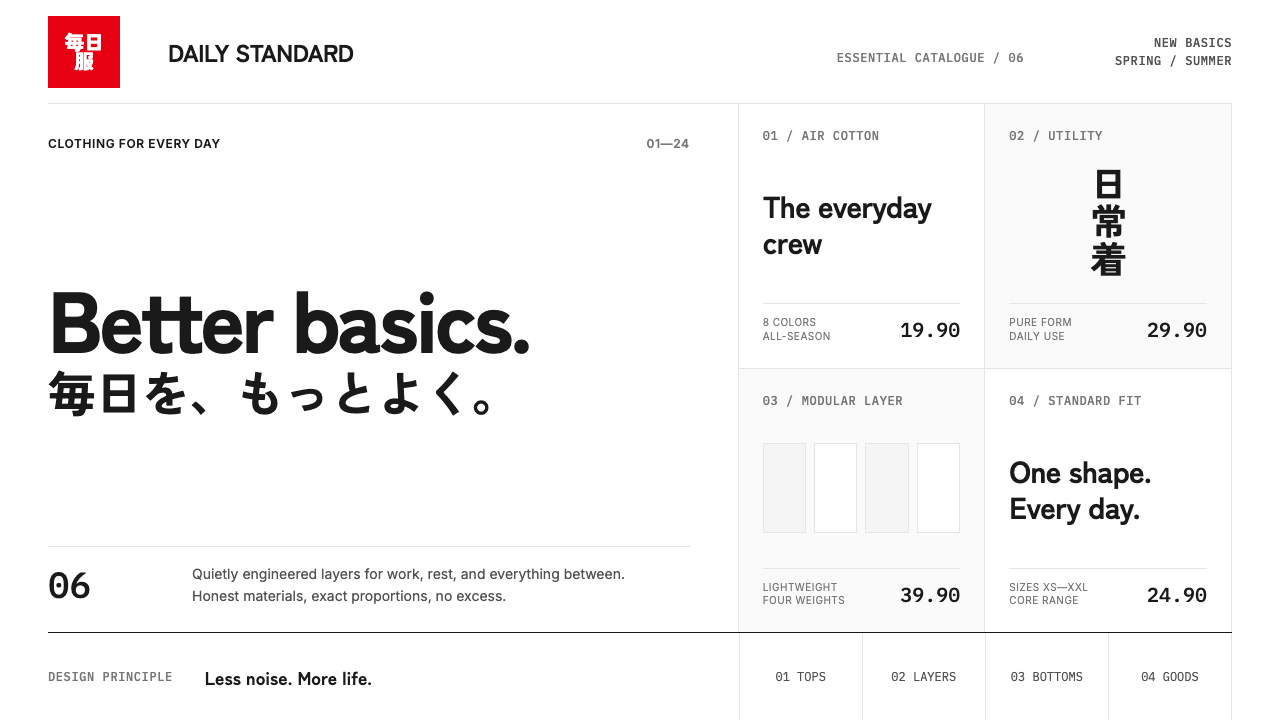 UNIQLO LifeWear (2006)Whitespace is the product. A hard modular grid and one rationed red square en…
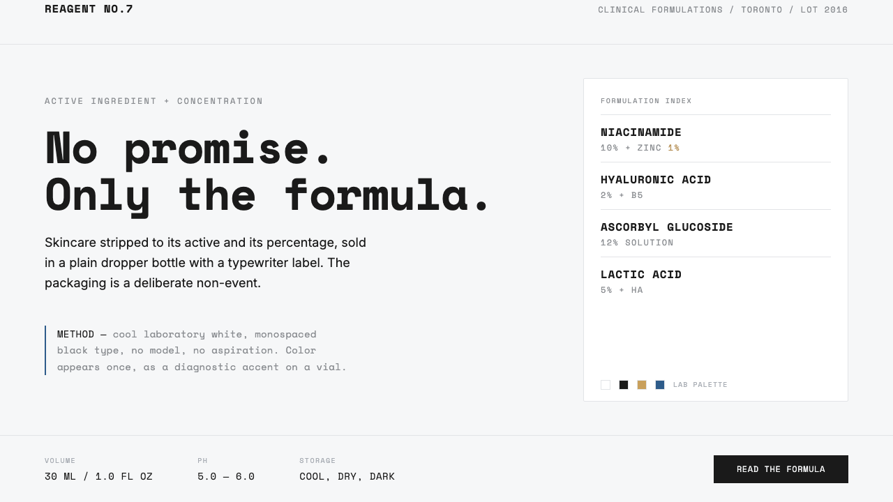 The OrdinaryNo promise, only the formula. Cool lab white, Space Mono labels, color as rar…
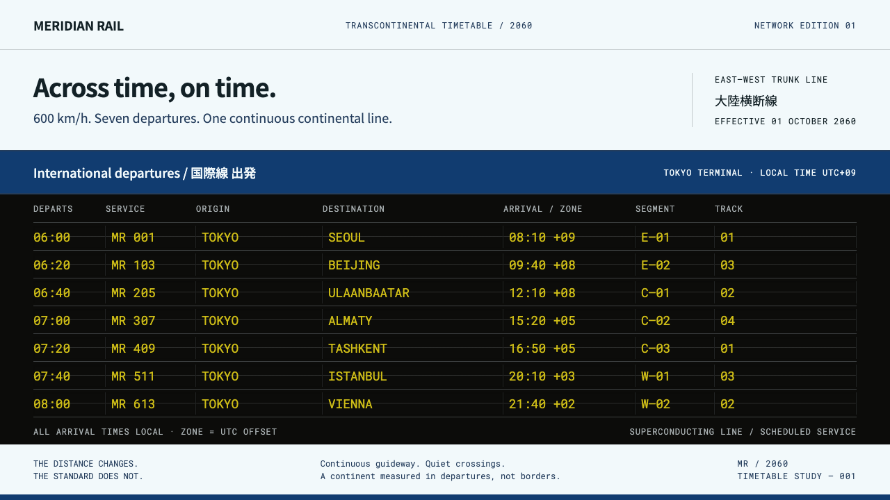 Transcontinental MaglevQuiet livery, dense departures. Cool white and blue frame a black board of ch…
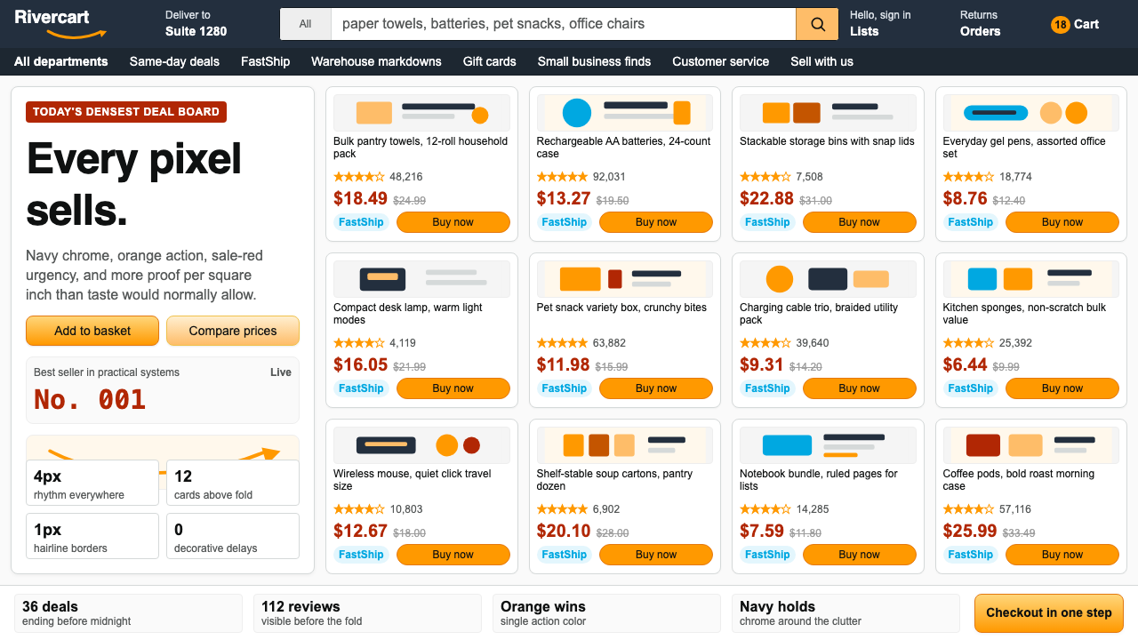 AmazonUgly sells efficiently. Navy chrome, orange buttons, red prices crowd a dense…
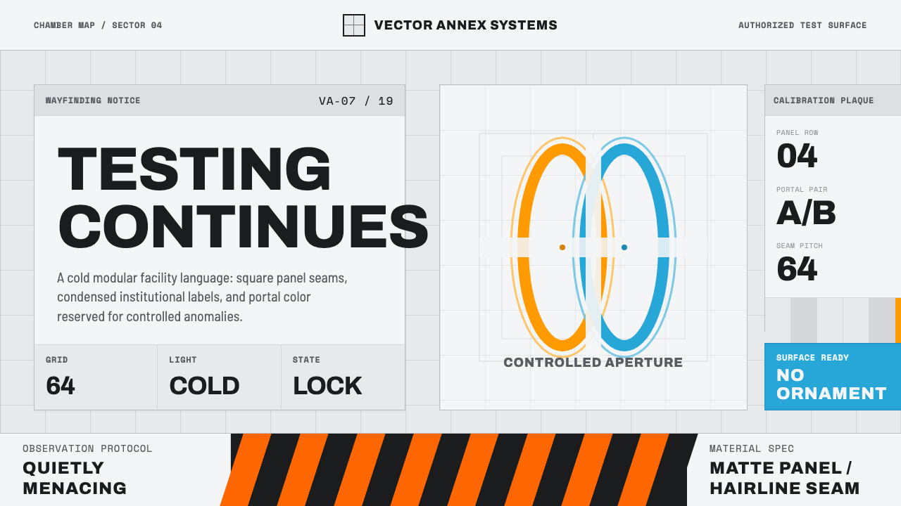 Aperture ScienceSterile authority. Cool panel seams, Archivo signage, and sparse orange-blue…
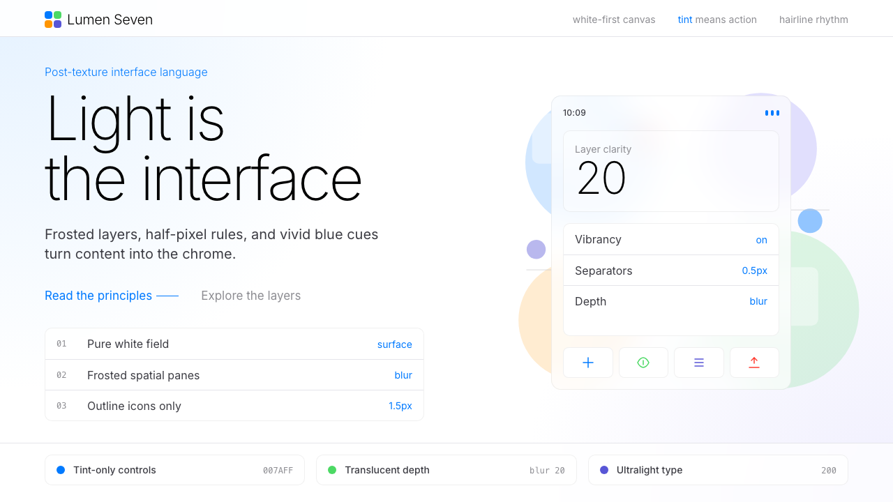 Flat Design iOS 7The day skeuomorphism died. Bright tints on white, hairline separators, frost…