What is UNIQLO LifeWear (2006)?
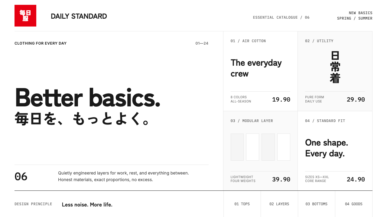
UNIQLO LifeWear turns retail identity into controlled quiet: a red square, a bilingual mark, and enough white space for the clothes to speak first.
UNIQLO LifeWear (2006) in brief
UNIQLO LifeWear emerged from a 2006 global rebrand built around an unusually narrow visual proposition. Kashiwa Sato reduced the identity to a red square containing stacked katakana, set against expansive cool-white fields. The system does not seek to make every surface expressive. Instead, it makes the brand recognizable by withholding expression almost everywhere else. Clothing, product photography, price, language, and circulation through the store are given room to remain legible because the identity refuses to compete with them.
The visual language is retail minimalism with unusually hard edges. Near-black type, delicate rules, modular alignment, bilingual arrangements, and a severely rationed use of red establish a sense of order that is closer to signage or information design than seasonal fashion advertising. The logo is not treated as a decorative badge. It is a fixed unit within a larger field of white, one concentrated interruption that gives the surrounding space purpose.
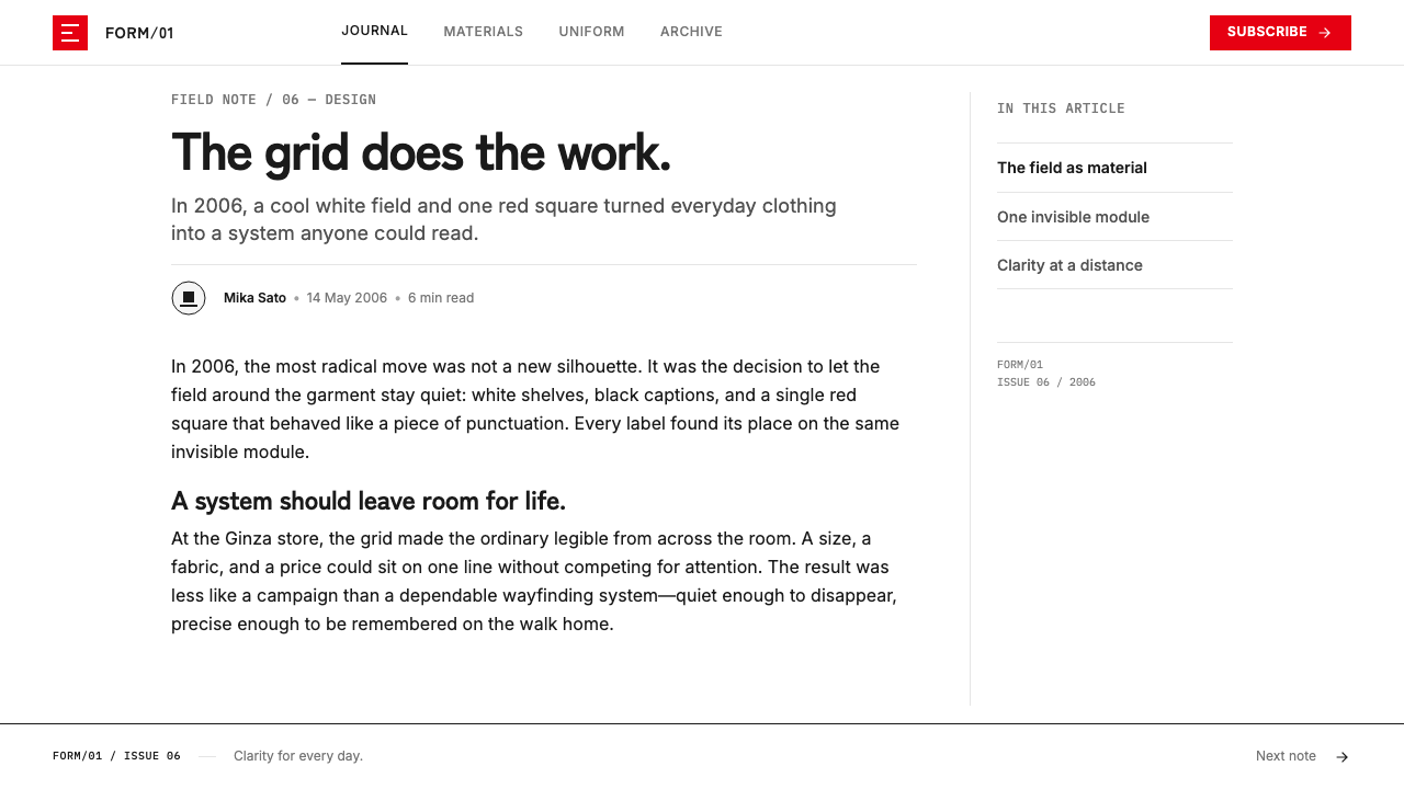
LifeWear is therefore less about minimalism as an empty look than about minimalism as operational discipline. Whitespace is the primary material; the grid is the invisible structure; red is a scarce signal. The resulting atmosphere is calm, precise, and broadly transferable across storefronts, packaging, campaigns, pricing, and digital interfaces. Its restraint makes ordinary garments feel considered without forcing them into a luxury or editorial pose.
Where does UNIQLO LifeWear (2006) come from?
The system belongs to UNIQLO’s 2006 global rebrand, a moment when the company moved from the identity of a low-cost Japanese fleece retailer toward a coherent international design language. Its geographic frame connected Japan, including Yamaguchi headquarters and Tokyo Ginza, with New York SoHo. That geography matters because the identity had to remain recognizably Japanese while functioning immediately in multilingual global retail environments.
Kashiwa Sato supplied the central gesture: the red square and stacked katakana logotype. The decision is compact but culturally and commercially ambitious. Katakana gives the mark a direct Japanese visual character, while the surrounding bilingual treatment makes the identity navigable beyond Japan. Rather than translate the mark into a different personality for each market, the system allows language to sit within one disciplined field.
The broader approach draws on Japanese retail minimalism, International Typographic Style, and katakana logotype design. From Japanese retail minimalism comes the confidence that space can carry value without being filled. From typographic modernism comes the insistence on alignment, hierarchy, and rules as the means of organizing attention. From the katakana mark comes a distinct visual signature that can sit in an international setting without becoming generic.
The system continued into the LifeWear era of the 2010s because it was designed as a framework rather than a campaign look. A hard modular grid can receive changing products, photographs, languages, and seasonal messages without losing its character. The red square remains stable while everything around it can change. This is the practical achievement of the identity: it makes consistency feel almost invisible, as though the brand’s clarity were simply the natural condition of the retail environment.
What defines the UNIQLO LifeWear (2006) look?
Whitespace as Material
Cool white space is not an empty margin around content; it is the field that makes the entire system work. It separates product from promotion, turns the logo into a deliberate interruption, and prevents retail information from becoming visual noise. The space should feel architectural and measured rather than merely sparse. When it is reduced too aggressively, the identity loses its calm; when it is treated as accidental emptiness, the product loses its authority.
The Red Square
Red is concentrated in the square logotype and reserved for a single primary action when an interface needs direction. Its power comes from scarcity. Against cool white and near-black, the square reads as a compact piece of certainty: a location, a signature, or an instruction. Repeating red across labels, badges, sale graphics, and secondary controls dissolves that certainty and turns the system into ordinary promotional retail design.
Hard Modular Order
A strict modular grid carries the visual labor that ornament might carry in another style. Product names, prices, bilingual labels, dividers, images, and calls to action align as related units rather than floating independently. The grid should remain felt even when it is not drawn. This creates an engineered impression: every placement appears inevitable, but nothing needs to announce the mechanism that produced it.
Bilingual Clarity
The identity uses Japanese and Latin-script language as information, not as exotic decoration. Bilingual arrangements should establish a readable relationship between names, categories, and instructions, with one language leading according to the audience and context. The contrast between katakana and Latin forms adds rhythm, but the result must remain quiet. Language is part of the grid, not an expressive collage layered over it.
Near-Black Typography
Typography is neutral, compact, and disciplined. Near-black type supplies contrast without introducing the theatrical harshness of a heavily expressive display voice. Price numerals and product information are aligned with the same seriousness as the logo, because retail details are part of the brand experience rather than administrative residue. Hierarchy comes through placement, scale, spacing, and grouping, not through decorative type treatments.
Hairline Separation
Fine rules create boundaries without becoming borders. They divide categories, frame information, and make the white field legible as a structured environment. Their restraint is essential: a line should clarify a relationship, not decorate a blank area. Used sparingly, these rules make product lists, price zones, and navigation feel orderly while preserving the sensation that the page is mostly air.
Disappearing Retail Architecture
The system is designed to recede. The SoHo glass wall and Ginza signage suggest an identity that functions like architecture: it directs, frames, and holds rather than performs for its own sake. Products supply change and color; the branded environment supplies continuity. The ideal result is not a surface that demands admiration, but a setting in which shopping feels unusually lucid and frictionless.
Who shaped UNIQLO LifeWear (2006)?
Kashiwa Sato is identified with the 2006 rebrand’s defining idea: a red square containing stacked katakana, placed within large cool-white fields and ordered by a hard modular grid. That reduction established the visual premise carried forward into LifeWear: the identity should create conditions for the product rather than compete with it.
Tadashi Yanai is named among the key figures connected to the 2006 global rebrand. Within the supplied account, the rebrand marks UNIQLO’s movement toward a global design language spanning Japan and New York, with the LifeWear system carrying that disciplined identity into later years.
John C Jay is listed as a key figure in the source material for the rebrand. The identity context associated with that period is explicitly international: Japanese retail minimalism, typographic order, bilingual communication, and a visual system intended to operate from Tokyo Ginza to New York SoHo.
Markus Kiersztan is also named among the key figures associated with the 2006 global rebrand. The lasting importance of that rebrand lies in its system logic: a stable red mark, extensive white space, disciplined alignment, and retail information arranged to remain clear as products and markets change.
How do you use UNIQLO LifeWear (2006) today?
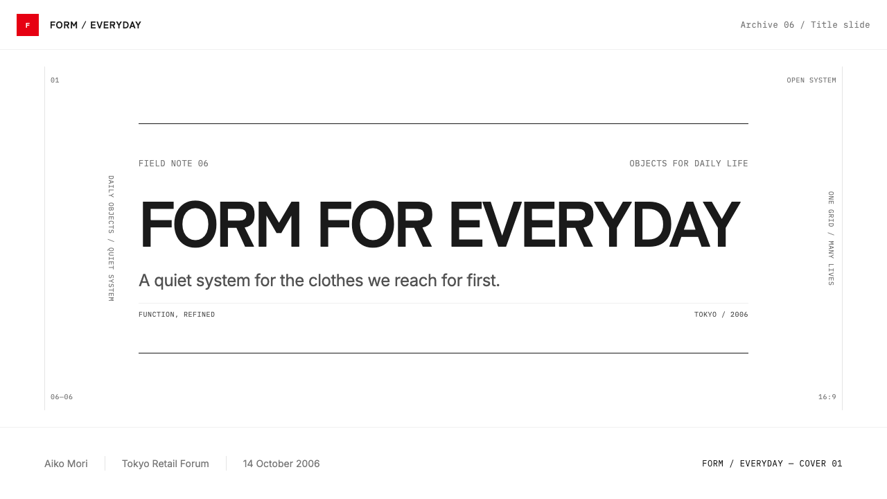
For presentation covers, use the LifeWear approach to make a title feel composed rather than decorated. Begin with a broad white field, place a compact red square as the sole high-intensity accent, and organize the title, subtitle, and contextual information along a strict shared alignment. The cover should leave visible room around the words. It succeeds when the opening slide feels like a storefront sign or a product label: direct, bilingual where needed, and confident without visual theater.
For content slides, treat every page as a retail information field. Give sections a stable reading edge, use fine rules only when they clarify a change of category, and allow explanatory text to sit in quiet blocks rather than ornamental containers. On data slides, make price-like numerals, measures, and comparison labels exceptionally orderly. Charts should remain spare and readable, with near-black carrying most information and red reserved for the one item that requires immediate attention. Do not let every series compete for the accent color.
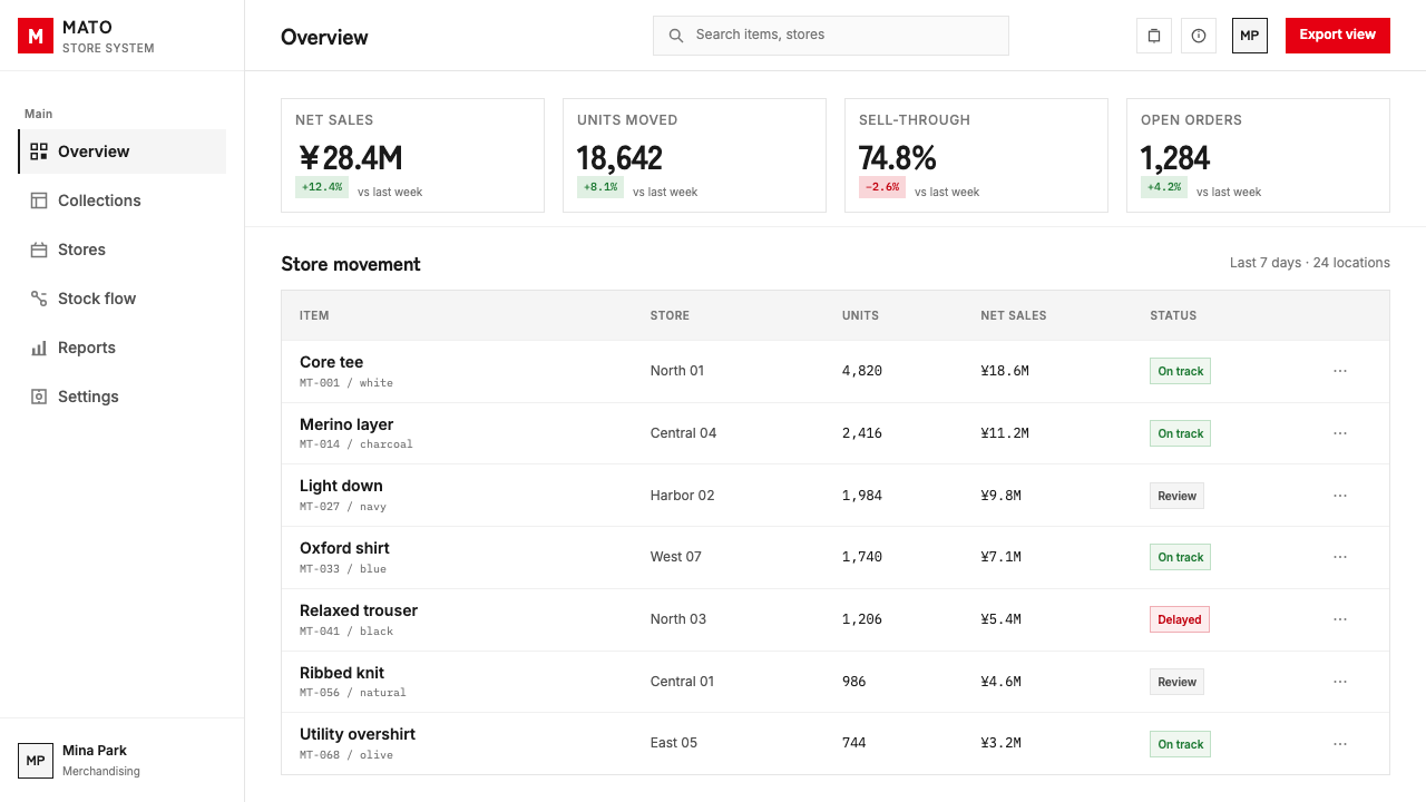
For web interfaces, the style is especially effective for product catalogs, dashboards, account areas, pricing pages, and service navigation. Use a persistent modular structure so search, filters, product cards, quantities, and checkout information all feel related. Keep surfaces predominantly white, make borders and rules precise, and use a single red action to establish the clearest next step. The interface should feel less like an app decorated as a store and more like a well-managed retail environment translated into digital form.
For editorial and marketing work, LifeWear supports campaigns that need credibility without excess. A landing page can alternate between large quiet product moments and tightly structured information bands. Editorial pages can use bilingual headings, narrow blocks of product context, and generous breaks between ideas. Photography or garment color should be allowed to create the visual variation; the layout itself should remain neutral enough to make each product feel newly visible rather than trapped inside a seasonal graphic treatment.
The common mistake is to copy the red square and white background while abandoning the discipline that gives them meaning. If red appears in multiple unrelated places, if type becomes decorative, if product cards gain soft ornamental depth, or if every area is crowded with promotional messages, the result stops reading as LifeWear. This system depends on subtraction. Its visual confidence comes from allowing one signal to matter, one grid to govern, and clothing to remain the principal color event.
UNIQLO LifeWear (2006) — FAQ
Is LifeWear simply Japanese minimalism?
Japanese retail minimalism is one of the stated influences, but it does not explain the system by itself. LifeWear also draws on International Typographic Style and katakana logotype design. Its distinctive character comes from their combination: white space treated as an active material, bilingual information handled through a rigid grid, and a Japanese red-square mark operating with international clarity. The result is less atmospheric minimalism than a disciplined retail language.
Why is the red square used so sparingly?
The red square is the system’s concentrated source of urgency and recognition. It works because cool white space and near-black information leave it almost no competition. Used as a logo and a single primary action, red can establish orientation immediately. Used across every promotion, label, and interface state, it becomes ordinary visual noise. Rationing red protects both the mark’s authority and the calm that makes the product presentation effective.
Can the style use colorful product photography?
Yes. The supplied material explicitly frames the clothes as the only color that the white field allows to dominate. Product color and photography can therefore provide variation, seasonal energy, and emotional interest. The surrounding system should remain neutral and structured so imagery reads as merchandise rather than background decoration. When the layout adds too many competing color accents, the product no longer receives the attention that the whitespace was designed to create.
Does a LifeWear-inspired interface need Japanese text?
No. Katakana is central to the original mark and its Japanese identity, but the transferable principle is bilingual or multilingual clarity within a shared system. A project should use the languages its audience needs, then give them a consistent hierarchy and alignment. Adding Japanese without a real communicative role turns language into decoration, which conflicts with the identity’s information-first logic.
Where does this style struggle?
It struggles when a product requires dense visual storytelling, many simultaneous alerts, or a deliberately warm and handmade atmosphere. The system depends on spaciousness, controlled hierarchy, and a limited accent signal, so it can become strained when every message insists on urgency. It is strongest when the product, price, and navigation need to feel trustworthy and calm; it is weaker when the communication goal is exuberance, ornament, or constant promotional escalation.
Related design styles
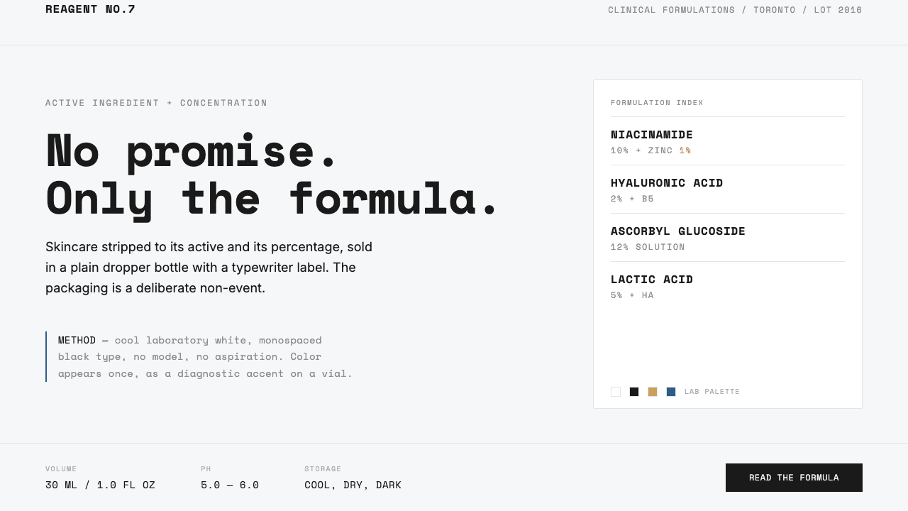 The OrdinaryNo promise, only the formula. Cool lab white, Space Mono labels, color as rar…
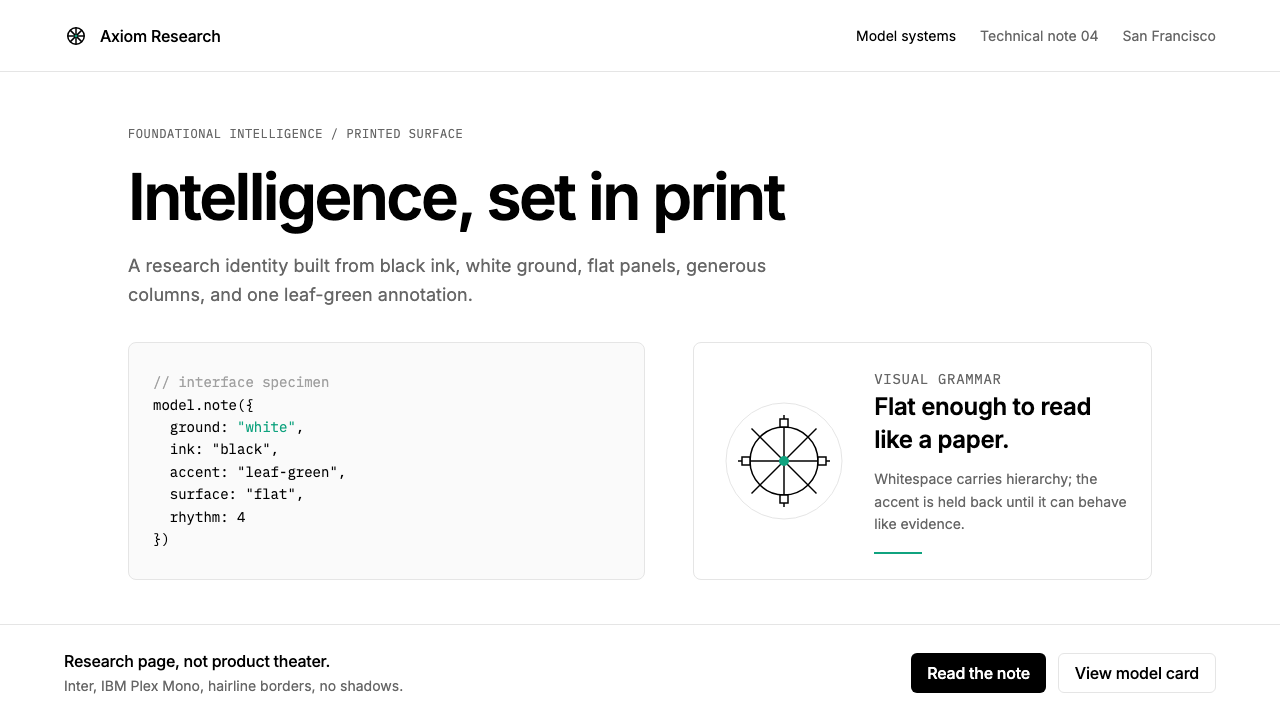 OpenAI 2024Research-grade restraint. Black-on-white Inter, flat code panels, one leaf-gr…
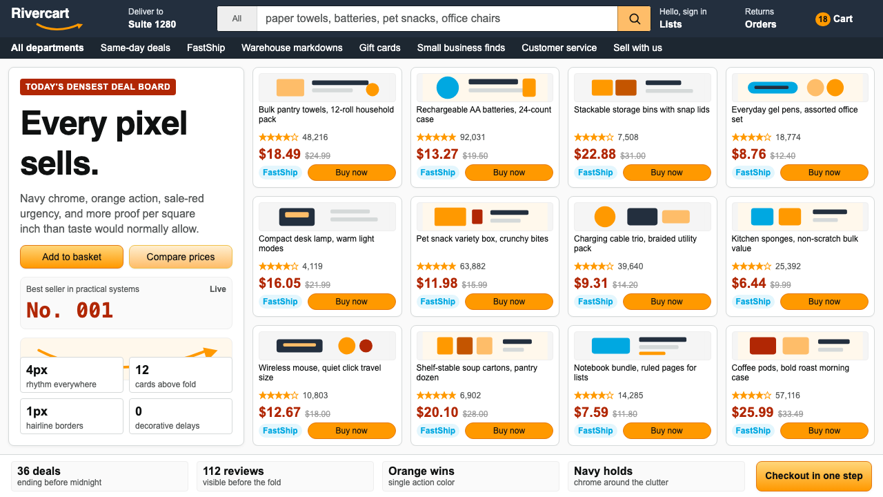 AmazonUgly sells efficiently. Navy chrome, orange buttons, red prices crowd a dense…
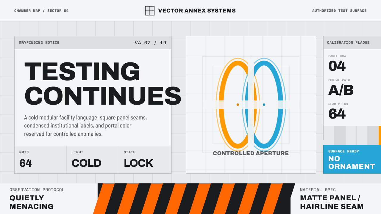 Aperture ScienceSterile authority. Cool panel seams, Archivo signage, and sparse orange-blue…
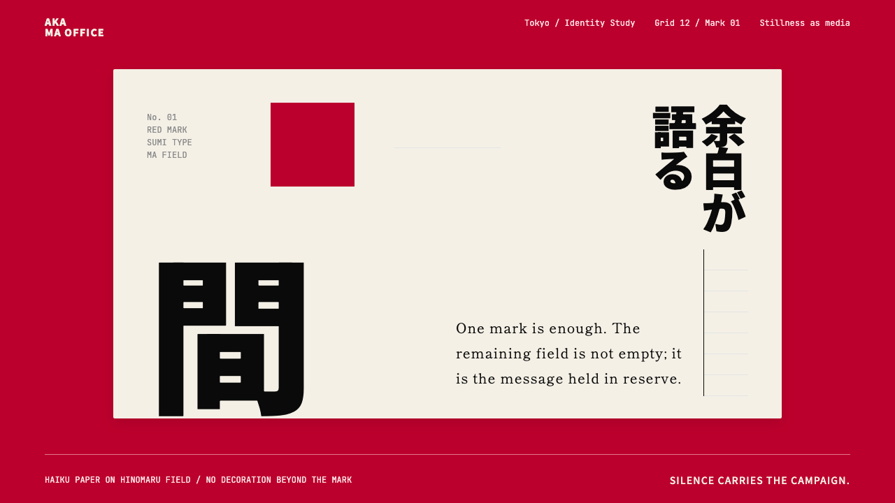 Dentsu Tokyo CreativeSilence does the selling. Hinomaru red, sumi type, and empty columns carry th…
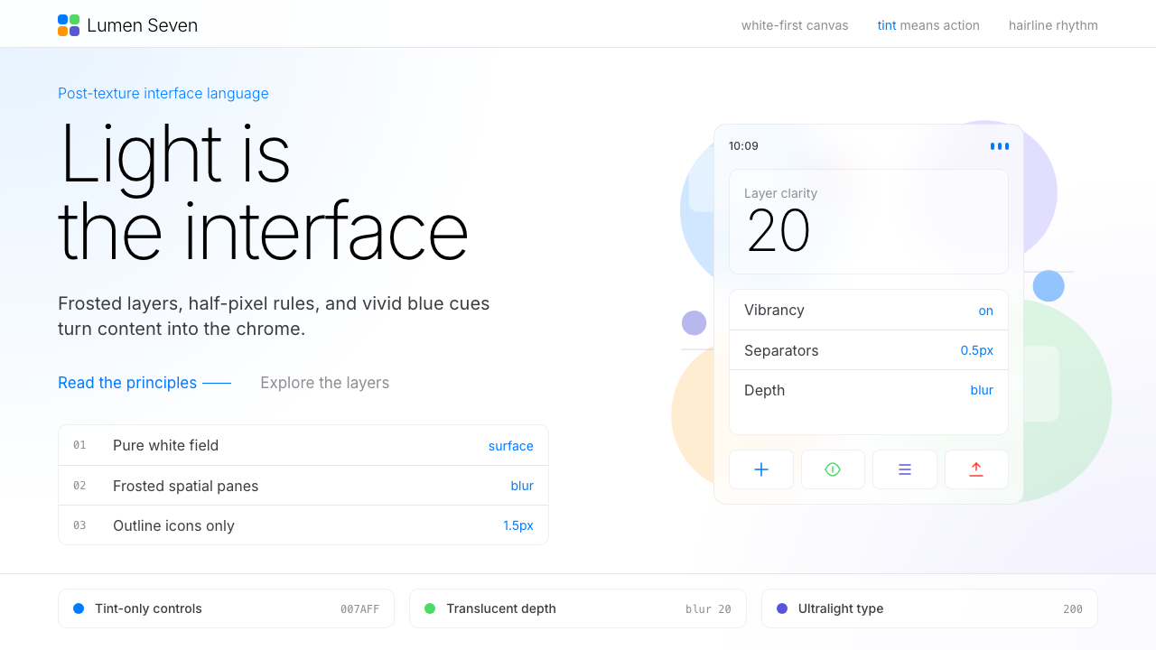 Flat Design iOS 7The day skeuomorphism died. Bright tints on white, hairline separators, frost…