What is Stratospheric Sunshade?
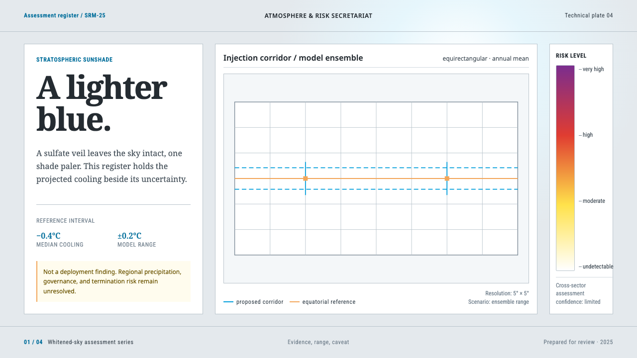
Stratospheric Sunshade takes the whitened sky of aerosol injection as its page and fills it with the restrained, caveat-laden grammar of a UN assessment report, where the uncertainty range speaks as loudly as the finding.
Stratospheric Sunshade in brief
The Stratospheric Sunshade style is a design system for intergovernmental assessment documents about solar geoengineering, and specifically about the idea of injecting sulfate aerosols into the stratosphere so that a little more sunlight is reflected back to space. It is not a style about the glamour of a technology. It is a style about how institutions write down what they know, what they do not know and what could go wrong.
Its starting point is a physical observation. Aerosol injection does not darken the sky; it whitens it. The blue stays, one shade lighter. Sunsets grow brighter, and a milky halo opens around the sun. The system takes that pale haze as its page colour: a washed sky-blue paper tone that suggests daylight seen through a thin veil. On top of that ground it builds the furniture of an assessment, namely plain world maps with dashed injection corridors, cooling targets set out region by region, columns of colour-coded risk, and the boxes of caveats and dissent that this kind of document always carries.
The register is deliberately that of the United Nations: sober, multilingual, hierarchical and wary of drama. There is no apocalypse imagery and no hero shot of a product. The page lets the register speak, and it lets the uncertainty range speak with it.
Where does Stratospheric Sunshade come from?
The physical precedent is the eruption of Mount Pinatubo in 1991, which put roughly fourteen to twenty million tonnes of sulfur dioxide into the stratosphere. The gas converted into a veil of sulfate aerosol that spread around the planet and measurably cooled it for a year or two. That natural experiment is the reason solar geoengineering is taken seriously as a research topic at all: it showed, at planetary scale, that a stratospheric sulfate layer reflects sunlight and that the effect is real but temporary.
From about 2012 onward, a body of modelling and assessment literature grew up around the question of what a deliberate version of that intervention would do. The field is academic and intergovernmental rather than commercial. Its work comes from university groups at institutions such as Rutgers and Harvard and from assessments produced within the United Nations system, and it is the look of those assessment documents that this design system borrows. The literature runs through 2025, and the people who write it tend to insist that the technique raises questions at least as readily as it answers them, so the documents are written to display uncertainty rather than conceal it.
One strand of that literature is GeoMIP, the Geoengineering Model Intercomparison Project. Its idea is simple and very characteristic of the assessment genre: many independent climate models are asked to simulate the same hypothetical intervention under the same conditions, and the differences between their answers are treated as information rather than as noise. That habit of showing spread instead of a single number is why this design foregrounds ranges, ensembles and caveats.
The other strand is risk communication graphics. The burning-embers diagram used by the IPCC expresses how risk grows as warming increases, through columns whose colour passes from white through yellow and red to purple. This system borrows that ramp intact. The discipline of the graphic is the point: colour means one thing, it is applied the same way every time, and nobody has improved on it for the sake of prettiness. Together, the volcanic precedent, the model intercomparison and the risk graphic give the style its three themes: an observed event, a hedged projection and a plain way of showing how worried one should be.
What defines the Stratospheric Sunshade look?
Pale Sky Ground
The page is a pale, milky sky tone, lighter and less saturated than a normal blue, as though a thin white veil had been drawn across clear air. It is neither stark white nor dramatic night. The ground lowers contrast just enough to feel calm and institutional, while dark text on it stays fully legible, which matters for a document type that is read, cross-checked and cited.
The Specified Blue
There is one blue, and it is specified rather than chosen: a clear institutional blue of the kind international organisations settle on once and then never vary. It colours headings, rules, corridor outlines and links, and nothing else. Because it is not a mood but a standard, the page avoids the usual decorative drift of several blues, tints and gradients.
Burning-Embers Risk Ramp
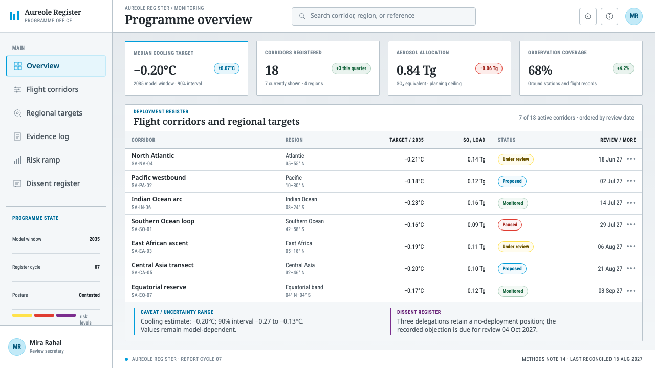
Risk is shown with a four-stage ramp that moves from white through yellow and red to purple, borrowed unchanged from the IPCC. It appears as tall, narrow columns in which each band marks a level of risk at a given amount of warming. The ramp is used for risk and for nothing else, so that red never means a button and purple never means a brand colour.
Plain Maps, Dashed Corridors
Maps are drawn on a plain flat world projection, with simple land outlines and no globe, no glow and no cinematic lighting. Injection corridors appear as dashed bands in the institutional blue, and regional cooling targets are labelled in small type. The map is a diagram, not a picture: its job is to locate a proposal and to be annotated, not to impress.
Six-Language Typography
Typography is chosen for coverage and density. A humanist sans-serif family built to cover all six official languages of the United Nations carries headings and running text, and a condensed grotesque handles tightly packed table columns. The two are set with plain hierarchy, with no expressive display type. The page is designed on the assumption that the same layout will have to hold a translation in another script.
Caveat and Dissent Blocks
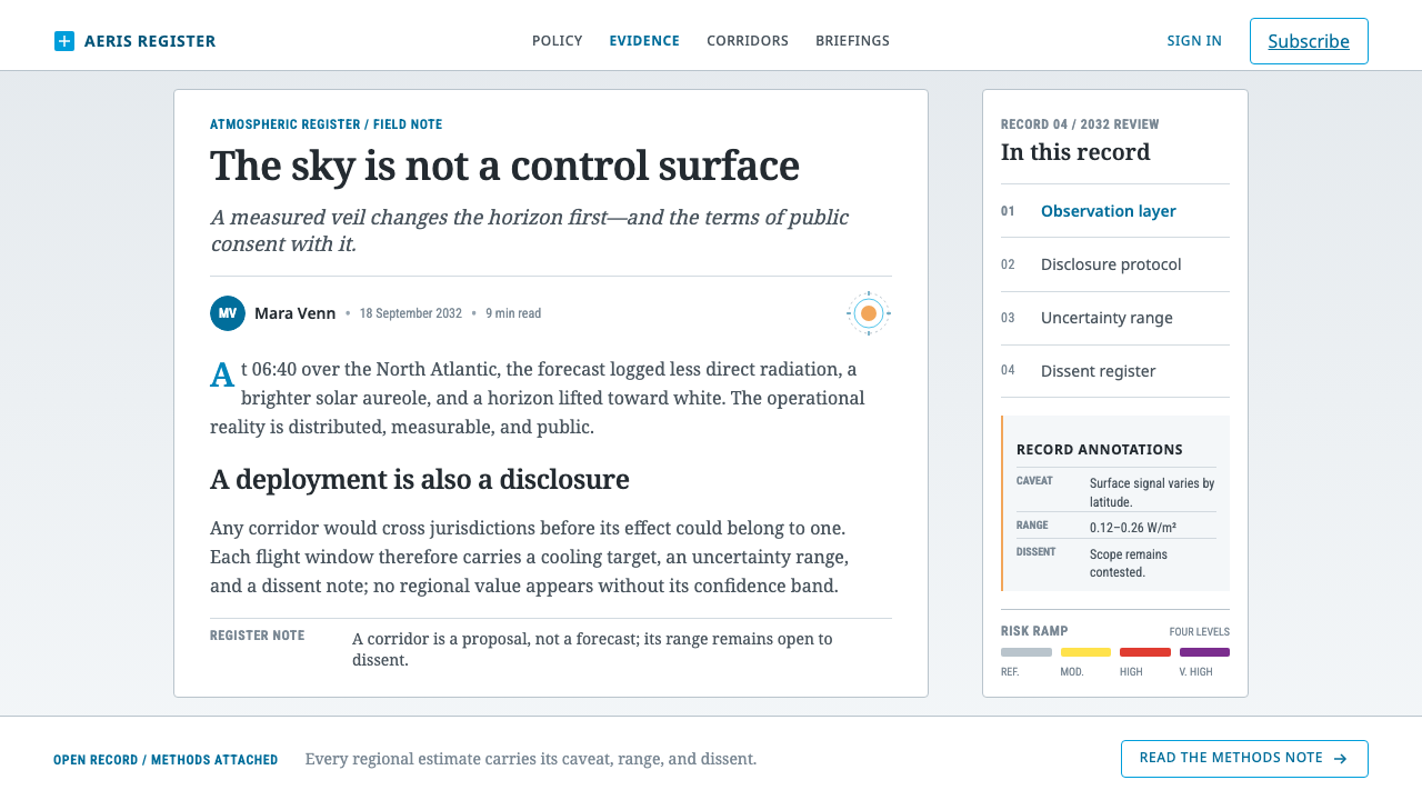
Every finding is accompanied by its limits. Boxed caveat panels, confidence statements, ranges and notes on dissent are as visible as the headline results, set in a calm, ruled style rather than hidden in footnotes. The layout treats doubt as content that deserves a place on the page, not as a legal disclaimer to be minimised.
No Apocalypse, No Hero
The style refuses the two clichés of climate imagery: the burning planet and the shining technology. There are no dramatic photographs, no product hero and no glowing earth. Interest comes from information design, meaning the arrangement of maps, tables, ramps and notes. This restraint is the style's main ethical gesture, because it lets the reader judge without being steered.
Who shaped Stratospheric Sunshade?
Kravitz is a climate scientist closely associated with GeoMIP, the model intercomparison effort that asks many climate models to simulate the same hypothetical interventions. His presence in the source material points to the idea that gives this style its structure: show how much independent models agree and where they diverge, and treat the divergence as part of the result.
Robock, a climate scientist at Rutgers, is known for work on how volcanic eruptions affect climate and for careful analysis of the risks of solar geoengineering. In the context of this design he stands for the sceptical, risk-aware voice that assessment documents are supposed to contain. The style's insistence on caveat blocks and visible dissent reflects that voice.
Keith, associated with Harvard, is among the researchers who have argued that solar geoengineering deserves serious and carefully governed research. He represents the other side of the debate that the document type has to accommodate. A well-made assessment, as this style imagines it, can hold his arguments for research and Robock's warnings about risk on the same page without caricaturing either.
Mastrandrea is associated with IPCC assessment work and with the way its reports communicate uncertainty and risk. His name connects this design system to the burning-embers tradition, in which complicated judgements about risk are compressed into a graphic that is simple, colour-coded and honest about its limits. The style inherits that graphic discipline wholesale.
How do you use Stratospheric Sunshade today?
Stratospheric Sunshade is a document style, and it works best where an institution has to present evidence, projections and risks to a sceptical reader. It suits policy briefs, scientific assessments, regulatory submissions, sustainability and climate-risk reports, and public-sector dashboards. Its value is not beauty but credibility: it signals that the author has shown the working and acknowledged the limits.
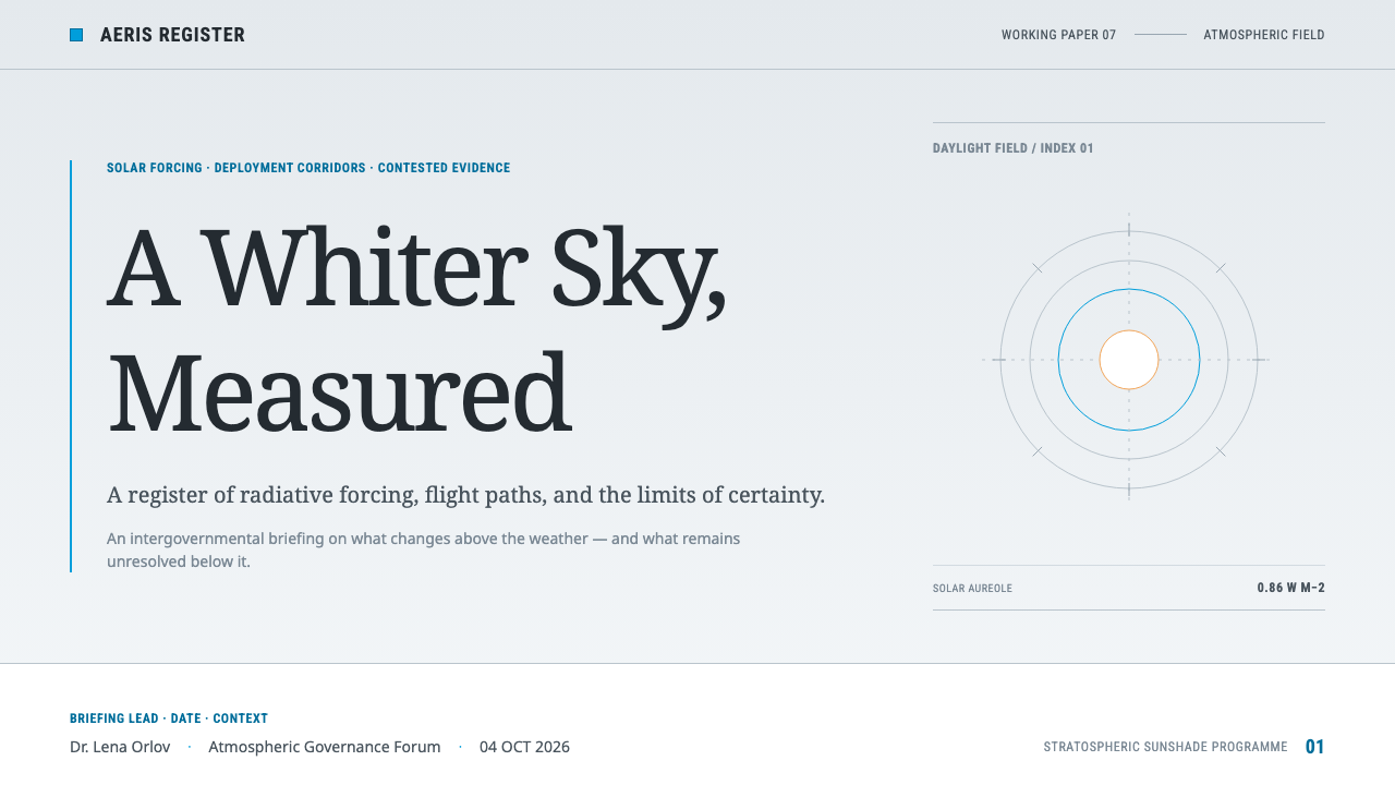
For presentation slides, begin with a cover on the pale sky ground: a title in plain sans-serif, a short subtitle naming the assessment, and perhaps a quiet flat map across the lower part. Content slides should be organised like report pages, with a clear heading, one finding per slide, and a caveat panel at the bottom. Data slides can use the risk ramp for columns, ranges instead of single values, and a short note on confidence, so that nobody mistakes an estimate for a fact.
For web interfaces, the style fits research portals, scenario explorers, monitoring dashboards and data catalogues. Build the layout on a reserved, multi-column grid with the institutional blue for headings and links, and use the risk ramp only where the data genuinely expresses risk. Provide language switching as a first-class feature, and leave room in each column for text that runs longer in translation. Maps should be interactive but visually plain.
For editorial and marketing work, the style supports white papers, policy explainers, think-tank publications and long-form reports. Use a wide margin for notes, ruled section heads, numbered findings and a dedicated block for dissent or limitations. Marketing in the usual sense hardly applies; if a call to action is needed, make it a quiet link in the institutional blue, such as 'Read the full assessment'.
The most common mistake is to dramatise. Adding a glowing earth, a dark background or an alarming red banner turns the assessment into a campaign and breaks the trust that the style depends on. A second mistake is to use the risk ramp as general decoration, which empties it of meaning. A third is to hide uncertainty in small print: if the caveats are less visible than the headline, the page has stopped doing what this style exists to do.
Stratospheric Sunshade — FAQ
Does this style take a position for or against solar geoengineering?
No. It is a document style, not an argument. It is modelled on the register of intergovernmental assessments, which are meant to set out evidence, projections, risks and disagreements without campaigning. Its devices, such as the ranges, caveat blocks and dissent panels, exist so that a reader can see what is known and what is not. The same visual language could carry a report that is cautious about the technique or one that recommends further research.
Why does the page borrow the IPCC risk ramp instead of designing a new one?
Because familiarity is a form of accuracy. Readers of climate material already know how to read the white, yellow, red and purple columns, so a new palette would force them to learn the code again and would make comparison with other assessments harder. The ramp is also deliberately plain, so using it unchanged signals that the document is meant to inform rather than to impress.
Why use a pale ground instead of a dark, dramatic one?
The pale ground comes from the physics of the subject. Aerosol injection whitens the sky, so the page whitens too. A pale ground also supports the genre: assessment documents are printed, annotated and read at length, and a light surface gives dense tables and small notes the best legibility. A dark ground would add a cinematic mood the subject does not call for.
Where does the style work best?
It works best for content that must be trusted by cautious readers: policy and regulatory documents, scientific reports, ESG and climate-risk disclosures, research portals, and data dashboards for public institutions. It is also a good choice for any product that needs to present forecasts and ranges honestly, such as scenario planning tools, because its structure makes uncertainty a normal part of the layout.
Where does the style struggle?
It struggles in consumer, entertainment and lifestyle contexts, where its institutional restraint reads as dull, and in persuasive marketing, where its habit of displaying doubt undercuts the message. It is not a style for brand energy or emotional storytelling. If a project needs excitement, another style will serve better than this deliberately sober one.
Related design styles
 OpenAI 2024Research-grade restraint. Black-on-white Inter, flat code panels, one leaf-gr…
 Mercury BankQuiet precision wins. Cream paper, charcoal Inter, and one electric-blue spar…
 AI Alignment LabEvidence has a sign. Narrow serif prose yields to a red-blue attribution matr…
 Cereal Magazine MinimalLuxury as margin. Cool paper-gray, light sans, and Garamond captions hold the…
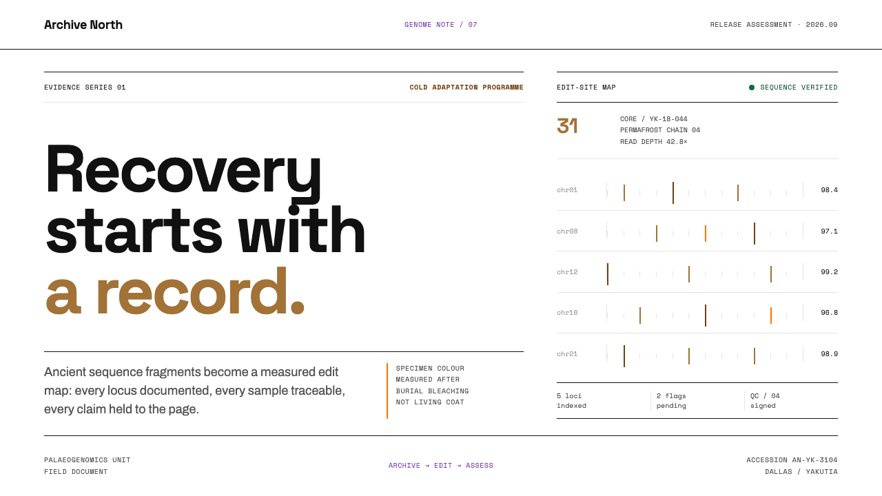 De-extinction LabResurrection reads as evidence. Black rules and specimen brown map every geno…
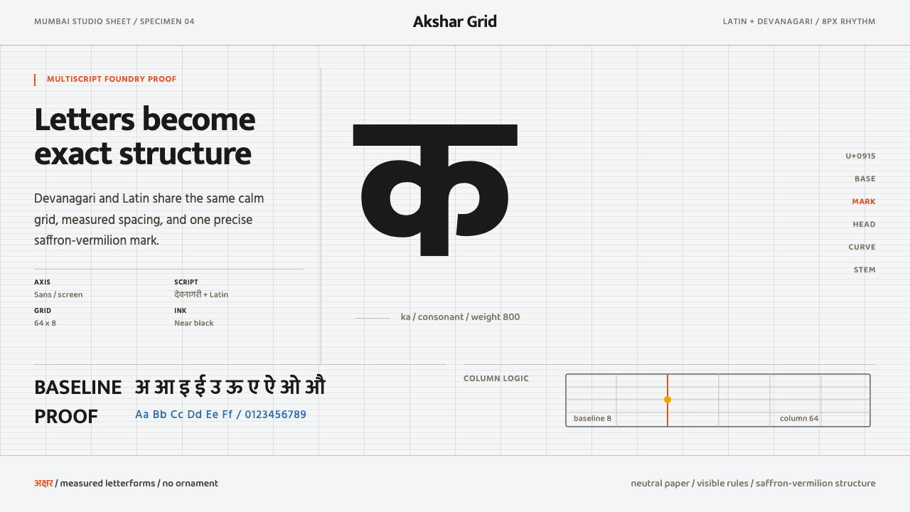 Modern Devanagari TypeType is the subject. Warm off-white grid, giant glyphs, one saffron-vermilion…