What is AI Alignment Lab?
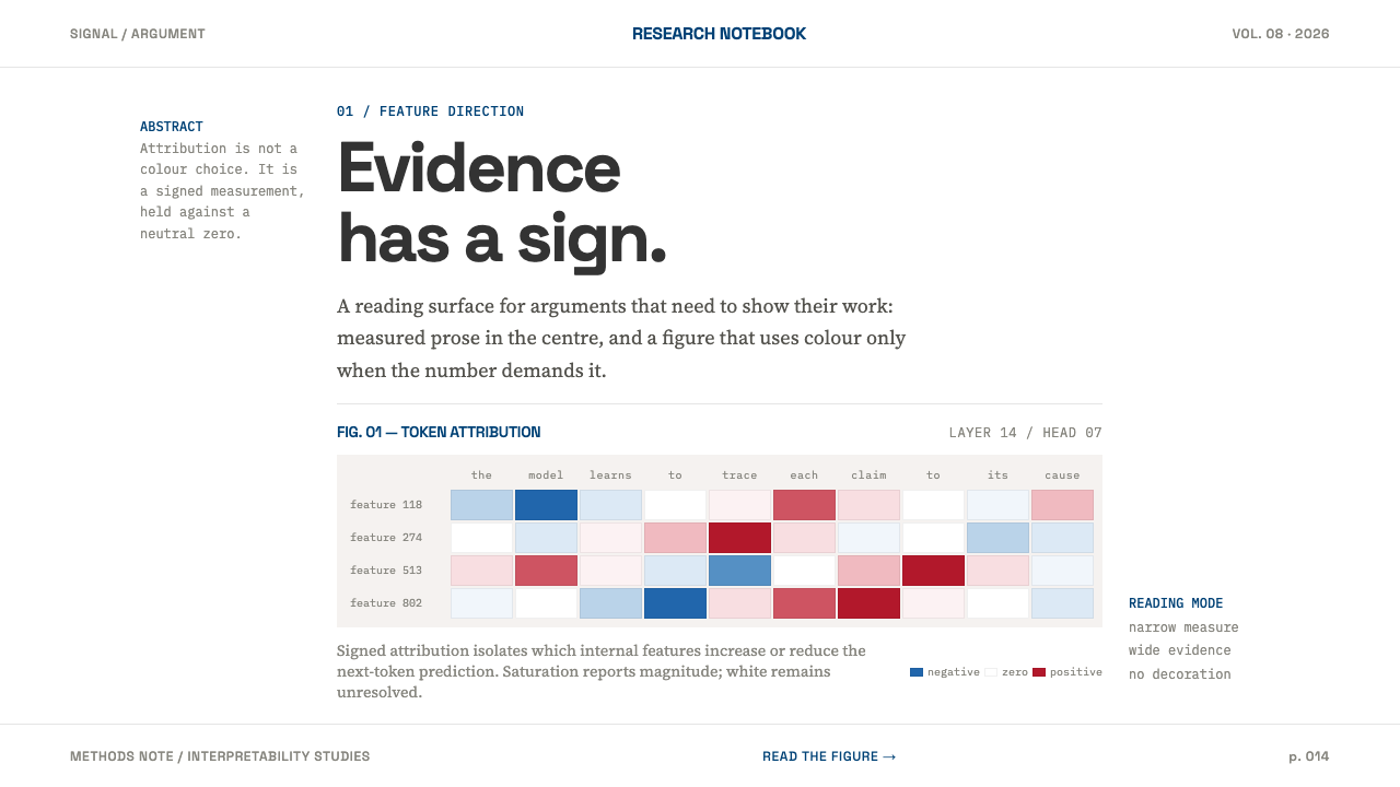
AI Alignment Lab is what a research article looks like when evidence is the only decoration: a white page, a narrow serif column, and one red-blue ramp that gives data a sign.
AI Alignment Lab in brief
AI Alignment Lab is a publication-style design language drawn from interpretability research. It descends from the article template built by Distill and later inherited by transformer-circuits.pub: a white page, one measured column of serif prose, and figures that step out into the margin when the data needs the room. It reads like a journal but behaves like software.
Colour is rationed on purpose. A single deep navy carries every link and accent. Greys do all the structural work of separating headings, captions, rules and labels. The only saturated pigment on the page is the diverging red and blue ramp that reports attribution, so that when colour does appear, it is telling the reader something measurable.
That is the idea at the centre of the style: evidence has a sign. Red and blue are not brand colours or mood colours. They report whether a contribution points one way or the other and how strongly. Everything else is withheld. There are no shadows, no rounded cards and no gradients, and paragraphs are separated by a hairline rule and by space. Nothing decorates, and every graphic is evidence.
Where does AI Alignment Lab come from?
The style begins with a publishing experiment. Distill launched in 2016 and built an article template that reads like a journal and behaves like software. Chris Olah and Shan Carter are the two names the record attaches to it, and the work sits in the San Francisco Bay Area. The template made a quiet decision that shaped everything after it: scientific writing could be as well designed as any product, so long as the design served the reading and not itself.
Two currents run through it. The first is the tradition of explorable explanations, in which an article is not a fixed page but a place where figures respond to the reader, where an argument can be tried as well as read. That is why figures in this style are treated as first-class content and are allowed to leave the text column when they need more width. The second is scientific colour, the ColorBrewer tradition of ramps designed specifically so that numbers can be read from colour, including diverging ramps for values that pass through zero.
The third current is the subject matter itself. Mechanistic interpretability is the research programme of working out how a trained model arrives at what it says, and from 2021 onward transformer-circuits.pub inherited the Distill template as the home of that work. In such research, a figure is often an attribution: a measure of how much each part of a model or an input contributed to an output, and in which direction. A red and blue ramp, neutral at the centre, is the natural way to draw that, and the template gave it a calm page on which to appear.
The result is an interface whose austerity is functional and not stylistic fashion. There are few visual devices because each one would compete with the data. A reader meeting this page should feel that nothing is trying to sell them anything, and that the argument is being offered openly, with its evidence in view. That posture of trust earned through showing the data is what a designer is really borrowing when they use the style.
What defines the AI Alignment Lab look?
The Measured Column
Prose lives in a single narrow column set in a serif face, with a line length chosen for sustained reading rather than for filling the screen. The column is the spine of the page. Headings, paragraphs and captions all hang from it, which is why the page feels like an article rather than a layout, and why long explanations stay readable from start to finish.
Figures in the Margin
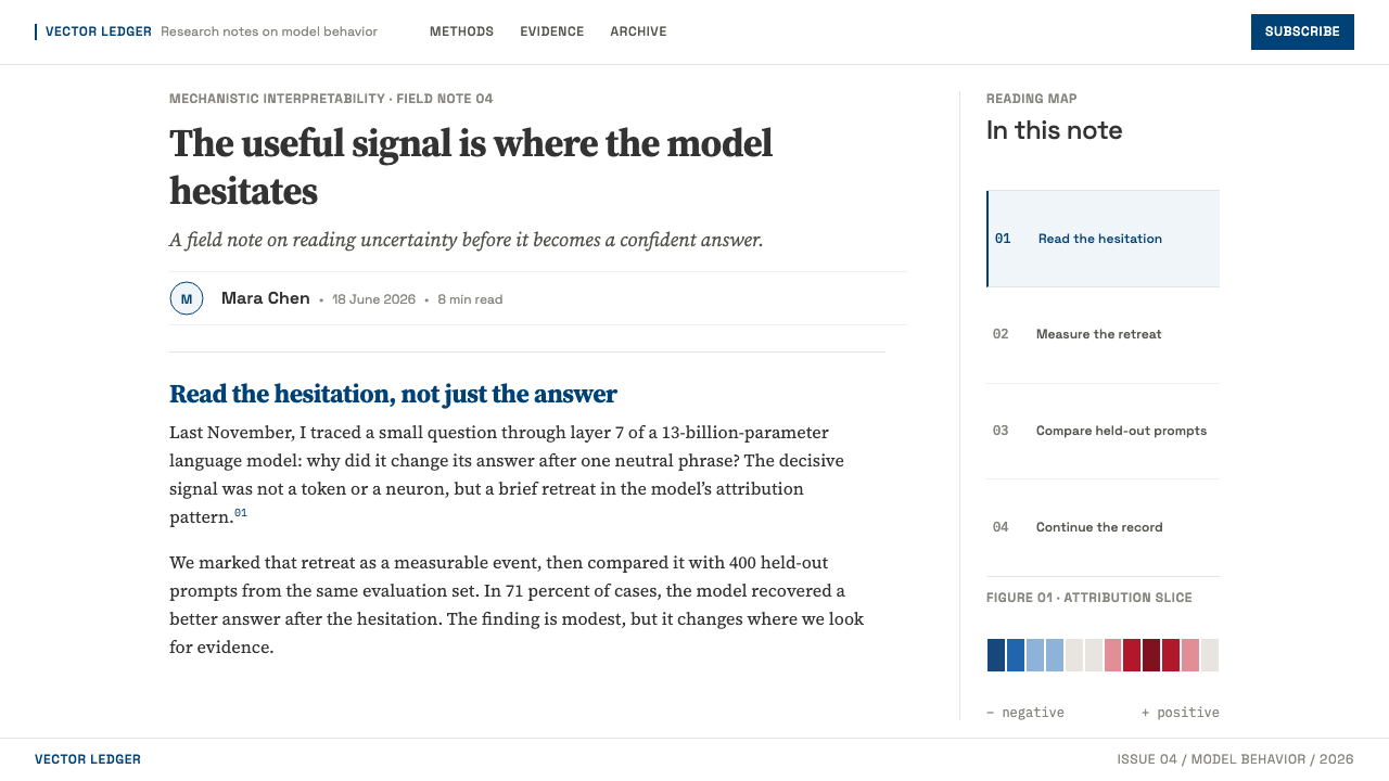
Figures are allowed to step out of the text column into the margin whenever the data needs more room. A wide attribution matrix can extend past the prose without breaking its rhythm, and small notes and captions sit in the outer space beside the text. The page therefore has a clear hierarchy of reading and looking, with the column for argument and the margin for evidence.
Serif Prose, Grey Structure
Structure is built from greys rather than from colour. Headings, captions, labels, axes and rules each take their own step in the grey scale, and weight and spacing do the rest. This lets the page establish a clear order without ever spending its colour budget. It also keeps the serif prose looking calm and bookish, the way a printed paper does.
One Navy
A single deep navy carries every link and every accent. It is not used to fill large areas or to decorate, but to signal that something is clickable or worth noticing. Because there is only one accent, the reader learns the code instantly, and the colour keeps its meaning. A second accent would compete with it and with the data ramp.
The Red–Blue Ramp
The only saturated pigment on the page is a diverging ramp running from red to blue through a neutral centre. It reports attribution: the hue says which way a contribution points, and the intensity says how strong it is. It appears in matrices, heatmaps and highlights over text. Because it is reserved for signed data, its appearance is always information and never decoration.
Hairlines and Space
Paragraphs and sections are separated by a hairline rule and by empty space, never by shadows, rounded cards or gradient panels. Surfaces are flat and edges are drawn, not lit. This gives the page its sober quality: depth is not simulated, because nothing in the content is physical. The white page is the same white everywhere, and hierarchy is expressed by position and weight.
Graphics as Evidence
Every graphic on the page makes a claim that can be checked. There are no decorative illustrations, stock imagery or ornamental dividers. Diagrams, charts and matrices are drawn to be read, with labelled axes and legible captions, and the style assumes a reader who wants to follow the data. If a visual element cannot be defended as evidence, it does not belong.
Who shaped AI Alignment Lab?
Olah is one of the two key figures the record attaches to this style. His name is tied to the Distill article template and to the mechanistic interpretability work that later found its home on transformer-circuits.pub. He stands for the idea that explaining how a model works deserves the same design care as the research itself.
Carter is the second key figure named in the record, associated with the same article template and the 2016 launch of Distill. His name is a reminder that the style is a piece of design and engineering together: pages built to be read, with figures that behave like software.
Distill is the journal whose launch in 2016 produced the template at the heart of this style. It built an article format that reads like a journal and behaves like software, with a white page, a serif column and figures that can step out into the margin. Much of what later publications in this vein look like descends from the choices it made.
From 2021 onward, transformer-circuits.pub inherited the Distill template as the venue for interpretability research. It is the clearest living example of the style in use: dense technical argument set in a calm serif column, with attribution figures in the red–blue ramp and a single navy for links.
How do you use AI Alignment Lab today?
This style works wherever the content is an argument supported by data and the reader's trust matters more than their excitement. It suits research writeups, evaluation reports, technical documentation and any product that wants to look like it shows its working. The discipline to hold on to is simple: a measured serif column, greys for structure, one navy for links, and the red–blue ramp only for signed values.
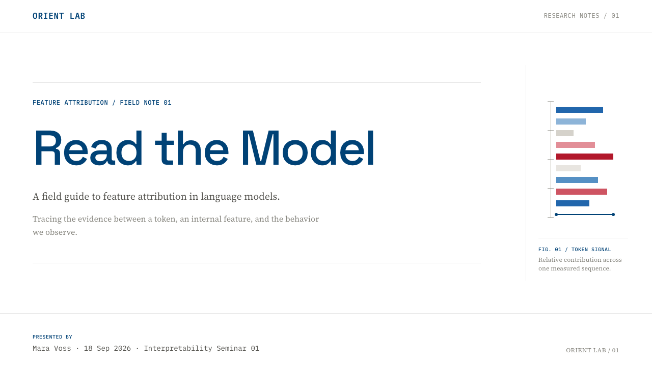
For presentation slides, a cover can be a white field with a single serif title and a small line of grey metadata, with navy used only for one link or name. Content slides keep to one column of text with a figure beside it, mirroring the margin logic of the web page. Data slides are where the style shines: an attribution matrix or heatmap drawn in the diverging ramp, with a neutral centre, labelled axes and a short caption that states what the reader is meant to see.
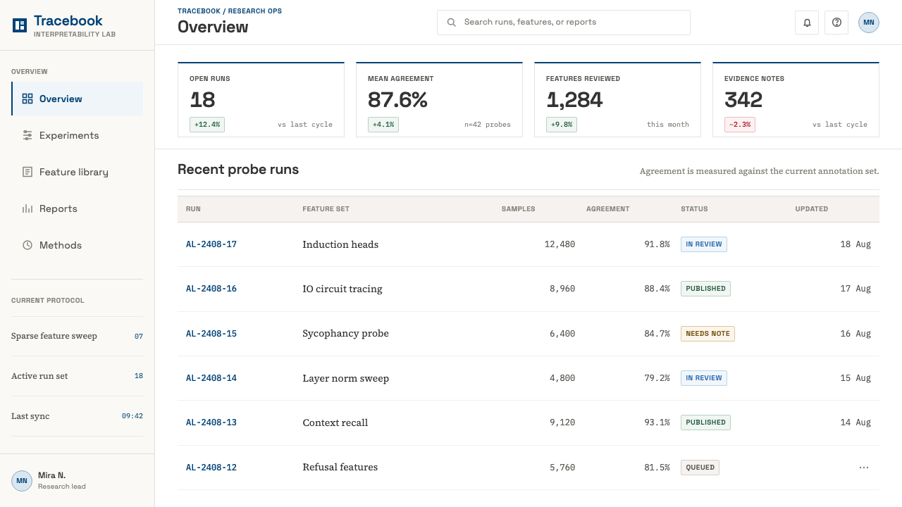
For web interfaces, the style fits interpretability tools, evaluation dashboards, model cards and documentation sites. Tables take hairline rules and grey headers, links are navy, and any chart showing signed contributions uses the red–blue ramp. Cards, drop shadows and rounded containers are replaced by space and rules. A pricing or product page in this idiom would be plain and text-led, with comparison tables doing the persuading and navy marking the single action.
For editorial and marketing work, it is a natural fit for papers, long-form essays, technical blogs, whitepapers and research announcements. Let figures break the column when they need to, use captions as a place for real explanation, and keep any promotional element as understated as the content around it. The look signals care and candour, which is exactly what a research organisation or a trust-sensitive product wants to project.
The most common mistake is to treat red and blue as a decorative palette. Using them for brand colouring, for good and bad, or for unsigned values such as plain counts confuses readers who have learned that these two hues mean direction. Other errors include adding a second accent colour, rounding every container, putting soft shadows under figures, or switching to a bold sans-serif display style that turns a paper into a landing page. The style earns its credibility by what it refuses to do.
AI Alignment Lab — FAQ
Why is the body text set in serif and in such a narrow column?
Because the page is built for sustained reading of an argument. A serif face in a measured column signals a paper rather than a product page, and the narrow line length keeps long explanations comfortable to follow. The narrowness also frees the margin: figures can step out of the column when the data needs the room, so the text is never competing with the evidence.
What do the red and blue actually mean?
They report attribution, which is a signed quantity. One hue says a contribution points in one direction, the other says it points the opposite way, and intensity says how strong it is, with a neutral colour at the centre. They are not good and bad, and they are not brand colours. Keeping them for signed data is what lets a reader trust the colour whenever it appears.
Can I use the red–blue ramp for other things, like status or charts of counts?
It is better not to. The ramp's value comes from its exclusivity: it is the only saturated pigment on the page and it always means a signed measurement. Using it for plain counts, statuses or decoration weakens that meaning. For unsigned data, use greys or the navy accent, and keep the diverging ramp for values that genuinely pass through zero.
Does the style work on a dark background?
Its natural form is a white page, and that is how the research publications that define it appear. A dark version is possible, but it needs care: keep the same rules of one accent, grey for structure and the diverging ramp reserved for signed data, and check that the neutral centre of the ramp still reads as neutral against the dark ground. If those principles survive, the spirit survives.
Is this style only for AI research?
No. It comes from interpretability research, but its logic applies to any publication where evidence leads: scientific reports, data journalism, technical documentation, internal analysis and trust-sensitive product pages. What the content needs is a claim, some data and a reader willing to follow the argument. Where the goal is excitement or emotional warmth rather than clarity, a different style will serve better.
Related design styles
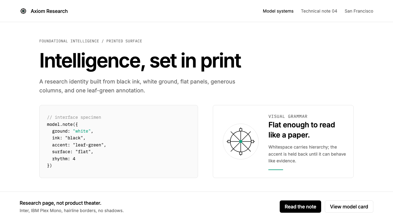 OpenAI 2024Research-grade restraint. Black-on-white Inter, flat code panels, one leaf-gr…
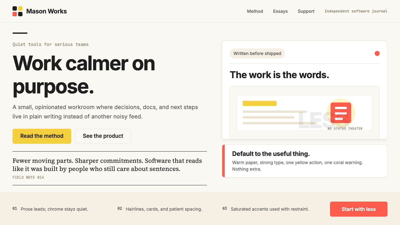 Basecamp / 37signalsQuiet craft, strong opinions. Cream paper, tight sans type, yellow and coral…
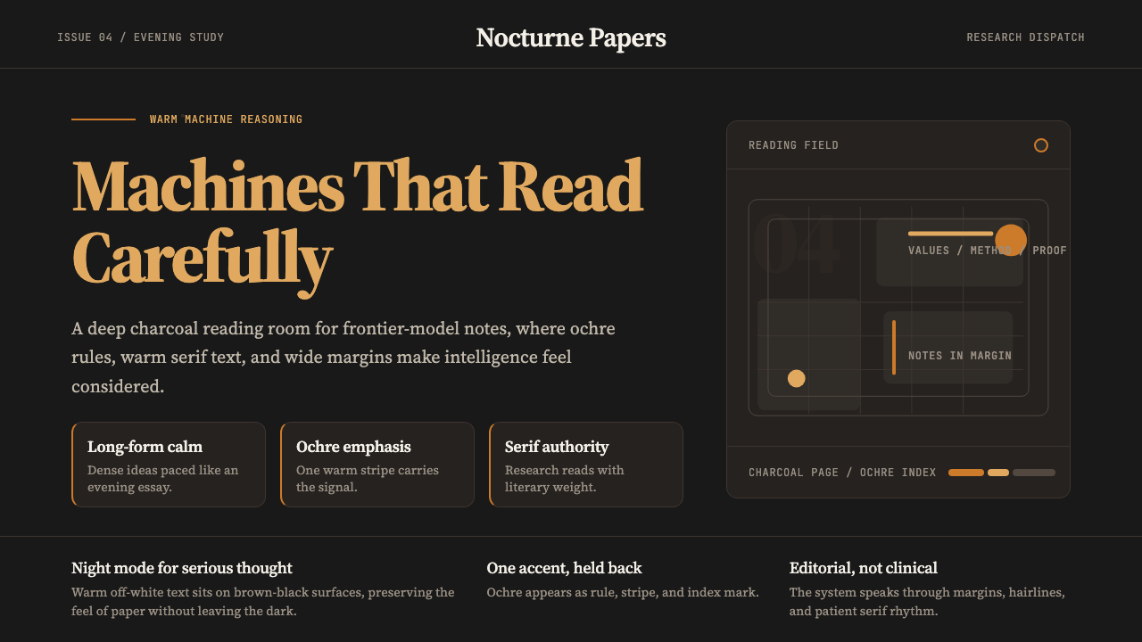 Claude / Anthropic Warm 2024Warm intelligence at night. Ochre rules and Source Serif glow on deep charcoa…
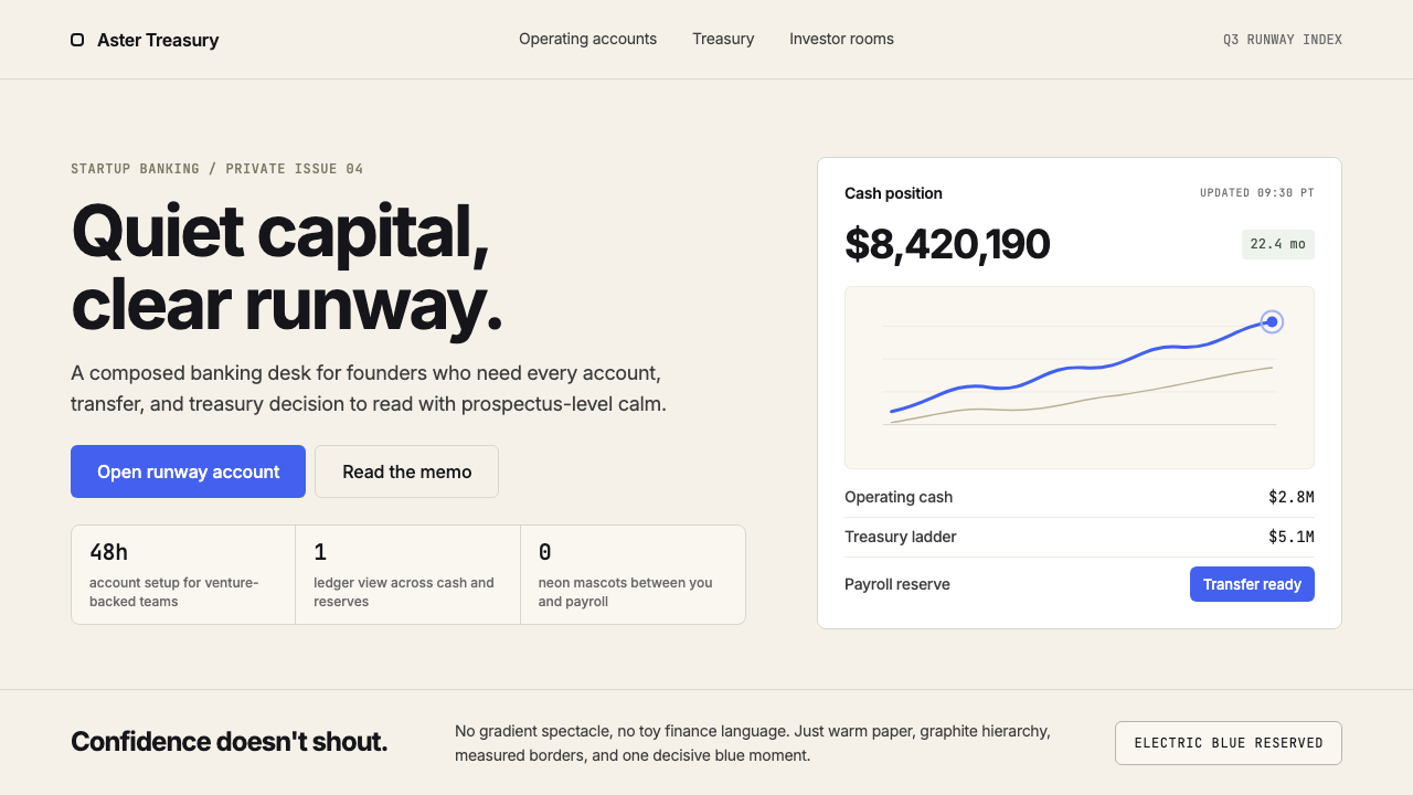 Mercury BankQuiet precision wins. Cream paper, charcoal Inter, and one electric-blue spar…
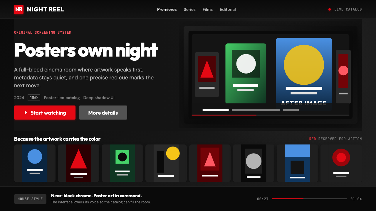 Netflix 2024Cinema UI goes dark. Near-black chrome, poster rails, and one surgical red ac…
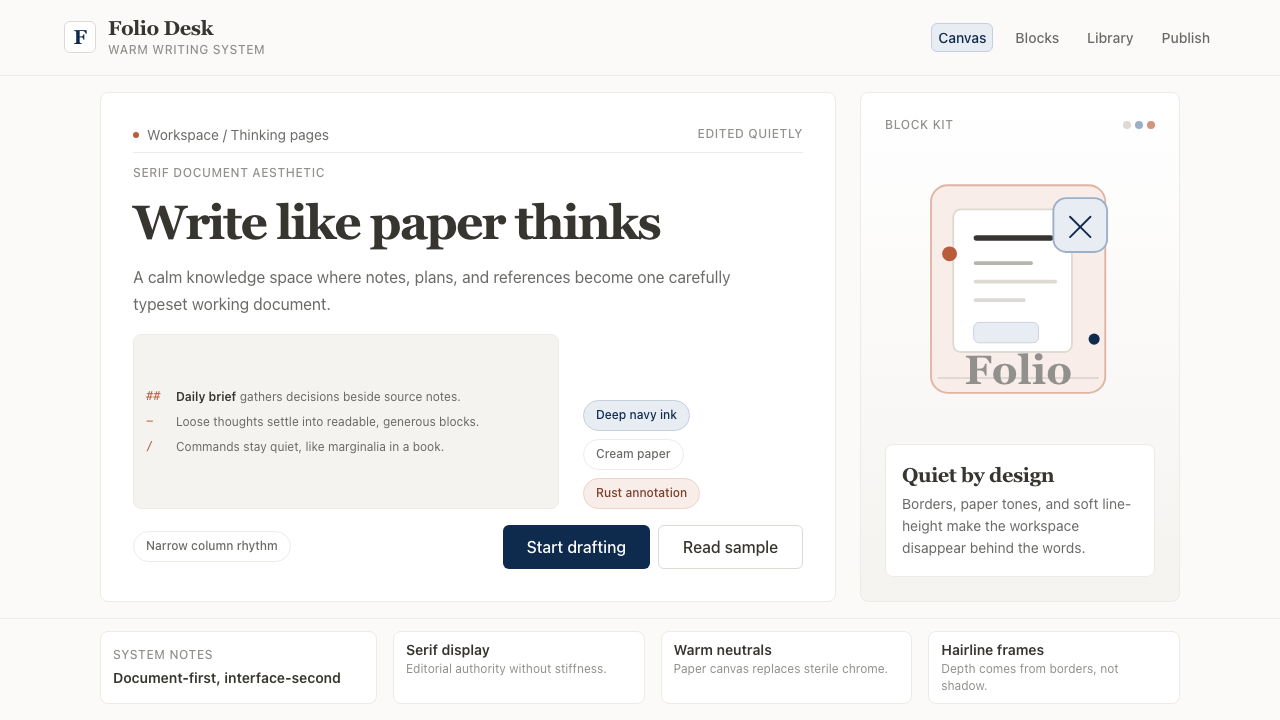 Notion ModernWriting feels papery. Source Serif on warm cream, navy ink, and hairline bord…