What is Post-Quantum Crypto Agency?
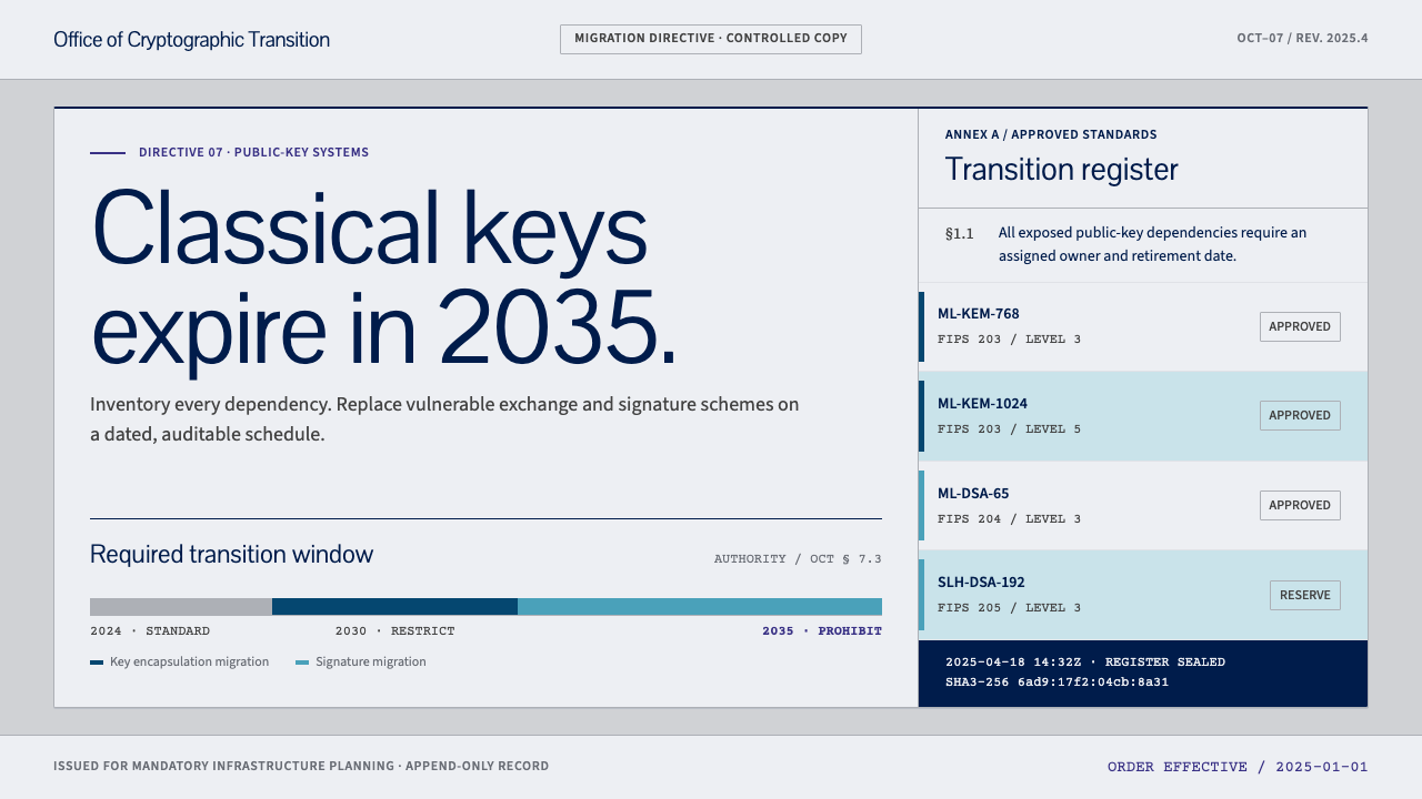
Post-Quantum Crypto Agency looks like the document it is: a cool blue-grey standards page with white panels, indigo links, and dates that mean it.
Post-Quantum Crypto Agency in brief
Post-Quantum Crypto Agency is a design system for the institutional side of cryptography: the standards, schedules and migration programmes through which organisations replace the public-key algorithms that a future quantum computer could break. It starts not from the glowing atoms and orbital rings that usually illustrate 'quantum', but from what the field actually publishes — documents. Its reference point is the website of the CRYSTALS suite, a cool blue-grey page carrying white document panels, deep indigo links and two teal blocks that keep the key-encapsulation scheme apart from the signature scheme.
From there the system gives that page a mandate. It adds the components an agency needs: parameter tables grouped by scheme family, lifecycle bars that end on a hard-coded sunset date, append-only audit logs, key fingerprints and per-system migration rosters that call every system by name. Type follows the conventions of NIST technical publications — sans-serif for body text, serif for mathematics, and a serif monospace for code and key material.
The result reads like a standard because a standard is meant to be obeyed, not admired. It has the finish of matte office paper: flat colour blocks, hairline dividers, thin panel borders and no drop shadows. Its authority comes from precision and from the fact that every date on it is binding.

Where does Post-Quantum Crypto Agency come from?
The technical story begins with a threat to a specific class of mathematics. Widely used public-key systems protect data and identities with problems — factoring large numbers, computing discrete logarithms — that are hard for classical computers but, in principle, solvable by a large enough quantum computer running Shor's algorithm. No such machine exists yet, but secrets that must stay secret for decades can be recorded today and decrypted later, which is why migration planning had to start long before the hardware does. Cryptographers therefore looked for algorithms built on other problems that quantum computers do not appear to solve efficiently, and one of the most successful families rests on the geometry of lattices.
The institutional story begins in 2017, when NIST — the US National Institute of Standards and Technology, based in Gaithersburg, Maryland — ran a public call for post-quantum submissions and began an open, multi-year evaluation in which teams from many countries proposed, attacked and refined candidates. Among the entries was CRYSTALS, a collaboration across European and American institutions that produced two schemes: Kyber, for key encapsulation, and Dilithium, for digital signatures. Both are lattice-based, and the project's website keeps them apart with two teal blocks — one for establishing shared secrets, one for proving authorship.
In 2024 the process reached its first finished standards. FIPS 203, 204 and 205 were finalised that year: FIPS 203 specifies a module-lattice key-encapsulation mechanism derived from Kyber, FIPS 204 a module-lattice digital signature scheme derived from Dilithium, and FIPS 205 a stateless hash-based signature scheme from a different family. The standards use new names — Kyber and Dilithium became ML-KEM and ML-DSA — but the CRYSTALS names remain the shorthand engineers still use in conversation.
What comes after standardisation is the part this design system is really about: migration. Organisations must inventory where public-key cryptography is used, rank systems by how long their data must stay protected, and move them in stages, with national and institutional timelines that run as far as 2035. The discipline of cryptographic agility — building systems so that algorithms can be swapped without redesigning everything — is the other half of the field. The design language that fits this phase is not a laboratory aesthetic. It is that of a compliance office: tables, rosters, logs and dates.
What defines the Post-Quantum Crypto Agency look?
Cool blue-grey ground
Pages sit on a cool, desaturated blue-grey that reads like official stationery under office light. It is calm, neutral and slightly institutional, nothing like a tech-startup dark mode or a neon gradient. The ground exists to make the white panels stand out as the actual documents.
White document panels
Content lives on white panels that look like pages laid on a desk: flat, rectangular, outlined by a fine border and separated by hairline dividers. Panels do not float or cast shadows; they sit. The border is the only depth they have, and that is enough to make a clear difference between a document and its surroundings.
Deep indigo links
Links and interactive text are a deep, dark indigo that feels close to ink: saturated enough to be recognised as links without turning decorative. Interactivity is communicated through colour and underline, not through pill buttons, fills or glow. The reader always knows what is clickable, and nothing else on the page competes for that job.
Two teal blocks
Teal is the only chromatic fill, and it has a job. One teal block marks the key-encapsulation scheme and a second marks the signature scheme, the two fundamental kinds of operation in the standardised suite. Using teal anywhere else would erase the distinction the colour exists to preserve. It is a label, not an accent.
Typography by role
Type follows NIST's authoring conventions rather than a brand's taste: sans-serif for running text, a serif face for mathematical notation, and a serif monospace for code, identifiers and key material. The three roles never mix. If it is a fingerprint, it is set in the serif monospace; if it is a formula, it is serif. The roles make a page parse like a standard before a single word is read.
Tables and hard dates
Parameter tables are grouped by scheme family and kept tight and legible. Lifecycle bars stop at a written date; the end of a bar is a fact, not an estimate. Status is stated in plain words such as permitted, deprecated or disallowed, not in decorative badges. Every date on the page is meant to be taken literally, and the layout never softens one into a vague season or quarter.
Append-only, matte finish
Audit logs only grow. New entries arrive at the end, nothing is edited in place, and there are no edit controls. Combined with the matte, shadowless finish — flat colour blocks, hairline dividers, a thin panel edge — the system feels like paper: durable, auditable and deliberately uneventful. Its calm is a kind of credibility.

Who shaped Post-Quantum Crypto Agency?
CRYSTALS is the collaboration across European and American institutions that produced Kyber, a key-encapsulation scheme, and Dilithium, a digital signature scheme, both based on lattices. Its reference website is the direct visual source for this system: the blue-grey ground, the white panels, the indigo links and the two teal blocks that keep the two schemes apart.
The Computer Security Resource Center is the part of NIST that publishes the technical standards and guidance documents through which post-quantum cryptography becomes official. Its publications set the typographic roles used here, and its house tone — plain, dated, numbered, cross-referenced — is the tone the whole system adopts. The agency voice of the interface comes from here.
The open, multi-year process that began with a public call in 2017 is itself a design influence. It was transparent, comparative and slow, with candidates attacked in public before any were chosen. That culture explains the system's preference for tables, change logs and dated milestones: it looks like a process that expects to be audited.
The three standards finalised in 2024 are the system's fixed points: a module-lattice key-encapsulation mechanism, a module-lattice signature scheme and a stateless hash-based signature scheme. They supply the vocabulary the interface organises itself around, and they are the reason the sunset and migration components exist. When a page shows a deadline, it is counting down from these documents.
How do you use Post-Quantum Crypto Agency today?
This style suits any subject where being exact is part of the message: standards, compliance, security, audit, governance. It works because it makes information look obligatory, and it should be avoided where the aim is delight or persuasion by atmosphere.
A presentation cover can be a cool blue-grey field carrying a single white panel with the title, a document-style identifier and a date, as if the deck were a numbered publication. Content slides should be treated as tables and short numbered statements, one claim per slide, with the serif monospace reserved for identifiers. Data slides suit lifecycle bars, migration rosters and timelines that stop on a written deadline; a bar's end is a promise, so label it.
In interfaces the style fits compliance dashboards, cryptographic asset inventories, migration trackers, status pages and developer documentation for security libraries. A roster of systems with a migration state beside each is the natural central component. Links are indigo and everything clickable is obvious; the two teal blocks appear only where the key-encapsulation and signature distinction matters. A pricing page can be laid out as a parameter table, where plans become rows and attributes become columns.
For editorial work, the style is made for whitepapers, advisories, regulatory briefs, standards explainers and migration guides. Use numbered sections, footnotes, dated revision notes and plain, sentence-case headings, and let tables carry the weight. Marketing in this register should sound like a standards body: precise, calm and specific, with deadlines stated outright and no promise that cannot be checked.
The most common mistake is reaching for the usual quantum imagery: glowing orbs, particle trails, neon gradients and floating glass cards. They contradict the system's whole premise, which is that this is a document and not a demonstration. A second mistake is spending teal as a general brand accent, which dissolves the one distinction it exists to draw. A third is softening deadlines with approximate language or decorative badges, and a fourth is adding shadows and rounded corners, which turn a standard into a startup.

Post-Quantum Crypto Agency — FAQ
Is this an official NIST or CRYSTALS look?
No. The system draws on the visual character of the CRYSTALS reference website and on NIST's authoring conventions for type, but it is an independent design language and has no affiliation with either. It should not be used to imply government endorsement or to imitate an official body's identity. Treat it as a style inspired by how this field publishes, not as a credential.
Why avoid glowing quantum imagery?
Because the real work of post-quantum cryptography is standards, parameter choices and migration schedules, and the interface should look like that. Glowing orbs and particle trails signal a demonstration of the future, while this system signals an obligation in the present. It follows the field's own publications, which are plain documents. The restraint is the credibility.
What are the two teal blocks for?
They separate the two basic kinds of scheme in the standardised suite: key encapsulation, used to establish a shared secret, and digital signature, used to prove who produced something. In the original reference site they keep Kyber and Dilithium visually apart. In the system teal keeps that meaning, so it should never be used as a general highlight, button colour or decorative accent.
Why a serif monospace for code and key material?
Because NIST's authoring rules assign code and key material their own face, distinct from running text and from mathematics. A serif monospace keeps characters evenly spaced, so fingerprints and identifiers can be compared character by character, while still sitting comfortably beside serif mathematics. It signals that a string is data to be checked, not prose to be read.
Can it work for products outside cryptography?
Yes, wherever a product deals in compliance, audit, risk, regulation or any process with fixed deadlines and accountable records. Its panels, tables, rosters and append-only logs are general tools for that kind of work. It is a poor fit for emotional, playful or consumer-lifestyle brands, where a document-like calm would read as distance rather than trust.
Related design styles
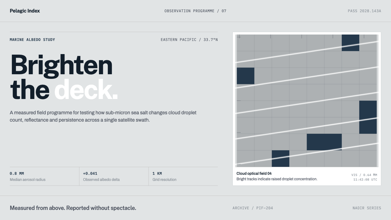 Cloud Brightening FleetBrightening becomes evidence. White ship-track lines score a cool-grey satell…
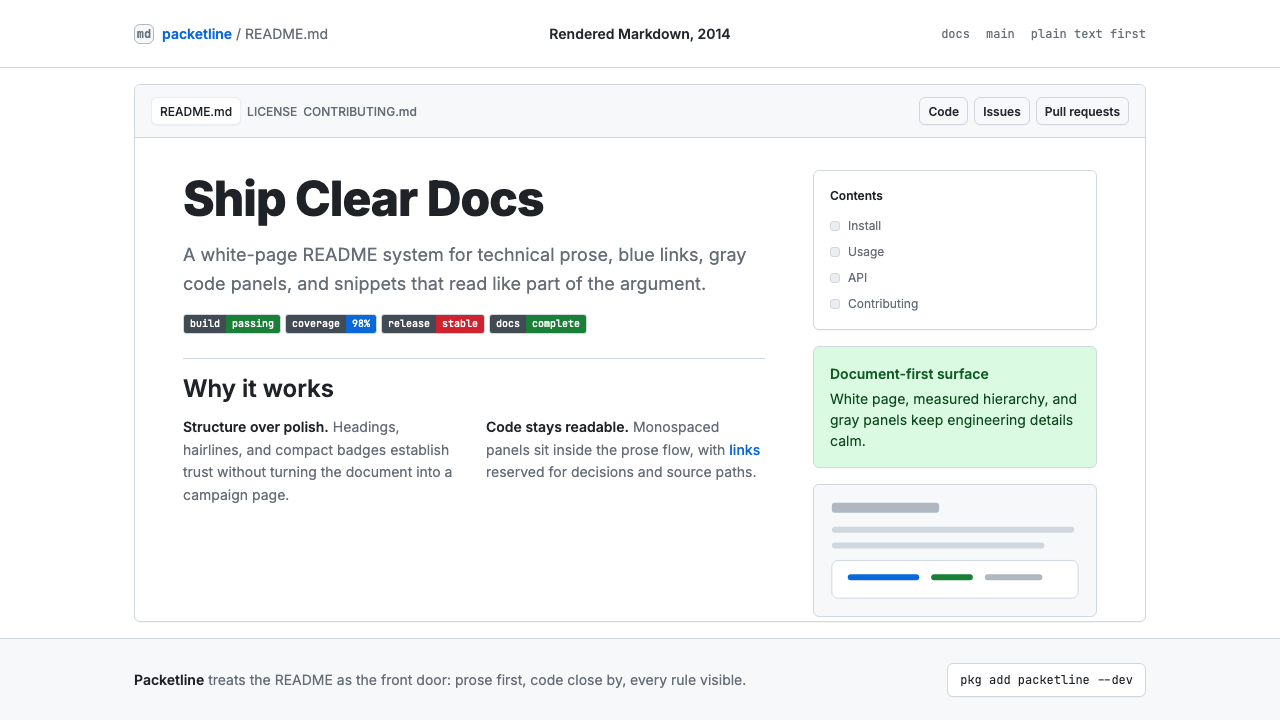 GitHub README Markdown (2014)Calm code authority. Blue links, gray code panels, and Inter/Mono stack on wh…
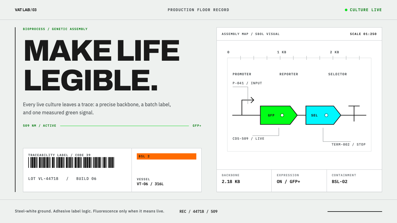 Synthetic Biology Vat LabLife is legible. GFP green traces a steel-white SBOL backbone and barcode rec…
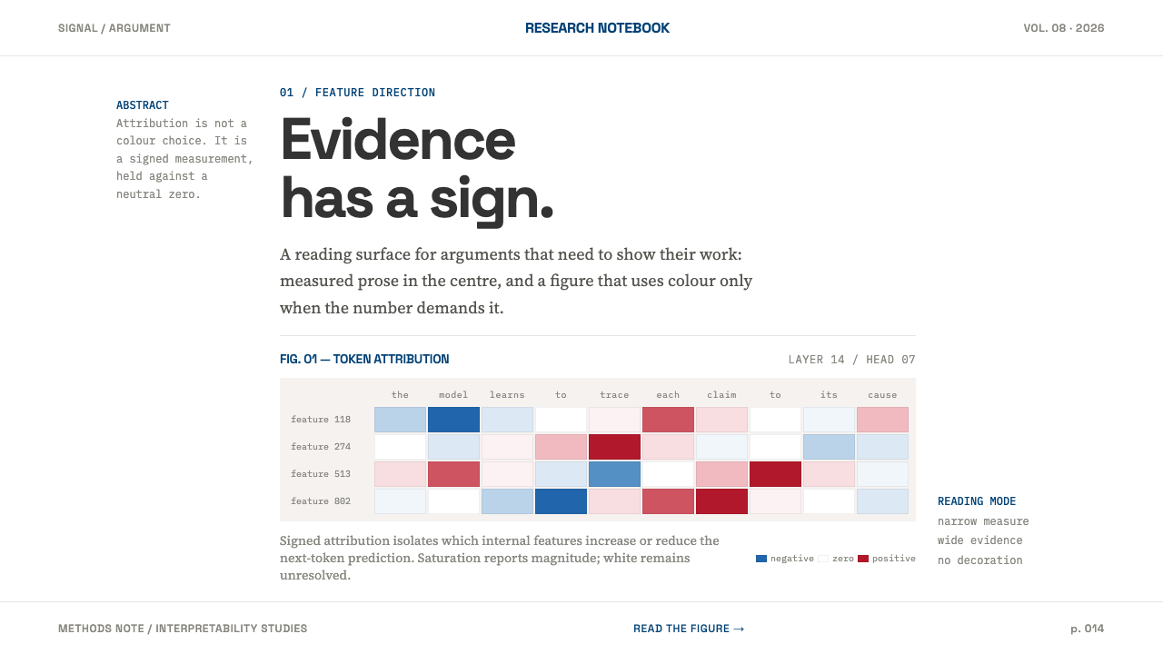 AI Alignment LabEvidence has a sign. Narrow serif prose yields to a red-blue attribution matr…
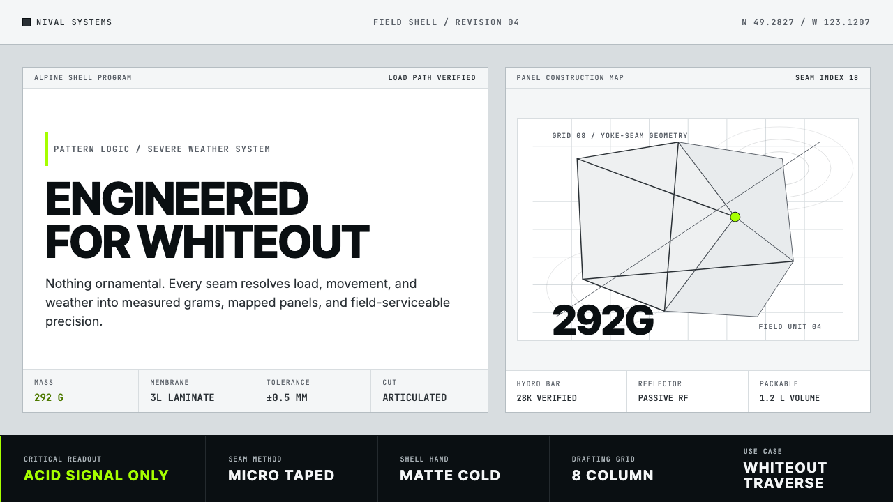 Arc'teryx Technical OutdoorEngineered, never ornamental. Glacier silver grid, mono specs, one acid-green…
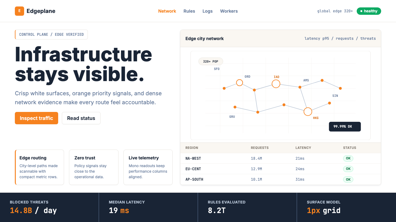 Cloudflare Orange EdgeOperational clarity wins. Orange accents, hairline grids, and mono metrics ma…