What is GitHub README Markdown (2014)?什么是 GitHub README Markdown (2014)?
GitHub's README turned a plain-text formatting convention into the universal visual grammar of open-source software — calm, flat, and built entirely around the authority of well-structured information.GitHub 的 README 将一种纯文本格式约定,变成了开源软件的通用视觉语法——沉静、扁平,完全建立在结构良好的信息权威之上。
GitHub README Markdown (2014) in briefGitHub README Markdown (2014) 速览
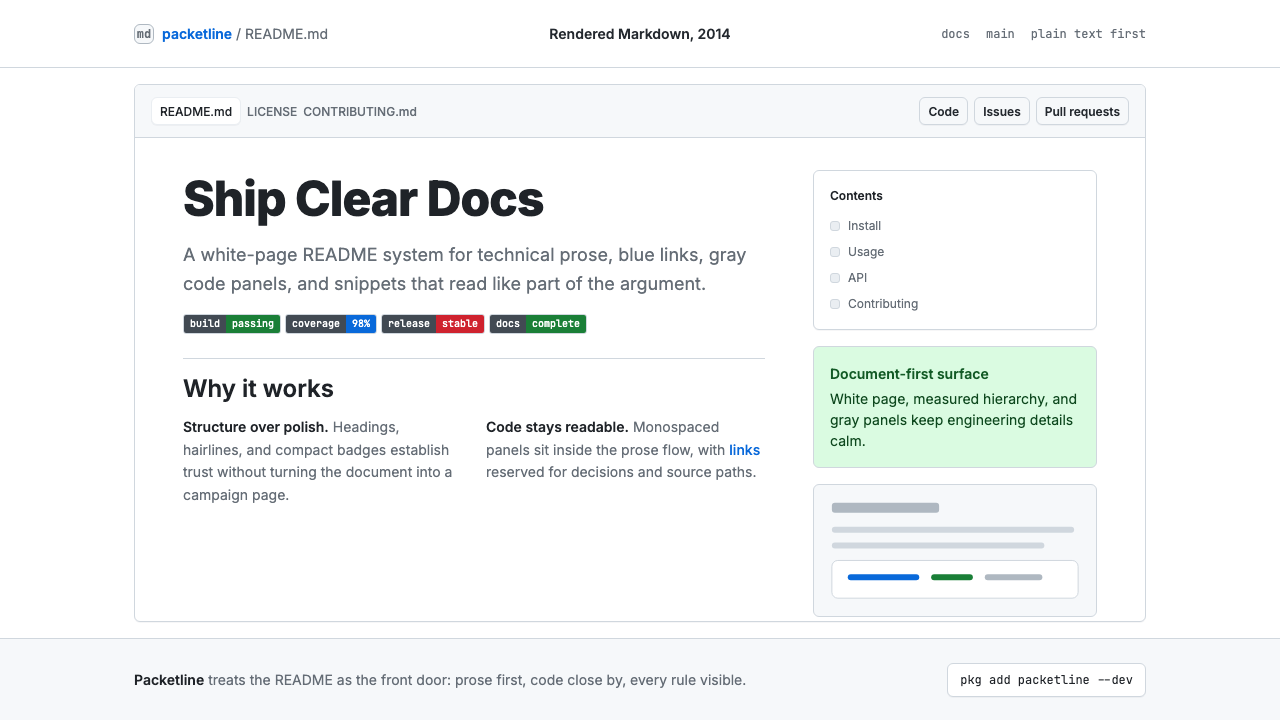
GitHub README Markdown is the visual system that emerged from GitHub's rendering of the Markdown lightweight markup language — first popularized by John Gruber in 2004, then refined into GitHub Flavored Markdown (GFM) and formalized around 2014. Its canonical look is immediately recognizable: white page ground, black body text at a comfortable reading width, blue hyperlinks, gray-tinted code blocks in a monospaced typeface, horizontal rules as section dividers, and rows of colorful shields.io status badges near the top of every serious project. Together these elements compose a visual language that is rigorously flat, typographically restrained, and entirely optimized for scannable technical prose.GitHub README Markdown 是 GitHub 渲染 Markdown 轻量标记语言所产生的视觉系统——Markdown 由 John Gruber 于 2004 年推广,后发展为 GitHub Flavored Markdown(GFM)并于 2014 年前后正式定型。其经典外观一眼可辨:白色页面底色、在舒适阅读宽度上排布的黑色正文、蓝色超链接、以等宽字体呈现的灰色代码块、作为章节分隔符的水平线,以及每个重量级项目顶部那排色彩缤纷的 shields.io 状态徽章。这些元素共同构成一套严格扁平、排版克制、完全为可扫读的技术散文而优化的视觉语言。
The system is not a deliberate art-directed aesthetic in the way that Bauhaus or Swiss International Style are — it emerged organically from the constraints of Markdown's plain-text origins and the practical requirements of developer documentation. Precisely because it was never formally designed, it achieved a kind of universal neutrality: it looks authoritative without appearing designed, readable without demanding attention, and professional without any expenditure on visual production. That neutrality became its power. By the mid-2010s, developer tools, open-source libraries, API documentation, and technical portfolios worldwide had converged on this rendering as the default backdrop for serious technical work.这套系统并非像包豪斯或瑞士国际主义风格那样经过刻意艺术指导——它从 Markdown 纯文本起源的约束条件和开发者文档的实际需求中有机生长出来。恰恰因为从未被正式设计,它达到了一种普遍的中性:看起来权威,却不显摆设计感;易于阅读,却不争夺注意力;专业得体,却无需任何视觉生产成本。这种中性成为它的力量。到 2010 年代中期,全球的开发者工具、开源库、API 文档和技术作品集,都以这种渲染风格作为严肃技术工作的默认底色。
In retrospect, the GitHub README aesthetic represents a distinct moment in software culture — the period when open source moved from enthusiast hobbyism to professional infrastructure, and when documentation quality became a signal of project maturity. The visual conventions that accumulated in this period (the badge row, the installation code block, the table of contents anchor links, the contributor table) are as much cultural artifacts as design decisions. Applying this aesthetic today is an act of deliberate citation: it signals technical seriousness, open-source ethos, and a preference for clarity over decoration.回望来看,GitHub README 美学代表了软件文化中一个独特的时刻——开源从爱好者的消遣转变为专业基础设施的时期,文档质量开始成为项目成熟度的信号。在这一时期积累下来的视觉惯例(徽章行、安装代码块、目录锚点链接、贡献者表格)既是设计决策,也是文化遗物。今天主动应用这种美学,是一种刻意的引用行为:它传达技术严肃性、开源精神,以及对清晰胜于装饰的价值取向。
See the GitHub README Markdown (2014) design system查看 GitHub README Markdown (2014) 完整设计系统
Where does GitHub README Markdown (2014) come from?GitHub README Markdown (2014) 从何而来?
The story begins in 2004, when writer and developer John Gruber released Markdown — a plain-text formatting syntax designed to be readable as-is and convertible to clean HTML. Gruber's central insight was that email conventions had already established a de facto plain-text markup: people used asterisks for emphasis, hyphens for lists, and indentation for code. Markdown formalized these conventions into a specification. The original goal was not to define a visual aesthetic but to eliminate the friction of writing HTML by hand, letting writers focus on structure and content.故事始于 2004 年,作家兼开发者 John Gruber 发布了 Markdown——一种纯文本格式语法,设计目标是在原始状态下即可阅读,并可转换为整洁的 HTML。Gruber 的核心洞见在于:电子邮件的书写惯例已经建立起一套事实上的纯文本标记体系——人们用星号表示强调,用连字符表示列表,用缩进表示代码。Markdown 将这些约定形式化为一套规范。其最初的目标不是定义一种视觉美学,而是消除手写 HTML 的摩擦,让写作者专注于结构与内容。
GitHub launched in 2008 and adopted Markdown as its native format for repository README files, wiki pages, and issue comments. As GitHub grew from a niche developer tool into the central hub of global open-source collaboration, its specific rendering choices — the typeface stack, the gray code block, the blue link color, the section divider weight — became the reference implementation. Other platforms and documentation tools converged on similar aesthetics, but GitHub's rendering remained the canonical version. By 2014, GitHub had formalized its variant as GitHub Flavored Markdown (GFM), adding tables, task lists, fenced code blocks with syntax highlighting, and automatic URL linking — features that pushed the format from a simple markup language toward a full-featured documentation substrate.GitHub 于 2008 年上线,并将 Markdown 作为仓库 README 文件、Wiki 页面和 Issue 评论的原生格式。随着 GitHub 从一个小众开发者工具成长为全球开源协作的核心枢纽,它的具体渲染选择——字体栈、灰色代码块、蓝色链接色、章节分隔线的粗细——成为参考实现。其他平台和文档工具纷纷向类似美学靠拢,但 GitHub 的渲染始终是标准版本。到 2014 年,GitHub 将其变体正式定名为 GitHub Flavored Markdown(GFM),增加了表格、任务列表、带语法高亮的围栏代码块以及自动 URL 链接——这些功能将该格式从简单的标记语言推向了功能完备的文档基础设施。
The shields.io badge system, which emerged in the early 2010s from the open-source community itself, became a defining layer of the aesthetic. Badges communicated build status, test coverage, license type, package version, and download counts — live metadata rendered as small, flat, color-coded rectangles. Their visual logic is a microcosm of the whole system: information density without decoration, color used only to signal status (green for passing, red for failing, gray for neutral), and a horizontal rhythm that reads like a metadata dashboard at the top of every well-maintained repository.shields.io 徽章系统在 2010 年代初从开源社区内部涌现,成为这套美学的标志性层次。徽章传递构建状态、测试覆盖率、许可证类型、包版本和下载次数——以小型、扁平、色彩编码的矩形渲染的实时元数据。它们的视觉逻辑是整个系统的缩影:无装饰的信息密度,色彩仅用于传递状态(绿色代表通过,红色代表失败,灰色代表中性),以及在每个维护良好的仓库顶部形成如元数据仪表板般的水平节奏。
The key figures who shaped this aesthetic include Gruber as the originator of Markdown's philosophy; Tom Preston-Werner, GitHub's co-founder, who championed the README as a project's primary communication surface; and Sindre Sorhus, the Norwegian open-source developer whose prolific library work helped establish the conventions of the exemplary GitHub README — the installation section, the API documentation pattern, the badge row, the contributing guidelines. The GitHub Primer design team, which maintained GitHub's design system from the mid-2010s onward, codified the rendering into consistent components and documented it as a repeatable system, transforming what had been an emergent folk aesthetic into an intentional, maintained visual language.塑造这套美学的关键人物包括:作为 Markdown 哲学创始人的 Gruber;GitHub 联合创始人 Tom Preston-Werner,他倡导将 README 作为项目的主要传播界面;以及挪威开源开发者 Sindre Sorhus,他大量的库作品帮助确立了典范 GitHub README 的惯例——安装章节、API 文档模式、徽章行、贡献指南。GitHub Primer 设计团队从 2010 年代中期开始维护 GitHub 的设计系统,将这种渲染风格编纂为一致的组件并加以记录,使其成为可重复的系统,将一种自发涌现的民间美学转变为有意为之、持续维护的视觉语言。
What defines the GitHub README Markdown (2014) look?GitHub README Markdown (2014) 的视觉特征是什么?
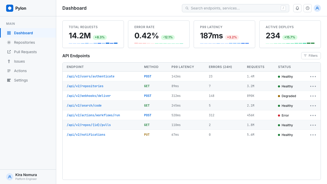
White Ground and Breathing Space白色底面与呼吸空间
The page ground is pure white or near-white, and content is contained within a centered column of generous but not excessive width — wide enough for comfortable reading, narrow enough to prevent exhausting line lengths. Generous vertical spacing between sections means that each block of content — a paragraph, a code snippet, a table — is clearly separated without the need for decorative dividers. The whitespace is not emptiness but structure: it does the organizational work that borders and backgrounds do in denser visual systems.页面底色为纯白或接近白色,内容包裹在一个宽度适中的居中栏内——足够宽以保证舒适阅读,足够窄以避免让人疲惫的超长行。各章节之间充裕的垂直间距意味着每个内容块——段落、代码片段、表格——都清晰分离,无需借助装饰性分隔线。留白不是空洞,而是结构:它承担了在更密集视觉系统中由边框和背景色完成的组织工作。
Typographic Hierarchy by Scale Alone仅靠尺度建立的排版层级
Heading levels are differentiated almost entirely by scale and weight — the largest heading is noticeably bolder and taller than the second level, which is in turn clearly distinct from body text. Color plays almost no role in the typographic hierarchy; the system relies on size, weight, and the subtle visual boundary of a light bottom border under first- and second-level headings to signal structure. Body text is set at a comfortable reading size with a line height that feels open rather than cramped. The result is a page that communicates its own organization without graphic decoration.标题级别几乎完全靠尺度和字重来区分——最高级标题明显比第二级更粗更高,第二级又与正文有明确区别。色彩在排版层级中几乎不起作用;该系统依靠尺寸、字重以及一级和二级标题下方细浅底边框来传递结构。正文以舒适的阅读字号排布,行高开阔而不局促。结果是一个无需图形装饰就能自我解释组织结构的页面。
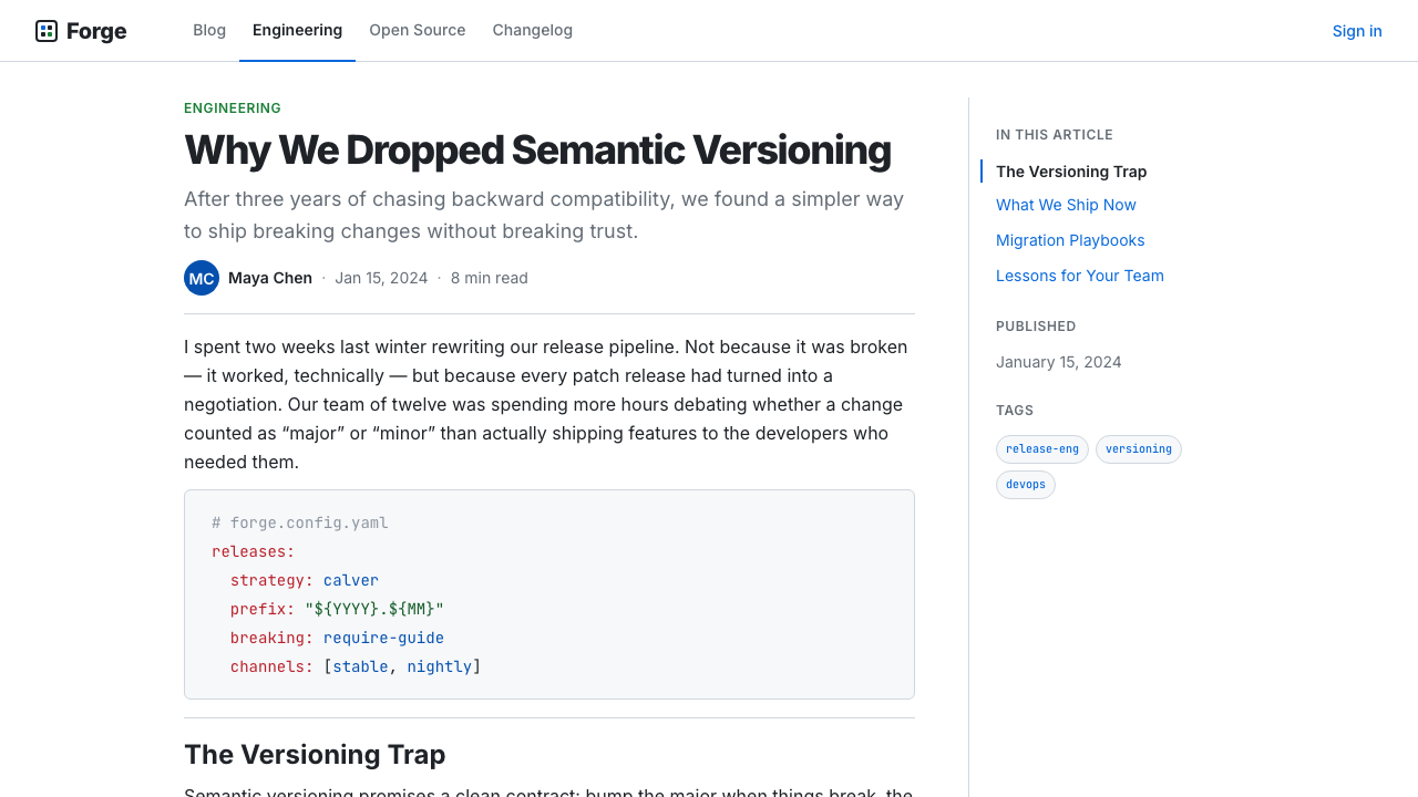
Gray Code Panels and Monospaced Cadence灰色代码面板与等宽节奏
Code blocks — whether inline snippets within a sentence or full multi-line fenced blocks — are rendered in a monospaced typeface against a light gray tinted panel. This visual distinction between prose and code is one of the most load-bearing elements of the system: it allows a reader to scan a page and instantly identify what is explanatory text and what is literal syntax. The gray panel is quiet enough not to interrupt reading flow but distinct enough to serve as a reliable landmark. Syntax highlighting within code blocks adds subtle color differentiation — keywords, strings, and comments rendered in different tonal values — without departing from the overall calm of the page.代码块——无论是句子中的行内片段,还是完整的多行围栏代码块——都以等宽字体渲染在浅灰色调色板上。散文与代码之间的这种视觉区分是系统中最关键的元素之一:它让读者扫视页面时即可立刻分辨哪些是解释性文字,哪些是字面语法。灰色面板安静得不打断阅读流,却又足够清晰地充当可靠的视觉路标。代码块内的语法高亮添加了细腻的色彩区分——关键字、字符串和注释以不同色调值呈现——而不破坏整页的平静基调。
Blue Links as the Only Accent Color蓝色链接作为唯一强调色
Hyperlinks are rendered in a medium, unsaturated blue that reads clearly against white without dominating the page. This blue carries the entire navigational and relational load of the document — everything that is connected to something else is this color. Outside of badge graphics and syntax highlighting, the blue link is the only chromatic accent in an otherwise achromatic page. Its restraint is meaningful: because only links are blue, the color acts as a reliable affordance signal. A reader learns almost immediately that blue text is interactive, and no other visual element competes with that signal.超链接以中等、不过饱和的蓝色渲染,在白色底面上清晰可辨,同时不主导整个页面。这种蓝色承担了文档全部的导航与关联负荷——所有与其他内容相连的元素都是这种颜色。除徽章图形和语法高亮外,蓝色链接是一个本质上近乎无色调页面上唯一的色彩强调。它的克制是有意义的:因为只有链接是蓝色的,这种颜色就成为可靠的交互信号。读者几乎立刻就学会了蓝色文字是可交互的,没有其他视觉元素与这个信号竞争。
Badge Rows as Visual Metadata徽章行作为视觉元数据
The horizontal row of shields.io badges near the document top functions as a compact metadata dashboard. Each badge is a small, flat, pill-shaped graphic divided into a dark label segment and a status-colored value segment — green for healthy states, red for failures, yellow for caution, gray for neutral information, and blue for informational links. The badges borrow traffic-light color logic and apply it to software lifecycle signals: build passing, tests covered, version released, license declared. Visually, a dense row of badges immediately communicates that a project is actively maintained and that its maintainers consider documentation a first-class concern.文档顶部附近水平排列的 shields.io 徽章行,作为一个紧凑的元数据仪表板发挥作用。每枚徽章是一个小型、扁平、胶囊形的图形,分为深色标签段和状态色值段——绿色代表健康状态,红色代表失败,黄色代表警告,灰色代表中性信息,蓝色代表信息链接。徽章借用了交通灯的色彩逻辑,将其应用于软件生命周期信号:构建通过、测试覆盖、版本发布、许可证声明。在视觉上,一排密集的徽章立即传达出:项目处于积极维护中,且维护者将文档视为头等要务。
Tables and Lists as Information Structure表格与列表作为信息结构
Markdown tables and ordered or unordered lists are rendered with the same quiet authority as everything else on the page — light dividers between table rows, consistent indentation for nested lists, no decorative styling beyond what is structurally necessary. Tables use alternating row tinting so faint it barely registers, yet sufficient to keep the eye tracking horizontally across dense data. Lists use plain bullet glyphs with consistent left margin. The overall effect is that complex structured information — comparison tables, API parameter lists, step-by-step installation sequences — can be presented in a single visual register without visual noise.Markdown 表格和有序或无序列表的渲染,与页面上其他所有内容保持同样的沉静权威——表格行间细浅分隔线,嵌套列表的统一缩进,除结构必要之处外无任何装饰样式。表格使用几乎察觉不到却又足以让视线沿密集数据水平追踪的交替行底色。列表使用带统一左边距的简洁项目符号。整体效果是:复杂的结构化信息——对比表格、API 参数列表、逐步安装序列——可以在单一的视觉语境中呈现,不产生视觉噪音。
Flatness and Anti-Skeuomorphism扁平性与反拟物主义
The entire rendering is rigorously flat. There are no drop shadows on elements, no gradient fills, no simulated depth or dimensionality. Even the gray code panel sits flush with the page rather than appearing to float above it. This flatness was partially a consequence of Markdown's plain-text origins — the format was not designed to carry design tokens — and partially a product of the 2010s broader move toward flat design in digital interfaces. But in the README context, flatness serves a specific purpose: it keeps the visual system from ever competing with the content. The design is a substrate for information, not a layer on top of it.整个渲染严格扁平。元素上没有投影,没有渐变填充,没有模拟的深度或立体感。即使是灰色代码面板也与页面齐平,而非显得悬浮其上。这种扁平性一半是 Markdown 纯文本起源的结果——该格式本不是为承载设计令牌而设计的——另一半是 2010 年代数字界面整体向扁平设计转变的产物。但在 README 语境中,扁平性服务于一个特定目的:防止视觉系统与内容竞争。设计是信息的基底,而非覆盖其上的一层。
See the GitHub README Markdown (2014) design system查看 GitHub README Markdown (2014) 完整设计系统
Who shaped GitHub README Markdown (2014)?谁塑造了 GitHub README Markdown (2014)?
Gruber created Markdown in 2004 with the explicit goal of making web writing feel as natural as composing email — the plain-text source should be legible without any rendering. His fundamental insight, that existing typographic conventions in plain email already constituted an informal markup language, gave Markdown its distinctive character: a format that privileges human readability of the source over machine processing efficiency. This philosophy embedded itself in the entire GitHub README aesthetic, which always maintains a clear relationship between the raw text and its rendered form.Gruber 于 2004 年创建了 Markdown,明确目标是让网络写作感觉像撰写电子邮件一样自然——纯文本源码无需渲染即可阅读。他的根本洞见在于,纯文本邮件中已有的排版惯例本身就构成了一种非正式标记语言,这赋予了 Markdown 独特的性格:一种始终将源码的人类可读性置于机器处理效率之上的格式。这一哲学根植于整个 GitHub README 美学之中——原始文本与渲染形态之间始终保持清晰的对应关系。
As GitHub's co-founder, Preston-Werner championed the README file as a software project's primary public face — a conviction captured in his 2010 essay 'Readme Driven Development,' which argued that writing the README before writing any code forces clarity of thought about what the software is actually for. This philosophical framing elevated the README from a convenience to a discipline, and indirectly shaped the visual culture of developer documentation by making the README the artifact that every serious open-source project was judged by.作为 GitHub 联合创始人,Preston-Werner 倡导将 README 文件视为软件项目的主要公共门面——这一信念体现在他 2010 年的文章《README 驱动开发》中,文章主张在编写任何代码之前先写 README,能迫使人对软件的真正用途保持清醒认知。这一哲学框架将 README 从一种便利提升为一种纪律,并通过使 README 成为衡量每个严肃开源项目的标准产物,间接塑造了开发者文档的视觉文化。
The Norwegian open-source developer and prolific library author became one of the most influential practitioners of the exemplary README. With hundreds of npm packages maintained to a consistent documentation standard, Sorhus established many of the structural conventions — the installation section, the API reference pattern, the badges row, the contributing section, the license declaration at the bottom — that define what a well-maintained README looks like. His repositories function as a living style guide for the aesthetic.这位挪威开源开发者和多产的库作者,成为典范 README 最具影响力的实践者之一。凭借数百个维护在一致文档标准下的 npm 包,Sorhus 建立了许多结构惯例——安装章节、API 参考模式、徽章行、贡献章节、底部许可证声明——定义了一个维护良好的 README 的面貌。他的代码仓库作为这套美学的活态风格指南而存在。
The GitHub Primer design system team, active from the mid-2010s onward, transformed what had been an organically accumulated visual folk standard into a deliberately maintained and documented design system. Primer codified the rendering decisions — typography scale, spacing rhythm, component patterns, color tokens — into public documentation and open-source components. By making the system explicit and reusable, Primer ensured that the GitHub README aesthetic could be intentionally applied beyond GitHub itself, and it provided the vocabulary for describing the style as a coherent visual language rather than a collection of browser defaults.GitHub Primer 设计系统团队自 2010 年代中期起活跃至今,将有机积累的视觉民间标准转变为有意维护和记录的设计系统。Primer 将渲染决策——排版比例、间距节奏、组件模式、颜色令牌——编纂为公开文档和开源组件。通过使系统变得明确且可复用,Primer 确保了 GitHub README 美学可以在 GitHub 之外被有意应用,并提供了将这种风格描述为连贯视觉语言而非浏览器默认值集合的词汇。
Sauter initiated the shields.io project, which standardized the visual format for the badge ecosystem that became one of the README aesthetic's most distinctive layers. The shields.io badge format — a horizontally divided pill shape with a label on the left and a value on the right, rendered in flat color without gradients or shadows — is a small masterpiece of information design: it packs project lifecycle metadata into a scannable, universally understood graphic form. The badge standard spread across the open-source ecosystem and is now used by millions of repositories.Sauter 发起了 shields.io 项目,为徽章生态系统的视觉格式制定了标准,使其成为 README 美学最具标志性的层次之一。shields.io 徽章格式——水平分割的胶囊形,左侧为标签,右侧为值,以无渐变、无阴影的平面色彩渲染——是信息设计的小型杰作:它将项目生命周期元数据压缩进一种可扫描、普遍可理解的图形形式。徽章标准在开源生态系统中广泛传播,如今已被数百万个代码仓库使用。
How do you use GitHub README Markdown (2014) today?今天怎么用 GitHub README Markdown (2014)?
Applying the GitHub README aesthetic to designed artifacts — slides, web interfaces, marketing materials — requires understanding what the style is actually doing at a structural level. It is not a collection of decorative motifs but a set of convictions about how information should be organized and presented: hierarchy through scale, color reserved for function, flatness as a form of respect for content, and whitespace as the primary organizational tool. Starting from those convictions produces more authentic results than starting from a visual reference and copying surface features.将 GitHub README 美学应用于设计产物——幻灯片、网页界面、营销材料——需要在结构层面理解这种风格实际上在做什么。它不是一组装饰母题,而是一套关于信息应如何组织与呈现的信念:通过尺度建立层级,色彩保留给功能,扁平性作为对内容的尊重,留白作为首要的组织工具。从这些信念出发,比从视觉参考出发并复制表面特征,能产生更真实的结果。
For presentation slides, the style works exceptionally well when the content is technical, comparative, or instructional. A cover slide benefits from the system's typographic directness: a large, weight-differentiated title against a white ground, possibly accompanied by a small badge row that mimics the README's metadata dashboard — version, category, date. Content slides should resist the temptation to fill the slide; the README aesthetic is comfortable with density in text and tables, but requires generous whitespace around content blocks. Code-heavy slides — showing API responses, configuration snippets, or terminal output — gain authority from the gray code panel treatment: monospaced text on a quietly differentiated background, no framing chrome beyond the panel itself. Data slides translate well as diagram-like objects: clean bar charts and simple tables without grid lines, color used only to signal category or status, no decorative fills.对于演示幻灯片,当内容具有技术性、对比性或教学性时,这种风格表现尤为出色。封面幻灯片受益于该系统的排版直接性:白色底面上字重分明的大号标题,可能辅以一排仿照 README 元数据仪表板的小徽章行——版本、类别、日期。内容幻灯片应抵制填满幻灯片的冲动;README 美学在文字和表格的密度上是自信的,但要求内容块周围有充裕的留白。代码密集型幻灯片——展示 API 响应、配置片段或终端输出——从灰色代码面板处理中获得权威感:安静区分的背景上的等宽文字,除面板本身外无任何外框装饰。数据幻灯片作为示意图式对象效果良好:没有网格线的简洁条形图和表格,色彩仅用于传递类别或状态,无装饰性填充。
For web UI applications — dashboards, developer tools, pricing pages, and documentation sites — the style is a natural fit. The approach: a near-white or true-white background, a single centered or left-anchored content column at a comfortable reading width, black body text, blue only for interactive elements and navigation links, gray-panel treatment for any displayed code. Card components and containers should have subtle borders rather than shadows, keeping the page flat. Navigation should be typographically simple — text labels, no icon clusters. A developer-facing pricing page benefits from a comparison table rendered in the system's quiet table style: light row dividers, a single column highlighted with a blue border or subtle background tint to indicate the recommended tier.对于网页 UI 应用——仪表板、开发者工具、定价页面和文档站点——这种风格是自然的契合。方法如下:近白色或纯白色背景,单一的居中或左锚定内容栏保持舒适阅读宽度,黑色正文,蓝色仅用于交互元素和导航链接,对任何显示的代码使用灰色面板处理。卡片组件和容器应有细微的边框而非阴影,保持页面的扁平性。导航应排版简洁——文字标签,无图标群组。面向开发者的定价页面受益于以该系统安静表格风格渲染的对比表格:轻浅的行分隔线,单列以蓝色边框或细微的背景色调突出显示以标示推荐方案。
For editorial and marketing work, the style's authority translates into a kind of anti-advertising confidence. A GitHub README-styled landing page or editorial layout signals that the content leads — there is no visual persuasion machinery, just well-organized information. Feature sections work as structured lists or definition-style blocks rather than illustrated cards with soft shadows. Section headers use the heading scale directly from the document style, possibly accompanied by a subtle horizontal rule. Calls to action should be typographically bold with the blue link color extended to button styling. Marketing copy benefits from the style's natural constraint: if the visual system refuses decoration, the writing must do the persuasive work, which usually makes both better.对于编辑和营销内容,这种风格的权威感转化为一种反广告的自信。GitHub README 风格的落地页或编辑版面传递的信号是:内容主导——没有视觉说服机制,只有组织良好的信息。功能章节作为结构化列表或定义式区块,而非带柔和阴影的插图卡片。章节标题直接使用文档风格的标题比例,可能辅以细水平线。行动号召应排版粗重,蓝色链接色延伸至按钮样式。营销文案受益于这种风格的自然约束:如果视觉系统拒绝装饰,写作就必须承担说服工作,而这通常使两者都变得更好。
A common mistake when applying this aesthetic is adding visual richness in ways that the system structurally opposes. Soft drop shadows on cards, gradient backgrounds in hero sections, multiple typefaces mixing serif and sans-serif, or custom illustration styles all pull against the flatness and typographic singularity that give the style its authority. Similarly, overusing the badge visual metaphor — decorating non-technical content with badge-shaped elements for purely aesthetic reasons — empties the badge of its functional meaning. The style's restraint is not a starting point to be decorated but a discipline to be maintained. Every element that does not serve a clear informational purpose should be removed, not substituted with something quieter.应用这套美学时最常见的错误,是以系统在结构上所反对的方式增加视觉丰富性。卡片上的柔和投影、主视觉区的渐变背景、混合衬线与无衬线的多字体组合,或自定义插图风格,都与赋予这种风格权威感的扁平性和排版单一性相悖。同样,过度使用徽章视觉隐喻——纯粹出于美学原因用徽章形状元素装饰非技术内容——会剥夺徽章的功能意义。这种风格的克制不是一个待装饰的起点,而是一种需要坚守的纪律。每个不服务于明确信息目的的元素都应被移除,而非以更安静的替代物取代。
See the GitHub README Markdown (2014) design system查看 GitHub README Markdown (2014) 完整设计系统
GitHub README Markdown (2014) — FAQGitHub README Markdown (2014) · 常见问题
Is the GitHub README aesthetic the same as flat design?GitHub README 美学和扁平设计是同一回事吗?
They overlap significantly but differ in origin and intent. Flat design, as a trend articulated around 2012 to 2014, was primarily a reaction against skeuomorphism in mobile and web UI — it was a design movement with aesthetic ambitions. The GitHub README aesthetic is flat for practical reasons that predate the trend: Markdown's plain-text origins mean the format carries no styling instructions, and GitHub's rendering engine filled that vacuum with choices that happened to be flat, restrained, and typographically simple. The README aesthetic also has elements flat design rarely features — the monospaced code block, the badge system, the horizontal rule as a structural element — that are specific to technical documentation rather than to flat design as a style movement.两者有相当大的重叠,但在起源和意图上有所不同。扁平设计作为一种在 2012 至 2014 年前后被明确表述的趋势,主要是对移动和网页 UI 中拟物主义的反应——它是一种具有美学抱负的设计运动。GitHub README 美学出于先于这一趋势的实际原因而扁平:Markdown 的纯文本起源意味着该格式不携带任何样式指令,而 GitHub 的渲染引擎用碰巧是扁平、克制和排版简洁的选择填补了这一真空。README 美学也具有扁平设计中罕见的元素——等宽代码块、徽章系统、作为结构性元素的水平线——这些是技术文档特有的,而非作为风格运动的扁平设计所特有的。
Can the README aesthetic work for non-technical audiences and content?README 美学能用于非技术受众和内容吗?
Yes, but it requires intentional reframing. The style carries strong technical and developer connotations — it immediately signals 'software documentation' to anyone familiar with open-source repositories. Applied to non-technical content, that connotation can work as a deliberate positioning choice: a fintech product, a data journalism piece, a research summary, or a policy brief can all benefit from the style's signals of rigor and information density. The risk is that the style reads as cold or institutional in contexts where warmth or creativity is expected. The key test is whether the content's subject matter benefits from appearing authoritative and rigorously structured — if yes, the README aesthetic is a reasonable choice; if warmth or sensory richness is a primary value, a different approach will serve better.可以,但需要有意识地重新定位。这种风格带有强烈的技术性和开发者含义——对任何熟悉开源仓库的人来说,它立即传达出「软件文档」的信号。应用于非技术内容时,这种含义可以作为一种刻意的定位选择发挥作用:金融科技产品、数据新闻作品、研究摘要或政策简报都可以受益于这种风格传递的严谨和信息密度信号。风险在于,在预期温暖或创意的语境中,这种风格可能被解读为冷漠或机构性的。关键测试是:内容的主题是否受益于呈现得权威且严格结构化——如果是,README 美学是合理的选择;如果温暖感或感官丰富性是主要价值,则另一种方法会更好地服务于目的。
How do badges fit into designed artifacts — are they always appropriate?徽章在设计产物中如何应用——它们总是合适的吗?
Badges work best when they are carrying genuine structured metadata — status, category, version, certification level — and when the audience is accustomed to reading that metadata quickly. In a developer tool landing page or a technical slide deck, a badge row near the top is immediately legible and useful. In a consumer-facing product, the same element reads as technical jargon. The badge metaphor can be borrowed for general status indicators — a pricing tier label, a certification mark, a feature availability indicator — but only if the label-value structure is preserved and the color coding is consistent and meaningful. Badges used purely as decoration, without functional status content, drain the system of its authority.徽章在携带真实结构化元数据——状态、类别、版本、认证级别——且受众习惯于快速阅读该元数据时效果最佳。在开发者工具落地页或技术幻灯片中,顶部附近的一排徽章立即可读且有用。在面向消费者的产品中,同样的元素读起来像技术行话。徽章隐喻可以借用于通用状态指示器——定价方案标签、认证标志、功能可用性指示器——但前提是保留标签-值结构,且色彩编码一致且有意义。纯粹作为装饰使用的徽章,若不含功能性状态内容,会消耗系统的权威感。
What distinguishes an authentic application of this style from a superficial imitation?对这种风格的真实应用与肤浅模仿之间的区别是什么?
The authentic application starts from the underlying discipline: every visual element must serve an informational function, and elements that do not serve information should be removed rather than decorated. A superficial imitation typically adds the surface signals — a monospaced font here, a gray box there, a blue link color — while retaining decorative habits from other visual traditions: soft shadows, gradient hero backgrounds, multiple typeface families, ornamental dividers. The result looks vaguely technical but lacks the structural rigor that gives the original its authority. The deepest test is whether the absence of decoration makes the design stronger rather than emptier — authentic README-style work becomes more readable and trustworthy as ornamentation is stripped away, while imitations become sparse and unresolved.真实的应用从根本纪律出发:每个视觉元素都必须服务于信息功能,不服务于信息的元素应被移除而非装饰。肤浅的模仿通常添加表面信号——这里一种等宽字体,那里一个灰色框,一种蓝色链接色——同时保留来自其他视觉传统的装饰习惯:柔和阴影、渐变主视觉背景、多字体家族、装饰性分隔线。结果看起来有些技术感,但缺乏赋予原版权威感的结构严谨性。最深层的测试是:缺少装饰是否使设计更强而非更空洞——真实的 README 风格作品随着装饰的剥除变得更易读、更值得信赖,而模仿品则变得稀疏且无所归依。
Does this style work in dark-background variants?这种风格在深色背景变体中有效吗?
GitHub itself introduced a dark mode in 2020, which provides the most authoritative answer: yes, with careful adaptation. The dark variant inverts the ground — dark background, near-white body text — but preserves the structural decisions: the code block shifts from a gray tint on white to a slightly lighter tint on the dark ground, links retain their blue but at a slightly adjusted brightness for contrast, and the badge system adapts its color logic to maintain legibility. The key constraint in a dark variant is that the flatness must be preserved: adding depth cues, glow effects, or gradient backgrounds to make the dark version feel 'richer' undermines the system's core discipline. A dark README-style layout should feel like a white README-style layout with the ground color inverted — not like a different visual system that happens to use similar typefaces.GitHub 自身于 2020 年推出了深色模式,这提供了最权威的答案:可以,但需要仔细适配。深色变体反转了底色——深色背景、接近白色的正文——但保留了结构性决策:代码块从白色上的灰色调变为深色底面上略浅的色调,链接保留蓝色但略微调整亮度以确保对比度,徽章系统调整其色彩逻辑以维持可读性。深色变体的关键约束是扁平性必须被保留:添加深度线索、发光效果或渐变背景以使深色版本感觉「更丰富」,会破坏系统的核心纪律。深色 README 风格的版面应该感觉像一个底色被反转的白色 README 风格版面——而不像一个碰巧使用类似字体的不同视觉系统。
Related design styles相关设计风格
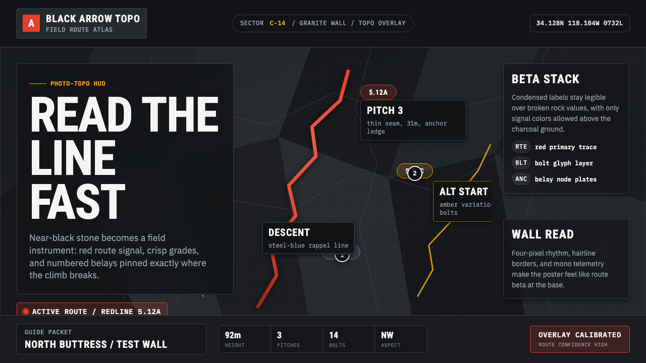 Climbing Topo GuideBeta at a glance. Red route telemetry cuts across near-black stone and conden…一眼读懂路线。红色拓扑线切过近黑岩面,紧缩标签如仪表读数。
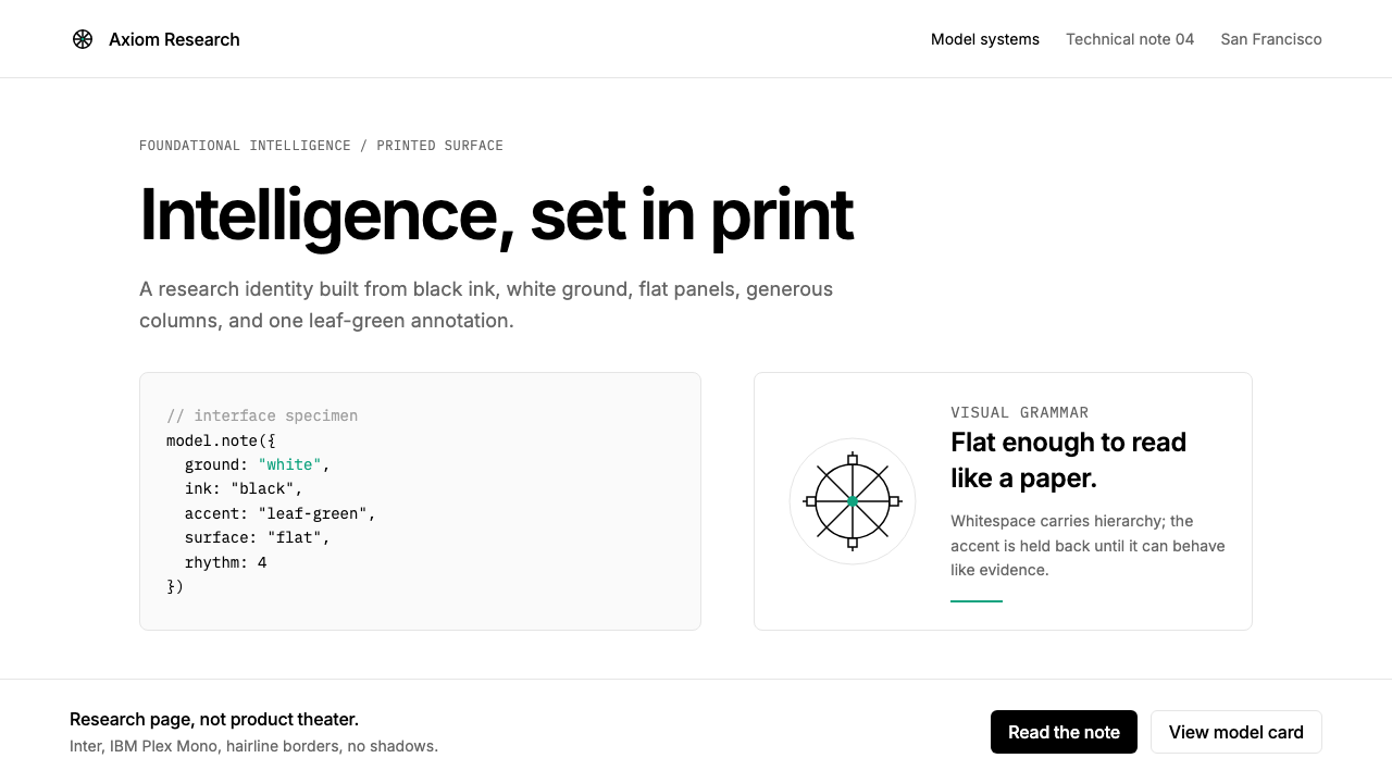 OpenAI 2024Research-grade restraint. Black-on-white Inter, flat code panels, one leaf-gr…研究级克制:黑白 Inter、扁平代码框、一枚叶绿色标记。
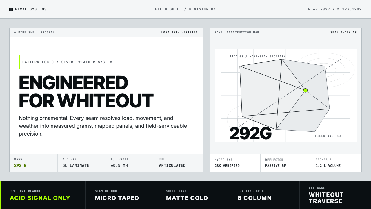 Arc'teryx Technical OutdoorEngineered, never ornamental. Glacier silver grid, mono specs, one acid-green…只讲工程,不作装饰。冰川银网格、等宽规格与一处酸绿信号。
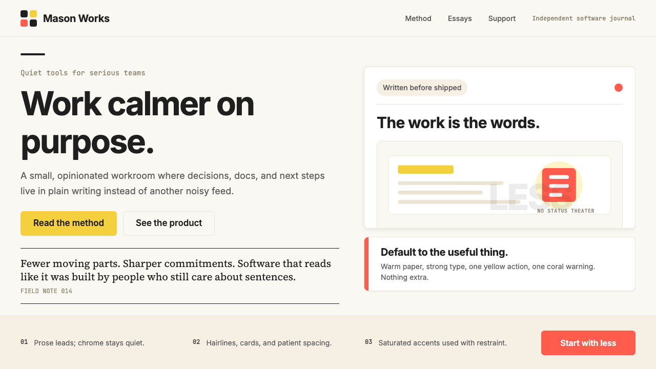 Basecamp / 37signalsQuiet craft, strong opinions. Cream paper, tight sans type, yellow and coral…安静却有主张。米色纸底、紧排无衬线、黄与珊瑚克制点题。
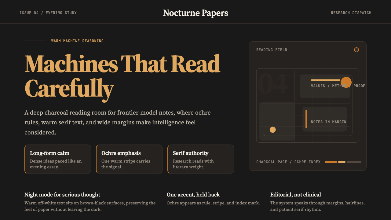 Claude / Anthropic Warm 2024Warm intelligence at night. Ochre rules and Source Serif glow on deep charcoa…夜读式温暖智能:深炭底、赭橙线与 Source Serif 发光。
 Flat Design iOS 7The day skeuomorphism died. Bright tints on white, hairline separators, frost…苹果一夜终结拟物化的革命:纯白留白、毛玻璃模糊面板、纤细到失重的字体——定义十…