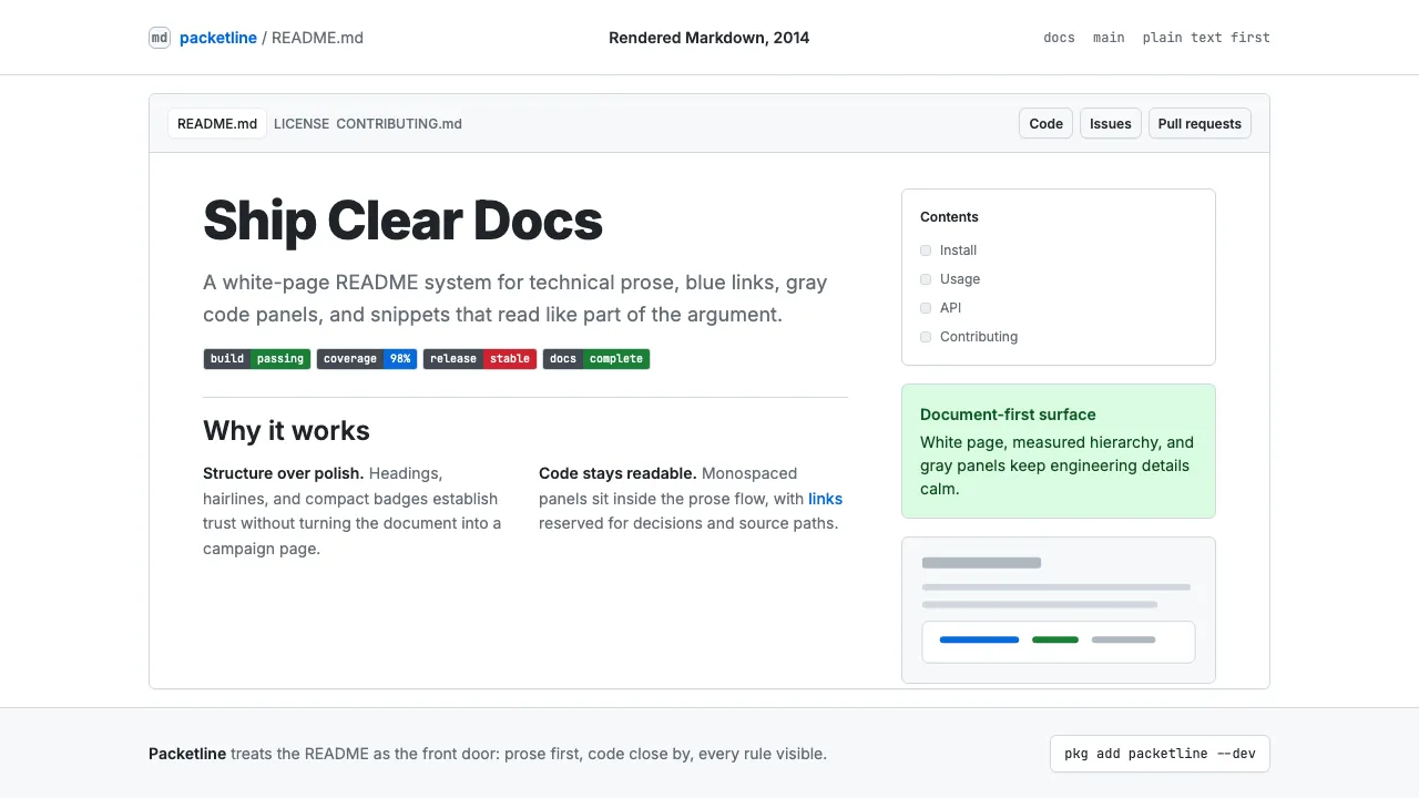
About GitHub README Markdown (2014)
The GitHub README is the universal welcome mat of open-source software. Its visual language — white page, blue links, gray code panels, monospaced snippets, and shields.io badge rows — became the default aesthetic for developer documentation across the 2010s and 2020s. It is rigorously flat, typographically restrained, and optimized for scannable technical prose.
This system captures that canonical rendering: Inter headings, JetBrains Mono code blocks, hairline section dividers, and the calm authority of well-structured Markdown rendered at a comfortable reading width.
- Origin
- San Francisco & Redmond, global open-source community
- Era
- 2004 Markdown invented; 2008 GitHub launched; 2014 GFM formalized; current through 2024
- Key figures
- John Gruber · Tom Preston-Werner · Sindre Sorhus · GitHub Primer team
- Movements
- open-source documentation aesthetics · 2010s developer-tool minimalism · Markdown-as-content-format
GitHub README Markdown (2014) design spec
Colors
Typography
The other 11 sections — buttons, cards, spacing, motion, techniques and more — open once you unlock. Download the DESIGN.md or send it to your AI in one click. Unlock once, yours forever.
Sign up nowStyles similar to GitHub README Markdown (2014)
Also inspired by brands & products, with a close feel.
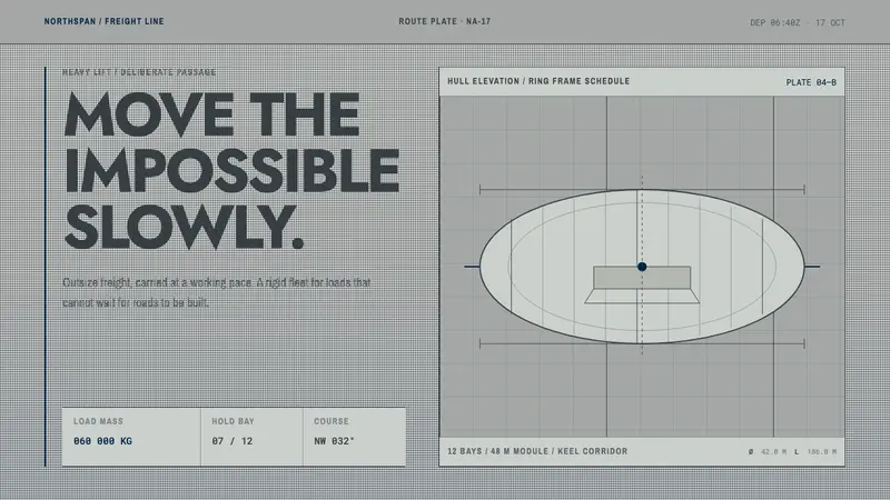 Hydrogen Airship FreightSlow freight is a capability. Matte aluminium grey, DIN grids, and a measured hull elevation.
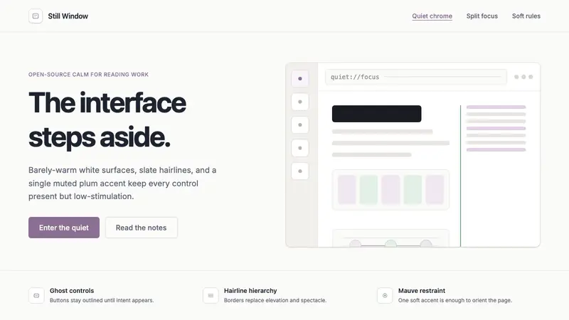 Zen BrowserSoftware steps aside. Warm white, slate hairlines, and muted plum carry the calm.
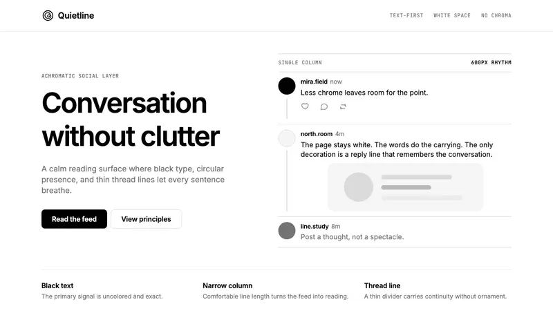 Threads (Meta)Restraint is the brand. Black Inter type, narrow feed, thin connectors, white air.
 OpenAI 2024Research-grade restraint. Black-on-white Inter, flat code panels, one leaf-green mark.