What is Synthetic Biology Vat Lab?
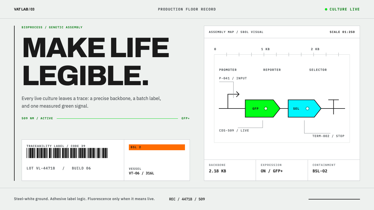
Synthetic Biology Vat Lab designs an interface the way the field documents itself: a steel-white schematic, a barcode record, and colour reserved for the only two things that glow.
Synthetic Biology Vat Lab in brief
Synthetic Biology Vat Lab is a design style assembled from two documents that synthetic biology cannot fake: the SBOL Visual schematic and the barcode batch label. SBOL Visual is a glyph language for drawing genetic designs, and the batch label is the adhesive strip that follows a lot through a production hall. Between them they describe the field's two lives: the design on paper and the material in the vessel.
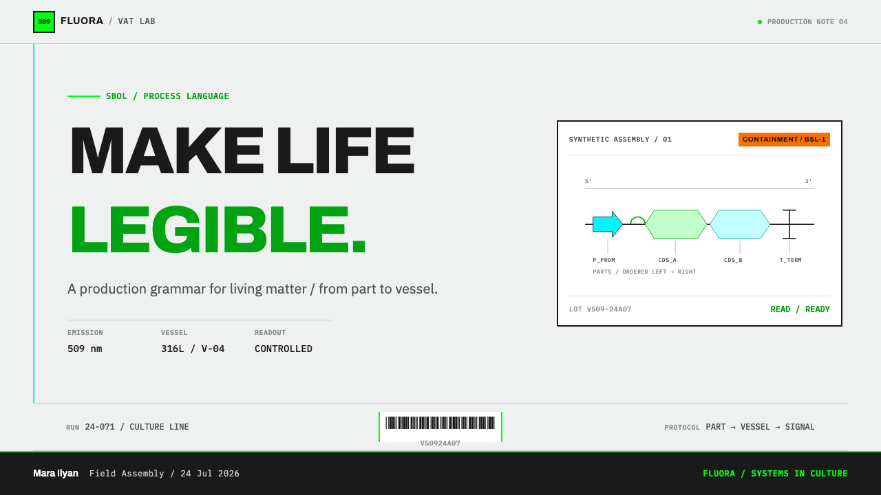
The schematic is a notation. Promoters are drawn as arrows, coding sequences as pentagons and terminators as T-bars, and they are strung from left to right along one backbone line, so a genetic design reads like an electronic circuit. The label is a record. It carries a strip of Code 39 bars, a lot number and a biosafety level, printed on adhesive stock and stuck to the thing it describes. One document says what the biology is meant to do; the other says exactly which batch is in front of you.
The style builds a whole interface from those two artefacts. The ground is the cool, steel-cast white of 316L vessels and schematic paper. Corners are square, lines are fine, and figures are set in monospace; nothing is rounded or soft. Only two saturated colours are allowed: fluorescence, taken literally from the measured glow of green fluorescent protein, and the fluorescent orange that safety law requires on hazard signage. The tagline says it plainly: life is legible.
Where does Synthetic Biology Vat Lab come from?
The era opens in 2003 with BioBricks, the effort at MIT to standardise biological parts so that a promoter or a coding sequence could be treated like an electronic component: documented, interchangeable and assembled in a predictable order. The idea that biology could be engineered from catalogued, standard pieces gave the field a vocabulary of parts, and it drew in an international community of researchers and students around the iGEM competition. The source material lists standard biological parts as the first of the movements behind the style, and the whole visual language descends from that ambition to make biology something you could read, copy and build from.
Standard parts demanded a standard way to draw them. A circuit diagram is legible to any electrical engineer, but early genetic designs were drawn as ad hoc cartoons that every lab invented for itself. The answer was SBOL Visual, a schematic notation for genetic circuits, issued in successive versions that the source material records as 2.1, 2.2 and 3.0. Herbert Sauro is among the people associated with that standardisation. The point of the notation is discipline: each glyph has a defined meaning, a design is read in one direction along a single line, and anyone who knows the code can read a design they have never seen before.
The other half of the style comes from the production hall. GMP bioprocess engineering, the regulated manufacture of biological products under good-practice rules, lives among stainless steel vessels, controlled rooms and paperwork that must account for every batch. The source material names 316L vessels as the reference for the style's cool white ground. A lot number, a barcode and a biosafety level are not decoration in such a place. They are how a batch is traced from vessel to shelf, and how anyone entering a room knows what is there.
Colour in this world is never aesthetic. The first saturated colour is fluorescence: green fluorescent protein is the reporter that makes a circuit's output visible, and its emission is taken literally from the measured physics. Roger Tsien is the figure whose work with fluorescent proteins gave biology that readout palette. The second is the fluorescent orange that OSHA 1910.145, the occupational safety standard in force since 1974, requires on hazard signage, paired with black lettering. Together they set the system's central rule: colour in the interface means signal or danger, and nothing else.
What defines the Synthetic Biology Vat Lab look?
Steel-White Ground
The page is a cool, slightly grey-blue white, the colour of brushed stainless steel and of schematic paper. It is clean without being clinical-bright, and it gives the interface a laboratory neutrality that makes everything else easy to see. Large areas of this ground stay quiet so that the glyphs, rules and signal colours carry the meaning.
Fluorescent Green
Green is the colour of the readout, taken from the measured glow of green fluorescent protein. It appears where something is active, reporting or complete: the trace along a backbone, a live status, a successful result. It is used like light rather than paint, in small amounts and with purpose. If everything glows nothing can be read, so the green stays a signal.
Hazard Orange
Fluorescent orange with black lettering is the colour the law requires on hazard signage, and the system respects that meaning absolutely. It is reserved for warnings, protection-level badges and danger notices, and it may never step across into ordinary interface. The restriction is the feature: because orange is never used casually, it is read instantly as a warning.
Glyph Language
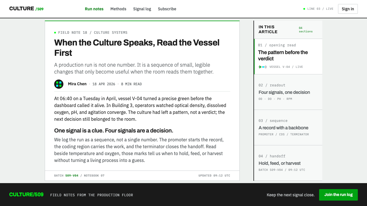
Promoters are arrows, coding sequences are pentagons and terminators are T-bars. Icons in this style are not illustrations but glyphs with defined meanings, drawn in the same fine line as everything else and repeated consistently. A new symbol needs a definition before it appears. The result is an interface in which the symbols are a grammar, not a mood.
The Backbone Line
A single line runs from left to right, and components are strung along it like parts on a circuit. This is the system's organising spine. Layouts follow it: sequences, pipelines and processes are drawn as modules on one line, read in one direction, with annotations hanging above and below. The backbone makes any process look like something that can be debugged.
The Barcode Record
A strip of bars, a lot number and a biosafety level make up the batch label, and the system treats that block as a model for how to present records. Identifiers are set in monospace, aligned in columns and separated by fine rules. A record page looks like an adhesive label on a vessel: dense, exact and traceable, with no storytelling around the facts.
Square and Fine
Corners are square, lines are fine and numerals are monospaced. Nothing is rounded for friendliness, and shadows are absent. Depth comes from alignment, spacing and thin boundaries. The surface feels like instrument paper: precise, plain and slightly cold, which is exactly how a trustworthy laboratory instrument is supposed to feel.
Who shaped Synthetic Biology Vat Lab?
A scientist based at MIT whose name is tied to BioBricks and the idea of standard biological parts. His contribution was a way of thinking: biology could be engineered from documented, interchangeable pieces. The style's reverence for catalogued parts and predictable assembly comes from that engineering mindset.
A bioengineer who has been a leading advocate for standardised, openly shared biological parts, and is associated with the iGEM community that grew around them. His work stands for the movement's public side: biology as a shared engineering discipline with common tools, not a collection of private tricks.
A chemist who shared a Nobel Prize in Chemistry for work on green fluorescent protein, and whose engineering of fluorescent proteins gave biology a palette of readout colours. He is the reason fluorescence can serve as an interface colour with a physical meaning: it is the visible answer to the question of whether a circuit is working.
A systems biologist associated with SBOL, the standard for describing biological designs. His field is the translation of biology into precise, shareable notation, which is the whole logic of the style's glyph language: a design that can be drawn the same way by anyone can be understood by everyone.
How do you use Synthetic Biology Vat Lab today?
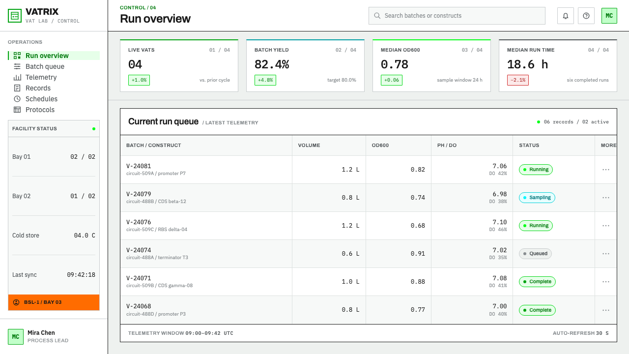
Synthetic Biology Vat Lab suits work that is technical, scientific or regulated, where users need to trust what they read. It fits biotechnology, laboratory software, data and analysis tools, compliance and quality dashboards, research reports, protocols and developer tools for science. It is strongest where traceability is part of the product's promise, and weakest where the brief asks for warmth or play.
For presentation slides, a cover can be a quiet steel-white sheet with the title set plainly and a single backbone line running beneath it, one fluorescent green mark on the line to indicate the thing that matters. Content slides work like schematic sheets: steps or modules strung left to right on one line with small captions above and below. Data slides behave like batch records, with monospaced figures aligned in columns, fine rules between rows, a barcode-like identifier strip in the corner, and green only for the series that is the signal. If a slide needs a risk or safety message, that is where hazard orange belongs, with black text.
On the web, dashboards fit the style naturally. A batch table has lot numbers in monospace, status shown by small defined glyphs, and a pipeline drawn as nodes on a backbone line. Green marks active or passing states; orange appears only in warnings and protection-level notices. Forms use square inputs with fine borders and monospaced entries. Pricing and plan pages should read like specification sheets, with columns of exact features. Never use orange as a promotional colour or as the main button, because that would teach users to ignore the warning.
In editorial and marketing work, the schematic is the hero. A white paper, a protocol or a platform page can open with a clean glyph diagram, then follow with captions set like figure legends. A barcode label motif makes a credible footer or section marker. Copy should be exact and unadorned. For biotech platforms, the persuasive message is transparency: the page itself should look like a record that can be checked.
The most common mistake is to let the signal colours spread. Green everywhere turns the interface into a neon 'cyber-lab' that no longer carries information, and orange used as decoration cheapens a colour that exists to protect people. Other errors include rounded friendly shapes, double-helix clip art, random icons in place of defined glyphs, and dark glowing backgrounds that imitate science fiction rather than a laboratory. Keep the ground quiet, define every symbol and let colour mean something.
Synthetic Biology Vat Lab — FAQ
What is SBOL Visual?
It is a standard schematic notation for drawing genetic designs. Each element, such as a promoter, a coding sequence or a terminator, has its own glyph, and the glyphs are strung along a backbone line from left to right. It plays the role for genetic circuits that circuit diagram symbols play for electronics, and the source material records versions 2.1, 2.2 and 3.0.
Why is orange restricted to warnings?
Because in the real world fluorescent orange with black lettering is the colour that hazard signage uses, prescribed by OSHA 1910.145, the safety standard in force since 1974. If the interface spends that colour on ordinary things, it loses its power to warn. Restricting it to warnings, protection-level badges and danger notices keeps the meaning clean.
Is the green really taken from green fluorescent protein?
Yes. The source material describes the green as the measured emission of green fluorescent protein, taken literally rather than chosen by eye. That is a deliberate stance: the interface's one signature colour has a physical origin and a meaning, which is why it should be used as a signal and not as a brand wash.
Does it work with a dark background?
The base interface is steel white, because the reference surfaces are vessels and schematic paper. A dark panel can work as an imaging view, since fluorescence reads best against darkness, but it should be a deliberate panel inside a light system rather than the default mode. A fully dark interface tends to turn into a neon laboratory cliché.
Do you need to understand biology to use this style?
Not in depth, but you do need to respect its structure. Treat the backbone line as the organising idea, define each glyph before using it, keep green and orange as signals and write precise copy. Products far from biology can borrow the discipline, for example for logistics, audit trails and quality systems, as long as traceability matters to them.
Related design styles
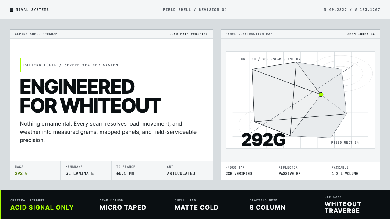 Arc'teryx Technical OutdoorEngineered, never ornamental. Glacier silver grid, mono specs, one acid-green…
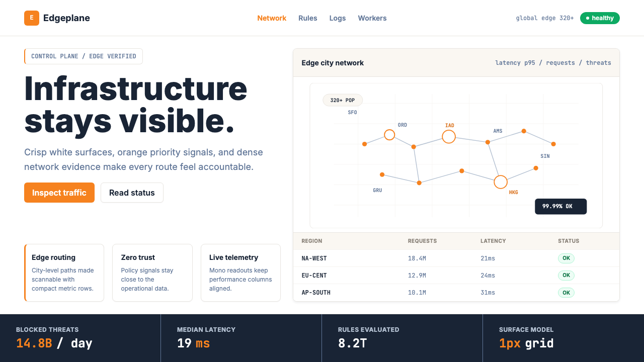 Cloudflare Orange EdgeOperational clarity wins. Orange accents, hairline grids, and mono metrics ma…
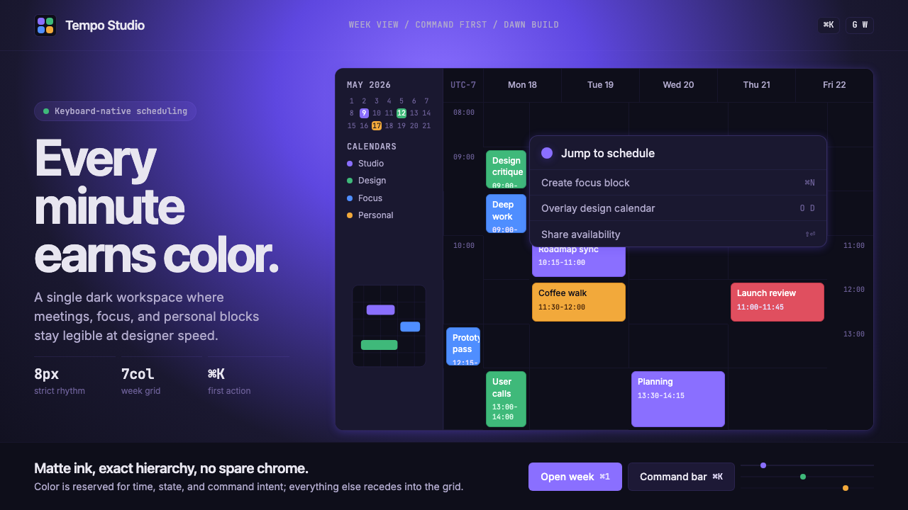 Cron CalendarDesigner-tech restraint. Purple wash, ink grid, mono shortcuts, surgical even…
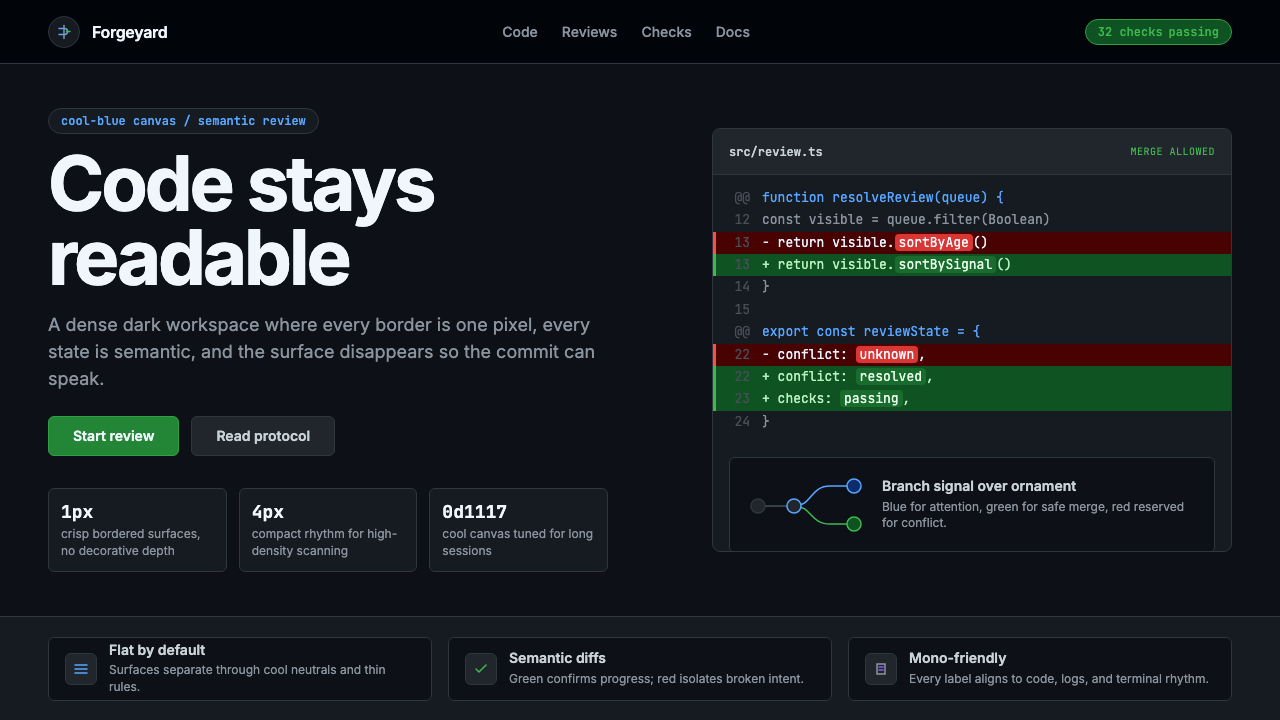 GitHub DarkCode-first darkness. Cool-blue canvas, 1px borders, green/red diff lines.
 Linear 2024Precision down to the millisecond. Near-black, indigo-violet accents, Inter D…
 Lunar Regolith SettlementMoonlight without the myth. Regolith gray, hard terminators, and a strict tec…