What is De-extinction Lab?
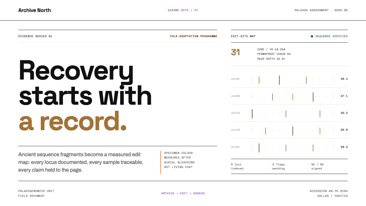
De-extinction does not look like a jungle. It looks like a white-floored laboratory where resurrection is handled as paperwork — edit maps, custody sheets and numbered assessments, all in black on white.
De-extinction Lab in brief
The De-extinction Lab style borrows its look from the real working world of genome-editing companies that aim to bring back lost species such as the woolly mammoth. That world is not the lush prehistoric landscape of film. It is a Dallas warehouse converted into a laboratory, with glossy white floors, overhead ducts painted black, and a steady flow of white paper: edit-site maps for the Asian elephant genome, chain-of-custody sheets for permafrost cores, and tundra release assessments with numbered criteria and a signature line at the bottom.
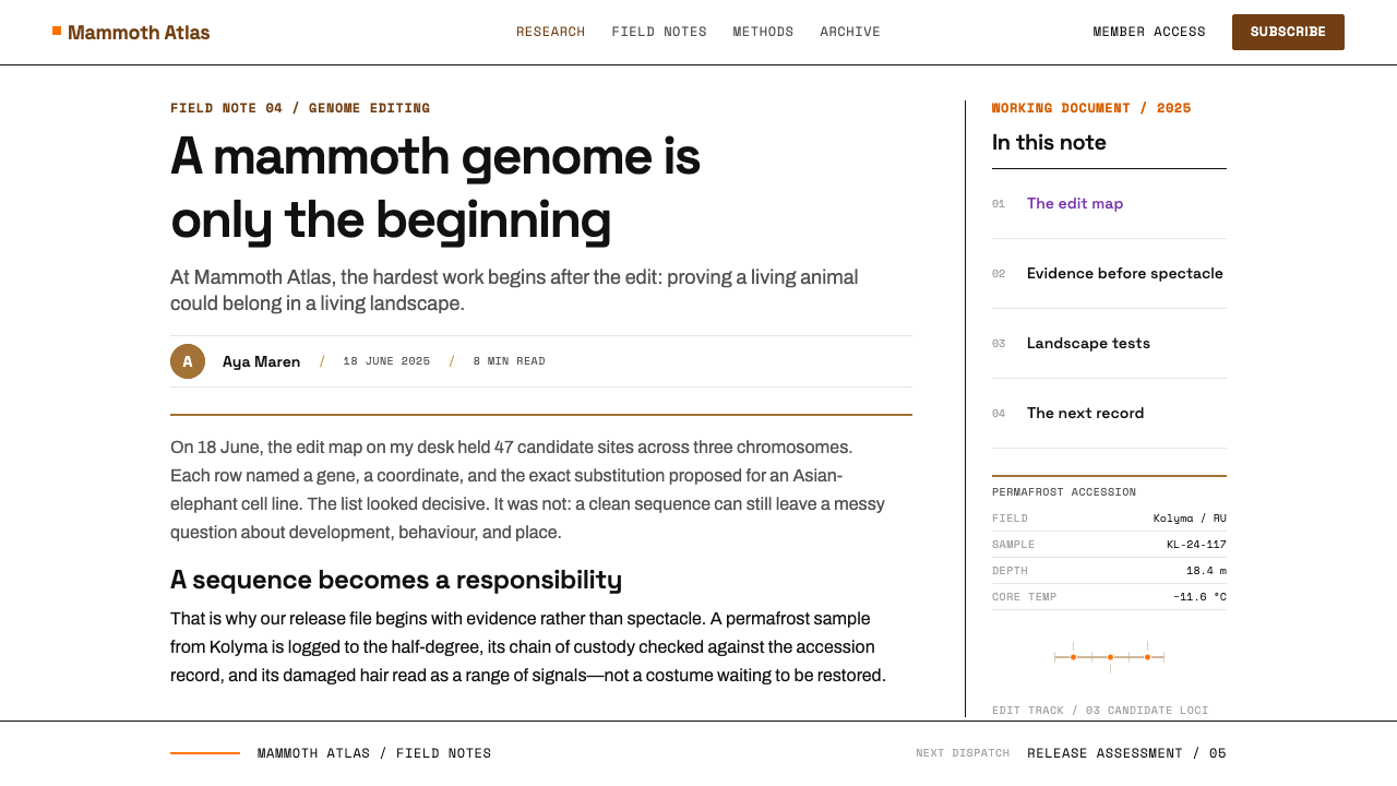
The visual language takes that literally. The page is pure white, the type is black, and structure is drawn with hairline rules. A violet marks links and an orange marks emphasis, and those two are nearly the only departures from monochrome. Corners are barely rounded, nothing is tinted or softened, and no texture or gradient is allowed to suggest atmosphere. Coordinates, identifiers and timestamps are set in monospaced type, so the page reads like a scientific paper and also like a lab record that has not yet been stamped.
The result is an aesthetic of evidence. Where a futuristic biotech brand might reach for glowing helix graphics, this style insists that resurrection is first of all a documentation problem: every edit has to be located, every sample traced, every release justified. The tone is sober, procedural and quietly serious, which is exactly why it feels credible.
Where does De-extinction Lab come from?
The raw material of this field is very old. The species in question lived in the Late Pleistocene, and the DNA that scientists work from is recovered from frozen remains preserved in permafrost, including samples sourced from Yakutia in Siberia. Palaeogenomics, the discipline of reading the genomes of extinct animals from ancient tissue, is what makes any of it thinkable. Without it, there would be no sequence to compare, no list of differences, and no target for editing. Much of the style's documentary feel comes from this origin: the first thing a lab does with a permafrost core is to record where it came from and who has handled it.
The modern commercial effort is recent. Colossal was founded in 2021, based in Dallas, with the goal of recreating features of lost species, beginning with the woolly mammoth. Its method relies on CRISPR germline editing: using the genome of the Asian elephant, the mammoth's closest living relative, as a template and introducing targeted changes to recover cold-adapted traits. In 2025 the company announced an edited 'woolly mouse', a small-animal demonstration of the broader idea. The work is staged as a sequence of verifiable steps, which is why its public face is so document-heavy.
A third thread is the idea of Pleistocene rewilding, the proposal that restoring large grazing animals could help rebuild the cold grassland ecosystems of the tundra. That concern is why the paperwork includes release assessments: if an animal were ever to leave the laboratory, someone has to decide, against numbered criteria and with a name signed at the bottom, whether the ground it enters is ready. The style carries that sense of procedural caution into everything it draws.
Even the system's single warm colour has a historical correction built into it. The orange-brown is measured off museum mammoth hair, but that colour is partly a burial artefact: after thousands of years in the ground, pigment fades, and for most animals the living coat was darker. The palette therefore does something unusual. Its one warm note is a reminder that the evidence itself needs interpretation, and that the specimen on the table is not the animal that once walked.
What defines the De-extinction Lab look?
Pure White Page
The ground is plain white, as clean as the laboratory floor and the stacks of paper. There is no cream, no tint and no texture. The white is not a neutral absence but a working surface: it says that anything printed on it is a record, and records must be easy to read and easy to check.
Black Type and Hairline Rules
Text is black and structure is drawn with the finest possible rules, which divide the page the way a form or a table in a paper does. Boxes are defined by their outlines rather than by filled backgrounds. The effect is of precision without decoration, and the density of thin lines becomes a visual texture of its own.
Violet Link, Orange Emphasis
Two accent colours do all the signalling. Violet is reserved for links and interactive elements, and orange is reserved for emphasis. Everything else stays black and white. Because the accents are so few, each one carries real information, and a reader learns within seconds what is clickable and what the page considers important.
Specimen Brown
The only warm tone in the system is an orange-brown measured from museum mammoth hair. It is used sparingly, as a data highlight or a specimen marker, and it should feel like something photographed under laboratory light rather than a decorative brand colour. Its provenance as a faded burial colour gives it an honest, slightly worn quality.
Monospaced Data
Coordinates, identifiers, edit positions and timestamps are set in monospaced type. Characters line up in columns, so numbers can be compared at a glance, and the lettering carries the feel of terminal output and lab printouts. Prose remains in a plain, readable text face, and the contrast between the two signals when the page is talking and when it is recording.
Flat and Barely Rounded
Nothing is tinted, softened or glossed. Corners are only the slightest bit rounded, shadows are absent or almost invisible, and there are no gradients. Buttons and cards look like printed form fields. This flatness keeps attention on content and avoids the sense of sales polish that would undercut the documentary mood.
Numbered, Signed Structure
Content is organised the way regulated documents are: numbered criteria, section references, date lines and a signature block. The layout expects to be audited. Even when the information is marketing or editorial, giving it numbered sections and visible reference marks makes it feel accountable.
Who shaped De-extinction Lab?
A geneticist and one of the best-known figures in genome engineering, Church is a co-founder of Colossal and a central scientific name behind the mammoth project. His association with the work shows the field's roots in academic genetics and the tools of gene editing, rather than in entertainment or spectacle.
Lamm is the entrepreneur who co-founded Colossal in 2021 and leads it as chief executive. His role links the scientific programme to funding, public communication and company-building, which explains why the project presents itself through carefully controlled documents, reports and web pages.
Shapiro is an evolutionary biologist and ancient-DNA specialist associated with Colossal's science leadership. Her field of palaeogenomics is the discipline that reads genomes from preserved remains, and her prominence in it underlines that de-extinction depends on rigorous comparison of ancient and living sequences.
Dalén is an evolutionary geneticist known for ancient-DNA research on mammoths. His work, based on material from frozen Ice Age remains, supplies part of the knowledge about mammoth genomes on which the editing targets depend, and it represents the permafrost-to-sequence chain that the style's custody sheets depict.
How do you use De-extinction Lab today?
The De-extinction Lab style is a light, document-driven look for subjects that need to feel rigorous. Its core rule is that the page behaves like a controlled record: white ground, black text, thin rules, two accent colours, and monospaced type wherever the content is data. Applied with that discipline, it makes even ambitious claims look careful.
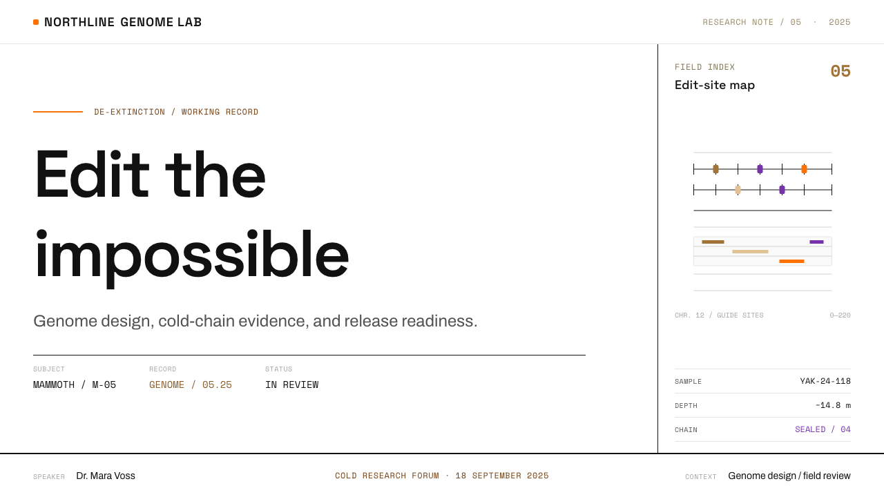
For presentation slides, begin with a nearly bare cover: a white field, a large black title set flush left, a thin rule beneath it, and a small monospaced line carrying a date or reference number. Content slides should read like numbered pages of a report, with clear section references and one orange or violet emphasis per slide at most. Data slides are the strongest case: tables with hairline rows, monospaced figures aligned in columns, and charts drawn with thin black lines and a single specimen-brown series.
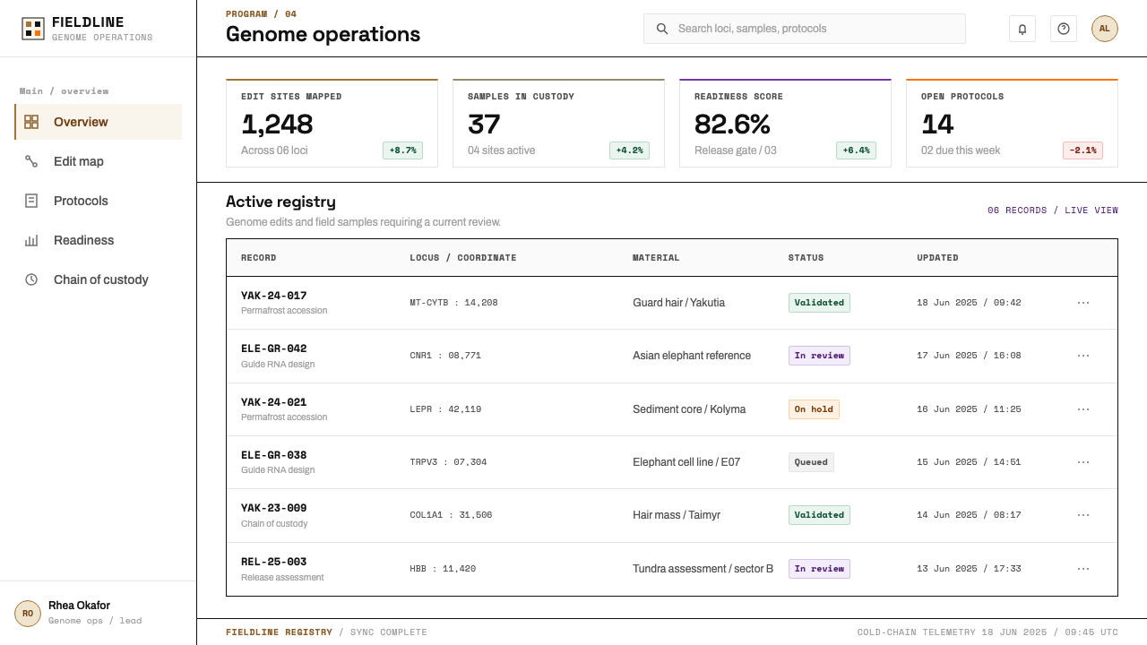
For web interfaces, it suits research platforms, biotech and life-science sites, scientific dashboards, regulatory and compliance tools, lab notebooks, and any product that wants to be trusted before it is loved. Use bordered inputs and tables, restrained buttons with minimal rounding, violet for links, and monospaced text for identifiers, timestamps and coordinates. Avoid shadows, tinted panels and imagery used purely for atmosphere.
For editorial and marketing work, treat each article as a report: numbered sections, a methods or sources note, a visible date, and captions in monospaced type. Photography of specimens, samples and instruments works well when it is shown in its own bordered frame, with a short caption giving its source. A signature or approval line, even a symbolic one, adds a surprising amount of credibility to a landing page.
The most frequent mistakes are adding atmosphere and adding colour. Gradients, glowing helix graphics and dramatic photography all work against the style's central claim that this is evidence, not fantasy. Likewise, using violet and orange as large background fills turns signal into decoration. Keep the accents small, keep the page white, and let the thin lines and the data do the persuading.
De-extinction Lab — FAQ
What does de-extinction mean in this context?
It refers to efforts to recreate features of species that no longer exist, using ancient DNA recovered from preserved remains and modern genome editing. The best-known example here is the woolly mammoth, whose source material comes from the Late Pleistocene and from permafrost in Siberia. The approach does not clone a mammoth from scratch; it edits a living relative, the Asian elephant, toward mammoth traits.
Why does the style look like paperwork rather than science fiction?
Because the real working environment looks like paperwork. The laboratory is a warehouse with white floors and black-painted ducts, and the output is edit-site maps, custody sheets and numbered release assessments. The style chooses to reflect that reality, which makes it more credible than a visual language borrowed from films.
Where does the orange-brown come from?
It is measured from museum mammoth hair. That colour is partly a burial artefact, because the pigment fades after thousands of years in the ground, and for most animals the living coat was darker. Using it as the single warm tone gives the palette a built-in reminder that specimens need interpreting.
Can this style be used with a dark background?
It is built on a white page, and its logic is that of a printed record, so a dark inversion changes its character. Thin black rules and black type would need to be swapped for light ones, and the orange and violet would behave differently on a dark field. If you need dark mode, treat it as an adaptation: keep the thin rules, the monospaced data and the sparse accents, but accept that it will feel less like paper.
What kinds of products suit it best?
Products that need to appear careful and verifiable: life-science and biotech companies, research tools, data-heavy dashboards, compliance and audit software, scientific publishing, and explanatory journalism about science. It is less suited to playful consumer apps or products that depend on warmth and visual richness.
Related design styles
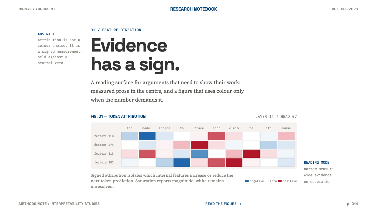 AI Alignment LabEvidence has a sign. Narrow serif prose yields to a red-blue attribution matr…
 Cargo Collective PortfolioInterface disappears. White space, full-bleed blocks, mono metadata and hairl…
 OpenAI 2024Research-grade restraint. Black-on-white Inter, flat code panels, one leaf-gr…
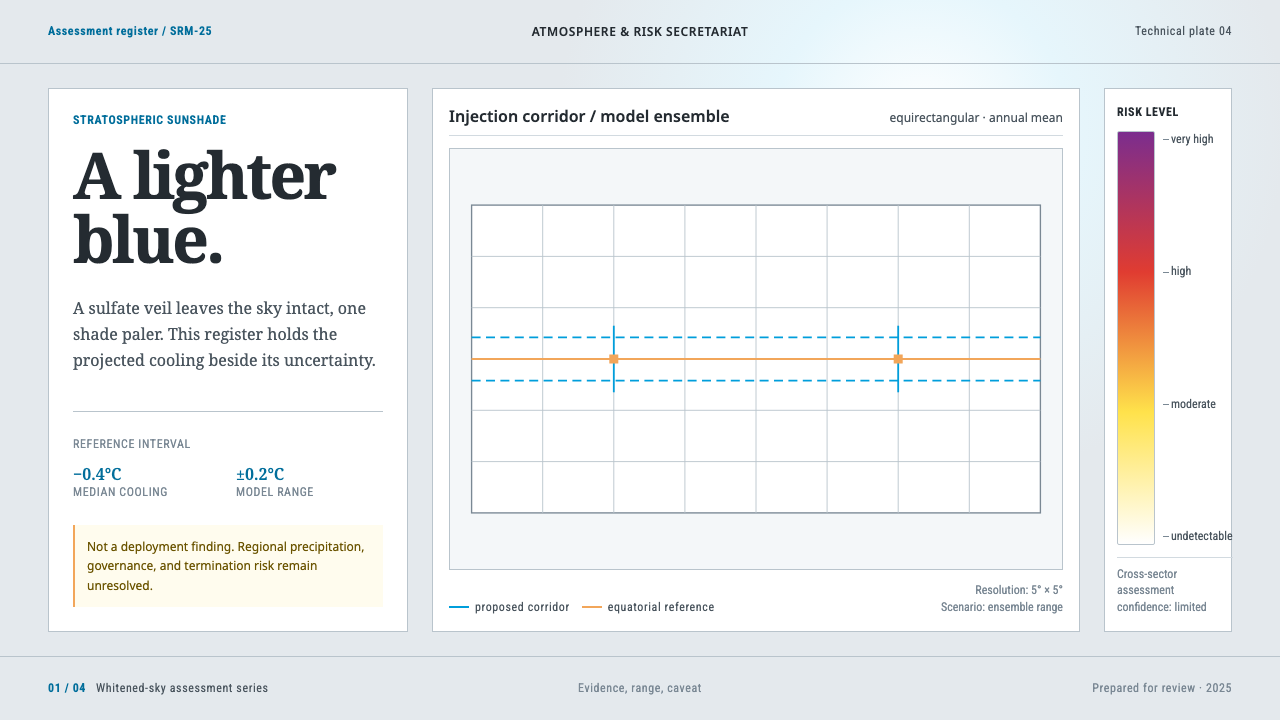 Stratospheric SunshadeUncertainty is the message. Pale sky stock, UN blue corridors, and an IPCC ri…
 Basecamp / 37signalsQuiet craft, strong opinions. Cream paper, tight sans type, yellow and coral…
 Claude / Anthropic Warm 2024Warm intelligence at night. Ochre rules and Source Serif glow on deep charcoa…