What is Frieze Art Fair?
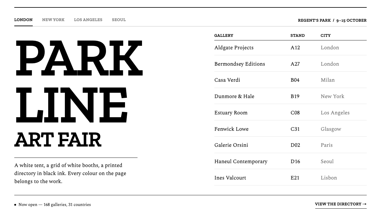
Frieze hands all of its colour to the art: a black-and-white identity of tight slab capitals, a warm text serif and a hairline directory grid, built to look like the fair's own printed catalogue.
Frieze Art Fair in brief
The Frieze Art Fair style is the visual identity of a contemporary art fair that began in a white tent in a London park. It is a strictly black-and-white system: tightly set slab capitals for titles, a warm text serif for everything that has to be read (gallery names, stand numbers, captions), and a layout organised as a ruled directory. The page has no colour of its own, because the colours and textures of the work are meant to supply it.
The reasoning is the same as the fair's architecture. A fair is hundreds of galleries showing wildly different work under one roof, and the container has to be neutral enough to hold all of it. White booths, white walls and a printed directory in black ink set the template for the identity: the system behaves like a sheet of paper on which any artwork can be laid down. Images sit in the grid as plain rectangles, without borders, rounded corners or shadows, and controls are drawn from rules, outlines and type.
What separates the style from generic minimalism is its typographic character. The slab capitals are blunt and weighty, closer to a sign than to a book, while the serif that carries the reading text is warm and humane. The contrast between those two voices, institutional announcement on one side and patient reading on the other, gives a monochrome system its personality. The same type system is shared by the fair's editions in London, New York, Los Angeles and Seoul, so the identity travels without changing.

Where does Frieze Art Fair come from?
Frieze Art Fair held its first edition in 2003 in Regent's Park, London, under a white tent. Its co-founders, Amanda Sharp and Matthew Slotover, are listed among the key figures behind the brand. From the start the visual language was organised around one conviction: the colour belongs to the art. The tent was white, the booth walls were white, and the guide and the printed directory were black on white.
The London design studio Graphic Thought Facility is also named among the key figures of the system, which places the identity in the tradition of British graphic design for cultural institutions, where a restrained typographic voice serves the content instead of competing with it. In that tradition the identity is not a logo with a campaign attached; it is a set of habits (how a title is set, how a list is ruled, how a caption sits) that make every printed and on-screen object recognisably the same hand.
In 2021, for the brand's thirtieth anniversary, the studio Pentagram redrew the identity and wrote the instinct into a rule: the brand uses only black and white. Luke Prowse is among the key figures named for the current system. The redesign did not add a flourish or a signature colour; it formalised what the fair had always done. The result is a bespoke-typeface identity, a type system made specifically for the brand, in which tight capitals and a warm text serif replace a colour palette as the carriers of recognition.
It helps to place the style in design history. Art-fair branding has its own conventions: neutral containers, institutional typography, the visual manners of the gallery. Frieze's identity descends from the International Typographic Style in its grid and its restraint, but it departs from the Swiss tradition by pairing heavy, sign-like capitals with a text serif, and by applying all of it to an event that actually takes place in a tent. The fair has editions in London, New York, Los Angeles and Seoul, and one type system runs across them. That portability is the strongest evidence that the identity works: it is recognisable without relying on a colour, an image or a city.
What defines the Frieze Art Fair look?
Black and White Only
The palette is limited to black and white by rule, not by accident. Everything the page needs to say, from titles to buttons to filters, is made from ink on a pale ground. This hands the colour budget entirely to the artworks: a reproduced painting is the loudest thing on the screen, and because nothing else competes, it reads more strongly than it would in a colourful interface.
Tight Slab Capitals
Titles are set in slab-serif capitals with tightened spacing. The result is dense, blunt and sign-like, a headline voice that sounds institutional rather than decorative. Setting titles in capitals keeps them short and declarative, and the tight spacing makes each word read as one block, which gives the page a few strong anchors without needing size or colour.
A Warm Text Serif
Everything that must be read at length, such as gallery names, stand numbers and captions, is set in a warm, readable serif. This is the quiet half of the type system. Its humane proportions soften the sharpness of the capitals and make long lists of names tolerable to scan, which matters in a product whose main content is hundreds of proper nouns.
The Hairline Directory
The page is organised as a strict directory: ruled rows, left-aligned columns, generous gaps. The format borrows from the printed guide a visitor carries through the aisles. Fine lines separate entries instead of boxes or fills, so a long list stays calm, and the eye moves down it the way it moves down a catalogue index.
Images as Plain Rectangles
Artwork thumbnails sit in the grid as unadorned rectangles: no frame, no rounded corner, no drop shadow, no overlaid effect. The page treats an image the way a wall treats a hung work, giving it a position and leaving it alone. This also makes the reproductions behave consistently, whatever their proportions or subject.
Controls Made of Type and Line
Buttons are a line of uppercase label with a black rule beneath. Filter tags are plain rectangular boxes. There are no filled pills, no hover glows and no icon-heavy toolbars. Interaction is signalled by changes in the line and the type, which keeps the interface in the same quiet register as everything else on the page.

Who shaped Frieze Art Fair?
The co-founders of Frieze, named among the key figures behind the brand, whose fair first opened in 2003. The identity's central idea, that colour belongs to the work and the container stays neutral, reflects the position of a fair that has to host many galleries at once without favouring any of them.
A London design studio named among the key figures of the system. Its place in the story situates Frieze's identity in British graphic design for cultural institutions, where typography does the work of tone and the interface stays quiet so that exhibited work can be loud.
The design studio that redrew the identity in 2021, for the brand's thirtieth anniversary, and wrote the long-standing instinct into a rule: only black and white. Its work turned a habit into a system with a bespoke type family, which is what lets the identity stay consistent across editions in four cities.
Named among the key figures of the current identity system, which dates from the 2021 Pentagram rebrand. His place in the list is a marker of the move from an instinct to a formal rule: from a fair that happened to look black and white to a brand that is, by definition, only black and white.
How do you use Frieze Art Fair today?
Frieze is the right reference when the content is visual and varied, and the interface has to behave like a gallery wall: portfolios, archives, listings of artists or works, event guides, directories of exhibitors, any product whose main subject is a catalogue of proper nouns and images. Its strength is neutrality with character. Its weakness is that it gives you no colour to lean on.
For presentation slides, a cover can be a white field with a title in tight slab capitals and a short line in the text serif beneath it, nothing more. Content slides work as directories: ruled rows with left-aligned columns, names in the serif, labels in capitals. Image slides place the picture as a plain rectangle on the grid, with a caption in the serif underneath. Data slides suit tables; if a chart is needed, draw it in black line and black fill on white, using hatching or direct labels instead of colour.
For web interfaces, it suits portfolios, event schedules, exhibitor lists, collection browsers and publishing sites. Build lists as ruled rows, filters as square outlined boxes, and buttons as capital labels over a black rule. Pricing or ticketing pages can be treated as directory tables, with each tier as a row. Because the system has no colour to signal state, use underlines, rules and inversion (a black block with white text) for hover and selected states.
For editorial and marketing work, the style is a good fit for exhibition guides, press releases, gallery newsletters, programme books and invitations. Set titles in the capitals, running text in the serif, and let one strong image per spread supply the colour. Because the system is portable across editions, it is also a useful model for any multi-location brand that wants a single identity in several cities.
The most common mistake is to treat black and white as a starting point and add an accent colour 'for warmth'. A single blue link colour or tinted banner changes the rule from 'the work supplies colour' to 'the brand supplies colour', and the system loses its reason for being. A second mistake is using the capitals for body text, which makes long reading tiring, or setting the text serif too small. Keep the capitals for titles and short labels only, and give the serif room.

Frieze Art Fair — FAQ
Why does Frieze use only black and white?
Because a fair's job is to show other people's work. White booths and white walls let each gallery's art supply the colour, and the identity follows the same logic. When Pentagram redrew the identity in 2021 for the thirtieth anniversary, it made the instinct explicit: the brand uses only black and white.
What are slab capitals?
Slab serifs are letterforms with thick, block-like serifs and little variation in stroke thickness. Set in capitals with tightened spacing, they look heavy and sign-like. In this system they are used only for titles, where a short, declarative voice is needed; everything meant for sustained reading uses the text serif instead.
Is this the same as Swiss Style or minimalism?
It is a descendant of the International Typographic Style in its grid and restraint, but it departs from it in two ways. It pairs heavy slab capitals with a warm serif rather than relying on a single neutral sans-serif, and it applies the discipline to an art-fair setting where the reference is the printed directory and the white booth. Generic minimalism removes things; this system removes colour specifically so that the content can supply it.
Can I add one accent colour?
You can, but know what you give up. The identity's rule is that colour comes from the work. If you must signal state, prefer underlines, rules or black-on-white inversion. If you still need a colour, restrict it to a single functional use, such as an error message, and keep it away from headings, backgrounds and buttons.
How does it work across several cities and languages?
The type system is shared across the fair's editions in London, New York, Los Angeles and Seoul, which shows how portable the approach is: it relies on structure (capitals, serif, rules) rather than on local colour or imagery. When localising, keep the same hierarchy and choose scripts of equivalent weight and warmth for the two roles.
Related design styles
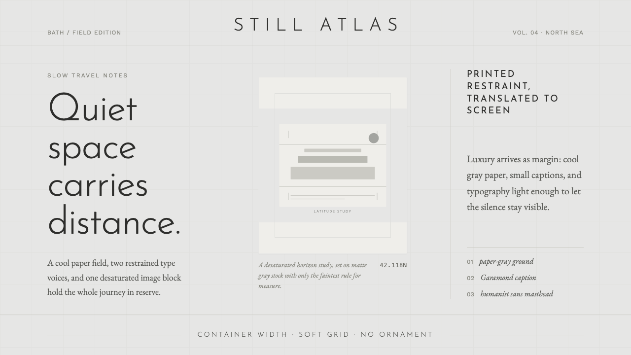 Cereal Magazine MinimalLuxury as margin. Cool paper-gray, light sans, and Garamond captions hold the…
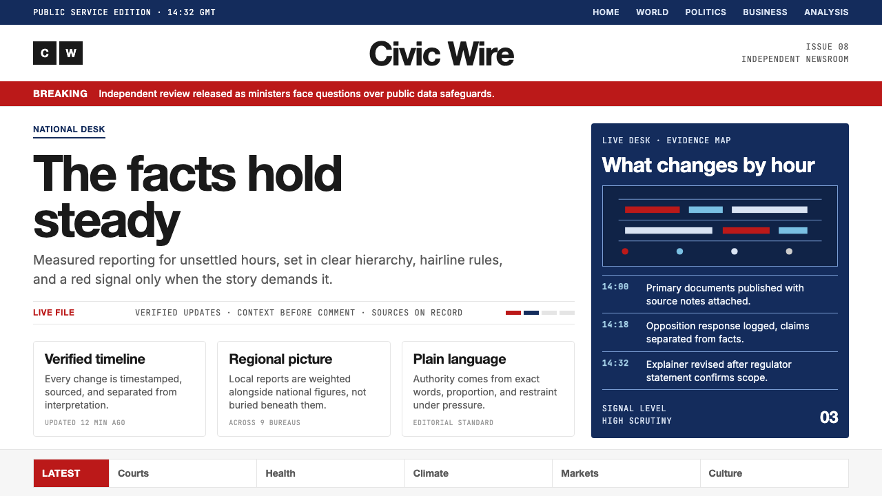 BBC NewsPublic trust, stripped bare. Red alerts, deep navy and hairline grids make ur…
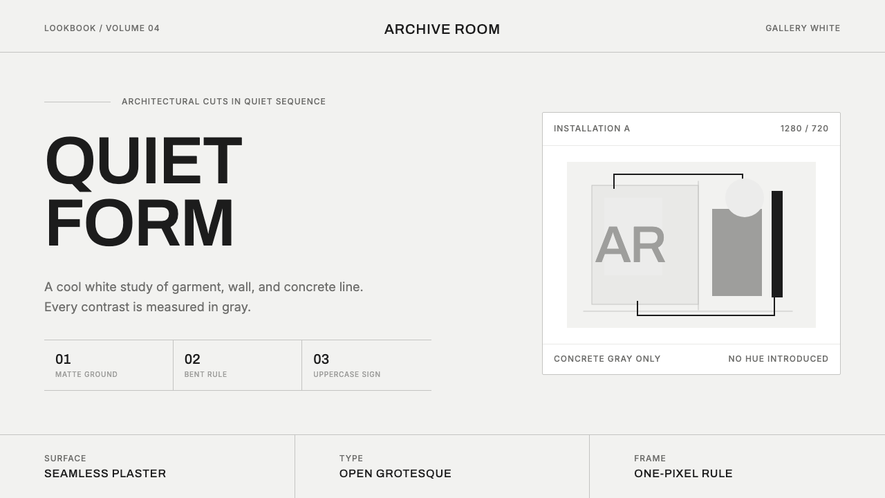 COS Gallery MinimalSilence has structure. Cool gallery white, Archivo uppercase, and concrete-gr…
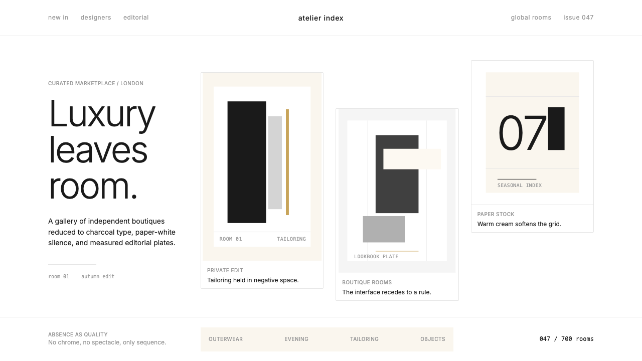 FarfetchLuxury as absence. Charcoal type, white canvas, and hairline editorial plates.
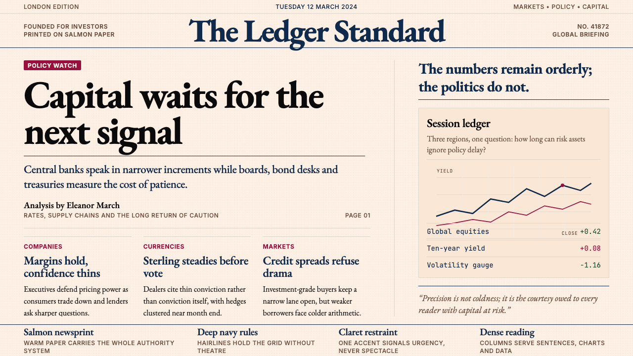 Financial Times (Pink Paper)Authority on salmon paper. Deep navy rules and claret accents discipline dens…
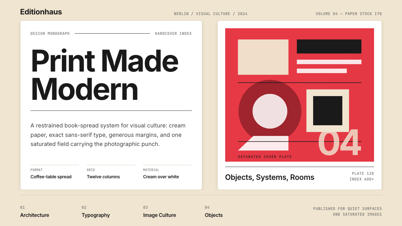 Gestalten Design BookCoffee-table calm. Cream paper, tight sans, one saturated block, and a strict…