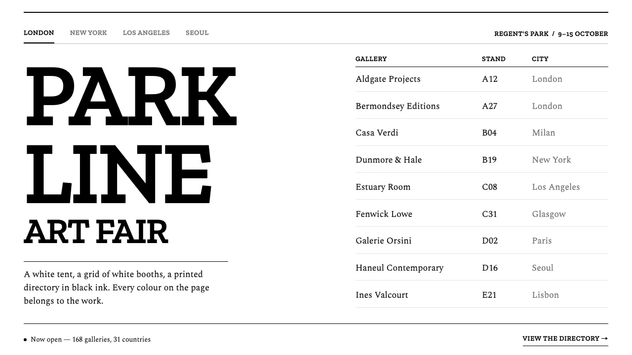
About Frieze Art Fair
Frieze is a white tent in a park, a grid of white booths, and a printed directory in black ink. The identity follows the same logic: a black-and-white palette so that the colours and textures of the work carry the page.
This system pairs tightly set slab capitals for titles with a warm text serif for everything that has to be read — gallery names, stand numbers, captions. Images sit in the grid as plain rectangles. Controls are rules, borders and type.
- Origin
- London, United Kingdom (with New York, Los Angeles and Seoul editions)
- Era
- 2003 first fair, Regent's Park; current system from the 2021 Pentagram rebrand
- Key figures
- Amanda Sharp · Matthew Slotover · Graphic Thought Facility · Luke Prowse
- Movements
- art-fair branding · International Typographic Style descendants · bespoke-typeface identity systems
Frieze Art Fair design spec
Colors
Background
Surface
Primary
Secondary
Accent
Text
Typography
Zilla SlabHeadings
SpectralBody
ui-monospaceMono
Unlock for 1 credit
The other 11 sections — buttons, cards, spacing, motion, techniques and more — open once you unlock. Download the DESIGN.md or send it to your AI in one click. Unlock once, yours forever.
Sign up nowHave an account? Sign in
Styles similar to Frieze Art Fair
Also inspired by brands & products, with a close feel.
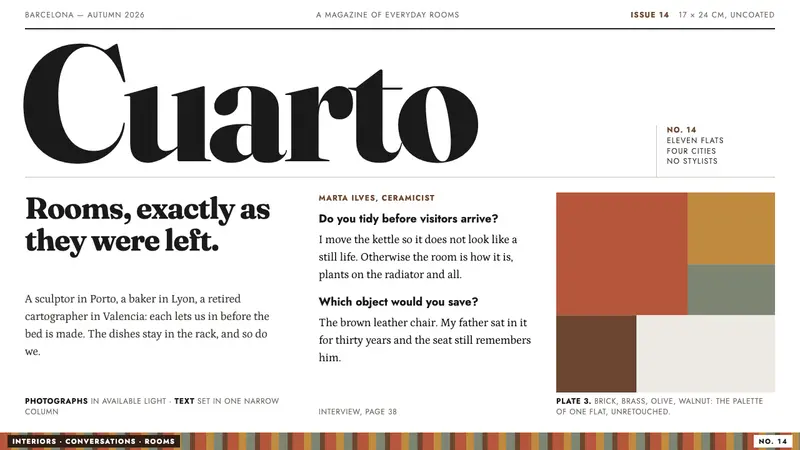 ApartamentoRooms left as they were found. Heavy Fraunces over plain white, Jost captions, walnut ink.
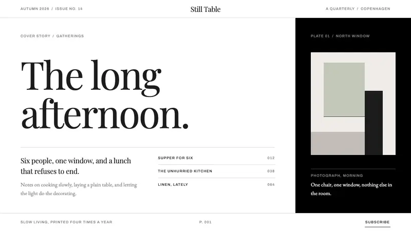 KinfolkA quarterly of mostly margin. Hairline serif on true white, broken by one full-bleed black page.
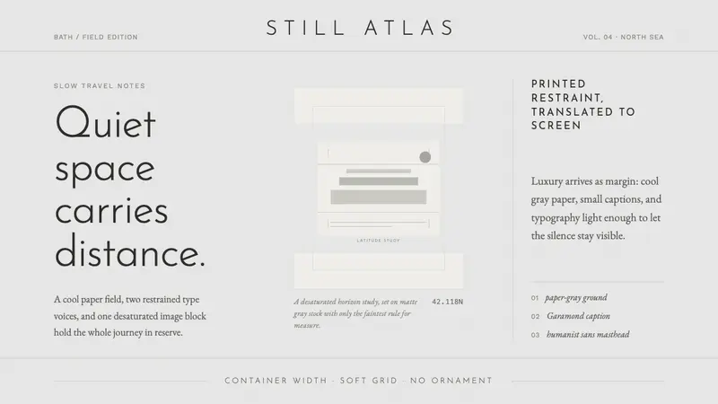 Cereal Magazine MinimalLuxury as margin. Cool paper-gray, light sans, and Garamond captions hold the silence.
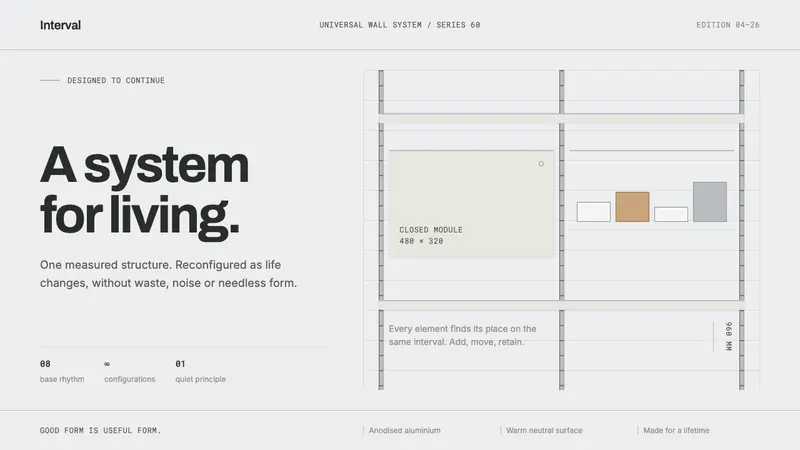 Vitsœ 606 ShelvingQuiet form, built to endure. Brushed silver rails impose rhythm on cool plaster and open space.