What is Cereal Magazine Minimal?
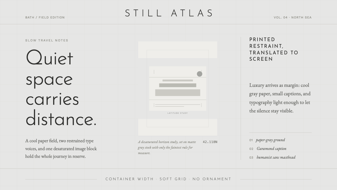
Cereal treats luxury as a spatial decision: cool paper-gray, quiet type, restrained images, and margins wide enough to let thought settle.
Cereal Magazine Minimal in brief
Cereal Magazine Minimal is a contemporary editorial language built around silence. Its defining materials are a cool soft paper-gray ground, muted mid-gray type, calm image blocks, and generous margins that make every element feel deliberate. The page does not compete for attention; it gives attention room to form.
The system comes from Cereal, a Bath-based travel-and-style magazine founded in 2012 by Rosa Park and Rich Stapleton. Its visual character joins contemporary minimalist editorial design with slow-travel print aesthetics: landscapes are cool and desaturated, typography is light and human, and composition depends on restraint rather than visual spectacle.
Cereal reads the printed page as an interface. A humanist sans carries the main voice, while Garamond appears in refined captions and supporting editorial details. The result is neither stark nor decorative. It is a measured environment where spacing, tone, and pacing communicate as much as the words and images do.

Where does Cereal Magazine Minimal come from?
Cereal was founded in Bath in 2012 by Rosa Park and Rich Stapleton as a travel-and-style magazine. Its origin matters because the publication treats travel not as a catalogue of attractions but as a quiet editorial experience. The visual system gives that attitude a physical form: images remain calm, text remains light, and the page preserves enough silence for place and observation to feel considered.
The magazine belongs to a contemporary minimalist editorial tradition, but its minimalism is not simply the removal of decoration. It is a method of allocating emphasis. Cool paper-gray establishes a soft, high-end white; muted gray type avoids the severity of pure black; and spacious margins turn absence into an active compositional material.
Cereal also draws on slow-travel print aesthetics. This means the page favors duration over urgency and atmosphere over spectacle. Cool, desaturated landscape photography is allowed to remain calm rather than being pushed toward dramatic contrast. Image blocks sit within the composition as measured pauses, not as loud interruptions.
When translated into a design system, the printed sensibility becomes a complete interface language. Grid restraint governs placement, the humanist sans and Garamond divide editorial roles, and captions become small but meaningful anchors. The system remains light and open because its central idea is not visual emptiness; it is the luxury of allowing content to arrive without pressure.
What defines the Cereal Magazine Minimal look?
Paper-Gray Ground
The background is a cool, soft paper-gray rather than a warm cream or stark digital white. It carries the quiet presence of matte magazine stock and gives type and imagery a gentle field to rest upon. The ground should feel tactile in mood even when rendered on a screen, creating the system's first layer of luxury through restraint.
Quiet Typography
A light humanist sans forms the primary typographic voice. Its presence is clear but never forceful, allowing hierarchy to emerge through spacing, scale, and placement rather than heavy display treatment. Garamond provides a contrasting serif register for captions and refined supporting text, adding literary warmth without disturbing the calm.
Cool Desaturated Imagery
Photography favors landscapes with a cool, desaturated character. Images should feel observed rather than staged, calm rather than sensational, and composed as quiet blocks within the page. Their role is atmospheric and editorial: they establish place and pace while leaving enough visual energy for the surrounding silence.
Generous Margins
Space is the signature feature. Wide margins surround content so that text and images never appear crowded or merely fitted into available room. The empty field is not leftover territory; it frames the material, slows the reading rhythm, and makes modest details such as captions feel intentional.
Grid Restraint
The grid is present through disciplined alignment rather than visible technical machinery. Text, imagery, captions, and open space should feel related without becoming rigid. Cereal's restraint comes from knowing where content should stop, how much air should remain around it, and when not to fill a vacant area.
Refined Captions
Captions are small editorial instruments, not disposable metadata. Set in Garamond or a similarly quiet serif voice, they can identify a place, clarify an image, or provide a secondary rhythm beneath the main text. Their refinement depends on proportion and positioning, not ornament or conspicuous contrast.

Who shaped Cereal Magazine Minimal?
Rosa Park is one of Cereal's two founders, establishing the publication's Bath-based identity alongside Rich Stapleton in 2012. Within this design language, her significance is tied to the magazine's editorial premise: travel and style can be communicated through calm observation, considered pacing, and space that refuses visual excess.
Rich Stapleton co-founded Cereal with Rosa Park in Bath in 2012. His role belongs to the publication's shared authorship, where the visual system grew from the relationship between travel subject matter and editorial restraint. The resulting language gives landscapes, captions, and quiet typography equal room to contribute.
Cereal is the publication that gives this system its name and clearest reference point. Its Bath origin, travel-and-style subject matter, cool landscape photography, generous margins, and humanist sans paired with Garamond define a recognizable editorial environment rather than a decorative preset.
How do you use Cereal Magazine Minimal today?
For presentation slides, use the system across cover, content, and data pages by treating each slide as a quiet editorial spread. A cover should give the title ample surrounding air and let one calm image or image block establish atmosphere. Content slides need a clear reading path with restrained text and refined captions. Data slides should avoid visual noise, allowing the figures and labels to sit within a cool, spacious field where hierarchy comes from placement and tone.
For web interfaces, Cereal Magazine Minimal suits dashboards and pricing pages that need calm scanning rather than urgency. Keep the light paper-gray ground consistent, use muted type, and let cards or panels feel like carefully placed editorial blocks. Pricing tiers should be distinguished through spacing, position, and restrained tonal differences before introducing conspicuous color. A quiet interface can still be highly usable when alignment and hierarchy are disciplined.
For editorial and marketing work, the style is especially effective for travel, hospitality, architecture, culture, and lifestyle subjects that benefit from atmosphere. Give photography room to breathe, use captions as genuine editorial guidance, and let the page alternate between image-led pauses and measured text. Marketing language should feel invitational rather than promotional, with the composition carrying confidence through calmness.
A common mistake is to confuse generous space with an unfinished layout. Empty areas must frame content, establish pacing, or protect the calm relationship between image and text; they should not appear accidental. Another mistake is replacing the cool paper-gray ground with warm cream, using saturated photography, or making every heading loud. Those choices remove the quiet tension that makes the system feel like Cereal.
The strongest applications preserve the whole relationship between ground, type, imagery, captions, and margin. Copying only the paper-gray background or pairing a serif with a sans is not enough. The design should make every element feel edited, unhurried, and proportionate, so that luxury is perceived through what the interface declines to demand.

Cereal Magazine Minimal — FAQ
Is Cereal Magazine Minimal just another form of minimalism?
It is related to minimalism but more specifically editorial. Its identity depends on the relationship between cool paper-gray, quiet typography, desaturated landscape photography, captions, and generous margins. Remove that editorial pacing and the result may still be sparse, but it will no longer feel like Cereal.
Why must the background stay cool rather than warm?
The cool soft paper-gray is part of the style's central material metaphor: the high-end white of matte magazine stock. Warm cream changes that temperature and shifts the system toward a different editorial mood. The background should feel quiet, refined, and lightly tactile without becoming nostalgic.
What is the purpose of pairing a humanist sans with Garamond?
The pairing creates a quiet division of editorial roles. The humanist sans carries the main interface or article voice with clarity and lightness, while Garamond gives captions and supporting details a more literary register. The contrast is subtle, so it enriches the page without turning typography into spectacle.
Can this style use colorful or highly dramatic photography?
It can, but doing so weakens the approved character. Cereal's reference point is cool, desaturated landscape photography arranged as calm image blocks. Strong saturation or theatrical contrast pulls attention away from the spacious composition and makes the page demand attention instead of allowing attention to settle.
Does Cereal Magazine Minimal work outside travel and lifestyle publishing?
Yes, when the subject benefits from calm authority, atmosphere, and careful pacing. It can translate to editorial web pages, presentation systems, dashboards, and pricing experiences that value clarity without aggression. It is less suitable when a product depends on loud urgency, dense information, or highly saturated visual energy.
Related design styles
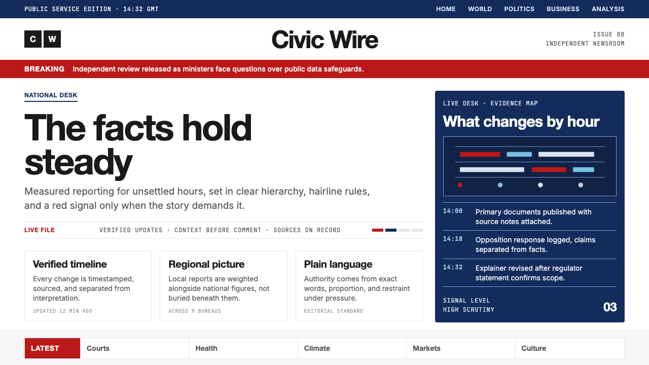 BBC NewsPublic trust, stripped bare. Red alerts, deep navy and hairline grids make ur…
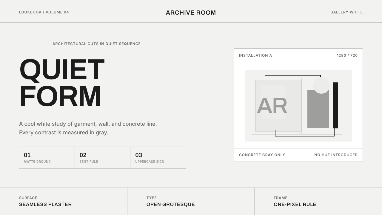 COS Gallery MinimalSilence has structure. Cool gallery white, Archivo uppercase, and concrete-gr…
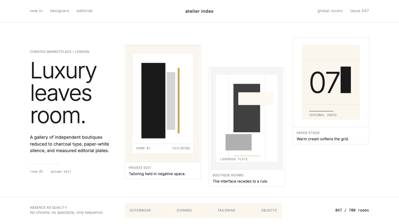 FarfetchLuxury as absence. Charcoal type, white canvas, and hairline editorial plates.
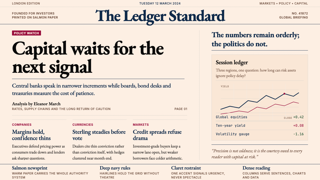 Financial Times (Pink Paper)Authority on salmon paper. Deep navy rules and claret accents discipline dens…
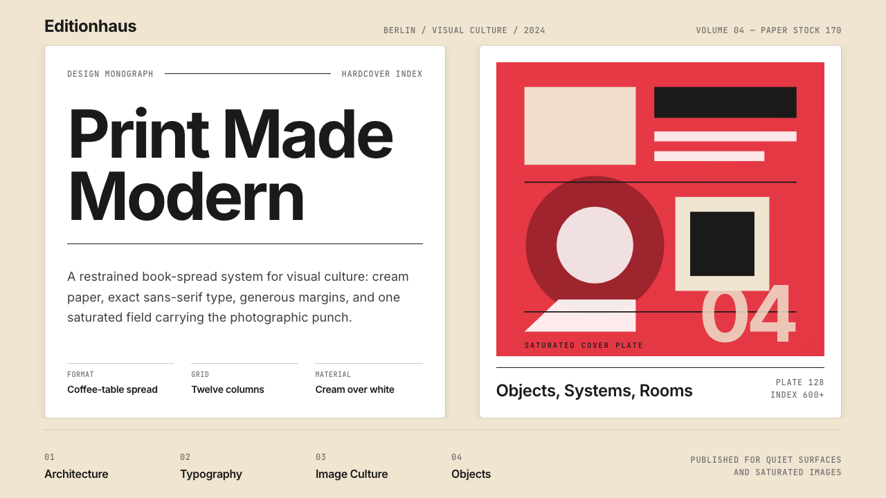 Gestalten Design BookCoffee-table calm. Cream paper, tight sans, one saturated block, and a strict…
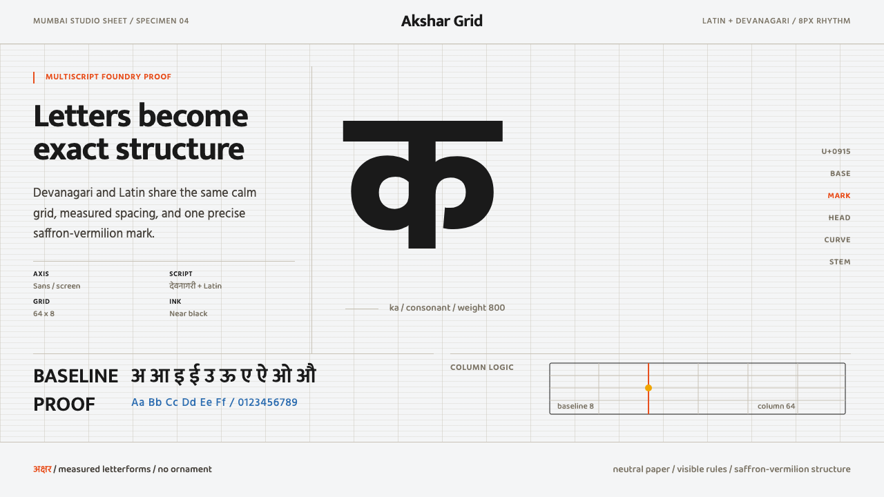 Modern Devanagari TypeType is the subject. Warm off-white grid, giant glyphs, one saffron-vermilion…