What is The Ordinary?
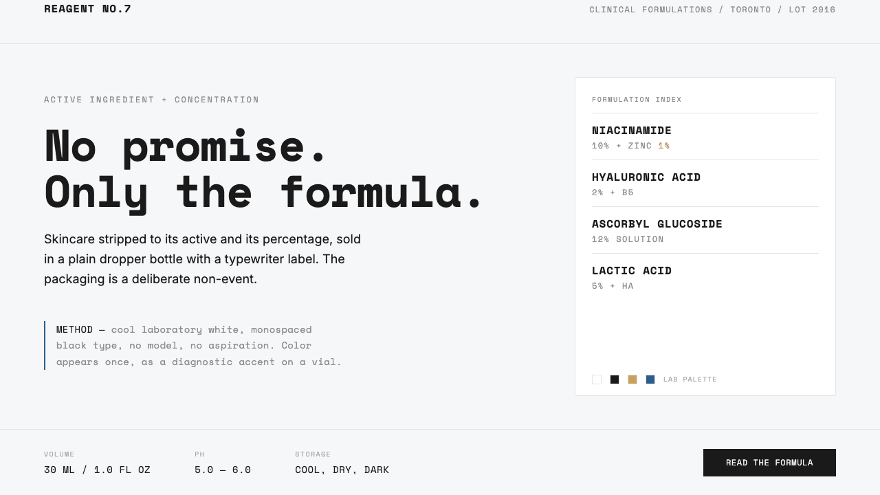
The Ordinary turns skincare packaging into an evidence label: no promise, only the formula, presented with the cool reserve of a laboratory reagent.
The Ordinary in brief
The Ordinary is Deciem’s clinical-formulations-with-integrity brand, launched in 2016 in Toronto. Its central proposition is unusually direct: skincare is reduced to an active ingredient and its concentration, then placed in a plain dropper bottle with a restrained label. A name such as Niacinamide 10% + Zinc 1% is not supporting information beneath a lifestyle story; it is the hero. The product identity begins with what is in the bottle rather than with an aspirational image of who might use it.
This makes The Ordinary an anti-brand in a precise sense. It does not reject branding by becoming visually chaotic or anonymous. Instead, it removes the usual signals through which beauty packaging asks to be desired: no model, no extravagant promise, no lush visual fantasy, and no decorative ceremony around the container. The packaging is deliberately a non-event. Its apparent plainness is a position: information should arrive before atmosphere, and a formula should be allowed to look like a formula.
The visual system reads more like a laboratory label than a luxury serum. Cool laboratory white establishes the field; monospaced black type gives product names and details the measured rhythm of a typewritten record; fine rules divide information without turning it into ornament. Space is generous but not cozy. Color appears rarely, as a diagnostic accent rather than a mood-setting wash. The result is clinical rather than soft, economical rather than empty, and controlled rather than austere for its own sake.
Where does The Ordinary come from?
The Ordinary emerged from Deciem, a company founded in 2013, and launched in 2016 from Toronto, Canada. Its visual era is associated with the period from its launch through the following years of the established system. The timing matters because the brand’s design is inseparable from its product language: the active ingredient and concentration are treated as the primary public fact. Packaging becomes a vehicle for clarity rather than a surface that must transform a formula into a fantasy.
Brandon Truaxe created the brand as an anti-brand. That designation explains both the verbal and visual restraint. The Ordinary does not begin with a beauty promise and then use formula language as proof. It reverses the order. Formula language is allowed to be the opening statement, while the bottle, label, and surrounding space refuse to add drama that would compete with it. The phrase clinical formulations with integrity captures this posture: clinical does not mean ornate expertise, and integrity does not need theatrical reassurance.
The brand belongs to an overlap of anti-branding, clinical or pharmaceutical minimalism, and ingredient transparency. Anti-branding here means removing familiar luxury cues without abandoning a coherent system. Clinical minimalism means allowing white ground, black type, measured divisions, and a plain vessel to carry the tone. Ingredient transparency means the named actives and concentrations are visible enough to function as identity. These are not separate layers applied one after another; they reinforce one another until the design itself feels like a declaration of method.
Nicola Kilner is also identified among the key figures connected to The Ordinary. Within the approved account of the brand, the most durable origin story is therefore not one of decoration, celebrity, or a campaign image. It is the decision to make an ingredient label public-facing and to make restraint legible. The system’s continuing visual character depends on that early choice: no promise, only the formula, with visual attention spent only where it helps the formula be read.
What defines the The Ordinary look?
Clinical White
The ground is a cool laboratory white, not a soft or decorative white. It establishes distance, cleanliness, and legibility before any individual product claim is encountered. The white space around type and rules is active: it separates facts, slows the reading process, and prevents the bottle from behaving like a crowded beauty advertisement. Its clinical quality is important because it makes the formula appear documented rather than styled.
Formula-First Naming
The active ingredient and concentration are presented as the main event. A formula such as Niacinamide 10% + Zinc 1% has the blunt clarity of technical notation, and that bluntness is intentional. Rather than disguising technical content with a poetic product name, the system makes the formula the visible anchor. This transforms information normally treated as secondary into the clearest expression of what the product is.
Monospaced Record
Monospaced black type gives the labels a typewriter-like, documentary character. Each character occupies an even visual beat, so the text feels entered, listed, and verified rather than luxuriously composed. This is not nostalgia for old machinery. It is a way of aligning the typography with the logic of a reagent label: direct, repeatable, and concerned with information before seduction.
Fine Division
Hairline rules organize the label without becoming borders that demand attention. They create compartments for names, formula details, and supporting information while preserving the flatness of the white field. Their delicacy matters: a heavier graphic structure would turn the package into a poster, while these restrained divisions keep it closer to a document or laboratory record.
Diagnostic Accent
Color is rare and functional. It does not flood the package, build a fantasy world, or provide automatic visual richness. Used as a diagnostic accent, it signals distinction only where distinction is useful. Because the field is otherwise white and black, even a small appearance of color has consequence. The restraint keeps color informational and prevents it from overriding the formula-first hierarchy.
Deliberate Non-Event
The plain dropper bottle and restrained label refuse the expectation that skincare must perform luxury. There is no model and no promise offered as a shortcut to desire. The package does not ask to be admired as an object before it is read as information. That refusal is the system’s strongest stylistic move: the absence of spectacle becomes a visible commitment to integrity, transparency, and plain presentation.
Who shaped The Ordinary?
Truaxe is identified as the creator of The Ordinary and the person behind its 2016 anti-brand position. In the approved account of the brand, his defining contribution is the reversal of conventional beauty hierarchy: the active ingredient and concentration become the public hero, while packaging is deliberately prevented from becoming a spectacle.
Kilner is named among the key figures associated with The Ordinary. The approved material places her within the brand’s Toronto and Deciem context, whose enduring public language is built around clinical formulation, ingredient transparency, and a presentation that withholds the usual cosmetic promise.
Deciem, founded in 2013, is the company from which The Ordinary emerged. Its importance to the visual story is structural: The Ordinary is not presented as a separate luxury fantasy but as a brand whose product and package language are organized around clinical formulations with integrity. The 2016 launch makes the formula-first approach the visible public face of that idea.
How do you use The Ordinary today?
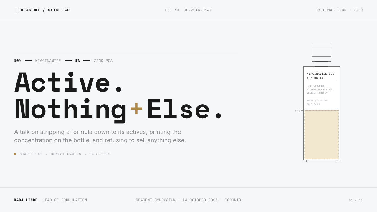
For presentation slides, The Ordinary works best when the cover treats the title as a label rather than a campaign line. Set a clear subject name in monospaced type on a cool white field, then allow a fine rule and a small diagnostic accent to establish structure. Avoid photographic glamour or a large decorative product image. The cover should feel as though the viewer has opened a concise formulation record: spare, calm, and certain about what deserves attention.
Content slides should preserve the label’s reading discipline. Use a primary statement, a measured block of supporting explanation, and restrained rules to separate groups of information. The visual hierarchy should come from order, spacing, and direct language rather than from a collection of colorful badges. For data slides, treat charts as evidence displays. Keep the field predominantly white, make labels highly legible, let black carry most information, and reserve a rare accent for the one comparison, status, or finding that needs to be diagnosed at a glance.
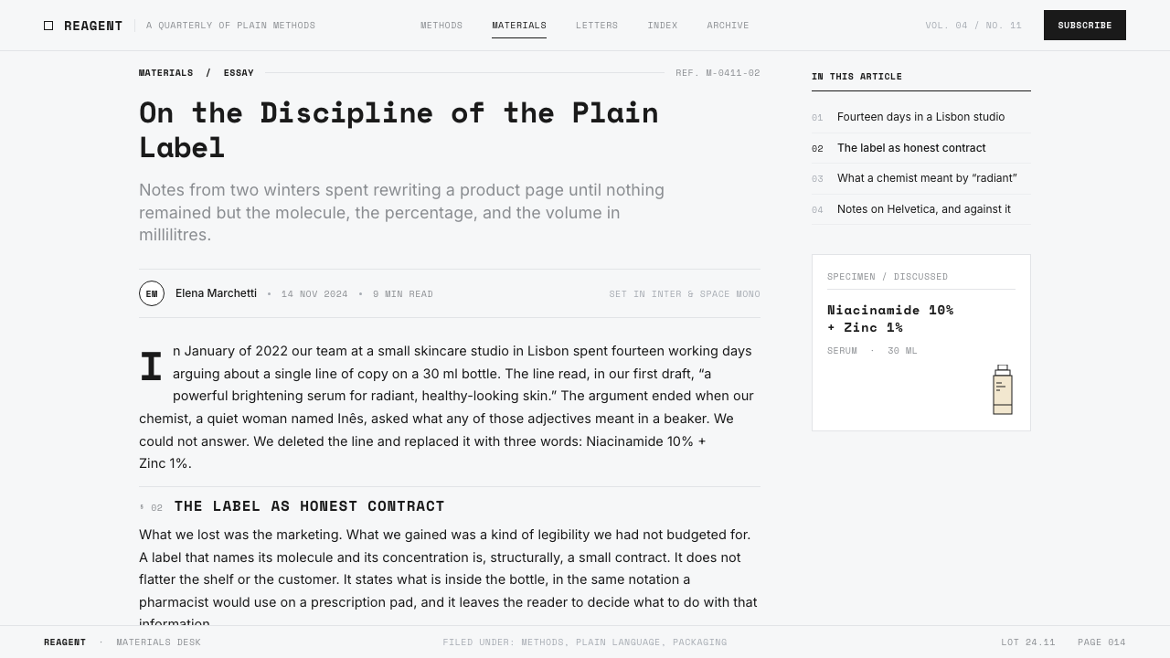
For web interfaces, the style is particularly suited to dashboards, ingredient directories, comparison tools, and pricing pages where users need to scan facts without being urged into an emotional response. A restrained white interface with monospaced labels can make filters, product names, status information, and formula details feel orderly. Fine separators can establish groups without creating heavy cards everywhere. In pricing contexts, tier names and inclusions should be written plainly, with a rare accent used only to clarify a meaningful distinction rather than to make every option compete.
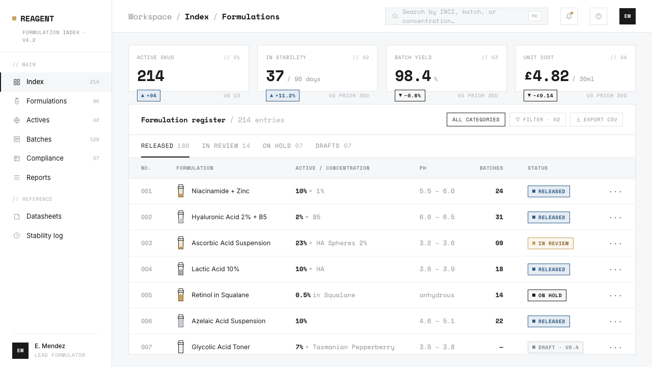
For editorial and marketing work, The Ordinary’s logic supports explainers, ingredient guides, launch notices, and product comparisons. A page can begin with a direct heading, use short factual sections, and allow generous white space to create a pace of reading that feels considered. Marketing should remain informational in tone: lead with the formulation, explain what is being shown, and let the plain container operate as proof of restraint. A campaign that depends on excess visual romance will dilute the very tension that makes the style distinctive.
The common mistake is copying the white background and monospaced type while reintroducing luxury behavior everywhere else. Overusing color, adding plush imagery, making every label into a badge, or surrounding the interface with persuasive promises turns clinical minimalism into a costume. The system works only when its omissions are respected. Color must remain rare, space must remain purposeful, and the formula must remain more important than the atmosphere built around it.
The Ordinary — FAQ
Is The Ordinary style simply minimalism?
No. Minimalism can describe many systems that use little visual material, including warm, luxurious, editorial, or highly abstract ones. The Ordinary is more specific: its restraint is tied to clinical or pharmaceutical minimalism, anti-branding, and ingredient transparency. The white field, monospaced type, fine rules, and rare accent color are not merely a reduced look. Together they make the product feel documented, formula-led, and deliberately free of cosmetic spectacle.
Why is color used so sparingly?
Because color is assigned a diagnostic role rather than an atmospheric one. A fully colorful package would immediately compete with the formula, while a rare accent remains legible as a signal. Against laboratory white and black type, small color decisions can communicate distinction without becoming decoration. The discipline is essential: when color is everywhere, it no longer diagnoses anything and the information hierarchy collapses.
Can this style use photography or influencer imagery?
It can, but imagery should not displace the formula-led hierarchy. The approved visual language explicitly rejects the model as the central packaging signal, so photography used in an adjacent campaign or interface should remain secondary to product information. If an image creates a promise of transformation, luxury, or lifestyle that the label itself refuses to make, it changes the system’s meaning. The safest use is factual and restrained, with the formula still doing the principal communicative work.
Does the style work on a dark background?
A dark version is possible, but it moves away from the central cue of cool laboratory white. The white field is not incidental: it gives the label its clinical reserve and allows black monospaced text and fine divisions to read as a record. A dark inversion can preserve direct naming and restrained color, but it should be treated as an adaptation rather than the core expression. If clinical documentation is the desired impression, the light laboratory field remains the more faithful choice.
What most quickly makes a design stop feeling like The Ordinary?
The quickest failure is allowing promise to outrank formula. Once a layout leads with aspirational language, decorative color, beauty glamour, or elaborate packaging theater, the anti-brand position disappears even if monospaced text remains. The Ordinary’s character comes from a consistent order of attention: active ingredient and concentration first, supporting information next, visual atmosphere last. Reverse that order and the style becomes a superficial imitation.
Related design styles
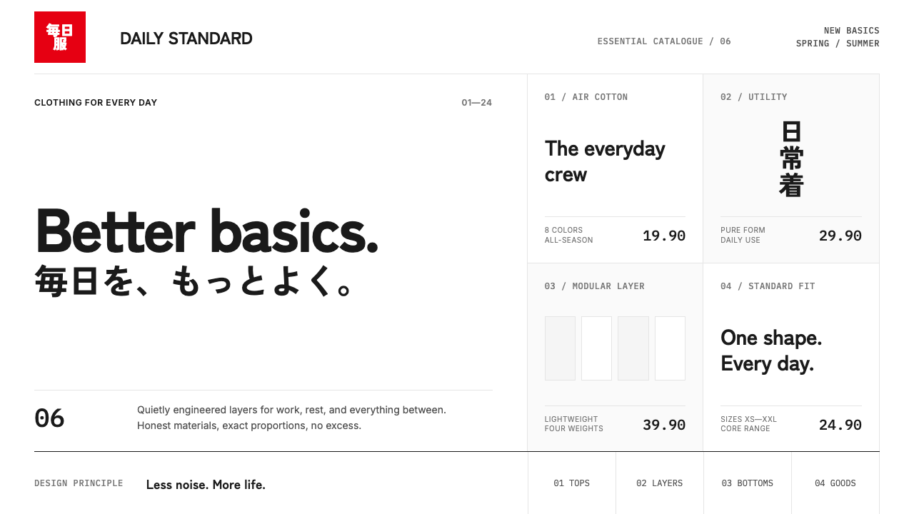 UNIQLO LifeWear (2006)Whitespace is the product. A hard modular grid and one rationed red square en…
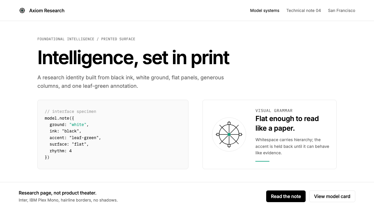 OpenAI 2024Research-grade restraint. Black-on-white Inter, flat code panels, one leaf-gr…
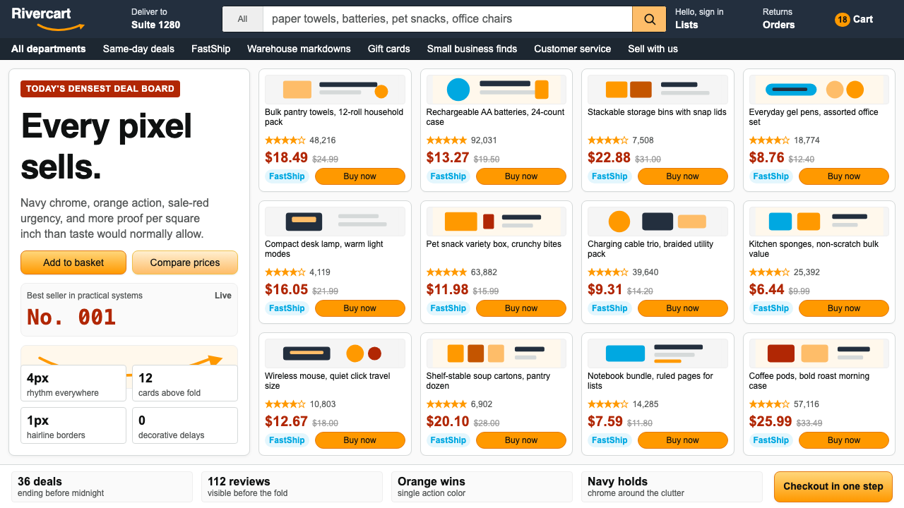 AmazonUgly sells efficiently. Navy chrome, orange buttons, red prices crowd a dense…
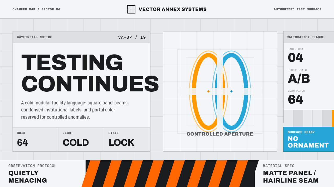 Aperture ScienceSterile authority. Cool panel seams, Archivo signage, and sparse orange-blue…
 Flat Design iOS 7The day skeuomorphism died. Bright tints on white, hairline separators, frost…
 GitHub README Markdown (2014)Calm code authority. Blue links, gray code panels, and Inter/Mono stack on wh…