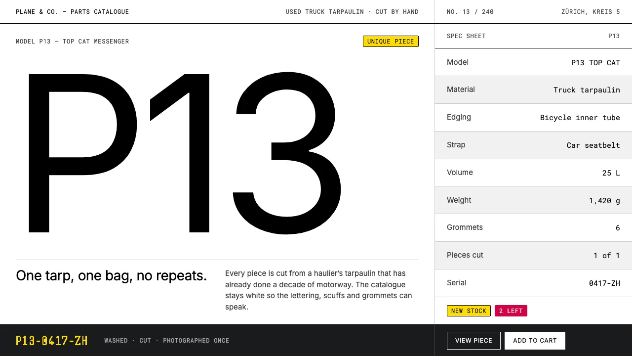
About FREITAG
FREITAG cuts messenger bags out of truck tarpaulins that have already spent years on European motorways, so no two bags share the same graphic. The brand answers that chaos with a catalogue: white studio sweep, concrete greys, one weight of grotesque type, and model codes set like part numbers.
This system keeps the page colour-zero so the tarp does all the talking. Hairline rules replace boxes, tiles sit in a strict equal grid, and the only chroma is caution yellow and tarp red at badge scale.
- Origin
- Zürich, Switzerland
- Era
- 1993 founded; documented brand system 1990–2020
- Key figures
- Markus Freitag · Daniel Freitag · Laurenz Brunner · Spillmann Echsle Architekten
- Movements
- Swiss / International Typographic Style · Upcycling and circular design · Industrial parts-catalogue photography
FREITAG design spec
Colors
Background
Surface
Primary
Secondary
Accent
Text
Typography
InterHeadings
Roboto MonoMono
Unlock for 1 credit
The other 11 sections — buttons, cards, spacing, motion, techniques and more — open once you unlock. Download the DESIGN.md or send it to your AI in one click. Unlock once, yours forever.
Sign up nowHave an account? Sign in
Styles similar to FREITAG
Also inspired by brands & products, with a close feel.
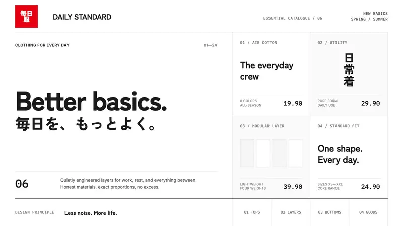 UNIQLO LifeWear (2006)Whitespace is the product. A hard modular grid and one rationed red square enforce calm.
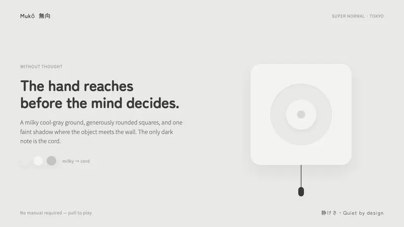 Fukasawa Without ThoughtHand reaches before mind decides. Milky cool-gray plastic, rounded squares, one faint wall shadow.
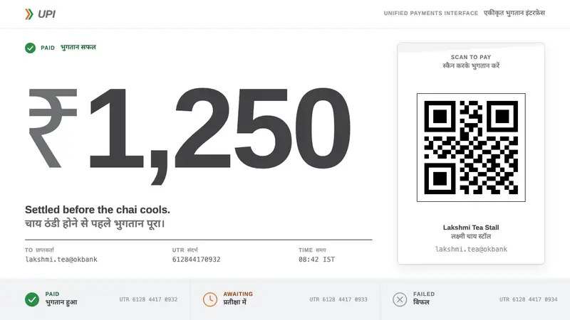 UPI PaymentsUtility, not brand. Grey Helvetica, a saffron-green chevron, black QR on white laminate.
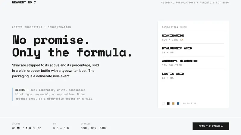 The OrdinaryNo promise, only the formula. Cool lab white, Space Mono labels, color as rare diagnostic accent.