What is FREITAG?
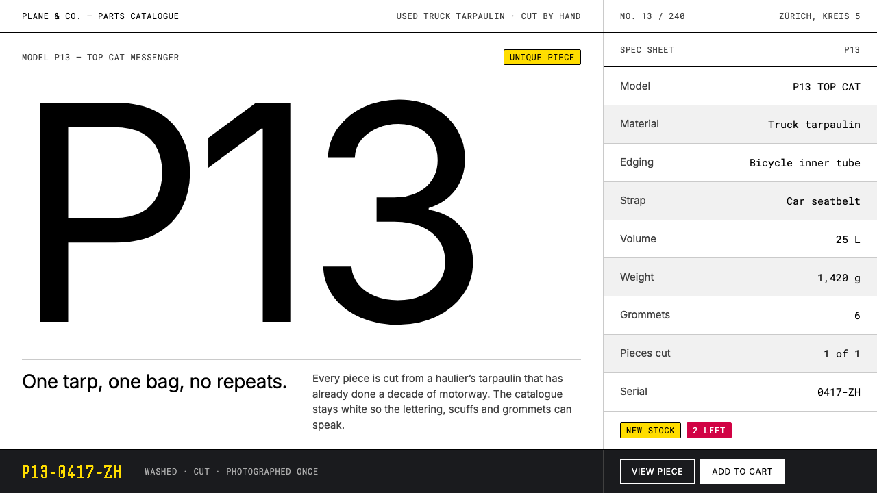
FREITAG's catalogue is deliberately colour-zero: a white studio sweep, hairline rules and a single weight of type, so that the only real chroma on the page is the secondhand truck tarpaulin itself.
FREITAG in brief
The FREITAG style is the visual system of a Zürich bag brand that cuts its messenger bags out of used truck tarpaulins. It is a catalogue aesthetic in the strict sense: a pure white studio sweep for the page, concrete greys for rules and secondary text, a single weight of grotesque sans-serif, and model codes set in the corner like part numbers in an engineering parts list. Nothing on the page is coloured on purpose, and that restraint is the whole idea. The brand's documented system runs from 1990 to 2020, and the company itself dates from 1993.
The logic is a division of labour between interface and object. A tarpaulin that has spent years on European motorways arrives already printed, scuffed, faded and patched, so no two bags share the same graphic. A brand that sells objects this unrepeatable has two options: compete with them or get out of their way. FREITAG gets out of the way. The page is neutral enough to be nearly invisible, which lets each bag's accidental composition (half of a haulage company's lettering, a seam, a worn crease) carry all the colour and personality.
Visually, the style is restraint with an industrial edge. Hairline rules replace boxes and cards; products sit in a strict grid of equal tiles; every bag is photographed alone, centred on white, and given a number. The only chroma permitted outside the photographs is caution yellow and tarp red, and only at badge scale, small enough to read as a label rather than a decoration. It belongs to the broad family of Swiss catalogue design, but its subject is rougher and more material than the polished goods that tradition usually serves.

Where does FREITAG come from?
FREITAG was founded in Zürich in 1993 by the brothers Markus and Daniel Freitag. The origin story is practical rather than romantic. They wanted a messenger bag that could survive rain, and the answer was outside their window: the trucks running along the viaduct, whose loads were kept dry by heavy tarpaulins. The material that protected cargo on the road was exactly what they needed, and they began cutting bags from old tarps taken down from those vehicles.
Reuse is the production logic, not a marketing layer. Each tarpaulin has spent something like a decade in sun, rain and road grime before it is stripped off a truck, so every bag cut from it inherits a composition no designer drew: the half-printed letters of a logistics company, abrasion marks, the metal of the eyelets. This is why the brand sits comfortably within upcycling and circular design while still being, first of all, a practical bag. The style that grew around it had to solve a problem most brand systems never face, which is how to present a product that cannot be standardised.
The answer was a catalogue. The reference point is industrial parts-catalogue photography, an old technical-documentation convention in which each item is shot alone, evenly lit, on a neutral ground and labelled with a code. Applied to bags, the convention makes variation legible: when every other aspect of the presentation is held constant, the differences between the bags become the only information on the page. The typographic half of the solution comes from the Swiss and International Typographic tradition: a grid, strict alignment, a single grotesque in a single weight, and hierarchy created by position and size rather than by ornament or colour.
The physical brand echoes the screen. The company's flagship in Zürich's fifth district is built from stacked, rusting shipping containers, a building made by the same logic as the bags: take something industrial that has already done its working life and give it a second one. The Zürich architecture practice Spillmann Echsle Architekten and the graphic designer Laurenz Brunner appear among the key figures behind the brand's documented system, alongside the founding brothers. Across the three decades that system covers, the through-line is consistency of presentation around inconsistency of product, and that is the principle worth borrowing.
What defines the FREITAG look?
Colour-Zero Ground
The page itself carries no colour. A pure white sweep fills the background, and concrete greys handle rules, captions and secondary text. This is a deliberate transfer of responsibility: the tarp is the only chromatic element, so the photograph of a bag can be as loud as it likes without competing with the interface. The test of the system is that you can remove every photograph and still feel the page is waiting for them.
Hairline Rules
Structure is drawn with the thinnest possible lines instead of boxes, cards or tinted panels. Rules separate sections, align columns and frame tables, and they carry no shadow or rounded corner. Because a hairline has almost no visual mass, it organises the page without adding any weight of its own, which keeps attention on the product. The effect resembles a printed technical sheet more than a shop.
One Weight of Grotesque
All type is a grotesque sans-serif in a single weight. Hierarchy comes from size, position, spacing and capitalisation rather than from bolding, which is why the page reads as consistent even when several kinds of information share it. Model codes are set small and in the corner, in the manner of part numbers on a component drawing, so a bag's identity feels like a catalogue entry rather than a product name shouted at the viewer.
Equal-Tile Grid
Products sit in a strict grid of identical tiles. No bag is promoted by size, no tile is highlighted by colour, and the rhythm of the rows is the same from the first item to the last. Equal treatment is also a statement about the product: since every tarp is unique, none should be presented as more important than another. The grid turns a pile of unrepeatable objects into a comparable set.
Studio-Sweep Photography
Each bag is photographed on its own, centred on the white sweep, and paired with a number. The picture documents rather than stages, without props or a setting. That neutrality is what allows the unplanned graphics of the tarp (cropped letters, wear, eyelets) to read as the content. It also gives the grid something to hold: tiles with consistent framing look like a set even when the objects inside them look nothing alike.
Caution Badges
Colour is not banned outright, only rationed. Caution yellow and tarp red appear at badge scale: small labels and markers that act as signals, in the way hazard tape or a warning sticker does on freight. Because they are rare and small, they register instantly and never become a theme colour. If they begin to appear across large areas, the system has stopped working.

Who shaped FREITAG?
The brothers who founded FREITAG in Zürich in 1993, driven by the practical wish for a bag that could survive rain. Their decision to take the answer from the trucks outside their window, rather than invent a new material, is the root of everything visual in the system: a product whose graphics are found rather than drawn needs a page that knows how to stay out of its way.
A Swiss graphic and type designer named among the key figures of FREITAG's documented brand system. His presence on that list is a useful reminder that the single weight of grotesque type is a considered typographic decision rather than a default, and that the catalogue discipline of the pages belongs to the Swiss typographic tradition.
The Zürich architecture practice named among the key figures behind FREITAG's physical and visual presence. Their relevance to the screen system is the flagship in Zürich's fifth district, a stack of rusting shipping containers that applies the bag's reuse logic at the scale of a building and shows the same neutral-industrial attitude behind both architecture and catalogue.
How do you use FREITAG today?
The FREITAG style is most useful when the content has its own strong colour and character and the interface should step aside: product catalogues, inventories of one-off or handmade goods, sample libraries, archives, parts lists. It is a neutral frame for variable content. Where the content is uniform, or has no colour of its own, the same discipline produces an empty page rather than a restrained one.
For presentation slides, the cover works best with almost nothing on it: a white field, a single large image or a single large word in the one weight, and a small code in the corner. Content slides should use hairline rules to divide sections and align columns, with grey for everything secondary. Data slides suit tables more than charts; when a chart is needed, render every element in concrete grey except the single series that matters, which may be marked with one small yellow or red badge.
For web interfaces, the style fits product listings, inventory screens, admin tools and dashboards. Use an equal-tile grid for browsing, hairlines for table rows and form fields, and one weight of type throughout. Reserve the accent colours for status: a new item, a low-stock flag, a sale. On pricing or comparison pages, present every option in identical tiles and mark the recommended one with a small label rather than a coloured background.
For editorial and marketing work, think of a printed spec sheet or a lookbook that lets objects talk. Photograph each item alone against a white ground, caption it like a part number, and let the layout repeat. It is a particularly good fit for brands whose story is material (recycled, secondhand, handmade, repaired), because the austerity of the page makes the history of the material the headline.
The most common mistake is to warm the system up. A brand-blue button, a tinted section background, rounded cards or a soft shadow each break the colour-zero contract and turn a catalogue back into a generic shop. The second mistake is mixing weights or typefaces for emphasis, which dissolves the part-number voice. Keep the page cold and the photographs hot; if the page feels too plain, the answer is better photography, not more decoration.

FREITAG — FAQ
Why does FREITAG's design use no colour at all?
Because the product is the colour. Each bag is cut from a used truck tarpaulin whose printed graphics, wear and fading are unique, so any colour added by the interface would compete with the one thing customers are actually choosing. The page stays neutral so the tarp can be the only chroma, with caution yellow and tarp red allowed only at badge scale.
Is this the same as Swiss Style?
It borrows heavily from it, but it is not identical. The grid, the grotesque sans-serif and hierarchy by position come from the Swiss and International Typographic tradition. What is distinctive is the subject, rough reused industrial material, and the borrowing from industrial parts-catalogue photography, which gives the pages a documentary, part-number voice rather than the poster-like polish usually associated with Swiss design.
Can I use it for a product that is always the same?
You can, but the effect changes. The style works by letting the variation between items become the content. If the products are identical and colourless, the page simply reads as empty. In that case keep the structure (hairlines, equal grid, a single weight) and add one disciplined colour as the brand's own chroma.
How should the yellow and red accents be used?
Sparingly and small. Treat them like hazard markings on freight: status labels, counters, a flag on a single item. Keep them out of backgrounds, repeated buttons and headings. If more than a handful appear on a screen at once, they stop reading as signals and the page loses its quiet.
Does it work in dark mode?
Only with care. The system's logic is a white studio sweep, so a black ground changes the metaphor, and photographs shot on white will look like pasted rectangles. If a dark theme is unavoidable, use a mid concrete grey rather than black, keep the hairlines and the single weight, and keep the accents at badge scale.
Related design styles
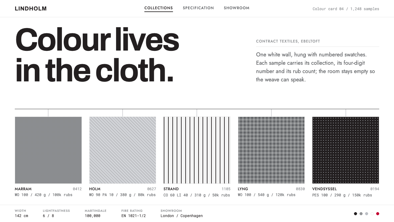 KvadratWhite wall, numbered swatches, no ornament. Hairline rules, square weave samp…
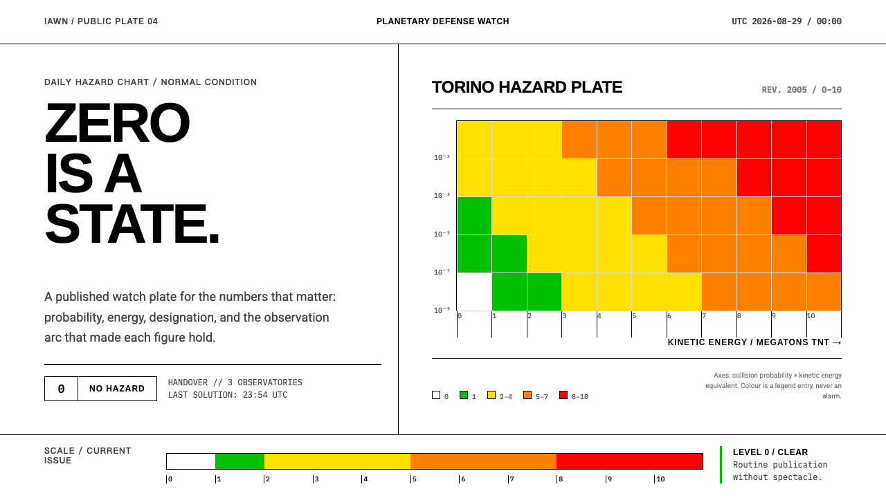 Planetary Defense WatchNothing to report is the point. Torino bands and monospace columns make risk…
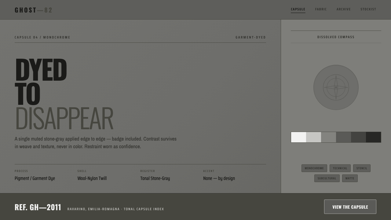 Stone Island GhostDyed to disappear. One garment-dyed stone-gray edge to edge, badge dissolved,…
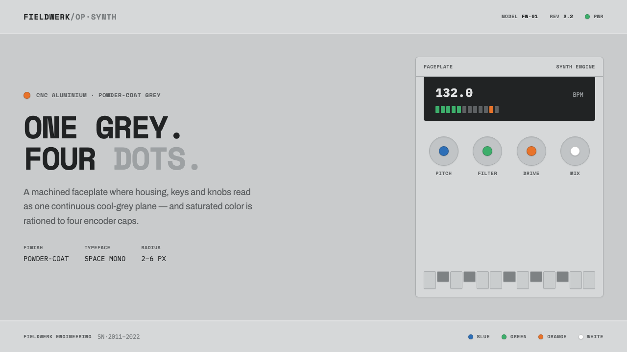 Teenage Engineering OP-1One grey, four dots. Machined aluminium in Space Mono, color rationed to tiny…
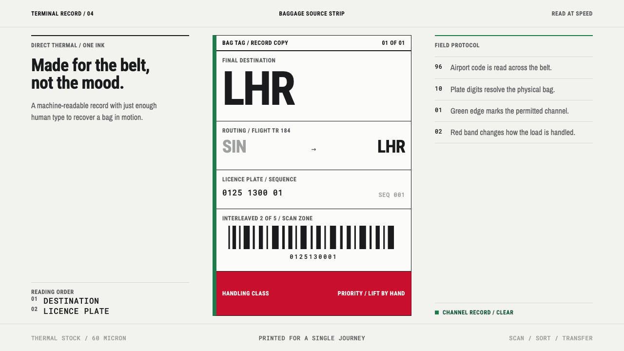 Airport Baggage TagBuilt to be read in motion. Burned-black codes, hard rules and functional cha…
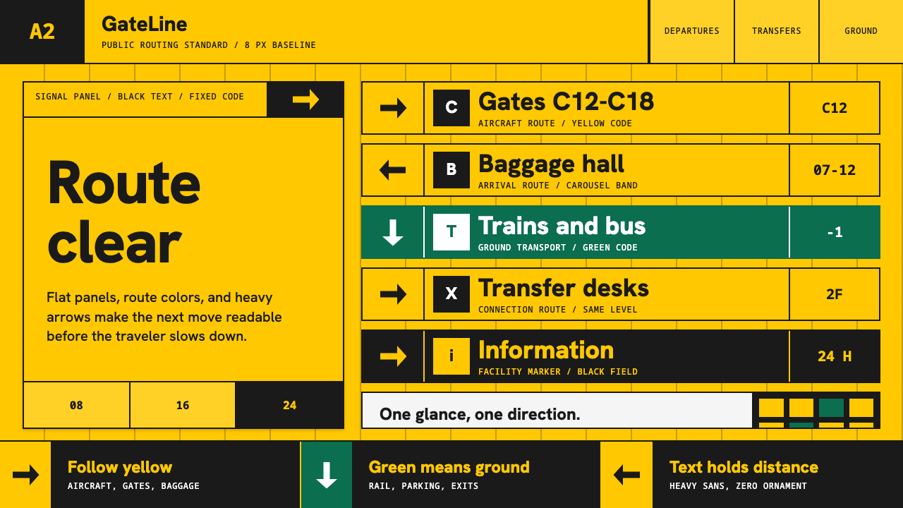 Airport Wayfinding GeometricLegibility becomes command. Signal yellow, black sans, and green route bands…