What is Planetary Defense Watch?
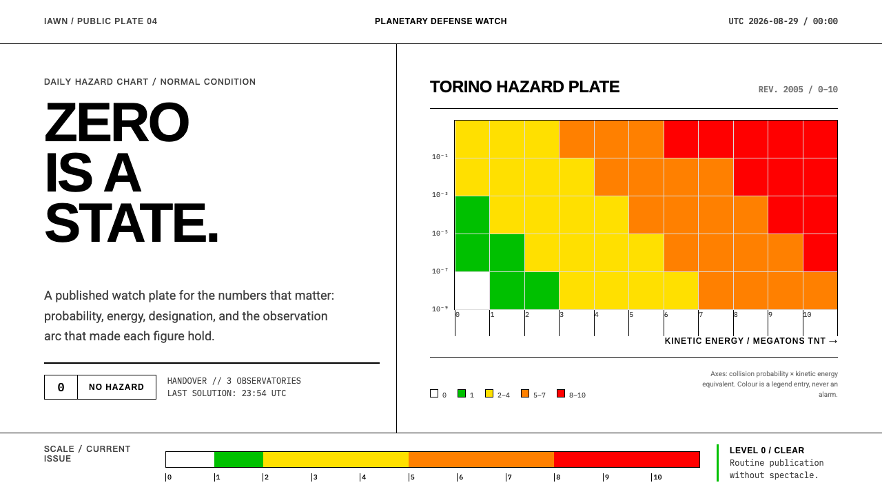
Planetary Defense Watch takes a printed risk chart literally — a white plate, ruled tables, columns of monospace figures — and treats 'nothing to report' as the design's most important state.
Planetary Defense Watch in brief
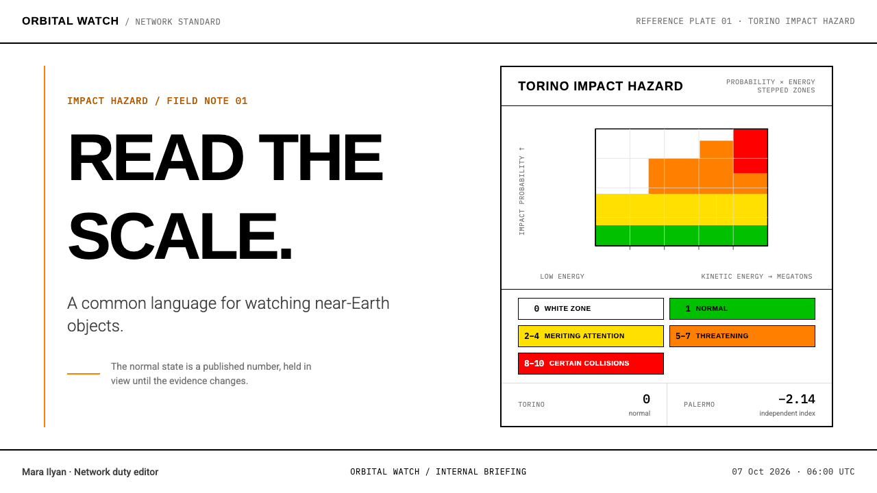
Planetary Defense Watch is a design language drawn from the way the asteroid-monitoring community communicates risk: a white plate, ruled tables, columns of monospace figures, and a single stepped color scale that stays silent until there is something to say. It descends from the Torino Impact Hazard Scale, which was published as a chart rather than a product — collision probability up one axis, kinetic energy across the other, and stepped color bands laid over a white plate on which level zero is defined as the white itself.
That origin explains every habit of the system. Because the chart's lowest level is the absence of color, the whole interface inherits a default of quiet. Risk lists are ruled tables with fine lines between the rows. Object designations and MOID values — the minimum orbit intersection distance astronomers use to describe how close one orbit passes to another — sit in monospace columns so that digits line up and comparisons can be made by eye. An impact window is a single line of figures. A shift handover sheet records who was on duty when a number changed, and ends with a place for a signature.
What makes the style distinctive is what it refuses to do. It does not flash, does not shout, and does not decorate its warnings with exclamation marks. Orange appears only where the Torino scale's 'threatening' band begins, and it should be seen only when the network is genuinely moving. The normal state is level zero, so the normal look is a white page with exact numbers on it. It is a watchkeeper's design language: calm, accountable, and precise about the one thing that matters on any given day — today's figures.
Where does Planetary Defense Watch come from?
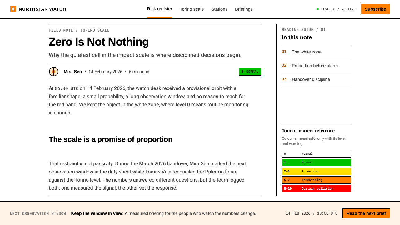
The Torino Impact Hazard Scale takes its name from a 1999 workshop in Torino, Italy, where it was put before the community that tracks near-Earth asteroids. The problem it solved was one of communication rather than measurement. Astronomers could compute the probability that an object would strike the Earth and estimate the energy it would release, but the two numbers meant little to the public and were easy to misreport. The scale folds them into a single integer from zero to ten, each step with a plain-language meaning. The planetary scientist Richard P. Binzel is the name most closely identified with it.
The scale was published as a chart. Collision probability runs up one axis and kinetic energy across the other, and stepped color bands are laid over a white plate. Level zero, meaning no hazard, is white — it is the absence of a band rather than a band of its own. Above it the bands climb through green for the routine, yellow for events that merit attention from astronomers, and orange for the three levels called 'threatening', and finally to red for certain collisions. The wording of the level descriptions was revised in 2005; the chart's structure, with its stepped bands over a white plate, remained recognizable.
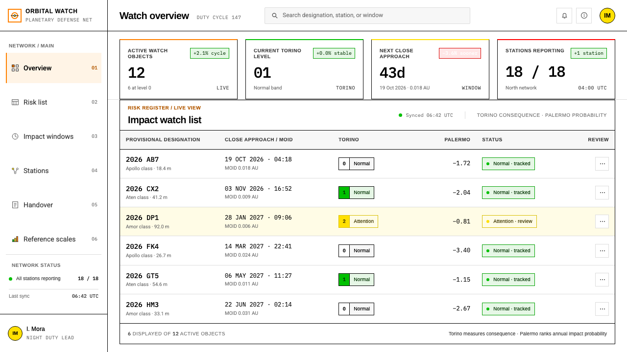
The scale has a companion. The Palermo Technical Scale is a finer instrument for specialists: it compares the probability of a particular possible impact with the background risk from all objects of similar size, and it is expressed on a logarithmic basis. Where Torino was built for outsiders, Palermo was built for people who must rank one risk against another. A watch network needs both — a plain scale for the public and a technical one for the table of objects under review. That is why the design system keeps two registers side by side: a quiet, nearly empty plate for the headline, and dense monospace tables for the working list.
Since the late 1990s the practice has widened from a chart into a standing institution. The International Asteroid Warning Network links observatories and organizations that find and follow asteroids and share what they learn. In 2016 NASA formed its Planetary Defense Coordination Office, with Lindley Johnson in the role of Planetary Defense Officer, and the work has run continuously to the present. The places named in the record are as scattered as the work itself: Torino and Frascati in Italy — the latter home to the European Space Agency's near-Earth object center — Cambridge in Massachusetts, where observations of minor planets are gathered, and Pasadena in California, associated with NASA's Jet Propulsion Laboratory.
What defines the Planetary Defense Watch look?
The White Plate
Level zero is defined as the white itself. The ground of the interface is therefore not a neutral background but the most important value on the scale: the state of nothing to report. Pages are plain white, generously margined, and free of tinted panels, so that when a color does arrive it is read against a surface that has never competed with it.
Stepped Color Bands
Color is a key, not decoration. Bands step upward in the order of the Torino chart — quiet green and yellow for the routine and the watched, a single orange for the threatening range, red held for certainty — and each appears only where a level is actually being reported. Orange, covering levels five to seven, is the color that matters most because it is the one that should almost never be seen; the system treats its absence as the healthy condition.
Ruled Tables
Lists are drawn the way a printed ephemeris draws them: fine horizontal rules between rows, no zebra striping, no filled header bars, no boxes around cells. The rule does the dividing and whitespace does the grouping. Because nothing is carded or shadowed, a dense table of objects stays calm to look at even when it runs long.
Monospace Columns
Designations and MOID values sit in monospace columns, where every digit has the same width and the decimal points stack down the page. This is a working choice — an analyst scanning for the smallest distance in a column can do it by eye — and it gives the pages their unmistakably technical texture. Proportional type is kept for headings and sentences; anything that gets compared is set in monospace.
The Impact Window as One Line
An impact window is the span of dates over which a possible collision could occur, and the system gives it a single line of figures, never a graphic flourish. The restraint is deliberate: the date range is the information, and anything that dramatizes it adds only the chance of misreading.
The Handover Sheet
Shift handover is treated as a first-class document. The sheet records who was on duty when a number changed and ends with a signature line. Accountability is part of the visual system: this is a form meant to be filled in, initialed and filed, which gives the style a procedural, paper-trail seriousness that dashboards rarely have.
Quiet by Default
No flashing, no animated alerts, no exclamation marks. The system never raises its voice because it cannot afford to: in a field where most days are level zero, an interface that is always alarmed teaches its readers to ignore it. The tone is that of a log — time-stamped, exact and neutral.
Who shaped Planetary Defense Watch?
Binzel is the planetary scientist most closely identified with the Torino Impact Hazard Scale. His contribution was less a new measurement than a new way of presenting existing ones: take two quantities astronomers already computed — probability and energy — and give the public a single, ordered scale with a plain-language meaning at each step. The design system borrows that spirit directly. The chart is the interface, and the aim is for a non-specialist to read the severity at a glance.
Johnson is associated with the Planetary Defense Coordination Office that NASA formed in 2016 and with the role of the agency's Planetary Defense Officer. His position marks the moment when asteroid tracking became a standing, coordinated function with an owner, not only a research interest. That institutional turn shows in the design: the duty roster, the handover sheet and the signed page are as much part of the language as the color bands.
The Palermo scale is the specialist companion to Torino. It compares one possible impact with the background risk from similar objects and uses a logarithmic basis, so it can rank hazards that the coarser public scale would lump together. In the design system it is the reason ruled tables and monospace columns exist: the working list is where fine distinctions get made, and the page has to hold them without ornament.
The International Asteroid Warning Network links observatories and organizations that detect and follow asteroids, so that a finding in one place can be checked and shared elsewhere. It stands for the style's collaborative side. No single observer owns a number; the sheet shows who reported it and when, and the page is written so that a stranger on the next shift can pick it up without a briefing.
How do you use Planetary Defense Watch today?
Planetary Defense Watch is for any context where the honest message is usually 'all clear' and exactness matters more than drama. Compliance registers, security posture reviews, uptime and incident reports, environmental monitoring, risk committees, and anything organized around a scale of severity are natural fits. The style asks the designer to make the normal state look good — a quiet, well-aligned white page — and to keep the apparatus of alarm in reserve.
On a cover slide the style is spare: a white field, a title set plainly, a short line of figures beneath it, and a single thin rule. Content slides work best as one ruled table or one short list per slide, with the key number set in monospace and given room. For data slides, treat the chart as a printed plate — labeled axes, stepped bands behind the data if the metric has natural levels, and a legend that reads like the key on a map. Avoid filled backgrounds, drop shadows and decorative icons; the slide should look like a page from a log.
On the web, the pattern suits dashboards that show status and thresholds rather than engagement: a risk register, a watch list, a service status page. Build tables with fine rules and monospace figure columns, show a severity key once at the top, and then use color only on the cells that have actually reached a band. A pricing page can borrow the same restraint: plans as columns of figures separated by rules, with a single accent for the recommended plan and no badges competing for attention. Forms follow the handover sheet — labeled fields, a visible timestamp, a place for a name.
In editorial and marketing work, the style signals credibility. A report or white paper can open on a key, lead with the number, and set its footnotes and methods in the same monospace as its tables. Marketing for tools that monitor or audit can stay deliberately plain, because the message is that the product tells the truth and does not manufacture urgency. Photography, if used, should be documentary and small; the plate, not the picture, carries the brand.
The most common mistake is to treat the color bands as a license for a traffic-light interface, with green, yellow and red badges scattered across every card. The system's color is rationed: if orange is on the page every day, the page has stopped meaning anything. A second mistake is to reach for a dark 'mission control' look with glowing accents because the subject is space; the source of this style is a printed chart on a white sheet, and its authority comes from that plainness. Finally, do not borrow urgency language — 'alert', 'warning', exclamation marks — for levels that do not warrant it. The style's whole credibility rests on not crying wolf.
Planetary Defense Watch — FAQ
Is this style only for space or astronomy projects?
No. Asteroid monitoring is where the visual habits come from, but the underlying idea travels well: a calm default, exact figures, rationed color and visible accountability. Any product whose normal state is 'nothing to report' — security, compliance, operations, finance, public health — can use the same plate. The subject matter does not need to be space, and the style often works better when the surrounding copy stays matter-of-fact.
Why is level zero white rather than green?
Because on the Torino chart level zero is the white of the plate itself — no band at all — and color only begins at level one. The distinction matters in design: green means 'normal, but registered', while white means 'nothing here'. By letting the absence of color carry the lowest meaning, the system keeps all of its color vocabulary available for things that are actually happening.
When is orange allowed to appear?
Only for the band of levels five to seven, which the Torino scale calls 'threatening', and only when the network is actually reporting something at that level. It is not an accent color, a button color or a highlight. If a design needs an emphasis color for ordinary interface elements, it should use weight, a rule or position, and leave orange untouched so that it keeps its meaning.
Why use monospace for figures instead of a proportional typeface?
Because the figures in this system are compared, not just read. In a monospace column every digit occupies the same width, so values line up vertically and a reader can spot the smallest distance or the latest date by eye. Monospace also tells the reader they are looking at a record rather than a story. Proportional type still belongs to headings and running sentences, where rhythm matters more than alignment.
Can it work on a dark background?
It is built on a white plate, and that is not incidental: level zero is the white itself. A dark inversion loses that meaning and tends to drift toward the glowing 'mission control' look the style is trying to avoid. If a dark mode is required, keep the other rules — hairline dividers, monospace columns, rationed color, no alarm language — and let the dark ground stay as quiet and nearly empty as the white one is.
Related design styles
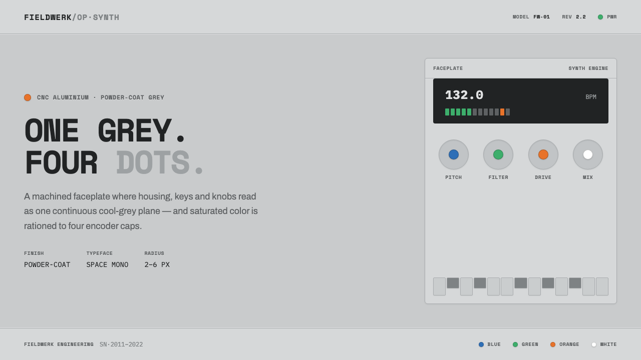 Teenage Engineering OP-1One grey, four dots. Machined aluminium in Space Mono, color rationed to tiny…
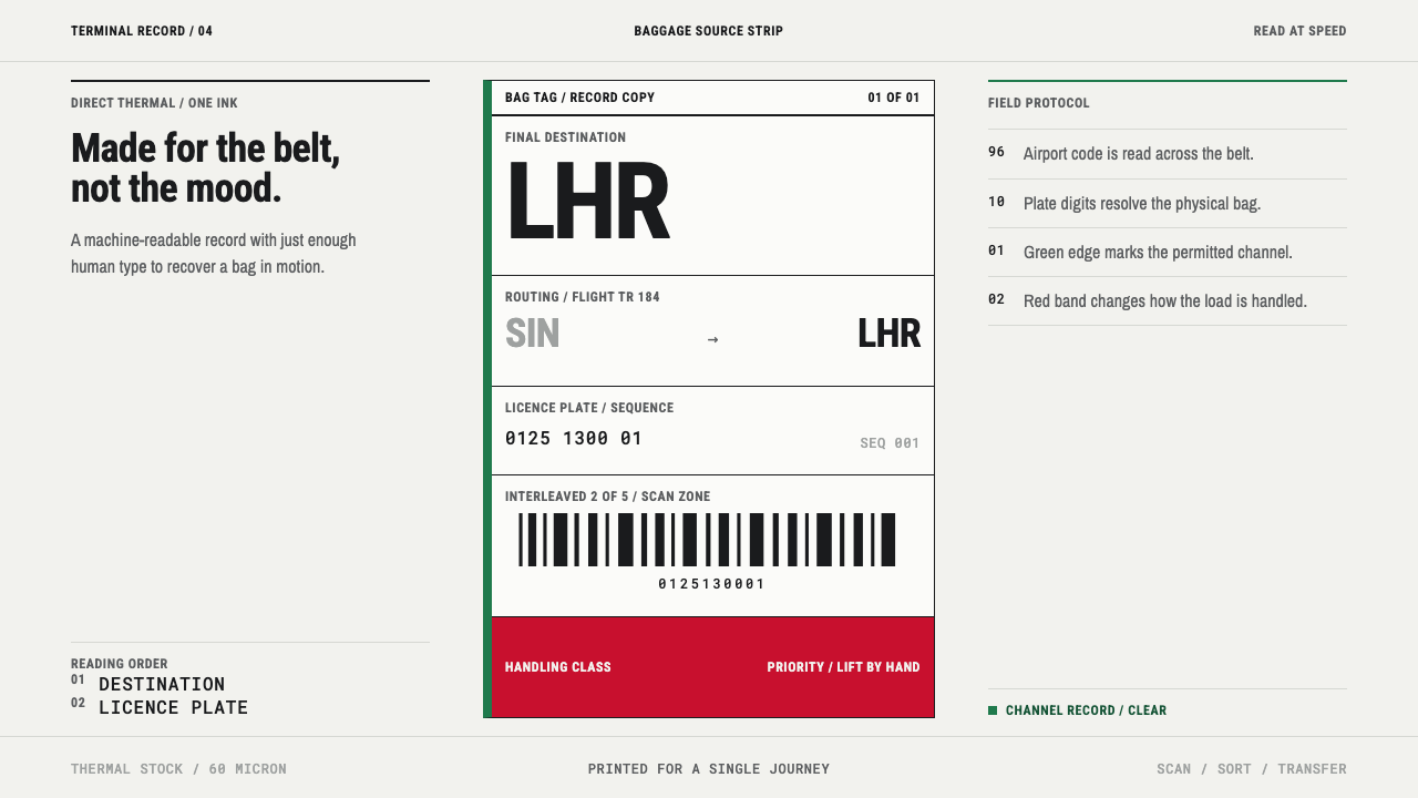 Airport Baggage TagBuilt to be read in motion. Burned-black codes, hard rules and functional cha…
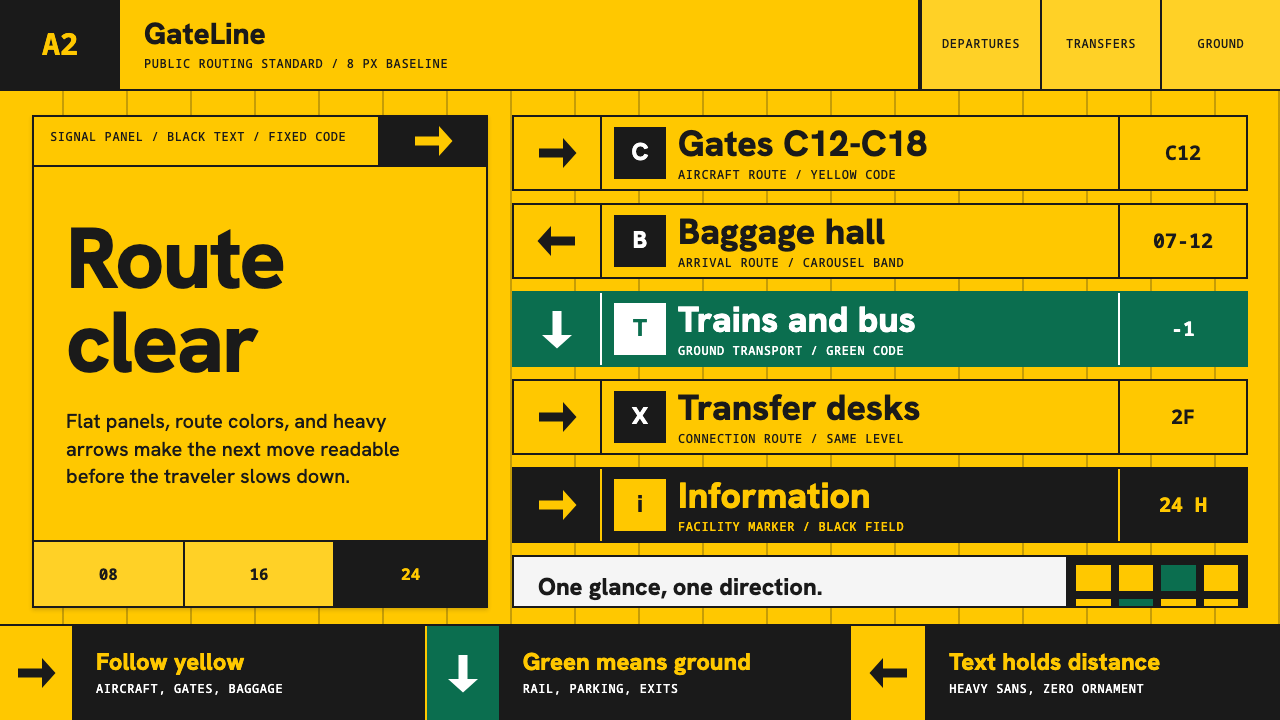 Airport Wayfinding GeometricLegibility becomes command. Signal yellow, black sans, and green route bands…
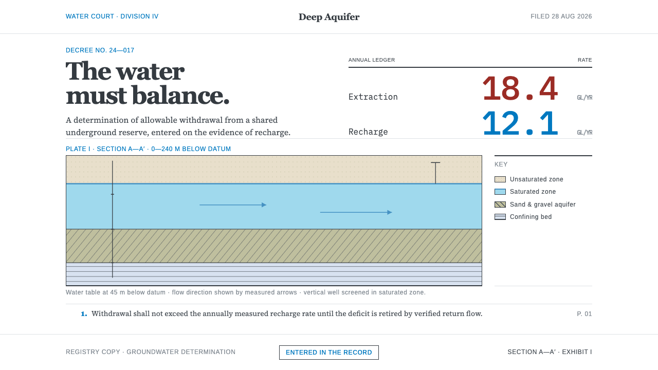 Deep Aquifer Water CourtRestraint makes the deficit undeniable. White bond, book serif, and a keyed a…
 Graphite Technical DrawingDrafting-room precision. Non-photo-blue grid and graphite DIN lettering do th…
 Hazmat SignageRead it from the loading dock. Caution-yellow ground, NFPA diamonds, monospac…