What is Teenage Engineering OP-1?
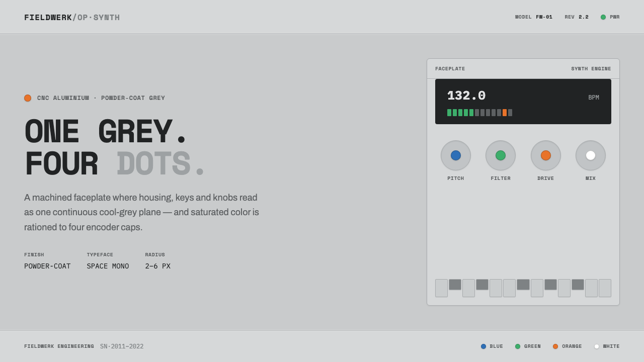
The OP-1 turns industrial restraint into an instrument: one machined grey body, technical lettering, and four tiny points of color that behave like controls.
Teenage Engineering OP-1 in brief
Teenage Engineering’s OP-1 is a CNC-machined, powder-coated aluminium synthesizer from Stockholm, Sweden. Its housing, keys, and knobs share one cool light grey, giving the entire instrument the visual unity of a single manufactured object rather than an assembly of decorative parts. Saturated color is rationed to four rotary encoder caps: blue, green, orange, and a bright white. The result is not colorful in the conventional sense. It is mostly grey, with color appearing only where the eye expects an instrument panel to provide orientation.
As a design system, the OP-1 translates this hardware discipline to the screen. The ground becomes a uniform machined grey rather than cream or pure white. Labels use technical monospace lettering in uppercase, with Space Mono as the clearest typographic reference. Fine seams, precise small radii, and carefully contained controls suggest folded or machined surfaces. The interface should feel assembled from real parts, but without simulated texture or visual clutter.
The character is matte, cool, and quietly engineered. Grey establishes the field; dark technical type provides legibility; lines and seams clarify construction; the encoder colors function as signals rather than decoration. Large saturated panels would violate the system’s logic because they would make color into scenery. Here, color is closer to a status light or instrument marker: small, deliberate, and valuable precisely because the surrounding world stays restrained.
Where does Teenage Engineering OP-1 come from?
The source places the OP-1 design language within the period from 2010 to the present, with the original OP-1 launched in 2011 and the OP-1 field appearing in 2022. That timeline matters because the style is not presented as a historical reconstruction. It is a contemporary product language whose identity has remained tied to portable synthesis, compact controls, and a highly considered physical object.
Its stated region is Stockholm, Sweden, and its cultural references are Scandinavian hardware minimalism and the pocket-operator or portable synth design language. These references explain the system’s preference for reduction without making the object feel fragile or precious. The design is minimal because each surface, label, seam, and color mark is asked to perform a clear role. It is hardware-oriented because the screen vocabulary retains the visual memory of machined casing, knobs, keys, and instrument-panel indicators.
Teenage Engineering is listed as a key figure in the source, alongside Jesper Kouthoofd. The available material does not assign separate biographies or production roles, so the safest reading is collective: the OP-1 is an expression of the company’s named design context and the Stockholm-based hardware sensibility around it. What can be stated confidently is the coherence of the result. The body, controls, lettering, and color accents behave as one system rather than as independent styling decisions.
The OP-1 field, dated to 2022 in the supplied material, extends the named product lineage into the present era without changing the central visual lesson. The lesson is not a fixed collection of decorative motifs but a method of allocation: keep the manufactured ground quiet, make the technical information explicit, and reserve visual intensity for the small controls that need to be found. Applied to digital work, this origin story becomes a discipline of hierarchy and material suggestion.
What defines the Teenage Engineering OP-1 look?
Machined Grey
Grey is not a neutral backdrop added after the fact; it is the system’s main material statement. The entire body of the OP-1, including housing, keys, and knobs, is described as one cool light grey. On screen, that unity becomes a continuous field with a matte industrial character. Avoid cream, pure white, and decorative tonal variation. Surfaces may be separated by seams, borders, or changes in density, but the dominant impression should remain that every part belongs to one manufactured object.
Rationed Color
Blue, green, orange, and bright white appear as the four encoder-cap accents, not as broad areas of decoration. Their small scale gives them the authority of signals. In an interface, color should identify a control, state, channel, or point of attention while the surrounding grey remains quiet. If every region becomes saturated, the design loses the very contrast that makes the OP-1 recognizable. Color is strongest when it is scarce.
Technical Monospace
Typography should recall the printed labels of a compact instrument. Space Mono is named as the reference, and the labels are uppercase, monospace, and technical rather than expressive. Lettering acts as calibration: it names parts, clarifies states, and reinforces the sense that the screen is an engineered panel. Keep hierarchy through scale, spacing, and placement, not through ornamental type changes or a collection of competing font families.
Seams and Small Radii
The interface should suggest precise assembly. Fine seams can separate controls, panels, or functional zones without becoming ornamental rules. Small, controlled radii soften the manufactured object just enough to imply a real casing, while generous curves or inflated cards would shift the language toward softness. The goal is not literal skeuomorphism. It is a restrained suggestion of folded, coated, and machined parts.
Instrument-Panel Hierarchy
Information should read as a control surface. Primary labels, secondary readings, and small status marks need clear positions and consistent relationships. The four colored dots can serve as anchors or active indicators, but they should never compete with the main title or become decorative confetti. A successful composition feels operational: the user can tell what is named, what is active, and where attention should move.
Matte Industrial Restraint
The overall finish is cool, matte, and engineered. Gloss, soft atmospheric shadows, cream-colored warmth, and large saturated fields would introduce a different emotional register. Depth should come from seams, tonal adjacency, and physical implication rather than theatrical lighting. The system feels confident because it does not need to advertise its complexity. Its restraint is the visible evidence of control.

Who shaped Teenage Engineering OP-1?
Jesper Kouthoofd is named in the supplied origin material as a key figure associated with the OP-1 context. Because no separate biography or role is provided, the design system should not attach unsupported claims to him. His inclusion confirms that the article belongs to a specific Stockholm product-design lineage rather than to an anonymous generic industrial style.
Teenage Engineering is the named company behind the OP-1 in the supplied material. Its significance here is systemic: the instrument’s grey enclosure, uppercase monospace labels, restrained colored controls, and portable synthesizer character operate as one coherent product language. The company name therefore functions as a reference point for disciplined hardware minimalism.
The OP-1 field is the later named point in the supplied timeline, dated to 2022. It keeps the discussion anchored in an active product lineage rather than treating the OP-1 as a closed historical artifact. Its place in the system is best understood as a reminder that the visual logic is durable: material unity, technical labeling, and carefully rationed color remain the central principles.
How do you use Teenage Engineering OP-1 today?
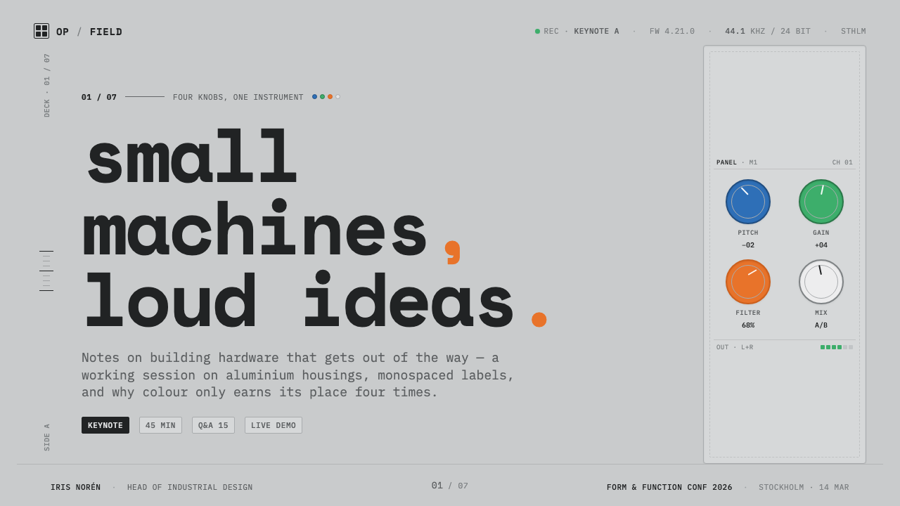
For presentation slides, use the machined-grey field as the consistent ground across cover, content, and data pages. A cover can place a concise uppercase title beside a small group of colored control dots, allowing the grey field to carry most of the visual weight. Content slides should read like labeled instrument panels: technical headings, restrained seams, and clear separation between information zones. Data slides can use the encoder colors to identify categories or active values, but the marks should remain compact and purposeful.
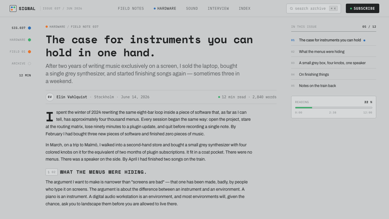
For web interfaces, the OP-1 language suits dashboards, monitoring tools, audio products, and pricing pages that need a calm technical authority. Keep the page grounded in one grey material field, use monospace uppercase labels for navigation and metadata, and let small colored indicators signal status or selection. Pricing tiers can be differentiated through labels and tiny color markers instead of large colored cards. Borders and seams should define structure; soft decorative surfaces would weaken the hardware analogy.
For editorial and marketing work, the style creates a distinctive contrast between quiet material presence and precise information. An article can use a broad grey field, narrow technical captions, and small color marks to identify sections or key facts. Marketing pages should feel like product documentation made unusually elegant: concise headings, controlled spacing, close-up details, and a limited number of saturated signals. The visual promise is exactness and portability, not luxury, nostalgia, or visual abundance.
For product storytelling, use the physical logic as the narrative logic. Begin with the single material field, introduce the technical labels, then reveal color only at the points where the product acts or communicates. This sequence makes the interface feel designed rather than themed. It is especially effective when the content concerns tools, instruments, compact devices, or creative software that benefits from an engineered and tactile impression.
The common mistake is to mistake OP-1 style for a generic grey interface with colorful decoration. Adding large blue, green, or orange panels, replacing the technical monospace voice with expressive display lettering, or using cream and pure white grounds changes the system’s identity. The colors must remain scarce, the labels must remain functional, and the grey must feel like a material field rather than an empty neutral background.
Teenage Engineering OP-1 — FAQ
Is the OP-1 style simply a grey monochrome interface?
No. Grey is the dominant material field, but the system depends on the tension between that restraint and four carefully rationed encoder colors: blue, green, orange, and bright white. Remove the colors entirely and the interface loses its instrument-panel character. Use them everywhere and it loses its discipline. The intended balance is quiet grey structure with small, legible points of signal.
Why should the background avoid cream and pure white?
The supplied design brief defines the OP-1 language through a cool, machined-grey ground. Cream and pure white introduce warmth or clinical brightness that belongs to another visual world. A grey field keeps the screen connected to powder-coated aluminium and allows the small saturated controls to register as instrument signals. The restriction is therefore material and structural, not merely a color preference.
Can the colored encoder dots become large buttons or card backgrounds?
They can identify an important action or state, but enlarging them into broad visual fields changes their role. In the OP-1 logic, color is reserved for tiny instrument-panel dots and encoder caps. It gains meaning through scarcity. Use colored controls as compact accents, status markers, or focused interaction points while keeping the surrounding structure grey and technically labeled.
What makes the style feel like hardware without becoming skeuomorphic?
Suggest construction rather than imitating every physical detail. Fine seams, controlled small radii, uppercase monospace labels, and a unified grey field can imply a machined casing without adding faux screws, simulated reflections, or decorative textures. The screen should borrow the OP-1’s allocation of attention, not copy an object literally. Material suggestion is enough when the hierarchy remains precise.
Related design styles
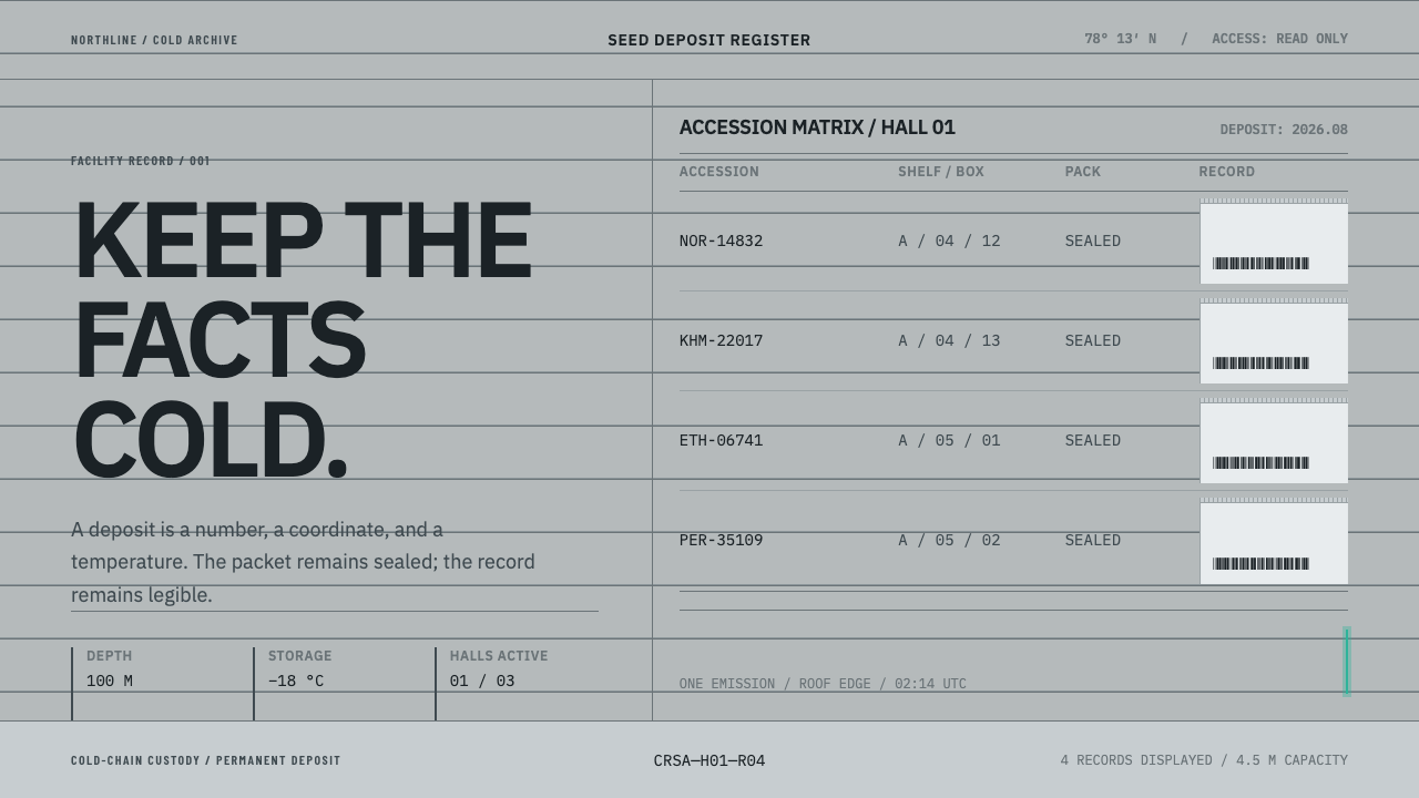 Climate Refuge Seed ArchiveFacts stay cold. Concrete-grey accession rows meet one turquoise fibre-optic…
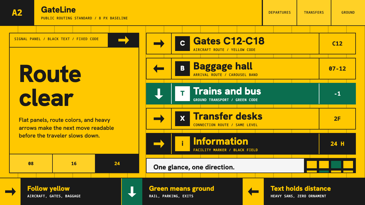 Airport Wayfinding GeometricLegibility becomes command. Signal yellow, black sans, and green route bands…
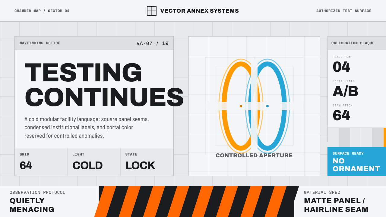 Aperture ScienceSterile authority. Cool panel seams, Archivo signage, and sparse orange-blue…
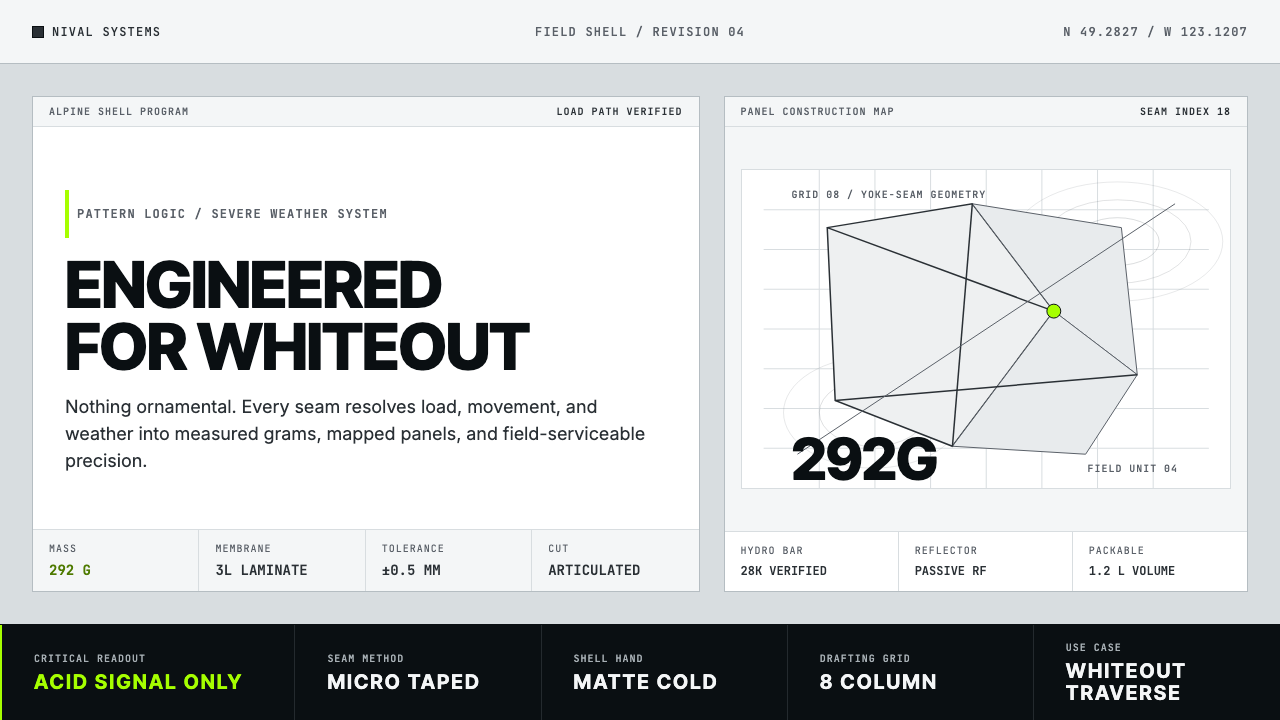 Arc'teryx Technical OutdoorEngineered, never ornamental. Glacier silver grid, mono specs, one acid-green…
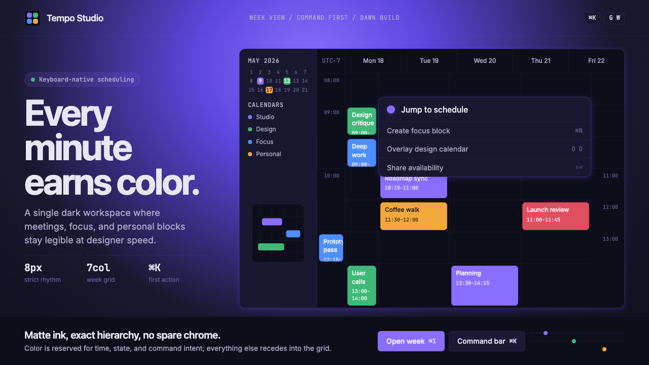 Cron CalendarDesigner-tech restraint. Purple wash, ink grid, mono shortcuts, surgical even…
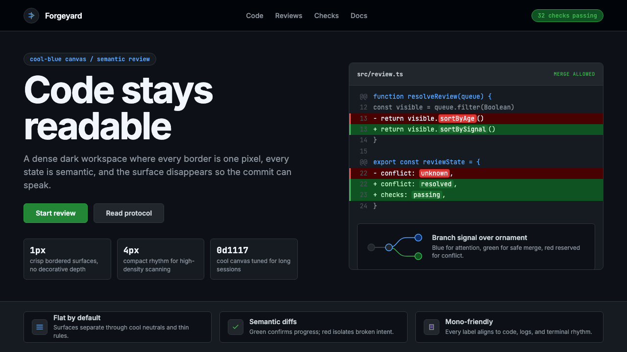 GitHub DarkCode-first darkness. Cool-blue canvas, 1px borders, green/red diff lines.