What is Ableton Live?
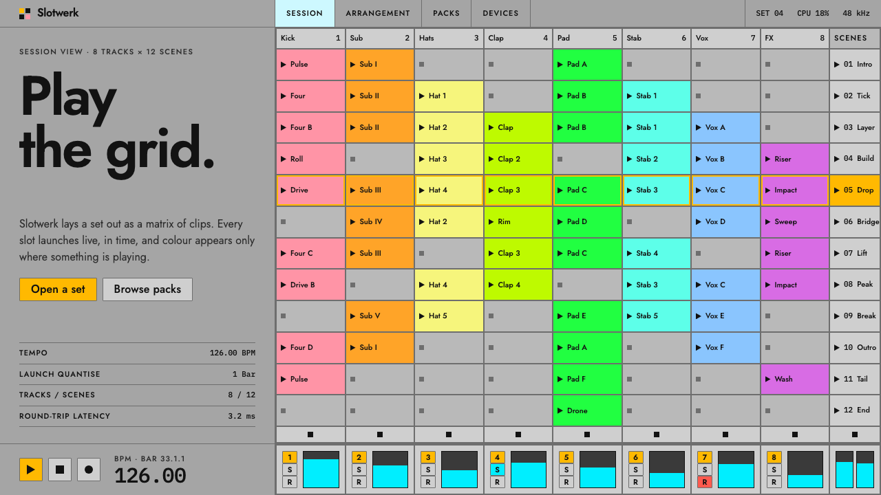
Ableton Live's Session view is a stage console disguised as software: a flat grey grid where colour is rationed for the things that are actually happening.
Ableton Live in brief
Ableton Live came out of Berlin in 2001 as software built to be played on stage, not only edited in a studio. Its Session view lays music out as a grid of clip slots, with tracks in columns and scenes in rows, and every slot can be launched live with a single click or a pad press. The interface that grew around this idea is dense, quiet and almost completely free of decoration.
Visually, the style is a flat mid-grey surface with slightly lighter grey controls, thin hairline frames around every element, a compact grotesque typeface set small and tight, and colour reserved for state. Amber means a control is on, cyan marks a range or selection, and a palette of clip colours lights up the slots and the grid of pads on the hardware controller. Nothing is there for ornament, and nearly everything on the screen is a control.
This is a design language for people who work under pressure and need to read the screen at a glance. It treats the interface like a mixing desk or a piece of rack equipment rather than a consumer app: the surface is neutral so that signals stand out, the type is small so that more information fits, and every colour has a job.

Where does Ableton Live come from?
Ableton was founded in Berlin, and Live 1.0 was released in 2001. The people behind it came out of the city's electronic and techno scene, where music was increasingly made and performed with a computer. Gerhard Behles, Robert Henke and Bernd Roggendorf are the names usually attached to the project's beginnings. Their starting question was practical: why should software that musicians use on stage behave like software for editing a finished recording?
The answer was the Session view. Instead of a timeline that runs left to right and has to be played in order, Live offers a grid in which any clip can be started at any time and in any combination, and clips of different lengths loop against one another. The grid makes the performance an act of selection and timing rather than of playback. This loop and clip logic came directly from the performance culture of Berlin's electronic music, where sets were built live out of pieces rather than from a score.
The look followed the function. Early versions were already flat and functional, shaped by the limits of the screens and operating systems of the early 2000s, and the maker never moved away from that reduction. When the hardware controller Push appeared in 2013, the same logic extended onto physical pads: the colours in the software's clip grid were mirrored in light on the device, so the screen and the hardware became a single surface.
Later versions refined rather than replaced the language. A custom typeface called Ableton Sans arrived with Live 10 in 2018, and the visual identity continued to evolve through the current Live 12 era. The key choices stayed the same throughout: a neutral grey ground, hairline frames, small tight type, and colour that is given out sparingly. That consistency is a large part of why the product's interface is recognised even by people who have never opened it.
What defines the Ableton Live look?
Color
The ground is a flat, mid-grey surface, with controls set one step lighter. Colour is not decoration but information: amber signals that something is on, cyan marks a range, and a bright clip palette identifies each slot and lights the pads. Because the base is neutral, the few saturated colours carry a lot of weight. A screen with no active elements looks almost monochrome, and one in the middle of a set glows.
Typography
Type is a compact grotesque, set small and tight, in the spirit of labels on hardware. The system here uses Jost, a geometric sans, to carry that feel. There are few weights and almost no size contrast; hierarchy comes from position, case and colour rather than from large headings. Text exists to name things: tracks, devices, parameters and values.
Layout
The layout is a rigorous grid. Tracks run in columns, scenes run in rows, and each intersection is a clip slot of identical size. Around it sit narrow strips for mixer controls and a browser, packed edge to edge. There is very little empty space; density is a feature, because the performer needs everything in view at once. Alignment is exact and repetition is the main organising principle.
Surface and depth
Surfaces are flat. Elements are separated by thin hairline frames, not by shadows or gradients, and there is no glass, blur or bevel. Controls are differentiated by a slightly lighter grey, and pressed or active states by a change of fill. The result feels more like printed equipment panels than like a layered screen, and it keeps the interface cheap to read at a glance.
Grid of pads and clips
The clip grid is the signature object. Each slot holds a looping clip, is filled with its own colour when it has content and shows a small play triangle when it can be launched. The same grid is reflected in the hardware controller, where an eight-by-eight array of pads shares the palette. Treat the grid as one component that appears both on screen and in light.
State, not ornament
Every visual choice answers the question 'what is happening right now?' Amber says a control is engaged, cyan says a range is selected, and a clip's colour says what it belongs to. If an element is not communicating a state, it is neutral grey. This discipline is what makes the screen legible on a dark stage or in a rushed rehearsal.

Who shaped Ableton Live?
One of the people most associated with starting Ableton in Berlin and with the idea of software designed for live performance.
A Berlin electronic musician and one of the early names attached to the project, which reflects the performance culture the interface was built to serve.
Another of the early figures usually named alongside the company's beginnings and the first release of Live in 2001.
How do you use Ableton Live today?
On slides, the style suits technical talks, product demos, music and audio presentations, and anything meant to feel like a control surface. A cover slide can be a flat grey field with a small, tight title and a grid of coloured cells as the only graphic. Content slides work well as modules: a row of labelled blocks, each with one status colour. For data, small tables and narrow bars with an amber accent for the active value are more in keeping than large, decorative charts.
In web UI, it is a strong fit for dashboards, creative tools, control panels, audio and video editors, device consoles and admin screens. The component vocabulary is clear: a grid of equal cells, narrow strips of controls, hairline frames, toggles that fill with amber when on, and range selectors in cyan. Dense data tables benefit especially, because the neutral ground lets state colour read instantly. Pricing and marketing pages are a harder fit, since the style gives you little room for persuasion.
In editorial and marketing work, the grey grid is a recognisable way to signal electronic music, live performance, studio craft and Berlin. It can frame an article about performance software, a festival page, a release announcement or a technical case study. Use the clip palette for category colours in diagrams, and mirror it in a pad-style grid for social images, so that the piece looks like a screenshot of the instrument itself.
The most common mistake is to spend colour freely. If amber and cyan appear on elements that are not actually on or selected, the whole point of the system is lost and the screen becomes a generic dark or grey dashboard. A second mistake is softening it with shadows, large rounded corners or big headline type, which makes the interface feel like a consumer app. Keep the frames thin, the type small and tight, and the saturated colours rare.
A third error is to treat density as clutter and add generous spacing. The compactness is the point. If something has to give, remove content, not the grid. Equal cell sizes and exact alignment should survive every layout decision.

Ableton Live — FAQ
What is the Session view?
It is Live's grid-based view for performance. Tracks run in columns, scenes in rows, and each cell is a clip that can be launched at any moment. It differs from a timeline, which plays in order, and is the visual centre of this style.
What do amber and cyan mean in this style?
Amber means a control is on. Cyan marks a range or a selection. Both are used only when that state is true, which is why the rest of the interface can stay a neutral grey and the signals still stand out.
Which typeface does it use?
The system sets the interface in Jost, small and tight, to capture the feel of compact grotesque labels. Ableton's own custom face, Ableton Sans, arrived with Live 10 in 2018. Jost is a close, openly available stand-in for the same compact feel.
Is it a dark theme?
No. The surface is a flat mid-grey, which sits between light and dark. That neutrality is deliberate, as it lets a few saturated colours stand out on any screen or stage.
What is it good for?
Dashboards, creative tools, control panels, editors and technical presentations. It is weaker for persuasive marketing, because the style is built to inform, not to sell.
Related design styles
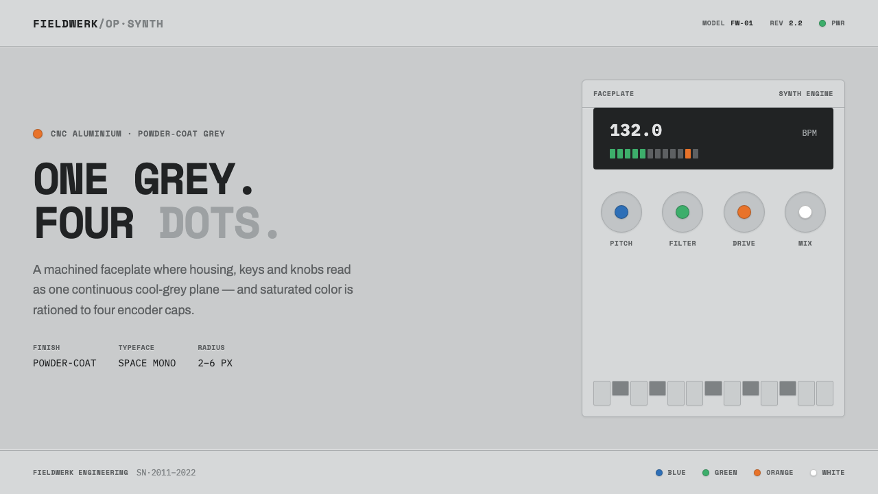 Teenage Engineering OP-1One grey, four dots. Machined aluminium in Space Mono, color rationed to tiny…
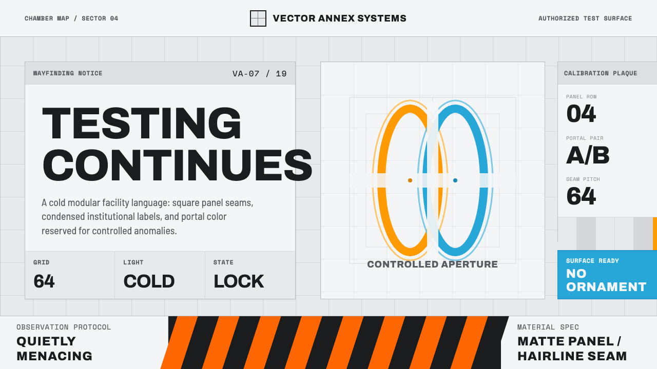 Aperture ScienceSterile authority. Cool panel seams, Archivo signage, and sparse orange-blue…
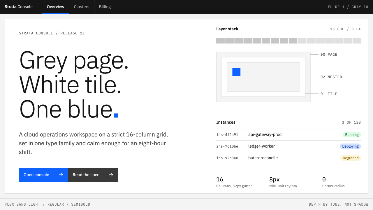 IBM CarbonGrey page, white tiles, one blue. Square corners and Plex Light on a strict 1…
 Oblivion Sky TowerSterile daylight futurism. Cool sky-grey glass, hairline steel mullions, a si…
 Permafrost Monitoring NetworkDepth sets the order. Overcast greys, slate profiles and hairline rules keep…
 SketchQuiet chrome, exact work. White artboards, hairline greys, and one yellow-ora…