What is Sketch?
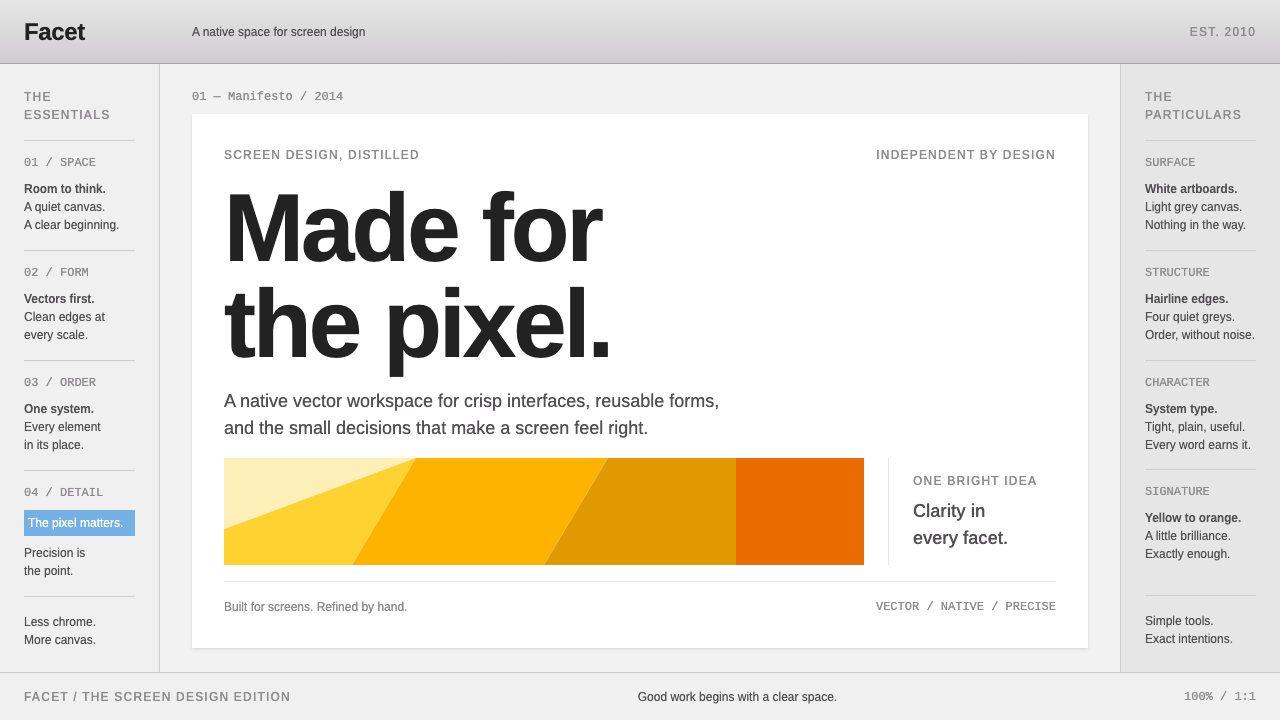
Sketch is the look of a workspace that stays out of the way: grey panels, hairline dividers, white artboards on a pale canvas, and one yellow-orange diamond allowed to show off.
Sketch in brief
Sketch is a vector design application for the Mac, released in 2010 by the Dutch company Bohemian Coding. As a visual style, it is the look of that application's window in its flat-design years: a gradient toolbar across the top, a layer list down the left, an inspector of properties on the right, and a pale grey infinite canvas in the middle where white artboards float.
The style is built on native desktop conventions rather than on a web idiom. Panels are grey, dividers are hairlines, controls are small and tidy, and a selected layer is marked by a row of soft blue. Because the tool exists to let other people make things, its own chrome is intentionally neutral and quiet. The work on the canvas should be the loudest thing on screen.
Only one colour is allowed to be playful, and that is the yellow-orange of the faceted diamond in the application's icon. It appears on splash moments, links and key accents, and it gives an otherwise sober interface a signature. The overall feeling is precise, calm and professional, the visual equivalent of a well-organised drafting table.

Where does Sketch come from?
Sketch 1.0 appeared in 2010 from Bohemian Coding, a small Dutch software company in the Netherlands. The application's principal author was Pieter Omvlee, with Emanuel Sá among the people associated with its design. It arrived at a time when interface designers still did most of their work in raster-oriented tools built for photography and print, which carried a great deal of weight and many features that screen design never needed. Sketch offered something narrower: vector shapes, artboards for each screen and a lightweight interface that did only what interface designers asked of it.
The timing was fortunate. In 2012 the application received an Apple Design Award, a recognition that placed an independent Mac developer among the best-regarded makers on the platform. Then in 2013 Apple's iOS 7 pushed the entire industry toward flat design, with its thin type, bright flat colours and absence of glossy textures. Flat interfaces were much easier to draw as clean vector shapes than as layered photographic effects, and designers who had been working in Photoshop found that Sketch fit the new aesthetic naturally.
That shift, from a photo editor to a dedicated screen design tool, was one of the most visible changes in digital design in the early 2010s. Teams adopted shared libraries of symbols, handed designs to developers through exported assets and specifications, and built whole design systems inside a single file format. Sketch's window became the default environment in which a generation of interface designers spent their days, which is why its look is so strongly associated with that era.
The visual style captured here follows the third major version, whose appearance dates to 2014, and the website screenshot that presented it. It is a period piece in the best sense. The toolbar still carries a gentle gradient, the panels use modest bevelled or flat greys, and the selected-layer blue is a little more saturated than recent tools would choose. It belongs to the moment just after the flat revolution, when professional software began to drop its skeuomorphic detail but had not yet adopted the more stripped-back look of later years. It also stands as an example of Mac indie software, where a small team could set the standard for an entire profession.
What defines the Sketch look?
Neutral grey chrome
Panels, toolbars and inspectors are filled with light and mid greys, so that no interface colour competes with the work. Different regions are distinguished by small shifts in tone, not by hue. The result is a frame that recedes into the background while still making clear where each tool lives.
Hairline dividers
Structure is carried by thin hairline rules between panels, rows and sections, together with subtle inset edges on input fields. Because the lines are light, even a crowded inspector with many sections stays calm and legible. This is where the system's sense of precision comes from.
Artboards on a canvas
The central stage is a pale grey canvas on which white rectangles, the artboards, sit with a faint shadow or edge. White on grey is the strongest contrast in the interface, which draws the eye to the work and gives each screen design a clear frame. Artboards are labelled with small captions above their top-left corners.
Blue selection, yellow-orange accent
A selected layer or object is marked with a soft blue row or outline, a convention shared with many native desktop tools. The signature yellow-orange appears separately and sparingly, tied to the diamond mark and to high-value moments. Keeping the two roles apart is the secret of the palette: blue means you are working here, yellow-orange means this is Sketch.
Compact native controls
Buttons, steppers, drop-downs and sliders are small and follow Mac desktop proportions. Labels are brief and set in a clean system sans at modest sizes. Icons are simple and monochrome, with a thin outline style so that dozens can sit in a toolbar without clutter.
Gentle gradients of the era
The top toolbar and some buttons retain a slight vertical gradient and a hint of bevel, a leftover from the earlier skeuomorphic era. Gradients are shallow and never glossy. They give controls a faint physical presence without returning to heavy textures, and they date the style to 2014 in a pleasant way.
Three-pane layout
Layers on the left, canvas in the middle and inspector on the right form a stable three-pane grammar. Everything a designer needs is always in the same place, which reduces the cost of switching between tasks. The proportions give the canvas the largest share of the window while keeping the side panels narrow and fixed in width.

Who shaped Sketch?
The developer most closely associated with creating Sketch and leading Bohemian Coding's work on it.
Associated with the design of Sketch and its visual identity during its early years.
The small independent Dutch software company that built Sketch and showed that a lean Mac-native team could reshape a profession.
How do you use Sketch today?
In slides, Sketch is excellent for design-process talks, product walkthroughs and anything that presents interface work. A cover can mimic the window itself: a pale grey background, a white artboard-like rectangle bearing the title, a small caption above it as if it were an artboard name, and a single yellow-orange diamond or accent line. Content slides can show a three-pane arrangement, with a narrow left list, a wide central panel and a narrow right panel of notes. For data slides, use hairline gridlines and let one yellow-orange series carry the story.
On the web, the style suits tools for makers: design-resource sites, plug-in directories, component libraries, documentation for creative software and portfolios that wish to feel like a working file. Use a light grey page with white content blocks that resemble artboards, a thin top bar, and a restrained sidebar. Keep buttons compact, use blue for selected states and use the yellow-orange accent for calls to action or the brand mark. Pricing pages should be matter-of-fact, with small cards and clear lists.
For editorial and marketing work, the look gives a trustworthy, craft-oriented tone. Tutorials, release notes, case studies of interface design and newsletters for designers benefit from labelled screenshots floating on grey, captioned like artboards. The style communicates that the author respects the reader's time and the quality of the work. It is less suitable for entertainment or lifestyle content that wants warmth, spectacle or emotion.
To adapt it, keep the neutral grey frame and white working surfaces, and then choose your own single accent for the one colour allowed to be bold. Preserve the thin dividers and compact controls, and the interface will keep its sense of precision. If you want a more modern feel, flatten the gradients entirely and let the dividers do all the work.
A common mistake is to colour the chrome. Giving the panels a bright tint, or using the accent for many elements at once, destroys the principle that the tool recedes and the work leads. Another mistake is to make controls large and airy, which turns a professional tool into something that feels like a consumer app. A third is to forget the white-on-grey contrast, putting white content on a white page so the artboard idea disappears. Stay quiet, stay compact and keep the accent rare.

Sketch — FAQ
What is Sketch?
Sketch is a vector design application for the Mac, released in 2010 by the Dutch company Bohemian Coding. It became the standard workspace for interface designers during the flat-design years, thanks to its focus on screen design, artboards and a lightweight interface.
What does the Sketch visual style look like?
It looks like a native desktop workspace: a gradient toolbar at the top, a layer list on the left, an inspector on the right, grey panels with hairline dividers, and white artboards on a pale canvas. A soft blue marks selection, and a yellow-orange diamond is the single bold accent.
Why is it linked to flat design?
Apple's iOS 7 in 2013 pushed the industry toward flat interfaces made of simple shapes and bright colours. Those were far easier to draw in a vector tool than in a photo editor, so many designers moved to Sketch and the tool became closely tied to that period.
Which era does this system reproduce?
It reproduces the window of the third major version, as it looked around 2014 and as it appeared in the product's website screenshot. The gentle toolbar gradient and slightly saturated selection blue are marks of that moment, soon after the flat-design shift.
Can this style be used for a modern product?
Yes, especially for creator-facing tools and portfolios. Keep the grey frame, white artboard-like surfaces, hairline dividers and compact controls, and choose a single accent of your own. Flattening the gradients gives a more current feel while keeping the sense of precision.
Related design styles
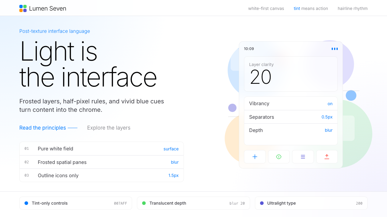 Flat Design iOS 7The day skeuomorphism died. Bright tints on white, hairline separators, frost…
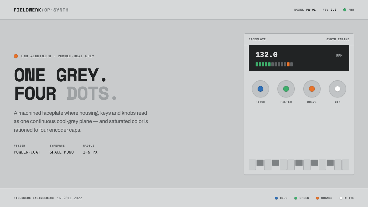 Teenage Engineering OP-1One grey, four dots. Machined aluminium in Space Mono, color rationed to tiny…
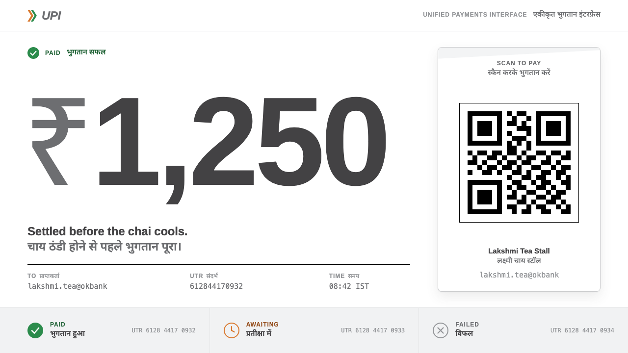 UPI PaymentsUtility, not brand. Grey Helvetica, a saffron-green chevron, black QR on whit…
 Aperture ScienceSterile authority. Cool panel seams, Archivo signage, and sparse orange-blue…
 Bang & Olufsen AluminiumQuiet luxury, machined flat. Satin aluminium grain, hairlines, thin charcoal…
 DJI PhantomWhite on white, one blue allowed. Hairline spec tables make the hardware the…