What is Bang & Olufsen Aluminium?
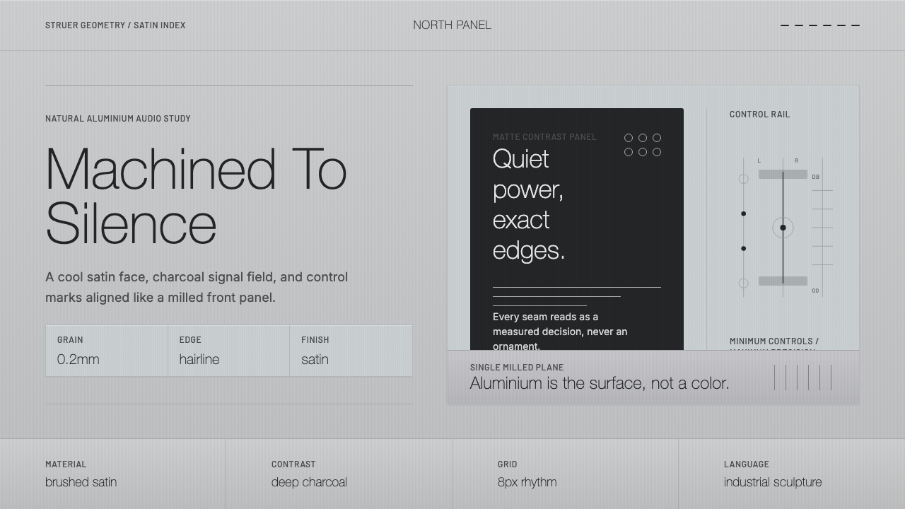
Bang & Olufsen turned hi-fi equipment into industrial sculpture, machining natural aluminium into satin-grained surfaces so precise that the metal itself, not paint or plastic, became the design.
Bang & Olufsen Aluminium in brief
Bang & Olufsen is a Danish audio and electronics company whose design language, developed principally around its BeoSound and BeoLab product lines, treats consumer electronics as objects of industrial sculpture rather than as boxes housing components. Where most audio manufacturers of the same era hid their engineering behind painted plastic or wood-veneer cabinets, Bang & Olufsen's defining move was to expose natural aluminium as the visible, finished surface itself — not painted to look like metal, but genuinely machined and finished metal, left to read as what it actually is.
The house style emerged from the Struer workshops under designers Jacob Jensen and David Lewis, whose work established a design discipline built on precision rather than decoration: cool, brushed-aluminium surfaces with a fine, consistent satin grain; hairline-thin borders and seams that read as machined tolerances rather than decorative lines; and deep charcoal tones used for type and controls rather than pure black, softening the contrast just enough to feel considered rather than harsh.
This is a design language built around restraint understood as a form of luxury. Nothing is glossy, nothing is chrome-mirrored, nothing simulates warmth through color or texture. The aesthetic communicates quality through the evident precision of the machining and the coolness of the material itself — a quietness that assumes the viewer already understands the value of what they are looking at, rather than needing to be told through ornament or shine.
Where does Bang & Olufsen Aluminium come from?
Bang & Olufsen was founded in Struer, Denmark, by Peter Bang and Svend Olufsen, establishing the company as a Danish audio manufacturer rooted in the broader current of Scandinavian industrial design — a tradition that treats functional, everyday objects as worthy of the same design rigor as fine art or architecture, and that generally favors honest material expression over applied decoration. The company's identity became inseparable from this regional design culture, in which restraint, craftsmanship, and material honesty are treated as design values in their own right rather than as budget constraints.
The aesthetic most associated with Bang & Olufsen internationally was shaped by designer Jacob Jensen, whose long collaboration with the company beginning in the 1960s established the visual vocabulary of satin-finished aluminium, minimal control surfaces, and precise, understated proportions that came to define the brand for decades. Jensen's approach treated the audio equipment itself as a considered object meant to sit visibly in a living space — not hidden in a cabinet — which meant its surface finish and formal restraint had to hold up to the same scrutiny as furniture or sculpture, not just function as a housing for speakers and electronics.
David Lewis extended and refined this design language over subsequent decades, continuing the emphasis on natural aluminium finishing, disciplined proportion, and understated color while adapting the vocabulary to newer product categories as the company's line expanded. Together, the Jensen and Lewis design heritage — spanning roughly from the 1960s and 1970s onward — established 'design as discipline' as one of Bang & Olufsen's core stated values, treating the design process itself as rigorous and systematic rather than expressive or trend-driven.
This design philosophy positioned Bang & Olufsen within a specifically Danish and Northern European current of modernism that prized functional clarity, material integrity, and long-term formal restraint over ornamentation or novelty for its own sake. The result is a design language that has remained recognizably consistent across several decades of product generations, because its core commitments — natural material, precise machining, minimal color, disciplined proportion — are structural principles rather than passing stylistic choices tied to a particular era's trends.
What defines the Bang & Olufsen Aluminium look?
Satin-Grain Aluminium Surface
The signature surface is natural aluminium finished with a fine, consistent brushed or satin grain — never glossy, never mirror-polished, and never painted to imitate the look of metal. The grain is subtle enough to read as refined rather than industrial-rough, but present enough that the surface visibly reflects and scatters light differently depending on viewing angle, which is precisely what a flat painted surface cannot do.
Cool, Neutral Tonality
The overall tonal register is cool and neutral, sitting close to the natural color of brushed aluminium itself rather than warmed toward cream or off-white. This coolness is deliberate and consistent — it is treated as a defining characteristic of the material's honest appearance, not as an aesthetic afterthought layered on top of it.
Hairline Structural Lines
Borders, seams, and dividing lines are rendered as extremely thin hairlines rather than bold rules or thick strokes. These lines read as evidence of precise machining and tight tolerances — the visual equivalent of a seam between two pieces of milled metal fit together exactly — rather than as decorative graphic elements added for visual interest.
Deep Charcoal Type
Text and control labeling use a deep charcoal tone rather than pure black, a small but deliberate softening that keeps the overall palette from tipping into harsh, high-contrast starkness. This choice reflects the same restraint that governs the rest of the system: even the darkest element in the palette avoids absolute extremes.
Thin, Elegant Sans-Serif Type
Typography favors thin-weight, elegant sans-serif letterforms aligned with mechanical precision to a strict underlying grid. The lightness of the type weight mirrors the lightness and precision of the machined surfaces around it, avoiding any heavy or bold treatment that would clash with the material's quiet, understated character.
Strict Grid Alignment
Every element — controls, labels, structural lines — is aligned to a strict, disciplined grid with exacting consistency, echoing the tolerances of precision-machined hardware. This is not a loose or intuitive layout logic; it behaves the way a mechanical assembly behaves, where every part has one correct, exact position.
Absence of Ornament and Warmth Substitutes
The system explicitly avoids anything that would simulate warmth or richness through decoration: no mirror-chrome finishes, no glossy plastics, no classical serif type, and no warm off-white or cream tones standing in for the cool aluminium base. Quality is communicated entirely through precision and material honesty, never through applied richness.
Who shaped Bang & Olufsen Aluminium?
Jensen's long collaboration with Bang & Olufsen beginning in the 1960s established the design vocabulary most associated with the brand internationally: satin-finished natural aluminium, minimal control surfaces, and precise, restrained proportions. He treated audio equipment as an object meant to be seen and lived with in a domestic space rather than hidden away, which required its material finish and formal discipline to hold up under the same scrutiny as furniture or sculpture.
Lewis extended and adapted the Jensen-era design language across subsequent decades as Bang & Olufsen's product range expanded, maintaining the core commitments to natural aluminium finishing, disciplined proportion, and understated color while applying them to new product categories. His work helped ensure the design philosophy remained coherent and recognizable across generations of hardware rather than fragmenting as the company's catalogue grew.
As co-founder of the company in Struer, Denmark, Bang helped establish the engineering and manufacturing foundation on which the later design language of natural-material precision would be built. The company's roots as a Danish manufacturer situated it from the outset within a broader Scandinavian design culture that valued functional honesty over applied decoration.
As co-founder alongside Peter Bang, Olufsen helped establish the company that would become synonymous with Danish design discipline in consumer electronics. The Struer origin and the founders' engineering-first orientation set the stage for a design culture in which technical precision and material integrity, rather than surface decoration, became the primary vehicle for expressing quality.
How do you use Bang & Olufsen Aluminium today?
The core transferable principle from Bang & Olufsen's design language is that quality and luxury can be communicated entirely through precision and material honesty rather than through ornament, gloss, or warm decorative color. Applying it well requires trusting restraint — resisting the urge to add richness through embellishment when the style's actual power comes from exacting consistency and a cool, considered palette.
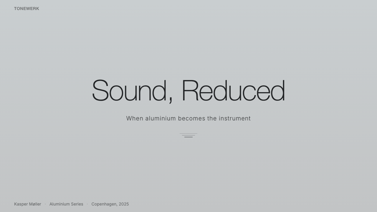
For presentation slides, this style suits cover and content pages for premium, technical, or engineering-forward products particularly well: a cool, neutral background evokes brushed metal without needing a literal texture, hairline-thin dividing rules organize content with the same precision as a machined seam, and thin-weight sans-serif type set on a strict grid signals confidence without needing bold emphasis. Data slides benefit from the same restraint — charts and tables should use fine hairline gridlines and a narrow tonal range rather than saturated multi-color coding, letting precision of alignment do the work that color variety usually does.
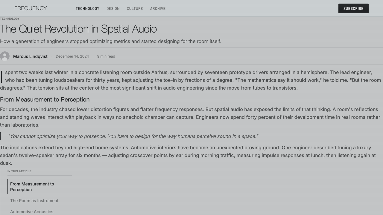
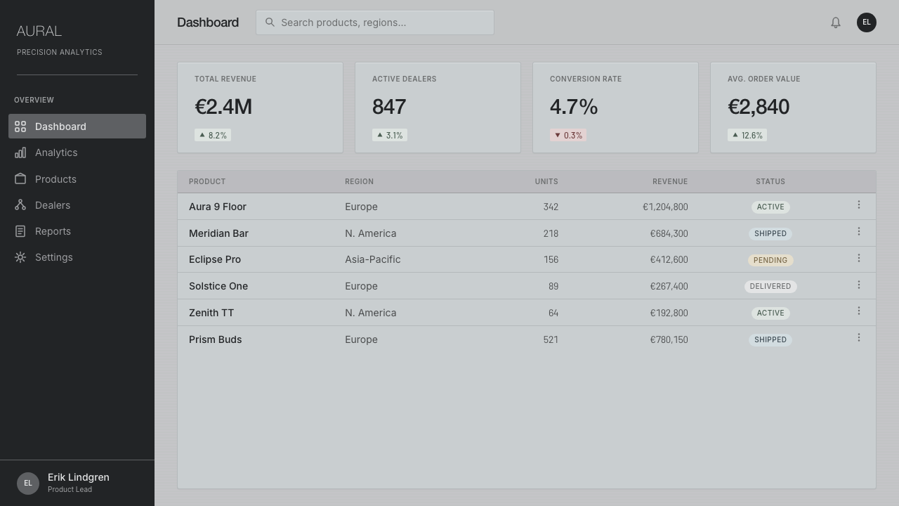
For web interfaces, the aesthetic is especially well suited to dashboards and pricing pages for premium or professional-grade products, where the goal is to signal precision, trustworthiness, and quiet confidence rather than energy or playfulness. Interface chrome should stay close to the cool neutral base, interactive elements should be distinguished through subtle tonal shifts rather than bright accent color, and structural lines throughout the layout should stay hairline-thin and exact rather than bold or decorative.
For editorial and marketing work, the style supports brand storytelling built around craftsmanship, engineering heritage, and material quality — feature layouts with generous, precisely gridded whitespace, thin structural rules separating sections, and headline type set with restrained elegance rather than dramatic scale contrast. Marketing pages for premium or professional products can use the cool aluminium-toned palette to signal sophistication without relying on color saturation or ornamental flourish to do that work.
A common mistake when applying this style is treating 'metallic' as equivalent to shiny or reflective — using glossy gradients, chrome-mirror effects, or high-shine metallic textures actually contradicts the aesthetic, which is built specifically on a matte, satin-grained finish rather than gloss. Another frequent error is warming the palette toward cream or off-white for approachability; the coolness of the base tone is a structural commitment, not an incidental choice, and warming it undermines the precise, considered character the whole system depends on.
Bang & Olufsen Aluminium — FAQ
Why does this style use aluminium rather than another metal or a painted finish?
Bang & Olufsen's design tradition specifically favors natural aluminium finished with a satin grain because it allows the material's genuine properties — its coolness, its subtle light-scattering texture, its precision-machined surface — to be the visible design itself, rather than simulating those qualities through paint or plastic. The choice reflects a broader design value of material honesty: the surface should be what it appears to be, not a representation of something else.
Is this style the same as generic 'brushed metal' UI skins from the 2000s?
No — generic brushed-metal interface skins from that era typically simulated a metallic texture decoratively, often layered with glossy highlights or gradient effects, applied as surface flourish rather than as a structural design principle. The Bang & Olufsen approach is the opposite: restraint, hairline precision, and a genuinely cool neutral tonality are treated as load-bearing design decisions tied to actual industrial design heritage, not a decorative texture applied for visual interest.
What kind of products or brands does this aesthetic suit best?
It suits products and brands that want to communicate precision, trustworthiness, and quiet high-end quality — premium hardware, professional tools, engineering-forward products, and services positioning themselves as considered and mature rather than energetic or playful. Its restrained, cool character makes it a strong match for audiences who read understatement as confidence rather than as a lack of personality.
Why is deep charcoal used for text instead of pure black?
Pure black against a cool aluminium-toned background can read as harsh or overly stark, breaking the sense of considered restraint the rest of the system depends on. Deep charcoal softens that contrast just slightly while still providing strong readability, keeping the overall palette consistent with the material-honest, precisely calibrated character of the aesthetic rather than introducing an extreme value that feels disconnected from the rest of the system.
Does this style work for warm, consumer-friendly or playful brand contexts?
It generally does not — the aesthetic's entire identity is built on coolness, restraint, and precision, which can read as distant or overly serious in contexts that call for warmth, approachability, or playfulness, such as children's products, food and hospitality brands, or casual consumer apps. It is most effective when a product's actual values align with precision and understated confidence rather than being applied simply because metallic surfaces look premium in isolation.
Related design styles
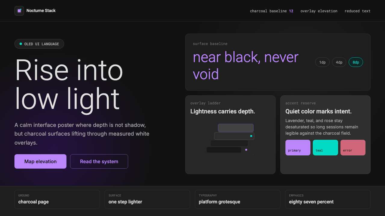 Dark Mode UICalm night interfaces. Charcoal layers rise by overlay lightness, not shadow.
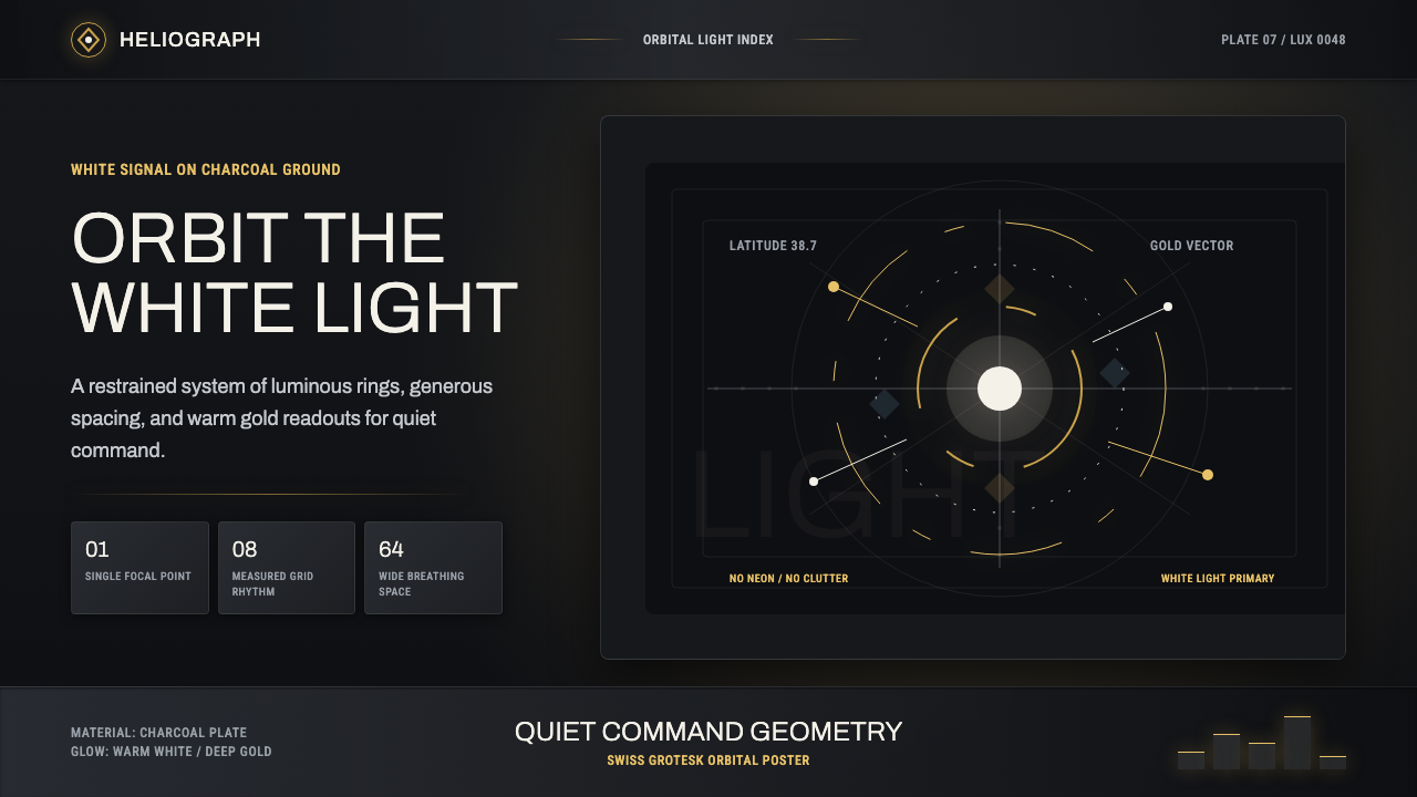 DestinyLuminous restraint. White-gold rings orbit charcoal plates in clean grotesk t…
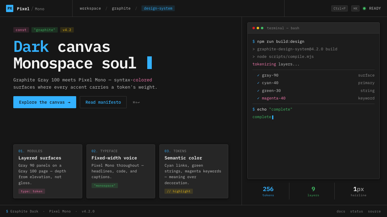 IBM Plex Mono DevColor used like syntax highlighting. Carbon Gray 100 canvas, IBM Plex Mono th…
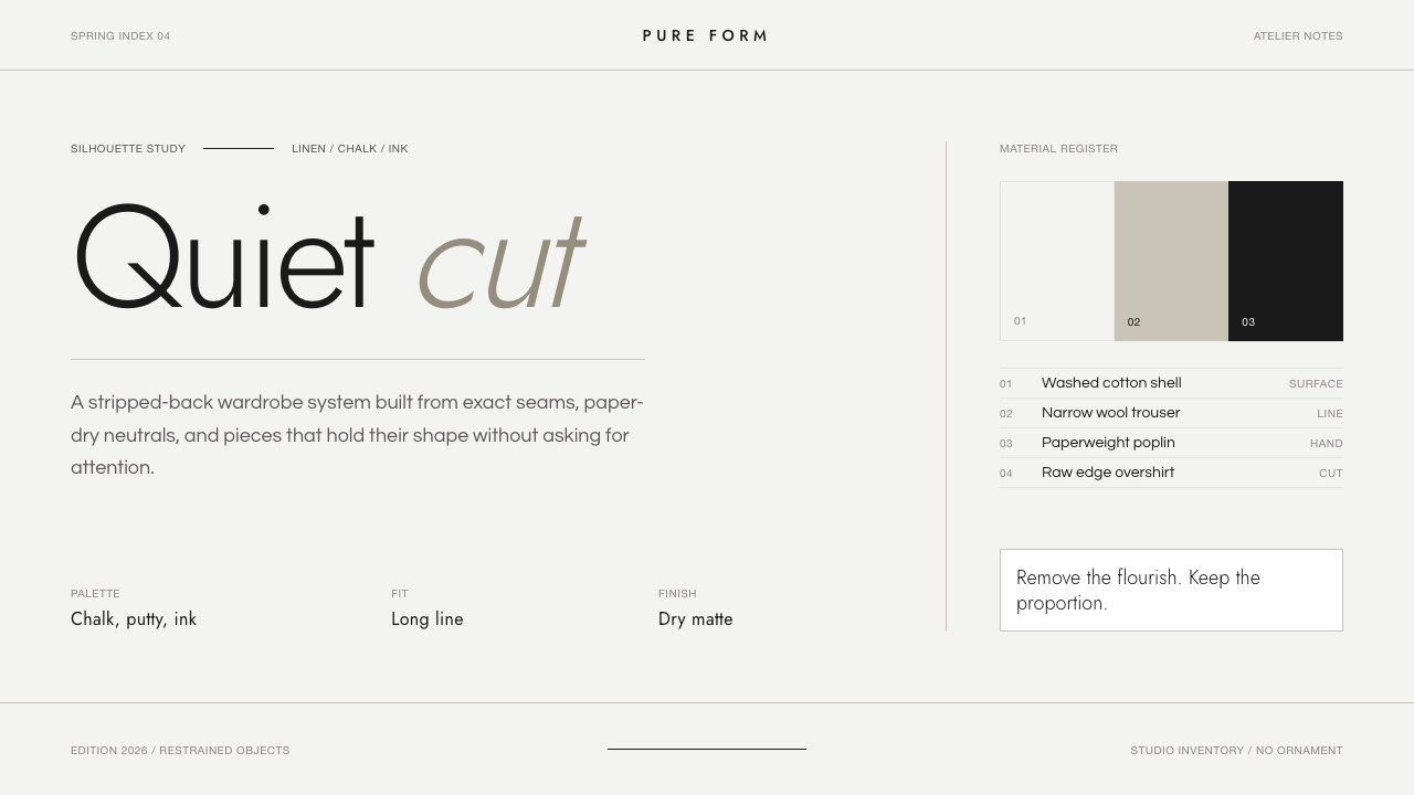 Jil Sander PurePrecision feels luxurious. Near-black geometric sans on curated near-white, w…
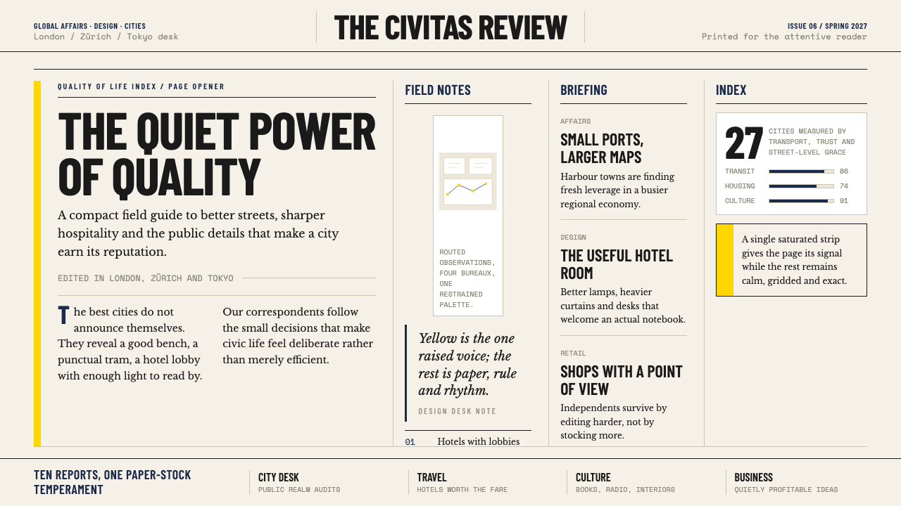 Monocle MagazineQuiet authority. Yellow spine, warm paper and dense ruled columns speak at li…
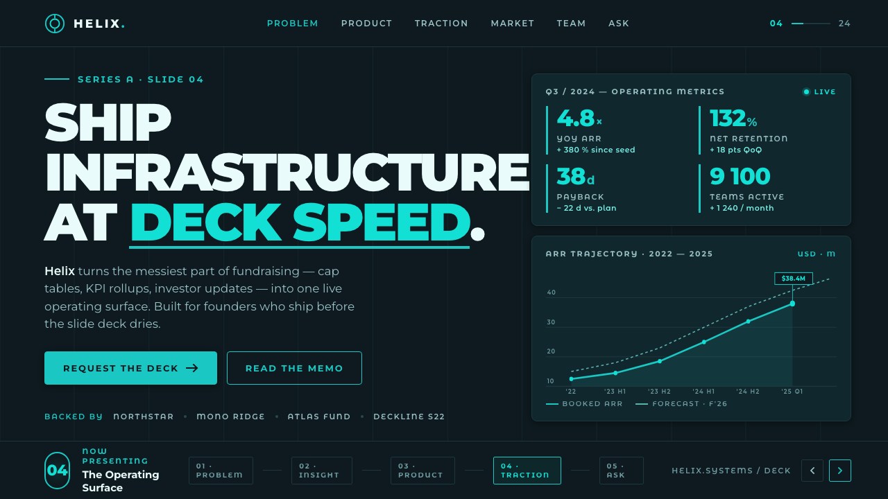 Montserrat StartupSeries-A on a projector. Black Montserrat on charcoal-teal, lit by one bright…