What is Destiny?
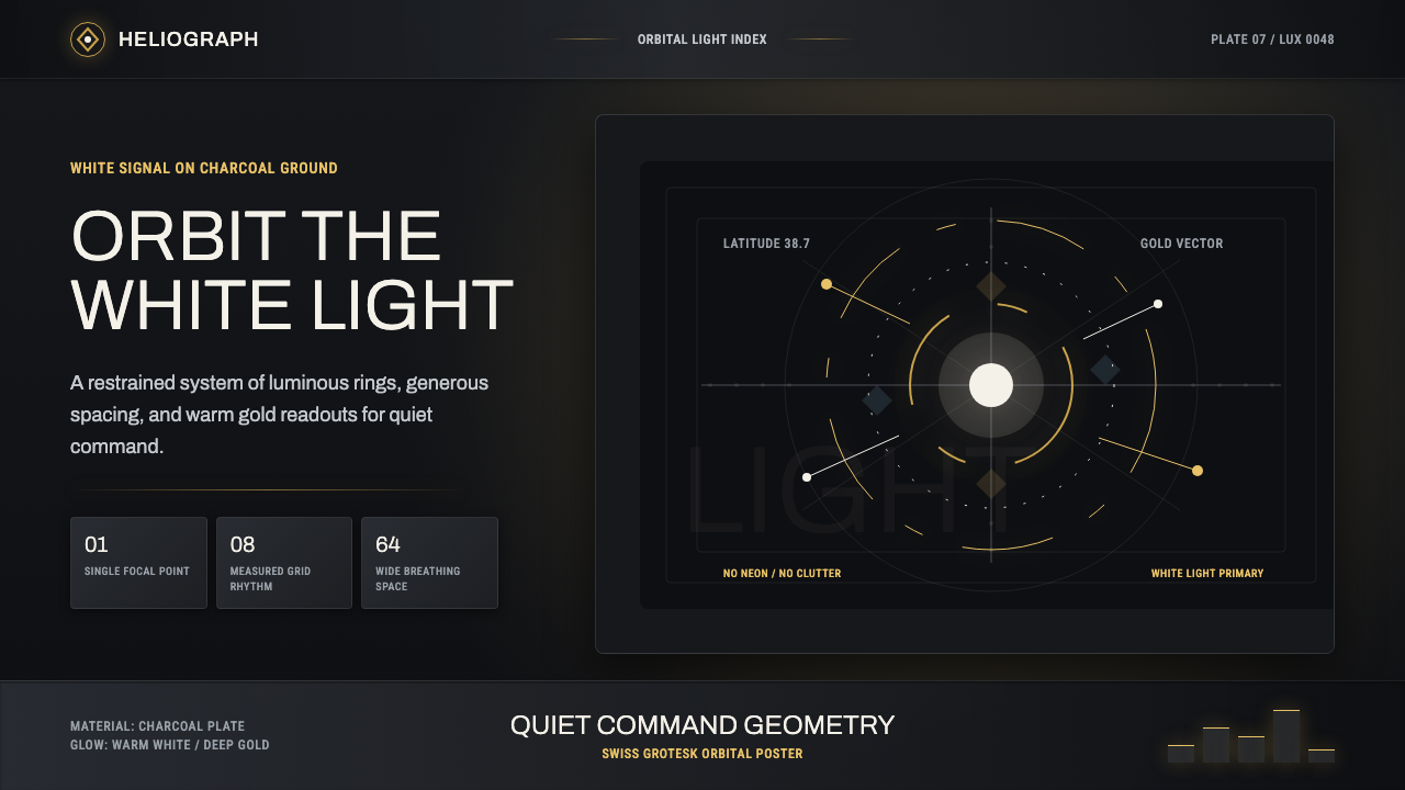
Destiny turns science-fiction interface design into luminous restraint — white-gold orbits, charcoal planes, and disciplined grotesk type gathered around a single point of Light.
Destiny in brief
Destiny is the visual language developed for Bungie’s science-fiction franchise beginning with its 2014 launch. Designed under David Candland, the interface combines radial Director menus, deep charcoal plates, warm gold illumination, bright white information, and clean grotesk typography. Its atmosphere is futuristic without relying on neon spectacle: the future appears calm, ordered, spacious, and quietly luxurious.
The system takes the Traveler’s white Light as both narrative symbol and compositional principle. Menus orbit bright centers; rings imply navigation, movement, and celestial scale; illumination gathers around meaningful points instead of washing across the entire screen. Dark surfaces provide depth and silence, while white and gold establish hierarchy. The result feels less like a crowded machine console than a precise instrument suspended in darkness.
Although Destiny belongs to science-fiction HUD design, its discipline also recalls Swiss and International Typographic Style. Information is organized through alignment, spacing, proportion, and typographic contrast rather than decorative framing. Neue Haas Grotesk is the honest typographic reference, with Archivo, Roboto Condensed, and Barlow Semi Condensed offering related voices. This lineage matters: Destiny’s identity comes from controlled grotesk typography, not from automatically applying a generic contemporary interface font.
Where does Destiny come from?
Destiny’s visual language originated at Bungie in Bellevue, in the Seattle area of Washington State, and entered public view with the game’s 2014 launch. The franchise required an interface capable of holding science-fiction scale without sacrificing legibility. Under David Candland’s design leadership, Bungie answered with a restrained system of orbiting menus, luminous focal points, dark plates, and typographic clarity. Its defining gesture was not technological excess but the careful staging of information against darkness.
The Traveler supplied the system with its central image: a brilliant white presence associated with Light. That image became more than narrative decoration. It offered a model for composition in which information could orbit a bright center, just as celestial bodies gather around a larger force. The radial Director menus translate that idea into interface form. Rings and arcs suggest trajectories rather than boxes, while concentrated glows make selected or important locations feel illuminated from within.
Typographically, the design draws its authority from the lineage of Neue Haas Grotesk and from the broader principles of Swiss and International Typographic Style. Clean grotesk forms prevent the celestial imagery from drifting into fantasy ornament, while generous spacing gives labels and controls an institutional calm. Archivo, Roboto Condensed, and Barlow Semi Condensed can express this character in accessible systems because they retain the directness, compact structure, and neutral confidence required by the interface.
Across the franchise from roughly 2014 through 2024, this vocabulary remained recognizable: white information over charcoal ground, restrained gold radiance, radial geometry, and uncluttered type. Individual applications could change while the underlying relationship stayed stable. Darkness acted as a field, white carried primary meaning, and gold marked warmth or significance. That consistency established Destiny as a distinctive form of science-fiction minimalism rather than a collection of fashionable effects.
What defines the Destiny look?
Color and Light
The palette is built from luminous white, warm gold, and deep charcoal. White carries primary information and evokes the Traveler’s Light; gold introduces warmth, importance, and controlled radiance; charcoal gives both colors room to breathe. The glow should collect around focal points and edges rather than becoming a general haze. Brightness is scarce enough to feel meaningful, and neon color is excluded because it would replace quiet authority with spectacle.
Radial Geometry
Circles, rings, arcs, and orbit-like relationships form the principal geometric vocabulary. They make navigation feel celestial and directional while keeping the composition centered on a meaningful point. Radial structure should guide attention, not become ornamental machinery: a few clear trajectories are stronger than a dense web of technical marks. Straight alignments may support labels and secondary information, but the circle supplies the system’s identity.
Grotesk Typography
Typography is clean, controlled, and descended in spirit from Neue Haas Grotesk. Archivo provides a broad, assured voice, while Roboto Condensed and Barlow Semi Condensed can carry compact navigational language without becoming theatrical. Hierarchy comes from changes in scale, width, density, and spacing rather than decorative type treatments. The voice should feel engineered yet humane, avoiding both retro-futurist lettering and the anonymous softness of a default interface font.
Charcoal Plates
Information rests on gunmetal-like charcoal surfaces rather than absolute visual emptiness. These plates should feel thin, calm, and materially present, giving labels and diagrams a stable field without enclosing every item in a heavy container. Differences between layers remain subtle. Depth comes from overlap, restrained illumination, and tonal separation, not from glossy textures or a stack of conspicuous shadows.
Generous Space
Destiny’s luxury comes largely from what it leaves unoccupied. Wide intervals around headings, controls, and radial forms allow each element to register independently. Space also amplifies light: a small bright point feels more powerful when surrounded by darkness. Crowding destroys the celestial scale and turns the interface into an ordinary control panel, so reduction and grouping are essential parts of the style.
Quiet Hierarchy
Hierarchy is unmistakable but rarely loud. Primary information appears in bright white, secondary material recedes into softer charcoal relationships, and gold is reserved for moments that deserve warmth or attention. Alignment and proximity do most of the organizational work. Borders, icons, and glows should never compete simultaneously; one signal establishes priority while the others remain supporting structure.
Who shaped Destiny?
Candland led the design direction described in the source material and is the central named designer behind Destiny’s restrained interface language. The radial Director menus, luminous centers, charcoal plates, and disciplined typographic atmosphere reflect a coherent approach in which narrative symbolism and practical navigation share the same visual grammar. His role is essential to understanding the interface as a designed system rather than an incidental layer of science-fiction decoration.
The Bellevue-based studio created Destiny and sustained its visual language across the franchise. Bungie’s contribution is collective as well as institutional: the interface connects the world’s central image of Light with a repeatable system for menus, information, and navigation. That continuity allowed the style to remain recognizable across roughly a decade without depending on a single decorative motif or temporary technology trend.
The Traveler is not a historical designer but the defining symbolic figure within the supplied visual account. Its white Light gives the interface a compositional center and explains why brightness carries more than functional emphasis. Radial menus can be read as visual echoes of orbit, while the surrounding charcoal space heightens the sense of a luminous presence. The Traveler therefore connects Destiny’s narrative identity to its most reusable design principles.
How do you use Destiny today?
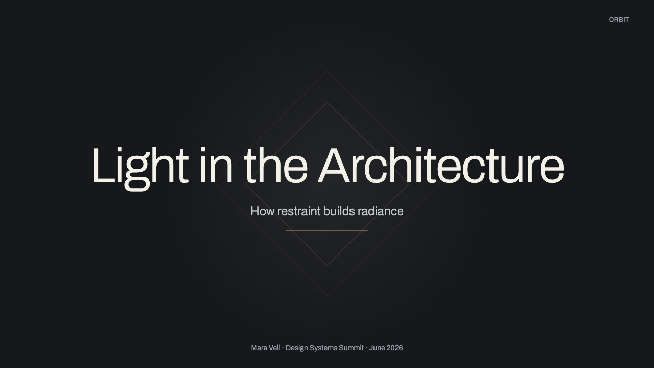
For presentation slides, Destiny works best when the deck is treated as a sequence of illuminated fields rather than conventional pages. A cover can place a restrained ring or arc around one bright focal point, with the title held in clean grotesk type across a broad charcoal ground. Content slides should keep one dominant idea per field, using white for the essential statement and quieter tones for context. A thin gold orbit or localized glow may connect sections, but it should never become a decorative border repeated around everything.
Data slides benefit from the style’s orbital logic and strong light hierarchy. Circular charts, progress indicators, and relationship diagrams can behave like trajectories around a center, while conventional bars and tables should remain planar and sharply aligned. Use gold to identify the finding that deserves attention, not to color every category. White labels remain primary, secondary comparisons recede, and generous empty space prevents a complex dataset from turning into a crowded cockpit display.
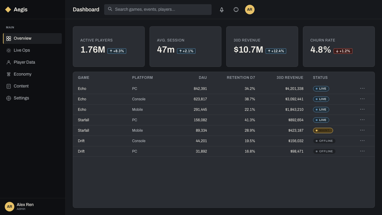
For web interfaces, Destiny is especially effective on dashboards, analytical tools, and pricing pages that need to feel advanced without becoming noisy. A dashboard can organize high-level status around a luminous central indicator, then distribute supporting modules across charcoal plates. Pricing tiers should rely on spatial separation and typographic hierarchy, with gold reserved for the recommended or active choice. Controls remain simple and legible; radial devices are most useful for navigation or focused selection, not for every routine input.
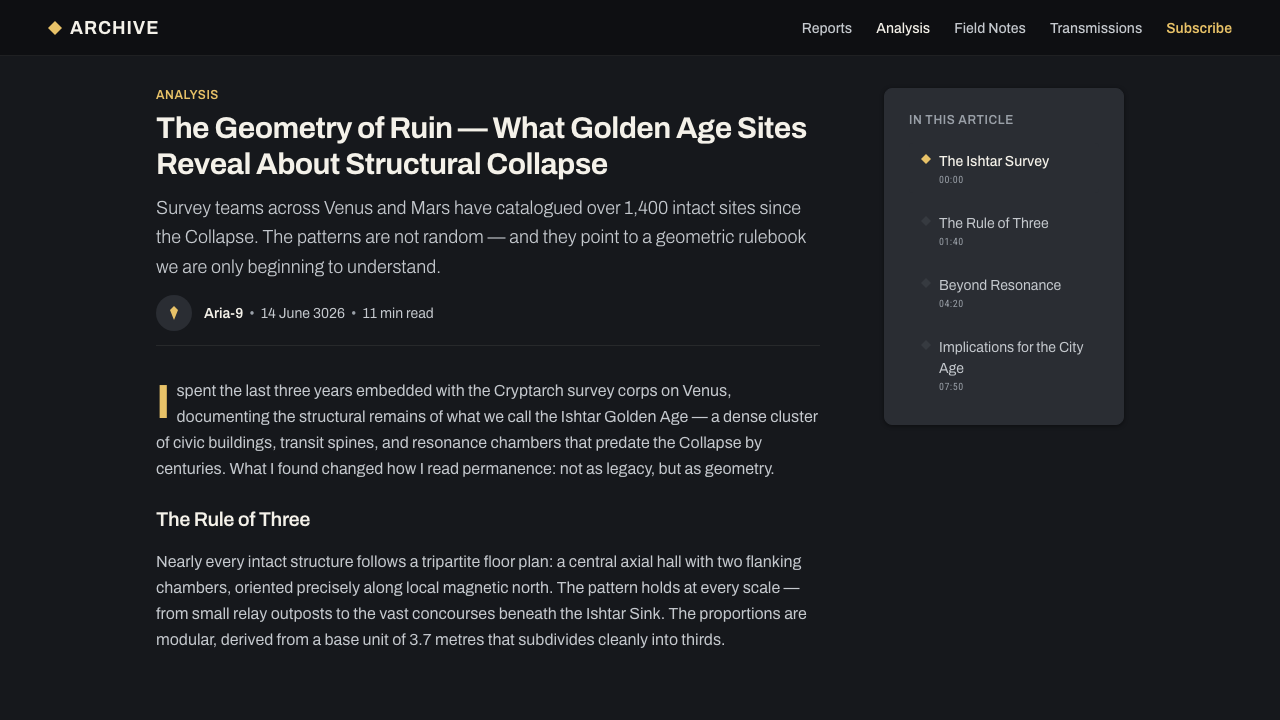
Editorial and marketing layouts can use the style to frame a product, report, or campaign as precise and aspirational. An article may open with a spacious dark field, a white headline, and one orbital diagram, then move into disciplined text columns with occasional gold signals. Marketing sections can alternate between open charcoal expanses and lightly differentiated plates. Imagery, when present, should support the luminous atmosphere rather than competing with it through saturated color or elaborate visual noise.
The most common mistake is confusing science fiction with maximal technological decoration. Adding neon colors, dense grids, constant glow, ornamental micro-labels, and multiple futuristic typefaces erases the restraint that makes Destiny distinctive. Another error is using Inter automatically and assuming any neutral sans serif will carry the same character. Begin instead with the Neue Haas Grotesk lineage, choose one compatible grotesk family, preserve large areas of darkness, and allow only a few white or gold elements to command the scene.
Destiny — FAQ
Is Destiny’s interface simply a dark science-fiction HUD?
No. Its science-fiction identity is carried by a specific relationship among radial geometry, luminous hierarchy, charcoal surfaces, and grotesk typography. A generic dark HUD often relies on dense technical markings, neon accents, or simulated machinery. Destiny does the opposite: it removes noise, concentrates light, and allows space to suggest scale. The style is therefore defined as much by restraint and typographic discipline as by rings or glows.
Why is Neue Haas Grotesk an important reference?
It identifies the typographic character more accurately than the vague instruction to use a modern sans serif. The reference points toward clean grotesk construction, neutral confidence, and disciplined information design associated with Swiss and International Typographic Style. Archivo, Roboto Condensed, and Barlow Semi Condensed can carry related qualities in accessible implementations. Choosing from this lineage preserves Destiny’s precise voice and avoids the generic appearance produced by defaulting to Inter.
How should gold be used without making the design ornate?
Treat gold as illumination and significance, not as luxury decoration applied everywhere. It works best around a selected point, an active trajectory, an important conclusion, or a recommended option. White should still carry most primary information, while charcoal provides the field. When gold becomes a broad surface treatment or surrounds every component, it loses its signaling role and turns the interface from quietly luxurious into conventionally ornamental.
Must every Destiny-inspired layout use circular navigation?
No. Radial Director menus are the clearest signature, but copying them into every context can harm usability and reduce the style to a motif. Conventional lists, tables, and linear flows can remain linear while adopting the deeper system: charcoal grounds, bright white hierarchy, selective gold light, generous spacing, and controlled grotesk type. Use radial structure when orbit, focus, or directional selection genuinely clarifies the relationship among items.
Where does the Destiny style work poorly?
It struggles when an experience depends on visual abundance, playful color, informal warmth, or dense continuous reading. The dark field and concentrated light naturally create distance, ceremony, and technological authority; those qualities can feel severe when friendliness or casual familiarity is the primary goal. The style also weakens when a screen must display many equally important signals, because its hierarchy depends on allowing only a small number of bright elements to dominate.
Related design styles
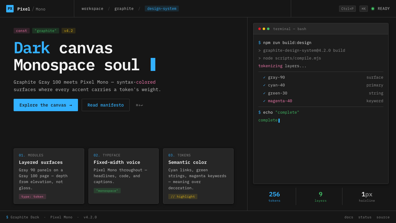 IBM Plex Mono DevColor used like syntax highlighting. Carbon Gray 100 canvas, IBM Plex Mono th…
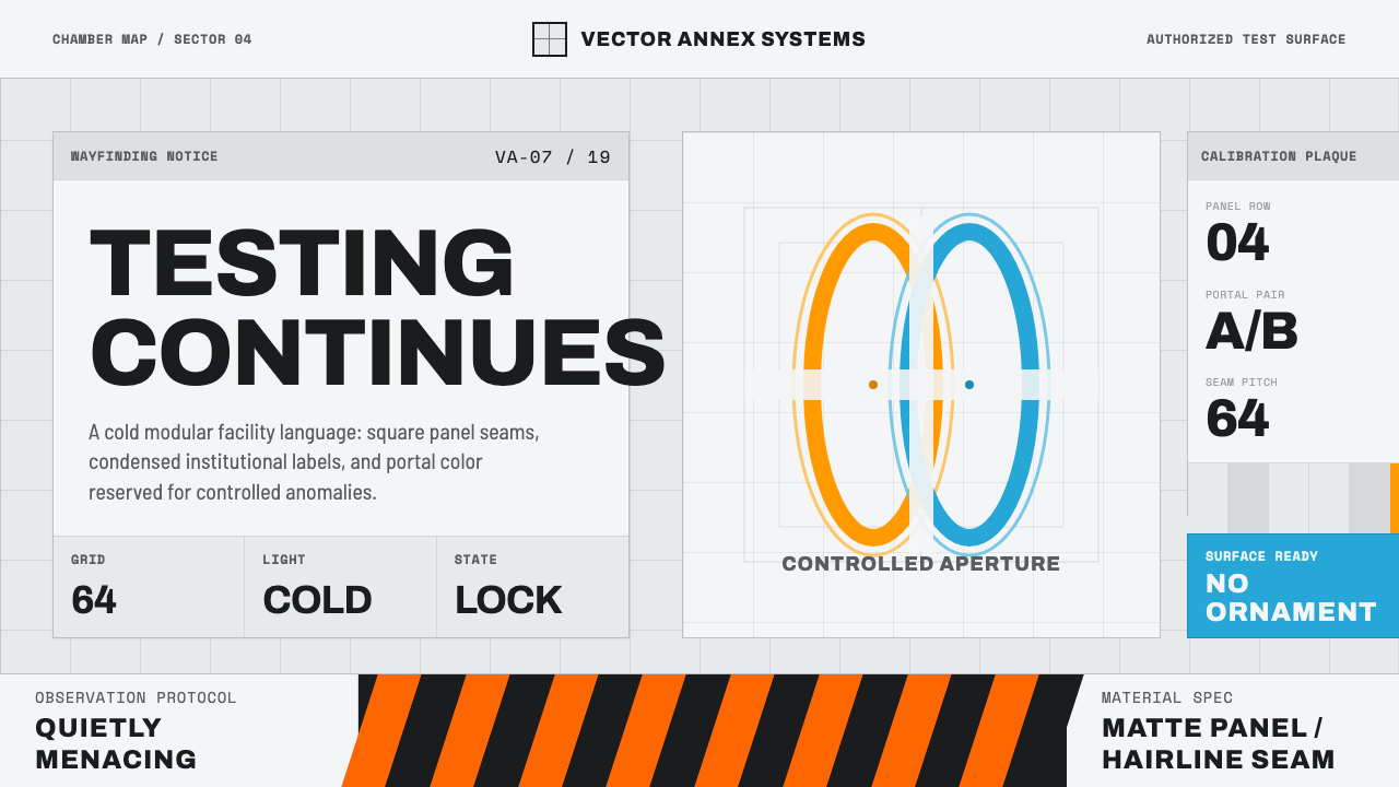 Aperture ScienceSterile authority. Cool panel seams, Archivo signage, and sparse orange-blue…
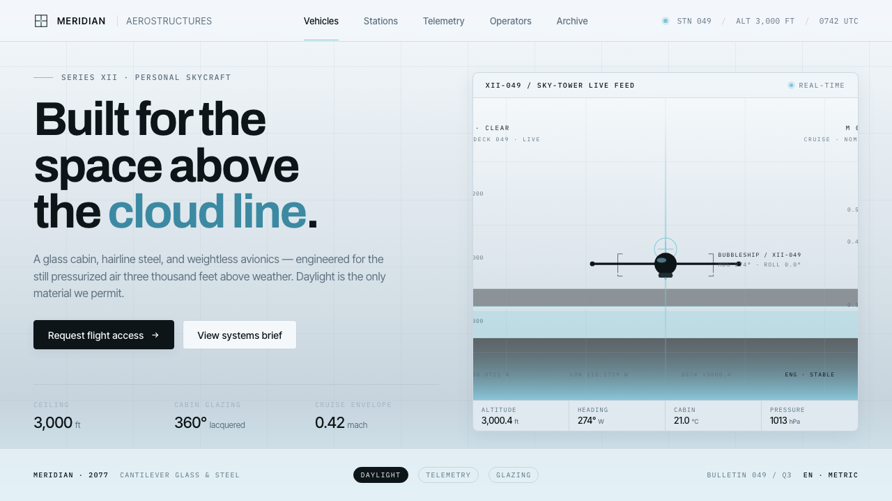 Oblivion Sky TowerSterile daylight futurism. Cool sky-grey glass, hairline steel mullions, a si…
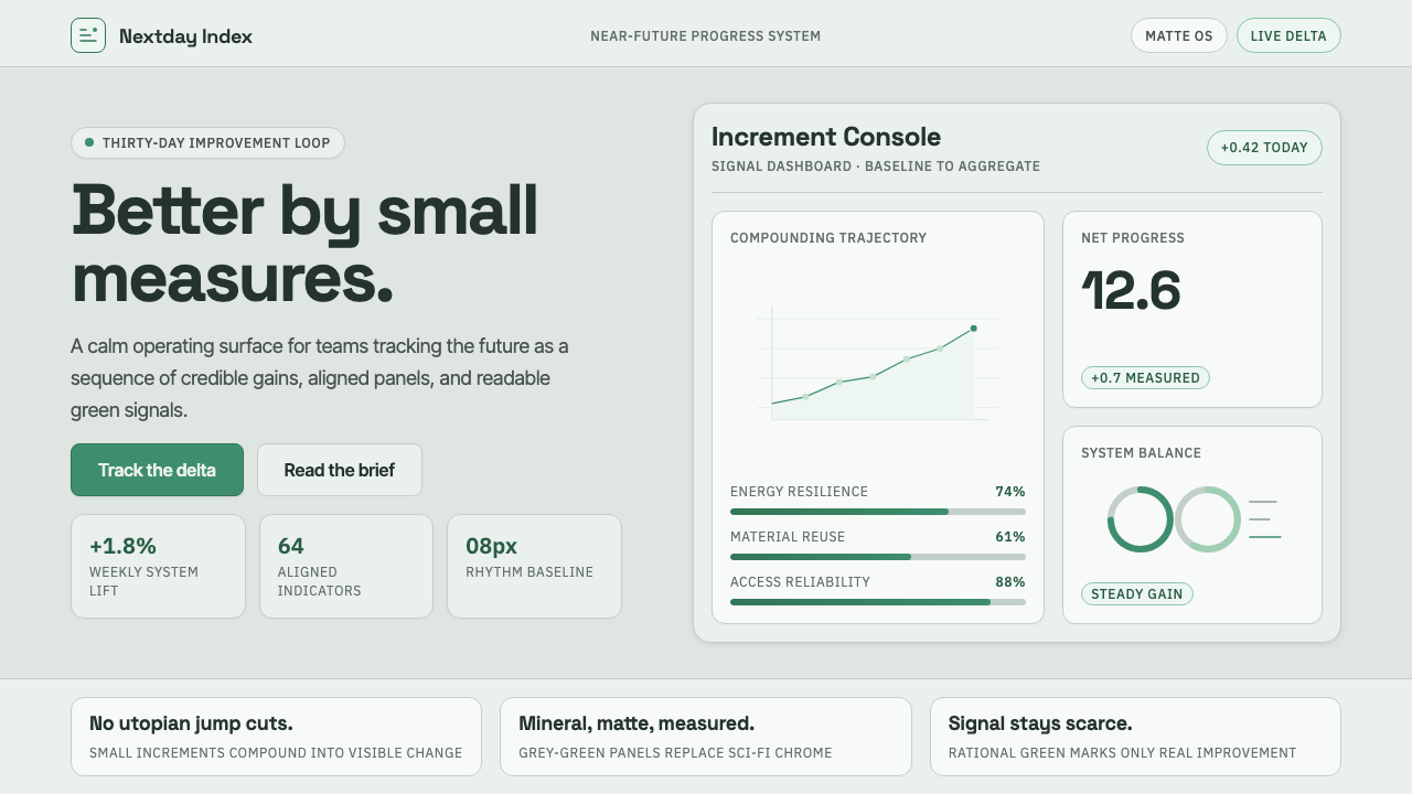 ProtopiaCalm progress, not sci-fi hype. Mineral grey-green grids make every small gai…
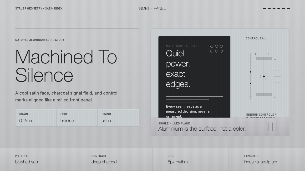 Bang & Olufsen AluminiumQuiet luxury, machined flat. Satin aluminium grain, hairlines, thin charcoal…
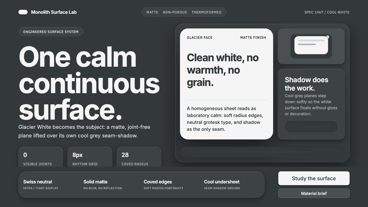 Corian Solid SurfaceSeamless matte calm. Glacier White floats over cool grey shadow with neutral…