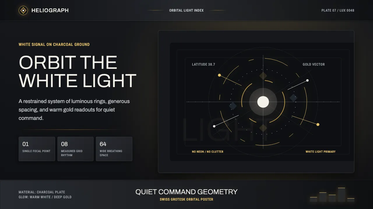
About Destiny
Destiny's interface is sci-fi restraint made luminous. Designed under David Candland, its radial Director menus orbit a single bright point — the Traveler's white Light — while warm gold glows pool across deep charcoal plates. The honest type referent is Neue Haas Grotesk, so this system speaks in clean Google grotesks: Archivo, Roboto Condensed, Barlow Semi Condensed. Never Inter by reflex.
The result is precise, generously spaced, and quietly luxurious: white as primary, gold as glow, charcoal as ground. No neon, no clutter — just elegant light on gunmetal.
- Origin
- North America (Bungie, Bellevue / Seattle area, USA)
- Era
- 2014 (Destiny launch); current visual language ~2014–2024 across the franchise
- Key figures
- Bungie · David Candland
- Movements
- Swiss / International Typographic Style · Sci-fi minimalist HUD design
Destiny design spec
Colors
Typography
The other 11 sections — buttons, cards, spacing, motion, techniques and more — open once you unlock. Download the DESIGN.md or send it to your AI in one click. Unlock once, yours forever.
Sign up nowStyles similar to Destiny
Also inspired by film, games & music, with a close feel.
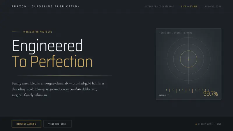 Westworld (Delos)Beauty engineered in a morgue-clean lab. Cold blue-gray ground, brushed-gold hairlines, thin titles.
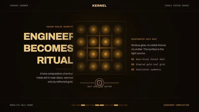 Devs (Amaya)Engineering turns sacred. Near-black void, sodium gold, and a centered dimpled cube.
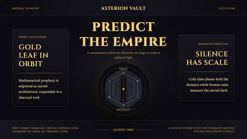 Foundation (Apple TV+ 2021)Sacred empire in shadow. Cinzel capitals and gold geometry float on cosmic charcoal.
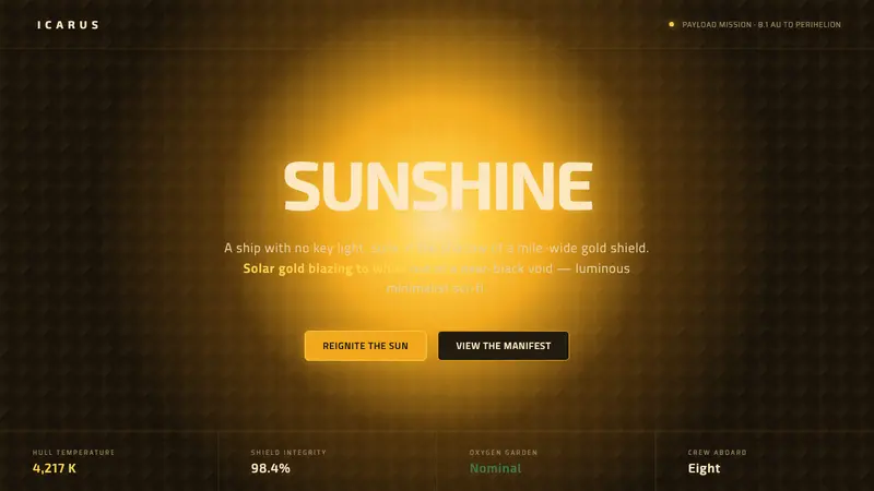 Sunshine (2007)Ship with no key light. Solar gold blooms to white from near-black void — squared Eurostile sci-fi.