What is Jil Sander Pure?
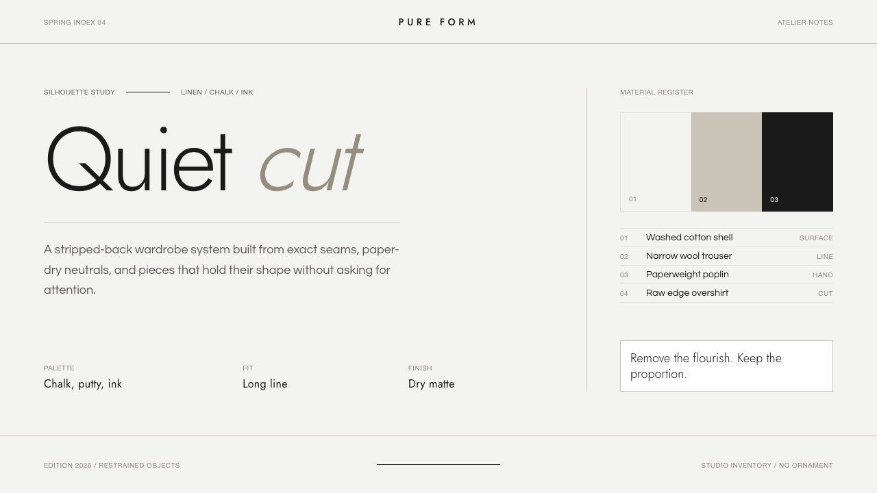
Jil Sander Pure makes precision feel luxurious: ink-dark geometry, curated light, and space held to the standard of tailoring.
Jil Sander Pure in brief
Jil Sander Pure is German precision minimalism translated into an interface language. It begins with a refined near-white field that feels cool rather than creamy, then places near-black geometric sans-serif typography within it with uncompromising care. The result is not simply sparse. It is composed: every visible element appears selected, aligned, and given enough room to justify its presence.
Its luxury comes from restraint rather than display. There is no ornamental surplus, no decorative softness, and no attempt to make the surface feel busy or expressive through accumulation. Instead, the system borrows the discipline of immaculate tailoring: edges read as deliberate seams, typographic relationships behave like measured proportions, and negative space becomes an active material rather than unused background.
The visual impression is architectural couture. Dark type establishes authority without becoming theatrical; curated light keeps the page calm without becoming blank. Restrained putty and sand accents introduce warmth only when hierarchy or material contrast requires it. Everything else is governed by alignment, tonal control, and the quiet confidence of leaving enough unsaid.
Where does Jil Sander Pure come from?
The Pure-era language belongs to the period from 1990 to 2010, when its most concentrated form of minimalism reached its peak. Its stated setting is Western Europe, specifically Germany and Hamburg, and that geographical frame matters because the style is defined less by romantic atmosphere than by disciplined reduction. Precision is not an embellishment added after the composition is finished; it is the system that determines what is allowed to remain.
Jil Sander Pure draws directly on German precision minimalism and minimalist luxury tailoring. These two movements explain its distinctive balance. German precision supplies the exactness: controlled alignment, clear geometry, and a refusal to let incidental decoration weaken structure. Minimalist luxury tailoring supplies the sensibility: surfaces may be spare, but they should never feel casual, improvised, or merely economical.
Jil Sander, whose full name is Heidemarie Jiline Sander, is the named key figure associated with the source material. In this design interpretation, her name functions as a standard of reduction rather than a historical costume. The interface does not imitate fashion imagery; it turns the values named by the theme into visual decisions—clean fields, ink-dark type, earned margins, restrained accents, and a finish that feels composed rather than embellished.
What defines the Jil Sander Pure look?
Curated Light
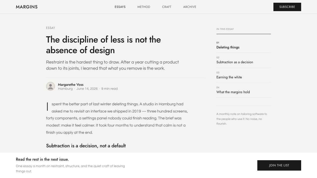
The background is a cool, refined near-white rather than cream. It should feel selected, not default: bright enough to make ink-dark type exact, restrained enough to preserve a sense of material calm. This light field is the main atmosphere of the style, so it must remain uninterrupted by decorative texture, visual noise, or gratuitous tonal shifts.
Ink-Dark Type
Near-black typography forms the structural skeleton. It is not used as dramatic contrast for its own sake; it gives language weight, legibility, and finality against the pale ground. Headings, labels, numbers, and body copy should all feel related through a single typographic logic, with hierarchy created by measured changes in scale, density, and placement.
Geometric Sans
Geometric sans-serif typesetting gives the interface its engineered poise. The letterforms should read as clean and controlled, never playful or decorative. Their role is similar to a precisely cut garment pattern: they establish order before content is even read. Avoid expressive display faces or competing typographic personalities, because visual character should come from composition, not typographic novelty.
Earned Space
Space is the primary material, not the remainder after components have been placed. Margins, gaps, and open fields make the design feel expensive because they demonstrate control: nothing is crowded merely to prove that the interface contains information. Each line and block needs a clear reason for where it begins, where it ends, and what silence surrounds it.
Obsessive Alignment
Alignment is the style's most visible discipline. Edges, baselines, image boundaries, and control groups should appear to belong to one underlying order. This does not require every object to form a rigid box; it requires relationships to be intentional. A deliberately offset element can work, but only when its offset creates a clearer compositional tension than conventional alignment would.
Restrained Warmth
Putty and sand accents are the only source of warmth, and they work best as small material interruptions within the cool field. They can distinguish states, soften a secondary area, or give a quiet emphasis to an object that would otherwise disappear. They should never turn the palette cozy. Their value lies in contrast with the surrounding restraint, not in decorative abundance.
Who shaped Jil Sander Pure?
Jil Sander, identified in the source material as Heidemarie Jiline Sander, is the named figure behind the theme. Pure takes the associated values of immaculate tailoring, reduction, and quiet luxury as an interface standard. The design language is therefore concerned with finish and discipline: every alignment, margin, and typographic decision should feel considered rather than merely minimal.
German precision minimalism is the structural movement named by the source material. Within Pure, it explains the cool near-white ground, exact alignment, geometric sans-serif type, and rejection of ornament. It is not austerity for its own sake. Its purpose is to make each surviving element appear necessary, stable, and sharply resolved.
Minimalist luxury tailoring is the second named movement and gives Pure its sense of couture rather than generic minimalism. The interface should feel cut, measured, and finished with care. Generous space is not emptiness, and a reduced palette is not a lack of expression; both are evidence that the composition has been edited until only its essential relationships remain.
How do you use Jil Sander Pure today?
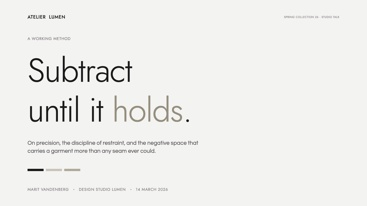
For presentation covers, Jil Sander Pure works best when the title is treated as an object with physical presence. Set it in ink-dark geometric sans-serif type against curated light, give it ample open field, and align supporting information with the same underlying edges. A single restrained putty or sand detail may establish a focal point, but the cover should derive its confidence from placement rather than illustration or spectacle.
Content slides should behave like carefully tailored editorial pages. Keep the reading path calm, make section labels and headings feel unquestionably related, and allow explanatory text to occupy a measured field rather than a dense slab. Data slides benefit from the same discipline: charts should look integrated into the page architecture, with clear labels, quiet rules, and restrained tonal differentiation instead of a crowded palette or decorative visual effects.
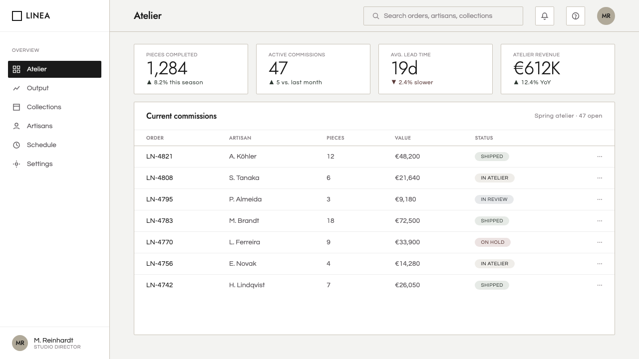
For web interfaces, the style is particularly effective in dashboards, account areas, and pricing pages where users must recognize hierarchy quickly. Use the pale field to reduce fatigue, let near-black type carry primary information, and reserve warmth for meaningful distinctions such as a selected state or a secondary emphasis. Cards, controls, and navigation should feel aligned to a shared system, with boundaries expressed clearly but without ornamental weight.
For editorial and marketing work, Pure supports products that need to appear composed, exact, and quietly premium. Editorial layouts can use generous side space to separate metadata from reading content, while marketing pages can make a statement through large calm fields and precisely placed product language. The tone is strongest when a message has enough substance to withstand a restrained presentation; the layout should clarify value, not manufacture excitement around weak information.
The common mistake is to confuse this style with empty white minimalism. Pure requires more than removing decoration: it requires exact relationships among type, margins, accents, and boundaries. Another mistake is introducing warm beige, soft imagery, expressive fonts, or arbitrary rounded details until the interface becomes cozy. If the result feels casual, soothing, or fashionably generic, it has lost the cool precision and architectural couture that define the system.
Jil Sander Pure — FAQ
Is Jil Sander Pure simply a white minimal style?
No. Its pale field is a cool curated light, not an empty default white surface, and the system depends on near-black typography, geometric order, and exact alignment. Removing visual material without establishing those relationships produces blankness, not Pure. The style is defined by disciplined composition and refined finish rather than by absence alone.
How should warmth enter a Pure layout?
Warmth should arrive through restrained putty and sand accents, used only where they make hierarchy or material contrast clearer. The main atmosphere remains cool and refined. When warm tones spread across large areas or begin to soften every interaction, the design shifts away from precision minimalism and toward a more familiar, cozy visual language.
Does the style work for data-heavy dashboards?
Yes, provided information is organized rather than merely compressed. The emphasis on alignment, measured spacing, and strong typographic structure can make complex dashboard content easier to scan. Charts and controls should join the same visual architecture as text. If every metric receives equal visual emphasis, however, the calm hierarchy that makes Pure useful will collapse.
What most often makes a Pure-inspired design feel inauthentic?
Usually, it is the accumulation of small, ungoverned choices: inconsistent alignments, decorative shapes, multiple expressive type treatments, or warmth applied everywhere. A Pure layout can contain accents and contrast, but each must serve the compositional order. When elements look added for charm rather than necessity, the tailored precision gives way to generic minimal luxury.
Related design styles
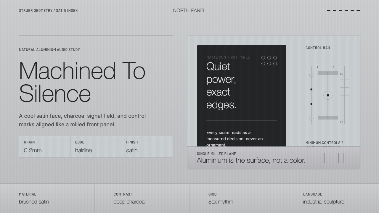 Bang & Olufsen AluminiumQuiet luxury, machined flat. Satin aluminium grain, hairlines, thin charcoal…
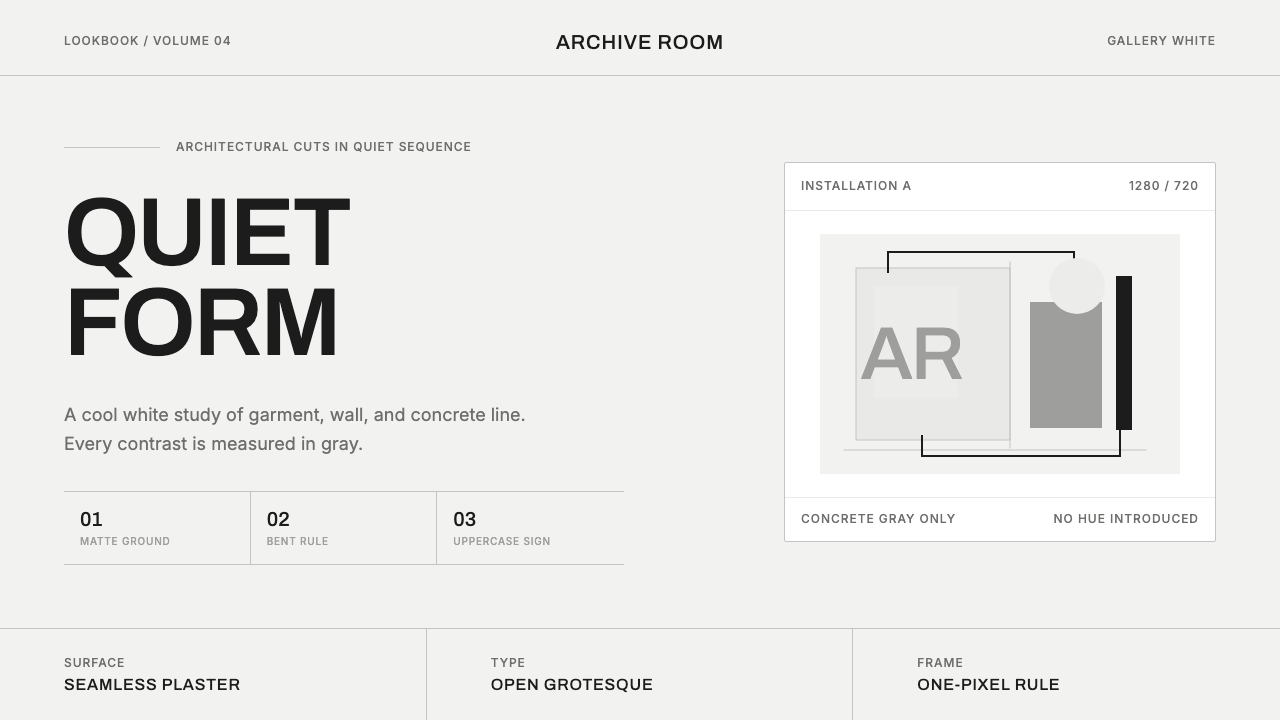 COS Gallery MinimalSilence has structure. Cool gallery white, Archivo uppercase, and concrete-gr…
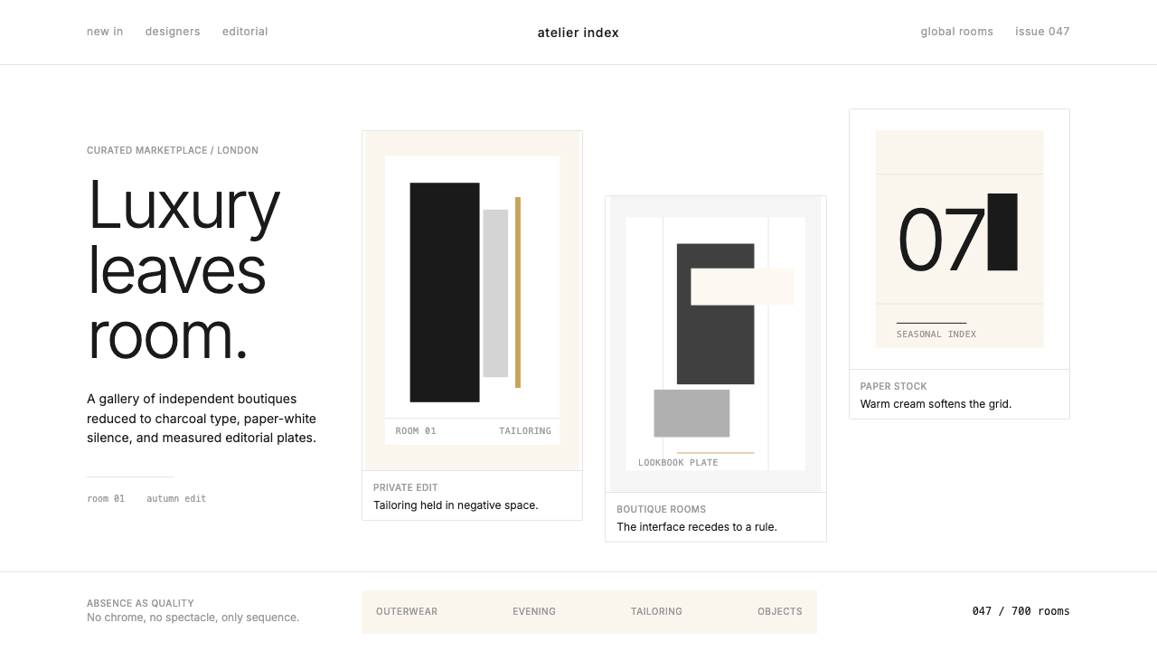 FarfetchLuxury as absence. Charcoal type, white canvas, and hairline editorial plates.
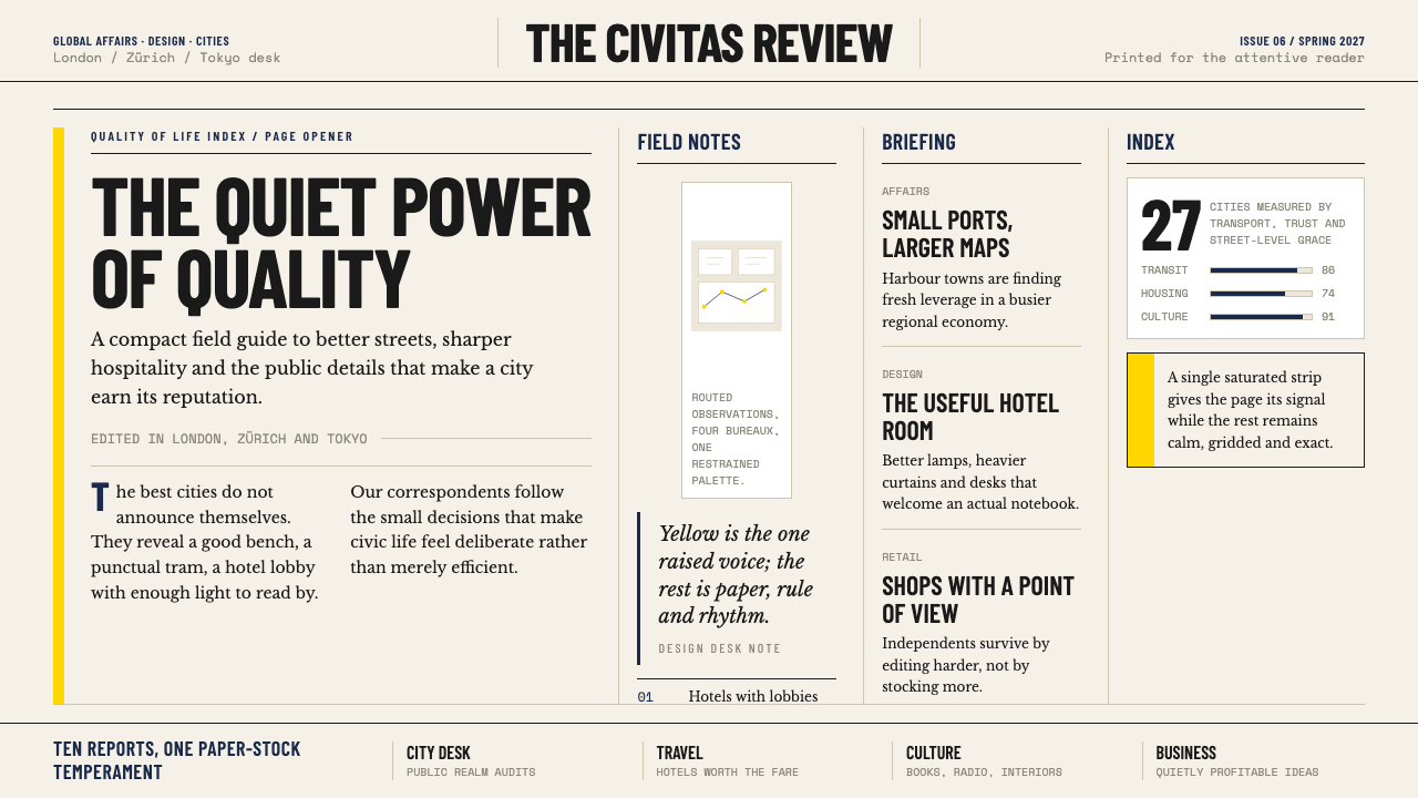 Monocle MagazineQuiet authority. Yellow spine, warm paper and dense ruled columns speak at li…
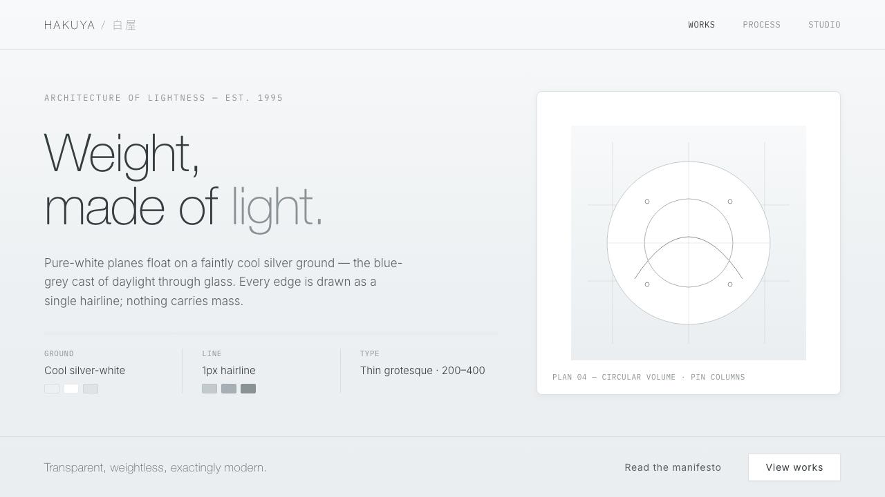 SANAA White LightnessArchitecture made of light. White planes float on cool silver-grey, edged in…
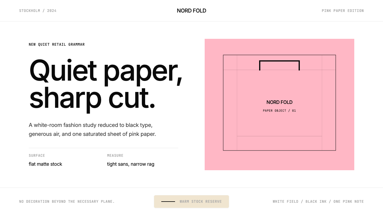 Acne Studios Pink-PaperQuiet luxury in one pink plane. Inter type floats on white with a bag-like re…