What is SANAA White Lightness?
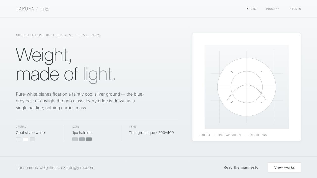
SANAA turns architecture into atmosphere — white planes, curved transparency, and cool daylight held together by almost nothing.
SANAA White Lightness in brief
SANAA White Lightness translates the architecture of Kazuyo Sejima and Ryue Nishizawa into an interface language of luminosity, restraint, and suspension. Its signature is not decorative whiteness but the sensation of being inside diffuse daylight: pure white planes appear to float over a faintly cool silver-grey ground, while thin geometric sans-serif type and hairline boundaries keep the system legible without making it feel heavy.
The visual logic depends on absence. There are no dense surfaces, dramatic contrasts, or ornamental layers competing for attention. Space does the organizing work. Content is separated by air, grouped through subtle tonal shifts, and supported by borders so fine that they read as an edge of light rather than a frame. The result is minimal without becoming blank: every plane, line, and word has room to remain perceptible.
Its architectural reference is visible in the balance between solidity and transparency. Ultra-thin white steel becomes a clean interface plane; curved glass becomes continuous containers and softened transitions; diffuse white interiors become a cool silver-white field. The design feels almost weightless because depth is suggested through pale shadow ramps and overlapping planes rather than heavy elevation or strong visual effects.
Where does SANAA White Lightness come from?
SANAA is the Tokyo-based architectural practice of Kazuyo Sejima and Ryue Nishizawa, founded in 1995. Its defining period in this source framework runs from 1990 to 2010, with the most concentrated expression of its white, light, and transparent vocabulary appearing between 2004 and 2010. The practice belongs to an East Asian context while operating within a broader late-modernist interest in lightness and transparency.
The system sits at the intersection of Japanese minimalism, lightness and transparency in late modernism, and neo-modernism. These references matter because the style is not simply a white theme applied to a conventional interface. It treats reduction as an architectural discipline: surfaces become thinner, boundaries quieter, and the relationship between empty space and occupied space becomes part of the composition.
Works such as the 21st Century Museum of Contemporary Art Kanazawa and the Rolex Learning Center provide the clearest architectural atmosphere for the system. Their relevant qualities here are ultra-thin white steel, curved glass, and interiors shaped by diffuse white light. The ground is not a neutral paper white but a cool silver-white, carrying the blue-grey cast of daylight passing through glass.
The interface translation preserves that atmosphere while changing its medium. Pure white becomes the principal plane, silver-grey becomes the supporting shadow ramp, hairline borders replace substantial architectural frames, and thin geometric sans-serif type carries information across the open field. The result is a design language that feels architectural without imitating a building: its subject is the sensation of lightness.
What defines the SANAA White Lightness look?
White Planes
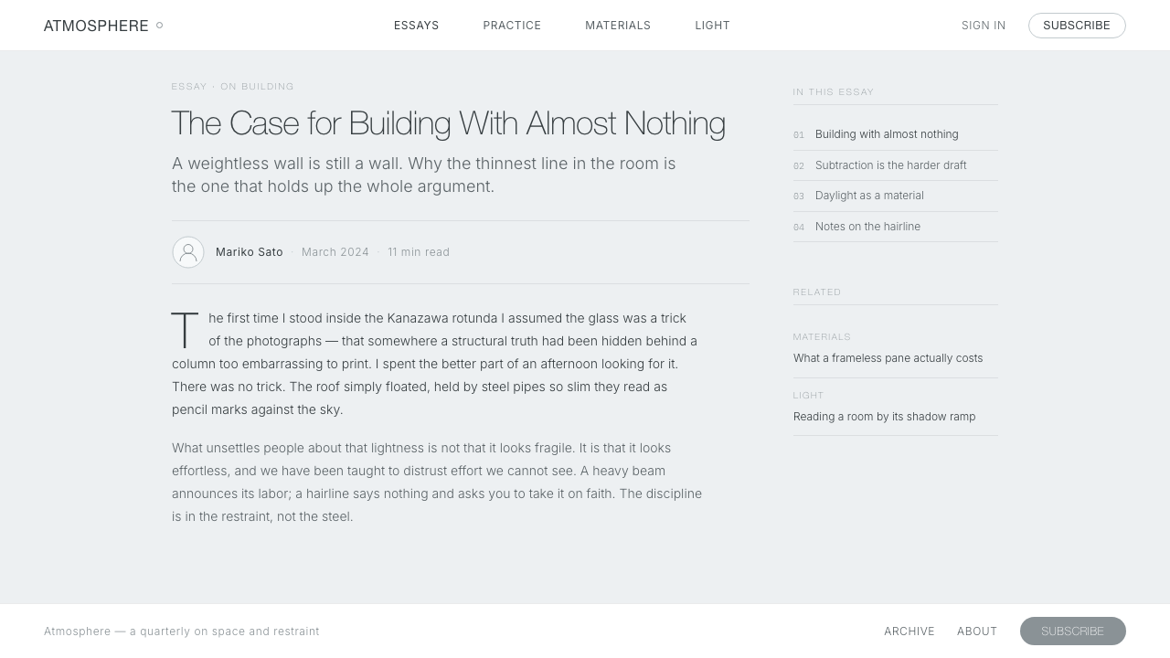
Pure white is the signature surface, but it is never treated as a decorative blank. It acts as architecture: a plane that holds content, catches diffuse light, and allows neighboring tones to remain quiet. Cards, panels, and large content fields should feel like thin surfaces placed in space rather than dense containers filled with visual treatment.
Cool Silver-White Ground
The surrounding field is faintly cool rather than starkly neutral. Its silver-grey cast recalls daylight filtered through curved glass and prevents pure white planes from dissolving into the background. The contrast remains deliberately weak, so hierarchy comes from placement, scale, and spacing before it comes from color intensity.
Lightness and Transparency
Depth is suggested through overlapping white surfaces, pale shadow transitions, and the visual continuity of curved forms. Nothing should appear aggressively raised or locked into a heavy frame. Transparency is understood as visual permeability: elements relate across the page, and the eye can move through the composition without encountering abrupt barriers.
Hairline Boundaries
Borders are present but nearly weightless. They clarify the edge of a panel, separate neighboring fields, or mark an interaction boundary without becoming graphic ornament. A hairline should feel like a seam in a sheet of metal or a reflection along glass: precise, continuous, and easy to overlook when the larger composition is working.
Thin Geometric Sans
Typography uses thin geometric sans-serif forms that echo the system’s structural clarity. The type should be spacious, clean, and carefully aligned, with hierarchy carried by size, position, and quiet contrast rather than dense weight changes. Short labels and large headings can feel almost architectural when they sit alone inside generous white space.
Diffuse Depth
Shadow is not a dark outline or a dramatic floating effect. It is a silver-grey ramp that gently separates a white plane from its ground, as though daylight were accumulating beneath an edge. The transition should remain soft and atmospheric, preserving the feeling that the interface is illuminated from within rather than assembled from stacked blocks.

Who shaped SANAA White Lightness?
Sejima is one of the two architects whose Tokyo practice is SANAA. Within this design language, her significance is represented through the practice’s commitment to thin white structures, curved transparency, diffuse interiors, and an architecture whose presence is defined by lightness rather than mass. The interface does not illustrate her work; it carries forward that atmospheric discipline.
Nishizawa is the second architect named in the SANAA practice. His role in the source material is inseparable from the shared vocabulary of white planes, glass, and visual permeability. In interface terms, that vocabulary becomes a careful balance between containment and openness: information is organized, but the surrounding field remains continuous and calm.
SANAA is the shared architectural practice rather than an individual figure, and it is the direct source of the style’s name and atmosphere. The practice’s white works between the late twentieth century and the early twenty-first century establish the reference field: thin white steel, curved glass, diffuse interiors, and a cool daylight quality that can be translated into digital surfaces.
How do you use SANAA White Lightness today?
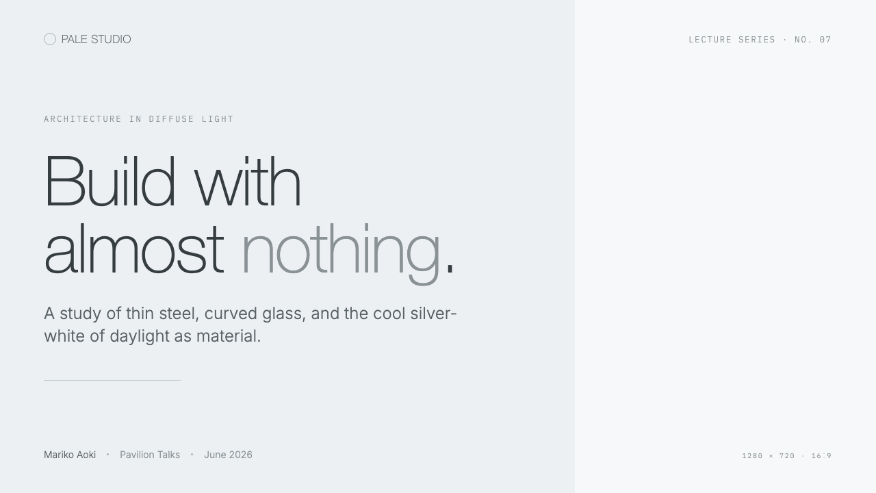
For presentation slides, the style works best when the cover behaves like an empty architectural room. Place the title as a quiet structural element on a cool silver-white field, allowing a broad white plane or translucent band to establish the composition. Content slides should preserve that calm by grouping information into open zones with hairline separations. Data slides should favor clean diagrams, pale tonal ranges, and generous breathing room so that the information appears suspended rather than boxed in.
For web interfaces, SANAA White Lightness suits dashboards and pricing pages that need clarity without visual aggression. Use pure white for primary surfaces, a faintly cool silver-grey for the surrounding field, and fine borders to distinguish panels without making them feel enclosed. Hierarchy should be carried by alignment, spacing, and restrained type contrast. Pricing tiers can be separated through surface position and subtle tonal shifts, while the strongest emphasis is reserved for a single action or decision point.
For editorial and marketing work, the system creates a sense of quiet authority. Articles can place a narrow text measure inside a much larger field, letting metadata, section labels, and supporting notes occupy their own zones of air. Marketing pages can use architectural pacing: a large statement, a calm image or white plane, then a precise call to action. The identity is strongest when photography or illustration is allowed to breathe and when every transition feels like moving through a bright, continuous interior.
The common mistake is confusing lightness with emptiness. Removing content, contrast, or hierarchy does not automatically create a SANAA-like result; it can simply make an interface hard to read. Another frequent error is using pure white everywhere, which erases the distinction between plane and ground. The system depends on relationships: cool silver-white around pure white, hairline boundaries at meaningful edges, and typography that is thin yet sufficiently clear to carry the structure.
SANAA White Lightness — FAQ
Is SANAA White Lightness simply a white minimalist style?
No. White and minimalism are only its visible starting points. The defining quality is the relationship between white planes, cool silver-white atmosphere, curved transparency, diffuse light, and almost weightless boundaries. A plain white interface with heavy cards or strong contrast may be minimal, but it does not carry the architectural sense of suspension that defines this system.
Why is the background silver-white instead of plain white?
The cool silver-white ground preserves the sensation of daylight passing through glass. It gives pure white planes somewhere to exist and keeps them visually distinct without introducing hard contrast. If every surface is the same white, the interface loses the difference between atmosphere and object; the subtle blue-grey cast is what makes the lightness legible.
How should depth be created in this style?
Use pale silver-grey shadow ramps, overlapping planes, and changes in surface tone that remain gradual and diffuse. Depth should feel like light gathering beneath an edge, not like a component being pushed dramatically toward the viewer. The aim is permeability: surfaces remain separate enough to read, but connected enough to preserve one continuous field.
Can the style use strong color accents?
The source system is defined by white, silver-grey, glass-like transparency, and thin neutral typography, so strong color should remain subordinate. If an accent is introduced, it should clarify an action or distinction rather than become a decorative focal point. The more color competes with the cool daylight atmosphere, the further the interface moves from SANAA White Lightness.
What makes the typography feel architectural?
The architectural quality comes from restraint and placement rather than from an unusual typeface. Thin geometric sans-serif forms, careful alignment, isolated labels, and generous surrounding space allow words to behave like structural marks. Typography should define direction and proportion while leaving the white field visible around it, so text participates in the architecture instead of covering it.
Related design styles
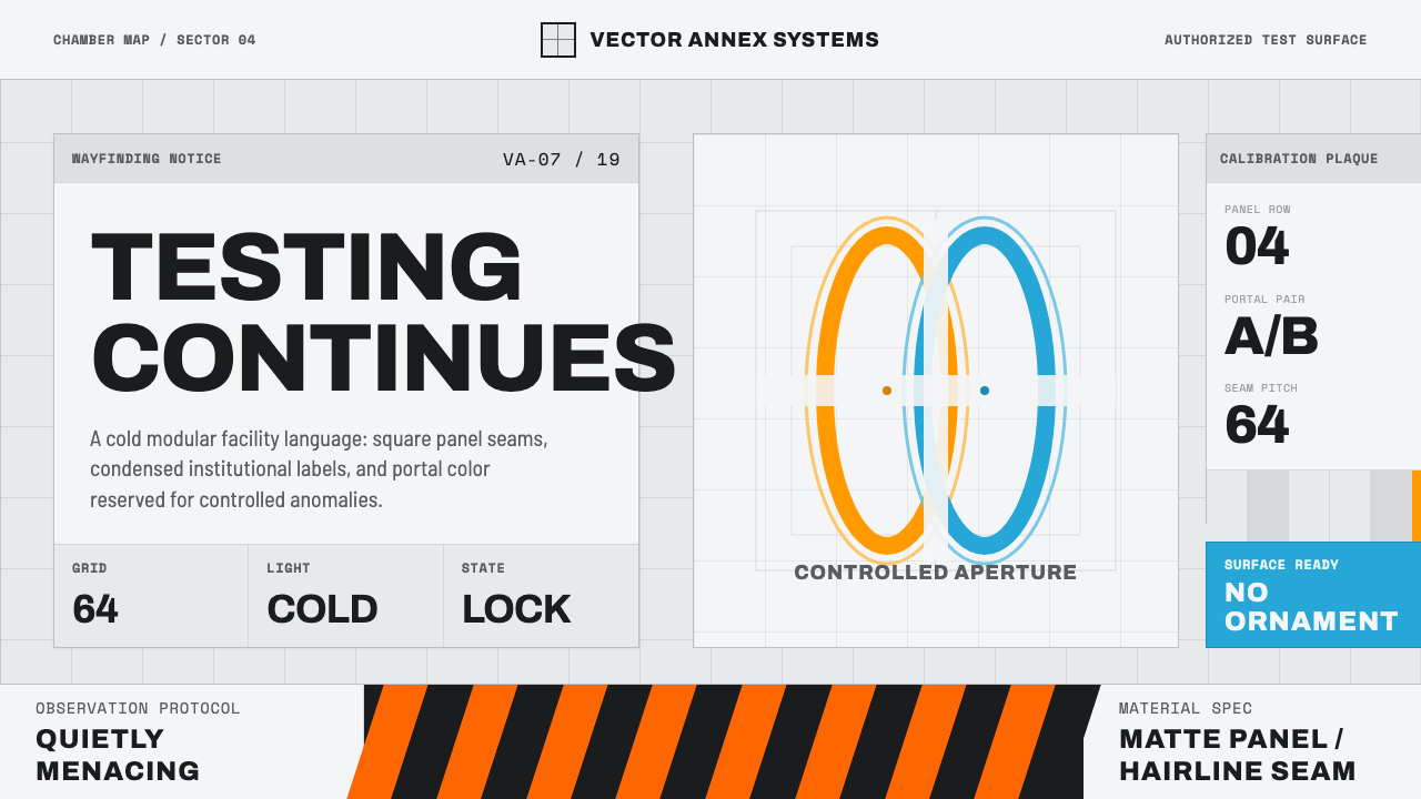 Aperture ScienceSterile authority. Cool panel seams, Archivo signage, and sparse orange-blue…
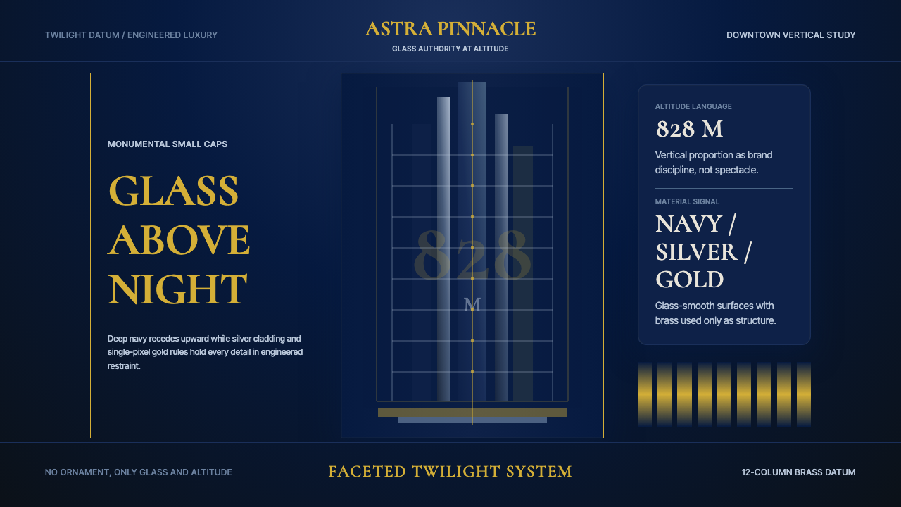 Burj Khalifa TowerAltitude becomes authority. Navy glass, silver facets, and hairline gold rule…
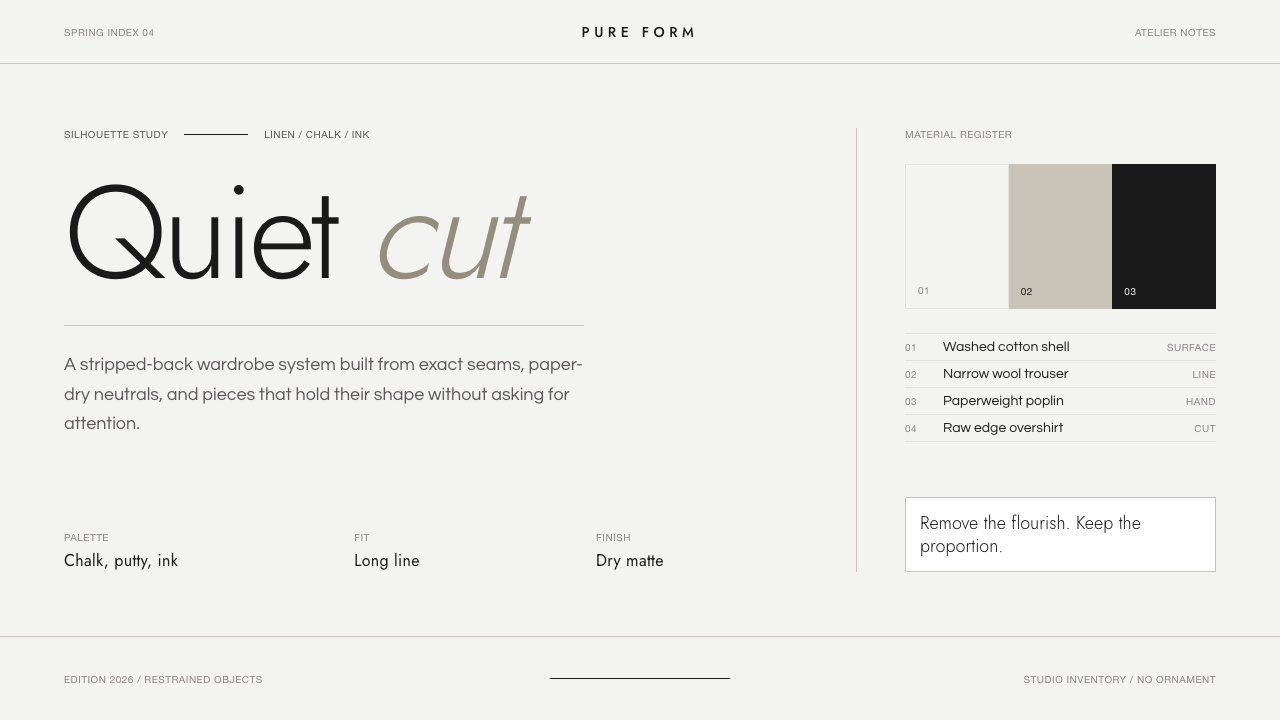 Jil Sander PurePrecision feels luxurious. Near-black geometric sans on curated near-white, w…
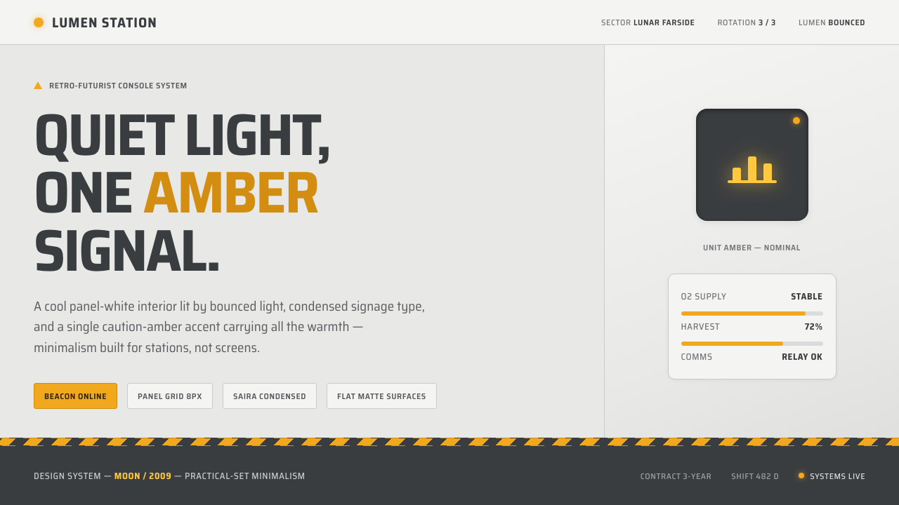 Moon (2009)Quiet light, one amber signal. Cool panel-white, condensed signage type, GERT…
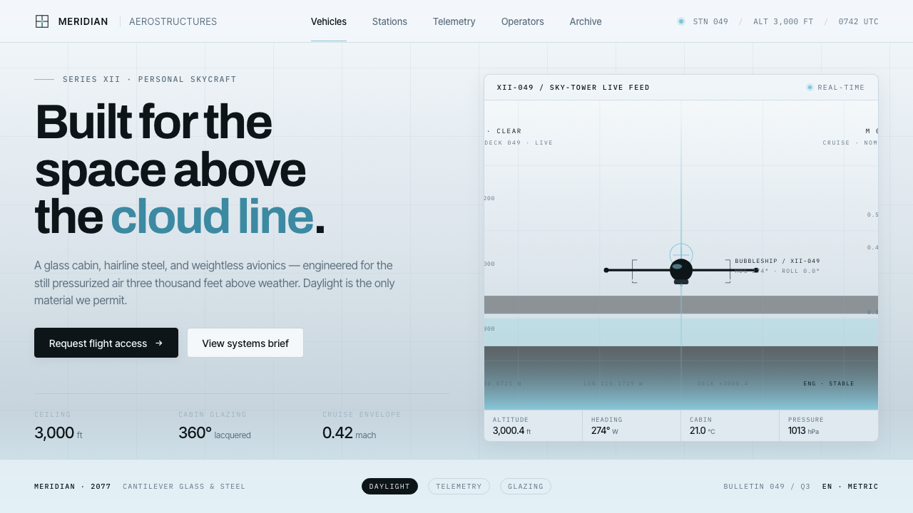 Oblivion Sky TowerSterile daylight futurism. Cool sky-grey glass, hairline steel mullions, a si…
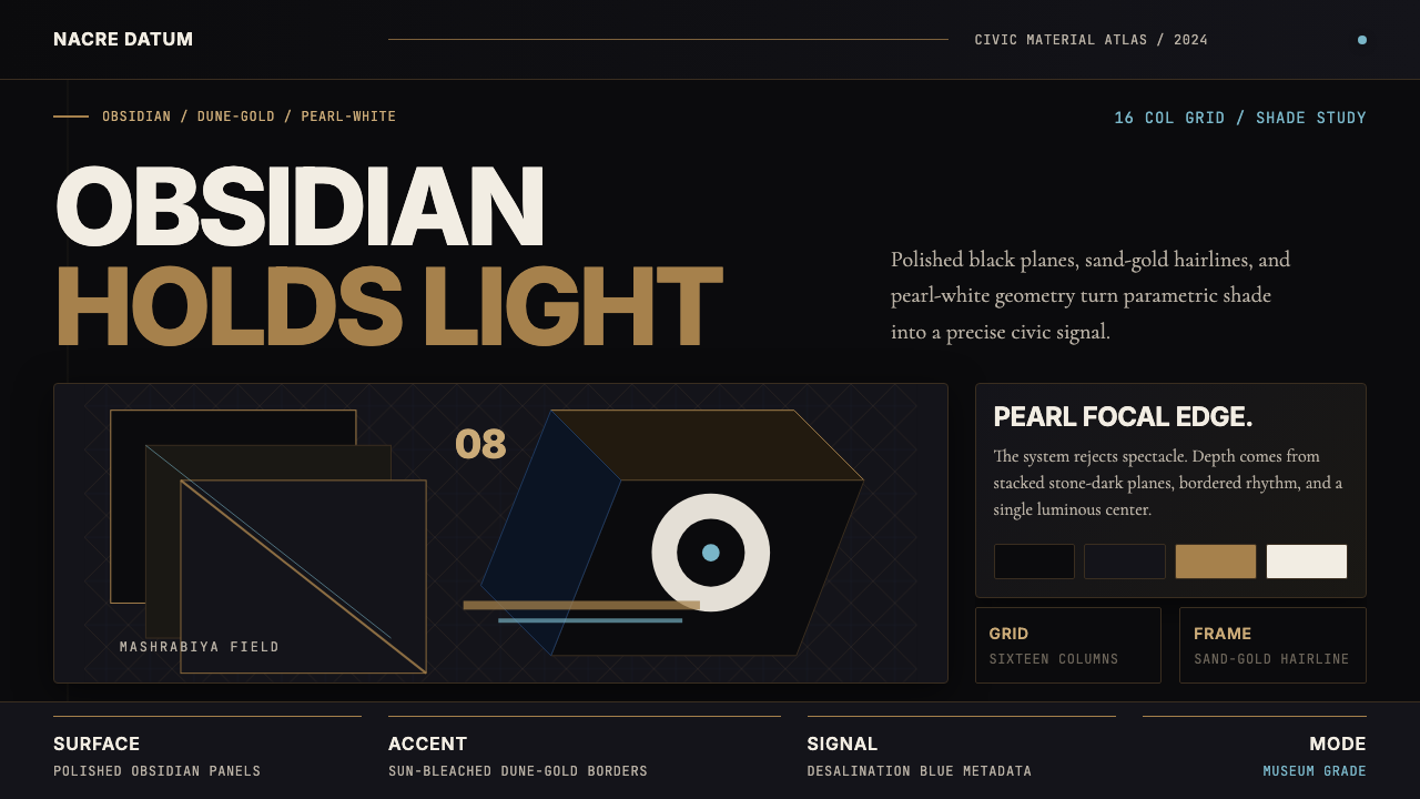 Qatari Pearl Modern Architecture 2024Monumental restraint. Obsidian panels, sand-gold gridlines, pearl-white geome…