What is Moon (2009)?
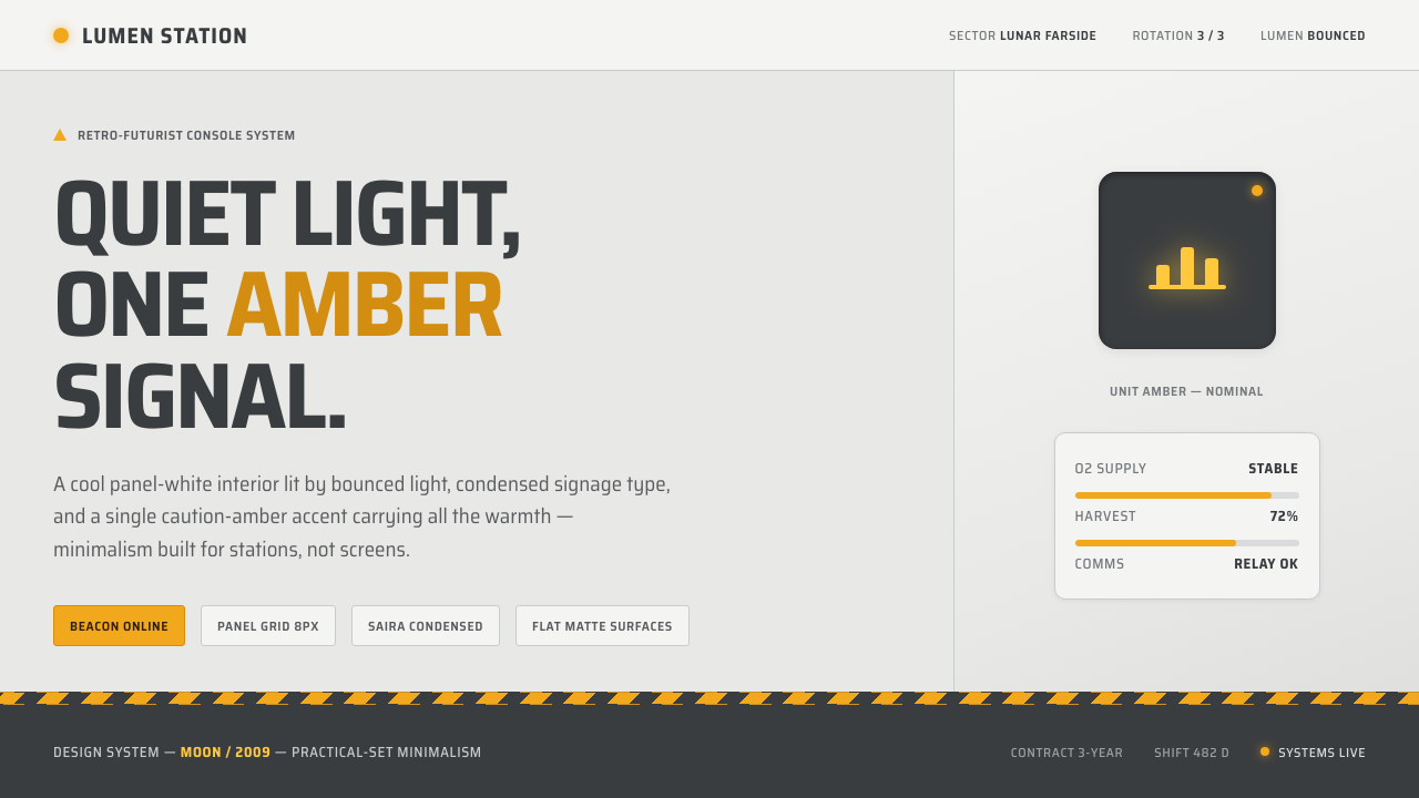
Moon turns a lunar workplace into a study in restraint: cool white panels, softened light, compressed signage, and one amber signal that carries all the room’s feeling.
Moon (2009) in brief
Moon is the visual world of Duncan Jones’s 2009 film, shaped in concept design by Gavin Rothery around the Sarang lunar station. Its interior is modular, quiet, and slightly cool: pale panel surfaces meet a field of even bounced light, while practical amber warning strips and an orange access ladder interrupt the whiteness only where the space needs a human or operational signal. The result is not a sleek fantasy of the future. It is a disciplined workplace whose calmness makes every deviation register.
The style belongs to retro-futurist science fiction, explicitly drawing on the minimalism associated with 2001: A Space Odyssey while retaining an industrial edge associated with Outland. It imagines advanced infrastructure through tangible parts rather than through decorative complexity. Walls read as assembled modules, wayfinding reads as signage, and machinery is allowed to remain legible as machinery. The visual language is therefore sparse without becoming empty: every visible object appears to have a job inside a maintained technical environment.
Its defining emotional device is GERTY’s yellow smiley LCD. Against the station’s cool, nearly neutral interior, that amber presence becomes the only real warmth. In a digital translation, this establishes a clear system: white and pale gray surfaces provide structure, condensed lettering provides order, and amber is withheld until it needs to indicate caution, access, status, or a moment of emotional attention. The style is less about adding a science-fiction skin than about controlling where warmth is allowed to exist.
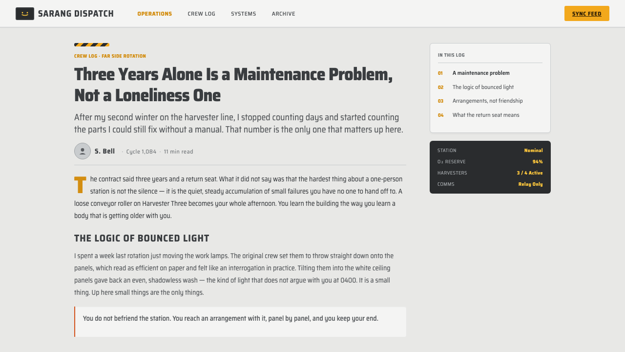
Where does Moon (2009) come from?
Moon was released in 2009, but its visual imagination looks deliberately backward to late-1960s and 1970s science fiction. That backward glance is central rather than nostalgic decoration. The Sarang station avoids the visual noise often used to announce futurity. Instead, it relies on clean modular surfaces, visible operational cues, and a controlled interior atmosphere. The future feels credible because it is organized, maintained, and inhabited rather than extravagantly displayed.
The production is British, situated within a Western European filmmaking context, and its key creative names are Duncan Jones and concept designer Gavin Rothery. Jones directs the film’s world toward quiet isolation and restraint; Rothery gives that restraint a physical system in the lunar station. The supplied visual vocabulary is concise but unusually coherent: cool panel-white, bounced illumination, condensed signage, caution amber, an orange ladder, and GERTY’s yellow display. Each element reinforces the others instead of competing for attention.
Its listed influences explain the balance. Retro-futurist science fiction supplies the premise that the future can be imagined through the design language of an earlier technological age. The minimalism of 2001: A Space Odyssey supplies the calm, pale, controlled interior. Outland industrial design supplies the sense that this is a functioning workplace with warnings, access routes, and equipment rather than an abstract gallery. Moon holds these tendencies together by refusing both clutter and sterility.
Sam Rockwell is also named among the film’s key figures, reminding us that the station is not merely an architectural image. Its visual discipline exists to frame a human presence. The restrained set gives performance, routine, and small signals more room to matter. That relationship is important for contemporary design use: the style succeeds when its system supports attention and behavior, not when the visual references become a costume.
What defines the Moon (2009) look?
Cool Modular Surfaces
The base environment is panel-white rather than glossy white: pale, slightly cool, and assembled from readable modules. Surfaces should feel clean and maintained, but not luxurious or seamless in a consumer-electronics sense. Divisions between panels, doors, bays, and utility zones provide the composition. The calm comes from repetition and alignment, not from empty blankness.
Bounced, Even Light
Light is soft, reflected, and broadly distributed through the interior. It does not create theatrical pools of darkness or glossy highlights that turn the station into a spectacle. This gives the scene an observational quality: forms remain visible, materials remain quiet, and the user can read the environment without being pushed toward dramatic focal effects. Depth comes from panel rhythm and utility objects, not from moody contrast.
Condensed Signage Type
Typography behaves like infrastructure. Condensed signage lettering fits naturally onto panels, access points, labels, and status areas, creating the impression of an established operational system. It should be direct, compact, and matter-of-fact rather than expressive or brand-like. Large labels can organize space, while smaller labels should resemble instructions or identifiers. The typographic tone is procedural: it tells the viewer where they are and what matters.
Amber as Emotional Signal
Amber is the system’s only warmth and therefore its most valuable color. It belongs to caution strips, access cues, GERTY, and moments that need immediate emotional or operational recognition. Used sparingly, it makes a quiet interface feel alive without breaking the station’s discipline. Used everywhere, it becomes generic industrial decoration and erases the essential contrast between the cool environment and its singular human signal.
Functional Industrial Markers
Warnings, ladders, access routes, and display panels are not decorative references. They establish that the environment has procedures, maintenance needs, and consequences. Orange access hardware and amber caution elements should appear where a person might move, intervene, or need to stop. The visual system gains credibility when these markers align with a real task, status, or route rather than floating as unrelated ornament.
Quiet Retro-Futurism
Moon avoids a polished, all-knowing vision of technology. Its retro-futurism is quiet because it lets the earlier science-fiction references shape proportion, atmosphere, and discipline rather than turning them into collectible nostalgia. The future is made from panels, signs, displays, and maintenance logic. That restraint preserves the loneliness and ordinariness of a remote work environment, which is more important than visual novelty.
Who shaped Moon (2009)?
Jones directed Moon and anchors the style in a filmic atmosphere of quiet restraint. The Sarang station’s cool, evenly lit interior is not presented as a technological spectacle; it functions as a controlled setting in which isolation, routine, and small changes can carry unusual weight. For designers, his contribution is a reminder that a visual system can be emotionally precise without becoming visually loud.
Rothery is credited in the supplied material as Moon’s concept designer and gives the Sarang station its coherent physical vocabulary. Cool panel-white interiors, condensed signage, caution accents, access hardware, and GERTY’s display read as parts of one designed environment. The lesson is systemic consistency: an effective science-fiction setting does not need many motifs when each motif has a clear role.
Rockwell is named among the film’s key figures, and his presence matters to the style because Moon’s design system is built around a human-scale environment rather than an impersonal visual display. The restrained station leaves room for behavior, routine, and attention. In digital work, that suggests reserving the most expressive elements for moments when a person needs guidance, reassurance, or acknowledgement.
How do you use Moon (2009) today?
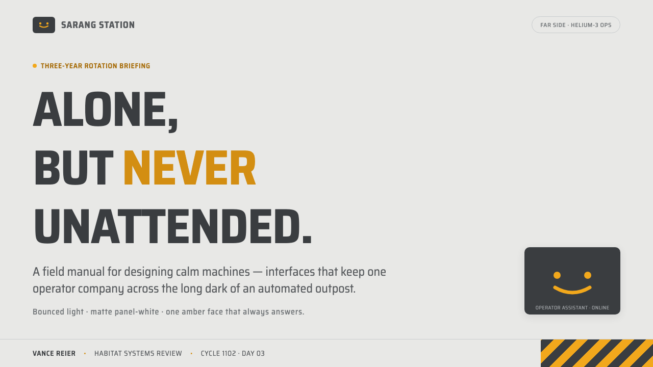
Moon works best when a product needs calm operational clarity with a deliberately limited emotional register. For presentation covers, begin with a pale modular field and a concise title in condensed signage typography. Let a single amber status mark, warning band, or small display-like element create the focal point. Avoid cinematic space imagery unless it carries actual information; the cover should feel like a station label or access panel, not a science-fiction poster.
On content slides, turn the modular interior into an information structure. Use broad pale sections, quiet dividers, and typographic labels that resemble operational zones. A small amber cue can identify the current topic, a risk, or a decision requiring attention. For data slides, keep charts pale and legible, allowing amber to isolate the active series, exception, threshold, or change. The aim is not technological ornament; it is the clarity of an environment where status must be read quickly and calmly.
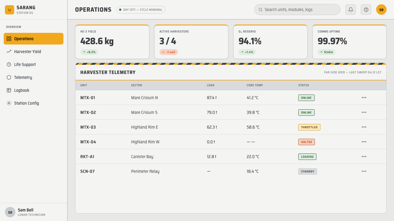
For web interfaces, the style is particularly effective in dashboards, internal tools, account areas, and pricing pages whose value depends on trust, status, and legibility. Treat surfaces as related panels rather than floating lifestyle cards. Condensed headings can identify sections and actions, while ordinary body text remains sober and highly readable. Reserve amber for live state, access, caution, selected plans, or support signals. A pricing page can use the contrast especially well: neutral plans remain calm, while the chosen or recommended path receives the limited warm signal.
In editorial and marketing work, Moon supports product stories about systems, craft, reliability, and focused work. Use a quiet pale field to give prose and photography room to breathe, then let labeled captions and controlled amber markers establish rhythm. Campaign pages should emphasize the difference between ordinary information and the few moments demanding attention. This is useful for technical services, tools, research products, and brands that want to project care and composure rather than speed or spectacle.
The common mistake is to confuse the style’s restrained palette with a license for generic space-interface decoration. Overusing warning stripes, orange hardware motifs, terminal-like text, or amber indicators makes the result loud and nostalgic instead of calm and functional. Another mistake is turning every surface into a floating card or every label into a dramatic headline. Moon depends on evenness: the cool environment must remain genuinely quiet so that the rare warm signal still means something.
Moon (2009) — FAQ
Is Moon style simply a dark science-fiction interface?
No. The supplied visual system is explicitly light: a quiet, slightly cool panel-white interior with even bounced illumination. Its drama comes from the contrast between that pale environment and the limited amber signal, especially GERTY’s yellow display. A dark interface can borrow the broader retro-futurist mood, but it loses the central relationship that makes Moon distinctive: warmth appearing inside disciplined cool whiteness.
Why should amber be used so sparingly?
Because amber carries both operational and emotional force in this system. It is associated with caution strips, access hardware, and GERTY, so it can signal a condition that matters while also making an otherwise cool environment feel briefly human. If amber becomes a general accent applied everywhere, it no longer distinguishes status from background and the station’s only warmth becomes visual noise.
How is this different from a generic retro-futurist style?
Moon is defined by a specific balance: 2001: A Space Odyssey minimalism, Outland industrial design, and the Sarang station’s quiet working atmosphere. Generic retro-futurism often foregrounds novelty, screens, vintage controls, or decorative technological detail. Moon foregrounds maintenance logic, modular order, even light, and one carefully protected warm signal. It feels less like an imagined future on display and more like an isolated workplace already in use.
What products are a poor fit for Moon style?
The style is a poor fit when a product depends on abundance, exuberance, playful social energy, or richly expressive visual variety. It can also feel too clinical if every user touchpoint requires overt warmth. Moon works when restraint itself communicates care: tools that manage systems, services that explain status, and products that benefit from a measured distinction between ordinary information and an important signal.
Related design styles
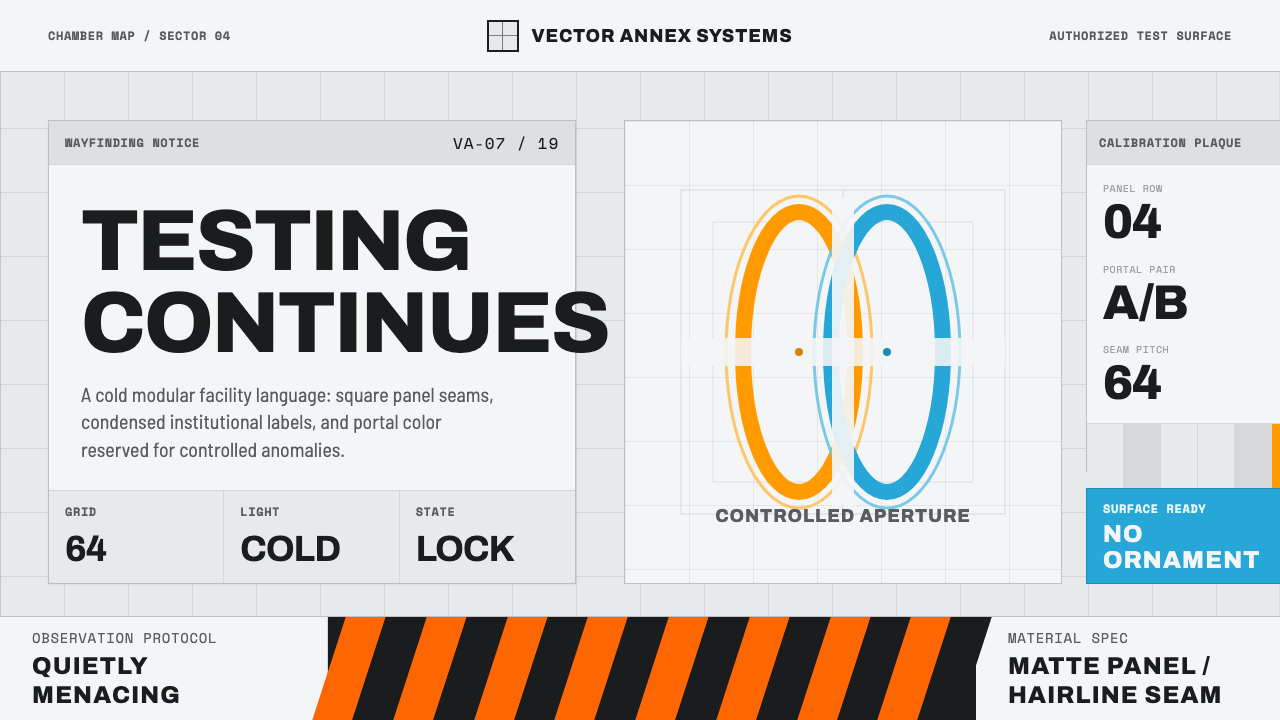 Aperture ScienceSterile authority. Cool panel seams, Archivo signage, and sparse orange-blue…
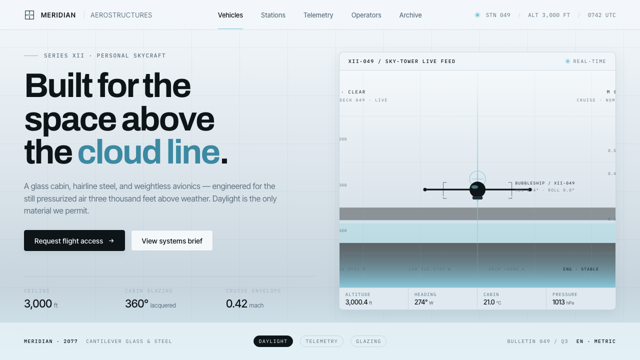 Oblivion Sky TowerSterile daylight futurism. Cool sky-grey glass, hairline steel mullions, a si…
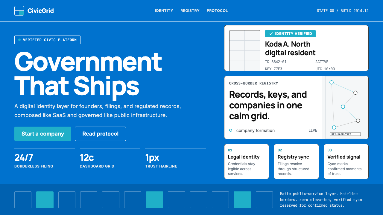 Estonia e-Residency Digital (2014)Trust without weight. Cornflower blue, 12-column grids, and cyan verified sig…
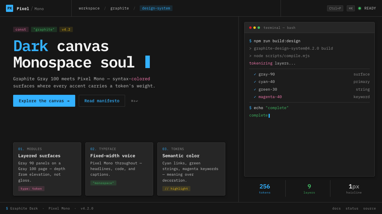 IBM Plex Mono DevColor used like syntax highlighting. Carbon Gray 100 canvas, IBM Plex Mono th…
 Interstellar TARSIf Mies built a robot. Brushed-aluminum grays on deep-space black, lit by one…
 OS UI HumanistBuilt like a working desktop, not a brand. Window-gray ground, system-blue ch…