What is Polestar?
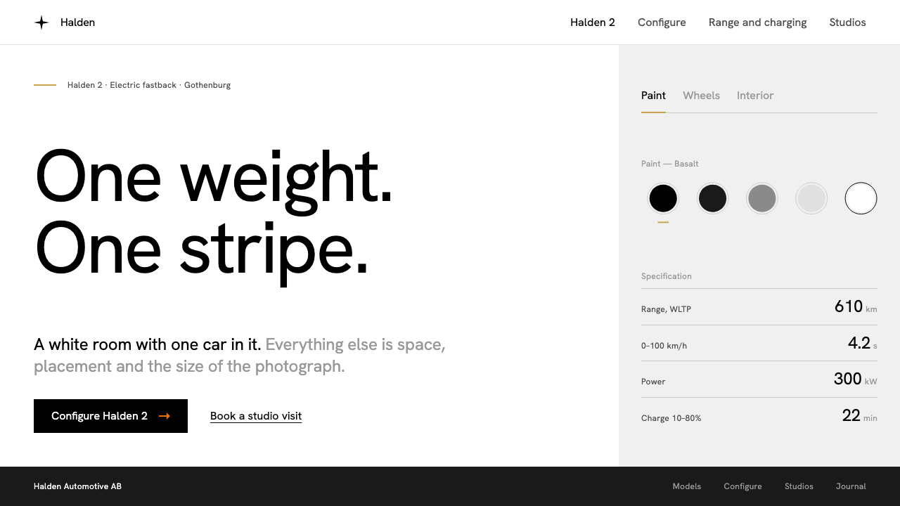
Polestar's visual language is a photo studio with a sales desk attached: a white room, one weight of black type, and a single thread of Swedish gold.
Polestar in brief
The Polestar style is the web and interface language of the electric-car brand founded as a standalone marque in 2017. Its current look, which took shape from roughly 2020 through 2024 across the Polestar 2 launch and on to the Polestar 3 and 4, treats a website like a photography studio. The page is white, a continuous grey backdrop sits behind each car like a seamless studio sweep, and every line of type is black and set in a single weight.
Because weight is not available as a tool, hierarchy has to be built from other things: space, placement and the size of images. Headings are distinguished from body copy by scale and position, not by boldness. The result is a layout that feels quiet and engineered, where the car photograph is always the largest and loudest object on the screen.
Colour is rationed with unusual discipline. The one signature hue, Swedish gold, appears only where it appears on the car itself, and is used as a fine rule, an active-tab stripe or a small detail on a model card. The only bright accent on the whole site is an orange arrow behind the primary call to action. The real centre of the experience is the configurator, where choosing paint, wheels and interior updates the specification and price in real time.

Where does Polestar come from?
Polestar began as a separate electric-performance brand in Gothenburg, Sweden, and became a standalone electric-car marque in 2017. The city and the country matter to the visual language. Gothenburg sits within a Scandinavian tradition of minimalism in which furniture, packaging and interfaces are expected to be plain, honest and quiet, and in which ornament is regarded as a kind of noise. When the brand needed a way to present cars that were new in kind, it did not reach for the glossy excitement common to car advertising. It reached for the calm of a gallery.
A second ancestor is the Swiss typographic tradition: grid discipline, neutral grotesque type and the belief that clarity is a form of respect for the reader. Polestar's choice of a single weight of a grotesque face, rather than a family with many weights, is the most direct expression of that inheritance. The restriction forces designers to solve problems with layout rather than with emphasis, which is exactly the habit the Swiss school tried to teach.
The people named in the source record as associated with the brand's design and direction are Thomas Ingenlath, Maximilian Missoni, André Gürtler and Christian Mengelt. The record does not assign each of them a precise role in the web language, so it is safer to say that the style belongs to a design culture around them: one that pairs car design with interface design and expects the screen to share the same restraint as the sheet metal.
Electric-car brand design is the third current. Newcomer electric brands had to explain unfamiliar products to buyers who could not rely on engine noise, badge heritage or showroom smell. Polestar's answer was to present the product with the calm confidence of a technology company and the finish of a design studio. Swedish gold, borrowed from details that already exist on the car, ties the screen back to the physical product, so the website feels less like an advertisement and more like a continuation of the object it describes.
What defines the Polestar look?
Color
White ground, pale grey bands and black type make up nearly everything. Swedish gold is the rationed signature, used only as a hairline rule, a tab marker or a small detail where the car itself carries gold. A single orange arrow is the lone bright note, reserved for the primary action. Because colour is so scarce, every appearance of it reads as an instruction.
Typography
The type is Unica77, a neutral grotesque, set in black and in one weight only. There is no bold and no light for contrast. Hierarchy is carried by scale, line spacing and where a block sits on the page. This gives text a measured, almost technical voice, closer to a specification sheet than to a brochure.
Photography stage
A pale grey seamless band sits behind each vehicle, like a studio sweep. The car is lit and cropped as if photographed on a stand, with nothing around it to compete. The page treats imagery as the main content and wraps text around it, so the product always has the largest presence.
Space and placement
With no weight contrast to lean on, the system leans on space. Generous margins, deliberate alignment to a quiet grid and consistent gaps separate ideas. Elements are placed rather than decorated, and where a block sits is as meaningful as how it looks.
Gold detail
Gold shows up as a line, a stripe under the active tab or a small marker on a model card. It echoes the details on the car, the sort of small colour accent you would find on a brake caliper or a seat belt. It is meant to be noticed slowly, as a detail, never as a surface.
Configurator
The configurator is the working heart of the interface. The user chooses paint, wheels and interior, and the specification and price on the side update live. The interaction is the design: controls are plain, options are shown as the real product rather than as icons, and feedback is immediate.

Who shaped Polestar?
Named in the source record among the people associated with Polestar's design and brand direction.
Named in the source record among the people associated with Polestar's design and brand direction.
Named in the source record among the people associated with Polestar's design and brand direction.
Named in the source record among the people associated with Polestar's design and brand direction.
How do you use Polestar today?
For slides, treat each slide as a gallery wall. A cover can be a single large image on a white or pale grey ground with one short title in black. Content slides work with one idea each, one weight of type and plenty of margin. Data slides suit this style well: keep charts monochrome, use the gold thread only to mark the one number that matters, and let white space separate figures instead of boxes.
For web interfaces, the style is ideal for product configurators, hardware and device sites, premium electronics, mobility, and any product where the object should dominate and the interface should recede. Dashboards can use a white canvas with grey bands, black text in one weight and a hairline accent for the active state. Pricing pages should show the real product at the side and update the figures live as the user selects options.
For editorial and marketing work, the style suits launches, brand pages, case studies and long-form product stories. Photography should be clean and studio-like, with generous crops, and captions should be short and factual. The tone to aim for is understated confidence: a short sentence that states what the product does is better than an exclamation.
A common mistake is to reintroduce hierarchy through bold type. Once a second weight arrives, the single-weight discipline that defines the style is gone and the layout starts to look like an ordinary corporate site. The other typical failure is to use the gold as a fill or a background. Gold is a thread, not a surface, and the moment it covers an area the rationing that makes it special disappears.

Polestar — FAQ
What is the Polestar design style?
It is the web and interface language of the Polestar electric-car brand: a white page, grey photographic bands behind the vehicles, black type in a single weight, and a rationed thread of Swedish gold. Hierarchy comes from space, placement and image size rather than from bold type.
Why does it use only one font weight?
The restriction comes from the Swiss typographic tradition and keeps the layout honest. With no bold available, designers must solve hierarchy with scale, space and placement, which produces a quieter, more engineered page that keeps attention on the product.
Where does the Swedish gold appear?
Only in small, deliberate places: a hairline rule, a stripe under the active tab, or a small detail on a model card. It echoes details on the car itself and is never used as a background or large fill.
What is the orange arrow for?
It marks the primary call to action and is the only bright accent on the site. Since nothing else competes with it, the eye finds the next step without effort.
What projects suit this style?
Product configurators, premium hardware and electronics, mobility brands, launch pages and calm decks where the object should lead. It is a poor fit for playful, crowded or highly decorative work.
Related design styles
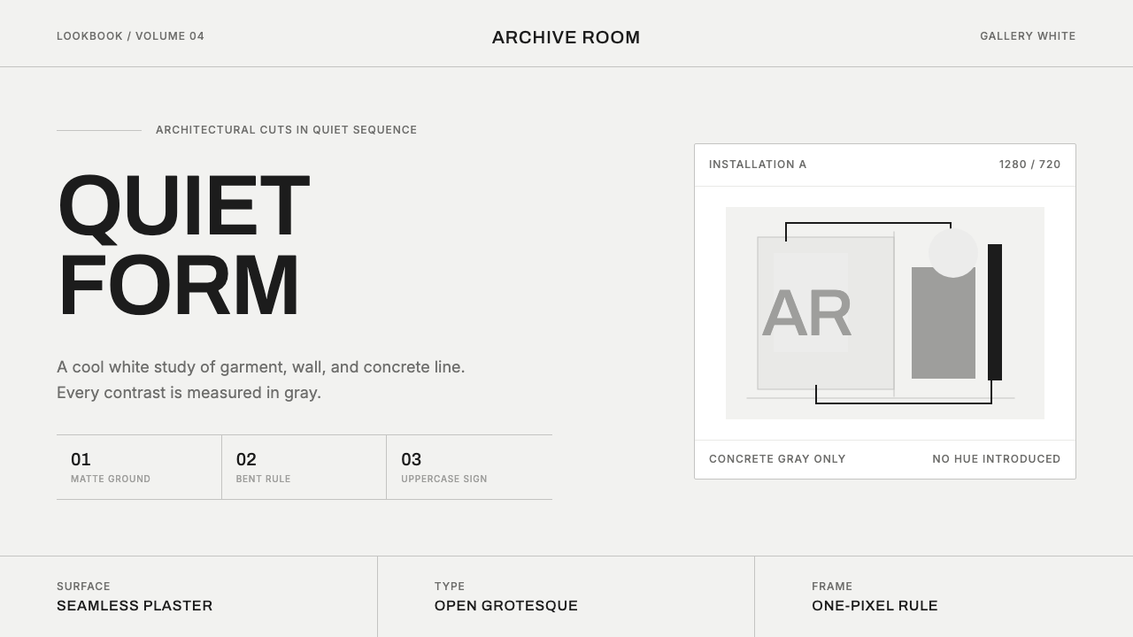 COS Gallery MinimalSilence has structure. Cool gallery white, Archivo uppercase, and concrete-gr…
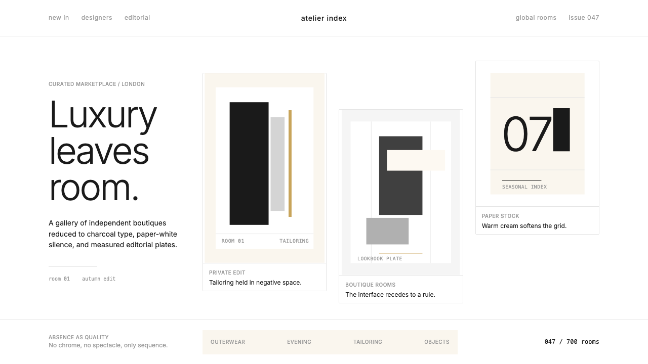 FarfetchLuxury as absence. Charcoal type, white canvas, and hairline editorial plates.
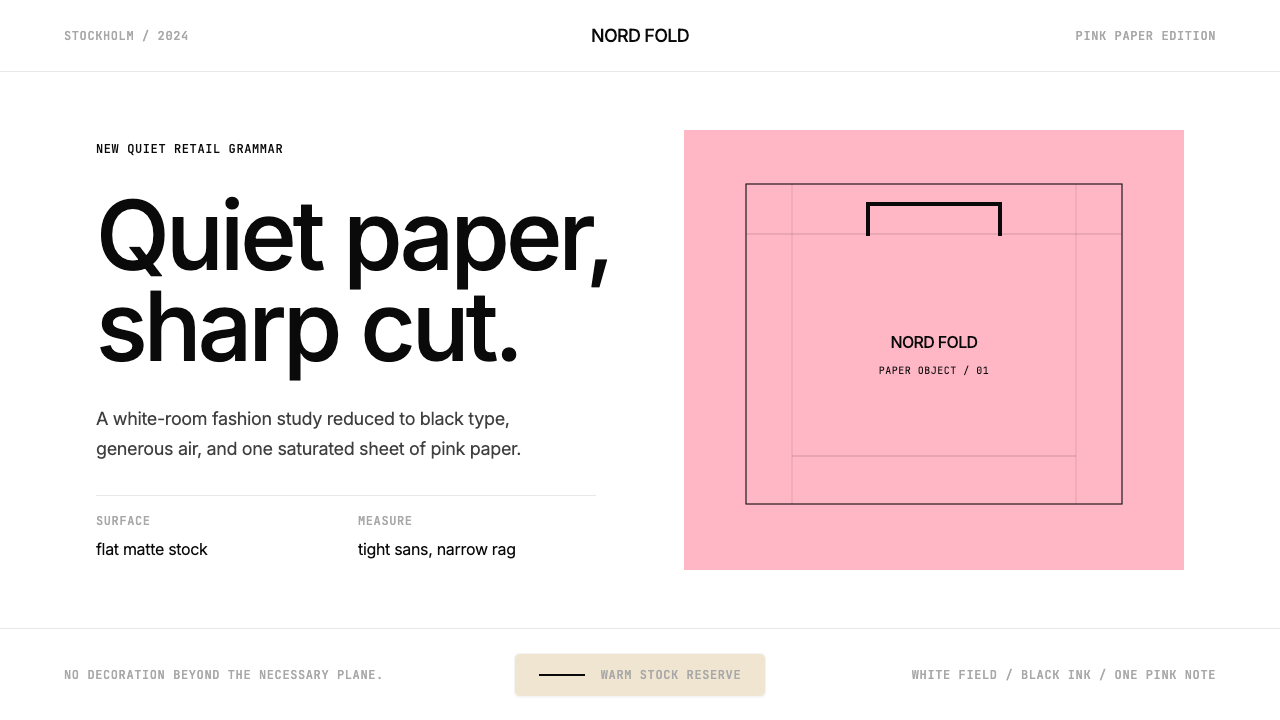 Acne Studios Pink-PaperQuiet luxury in one pink plane. Inter type floats on white with a bag-like re…
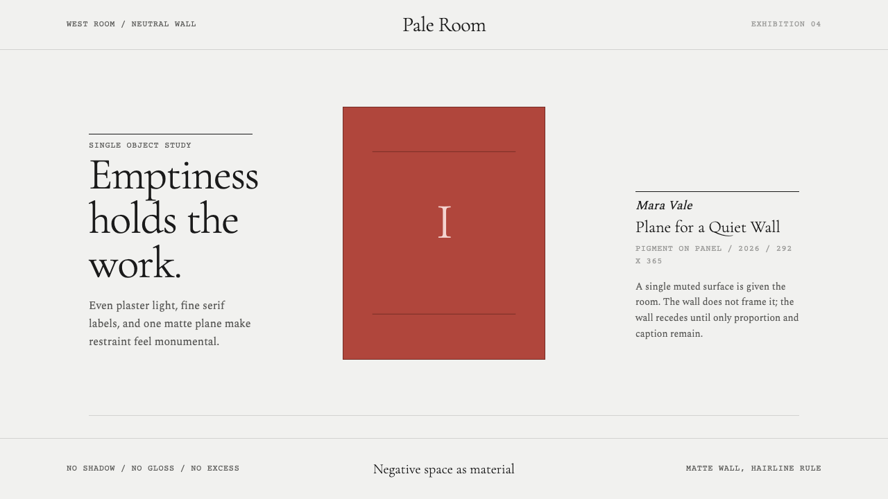 White Cube GalleryEmptiness is the medium. Cormorant labels and one terracotta plane hold the w…
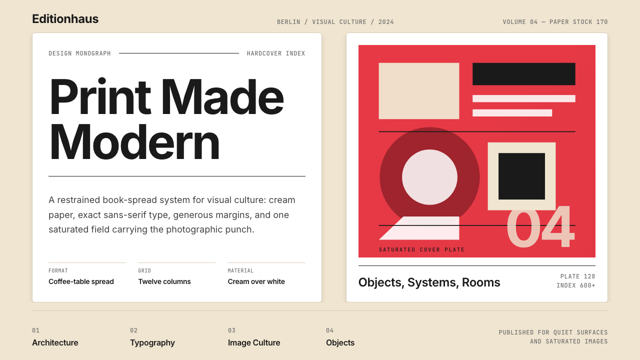 Gestalten Design BookCoffee-table calm. Cream paper, tight sans, one saturated block, and a strict…
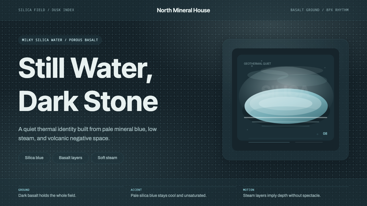 Glacial Teal LagoonQuiet feels elemental. Basalt darks and milky silica blue drift in a low-cont…