What is Glacial Teal Lagoon?
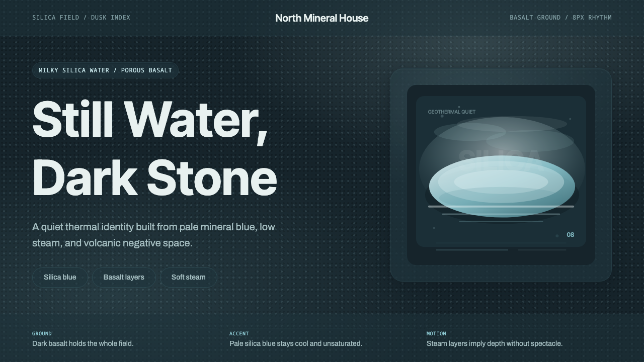
Iceland's Blue Lagoon distilled into a design language: a black lava ground, a scarce milky silica-blue accent, and steam-soft gradients built for calm, Nordic interfaces.
Glacial Teal Lagoon in brief
Glacial Teal Lagoon is a design system drawn not from a movement or a manufacturer but from a single, specific landscape: the geothermal lagoon on Iceland's Reykjanes Peninsula, where mineral-saturated water pools against black volcanic rock. The system treats that scene as a material palette rather than a postcard — it borrows the lagoon's actual optics, not a tourist-brochure idea of tropical water, and the result reads as considerably cooler, quieter, and more restrained than most water-inspired design work.
The defining move is contrast direction. Where a beach or reef palette pushes saturation up and pairs bright water against bright sky, this system holds almost everything dark. A deep, porous basalt tone anchors nearly every surface, and the pale, light-scattering blue that gives the lagoon its name is reserved for small, deliberate passages — a highlight, a data point, a single accent panel — never for a whole field. Geologists describe that blue as silica-scattered rather than pigmented: it is closer to milk suspended in water than to dye in water, and the palette avoids anything that reads as a saturated, swimming-pool teal for exactly that reason.
Above the color logic sits a quiet geometric sans and an unusually generous amount of empty space. Letterforms are even-weighted and unadorned, closer to signage than display type, because the system's job is to stay out of the way of the color relationship doing the work. Where motion appears, it behaves like drifting vapor rather than a mechanical transition — soft, directionless, slow to resolve — echoing the steam that rises off the lagoon's surface at dusk.
Where does Glacial Teal Lagoon come from?
The lagoon did not begin as a design object or even a tourist site — it began as industrial runoff. In the early 1970s, engineers drilled into the geothermal reservoir beneath the Reykjanes Peninsula to feed the newly built Svartsengi power station, which uses superheated, mineral-rich seawater trapped deep in porous lava rock to generate both electricity and hot water for the surrounding region. The spent water, still warm and saturated with silica and sulfur compounds, was discharged into the surrounding lava field. Because the rock is so porous, the water pooled instead of draining away, forming a pond that grew larger with every discharge cycle.
What turned an industrial byproduct into a destination was word of mouth. By the early 1980s, locals had begun bathing in the runoff, and some visitors with psoriasis reported that the warm, mineral-heavy water eased their skin condition. There was no marketing behind this — it was an accidental discovery repeated often enough that it became local knowledge, and eventually the site drew enough regular bathers that informal changing facilities appeared beside the pool.
Formal development followed the demand. The site opened to the public on a managed basis later in the 1980s, and in 1992 a dedicated company, Blue Lagoon Ltd., was established to operate it as a proper spa and research site rather than an unofficial swimming hole. Physicians, including dermatologist Grímur Sæmundsen, credited as a long-time co-founder and public face of the company, pushed the operation toward a clinical and wellness identity rather than a purely recreational one, and the company later developed its own skincare line built around the lagoon's silica and algae content.
The site's built environment grew in step with its reputation. Decades of expansion turned a roadside pool into a resort complex with hotels and research facilities, and the 2018 opening of a dedicated retreat, designed by the Icelandic firm Basalt Architects, gave the landscape's material logic — black stone, pale mineral water, drifting steam — an architectural translation for the first time, embedding the lagoon into walls, floors, and lighting rather than leaving it as scenery. The Reykjanes Peninsula itself remains geologically active; volcanic unrest near the neighboring town of Grindavík has repeatedly affected the region in recent years, a reminder that the calm surface this design system borrows sits directly on top of considerable underground energy.
What defines the Glacial Teal Lagoon look?
Color
The palette runs almost entirely through dark basalt and pale silica-blue, with warm off-white steam tones as a bridge between them. Blue is treated as scarce and precious rather than as a background — it appears as a highlight, an accent shape, or a data marker, never as the dominant field. Saturated, swimming-pool-style teal is deliberately avoided; the target hue reads as milky and light-scattered rather than pigmented.
Contrast and Layering
Value contrast stays low and gradual rather than jumping in hard steps. Elements drift into visibility the way a pale shape drifts into view through rising steam — a soft gradation rather than a sharp edge. This reads as calm rather than flat: depth comes from many close, quiet value shifts stacked on top of each other instead of one or two bold jumps.
Texture
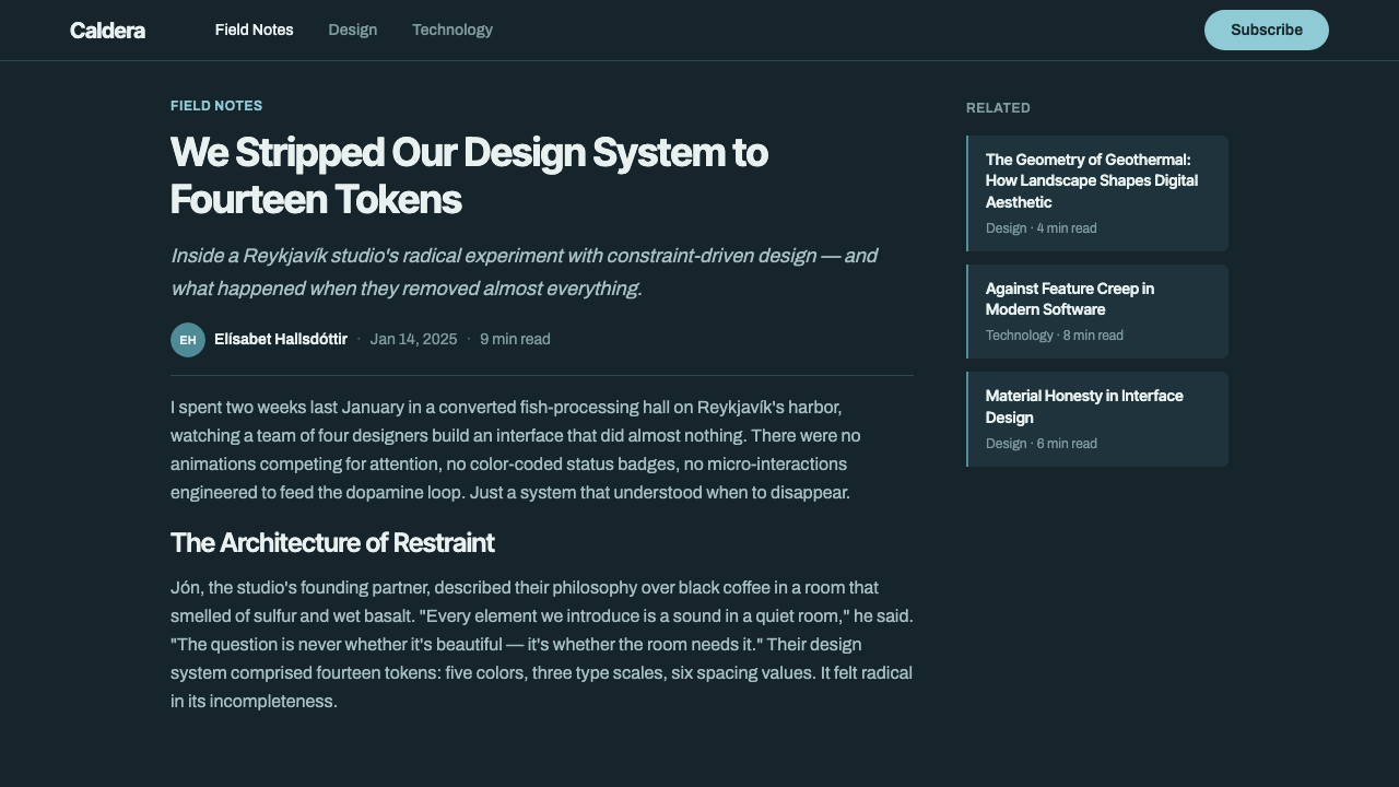
Two textures do all the work: a matte, porous, almost absorbent dark surface standing in for lava rock, and a smooth, faintly luminous pale surface standing in for mineral water. The system avoids anything glossy or reflective in the dark passages — basalt does not shine — while the pale passages are allowed a soft inner glow, as though lit from within rather than from an external source.
Typography
Letterforms are geometric, even in stroke weight, and quiet by design — closer to wayfinding signage in a spa than to a display headline. Spacing is generous and unhurried, with wide margins around labels so that type never competes with the color relationship for attention. Hierarchy is built mainly through scale and restrained weight changes rather than color, keeping the palette's scarcity intact.
Composition and Space
Layouts favor a large, quiet dark field with a single small pale element placed off-center, echoing the way a patch of lagoon reads as a bright island inside a much larger dark lava field. Negative space is not empty by accident — it is the majority material of the composition, and crowding multiple bright elements into one view breaks the effect immediately.
Atmosphere and Motion
Where the system moves at all, it favors soft, directionless drift over sharp, mechanical transitions — closer to steam dispersing over water than to a slide or a snap. Effects are used sparingly, typically to signal a state change rather than to decorate, keeping the overall mood closer to a quiet spa than an active, energetic product.
Who shaped Glacial Teal Lagoon?
The geothermal power plant on the Reykjanes Peninsula whose spent, mineral-rich water created the lagoon as an unplanned byproduct in the 1970s. The plant draws superheated water from deep in the porous lava field to generate electricity and district heating; the runoff, discharged into the surrounding rock, is the entire reason the lagoon exists at all.
A dermatologist credited as a long-time co-founder and public face of Blue Lagoon Ltd., the company established in 1992 to formalize the site's operation. His clinical background pushed the brand toward a wellness and skincare identity rather than a purely recreational one, shaping the calm, almost medicinal restraint that later carried over into its visual language.
The company that turned an accidental industrial pool into an internationally recognized spa and skincare brand, expanding the site over decades with hotels, research facilities, and a dedicated product line built around the lagoon's silica and algae content.
The Icelandic architecture practice behind the 2018 retreat and hotel expansion, which translated the landscape's raw material logic — black volcanic stone, pale mineral water, drifting steam — into built form for the first time, giving the design system's palette an architectural, rather than purely photographic, precedent.
How do you use Glacial Teal Lagoon today?
Because the system is built around restraint and scarcity rather than pattern or ornament, it transfers well to any format where calm authority matters more than visual noise. The core discipline to preserve wherever it is applied is the imbalance between the dark field and the pale accent — the moment blue starts filling more than a small fraction of a layout, the system stops reading as this lagoon and starts reading as generic dark mode.
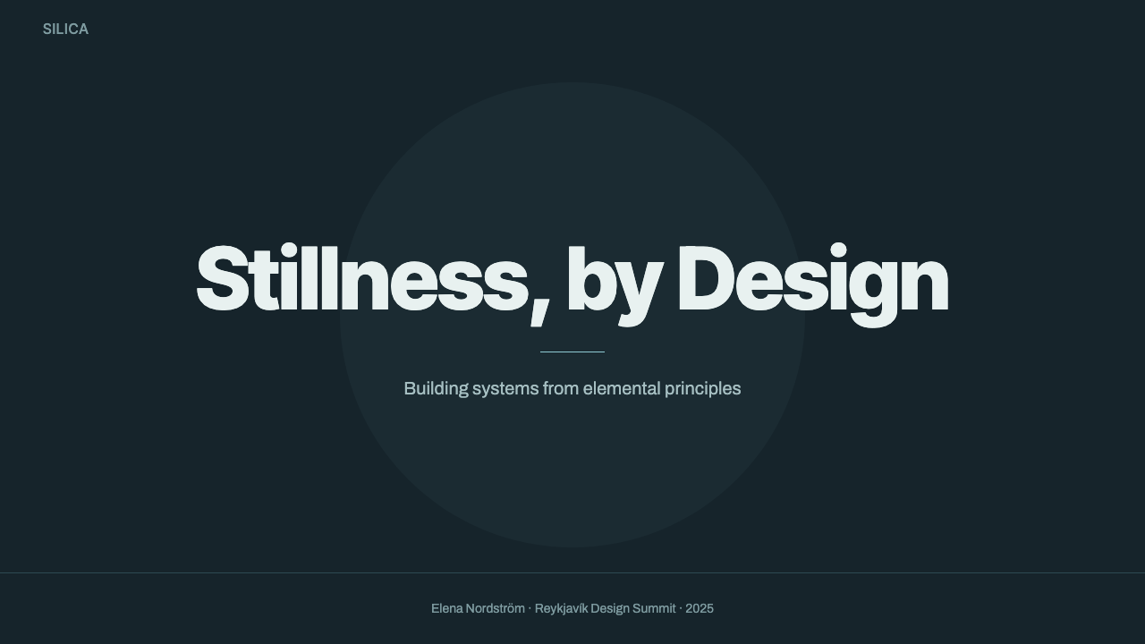
On presentation slides, a cover works best as a nearly full dark field with a single pale shape or numeral placed off-center, echoing the lagoon-as-island composition. Content slides should keep body text in a warm off-white against the dark ground, reserving the pale blue exclusively for one emphasized word, icon, or figure per slide — spreading it across multiple elements dilutes the effect. Data slides benefit especially: a single metric picked out in pale blue against an otherwise dark chart reads as considered and deliberate, the visual equivalent of a highlighted result.
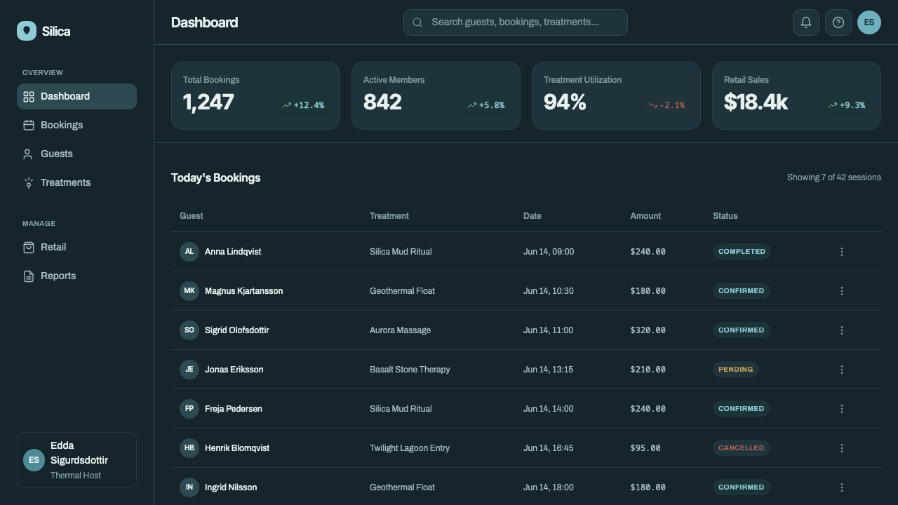
For web interfaces, the palette suits dashboards, analytics tools, and premium or wellness-adjacent products where a dark theme should feel considered rather than merely inverted. Backgrounds stay in the dark basalt range; primary actions and key metrics take the pale accent, while everything else — labels, secondary text, dividers — sits in muted mid-tones that neither compete with the accent nor disappear into the background. Pricing pages benefit from the scarcity logic directly: reserve the accent color for the recommended tier only, and let every other tier remain in the quiet dark register.
In editorial and marketing contexts, the system reads as premium and unhurried rather than loud. Long-form layouts benefit from wide margins and a narrow text column set against a dark or near-dark field, with the pale accent reserved for pull quotes, section markers, or a single hero image treatment. Marketing pages built around this palette tend to work best when the copy itself matches the restraint — short, declarative lines rather than dense persuasive copy, since the visual system is already doing the work of suggesting quality.
The most common mistake is treating this as a generic dark-mode palette and reaching for a brighter, more saturated cyan or teal to make it feel more exciting. That instinct destroys the effect: the blue is supposed to read as pale, mineral, and slightly desaturated, closer to light scattering through suspended particles than to a dyed or digital color. A second frequent error is spreading the accent color too widely — using it for every icon, every link, and every button turns a deliberately rare highlight into ordinary interface color, and the sense of calm scarcity disappears.
Glacial Teal Lagoon — FAQ
Is this just a beach or ocean palette?
No — and treating it as one is the fastest way to get it wrong. Beach and ocean palettes tend toward bright sky, warm sand, and saturated turquoise water under strong sunlight. This system is landscape-specific: a geothermal lagoon set in a dark volcanic field, where the water is pale and mineral rather than saturated and tropical, and the overall register is cool, muted, and closer to dusk than to noon.
Does the system work in a light, rather than dark, layout?
It can, but the inversion needs care. The dark basalt ground is doing most of the emotional work — it is what makes the pale blue feel rare and precious. In a light layout, replace the dark field with a very quiet, warm off-white rather than pure white, keep the blue equally scarce, and lean on a mid-gray for structure so the composition still reads as restrained rather than simply washed out.
How is this different from a generic dark-mode interface?
Generic dark mode usually just inverts a light theme: same proportions, same amount of accent color, flipped background. This system is built on an asymmetry — a very large, quiet dark field paired with a very small, precious pale accent — and on a specific material logic, porous stone versus mineral water, rather than an arbitrary inverted palette. The steam-like softness of its gradients and the near-absence of gloss or reflection are also deliberate choices that a default dark theme rarely makes.
Is this style limited to wellness or hospitality brands?
Its origin is a spa, but the underlying logic — extreme restraint, a scarce accent color, low-contrast layering — is not tied to any single industry. It reads equally well on an analytics dashboard, a premium fintech product, or a data-heavy report, anywhere a quiet, considered, slightly clinical mood supports the content rather than fighting it. It suits products that want to signal precision and calm more than it suits products built around energy, urgency, or playfulness.
Why does the system avoid glossy or reflective surfaces?
Because the two materials it draws from behave very differently under light: porous lava rock is matte and absorbs light, while the mineral-rich water has a soft, almost internal glow rather than a hard specular shine. Adding gloss or sharp reflections to either surface would import a texture — polished, manufactured — that has nothing to do with the landscape, and it would immediately push the mood toward a generic luxury product shot rather than a specific, elemental place.
Related design styles
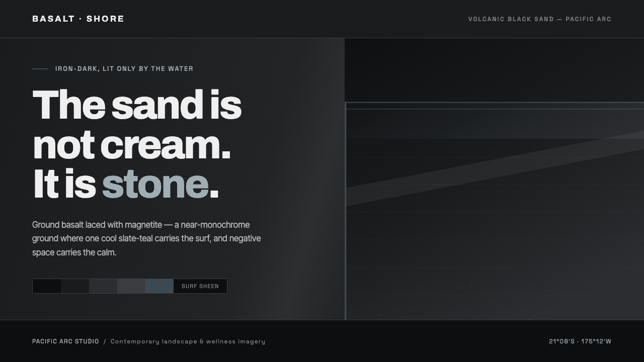 Tongan Black SandThe sand is stone, not cream. Iron-dark basalt grays with one cool slate-teal…
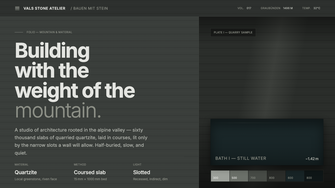 Zumthor Thermal BathsArchitecture as atmosphere. Greenish-slate stone, stratified courses, dim lig…
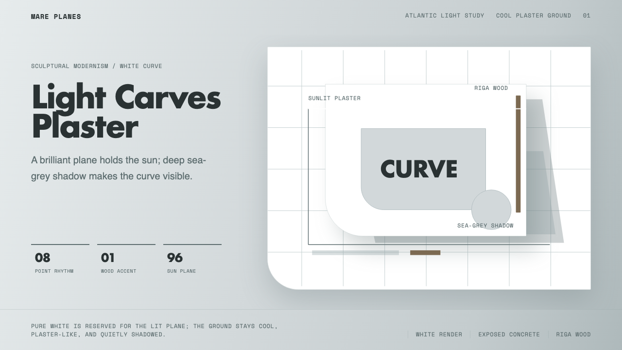 Alvaro Siza WhiteLight makes the form. White planes on cool plaster throw sea-grey shadow and…
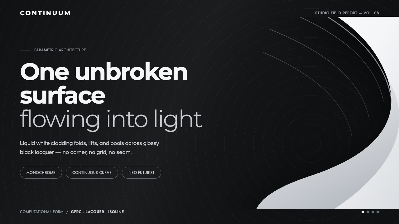 Parametricism (Zaha Hadid)Architecture as one unbroken surface. A liquid-white swoop floats on glossy b…
 Qatari Pearl Modern Architecture 2024Monumental restraint. Obsidian panels, sand-gold gridlines, pearl-white geome…
 Succulent CactariumQuiet desert order. Sage rosettes and terracotta rings rest on dark warm soil.