What is Parametricism (Zaha Hadid)?
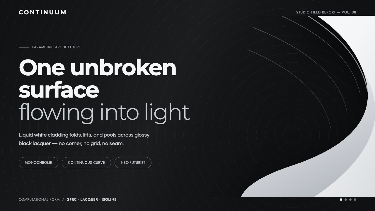
Parametricism treats architecture as a single continuous event: luminous white surfaces bending, blending, and seeming to float over a deep glossy black field.
Parametricism (Zaha Hadid) in brief
Parametricism is the Schumacher–Hadid architectural school associated with seamless fluid surfaces, continuous parametric curves, and an insistence that form should read as an unbroken system rather than an assembly of separate objects. Its visual language is defined by sweeping white cladding, topographic linework, and volumes that appear to morph from one condition into another. A wall becomes a roof, a floor rises into a bench-like contour, and an edge dissolves into the next surface instead of ending at a conventional corner.
The style’s clearest architectural image is a liquid-white form set against a glossy black-charcoal ground. White belongs to the form, never to the page behind it. Against the dark lacquer-like field, the curved surface reads as reflection, illumination, and motion at once. The result is monochrome, sleek, and highly controlled: no decorative motif, no visible grid, no visual noise, and no interruption that competes with the main sweep.
At its core, Parametricism is concerned with continuity. Curves are not added as expressive flourishes after a structure has been composed; they are the structure’s visual logic. Surfaces blend, taper, split, and reconnect as if they were responding to a common field. The atmosphere is neo-futurist but not chaotic: it suggests a future shaped by computational and generative design, where complexity is made legible through a single flowing gesture rather than through accumulation.
Where does Parametricism (Zaha Hadid) come from?
The movement belongs to a contemporary architectural context: Parametricism was named around 2008, while built exemplars continued through the 2010s and its practice extends from 2010 to the present. It is rooted in Western Europe, with a UK-based center of practice and global reach. Its emergence sits at the intersection of Parametricism, computational and generative design, and neo-futurist architecture.
Zaha Hadid and Patrik Schumacher are the key figures named by the source material. Their school framed fluidity not as an isolated visual effect but as an architectural language of continuous transformation. In this language, architectural parts do not simply touch. They transition. A surface can change direction, scale, or role while retaining the sense that it belongs to one coherent whole.
The Heydar Aliyev Centre is the supplied exemplar of this approach. Its white GFRC cladding flows into topographic isolines, demonstrating the defining condition of the style: surfaces morph and blend rather than breaking at hard corners. The project makes continuity visible at building scale, where cladding, contour, and silhouette operate as parts of one extended sweep.
The style’s graphic translation follows the same architectural discipline. A glossy black-charcoal ground replaces the neutral page, while a luminous white curve becomes the central spatial event. The design does not rely on ornament, conventional gridded order, or a crowded palette to signal sophistication. It relies on the conviction that one uninterrupted surface, given enough room and contrast, can carry the entire composition.
What defines the Parametricism (Zaha Hadid) look?
Continuous Surface
The fundamental unit is not the card, panel, box, or isolated object. It is the surface in motion. A white form should appear to pass through the composition without being cut into unrelated segments, changing contour gradually and preserving a sense of material continuity from beginning to end.
Luminous White Form
White is the signature swoop rather than a default background. It reads as a lit architectural skin or a reflection hovering above darkness. This reversal is essential: the white area carries mass, direction, and visual energy, while the dark field gives it depth and makes its edges feel exceptionally clean.
Glossy Dark Ground
The supporting ground is black-charcoal and lacquer-like rather than merely dark. Its role is to create a polished, near-reflective atmosphere that makes the white sweep feel liquid and spatial. It should remain quiet and uninterrupted, never becoming a textured backdrop, an ornamental pattern, or a field of competing effects.
Soft Morphing, No Hard Corners
Transitions should imply morphing and blending. A contour may fold inward, spread outward, or merge into another line, but it should not terminate with a hard corner that denies the flow. The visual effect is topographic: one condition gradually becomes another, as though the surface were continuously recalculated.
Topographic Linework
Topographic isolines provide a secondary expression of the same continuous logic. They suggest contours, gradients of form, and spatial change without resorting to ornament. Used sparingly, these lines can extend the white surface’s motion into the surrounding space and make the composition feel architectural rather than merely abstract.
Monochrome Discipline
The style depends on a narrow tonal relationship: luminous white against glossy black-charcoal. This is not emptiness but concentration. Restricting the palette prevents the image from fragmenting and keeps attention on curvature, silhouette, reflection, and the illusion of a single uninterrupted material system.
Zero Noise
There is no place for ornamental clutter, visible grid scaffolding, or unrelated decorative detail. Every added mark risks breaking the illusion that the composition has been shaped by one governing field. Restraint therefore has a structural purpose: it protects the surface from being read as a collage.

Who shaped Parametricism (Zaha Hadid)?
Zaha Hadid is one of the two key figures identified for this school. Her name anchors the style’s association with seamless fluid white swoops and architecture that resists hard-cornered separation. In the supplied account, the Heydar Aliyev Centre demonstrates this visual language at full scale through white GFRC cladding that flows into topographic contours.
Patrik Schumacher is the other key figure named by the source material and is directly associated with Parametricism as the Schumacher–Hadid school. His presence identifies the movement as a coherent architectural position rather than a loose preference for curves, linking its fluid formal language to computational and generative design.
The Heydar Aliyev Centre is not a person, but it is the source material’s essential built reference. Its white GFRC cladding morphs into topographic isolines and avoids hard-cornered breaks. For designers borrowing the style, it is the clearest reminder that Parametricism’s identity lies in continuity between conditions, not in adding isolated wave-like decoration.
How do you use Parametricism (Zaha Hadid) today?
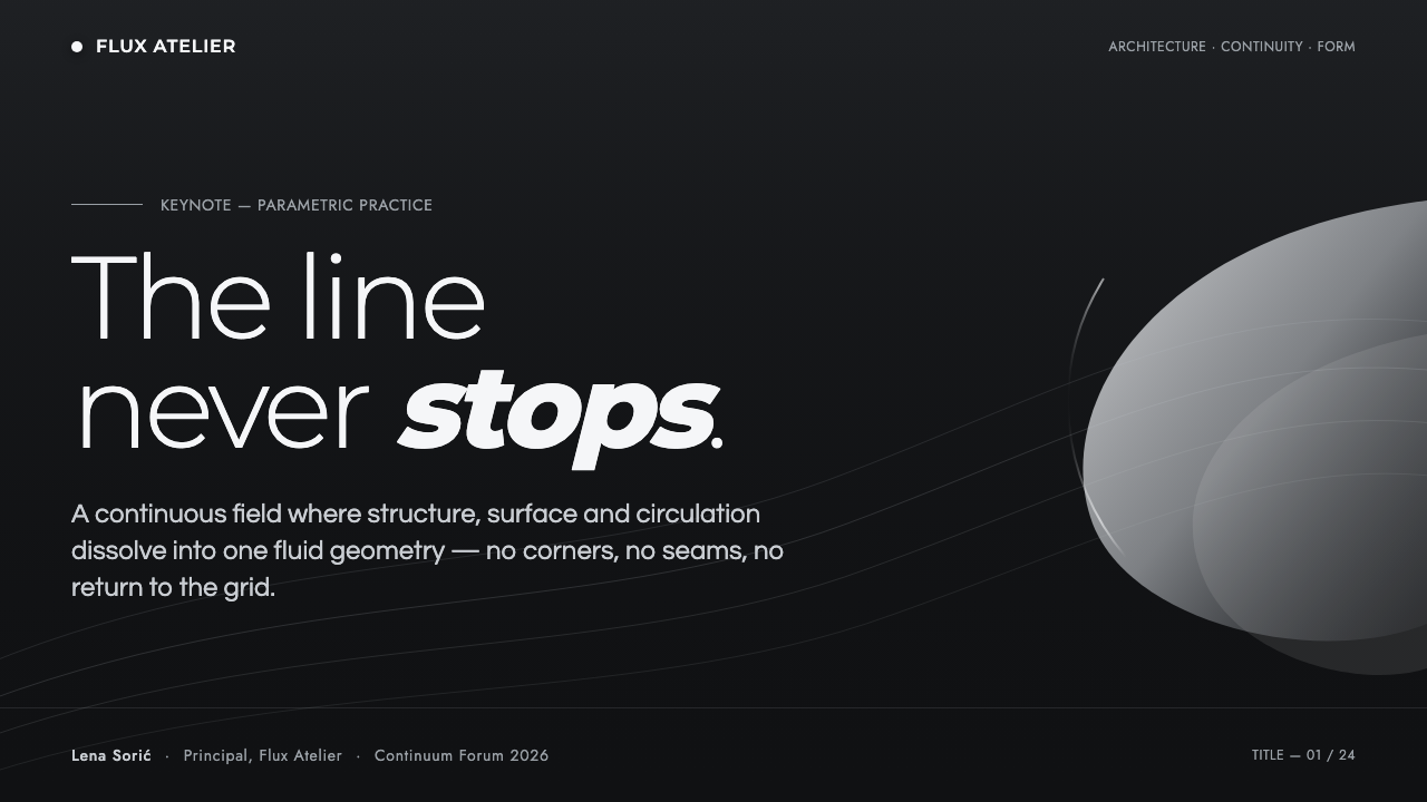
For presentation covers, begin with one dominant white sweep crossing or emerging from the black-charcoal field. Let the title sit in the calmer space created by the form rather than boxing it into a conventional banner. The cover should feel like an architectural silhouette seen under controlled light: a single gesture establishes movement, scale, and direction before any supporting information appears.
For presentation content pages, treat text and diagrams as occupants of a continuous spatial field. Keep information grouped in calm regions around the main curve, and allow section transitions to follow the surface’s direction rather than relying on heavy dividers. On data pages, charts should remain clear and legible, but their framing can borrow the style’s logic: one flowing contour can define a region of emphasis, while dark space preserves separation without introducing visual clutter.
For web interfaces, Parametricism is most persuasive in dashboards, premium landing pages, and pricing contexts where a sense of advanced systems and controlled complexity supports the product’s message. Use the glossy dark ground as the stable environment, then employ white flowing forms to establish hierarchy, guide the eye toward an important state, or distinguish a featured offer. Functional controls still need straightforward labels and strong contrast; the fluid visual layer should clarify the experience, not obscure interaction.
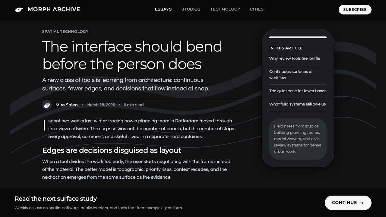
For editorial and marketing work, use the style to create a sense of editorial scale and futurist confidence. A hero image can be constructed from one luminous surface and a small amount of carefully placed copy, while successive sections may reveal different turns of the same visual language rather than introducing unrelated motifs. This works especially well for architecture, technology, generative systems, and cultural projects that benefit from an atmosphere of continuity and forward motion.
The common mistake is to reduce Parametricism to any arbitrary curved shape on a dark background. A decorative wave with unrelated cards, bright competing accents, conventional boxy modules, or noisy texture is not a continuous system. The style works only when the curve governs the composition: white remains the active material, darkness remains the reflective ground, and every transition reinforces the impression of one surface changing state.
Parametricism (Zaha Hadid) — FAQ
Is Parametricism simply a style of using curves?
No. Curves are visible evidence, not the complete idea. The defining condition is continuous transformation: surfaces should morph, blend, and preserve a shared logic across the composition. An isolated wave used as decoration can look futuristic, but it does not create the sense of one uninterrupted architectural system that defines Parametricism.
Why is the ground dark if the signature form is white?
Because white is intended to read as the active surface, not as empty page space. A glossy black-charcoal ground gives the white sweep the character of a luminous reflection or polished architectural skin. It creates the contrast that makes continuity visible and prevents the composition from becoming a pale field with indistinct contours.
Can a Parametricism-inspired interface use cards and a conventional grid?
It can, but those structures must not become the dominant visual story. The source language explicitly rejects a grid-led, noisy appearance in favor of uninterrupted flow. If functional modules are necessary, keep them visually quiet and organize them so the principal white surface still reads as the system that connects the experience.
Where does this style work best in product communication?
It works best where continuity, computational sophistication, and neo-futurist ambition reinforce the subject: architectural projects, technology platforms, generative design tools, premium dashboards, and focused presentation narratives. It is less effective when a product needs visual warmth, dense everyday utility cues, or many competing categories presented at once, because those needs can fracture its single-surface logic.
Related design styles
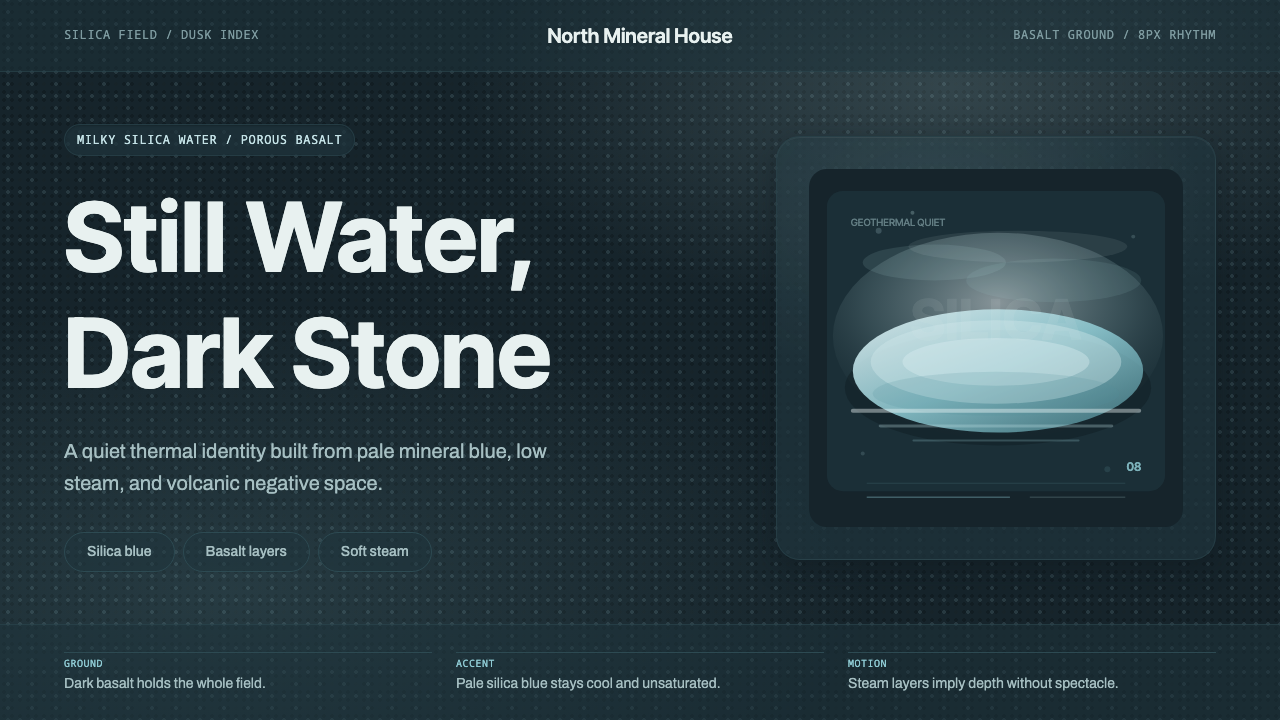 Glacial Teal LagoonQuiet feels elemental. Basalt darks and milky silica blue drift in a low-cont…
 NEOM Mirror FuturismPermanently unweathered. Chrome-white grids and ultramarine seams stage a CGI…
 Qatari Pearl Modern Architecture 2024Monumental restraint. Obsidian panels, sand-gold gridlines, pearl-white geome…
 Raised by WolvesBleached neo-religious silence. Ash-gray tundra, austere Cormorant serif, one…
 Sunshine (2007)Ship with no key light. Solar gold blooms to white from near-black void — squ…
 Tongan Black SandThe sand is stone, not cream. Iron-dark basalt grays with one cool slate-teal…