What is Raised by Wolves?
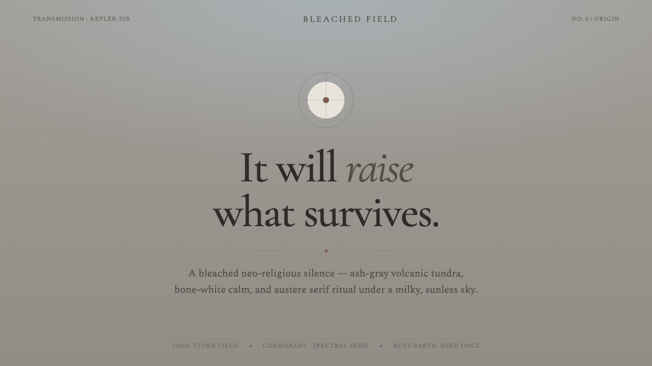
Raised by Wolves turns a hostile alien landscape into a visual religion: pale stone, cold ash, austere type, and one rust-colored sign of life.
Raised by Wolves in brief
Raised by Wolves is a design style distilled from Ridley Scott’s 2020 series, set on Kepler-22b: a world of barren volcanic tundra beneath a milky, drained sky. Its visual field is not clean minimalism in the cheerful contemporary sense. It is bleached, cold, and withholding. Pale surfaces feel weathered rather than pristine; gray feels geological rather than neutral; empty space reads as exposure, distance, and silence.
The system draws its tension from a stark opposition. Bone-white android forms and minimalist lander geometry appear against desaturated ash-gray terrain, while a single rust-earth accent interrupts the cold palette. That warm note should never become decorative comfort. It functions more like a trace left in a ruined ritual landscape: a warning, a relic, or evidence that something living once touched the scene.
Typography carries much of the atmosphere. Austere Cormorant serif headings float over broad pale-stone fields, producing a tone that is ceremonial without becoming ornate. The result is neo-religious rather than historical: sacred-seeming space without warmth, authority without celebration, and restraint that feels less like luxury than survival.
Where does Raised by Wolves come from?
The style belongs to the 2020–2022 world of Raised by Wolves, a North American production filmed in South Africa and situated in a futuristic colonization of Kepler-22b. Its central setting supplies the design language directly: barren ash-gray volcanic ground, a pale sky, bone-white android presence, and severe landing architecture. These are not incidental references to be pasted onto an interface; they are the source of its compositional logic.
Ridley Scott’s austere science-fiction tradition is one of the approved roots of the system. In this vocabulary, technology is not glossy reassurance. It is cold, spare, and physically isolated within a landscape that appears indifferent to human arrival. Clean geometry therefore works best when it feels engineered for endurance rather than styled for novelty. Large quiet surfaces, firm divisions, and controlled alignment create the sense of a constructed object holding its position in an inhospitable world.
The other root is neo-religious minimalism. The style does not depend on conventional religious symbols or decorative sacred imagery. Instead, it creates ritual through silence, hierarchy, repetition, and the careful isolation of important words. A serif heading can feel like an invocation when it is given enough stillness around it; a thin rule, an aligned block, or a solitary accent can feel like a marker in ceremonial space.
This combination explains why Raised by Wolves should remain emotionally severe. The palette rejects cream and plain white in favor of cool, desaturated pale grays. The visual system is neither warmly nostalgic nor technologically exuberant. It is a future imagined as a weathered threshold: human-made forms are present, but the landscape, the silence, and the unanswered implication of belief are larger than they are.
What defines the Raised by Wolves look?
Bleached Stone Palette
The foundation is cool, desaturated gray rather than cream or plain white. Pale fields should suggest stone dust, ash, fog, or a sky drained of warmth. Darker gray establishes structure and legibility without turning the composition into a conventional dark interface. The palette works through subtle temperature differences and material association, not through colorful variety.
Rust as Evidence
The rust-earth accent is deliberately scarce. It should identify the one element that must feel consequential: a warning, selected state, threshold, key datum, or ritual focal point. Its power comes from interruption. If the accent becomes a recurring decorative color, the landscape loses its severity and the system begins to feel merely rustic or cinematic.
Austere Serif Typography
Cormorant serif headings establish the voice: tall, deliberate, and calm enough to carry ceremonial weight. They should be used for declarations, section titles, and high-level concepts rather than dense operational copy. Supporting text should remain restrained and highly readable, allowing the serif display moments to appear as rare acts of emphasis instead of an all-purpose ornamental texture.
Ritual Negative Space
Empty space is not unused capacity. It is the atmosphere around the object, the distance between an isolated settlement and an indifferent planet. Give major headings, images, and calls to action room to remain alone. Crowded grouping weakens the style because it replaces silence with productivity and turns an austere field into an ordinary content layout.
Lander Geometry
Structure should feel engineered and minimally inhabited. Use hard, simple planes, reserved framing, and alignment that implies a practical object placed in open terrain. Geometry is most effective when it supports containment, orientation, and hierarchy. Avoid playful rounded motifs or expressive decorative shapes; they introduce social warmth that conflicts with the source world’s isolated machinery.
Neo-Religious Restraint
The sacred quality comes from restraint, not embellishment. Repetition, isolation, solemn headings, and one carefully placed warm signal can imply belief, ceremony, or taboo without literal iconography. The design should leave interpretation unresolved. When every area explains itself, the sense of mystery collapses; when every surface is decorated, the ritual atmosphere becomes costume.
Who shaped Raised by Wolves?
Ridley Scott is identified in the approved material as the creator associated with the 2020 series and with its austere science-fiction tradition. For this design system, that tradition matters as a tonal foundation: futurism is presented through restraint, hostile space, pale material fields, and severe engineered geometry rather than celebratory technological spectacle.
Aaron Guzikowski is listed among the key figures for Raised by Wolves. Within the approved framing of futuristic colonization and neo-religious minimalism, his association belongs to the thematic side of the system: a visual language in which belief, human survival, and alien terrain are held in unresolved tension rather than simplified into a familiar science-fiction interface.
Important Looking Pirates is included among the key figures in the approved source material. Its presence underscores that the world is built through a coherent visual environment rather than a loose collection of props. A successful adaptation should therefore preserve relationships between atmosphere, terrain, android whiteness, and lander-like structure instead of borrowing one isolated visual cue.
How do you use Raised by Wolves today?
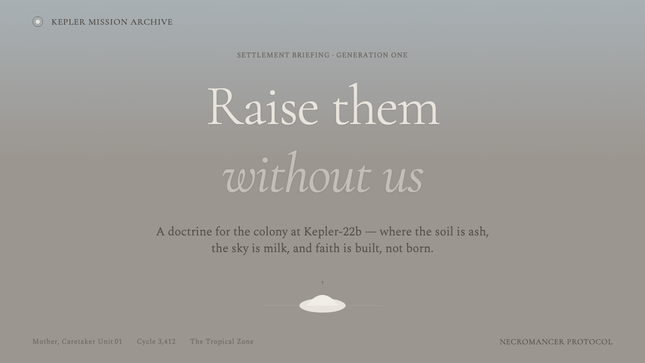
For presentation covers, use the style as an environmental statement. Place a restrained serif title in a wide pale-stone field, supported by one severe geometric structure or a carefully cropped ash-gray image. Let the rust-earth accent identify only the decisive word, marker, or small focal detail. The cover should feel like an arrival at a threshold, not an entertainment poster.
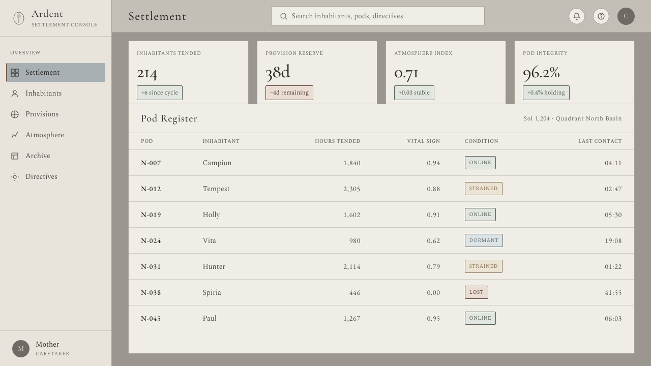
Content and data slides benefit from the system’s quiet hierarchy. Treat information as artifacts arranged on a barren field: one dominant heading, restrained supporting copy, and clear separation between groups. Charts should remain spare and geological in tone, with muted gray structure and the rust accent reserved for the datum that requires attention. Avoid turning every category into a competing color signal.
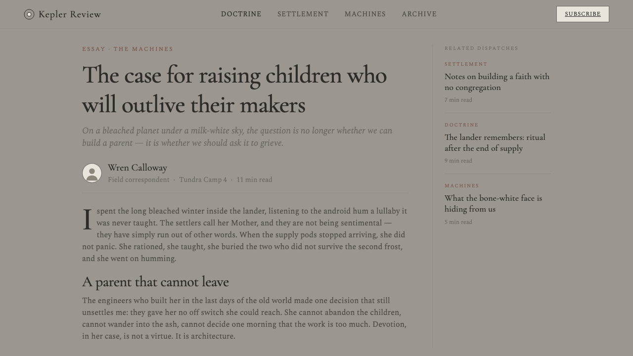
For web interfaces, Raised by Wolves suits dashboards, analytical tools, research products, and pricing pages that need gravity and focus. Use pale gray fields to organize information, strong alignment to make navigation feel engineered, and serif display type for major conceptual moments. Interactive emphasis should be rare and deliberate, so that alerts, selected states, and primary decisions retain the force of a signal in an empty landscape.
In editorial and marketing work, the style is strongest when paired with serious subject matter: speculative technology, research, architecture, cultural analysis, or high-consequence product narratives. Long-form pages can use broad quiet margins, isolated pull lines, and section openings that feel like inscriptions. Campaigns should lead with atmosphere and declarative language rather than crowded feature lists or cheerful promotional imagery.
The common mistake is confusing bleakness with generic monochrome minimalism. Simply removing color, adding a serif font, and leaving excessive blank space will not produce this world. The specific balance matters: cool pale gray rather than warm white, engineered geometry rather than generic cards, one rust-earth interruption rather than broad accent usage, and silence that serves tension rather than simply making the page look unfinished.
Raised by Wolves — FAQ
Is Raised by Wolves simply a monochrome science-fiction style?
No. Gray is essential, but the system is defined by the relationship between ash-gray terrain, pale stone fields, bone-white android presence, severe geometry, and a single rust-earth interruption. Generic monochrome design often feels neutral or sophisticated. Raised by Wolves should feel exposed, hostile, and faintly ceremonial. Its color restraint serves atmosphere and narrative tension, not merely visual tidiness.
Can the rust-earth accent be used for every primary action?
Usually no. The accent works because it is scarce and consequential. If every button, badge, chart segment, and active label uses it, the visual signal becomes routine and the cold field loses its pressure. Reserve it for the action or state that deserves immediate attention, then let quieter decisions remain inside the gray structural system.
Why use a serif heading in a futuristic interface?
Here the serif is not a historical decoration. The austere Cormorant voice introduces gravity, ritual distance, and a sense that language carries more than utility. It counterbalances the cold minimalist lander geometry. Used sparingly, it makes major statements feel ceremonial; used everywhere, it loses that authority and can turn the interface into an ornamental pastiche.
What kinds of products fit this style best?
It is best for products that benefit from seriousness, distance, and concentrated attention: analytical platforms, research tools, architecture or technology editorial work, speculative product launches, and pricing or dashboard experiences with a clear hierarchy. It is less suitable for products that need immediate warmth, playfulness, abundance, or social intimacy. The style asks users to slow down and look; it should be chosen when that emotional posture supports the product.
Related design styles
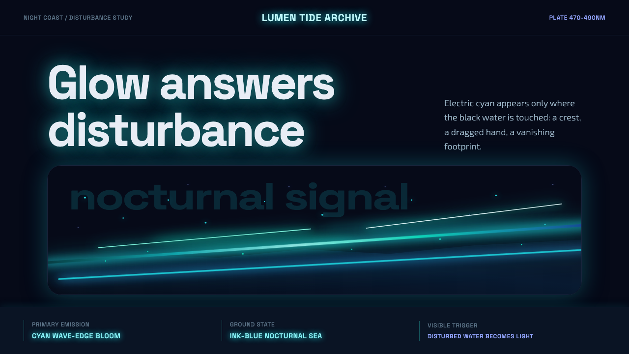 Bioluminescent ShoreDarkness becomes alive. Cyan wave-lines and specks ignite over an ink-blue se…
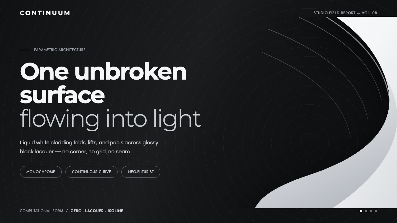 Parametricism (Zaha Hadid)Architecture as one unbroken surface. A liquid-white swoop floats on glossy b…
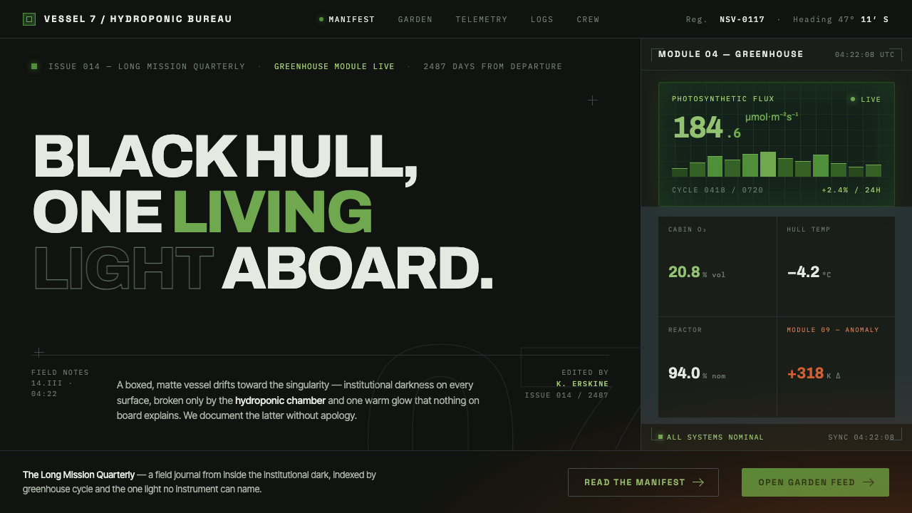 High Life (2018)Institutional dark, one living light. Matte-black hull, hydroponic green, one…
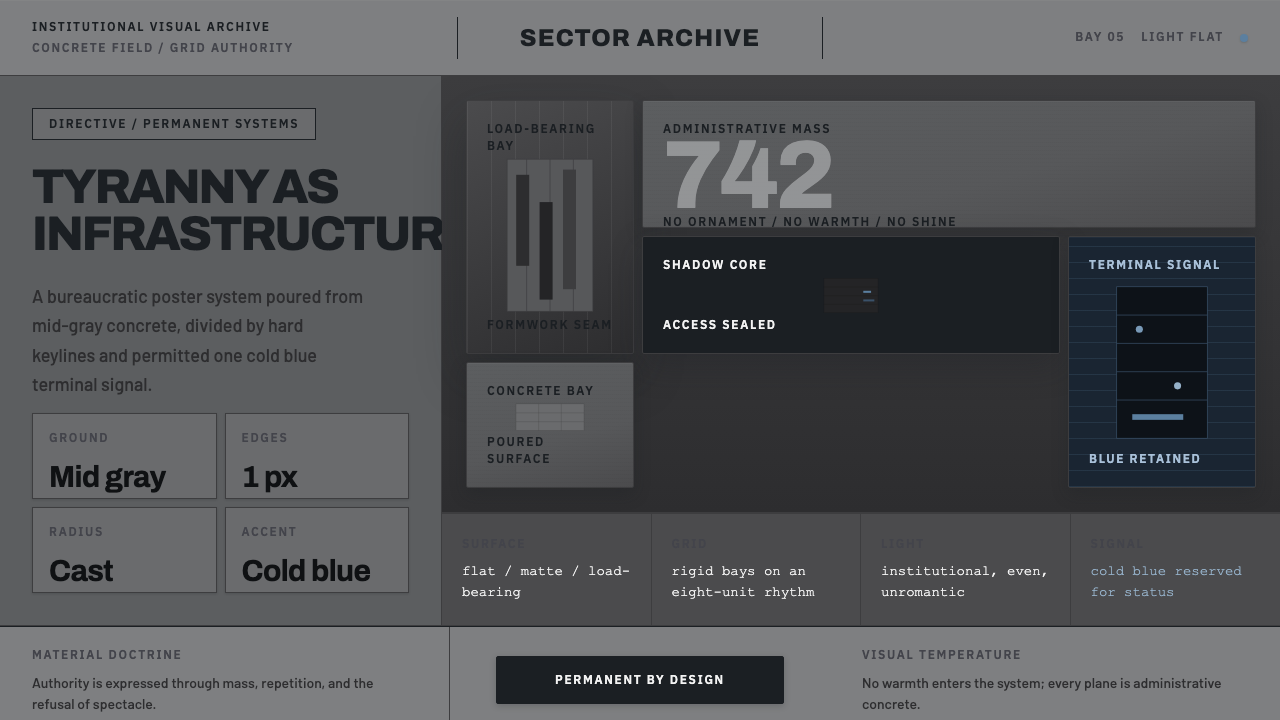 Andor Imperial GrayOppression made ordinary. Mid-gray concrete slabs, hard keylines, one cold bl…
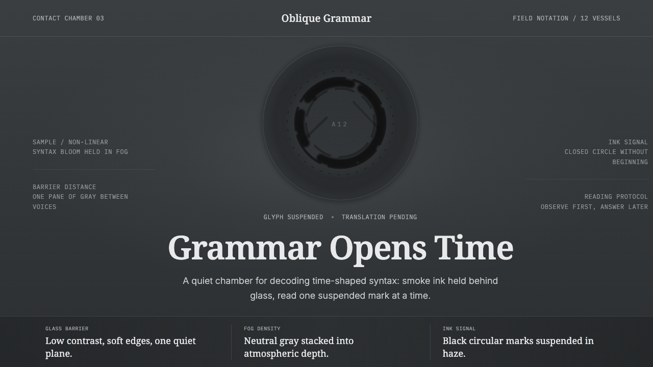 Arrival LogogramFirst contact turns quiet. Fog gray, serif notes, and smoke-black rings decod…
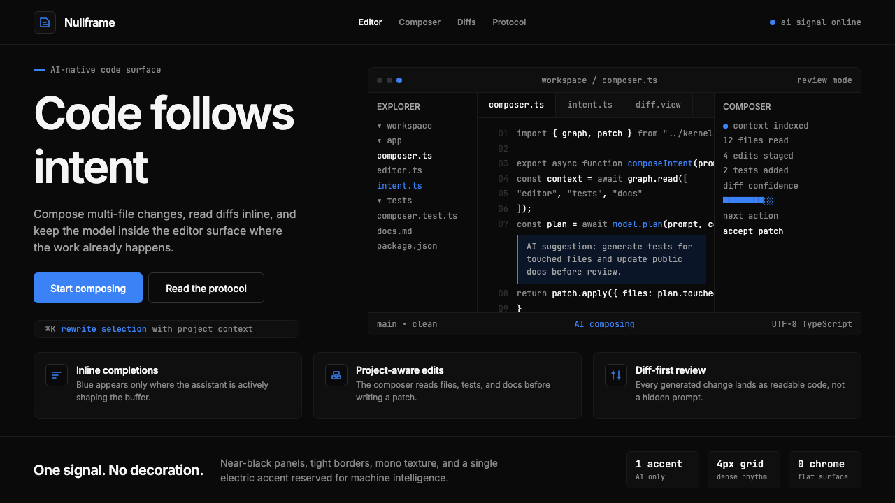 Cursor IDEAI-first code editor. Pure dark surfaces, off-white text, electric blue reser…