What is High Life (2018)?
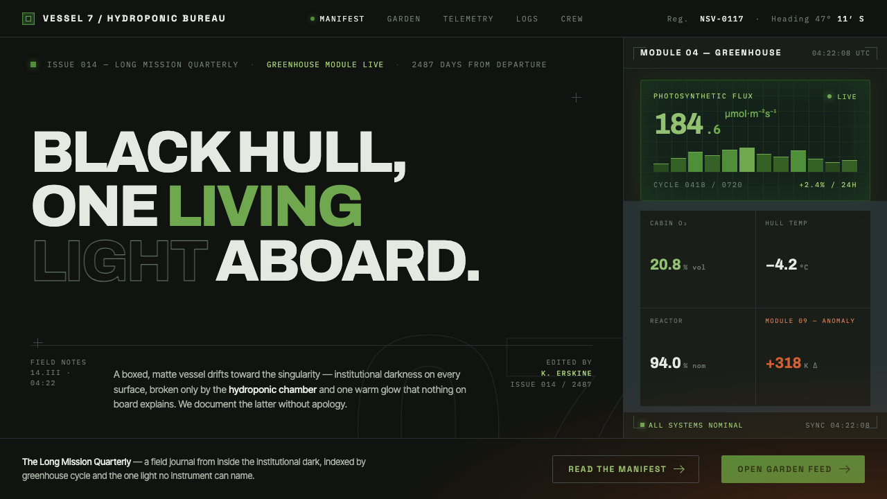
High Life turns deep space into institutional captivity — a matte-black box where living green and a solitary terracotta glow become acts of resistance.
High Life (2018) in brief
High Life is a dark visual system derived from Claire Denis’s 2018 deep-space film, a French, German, and British co-production shaped by the sensibility of installation artist Olafur Eliasson. Its central image is not the gleaming spacecraft familiar from technological spectacle, but a boxy prison ship drifting toward a black hole. The hull is matte, the interiors approach total darkness, and the sets reject decorative futurism. Space is presented as confinement rather than freedom.
The style is built around a severe contrast between institutional darkness and biological life. Black negative space dominates, often carrying a muted teal or blue-green cast that makes the environment feel regulated, airless, and impersonal. Against it sits the hydroponic garden: luminous, dense, and unmistakably alive. Green is therefore more than an accent. It represents growth, moisture, vulnerability, and the persistence of organic systems inside a machine designed as a prison.
A single terracotta-orange zone introduces a second kind of life. Unlike the garden’s botanical green, this warmth feels invented and spatially contained, as though an unfamiliar light has entered one compartment and nowhere else. The resulting language is sparse but emotionally charged: matte black establishes the institution, green marks the living enclave, and terracotta marks an exceptional human or sensory interruption.
Where does High Life (2018) come from?
The style begins with High Life, Claire Denis’s 2018 work of European art-house science fiction. Its production belongs to Western Europe through French, German, and British collaboration, but its setting abandons recognizable geography for a futuristic voyage through deep space. This displacement allows familiar systems of confinement to be rendered as an isolated object: a prison ship surrounded by darkness, moving toward a black hole with no bright metropolitan future waiting outside.
Olafur Eliasson’s involvement is central to the visual premise described in the source material. Known here through his role as an installation artist shaping the film’s look, he brings an understanding of light as a physical condition rather than decorative polish. Illumination does not evenly reveal the ship. It separates environments, changes the emotional meaning of matter, and makes the garden’s living green appear almost self-luminous against the near-pitch interior.
The design belongs equally to European art-house science fiction and Brutalist minimalism. Its science-fiction identity comes from the deep-space voyage, the black hole, and the closed artificial habitat. Its Brutalist quality comes from the ship’s box-like form, no-frills construction, matte surfaces, and refusal of glamorous technological display. The future is not streamlined or luxurious; it is severe infrastructure assembled around containment and survival.
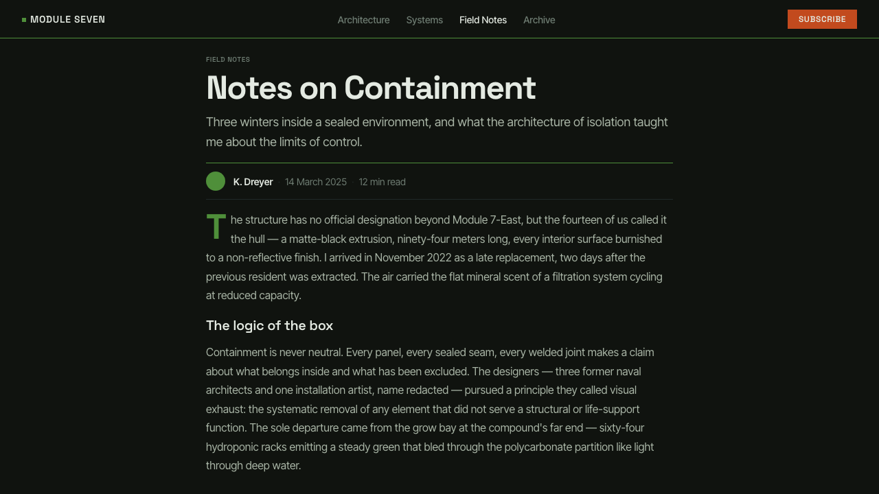
Curio’s design interpretation condenses this cinematic environment into a transferable system. It preserves the dominance of black negative space, the institutional teal darkness, the concentrated hydroponic green, and the exceptional terracotta-orange zone. Rather than reconstructing the film literally, the system carries forward its governing relationship: an oppressive container interrupted by small, intensely meaningful signs of life.
What defines the High Life (2018) look?
Institutional Darkness
Darkness is the primary material, not a background applied after the composition is complete. Matte black fills broad fields and absorbs boundaries, while a restrained teal cast gives some surfaces the cold atmosphere of regulated infrastructure. The darkness should feel administered and architectural rather than romantic, cosmic, or luxurious.
Living Green
Green is concentrated rather than scattered. It belongs to the hydroponic enclave and should appear lush enough to oppose the ship’s sterility without turning the entire composition botanical. Its power comes from containment: life occupies one protected region, making every leaf-like mass or luminous green plane feel scarce and consequential.
Terracotta Exception
Terracotta orange is an invented warmth assigned to a single zone. It should not become a general highlight color or repeat rhythmically across the page. Used correctly, it feels like heat, clay, skin, or an unfamiliar lamp entering the black system. Its isolation is what makes it emotionally legible.
Boxed Geometry
Forms are rectangular, enclosed, and blunt. Panels, frames, cards, and image fields resemble compartments within a vessel rather than floating consumer-interface objects. Corners and divisions should feel constructed for containment. Curves, if present, are rare interruptions and never the dominant organizing language.
Matte Materiality
Surfaces absorb light instead of returning spectacle. There is no polished hull, glamorous reflection, or lens-flare futurism. Depth emerges through overlap, occlusion, and zones of partial illumination rather than glossy modeling. The result should feel tactile but unseductive: machinery, wall, soil, and foliage retain distinct material identities.
Restricted Illumination
Light is distributed unequally and treated as a scarce resource. Some regions remain almost unreadable while one garden or terracotta zone receives concentrated visibility. This produces hierarchy without decorative abundance. A bright area matters because the surrounding system withholds brightness, not because every object has been individually accented.
Severe Typography
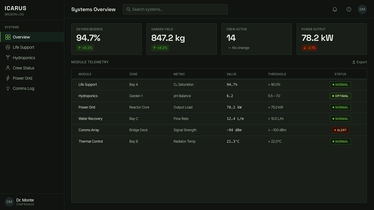
Typography should feel functional, quiet, and embedded in an institutional environment. Compact sans-serif forms, restrained scale changes, and plain alignment support the boxed architecture. Display type should not imitate science-fiction machinery. The stronger choice is bureaucratic clarity under pressure: labels, headings, and data that appear necessary for operating inside confinement.
Who shaped High Life (2018)?
Denis is the filmmaker at the center of High Life and the authorial force behind its deep-space prison premise. In this visual system, her decisive contribution is the refusal to treat space as spectacle. The voyage toward a black hole becomes an environment of isolation, while the contrast between institutional darkness and living matter carries the emotional argument.
Eliasson is the installation artist identified as shaping the film’s look. His importance lies in the treatment of light, color, and environment as inseparable conditions. Green illumination does not merely decorate the garden, and terracotta warmth does not merely beautify a chamber; each transforms the perceived reality of the space it occupies.
Shrewsbury is named among the key figures associated with the source material for High Life. Within a style defined by severe enclosure and materially distinct zones, that association belongs to the collective construction of a world in which matte surfaces, dark compartments, and the concentrated garden must read as parts of one coherent vessel.
Pattinson is also identified among the film’s key figures. For this design language, the human presence associated with the work is essential because it prevents the ship from becoming an abstract exercise in dark minimalism. The enclosed environment gains meaning through the tension between a severe mechanical container and vulnerable life held inside it.
How do you use High Life (2018) today?
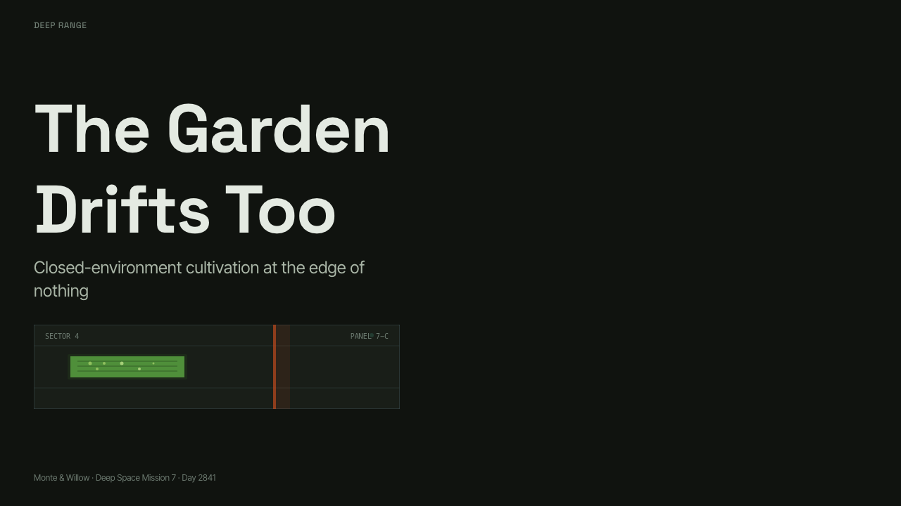
For presentation covers, begin with darkness and allow only one illuminated event. A title can sit inside a broad matte field while a contained green image or terracotta block occupies an offset compartment. The cover should feel like an exterior hull interrupted by a window into life. Content slides should retain the enclosure through boxed regions, restrained headings, and large areas left deliberately unlit.
For data slides, treat information as readings inside a closed system. Tables and charts should be quiet, linear, and mostly neutral, with green reserved for living, active, or sustaining quantities. Terracotta can identify one exceptional condition, but it should not compete with green across every series. The surrounding darkness provides hierarchy; excessive labels and colorful legends weaken the sense of controlled scarcity.
For web dashboards and pricing pages, the style works best when the interface feels operational rather than promotional. Navigation, status areas, and account information can occupy matte dark compartments separated by subtle structural boundaries. Green should indicate the system’s living core or primary action, while a terracotta region can distinguish one plan, warning, or temporary state. Controls should appear sturdy and necessary, not glossy or playful.
Editorial and marketing layouts can use the contrast to build a narrative of containment and release. Long dark passages establish pressure; a lush green image, quotation, or feature section then becomes a biological opening. A terracotta interlude can mark a human-centered story or exceptional proposition. Marketing language should remain spare, because exuberant copy and dense decorative imagery conflict with the style’s atmosphere of isolation.
The common mistake is to turn the palette into generic dark-mode science fiction. Neon lines, polished metallic surfaces, luminous borders around every component, and repeated orange-green accents destroy the original tension. High Life depends on deprivation: most of the composition must remain matte, black, and visually quiet so that one garden and one warm zone can carry disproportionate emotional force.
High Life (2018) — FAQ
Is the High Life style simply a cinematic dark mode?
No. Ordinary dark mode is often an interface preference that reduces brightness while preserving a conventional component system. High Life uses darkness as subject matter and structure. The black field represents enclosure, institutional control, and the surrounding void. Green and terracotta are not interchangeable accents; they identify specific kinds of interruption within that controlled environment.
Why is the hydroponic garden so important to the visual system?
The garden is the clearest opposition to the prison ship. It is lush where the vessel is stripped, organic where the architecture is box-like, and luminous where the interior approaches darkness. Because the green is spatially contained, it reads as a fragile reserve of life rather than a decorative nature theme. Remove that contrast and the style becomes merely severe.
Can more than one warm-colored zone be used?
It is possible, but repetition changes the logic. The terracotta zone is powerful because it is exceptional and appears to have entered the system from elsewhere. If warm color is distributed across buttons, headings, charts, and illustrations, it becomes branding rather than an event. Additional warm elements should remain subordinate to one unmistakable center of warmth.
How should imagery be handled in a High Life-inspired layout?
Imagery should reinforce material and environmental contrast. Dark architectural fields, matte surfaces, enclosed passages, and dense vegetation are more appropriate than expansive star fields or polished spacecraft. Images should feel embedded within compartments, not placed as floating decoration. A green image works best when surrounded by enough darkness to make its vitality physically apparent.
What kinds of products suit this style best?
It suits projects concerned with isolation, systems, survival, ecology, institutional power, or speculative futures. It can give analytical tools, cultural presentations, environmental narratives, and serious editorial work a controlled dramatic atmosphere. It is less suitable when a product needs constant friendliness, cheerful abundance, or frictionless luxury, because its strongest qualities are restraint, pressure, and the rarity of comfort.
Related design styles
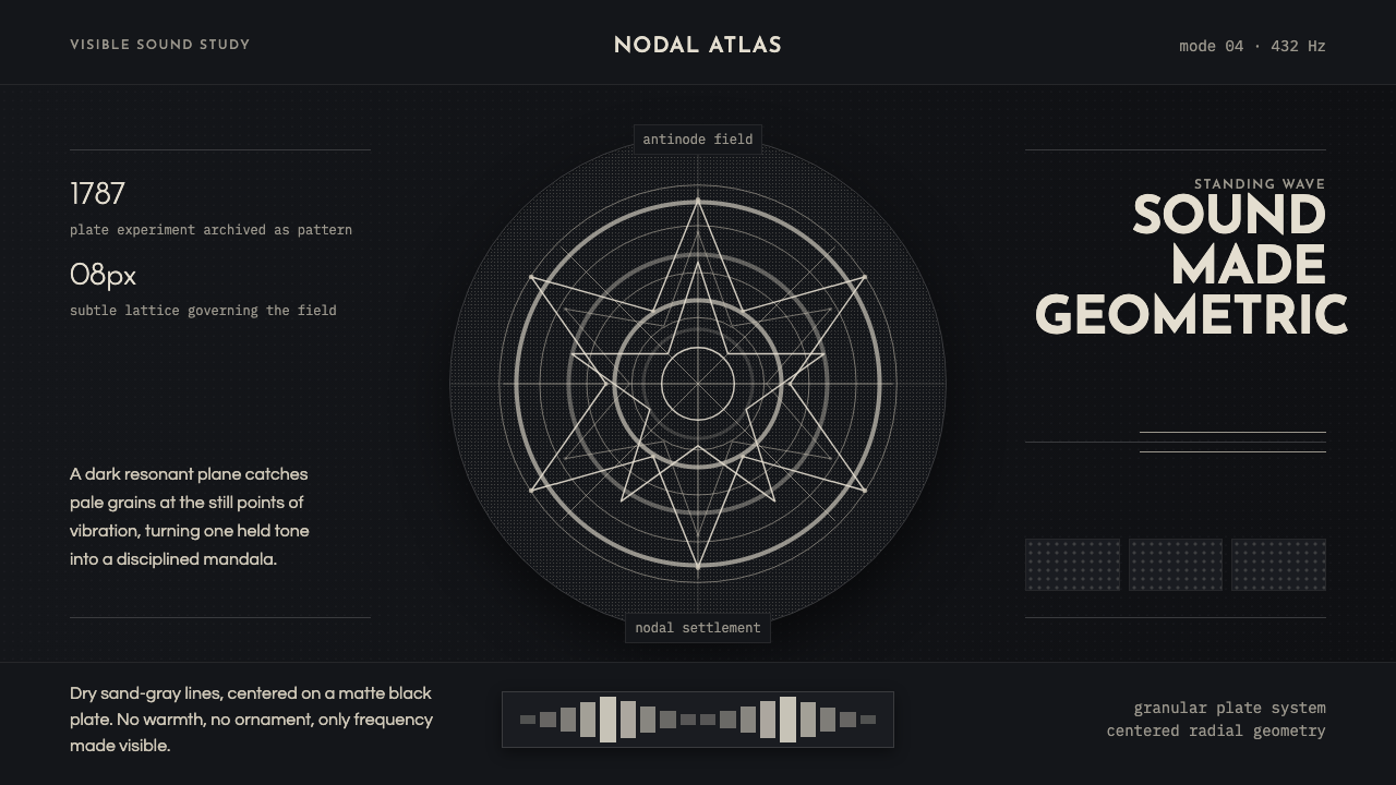 Cymatics Standing WaveSound becomes geometry. Sand-gray nodal rings settle on a dark resonant plate.
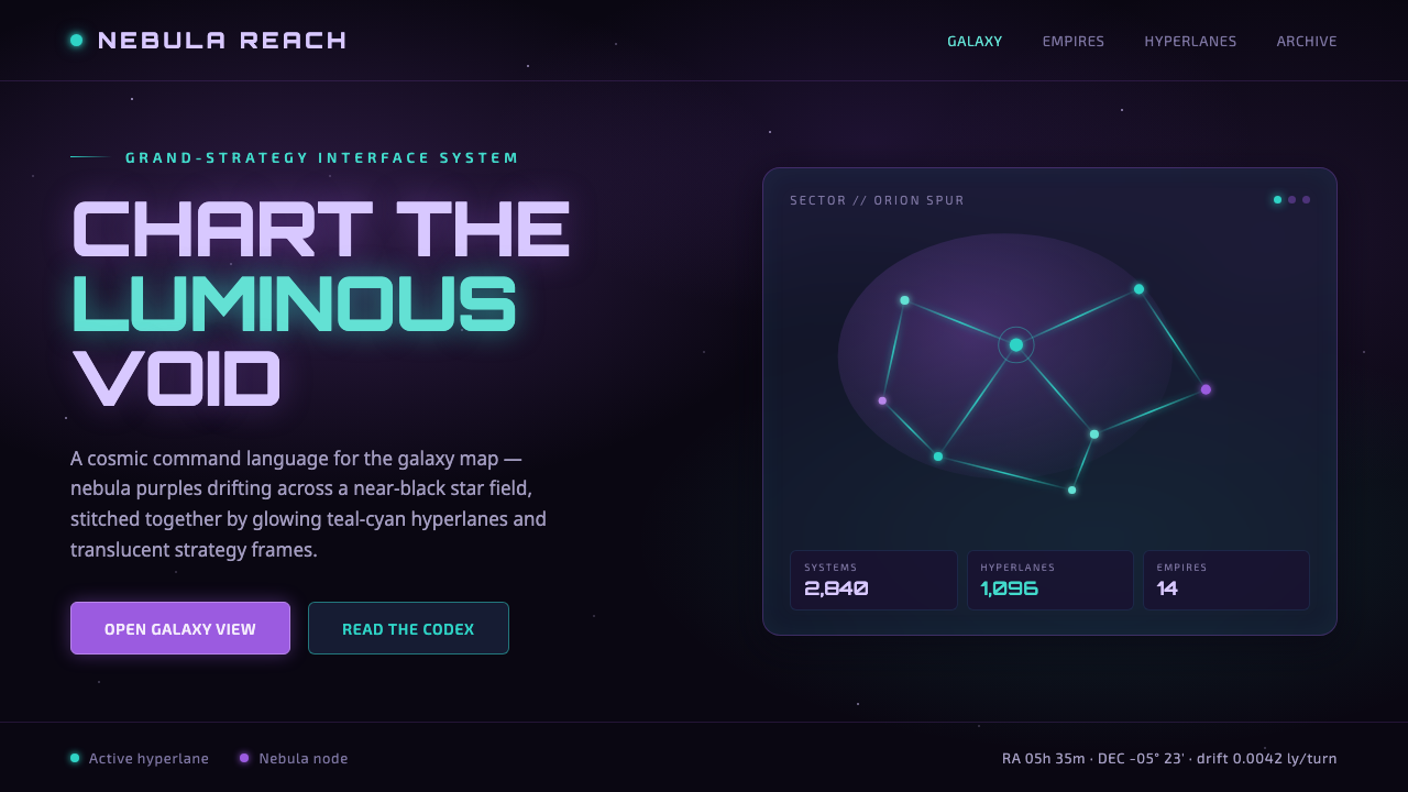 StellarisQuietly grand cosmic command UI. Nebula purples on near-black void, teal-cyan…
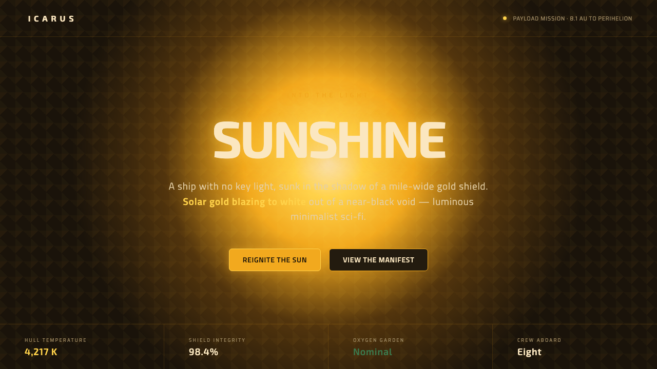 Sunshine (2007)Ship with no key light. Solar gold blooms to white from near-black void — squ…
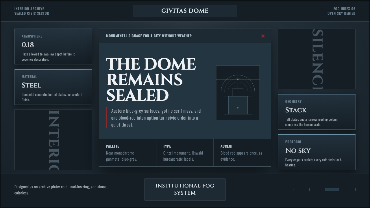 Ergo Proxy Romdo DomesCold order becomes dread. Gunmetal fog, gothic serif mass, one blood-red mark.
 Pink Floyd — Dark Side of the MoonOne image does everything. Black void, white beam, hard prism, seven exact co…
 Raised by WolvesBleached neo-religious silence. Ash-gray tundra, austere Cormorant serif, one…