What is Ergo Proxy Romdeau Domes?
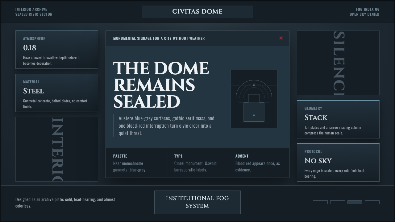
Cold order becomes dread: gunmetal fog, gothic serif mass, and one blood-red mark.
Ergo Proxy Romdeau Domes in brief
Ergo Proxy is a neo-noir science-fiction anime produced by Manglobe and directed by Shūkō Murase in 2006. Its visual world is sealed inside Romdeau, a domed city where architecture, signage, and machinery exist beneath a permanent atmospheric weight. The result is not a futuristic vision of abundance but a post-cyberpunk environment of enclosure, institutional control, and slow psychological pressure.
The palette is nearly monochromatic: gunmetal blue-grey concrete, smoke, shadow, and surfaces that seem to absorb rather than reflect light. Gothic and expressionist influences turn this restraint into menace. Buildings feel monumental and load-bearing; corridors appear devotional rather than domestic; silhouettes become signs of authority before they become recognizable objects.
The system breaks its austerity only through dark blood-red, used as punctuation rather than decoration. Red does not warm the environment or create visual comfort. It interrupts the grey field like a warning, wound, seal, or forbidden signal. Every other element should preserve the feeling of a city that has never seen open sky.

Where does Ergo Proxy Romdeau Domes come from?
The style belongs to the mid-2000s post-cyberpunk anime context and is anchored to the original 2006 work. Romdeau provides its central condition: a domed city whose inhabitants and structures exist within a controlled interior rather than an open landscape. This enclosure gives the visual language its persistent sense of pressure, distance, and unreleased dread.
Manglobe, identified in the source as a Tokyo studio, is the production context for the work. Shūkō Murase is named as director, while Dai Satō is listed among the key figures associated with the project. The approved material does not assign each contributor a separate stylistic doctrine; together, however, their presence belongs to a work whose identity is carried by atmosphere, architectural mass, and disciplined color.
The movement vocabulary is deliberately layered. Neo-noir supplies moral darkness and low-light tension; gothic expressionism gives the world its religious severity and emotional distortion; German expressionism informs the exaggerated massing and ominous silhouettes; post-apocalyptic dystopia turns the city into a closed system where survival and administration seem inseparable.
Unlike a style built from interchangeable surface effects, the Romdeau language is fixed at the original broadcast. Its defining decisions are therefore systemic: the dark field, the scarce light, the institutional material impression, the gothic weight of type and architecture, and the isolated blood-red interruption. Recreating it means preserving that hierarchy rather than merely making a layout dark.
What defines the Ergo Proxy Romdeau Domes look?
Gunmetal Atmosphere
The ground should feel like fog pressed against concrete: blue-grey, metallic, cold, and nearly without chromatic relief. Darkness is not an empty backdrop but the prevailing material condition of the city. Surfaces should recede into haze while retaining enough density to suggest walls, floors, and institutional enclosures.
Gothic Serif Mass
Typography should carry architectural gravity. Gothic or gothic-adjacent serif forms work as monoliths, with dense strokes, severe proportions, and a ceremonial rhythm. Type is not a friendly interface layer; it behaves like carved inscription, official doctrine, or a title fixed to a monumental wall.
Institutional Geometry
Composition favors blocks, slabs, frames, vertical shafts, and silhouettes with load-bearing presence. Geometry should feel administered rather than playful. Repetition can imply regulation, while a single interruption can imply a breach in the system. Curves are useful only when they belong to domes, machinery, or an imposing mechanical-angel form.
Scarce Light
Light is treated as an event, not a default condition. Keep illumination narrow, directional, and reluctant. It may reveal a plane of concrete, catch the edge of a sign, or separate a silhouette from fog, but it should never make the environment inviting. Shadow remains an active architectural mass.
Blood-Red Punctuation
Dark blood-red is reserved for rare moments of emphasis: a mark, warning, seal, or signal. It should occupy little visual territory and gain force from the surrounding grey. Broad red surfaces weaken the language by turning dread into decoration. The color matters because it is withheld.
Monumental Silhouette
Figures and objects should read first as silhouettes, masses, or signs of scale. The mechanical angel is powerful as an outline because ambiguity intensifies its authority. Details may exist, but they should remain subordinate to the impression of something ancient, engineered, and too large for ordinary comfort.

Who shaped Ergo Proxy Romdeau Domes?
Shūkō Murase directed Ergo Proxy, and his name is inseparable from the work's sealed visual world. The Romdeau language is organized around the qualities supplied in the source: neo-noir darkness, gothic and expressionist severity, institutional architecture, scarce light, and silhouettes that seem to carry symbolic authority. His role in the approved material is therefore the directorial anchor for the style's controlled atmosphere.
Dai Satō is identified in the source as a key figure associated with Ergo Proxy. The approved material does not attach a separate biographical or formal role description to him, so his relevance here is best understood through the shared work: a post-cyberpunk anime whose visual identity depends on enclosure, dread, and a restrained rupture of blood-red against gunmetal grey.
Manglobe is the Tokyo studio named as the producer of Ergo Proxy. Its importance to this style is the production frame in which the visual system appears: a 2006 anime built around Romdeau's dome, perpetual haze, institutional surfaces, and the refusal of warmth. The studio name anchors the aesthetic to a specific Japanese animation context rather than to an abstract dark-design moodboard.
How do you use Ergo Proxy Romdeau Domes today?
For presentation slides, use the opening slide as a sealed threshold: a dark field, a monumental gothic title, and a distant architectural or mechanical silhouette. Content slides should preserve the same institutional gravity through restrained text blocks, severe alignment, and sparse illumination. Data slides should treat charts as structural diagrams, with gunmetal fields carrying the system and blood-red reserved for the decisive finding or warning.
For web dashboards and pricing pages, the style can make hierarchy feel consequential. Use dark panels, dense serif headings, quiet blue-grey surfaces, and clear divisions that resemble doors, bays, or administrative compartments. Red should identify an exceptional state, a critical action, or a decisive tier difference. The interface must remain legible in the haze; atmosphere should frame information rather than obscure it.
For editorial and marketing work, the language suits investigations, speculative technology, institutional critique, science fiction, and products that want to communicate severity. Give long-form text a calm, narrow reading field inside a larger dark architecture. Marketing pages can alternate between fogged image areas and stark typographic declarations, using a single red mark to make a promise, warning, or call to action feel consequential.
For identity systems, signage, and campaign graphics, favor symbols that look issued rather than illustrated. Monolithic wordmarks, vertical markers, severe frames, and mechanical silhouettes can establish a world of controlled access. Imagery should feel cropped from surveillance, architecture, or ritual machinery, with atmosphere doing the work of emotional context.
The common mistake is confusing darkness with the style itself. A black background plus red accents is not enough if the composition remains soft, cheerful, spacious, or casually futuristic. The Romdeau language depends on the combination of institutional mass, gothic type, scarce light, gunmetal haze, and withheld red. Add warmth, abundant color, playful geometry, or generous ambient glow, and the central dread disappears.

Ergo Proxy Romdeau Domes — FAQ
Is Ergo Proxy Romdeau Domes simply a cyberpunk style?
Not quite. The source places it in a post-cyberpunk anime context, but its visual identity is equally shaped by neo-noir, gothic expressionism, German expressionism, and post-apocalyptic dystopia. The emphasis is not on luminous technological abundance. It is on enclosure, institutional weight, perpetual haze, scarce light, and the dread produced by a city that never opens onto the sky.
Can this style work on a light background?
A light adaptation is possible, but it changes the central condition of the language. Romdeau is defined by a sealed, almost religious darkness, so a pale field should appear only as a deliberate contrast, such as a document, glare, or exposed plane inside an otherwise oppressive system. If the whole design becomes bright and airy, the gothic institutional tension is lost.
How should the blood-red accent be used?
Use it as a rare signal rather than a palette partner. A mark, warning, seal, status, or decisive data point can carry the red. Its power comes from the gunmetal field around it and from the expectation that it will not spread. Large red panels turn the accent into ordinary decoration and weaken the sense of danger.
Why do gothic type and silhouettes matter so much?
They turn information into authority. Gothic serif mass suggests inscription, doctrine, and ritual, while a silhouette withholds ordinary descriptive detail. Together they make words and objects feel issued by a larger institution, even when the viewer cannot fully identify the source. This ambiguity is central to the style's dread.
Related design styles
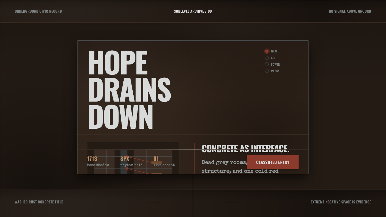 Texhnolyze Lux UndergroundHope drains into concrete. Rust-red grafts cut through dead grey negative spa…
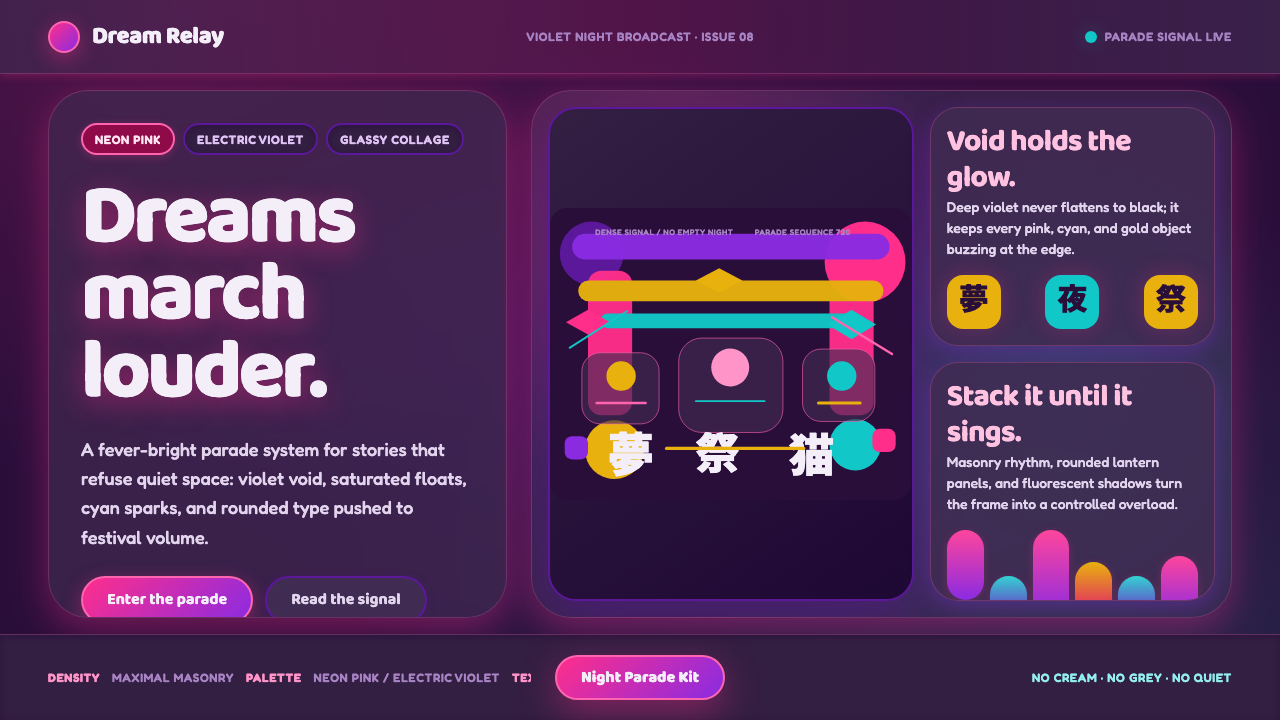 Paprika Dream ParadeDreams detonate in color. Neon pink and electric violet stack into a glassy p…
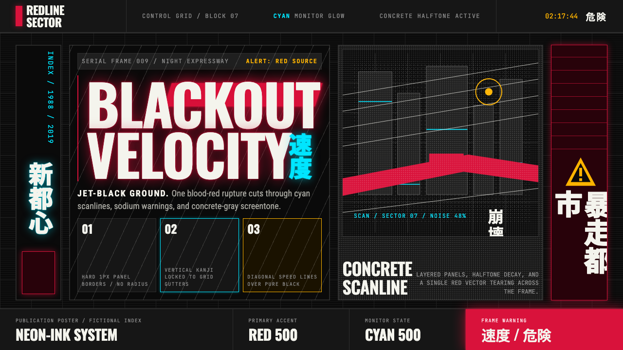 Akira (Otomo)Cyberpunk at impact. Kaneda red, cyan kanji, halftone concrete, and diagonal…
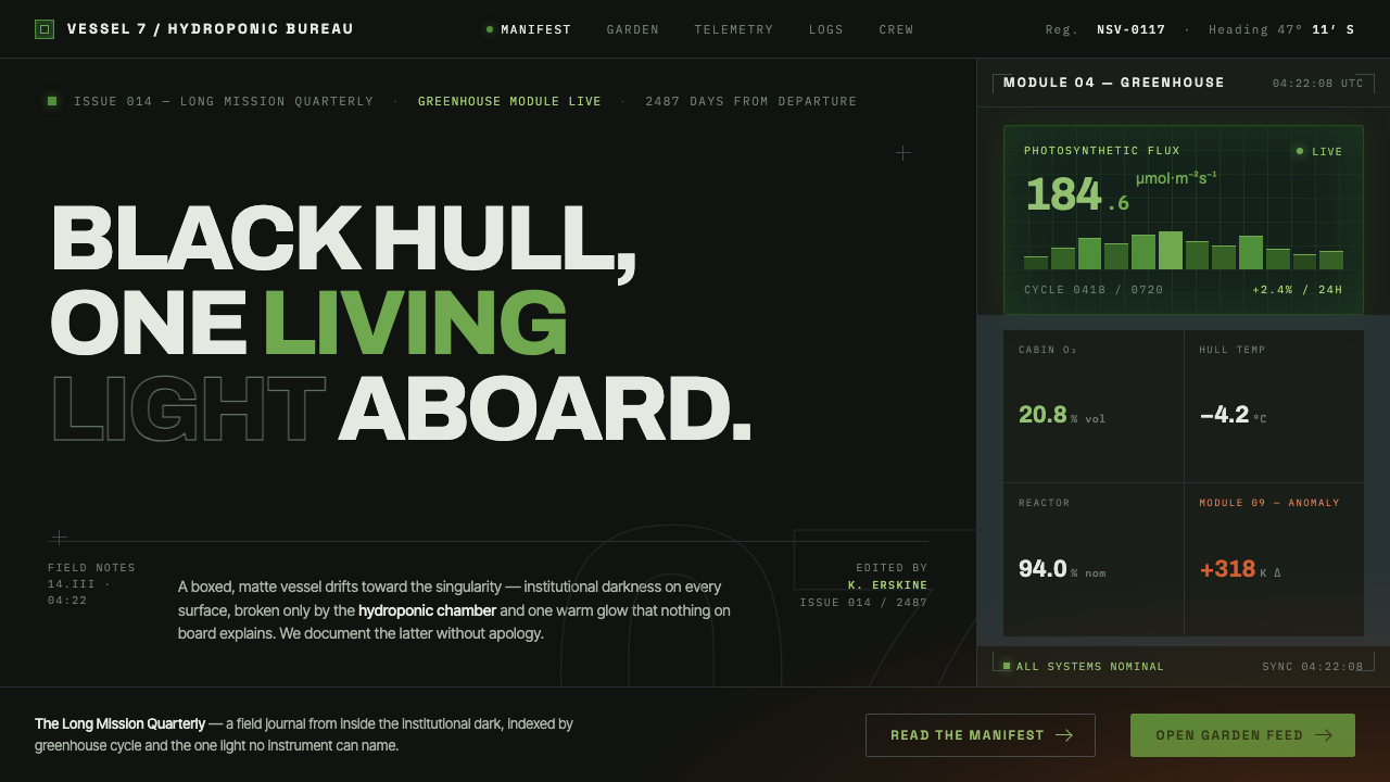 High Life (2018)Institutional dark, one living light. Matte-black hull, hydroponic green, one…
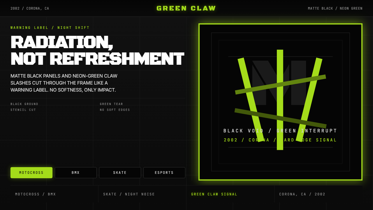 Monster Energy Claw (2002)Aggression, not refreshment. Matte black and neon-green claw slashes cut the…
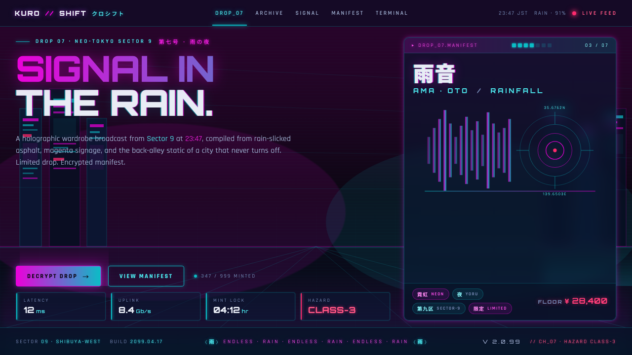 Neo-Tokyo 2099Endless rain, a thousand signs. Magenta vs cyan on near-black asphalt, kana b…