What is Paprika Dream Parade?
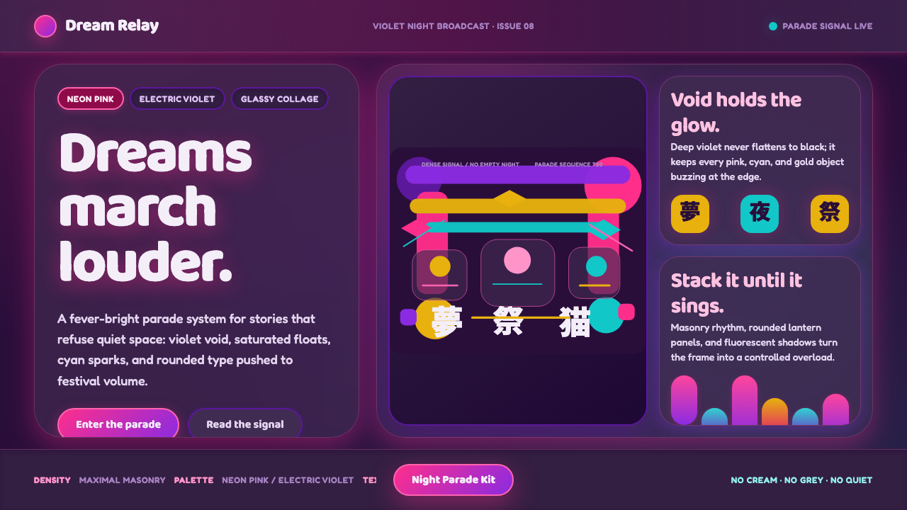
Paprika Dream Parade turns the night into a lucid collision of neon pink, electric violet, and dream logic too dense to stand still.
Paprika Dream Parade in brief
Paprika Dream Parade is a dark, maximalist visual system distilled from Satoshi Kon’s 2006 animated film Paprika. Its central premise comes from the film’s use of color as narrative machinery: ordinary reality tends toward restraint and greyness, while the dreaming mind arrives as an eruption of fluorescent intensity. The result is not simply a neon palette applied to a dark surface. It is a world in which color signals that the ordinary rules of space, scale, and sequence have stopped holding.
The system takes its emotional center from the nightmare parade: a kaleidoscopic procession of maneki-neko cats, Japanese dolls, marching appliances, and torii gates moving through an apparently bottomless violet night. These objects do not behave like a carefully curated collection. They accumulate, repeat, overlap, and advance with the unstoppable pressure of a dream that has become public. A composition in this style should feel populated even before its individual elements are examined.
Visually, Paprika Dream Parade is luminous, crowded, and theatrical. Neon pink and electric violet appear at full fluorescence against a deep violet void, while glassy layers make forms feel suspended, reflected, or caught between surfaces. There is no cream ground, no muted safety zone, and no reassuring pocket of visual silence. Its energy comes from density: one image, word, shape, or ornament should seem capable of opening into another.
Where does Paprika Dream Parade come from?
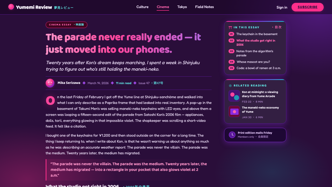
Paprika Dream Parade originates in Paprika, the 2006 animated film directed by Satoshi Kon and produced by Madhouse. Set within a Tokyo-shaped field of waking life and dreaming consciousness, the film provides the system’s most important contrast: reality can become drained and orderly, but dreams do not merely become more colorful. They become structurally excessive. Images gather without asking permission, categories mix, and familiar objects acquire the momentum of symbols.
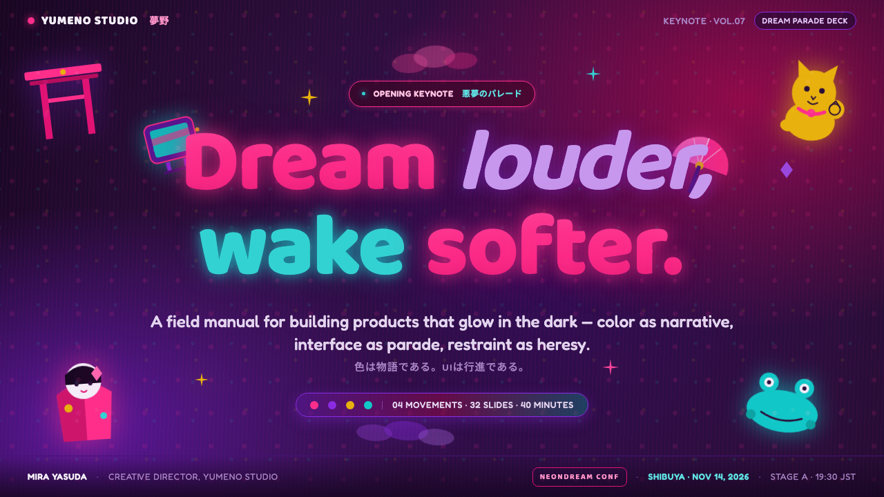
The parade image supplies the clearest formal model. Maneki-neko cats, Japanese dolls, household appliances, and torii gates are not presented as isolated cultural references or decorative props. They become units in a surging collage. Their repetition makes the scene feel ritualistic, while their mismatch makes it unstable. This is surrealist dream-logic animation in practice: things are recognizable, yet their coexistence refuses ordinary explanation. A design borrowing this language should preserve that tension between legibility and irrational assembly.
Its chromatic character belongs to the mid-2000s surreal animated-film context identified by the source material, alongside psychedelic hyper-color and postmodern collage. Hyper-saturation is not an accent layer placed over a sober composition; it is the atmosphere that all other elements must inhabit. Deep violet performs the role of night, depth, and unknown passage, while neon pink and electric violet create an unnaturally charged foreground. The sensation is less like daylight illuminating objects than signals glowing inside an active mind.
The source material also identifies novelist Yasutaka Tsutsui and musician Susumu Hirasawa among the key figures associated with the theme. Within this design system, their presence helps frame Paprika Dream Parade as more than an isolated screen aesthetic: it is a meeting point of surreal narrative, animated image-making, and sound-driven momentum. The usable lesson is not to reproduce a single frame. It is to design as though each surface were being pulled into an ongoing parade whose logic is emotional, rhythmic, and deliberately unstable.
What defines the Paprika Dream Parade look?
Fluorescent Night
Deep violet is the environment rather than a neutral backdrop. It should suggest endless night, interior depth, and a threshold into dreaming. Neon pink and electric violet appear as emissions within that field: bright enough to feel self-lit, never softened into polite accent colors. The contrast should create excitement and slight disorientation, as though the screen were showing a dream with its brightness turned outward.
Maximalist Accumulation
The composition gains force by accumulating motifs instead of isolating a single hero object. Repeated symbols, cropped fragments, overlapping labels, and secondary details should create the sense that the frame contains more material than attention can resolve at once. Density is not clutter for its own sake. It is the visual equivalent of the parade’s forward pressure, where one recognizable thing keeps arriving behind another.
Glassy Layers
Forms should appear to pass through panes, reflections, overlays, and translucent surfaces. This glassy quality is not quiet elegance; it is a device for making the image feel multiply inhabited. A title may seem to float above a motif while another fragment appears trapped beneath it. Layering should imply that realities are stacked close together and may slip across one another at any moment.
Collage Mismatch
The nightmare parade joins objects that have no ordinary reason to share a stage: lucky cats, dolls, appliances, gates, and marching forms. Paprika Dream Parade uses this mismatch as an organizing principle. Pair polished interface elements with strange ornamental fragments, or combine ceremonial silhouettes with mundane icons, while keeping the final arrangement intentional. The surprise must feel composed, not random.
Kaleidoscopic Motion
Even static work should imply movement. Repetition can become a march, diagonal stacks can become a surge, and circular framing can suggest a rotating dream mechanism. Avoid calm, centered stillness. The eye should travel through the work in loops and interruptions, repeatedly encountering a new motif before fully settling on the last. Motion here is psychological rather than merely animated.
No Safe Neutral
This system explicitly avoids cream, quietness, and desaturation. Neutral areas, if they exist, should still feel absorbed by the violet night rather than restored to ordinary daylight. Restraint comes from controlling hierarchy, repetition, and reading order, not from retreating into pale backgrounds or muted accents. The work can be highly legible, but it should never become emotionally bland.
Who shaped Paprika Dream Parade?
Satoshi Kon directed Paprika, the 2006 Madhouse animated film from which this system is distilled. The source material identifies his treatment of color as narrative machinery: waking reality drains toward grey while dream experience erupts into hyper-saturated fantasy. Paprika Dream Parade carries that contrast forward by treating fluorescent color, density, and visual instability as meaningful conditions rather than superficial decoration.
Yasutaka Tsutsui is named in the source material as a key figure associated with Paprika Dream Parade. In the system’s conceptual frame, his presence anchors the theme in surreal narrative possibility: a design may remain precise in its hierarchy while allowing images, symbols, and apparent realities to collide beyond conventional explanation. The visual language should feel like a story thinking in associations rather than a page arranging isolated objects.
Susumu Hirasawa is also identified as a key figure for the theme. His inclusion emphasizes rhythm as a useful design metaphor for the parade: motifs should recur, build, interrupt, and return. In a still composition, that rhythm can be created through repeated shapes, escalating type treatments, layered imagery, and directional flow. The goal is a visual field that seems to have its own pulse.
How do you use Paprika Dream Parade today?
For presentation slides, use the style as a staged entry into an idea rather than as constant decoration. A cover slide can open on the deep violet void, with a large fluorescent title intersected by a glassy fragment or a parade-like stack of symbols. Let the title feel discovered inside the scene, not placed safely above it. The opening should promise velocity, imagination, and a departure from ordinary presentation logic.
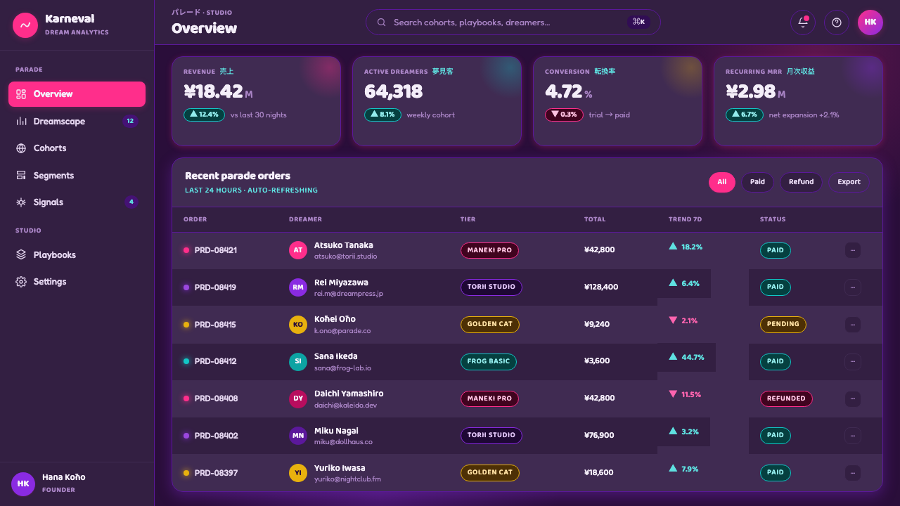
Content slides need a stronger governing rhythm. Keep the reading sequence unmistakable, then surround it with controlled excess: recurring motifs can mark sections, translucent overlays can separate ideas, and compact visual fragments can make side notes feel like dream intrusions. Data slides should preserve honest comparison and readable labels, but their charts may enter the parade through glowing categories, layered panels, repeated pictorial markers, and directional arrangements that turn analysis into a charged visual event.
For web interfaces, Paprika Dream Parade is most effective where an immersive identity matters more than institutional calm: creative tools, cultural experiences, editorial explorations, event pages, and concept-driven product launches. Dashboards can use the violet field as an ambient stage while bright states, alerts, and selected pathways behave like signals crossing it. Pricing pages can make tiers feel like distinct dream chambers, using layered imagery and theatrical hierarchy without sacrificing the clarity of features, choices, and calls to action.
Editorial and marketing work benefits from the system’s ability to make browsing feel like progression. An article can begin in a dense visual header, then let repeated motifs reappear at section transitions as if the parade is continuing off-page. Campaign pages can build anticipation through stacked, glowing blocks and collage interruptions, while product stories can move between intimate detail and overwhelming spectacle. The visual world should remain coherent because its night, fluorescence, and accumulation rules remain consistent.
The common mistake is reducing Paprika Dream Parade to a dark background with pink text. That removes the style’s narrative tension and leaves only a generic neon mood. Another mistake is using density without hierarchy, which turns dream logic into unreadable noise. The right balance is deliberate excess: use the deep violet void, fluorescent color, glassy overlap, and surreal collage to make the interface feel abundant, while giving every essential message a clear route through the parade.
Paprika Dream Parade — FAQ
Is Paprika Dream Parade simply a cyberpunk style?
No. Both can use dark grounds and electric color, but Paprika Dream Parade is organized around dream logic and surreal collage rather than technological urbanism. Its defining imagery comes from the nightmare parade: cats, dolls, appliances, gates, and other familiar forms accumulating into an irrational procession. The desired feeling is not a controlled future city, but a waking world overtaken by an exuberant, unstable dream.
Can the style remain readable despite its density?
Yes, provided hierarchy is designed before ornament and collage are added. Give the primary message a clear contrast in scale, placement, and surrounding space; then use the parade around it to create atmosphere and momentum. Dense imagery should occupy supporting roles, guide the eye between sections, or reward closer inspection. When every element competes at the same intensity, the result no longer feels dreamlike; it simply becomes difficult to use.
Why are cream and desaturated colors excluded?
The source system defines its emotional world through full fluorescence against a deep violet void. Cream and muted tones would reintroduce the calm, ordinary visual register that the parade is meant to escape. This does not mean every surface must be equally bright. Control can come from depth, layering, transparency, and contrast of attention, while the overall world remains committed to vivid dreaming rather than daylight neutrality.
What kind of imagery fits the style best?
Imagery works best when it is recognizable but capable of becoming strange through repetition, cropping, overlap, or unexpected companionship. The source material’s parade offers the model: maneki-neko cats, Japanese dolls, appliances, and torii gates all remain identifiable, yet together they become a surreal force. Choose motifs that can survive collage treatment and create a rhythm of return, rather than relying on one polished image presented alone.
Related design styles
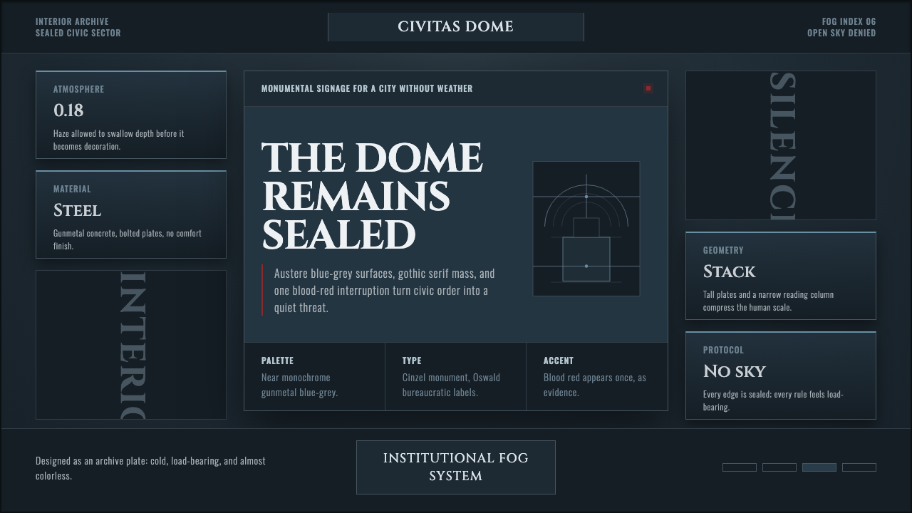 Ergo Proxy Romdo DomesCold order becomes dread. Gunmetal fog, gothic serif mass, one blood-red mark.
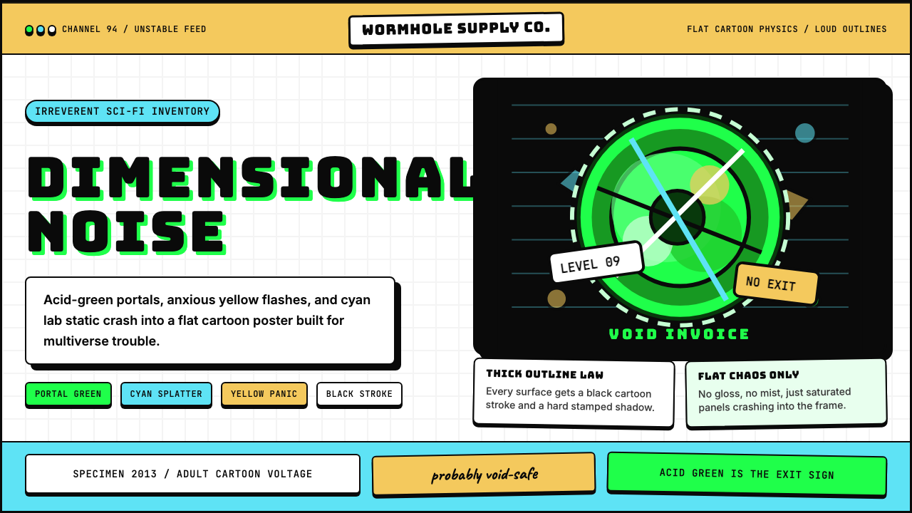 Rick and MortyCartoon chaos goes nuclear. Acid green portals, cyan jolts, yellow panic, thi…
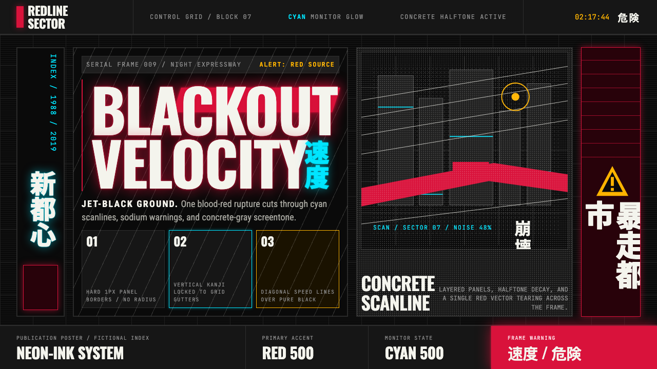 Akira (Otomo)Cyberpunk at impact. Kaneda red, cyan kanji, halftone concrete, and diagonal…
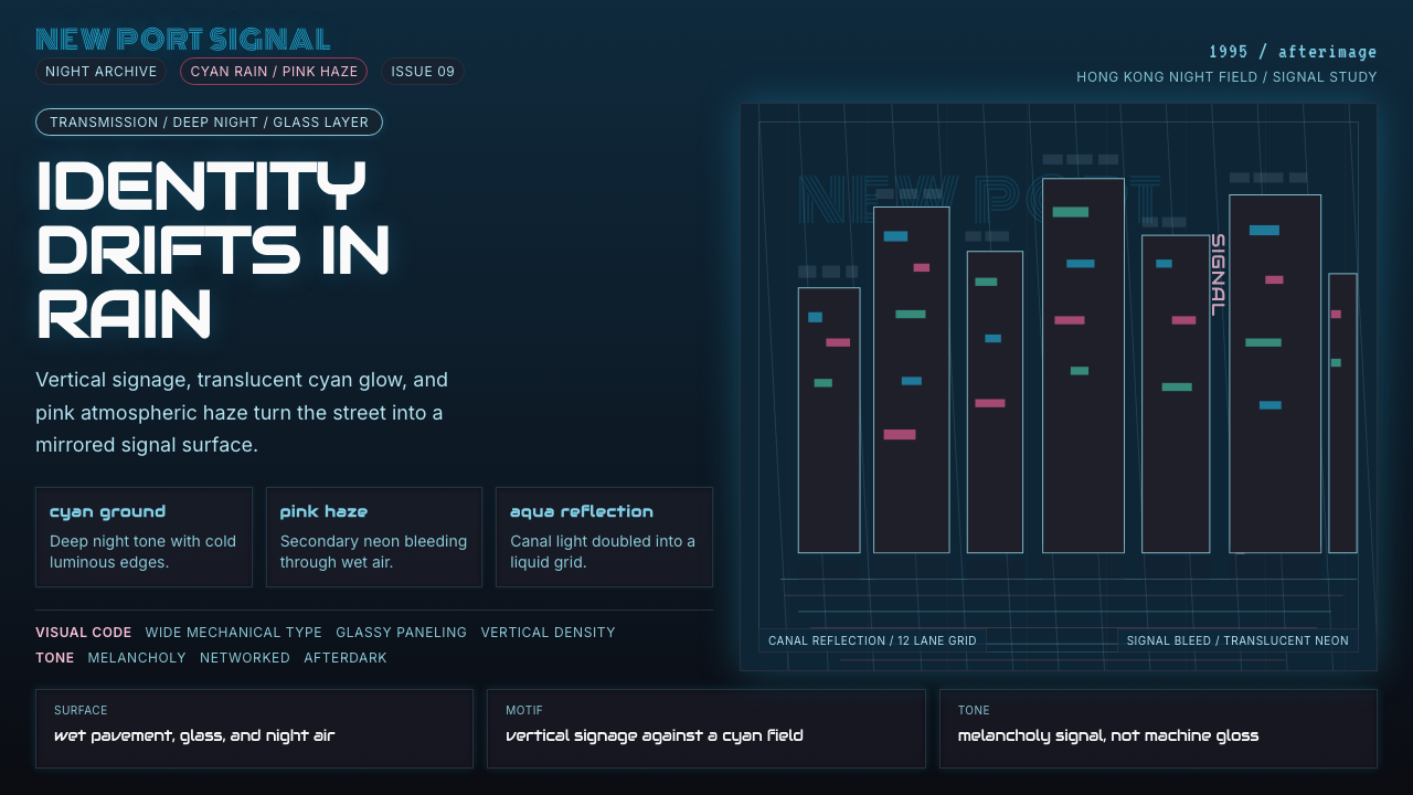 Ghost in the Shell 1995 CyberMelancholy in neon. Cyan glass, pink haze, and vertical signage over a wet gr…
 Monster Energy Claw (2002)Aggression, not refreshment. Matte black and neon-green claw slashes cut the…
 Neo-Tokyo 2099Endless rain, a thousand signs. Magenta vs cyan on near-black asphalt, kana b…