What is Neo-Tokyo 2099?
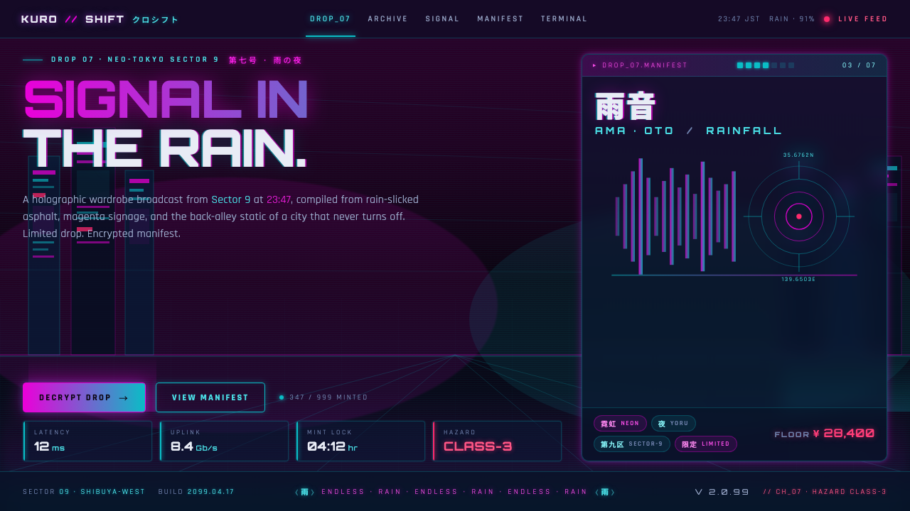
Neo-Tokyo 2099 turns a rain-soaked megacity into an interface: near-black streets, cyan and magenta signals, and a thousand signs fighting to be seen.
Neo-Tokyo 2099 in brief
Neo-Tokyo 2099 is a dark cyberpunk interface style built from the image of a high-density city after midnight. Rain darkens the asphalt until it becomes a reflective field; neon signage breaks that field into cyan, magenta, deep blue, and hot-pink fragments. The mood is not clean futurism. It is urban overload: wet surfaces, distant holograms, compressed information, and light that appears valuable precisely because the surrounding world is so dark.
Its visual lineage sits in speculative cyberpunk, neon-noir, dystopian science fiction, and the signage-heavy imaginary of a future East Asian megacity. Blade Runner from 1982 and Akira from 1988 provide the approved reference horizon: cities that feel technologically advanced without feeling orderly, where commerce, infrastructure, language, weather, and surveillance compete in the same visual field. Neo-Tokyo 2099 does not reproduce a historical Tokyo. It works with the idea of Neo-Tokyo: a dense, fictional metropolis whose identity is assembled from rain, electric color, kanji- and kana-like sign culture, and perpetual night.
In interface form, the system translates that atmosphere into black grounds, luminous outlines, bright gradient actions, glitch-like state changes, and compact kana-tagged chips. It is deliberately high-density. Information should feel layered like city signage, but not become unreadable. The style succeeds when the user feels surrounded by an active nocturnal network while still knowing exactly where to look, what is interactive, and what matters now.
Where does Neo-Tokyo 2099 come from?
Neo-Tokyo 2099 belongs to speculative 2099 cyberpunk rather than to a historical period. Its setting is a future city imagined through density, darkness, and technological saturation: a metropolis where streets remain wet, signs remain lit, and the boundary between physical pavement and projected information has become unstable. The name establishes an urban fiction first. Its purpose is to give contemporary digital products the emotional charge of a city that never fully powers down.
The style draws its approved visual lineage from 1980s neon-noir, particularly Blade Runner from 1982 and Akira from 1988. That lineage established a durable contrast between advanced systems and harsh lived environments. Light is not serene illumination; it is an interruption in rain and shadow. Architecture does not read as empty monumentality; it reads as layered infrastructure. The resulting cityscape became central to cyberpunk because it made technology feel embedded in congestion, commerce, risk, and atmosphere.
Its regional imaginary is East Asia, expressed through Neo-Tokyo and the visual pressure of a high-density megacity. Kana signage is important here not as decorative foreignness but as a signal that language itself can become architecture: labels stack vertically, glow through rainfall, crop into fragments, and turn navigation into part of the scene. In a Neo-Tokyo 2099 interface, kana-tagged chips and sign-like labels should carry this sense of compressed urban information rather than serve as arbitrary ornament.
Ridley Scott, Katsuhiro Otomo, and Syd Mead are the key figures named in this lineage. Their relevance is collective rather than interchangeable: the reference field joins neon-noir cinematic atmosphere, dystopian animated-city intensity, and future-facing industrial imagination. Neo-Tokyo 2099 condenses those approved influences into a usable design system. It retains the near-black ground, complementary neon tension, bridging blues, hot-pink warning energy, glitch behavior, and rain-slick visual drama while adapting them for screens that must still support decisions and tasks.
What defines the Neo-Tokyo 2099 look?
Nocturnal Ground
The foundation is near-black, like rain-darkened asphalt after traffic has passed. It is not empty blackness; it is a surface intended to receive reflections, borders, labels, and fragments of color. Large dark areas create the low-light condition that makes every luminous element feel intentional. Backgrounds should remain materially quiet so that the interface reads as a city at night rather than a page filled with decoration.
Complementary Neon
Magenta and cyan form the system's maximum-tension pair. Magenta reads as heat, urgency, commerce, and danger; cyan reads as signal, distance, navigation, and cold electronic light. Deep blues bridge the pair so the composition can move through darkness without collapsing into a duel of bright accents. Hot pink acts as a hazard flare: short, sharp, and reserved for moments that must cut through the downpour.
Rain and Reflection
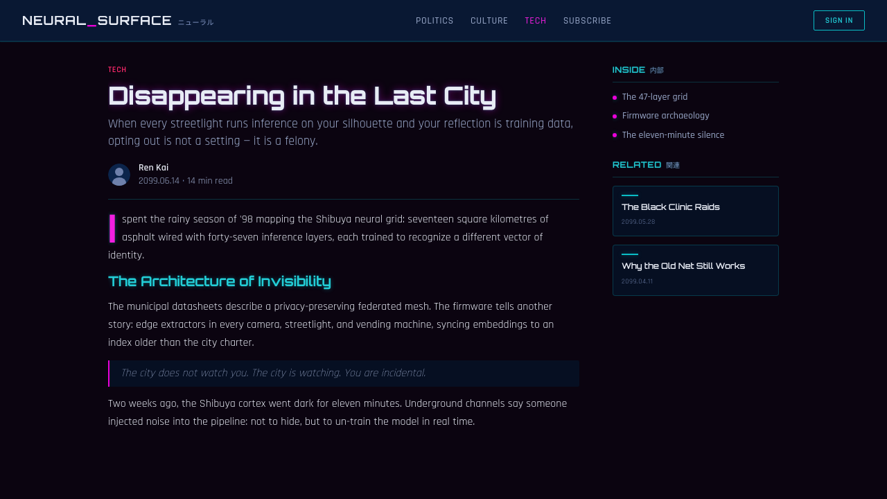
The style's depth comes from wet-city reflection, not from cheerful dimensional realism. Luminous elements may appear to bleed, blur, or echo against the dark field as though reflected in slick pavement or seen through rainfall. This effect should be selective. A few controlled halos and reflected fragments make the city feel wet; applying glow to every object removes the contrast that gives neon its force.
Signage Density
Neo-Tokyo 2099 favors compact clusters of labels, status fragments, and kana-tagged chips. The density should evoke a street where messages overlap without becoming an excuse for disorder. Small sign-like text works best when it supports a larger hierarchy: a dominant title, a decisive action, a readable metric, then ambient metadata around them. The visual impression is crowded; the interaction model must not be.
Luminous Boundaries
Cards and panels are defined by neon outlines against darkness. Their edges resemble lit storefront frames or projected interface panes rather than soft, friendly containers. The outline establishes separation, while the dark interior keeps the content integrated with the surrounding night. Borders should signal active zones and hierarchy; they should not turn every content block into an equally loud sign.
Glitch and Signal Failure
Glitch states introduce a brief sense of electronic instability: an offset edge, a split chromatic echo, a disrupted sign, or a fragment that appears misregistered. They belong to interaction and atmosphere, especially on hover or transition, because they suggest a network under pressure. The gesture must remain legible. A glitch that conceals labels, changes meaning, or interrupts task completion is not cyberpunk texture; it is simply failure.
Who shaped Neo-Tokyo 2099?
Scott is named in the approved visual lineage through Blade Runner from 1982. For Neo-Tokyo 2099, that reference anchors the neon-noir side of the system: rain, darkness, illuminated urban signage, and a future city whose atmosphere is inseparable from its infrastructure. The value of this influence is not imitation of a frame, but the understanding that light can carry narrative pressure in a crowded city.
Otomo is named in the approved lineage through Akira from 1988. This reference contributes the dystopian Neo-Tokyo intensity behind the style: urban scale, pressure, velocity, signage, and a city that feels simultaneously collective and overwhelming. In interface terms, it supports the style's appetite for dense information and charged contrast, while reminding designers that density requires a disciplined route through the screen.
Mead is named as a key figure in the source material's future-city lineage. Within Neo-Tokyo 2099, his presence represents the industrially imagined future behind the glowing surface: vehicles, systems, structures, and urban technology as a coherent environment rather than isolated decorative props. This is why the style works best when panels, controls, labels, and data feel like parts of one operating city.
How do you use Neo-Tokyo 2099 today?
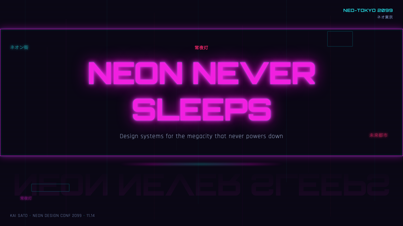
For presentation covers, use the style as a single charged city view rather than a collection of effects. Let a near-black field carry the page, place one decisive magenta or cyan sign-like form where the eye should enter, and set the title with high contrast. Supporting kana-like tags, small metadata, or a restrained reflected glow can establish the world. The cover should feel like a signal discovered in rain, not a poster crowded with every available neon treatment.
For content slides, preserve the night-city atmosphere through hierarchy instead of visual noise. Use dark panels and luminous boundaries to separate topics, then establish a clear primary heading before adding compact supporting labels. Reserve the brighter neon pair for active ideas, category shifts, or emphasis. For data slides, let charts behave like illuminated infrastructure: axes and supporting information can recede into deep blue darkness, while the most important series receives the brighter signal color. The aim is analytical clarity with nocturnal drama.
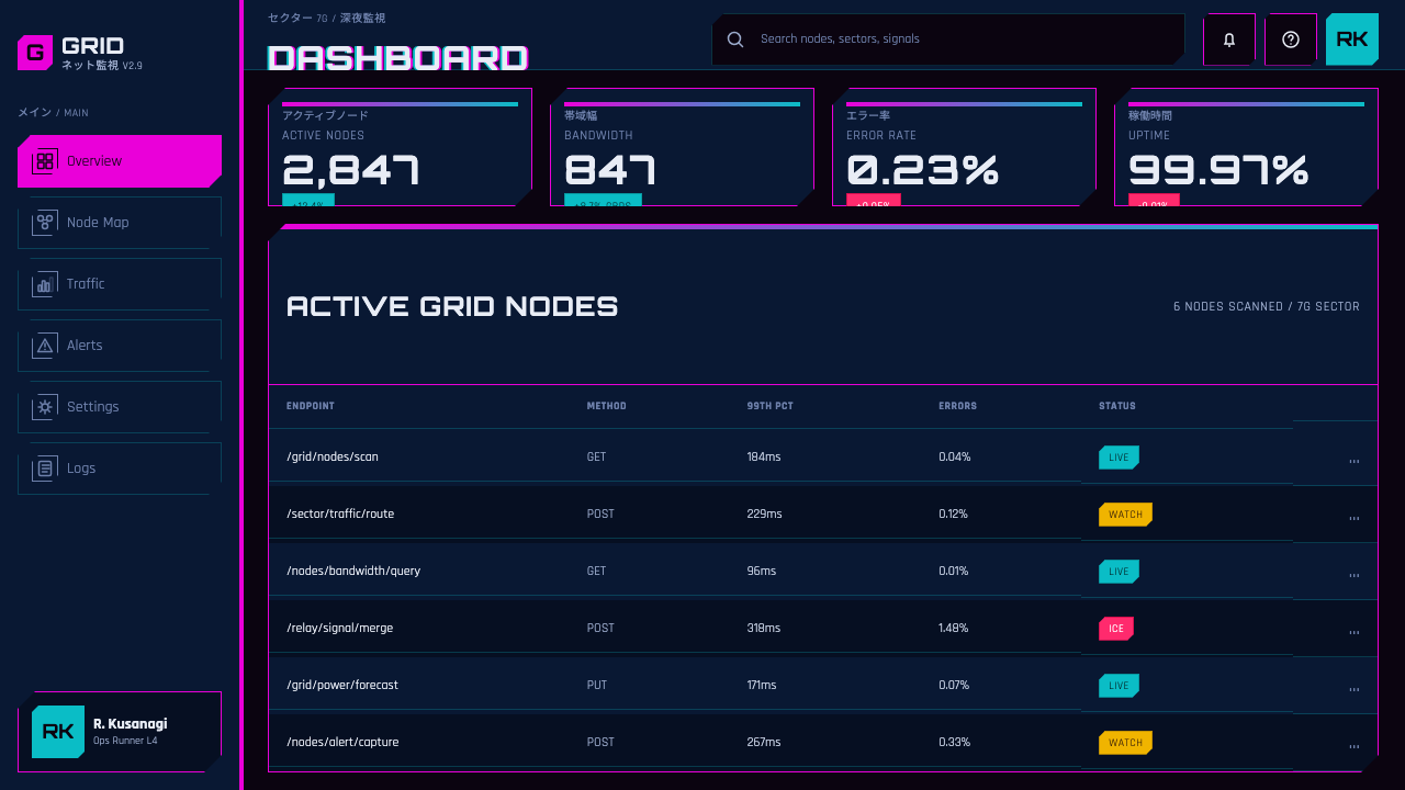
For web interfaces, Neo-Tokyo 2099 is particularly effective for dashboards, operational consoles, media libraries, and other products where live status and dense scanning matter. Neon-outlined cards can frame metrics, queues, or modules; kana-tagged chips can identify mode, location, source, or status; glitch states can make interactive elements feel electronically alive. A pricing page can use the same language more sparingly, treating each plan as a distinct lit bay in the dark and making the preferred action read as the strongest urban signal.
For editorial and marketing work, use the style to create an atmosphere of discovery, release, and high-stakes information. Editorial pages can pair a dark field with narrow columns of readable text, bright section markers, and cropped sign fragments as interruptions between ideas. Marketing pages can frame a product as a tool operating after dark: a central promise appears as the brightest sign, while capability details accumulate around it like city metadata. Keep the reader's route obvious even when the surrounding composition feels deep and crowded.
The common mistake is confusing cyberpunk with indiscriminate glow. If magenta, cyan, hot pink, deep blue, gradients, glitch fragments, luminous outlines, and kana labels all shout at once, the result loses both menace and usability. Begin with darkness, choose a primary signal, and let the remaining effects support hierarchy. Another mistake is using kana-like text as a decorative substitute for meaning. Every label should clarify a real state, category, or action; the city becomes convincing when its signals communicate.
Neo-Tokyo 2099 — FAQ
Is Neo-Tokyo 2099 simply a generic cyberpunk style?
No. Its identity is more specific: rain-slicked neon-noir at night, a near-black asphalt ground, maximum tension between magenta and cyan, deep blue bridges, hot-pink hazard energy, holographic kana signage, and dense megacity information. Generic cyberpunk can include many futures; Neo-Tokyo 2099 is anchored to a particular nocturnal, signage-saturated urban fiction.
Can this style work for data-heavy dashboards?
Yes, provided light is treated as hierarchy. Use darkness for the inactive field, deep blues for secondary structure, and the brighter neon colors for current status, priority changes, and the most important series. Neon outlines can establish module boundaries, but not every metric needs a glowing container. The dashboard should feel active without forcing the user to decode a visual storm.
How should kana-tagged chips be used?
Use them as compact sign systems for real metadata, modes, status, sources, or categories. They work because the style treats language as part of the urban surface, but their semantic role must remain clear to the intended audience. If a label is not readable or useful, it becomes scenery. Pairing a kana-like marker with clear primary language can preserve the atmosphere while keeping the product understandable.
Why are glitch effects best kept restrained?
Glitch is meaningful because it interrupts an otherwise coherent signal. Used selectively, it suggests transmission stress, interference, or electronic volatility and makes a hover or state change feel alive. Used constantly, it destroys the stable visual field needed for reading and action. Neo-Tokyo 2099 needs controlled instability: the city may be under pressure, but the interface must still be dependable.
Where does Neo-Tokyo 2099 struggle?
It struggles where calm, warmth, daylight clarity, or low sensory load are central to the product promise. The style's darkness, density, and signal tension can feel demanding in contexts that need quiet reassurance. It also requires care wherever legibility is critical, because its atmosphere depends on low light and vivid accents. The best fit is a product whose values include intensity, live systems, technical confidence, media energy, or nocturnal urban drama.
Related design styles
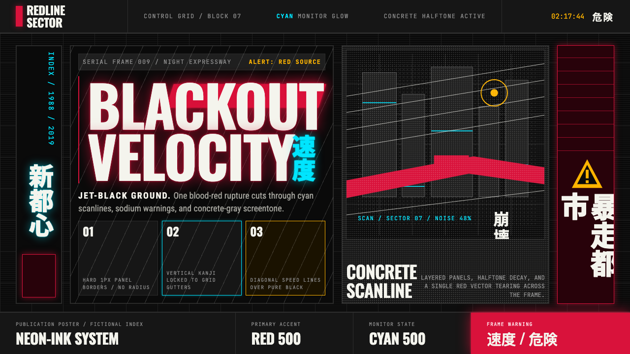 Akira (Otomo)Cyberpunk at impact. Kaneda red, cyan kanji, halftone concrete, and diagonal…
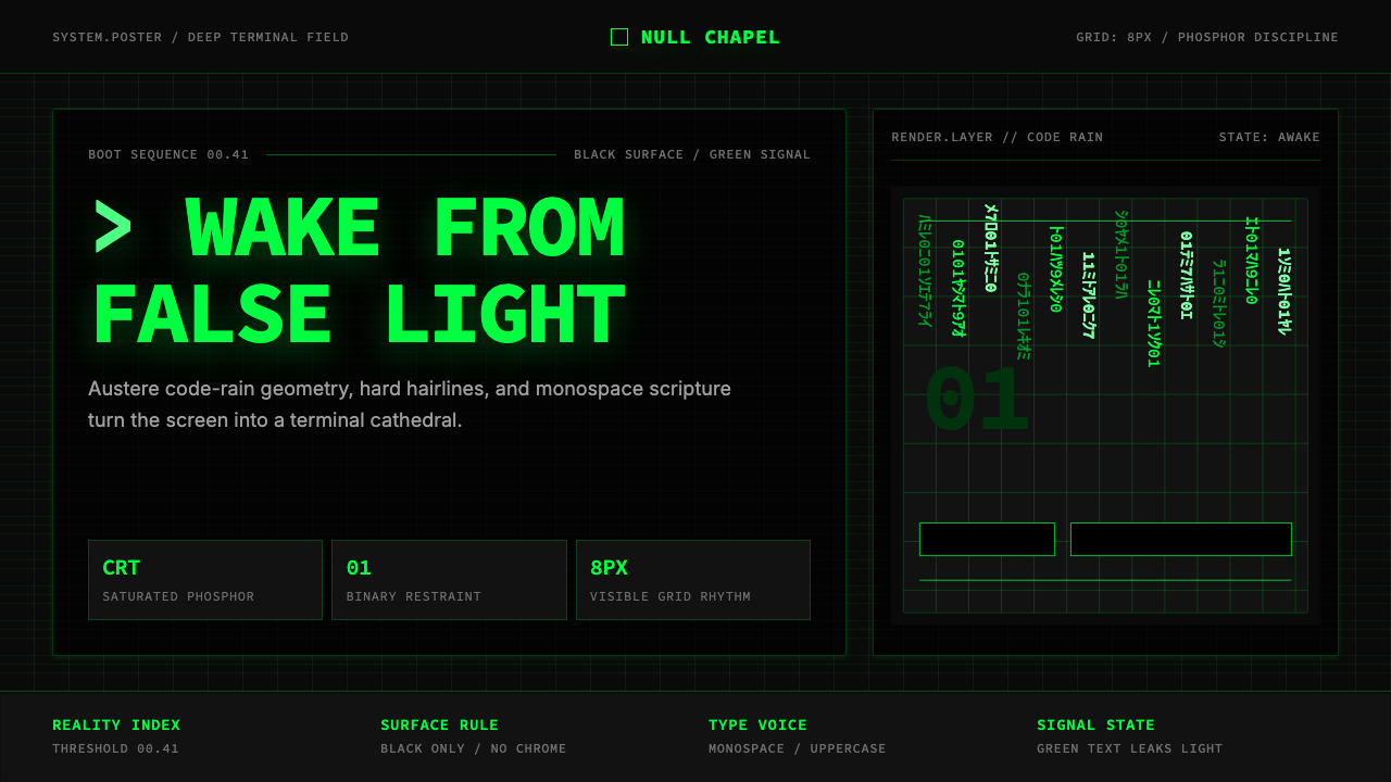 The Matrix (Green-Code)Terminal myth, disciplined. CRT green code rain, black grid, monospace script…
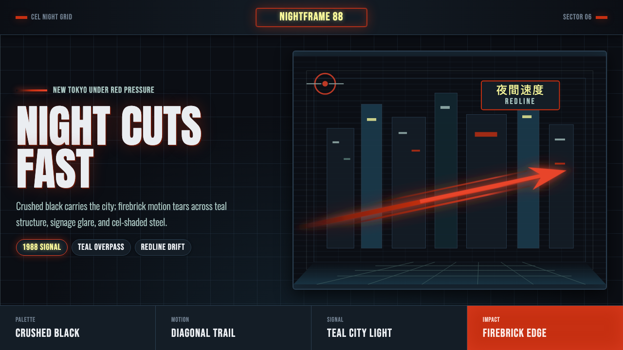 Akira Neo-TokyoNight moves fast. Firebrick trails cut crushed black, teal grids, and condens…
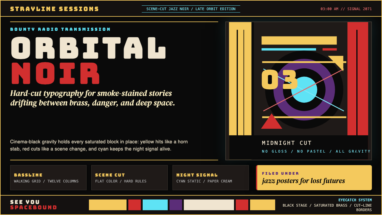 Cowboy Bebop Jazz-NoirCool at 3 AM. Bungee type, jazz yellow, red cuts, and cyan rules hit deep bla…
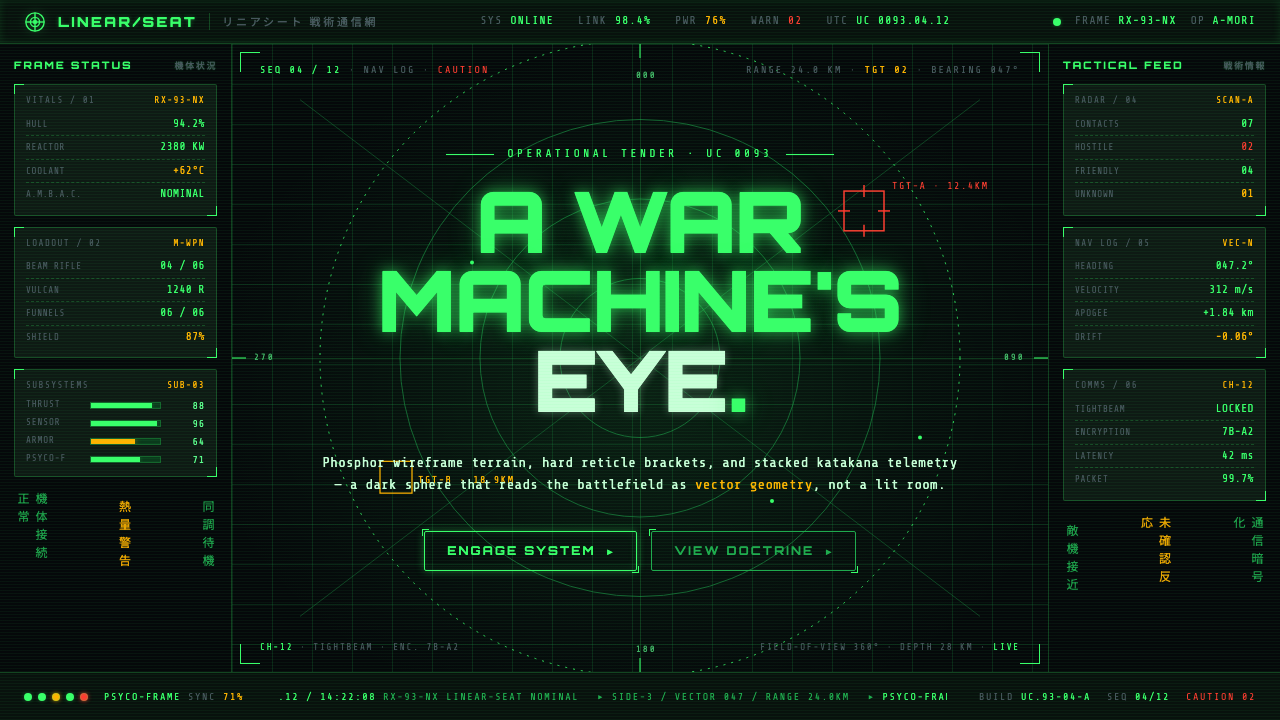 Gundam Universal Century UIA war machine's eye. Phosphor wireframe and katakana telemetry glow inside a…
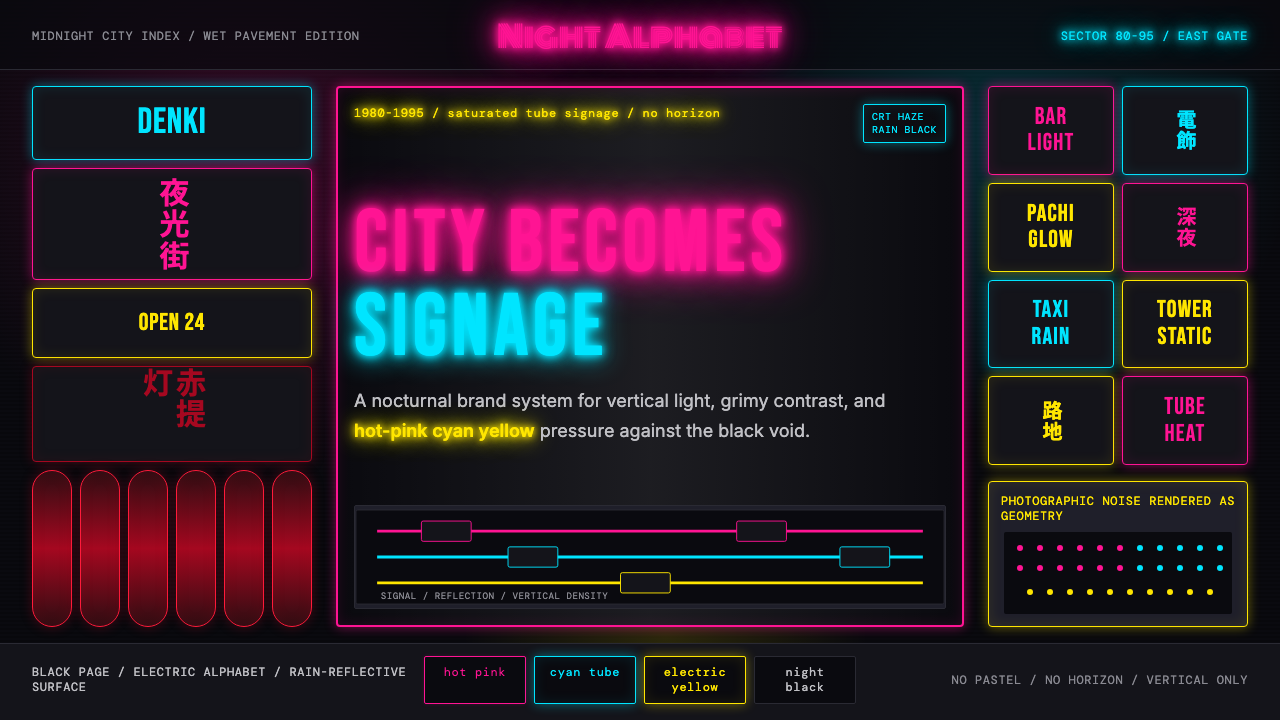 Tokyo Shinjuku Neon (1980)Night turns into alphabet. Hot pink, cyan, and yellow stack as glowing vertic…