What is Texhnolyze Lux Underground?
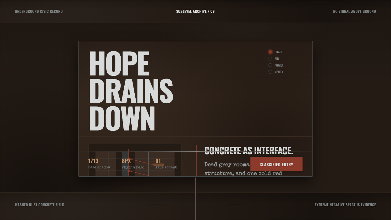
Texhnolyze Lux Underground turns decay into interface language: rusted grafts, exhausted concrete, and emptiness so severe it becomes part of the message.
Texhnolyze Lux Underground in brief
Texhnolyze Lux Underground is a dark design language derived from Texhnolyze, the 2003 Madhouse anime set in Lux, an underground city decaying from within. It does not use dystopia as a stage for technological spectacle. Instead, it makes deterioration visible through washed-out greys, rust-brown structure, exposed concrete, and the cold red-brown presence of prosthetic texhnolyze grafts.
The style treats visual depletion as its central expressive device. Surfaces feel aged rather than polished, rooms feel excavated rather than built, and large empty areas suggest that communication has failed, been withheld, or simply run out of energy. The result is not generic dark mode. Darkness here has weight: it reads as enclosed air, industrial residue, and a city whose remaining systems continue without reassurance.
In interface terms, Texhnolyze Lux Underground is built from dark concrete grounds, iron-brown divisions, muted text, and rare rust-red interruptions. Its restraint matters more than its palette. A screen should feel like a sparse signal moving through an underground structure, where every label, border, warning, and mechanical fragment has survived because it still has a reason to exist.
Where does Texhnolyze Lux Underground come from?
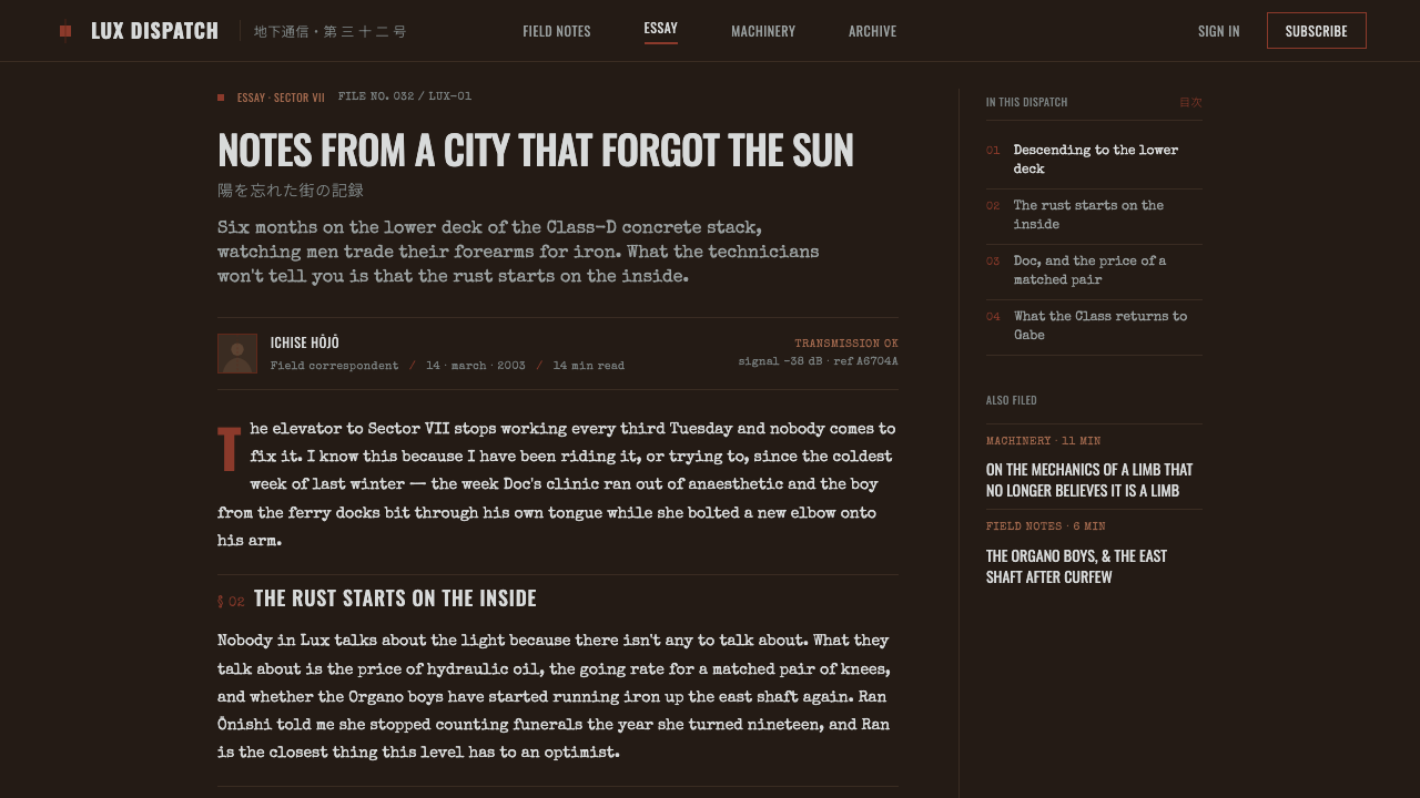
The origin of this visual system is Texhnolyze, a 2003 Japanese dystopian science-fiction anime produced by Madhouse. Its world is Lux, an underground city presented not as a gleaming future but as an enclosed place in decline. The city’s visual atmosphere joins cyberpunk with brutalist material presence: concrete is bare, greys are drained, and machinery does not promise liberation.
The project is associated with director Hiroshi Hamasaki, writer Chiaki J. Konaka, and character designer Yoshitoshi ABe. Within the approved framing of cyberpunk brutalism, philosophical body-horror science fiction, and minimalist arthouse anime, their collaboration establishes a vocabulary of withdrawal rather than abundance. Bodies, infrastructure, and social space all carry the feeling of systems becoming less whole.
Texhnolyze cybernetics are especially important to the design translation. The prosthetic graft is not a glossy enhancement; it reads as cold rust-red material attached to exhausted flesh tones. That contrast gives the system its governing tension: organic life remains present, but it is compromised by industrial intervention. Contemporary layouts can borrow that tension without imitating a scene, using sparse mechanical accents against deadened fields to make technology feel imposed rather than celebratory.
What defines the Texhnolyze Lux Underground look?
Aged Concrete Ground
The background should feel structural, weathered, and enclosed rather than merely black. Dark grey fields evoke exposed brutalist concrete and give the interface a physical, subterranean atmosphere. Avoid polished glass, luminous haze, or decorative texture that makes the surface feel newly manufactured.
Rust as Intervention
Rust-brown and restrained red-brown accents function like grafts, wounds, or exposed mechanical joints. They should interrupt the composition selectively, never coat it. Their purpose is to signal stress, attachment, danger, or a surviving trace of agency inside an otherwise depleted system.
Extreme Negative Space
Empty space is not a luxury or a neutral buffer. It carries the suffocation and isolation of Lux. Sparse composition gives individual elements emotional pressure: a small line of text, an isolated control, or a lone warning can feel consequential because the surrounding field refuses to soften it.
Mechanical Fracture
Structure should appear segmented, repaired, or under strain. Dividers, frames, and interface regions can suggest industrial assembly without becoming decorative machinery. The intended feeling is not precision engineering at its peak, but infrastructure continuing through damage and attrition.
Muted Hierarchy
Typography and interface hierarchy should emerge from placement, density, and contrast rather than dramatic visual flourish. Most information remains subdued against the dark ground. Strong emphasis is rare, which makes an isolated rust-colored alert or a severe structural heading feel like a meaningful escalation.
No Spectacle
The style rejects the bright futurism often associated with cyberpunk. No abundant neon, no celebratory shine, and no visual excess should override the sense of depletion. Technology appears as cold infrastructure and bodily intervention, not as entertainment or evidence of progress.
Who shaped Texhnolyze Lux Underground?
Hamasaki is identified as a key figure in Texhnolyze. Within this design system, the series’ severe underground atmosphere is the essential reference: a world of enclosed space, exhausted surfaces, and visual restraint rather than technological spectacle.
Konaka is identified as a key figure in the work’s philosophical body-horror science-fiction framing. The interface translation draws on that framing by treating prosthetic technology as an uneasy graft and by allowing emptiness, interruption, and decay to carry narrative force.
ABe is identified as a key figure in the visual identity of Texhnolyze. The system’s contrast between deadened flesh tones and cold rust-red cybernetic additions follows the source material’s central image of the body altered by machinery without being redeemed by it.
How do you use Texhnolyze Lux Underground today?
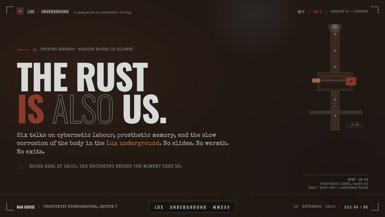
For presentation covers, use the style to establish a serious, enclosed premise immediately. Let a broad concrete-like field dominate the slide, place the title with deliberate isolation, and introduce a rust-toned mark only where the composition needs a wound or point of tension. Content slides should remain sparse: use structural divisions, subdued labels, and generous absence instead of decorative supporting graphics. Data slides can treat charts as infrastructure, keeping most marks muted and reserving rust accents for anomalies, failures, or decisive changes.
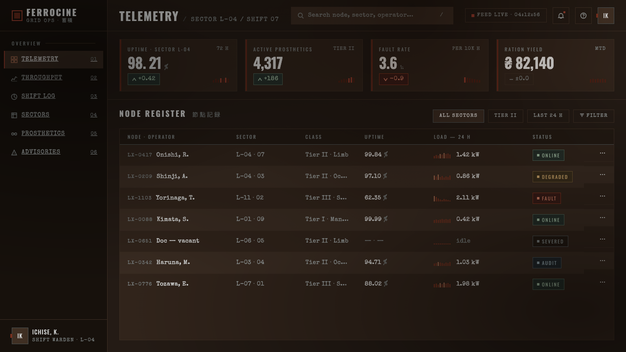
For web interfaces, Texhnolyze Lux Underground suits dashboards, operational consoles, archive tools, incident views, and pricing pages that need to convey scarcity, severity, or difficult decisions. Build hierarchy from dark fields and restrained boundaries. Panels should read as embedded sections of a larger underground system, while alerts and active states appear as rare invasive marks. It is less appropriate for products whose central promise is friendliness, abundance, play, or immediate emotional comfort.
For editorial and marketing work, the style can make a long-form story, manifesto, product dossier, or campaign page feel forensic and atmospheric. Use large quiet regions around short passages, captions, or images so the page has room to feel withheld. Photography or illustration, where present, should serve the same exhausted material world: isolated fragments, deadened scenes, or mechanical details are more coherent than glossy aspirational imagery.
The common mistake is reducing the style to dark grey plus red. That produces a generic industrial interface and loses the source material’s psychological pressure. Texhnolyze Lux Underground depends on restraint, emptiness, and the refusal of spectacle. If every panel glows, every divider is ornamental, or rust accents are everywhere, the system stops feeling damaged and starts feeling decorative.
Texhnolyze Lux Underground — FAQ
Is Texhnolyze Lux Underground simply a cyberpunk style?
No. Cyberpunk is one of its source movements, but this system specifically rejects the genre’s more familiar spectacle: bright futurism, visual abundance, and technology as aspiration. Its character comes from cyberpunk brutalism, philosophical body-horror science fiction, and minimalist arthouse anime working together. The emphasis is on deterioration, enclosure, and compromised bodies rather than excitement.
Why is negative space so important in this style?
Because emptiness is part of the emotional content. Lux is framed as an underground city rotting from within, and sparse space translates that condition into interface form. Negative space makes a screen feel underpopulated, withheld, and tense. It also gives rare pieces of information greater consequence, since nothing decorative is present to absorb their force.
Can the rust-red accent be used as a general brand color?
It can, but only with discipline. In this system, rust-red carries the meaning of a graft, wound, or mechanical interruption. If it becomes the default color for every action, badge, or decoration, it loses that narrative charge. Keep it reserved for moments that need to feel invasive, stressed, damaged, or decisively alive against the deadened ground.
What kinds of products should avoid this style?
Avoid it when warmth, delight, abundance, or reassurance are essential to the product’s promise. The style is intentionally suffocating and emotionally severe. It is strongest when a product benefits from feeling infrastructural, investigative, difficult, or post-catastrophic; it is weaker when users need softness, playfulness, hospitality, or an uncomplicated sense of safety.
Related design styles
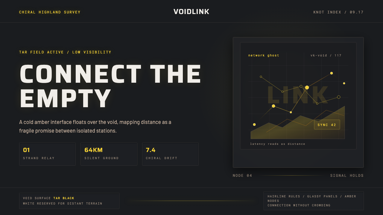 Death StrandingLonely connection, made visible. Amber HUD lines hover over a tar-black void.
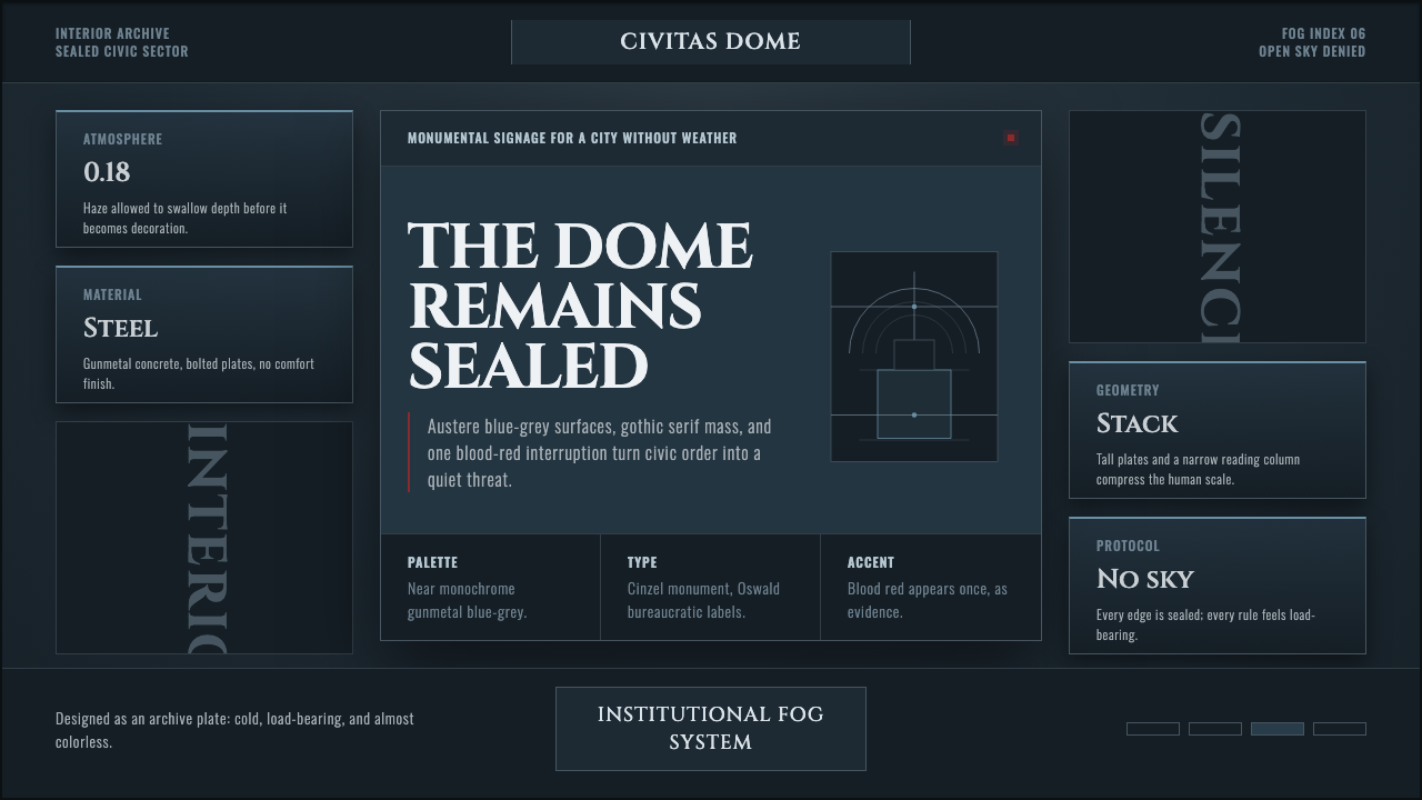 Ergo Proxy Romdo DomesCold order becomes dread. Gunmetal fog, gothic serif mass, one blood-red mark.
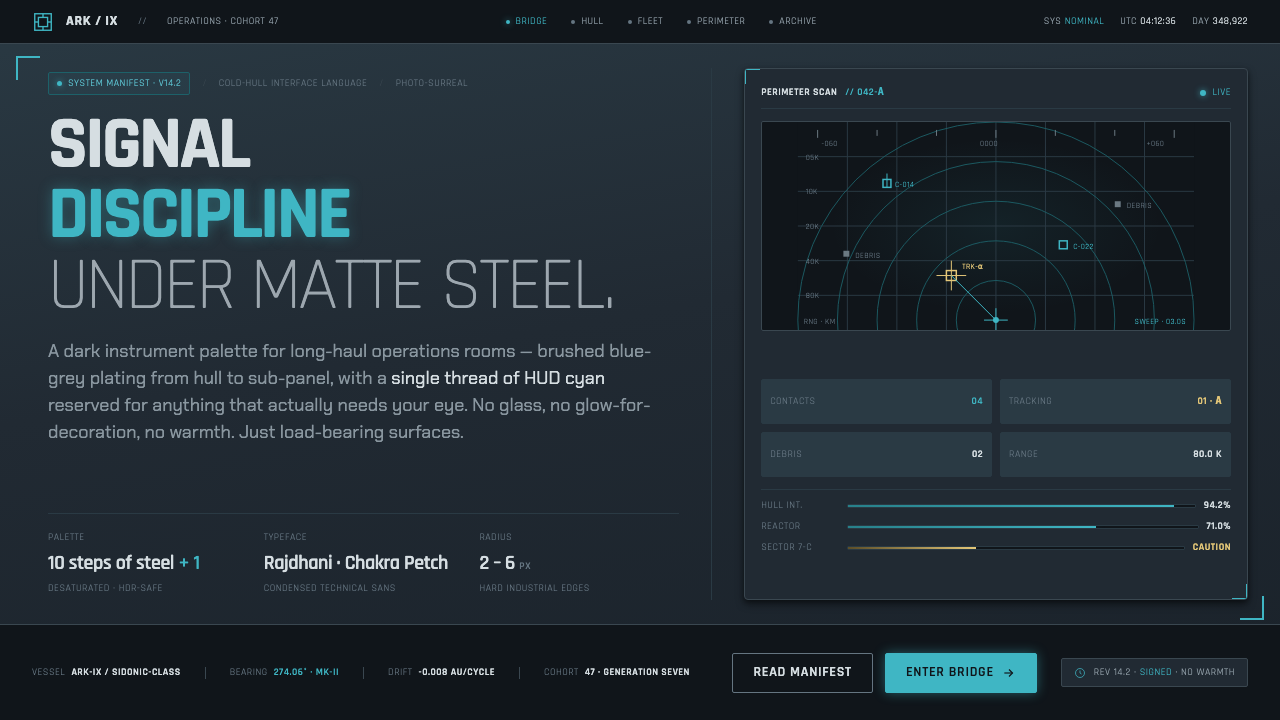 Knights of SidoniaSignal discipline under matte steel. Blue-grey hull, condensed Rajdhani, one…
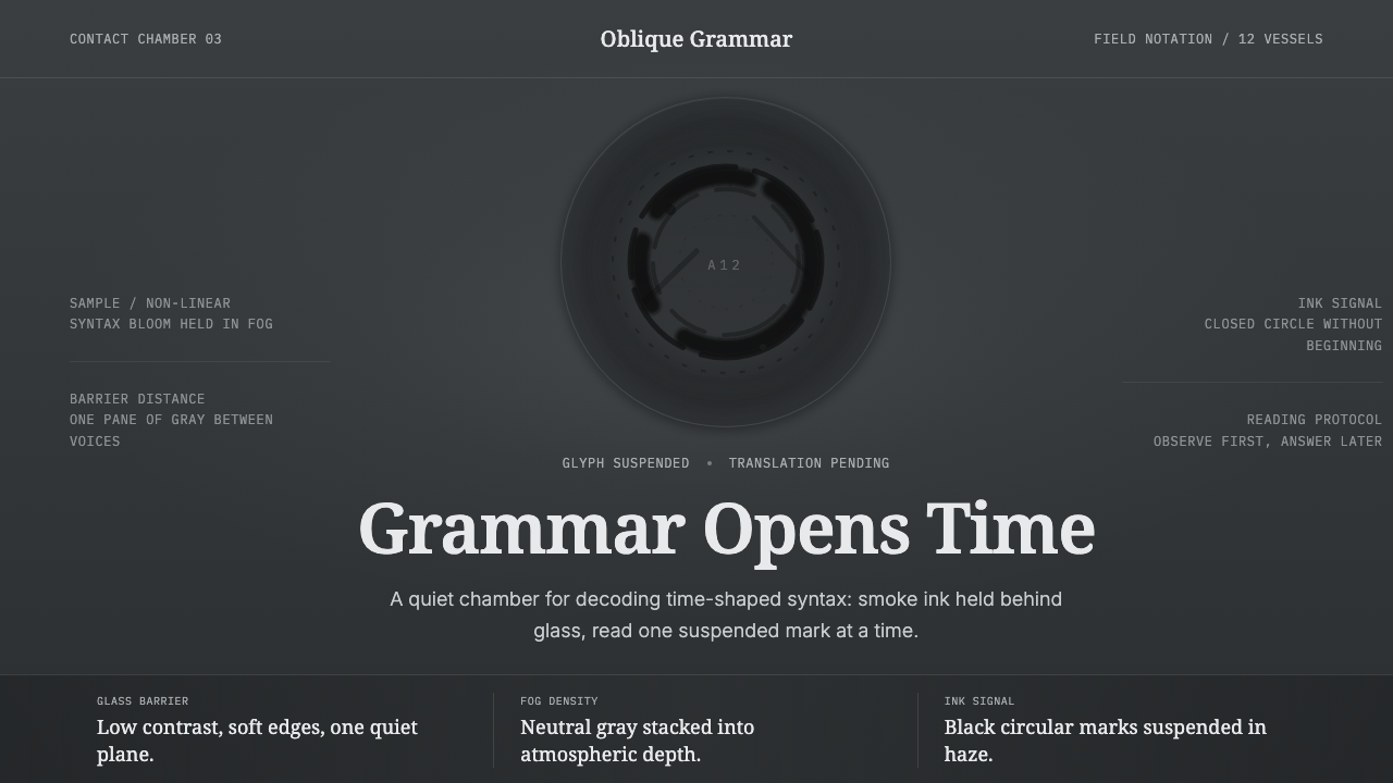 Arrival LogogramFirst contact turns quiet. Fog gray, serif notes, and smoke-black rings decod…
 Elite DangerousOne amber instrument. Star-orange wireframes, mono numerics, and black-glass…
 Ghost in the Shell 1995 CyberMelancholy in neon. Cyan glass, pink haze, and vertical signage over a wet gr…