What is Arrival Logogram?
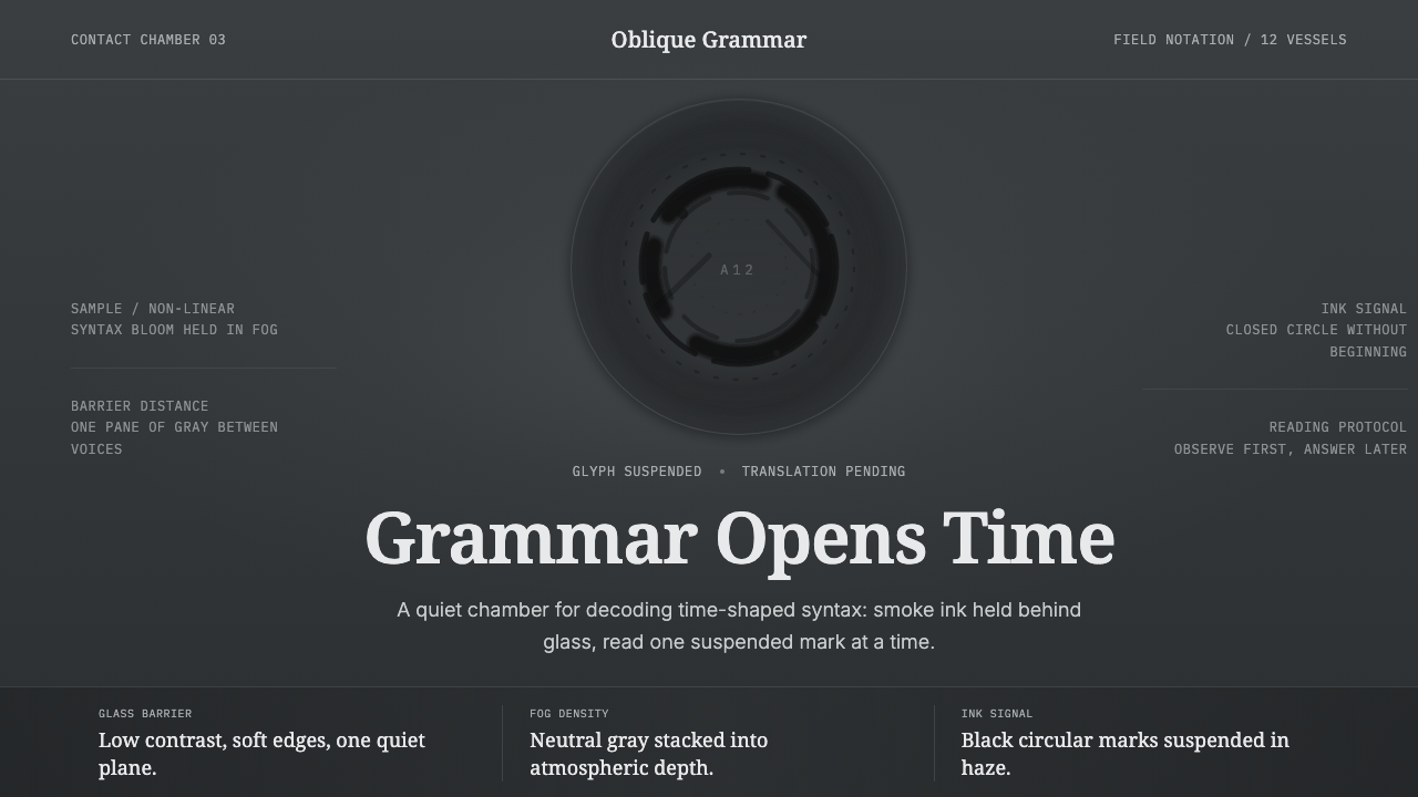
First contact, rendered on film, turned out quiet — a fog-grey chamber where an alien language hangs suspended in ink, waiting to be decoded.
Arrival Logogram in brief
Arrival Logogram reconstructs the visual world of the 2016 science-fiction film Arrival, adapted from Ted Chiang's 1998 novella Story of Your Life, in which cinematographer Bradford Young rendered first contact between humans and an alien species as a hushed, near-monochrome fog: a smoke-filled chamber behind a glass barrier, inky circular logograms suspended in mist.
The system is deliberately desaturated and low-contrast, drawing on the film's linguistics-focused, cerebral science-fiction sensibility rather than the bright, high-energy visual language typical of the genre. Every surface reads as suspended in haze — dense neutral fog grounds, black smoke-ink marks with soft rather than hard edges, and a restrained, almost academic calm throughout.
Typography follows a linguist's voice: serif for careful, considered text, monospace for anything resembling data or transcription — the visual register of someone patiently working through an unfamiliar symbolic system rather than a marketer's confident pitch.

Where does Arrival Logogram come from?
Arrival was released in 2016, directed by Denis Villeneuve and adapted from Ted Chiang's 1998 novella Story of Your Life, a work of literary science fiction centered on linguistics rather than spectacle — the story of a linguist tasked with learning to communicate with an alien species whose written language, Heptapod B, does not follow linear, time-ordered logic the way human languages do. The film was a North American production, shot in Quebec, and translated Chiang's dense, cerebral prose into a visual language equally committed to restraint.
Cinematographer Bradford Young made the film's defining visual choice: a deliberately desaturated, low-contrast palette that avoided the bright color grading and dramatic lighting typical of alien-contact science fiction. Young's approach treated the alien encounter not as a spectacle to be lit for maximum drama but as a quiet, almost clinical event — the visual equivalent of careful, patient scholarly observation rather than fear or wonder rendered in bold color.
Production designer Patrice Vermette and art director Martine Bertrand built the film's central location — the interior of the alien vessel where the protagonists meet the Heptapods — as a smoke-filled chamber divided by a glass barrier, with visibility deliberately obscured by drifting fog and haze. This physical staging choice reinforced Young's photographic approach: an environment where nothing is sharply resolved, where meaning must be extracted patiently from an ambiguous, softly lit field rather than read instantly from a clear image.
The Heptapods' written language, Heptapod B, is realized on screen as circular logograms — dense, inky, ring-like marks that convey entire concepts or sentences in a single non-linear symbol, a direct visual expression of the novella's core idea that the aliens' non-linear writing system reflects a non-linear experience of time. These logograms, rendered in black ink against the fog, became the film's most iconic and most widely recognized visual signature, and are the direct source for this system's central graphic motif.
What defines the Arrival Logogram look?
Color
The palette is deliberately desaturated and near-monochrome: dense neutral fog grey dominates every ground, with black ink providing the only strong value contrast. There is no bright accent color anywhere in the system — warmth and saturation are withheld entirely, in keeping with the film's clinical, restrained visual approach.
Fog and Haze
Every surface reads as suspended in mist rather than clearly resolved — a dense, atmospheric quality that obscures rather than reveals. This haze is not a texture applied on top of clear content but the medium through which all content is seen, mirroring the film's smoke-filled central chamber.
Circular Logograms
Dense, inky, ring-shaped marks — modeled directly on the Heptapods' written language as it appears in the film — serve as the system's central graphic motif. These logograms carry meaning as complete, non-linear units rather than sequences of discrete characters, distinguishing them from any conventional alphabet or icon set.
Soft-Edged Ink
Where marks appear against the fog, their edges are soft rather than hard — ink diffusing into haze rather than sitting as a crisp, printed shape. This softness reinforces the sense of a message still being decoded, not yet fully resolved into legible meaning.
Typography
Type follows a linguist's dual register: a careful, considered serif for narrative or explanatory text, and a monospace face for anything resembling data, transcription, or notation. This pairing evokes the patient, methodical work of translation rather than a confident marketing voice.
Low Contrast
Value differences throughout the system stay muted and close rather than sharply separated — a photographic choice that avoids dramatic light-and-shadow staging in favor of an even, contemplative visual field. This mirrors Bradford Young's cinematographic approach to the film's central encounter scenes.
Quiet Weight
The overall tone carries a specific emotional register: not dramatic tension but a calm, weighty stillness appropriate to a scholarly encounter with the unknown. Nothing in this system is loud or urgent; its authority comes from restraint and patience rather than spectacle.

Who shaped Arrival Logogram?
Director of Arrival, Villeneuve committed the film to a restrained, cerebral tone true to Ted Chiang's source novella rather than the more spectacle-driven conventions of alien-contact cinema, setting the overall direction that Bradford Young's cinematography and Patrice Vermette's production design then realized visually.
The film's cinematographer, Young chose a deliberately desaturated, low-contrast visual approach for the alien-encounter scenes, treating first contact as a quiet, clinical event rather than a dramatically lit spectacle. His photographic choices are the direct source of this system's fog-grey palette and soft-edged ink quality.
As production designer, Vermette built the smoke-filled, glass-divided chamber where humans and Heptapods meet, a physical staging choice that reinforced the film's overall visual restraint and gave the fog-and-haze quality of this design system its literal, on-set origin.
As art director, Bertrand contributed to realizing the film's alien-vessel interiors and the circular Heptapod logograms as physical, on-screen elements, helping translate the novella's abstract linguistic concept into the concrete visual motif this system reproduces.
How do you use Arrival Logogram today?
This system rewards content that benefits from quiet, considered restraint rather than energy or urgency — it is a strong fit for anything that wants to feel thoughtful, scholarly, or contemplative rather than loud.
For presentation slides, the style suits research, linguistics, science communication, and speculative or literary content especially well. Cover slides can use a large circular logogram-style graphic against the fog-grey ground, while content slides should keep contrast low and typography paired between serif narrative text and monospace data or notation.
For web interfaces, the palette works well for research tools, documentation platforms, or products built around careful analysis and decoding of complex information. Backgrounds should stay in the muted fog-grey range rather than shifting to bright white; black ink marks should retain soft rather than hard edges wherever the interface allows for it; avoid bright accent colors entirely.
For editorial and marketing work, the style is a strong fit for science journalism, speculative fiction content, and any storytelling that benefits from a hushed, cerebral tone rather than a bold marketing voice. Feature layouts can use the circular logogram motif as a structural or iconographic device without over-explaining it, letting its ambiguity do communicative work.
A common mistake when applying this system is brightening the palette or sharpening the contrast to make the layout feel more energetic or commercially confident — this directly contradicts the quiet, decoding-in-progress mood that defines the style. Equally common is treating the circular logograms as generic decorative icons rather than dense, meaningful marks that deserve visual weight and careful placement.

Arrival Logogram — FAQ
Why is the palette so desaturated compared to most science-fiction visual styles?
Because Arrival deliberately departed from the bright, high-energy visual conventions of alien-contact science fiction. Cinematographer Bradford Young treated first contact as a quiet, near-clinical event rather than a dramatic spectacle, and this system reproduces that specific photographic choice rather than a generic sci-fi color scheme.
What do the circular logograms actually represent?
They are modeled on Heptapod B, the alien species' written language as depicted in the film, adapted from Ted Chiang's original novella. Each circular mark conveys an entire concept or sentence as a single non-linear symbol, reflecting the story's core idea that the Heptapods experience time non-linearly and their writing system mirrors that experience.
Why does the system pair serif and monospace type rather than a single typeface?
The pairing evokes the dual nature of a linguist's actual working process: considered, narrative prose alongside precise, data-like transcription and notation. This mirrors the protagonist's methodical work of decoding an unfamiliar language in the film, rather than presenting a single, uniform typographic voice.
Does this style suit upbeat, high-energy consumer branding?
Not naturally. Its entire visual identity depends on restraint, low contrast, and a quiet, contemplative mood, which sits at odds with the bright colors and confident energy typical of upbeat consumer branding. It suits research, science communication, literary, and speculative content far more naturally than a high-energy commercial pitch.
Related design styles
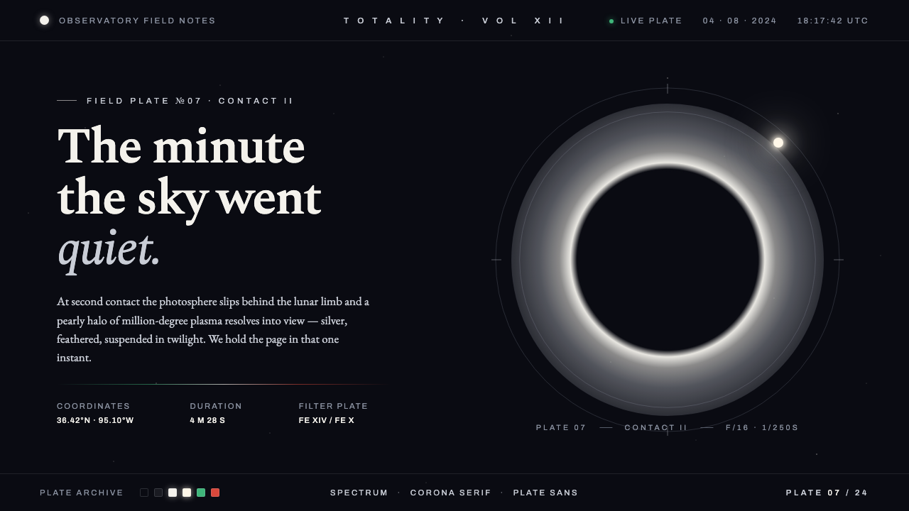 Solar Eclipse CoronaThe minute the sky went quiet. Pearly silver corona on twilight-black, one wa…
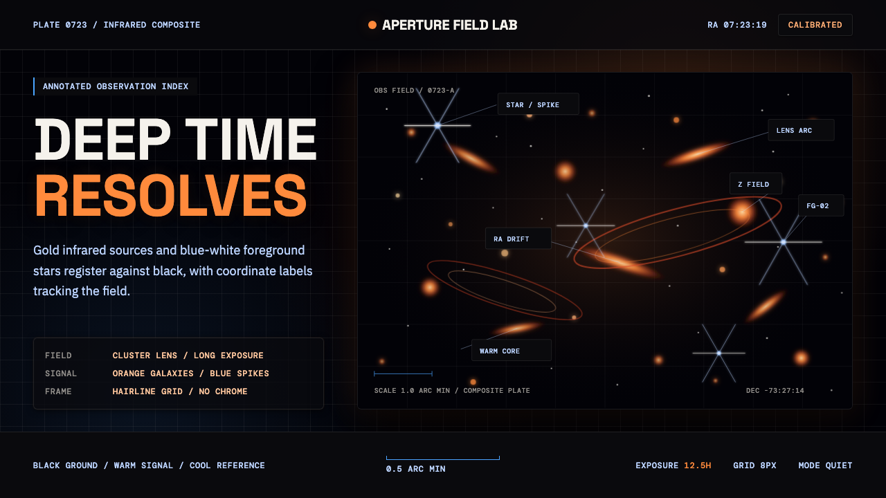 JWST Deep FieldPrecision in deep black. Orange galaxies, blue spikes, and DM Mono callouts m…
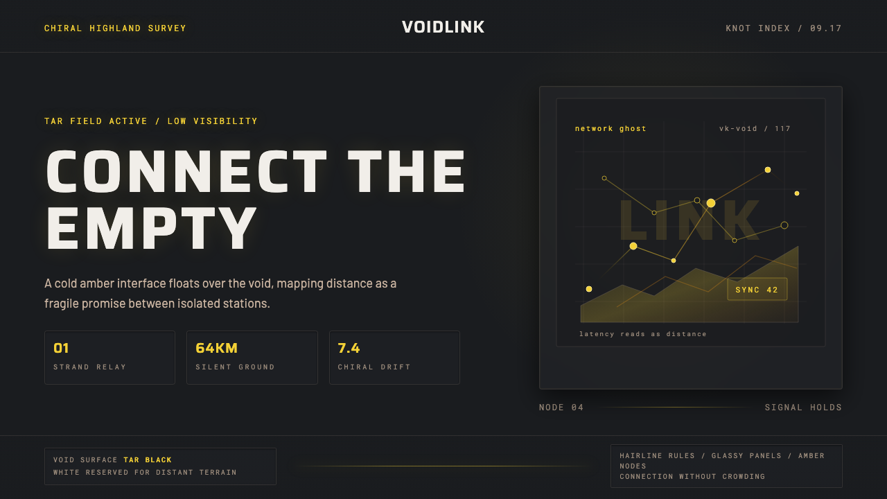 Death StrandingLonely connection, made visible. Amber HUD lines hover over a tar-black void.
 Halo (Forerunner UI)Hard light on the void. Cyan shield bars and concentric glyph rings glow on a…
 Interstellar Probe PatchCruise made visible. Black space, blue name rings, and a gold-ticked trajecto…
 Star CitizenDisciplined holographic HUD. Cyan readouts on glass over a black void, orange…